10,000 search results
(0.015 seconds)
- Liniga Serif by Graphite,
$15.00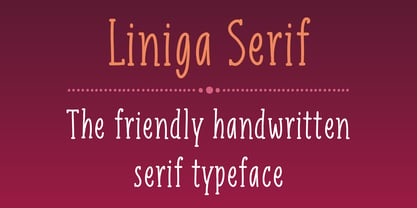 Linger Serif is a tall and friendly handwritten typeface with a simple structure and low contrast. It is the serif version of Liniga. Works well for both display and body text.
 - Sildetas by insigne,
$22.00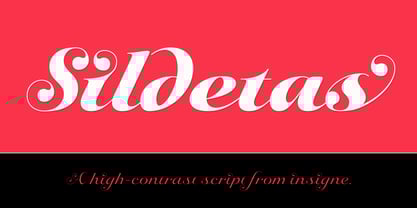 Sildetas is an elegant high-contrast script face. Sildetas was conceived as non-connected, high-contrast and ultra heavy script, as best exemplified by the Black weight. However, it was too much of a temptation to design a hairline variant, and this exploration gave the family’s lighter weights an elegant, graceful feel. The script was modified further to use connected letterforms as the primary glyphs. With its unique swirled ball terminals, this versatile script draws immediate attention. The face glides and flows across the page and the swirling ball terminals provide an interesting diversion to the flow. The lighter weights have an almost spencerian look. Sildetas includes six weights and is a very unique script face. Lighter weights can be used for elegant invitiations. Sildetas can get the job done for many unique design tasks. Sildetas includes many useful OpenType features, including a set of non-connecting and titling alternates, ligatures, and two types of end swashes. Opentype features include simplified swashed stylistic alternates without ball terminals, swash endings, ending contextual alternates, discretionary ligatures, ligatures and five different stylistic sets filled with alternates. In total, there are over 60 alternate letterforms. OpenType-capable applications such as Quark or the Adobe suite can take full advantage of the automatically replacing ligatures and alternates. This family also includes the glyphs to support a wide range of languages.
 - Woodout by Justyna Sokolowska,
$15.00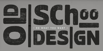 Wooden font block. Taken from the typesetting department at the Academy of Fine Arts in Warsaw. All the letters were printed on paper, scanned and polished on the computer. It’s very detailed font, which are suitable for large prints.
 - Dem Bones by Greater Albion Typefounders,
$3.50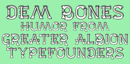 Dem Bones is a bit of fun-display alphabet (capitals), numbers and punctuation assembled out of the sort of knobbly ended bones that dogs used to gnaw on in all the best childrens cartoons and comics. Thing Gnasher and Gnipper or Spike and Tyke. Dem Bones is particularly apt at Halloween, but can introduce some un at any time of the year...
 - Nanquim by PintassilgoPrints,
$18.00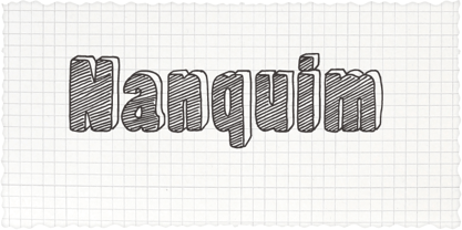 Nanquim is a versatile font, available in three sketchy options. At display sizes the line art is very eye-catching. At smaller sizes it turns out like textured faces. Always with a pleasant handmade feel. Nanquim characters were hand drawn with pen and India ink on film, like we use to do when preparing artwork for screenprint. Hope you enjoy!
 - Shamrock - 100% free

- Pauline by insigne,
$24.99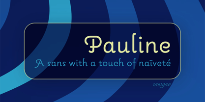 Pauline is a sans serif with a strong influence from retro scripts. Pauline is a geometric face formed with slow and deliberate rounded brush strokes. The tall ascenders give it a useful touch of naïveté. It’s a face suitable for some interesting titling and short bits of copy.
 - End of Path - Unknown license

- Kremlin Samovar - Unknown license

- Bremoleaf by Alit Design,
$22.00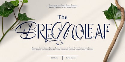 Introducing "Bremoleaf" - The Nature-Inspired Font 🌿 Embrace the beauty of nature with "Bremoleaf," a unique and versatile font that seamlessly blends the organic elegance of leaves with a harmonious mix of sans serif and script elements. This exquisite typeface is more than just a font; it's a work of art that brings the enchantment of nature to your creative projects. 🌱 The "Bremoleaf" font is a perfect choice for those who seek a harmonious fusion of two distinct typographic styles. It effortlessly combines the sleek and modern characteristics of sans serif letters with the flowing, graceful curves of an elegant script. This harmonious pairing creates a visually captivating and versatile typeface that suits a wide range of design needs. 🌿 With dynamic ligatures and an extensive selection of alternates, "Bremoleaf" offers endless possibilities to express your creativity. These ligatures and alternatives seamlessly flow, enhancing the readability and aesthetic appeal of your text. Whether you're designing a logo, a wedding invitation, a branding project, or any other creative endeavor, "Bremoleaf" has you covered. ✨ "Bremoleaf" boasts a wide range of characters and symbols, providing support for a staggering 708 characters. This inclusive font enables you to create content in various languages and styles with ease. Plus, it includes PUA (Private Use Area) Unicode, ensuring that you can access all its special characters and unique features effortlessly. 🌍 "Bremoleaf" is not bound by language or borders. It offers comprehensive multilingual support, making it the perfect choice for projects that target global audiences. From English to Spanish, French to Vietnamse, this font will help you convey your message beautifully and effectively. Experience the enchantment of "Bremoleaf" and elevate your design projects to new heights. This nature-inspired font brings the organic beauty of leaves to your creations, offering an irresistible combination of style and functionality. With "Bremoleaf," your designs will flourish like never before.
 - FS Conrad by Fontsmith,
$50.00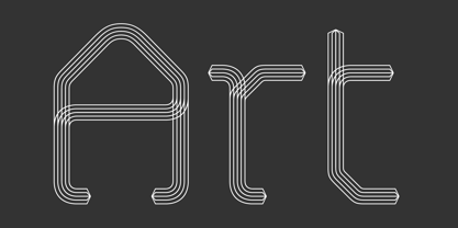 Art into type In 2008, Fontsmith were approached by their friend, Jon Scott, to investigate whether a typeface could assume the aesthetic of one artist’s body of work. Jon’s not-for-profit charity, Measure, was organising an event for the artist, Conrad Shawcross, whose giant mechanical installation, entitled Chord, was going on public display in the long-disused Kingsway tram tunnel in Holborn. Chord explores the way we perceive time, as either a line or a cycle. Two enormous machines with dozens of rotating arms and moving in opposite directions, weave rope with almost infinite slowness. An unusual brief Phil Garnham visited Conrad in his Hackney studio to get a feel for his work and ideas. “Conrad is a very clever and philosophical guy. He struggled to see how typeface design had any relevance to him and his art. This was going to be a challenge.” The artist presented the type designer with a pile of rope and a huge diagram of sketches and mathematical workings. “This was, in essence, my brief.” Phil developed three concepts, the simplest of which ticked all the boxes. “The idea of the strokes in the letterforms appearing and ending at peaks or points of origin fitted perfectly with Conrad’s idea of time occurring and ending at two ends of the sculpture.” Two versions Phil planned modules for two versions of the typeface: one with five lines in the letterforms and one with seven. He then drew the modules on-screen and twisted and turned them to build the machine that is FS Conrad. “This is not a simple headline typeface,” says Phil. “It’s not a rigid structure. It has varying character widths, and it’s informed by real typographic insight and proportions so that it actually works as piece of functioning, harmonious type.”
 - Assimilation - Unknown license

- Tower by Fenotype,
$19.95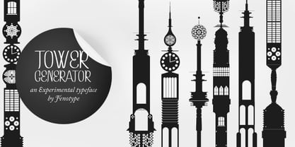 Tower was originally created as a school assignment at the University of Industrial Art & Design Helsinki in 2006. Tower is an experimental dingbat font. Try writing different kind of towers: set font size and leading the same and start experimenting!
 - Frisco Bay JNL by Jeff Levine,
$29.00Frisco Bay JNL is an entirely original design from Jeff Levine with strong Art Deco influences. A medium weight letter form, this design finds itself at home in any application where a touch of elegance from the past is needed. - Hardwood LP by LetterPerfect,
$39.00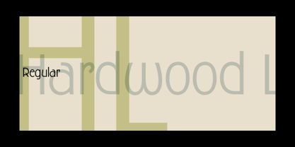 Hardwood is a reworked foundry typeface from the 1930's, providing an interpretation of the Art Deco graphic style. It harkens back to the golden era of poster design and Hollywood movie marquees, while retaining superb legibility at virtually any size.
 - Monster by Fenotype,
$19.95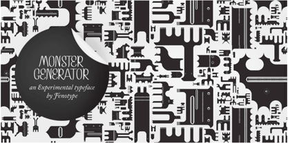 Monster was originally created as a school assignment at the University of Industrial Art & Design Helsinki in 2006. Monster is an experimental dingbat font. Try writing different kind of monsters: set font size and leading the same and start experimenting!
 - Riquet by Lipton Letter Design,
$20.00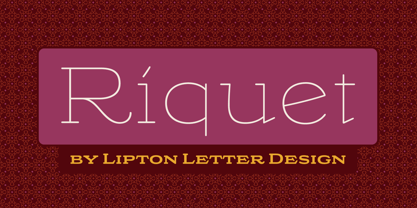 In the nineteen-twenties and early thirties, all display typography flourished in Europe. This was especially true in Germany, where poster design set a high creative standard, stimulating the design of a fantastic group of dramatic display letterforms. Richard Lipton designed Riquet after being inspired by a handful of freehand capital and lowercase letters on posters designed by lettering and poster artist Ludwig Hohlwein. He expanded this small group of display letterforms into a variable family with a weight axis. Riquet is a low contrast, delightfully casual typeface with 6 weights and the perfect selection of alternates. All of which gives an expressive look of precisely inked letters perfect for any packaging or branding project.
 - MB Vinatage by Ben Burford Fonts,
$25.00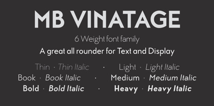 MB Vinatage is a 6 weight font family with italics that has its roots based firmly in the type and font design of the early 20th Century. With some art deco touches in the standard caps like the N and the low bars on the E, F & H, by using the stylistic alternates these can be changed to give the font a more contemporary look. The same applies to the lower case letters, with an alternate a and g and a stylistic lowercase t. The family works great as a display font using the thin and heavy weights and just as well for smaller & bulk text. Stay traditional or go contemporary or mix it up.
 - Funboy by Typodermic,
$11.95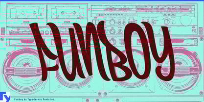 Introducing Funboy—the typeface that brings the bold, wild style of San Francisco’s graffiti right to your fingertips. With its thick lines and natural, flowing strokes, Funboy is perfect for adding an edgy, old-school hip hop vibe to any design. But this font isn’t just about style—it’s also about customization. With custom pairs and substitute characters, you can elevate your writing to a new level of polish and sophistication. And if you’re looking for even more personalization, simply play around with the uppercase and lowercase variants to create a unique look that’s all your own. Whether you’re designing a flyer for a block party or creating album art for your latest mixtape, Funboy is the typeface that will make your work stand out. So why settle for a boring, generic font when you can add some graffiti-inspired flair to your designs? Try Funboy today and see the difference for yourself. Most Latin-based European writing systems are supported, including the following languages. Afaan Oromo, Afar, Afrikaans, Albanian, Alsatian, Aromanian, Aymara, Bashkir (Latin), Basque, Belarusian (Latin), Bemba, Bikol, Bosnian, Breton, Cape Verdean, Creole, Catalan, Cebuano, Chamorro, Chavacano, Chichewa, Crimean Tatar (Latin), Croatian, Czech, Danish, Dawan, Dholuo, Dutch, English, Estonian, Faroese, Fijian, Filipino, Finnish, French, Frisian, Friulian, Gagauz (Latin), Galician, Ganda, Genoese, German, Greenlandic, Guadeloupean Creole, Haitian Creole, Hawaiian, Hiligaynon, Hungarian, Icelandic, Ilocano, Indonesian, Irish, Italian, Jamaican, Kaqchikel, Karakalpak (Latin), Kashubian, Kikongo, Kinyarwanda, Kirundi, Kurdish (Latin), Latvian, Lithuanian, Lombard, Low Saxon, Luxembourgish, Maasai, Makhuwa, Malay, Maltese, Māori, Moldovan, Montenegrin, Ndebele, Neapolitan, Norwegian, Novial, Occitan, Ossetian (Latin), Papiamento, Piedmontese, Polish, Portuguese, Quechua, Rarotongan, Romanian, Romansh, Sami, Sango, Saramaccan, Sardinian, Scottish Gaelic, Serbian (Latin), Shona, Sicilian, Silesian, Slovak, Slovenian, Somali, Sorbian, Sotho, Spanish, Swahili, Swazi, Swedish, Tagalog, Tahitian, Tetum, Tongan, Tshiluba, Tsonga, Tswana, Tumbuka, Turkish, Turkmen (Latin), Tuvaluan, Uzbek (Latin), Venetian, Vepsian, Võro, Walloon, Waray-Waray, Wayuu, Welsh, Wolof, Xhosa, Yapese, Zapotec Zulu and Zuni.
 - Subroc by Typodermic,
$11.95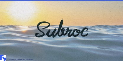 As I contemplate the beauty of Subroc, my mind drifts to a melancholic state, reminiscing the memories of a bygone era. This debonair joined-marker script typeface embodies a nostalgic charm that is difficult to resist. If your application supports ligatures, Subroc’s custom letter pairs automatically substitute for a more natural look. The resulting effect is akin to a handwritten note from a long-lost lover, carefully crafted with every stroke. But what truly sets Subroc apart is its inconspicuous, granular texture. The grittiness of its design transports you to a different time, evoking feelings of nostalgia and carefree abandon. Subroc’s beauty is not for the faint of heart, as it carries the weight of a thousand emotions with it. But for those brave enough to embrace it, the result is a breathtaking amalgamation of history, art, and emotion. So let Subroc be your muse, and let your words flow freely, imbued with the essence of a bygone era. Let your message carry the weight of history, and leave a lasting impression on all who see it. Most Latin-based European writing systems are supported, including the following languages. Afaan Oromo, Afar, Afrikaans, Albanian, Alsatian, Aromanian, Aymara, Bashkir (Latin), Basque, Belarusian (Latin), Bemba, Bikol, Bosnian, Breton, Cape Verdean, Creole, Catalan, Cebuano, Chamorro, Chavacano, Chichewa, Crimean Tatar (Latin), Croatian, Czech, Danish, Dawan, Dholuo, Dutch, English, Estonian, Faroese, Fijian, Filipino, Finnish, French, Frisian, Friulian, Gagauz (Latin), Galician, Ganda, Genoese, German, Greenlandic, Guadeloupean Creole, Haitian Creole, Hawaiian, Hiligaynon, Hungarian, Icelandic, Ilocano, Indonesian, Irish, Italian, Jamaican, Kaqchikel, Karakalpak (Latin), Kashubian, Kikongo, Kinyarwanda, Kirundi, Kurdish (Latin), Latvian, Lithuanian, Lombard, Low Saxon, Luxembourgish, Maasai, Makhuwa, Malay, Maltese, Māori, Moldovan, Montenegrin, Ndebele, Neapolitan, Norwegian, Novial, Occitan, Ossetian (Latin), Papiamento, Piedmontese, Polish, Portuguese, Quechua, Rarotongan, Romanian, Romansh, Sami, Sango, Saramaccan, Sardinian, Scottish Gaelic, Serbian (Latin), Shona, Sicilian, Silesian, Slovak, Slovenian, Somali, Sorbian, Sotho, Spanish, Swahili, Swazi, Swedish, Tagalog, Tahitian, Tetum, Tongan, Tshiluba, Tsonga, Tswana, Tumbuka, Turkish, Turkmen (Latin), Tuvaluan, Uzbek (Latin), Venetian, Vepsian, Võro, Walloon, Waray-Waray, Wayuu, Welsh, Wolof, Xhosa, Yapese, Zapotec Zulu and Zuni.
 - Lancet-Aken by Akenlee Type,
$39.00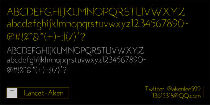 I want the font to have a vitality of life, Visually, the details are beautiful, long and fashionable, low-key and elegant, quiet and delicate, with the aesthetic feeling of fashion, not aggressive.
 - Ruthyne by DM Studio,
$25.00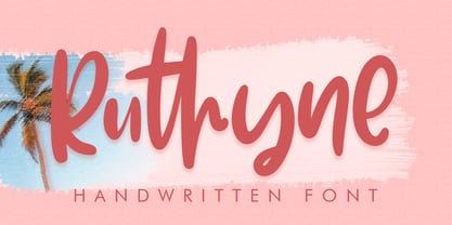 The Ruthyne Handwritten Font is a captivating and versatile typeface that embodies the beauty and warmth of human handwriting. With its flowing strokes and authentic character, this font adds a personal and elegant touch to your designs, making it perfect for greeting cards, invitations, branding, and various creative projects. Features: 1. Authentic Handwritten Style: The Ruthyne Font captures the authenticity and charm of natural handwriting. Its flowing strokes and genuine character lend an intimate and genuine feel to your text, making it suitable for projects that require a personal and human touch. 2. Versatile Application: This font is versatile and well-suited for a wide range of design projects. Use it in greeting cards, invitations, social media graphics, branding materials, and more to add a touch of personal elegance to your designs. 3. Uppercase and Lowercase Letters: The font includes both uppercase and lowercase letters, providing flexibility and creative freedom in your designs. Mix and match the cases to create visually appealing and balanced typography. 4. Punctuation and Symbols: In addition to the alphabet, the Ruthyne Font includes a comprehensive set of punctuation marks, numerals, and common symbols. This ensures consistency and ease of use when incorporating the font into your design projects. 5. Ligatures and Special Characters: The font offers a variety of ligatures and special characters that add character and uniqueness to your text. These unique glyphs create interesting connections between letters and decorative elements, allowing you to create personalized and visually appealing typography. 6. Easy to Use: Installing and utilizing the Ruthyne Handwritten Font is user-friendly. It's compatible with both Windows and Mac operating systems and seamlessly integrates into popular design software such as Adobe Photoshop, Illustrator, and InDesign. This ensures a smooth and efficient design workflow. Elevate your designs with the authentic and personal touch of the Ruthyne Handwritten Font. Let its flowing strokes and genuine character add a touch of elegance and human warmth to your greeting cards, invitations, and branding materials. Embrace the natural beauty of this font and create designs that resonate with sincerity and authenticity.
 - Camper by Fenotype,
$35.00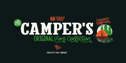 Camper is an original font collection of sixteen display fonts and extras. Camper’s core is a low-contrast connected script with three weights. In addition there are Sans, Serif and Slab fonts. All Camper fonts have a coherent style of solid forms with soft edges. They all play well together but work as themselves too. Camper’s Print is the same family with rugged “printed” edges and print texture. Camper Script is packed with several OpenType features: Contextual Alternates and Standard Ligatures help to maintain smooth flow while typing and they’re normally on. If you need more flashy characters try Swash, Stylistic or Titling Alternates or seek for even more Alternates from the Glyph Palette. Camper Script is PUA encoded and you can access extra characters in most graphic design softwares even without OpenType support. From Discretionary Ligatures you will find several flashier ligatures and a set of Catchwords: Access them by typing “The”, “And” or “With” with Discretionary Ligatures turned on. Camper Extras is a pack of strokes and swashes designed to go with the script. Many strokes can also be directly combined with a letter to make a custom “swash letter”. Check out posters for more inspiration. All Camper’s fonts have a wide language support — even Cyrillic. Camper is a recognizable and sturdy display pack with smooth and friendly outfit. It’s great for any display project from posters to identities and from online to print.
 - ITC Aram by ITC,
$29.99Jana Nikolic was finishing her degree program at the Faculty of Applied Arts, in Belgrade, with a final project that would combine her two majors: type and book design. Three stories from William Saroyan's My Name Is Aram would provide the text for the book, to be set in a typeface that Nikolic would design. Nikolic knew something special was happening the moment she put pen to paper. The letters just emerged," she recalls. "I started to explore a few new pens and found one I loved. I was able to make its tip bend with pressure." Like the family Saroyan writes about, the design flowing from Nikolic's pen would be simple but a little quirky. "When there were a whole bunch of little black letters around me," continues Nikolic, "I saw that this was going to be a very interesting typeface family." Nikolic drew Latin and Cyrillic letters, lowercase and capital letters, wide letters and narrow letters. She was surprised at how quickly and easily the design came. "There were no badly written letters," she says. "I hardly had to rework them and they fit together remarkably well." ITC Aram's standard character complement consists of one set of lowercase letters and two sets of capitals: one narrow and the other wide. The wide caps can be used with the standard lowercase, or mixed with the narrow caps for a variation on "cap and small cap" copy. The ITC Aram create the opportunity to mix and combine the letters into playful typographic expressions. Words and sentences that twinkle; text that seems light and alive - one runs the risk of creating work that is both delightful and charming when setting copy in ITC Aram." - Allust Italic by Halfmoon Type,
$20.00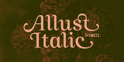 Allust Italic is an Upright italic font that is inspired by italic version some old-style serif typefaces specimen and an from my own flawed italic letterforms back in 2016. Download the cheat sheet for Allust Italic Ornament here: https://www.dropbox.com/s/yz1rvdopxm6mwva/Allust%20Italic%20Ornament%20Cheat%20Sheet.pdf?dl=0
 - Bingana by LetterStock,
$18.00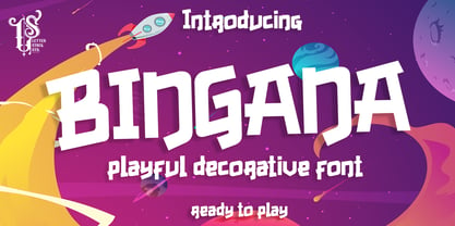 Bingana This pair was inspired by kids movie poster design that i saw on some gallery, It was crafted by hand specially to add natural handmade feeling in its brand identity than i make it clean with pentool. We improve with handmade to make a playful feel, this font is bold so it can look strong if you use it for branding or even title for your poster design with playful decorative style. Opentype features Bingana font has 175 character set included Bingana Font is very good looking in playful decorative logotype, labels, t-shirt prints, product packaging, invitations, advertising and others. This fonts works with folowing languages: Afrikaans, Albanian, Asu, Basque, Bemba, Bena, Chiga, Cornish, Danish, English, Estonian, Filipino, Finnish, French, Friulian, Galician, German, Gusii, Indonesian, Irish, Italian, Kabuverdianu, Kalenjin, Kinyarwanda, Low German, Luo, Luxembourgish, Luyia, Machame, Makhuwa-Meetto, Makonde, Malagasy, Malay, Manx, Morisyen, North Ndebele, Norwegian Bokmål, Norwegian Nynorsk, Nyankole, Oromo, Portuguese, Romansh, Rombo, Rundi, Rwa, Samburu, Sango, Sangu, Scottish Gaelic, Sena, Shambala, Shona, Soga, Somali, Spanish, Swahili, Swedish, Swiss German, Taita, Teso, Vunjo, Zulu Thank you for using this font. LS
 - Northills by LetterStock,
$25.00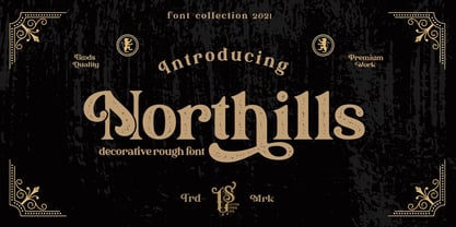 Northills Font This pair was inspired by the great lettering poster design that i saw on some coffee shop, It was crafted by hand specially to add natural handmade feeling in its brand identity than i make it clean with pentool. Opentype features Northills font has 215 character set Northills is very good looking in labels, retro logo design, product packaging, invitations, advertising and others. Rough lettering is always have a good retro vibes and give your design authentic and good looking, it’s perfect for branding or even poster design. If you looking for rough retro font for your logo or even lettering design, this font is a great choice to make your design authentic and good looking This fonts works with folowing languages: Afrikaans, Albanian, Asu, Basque, Bemba, Bena, Chiga, Cornish, Danish, English, Estonian, Filipino, Finnish, French, Friulian, Galician, Gusii, Indonesian, Irish, Italian, Kabuverdianu, Kalenjin, Kinyarwanda, Low German, Luo, Luxembourgish, Luyia, Machame, Makhuwa-Meetto, Makonde, Malagasy, Malay, Manx, Morisyen, North Ndebele, Norwegian Bokmål, Norwegian Nynorsk, Nyankole, Oromo, Portuguese, Romansh, Rombo, Rundi, Rwa, Samburu, Sango, Sangu, Scottish Gaelic, Sena, Shambala, Shona, Soga, Somali, Spanish, Swahili, Swedish, Swiss German, Taita, Teso, Vunjo, Zulu Thank you for using this font. LS
 - Schweimann Moderne NF by Nick's Fonts,
$10.00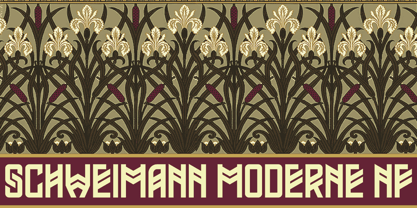 Here's a typeface from the Art Nouveau era that is equally at home in the world of contemporary science fiction, which is quite an achievement. Both versions of this font support the Latin 1262, Central European 1250, Turkish 1254 and Baltic 1257 codepages.
 - Sprouts by Wundes,
$18.00Sprouts is probably best described as "Bonsai-Nouveau". It's designed to look 100% organic up close, while maintaining good readability even at a distance. The looped letters terminate in playful swirls perfect for use on the cover of a menu or cookbook, yet would be equally at home in corporate logo art or as initials. Play with it, because creativity is an organic process. - Glowy by Redy Studio,
$17.00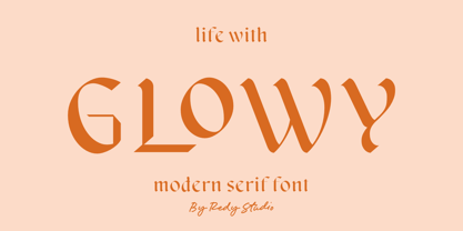 Glowy modern serif font is an exceptional font choice. This font effortlessly blends contemporary aesthetics with a touch of elegance, resulting in a visually captivating and professional typeface. Glowy Modern Serif font unique attribute lies in its luminous and bold quality. The letters seem to emit a soft glow, which sets it apart from traditional serif fonts and adds a modern twist. Glowy modern serif font also includes ligatures and alternate character, it's easy to achieve custom typography for stunning logos, headlines, and quotes. Feel free to give me a message if you have a problem or question. Thank you so much for taking the time to look at one of our products. ~Redy
 - Wermut by Brownfox,
$45.00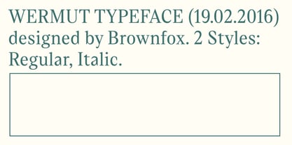 An intoxicating blend of rare flavours is what makes the new transitional typeface Wermut (German for vermouth) resemble its alcoholic namesake. Bitter and thorny at first glance, it proceeds to surprise the palate with a complicated taste that leaves a pleasant aftertaste. Wermut may not be taken in hastily, but needs to be thoughtfully enjoyed at a measured pace. Its dark colour, compressed, spring-like, shapes, well-built proportions, and agreeable letterforms all look safe enough until one is jolted to encounter the clipped serifs that lend the page an unexpectedly edgy appearance. The font comes in two weights with an extended character set in Latin and Cyrillic scripts supporting 66 languages. A product of slow, careful distillation, this infusion of multiple ingredients comes together to form a unique mature taste which will be appreciated by true connoisseurs of typographic cocktails. Desined by Gayaneh Bagdasaryan and Vyacheslav Kirilenko.
 - FS Dillon by Fontsmith,
$80.00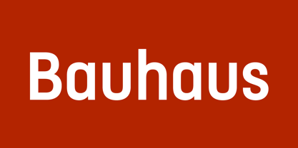 Bauhaus Geometric, economical, functional... The good, wholesome, modernist values that once fired up the tutors and students of the Bauhaus became the inspiration for FS Dillon after an exploration of the work of the pre-war art and design powerhouse in the Fontsmith studio. The font combines simplicity and directness with a characteristic Fontsmith warmth. Letterforms are compact, with a generous x-height, and built for maximum clarity and impact. The Bauhaus sought beauty through function. FS Dillon achieves it. Made for TV The weights of fonts for TV sometimes have to be adjusted so as not to “blow” on-screen. FS Dillon was originally drawn for the on-screen presentation branding of Film Four, whose primary colour was red. Black type on a red background looks heavier than white, so Dillon needed two weights that would allow white and black type to be used together, looking balanced and equal. Type design is an organic process. Years after developing FS Dillon, we revisited it, redrawing elements and adding italics to maintain consistency. Olympic You don’t get a much higher confirmation of the functional fitness of a typeface than to have it selected to guide visitors around an Olympic complex. FS Dillon was selected as the font for signage at some of the key venues at the London 2012 Olympic Park, helping to get spectators, athletes and officials from all over the world to their seats and starting blocks on time.
 - Competition by sportsfonts,
$15.00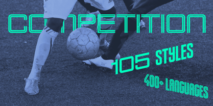 Competition is a state of the art sports typeface. A large width range, slant angles from –12 to 12, and an adjustable inline make it extremely versatile. It’s devided into 5 subfamilies, from the sizes S, M, L & XL with decreasing inline weights to Solid without an inline at all. (By the way: S doesn’t mean it doesn’t look good in large sizes!) Choose from 105 predefined styles, or 1 variable font with axes for width, slant and inline weight (which is included in the family package). Competition embraces the Latin S character set and therefore supports 400+ Latin-based languages. Go for Gold!
 - Nietos by Melvastype,
$22.00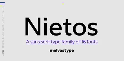 Nietos is a geometric sans serif type family of 16 fonts. Nietos is a clean and classy font but still full of character and warmth. It has open apertures to improve the legibility at small sizes. Terminals are angled and the contrast is low. Nietos has double-storey lowercase a to enhance the legibility but there is also one-strorey lowercase a included as a Stylistic Alternate. Nietos OpenType features: Stylistic Alternates for lowercase a and uppercase I, Case Sensitive Forms, Arrows, Circled and Black Circled Figures, Proportional Old Style figures, Tabular Lining figures, Slashed Zero, Fractions, Superscript and Subscript figures.
 - ZionTrain Pro by AndrijType,
$39.00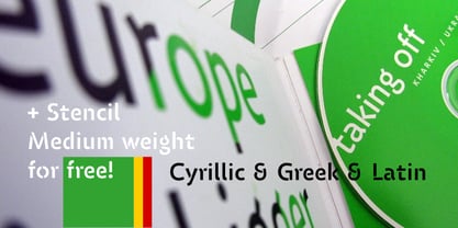 Originally ZionTrain was built as a (probably first in Cyrillic!) navigation typeface for the Kharkiv identity project and Kharkiv subway and airport navigation systems. We wanted comprehensible, distinctive letterforms, that can help everybody on the way from Babylon to Zion. The project was used in Kharkiv promotion at homeland and abroad, but was rejected by the new government. As a corporate typeface it was used for a few cultural projects. Now it is equipped with Slavic Cyrillic and Monotonic Greek and has special Stencil faces especially for low-budget navigations (don't forget to get your own Stencil Medium for free!).
 - Tioga by Monotype,
$29.99Tioga is a highly legible typeface designed specifically to display clearly on low-resolution displays. With superior readability even at small sizes, Tioga is an ideal typeface for developers of set-top boxes and digital televisions. Tioga is metrically compatible with Tiresias, a widely-used typeface designed for digital TV applications and adopted by the DVB and MHP standards. Tioga was fine-tuned to be more readable and aesthetically pleasing. Individual characters were adjusted for improved legibility and the letter spacing was revised to improve appearance and readability. Tioga bold was created to make the design more versatile. - Swifty by Match & Kerosene,
$25.00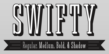 Swifty is four-style font family that features a low x-height and a towering cap height. This gives the font a distinct retro look that is great for titles, magazines, signs, shirts, and scrapbooking.
 - Lomesty by Sabrcreative,
$25.00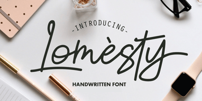 Introducing Lomesty, a captivating signature monoline font that exudes elegance and style. Designed with precision and attention to detail, Lomesty is the perfect choice for adding a touch of sophistication to your projects. Whether you're creating wedding invitations, branding materials, or personal stationery, this font will leave a lasting impression. With its seamless integration of uppercase and lowercase letters, Lomesty offers versatility and flexibility in your designs. Its extensive range of numbers and punctuations ensures consistency and harmony throughout your typography. Lomesty goes beyond language barriers with its multilingual support, allowing you to express yourself in various languages and cater to a diverse audience. From English to Spanish, French to German, Lomesty has got you covered. Unlock the full potential of Lomesty with its PUA encoding, which provides easy access to alternate glyphs and ligatures. This feature enhances the flow and uniqueness of your designs, making them truly stand out. Experience the beauty and finesse of Lomesty, where every stroke embodies elegance. Let this signature monoline font elevate your projects and bring them to life. Whether it's a logo, a website, or an art print, Lomesty will leave a lasting impression.
 - Salome by Canada Type,
$24.95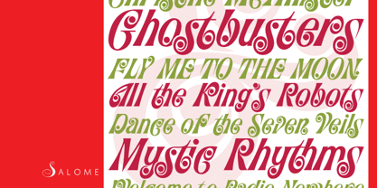 Salome is a revival, normalization and elaborate expansion of a 1972 film face called Cantini. The original film type, released by a tiny independent outfit called Letter Graphics, looked like it was hand drawn with little consideration for consistency in essential lettering flow measurements, like angles, stroke widths, and vertical metrics. All these issues have been resolved in this digital version, and the original character set, including the whole lot of alternates, was entirely redrawn and expanded to include even more alternates and many useful ligatures, as well as extended support for Latin-based languages. Combining elements of early 20th century art nouveau with common 1960s and 1970s signage and poster lettering flair, Salome uses curls and curves to wave its fantastic shapes in a most hypnotic dance. Salome simply cannot be unseen. Just like its namesake, the female seduction icon, it does not hesitate to put all of its natural beauty and energy on display in order to get what it wants. Salome comes in all popular font formats. The OpenType version, Salome Pro, combines the main font with the alternates one, and contains convenient features for push-button alternation and ligature substitution in supporting software programs.
 - South Coast by Set Sail Studios,
$14.00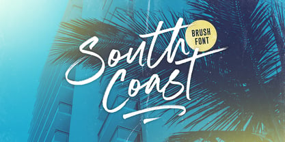 Keep it fresh with South Coast! A cool and confident brush font designed to deliver refreshing script lettering to a range of design projects. South Coast consists of: South Coast • A handwritten brush script font containing upper & lowercase characters, numerals, and a large range of punctuation. South Coast Alt • This is a second version of South Coast, with a completely new set of both upper and lowercase characters. If you wanted to avoid letters looking the same each time to recreate a custom-made style, or try a different word shape, simply switch to this font for an additional layout option. South Coast Swash • A third font containing 23 hand drawn swashes. Simply type any a-z or A-Z character in this font to generate a swash. Perfect for underlining your South Coast text and adding a bit of extra flair! Ligatures • 15 ligatures (double-letters) are included to help your lettering flow more naturally. Language Support • South Coast fonts support the following languages; English, French, Italian, Spanish, Portuguese, German, Swedish, Norwegian, Danish, Dutch, Finnish, Indonesian, Malay, Hungarian, Polish, Croatian, Turkish, Romanian, Czech, Latvian, Lithuanian, Slovak, Slovenian


