10,000 search results (0.141 seconds)
  1. Pinocchio - Unknown license
  2. D3 Euronism italic - Unknown license
  3. D3 Globalism italic - Unknown license
  4. D3 CuteBitMapism TypeA - Unknown license
  5. Becker - Unknown license
  6. D3 LiteBitMapism Bold - Unknown license
  7. D3 Superimposism Outline - Unknown license
  8. D3 Spiralism Outline - Unknown license
  9. D3 Superstructurism Outline - Unknown license
  10. D3 DigiBitMapism type A - Unknown license
  11. D3 CuteBitMapism TypeB - Unknown license
  12. DDD Pipe - Unknown license
  13. D3 Egoistism - Unknown license
  14. Gemerald - Unknown license
  15. D3 Superimposism Inline - Unknown license
  16. D3 DigiBitMapism type C - Unknown license
  17. D3 Skullism Katakana Bold - Unknown license
  18. D3 Superstructurism Inline - Unknown license
  19. D3 DigiBitMapism type B - Unknown license
  20. D3 Roadsterism Wide - Unknown license
  21. D3 Spiralism - Unknown license
  22. Reeperbahn - Unknown license
  23. D3 Petitbitmapism - Unknown license
  24. D3 Petitbitmapism - Unknown license
  25. D3 Digitalism - Unknown license
  26. D3 Skullism Alphabet - Unknown license
  27. D3 Roadsterism Long - Unknown license
  28. D3 LiteBitMapism Selif - Unknown license
  29. DUST - Unknown license
  30. Vaguely Repulsive is a distinctive font that lives up to its intriguing name through a design aesthetic that boldly pushes the boundaries of conventional attractiveness. At first glance, this font ch...
  31. We The People by K-Type, $20.00
    This typeface is extrapolated from the ‘We the People’ calligraphy of the handwritten US Constitution Preamble which employed a style based on German Text and Square Text exemplars from George Bickham’s penmanship copy-books, the most celebrated being The Universal Penman published in 1743. The original Constitution document was transcribed onto parchment by Jacob Shallus, a Pennsylvania Assistant Clerk, over a weekend in 1787. Shallus’s biographer, Arthur Plotnik (The Man Behind the Quill, 1987), notes that he was paid $30, a modest monthly wage at the time. He also suggests that the calligraphic headings, ‘We the People’ and ‘Article’, may have been inserted by Shallus’s 14 year old trainee son, Francis, “The manner in which the ‘Article’ headings are squeezed into the space Shallus allowed for them suggests a second hand—and perhaps not a very experienced one.” The unconventional backslant of the headings would seem to support this contention, and at the end of the document there is perhaps a novice’s inconsistency in the structure of the letter n between that used for ‘done’ and those used for ‘In Witness’. However, one has to admire the elegant swagger of the wavy t, h and l which the K-Type font extends to the b, f and k. Also, the simpler, Schwabacher-style W, an enlarged version of the lowercase w, is a little less flamboyant than the capital W from the German and Square texts in Bickham’s manuals. For designers using OpenType-aware applications, the typeface includes some Alternates, including a Bickham-style W, the letters t, h and n with added flourishes, two simpler forms of the A, and a few roman numerals for numbering articles. Also some ornamental flourishes and a round middle dot/decimal point. Punctuation marks are drawn in square, calligraphic style, but an alternative round period/full stop, for use with currency and numerals, is available at the period centered position (though placed on the baseline), accessed by Shift Option 9 on a Mac, or Alt 0183 on Windows. The full phrase, ‘We the People’, has been placed at the trademark keystroke and can be accessed by Option 2 (or Shift Option 2) on a Mac, or Alt 0153 on Windows. For designers who find the backslant awkward or unpleasant, the licensed typeface also includes two additional fonts which have a vertical aspect that may be more conducive to graphic design layouts. ‘We The People Upright’ and ‘We The People Upright Bold’ both retain the distinctive style, and the heavier weight is only slightly emboldened, just enough to add some punch.
  32. Perfecto by Autographis, $39.50
    Perfecto is the perfect font drawn imperfectly by hand. At small sizes the imperfections disappear; at large sizes, the hand-drawn touch becomes dominant.
  33. Modern LED Board-7, designed by Style-7, embodies the essence and aesthetic of contemporary digital displays reminiscent of LED (Light Emitting Diode) panels. This font, meticulously crafted to mimic...
  34. Atlas - Unknown license
  35. DS Diploma-DBL - Unknown license
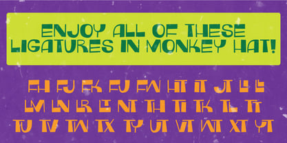
  36. Monkey Hat by PizzaDude.dk, $20.00
    Monkey Hat is art deco with a fresh twist of graffiti, and on top of that a lot of funk! Comes with a good handful of ligatures to make the text even more playful!
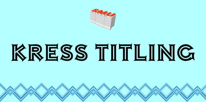
  37. Kress Titling by RMU, $30.00
    In 1923, the Schriftguss AG, Dresden, released this all-caps Art Deco font designed by Otto von Kress. From the existing basics, the now available font was completely redrawn and redesigned for modern use.
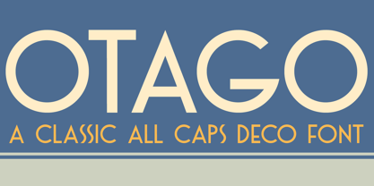
  38. Otago by Hanoded, $15.00
    Otago is a classic all caps Art Deco font. Clean, crisp and very, very legible. I took my inspiration for this font from a 1920's postcard. Otago comes with a bagful of diacritics.
  39. Virile by Monotype, $29.99
    The Virile and Virile Open fonts are late nineteenth-century typefaces in a rustic style. Use the Virile fonts to add charm to book covers and posters relating to natural history and decorative arts.
Looking for more fonts? Check out our New, Sans, Script, Handwriting fonts or Categories
abstract fontscontact usprivacy policyweb font generator
Processing