10,000 search results
(0.044 seconds)
- Risans Basic by Richard Ham Lettertype Ontwikkeling,
$24.99Font with more than 400 glyphs. This font can be used for the most comman languages and can als used for the basic calculus. Some glyphs for the fractions (and special rootfunction) there are used special characters (which be can used with the key code f0000 till f00014 (and Alt + X)) - Kolesom by Frantic Disorder,
$12.00 Kolesom is bold display font that inspired from classic rusty stuff like old signage and poster. This typeface has various styles of font that includes Clean, Alt, Texture, and Western. I found it perfect for poster design, t-shirt design, and other display design needs. Works best in 100pt and above.
 - Line Washington by Aqeela Studio,
$20.00 Line Washington is a thin and elegant handwritten font. Fall in love with its incredibly versatile style and use it to create gorgeous wedding invitations, beautiful stationary art, eye-catching social media posts and more! This font is PUA encoded which means you can access all the glyphs and sweeps easily!
 - City Wall by Hatftype,
$15.00 A graffiti display font with free style font that has the characteristics of street art that shows freedom and is filled with unique characters. Feature : * Symbol * Number * Punctuation * Multilingual support * Support in Mac and Windows OS * Support in design application (photoshop, illustrator, and more) I really hope you enjoy it.
 - Nicholia by Balpirick,
$15.00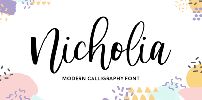 Nicholia is a cute and modern handwritten font with an incredibly friendly feel. It features gorgeous swashes and ligatures that make this script incredibly versatile. Whether you’re looking for fonts for Instagram or calligraphy scripts for DIY projects, Nicholia will turn any creative idea into a true piece of art!
 - Emalia by JprintStudio,
$10.00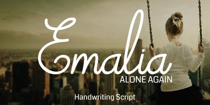 Emalia is a cute and casual handwritten font with an incredibly friendly feel. It features gorgeous swashes and ligatures that make this script incredibly versatile. Whether you’re looking for fonts for Instagram or calligraphy scripts for DIY projects, Emalia will turn any creative idea into a true piece of art!
 - Hillbear by Stringlabs Creative Studio,
$25.00 Hillbear is an incredibly charming script font that will turn any design project into a true piece of art. Hillbear Path is a flowing and elegant handwritten font, created with the help of a brush pen. Get inspired by its unique and beautiful style and add it to your favorite designs!
 - Coffee Matcha by Awan Senja,
$14.00 Coffee Matcha is a Lovely script font. It features a modern and elegant style that will take your designs to the next level. Whether you�re looking for fonts for Instagram or calligraphy scripts for DIY projects, Coffee Matcha will turn any creative idea into a true piece of art!
 - Lavineta by Balpirick,
$15.00 Lavineta is a beautiful and elegant handwritten font with an incredibly friendly feel. It features gorgeous swashes and ligatures that make this script incredibly versatile. Whether you’re looking for fonts for Instagram or calligraphy scripts for DIY projects, Lavineta will turn any creative idea into a true piece of art!
 - Bashirah by Cititype,
$14.00 Bashirah is a cute and casual handwritten font with an incredibly friendly feel. It features gorgeous swashes and ligatures that make this script incredibly versatile. Whether you’re looking for fonts for Instagram or calligraphy scripts for DIY projects, Bashirah will turn any creative idea into a true piece of art!
 - Revenge by Juncreative,
$19.00 Revenge is a cute and casual handwritten font with an incredibly friendly feel. It features gorgeous swashes and ligatures that make this script incredibly versatile. Whether you’re looking for fonts for Instagram or calligraphy scripts for DIY projects, Revenge will turn any creative idea into a true piece of art!
 - Oops by Posterizer KG,
$22.00 The initial idea for the Oops font, was to create graphemes, and by using them it could imitate a mark of a spilled liquid-stain. In an attempt to make the most convincing effect, those graphemes were written on glass. The final appearance of the graphemes, mostly remain in their basic form, and have the characteristic of a liquid, like fluidity in motion. This manuscript is expressive, but that does not affect the readability of the letters. The generated font was created by using Photoshop, Illustrator and a little bit of interventions in Font Lab. Font Oops is updated and edited version of an old version of the Art decor font, which had just basic letters. Today, Oops font contains Latin and Cyrillic letters, and it can be ideal for use in subjects like a paintball, art, expression, ink, water...
 - Arctic Chunky by Fly Fonts,
$15.00Arctic Chunky is a fun font that is best used at display sizes. - Octin Sports Free - 100% free

- Octin Prison Free - 100% free

- Octin College Free - 100% free

- Octin Vintage Free - 100% free

- Octin Spraypaint Free - 100% free

- Roller Poster by HiH,
$12.00 Roller Poster is named after Alfred Roller. In 1902, Roller created a poster to advertise the 16th exhibit of Austrian Artists and Sculptures Association, representing the Vienna Secession movement. The exhibit was to take place in Vienna during January & February 1903. The location is not mentioned because everyone in Vienna knew it would be held at the exhibit hall in the Secession Building at Friedrichstraþe 12, a few blocks south of the Opernring, near the Naschmarkt. Designed by Joseph Maria Olbrich in 1897, the buiilding has been restored and stands today as one finest of the many fine examples of Art Nouveau architecture in Vienna (see vienna_secession_bldg.jpg). Because of its dome, it is called “the golden cabbage.” The poster itself is unique. The word “secession” is in one type style and takes up two-thirds of the elongated poster. At the bottom of the poster are the details in a different lettering style. It is this second style at the bottom that is the basis for the font Roller Poster. In keeping with our regular naming conventions, we were going to call it Roller Gezeichnete (hand-drawn), but the wonderful play on both words and the shape of the three S’s in secession was too compelling. In November 1965 there was an exhibit of Jugendstil and Expressionist art at the University of California. Alfred Roller’s Secession Poster was part of that exhibit. Wes Wilson was designing promotional material at Contact Printing in San Francisco. Among their clients was a rock promoter named Bill Graham, staging dance-concerts at Fillmore Auditorium. Wilson saw the catalog from the UC exhibit and Roller’s lettering. Wilson adapted Roller’s letter forms to his own fluid style. The result was the poster for the August 12-13, 1966 Jefferson Airplane/Grateful Dead concert at Fillmore put on by Graham (BG23-1). Wilson continued to use Roller’s letter forms on most of the posters he did for Graham through May 1967, when he stopped working for Graham. The posters were extremely successful and the lettering style along with Roller’s letter forms were picked up by other artists, including Bonnie MacLean, Clifford Charles Seeley, James Gardner, and others. The Secession poster and the Fillmore posters have inspired a number of fonts in addition to ours. Among them are JONAH BLACK (& WHITE) by Rececca Alaccari, LOVE SOLID by Leslie Carbarga and MOJO by Jim Parkinson. Each is different and yet each clearly shows its bloodlines. Our font differs in two ways: 1) the general differences in the interpretation of the letter forms and 2) the modification of the basic letter form to incorporate the diacriticals within the implied frame of the letter, after the manner of the original design by Roller. We borrowed Carbarga’s solution to the slashed O and used it, in a modified form, for other characters as well to accomplish the same purpose. We recommend that you buy ours and at least one of the other three. According to Alaccari, a version called URBAN was released by Franklin Lettering in the 70’s (and is shown on page 51 of The Solotype Catalog). For comparison of our font to original design, see image files roller_poster_2s.jpg of original poster and roller_poster_2sx.jpg showing reconstruction using our font for the lower portion (recontructed area indicated by blue bar). Please note the consistency of character width. In the lower case, 23 of the basic 26 letters are 1/2 EM Square wide. The ‘i’ is an eighth narrower, while the ‘m’& ‘w’ are one quarter wider. All the Upper Case letters are 1/8 EM wider than the lower case. This is to make it easier to fill a geometrical shape like a rectangle, allowing you to capture a little of the flavor of Wes Wilson’s Fillmore West poster using only a word processor. We have also included a number of shapes for use as spacers and endcaps. If you have a drawing program that allows you to edit an ‘envelope’ around the letters to distort their shape, you can really get creative. I used Corel Draw for the gallary images, but there are other programs that can accomplish the same thing. The image file “roller_poster_keys.jpg” shows the complete character set with the keystrokes required for each character (see “HiH_Font_readme.txt” for instruction on inserting the non-keyboard characters). The file “roller_poster_widths.jpg” shows the exact width of each character in EM units (based on 1000 units per EM square). You will notice that the font is set wide for readability. However, most programs will allow you to tighten up on the character spacing after the manner of Roller & Wilson. In MS Word, for example, go to the FORMAT menu > FONT > CHARACTER SPACING. Go to the second Drop-Down Menu, labeled ‘Spacing’ and select "condensed' and then set the amount that you want to condense ‘by’ (key on the little arrows); two points (2.0) is a godd place to start. Let your motto be EXPLORE & EXPERIMENT. Art Nouveau has always been one of my favorite movements in art -- I grew up in a home with a couple of Mucha prints hanging on the living room wall. Perhaps because of that and because I lived through the sixties, I have enjoyed researching and designing this font more than any other I have worked on. Let’s face it (pardon the pun), Roller Poster is a FUN font. You owe it to yourself to have fun using it.
 - Nordeco by Leksen Design,
$29.00 Inspired by her Scandinavian heritage, Andrea Leksen created this modern geometric sans serif reminiscent of Scandinavian design and typography. With its tall x-height and monoweight strokes, Nordeco will be best showcased at large sizes, in headlines and other display uses. It contains 100 alternates with ornamental letters, borders, paragraph separators and seamless wallpapers for your designing pleasure. Designs include stripes, dots, art deco and leopard print. See some of the creative ways Nordeco can be used in this YouTube clip. Check out its cousin, Nordique!
 - Beachfront Hotel JNL by Jeff Levine,
$29.00 The Raleigh Hotel at 18th Street and Collins Avenue on Miami Beach is an Art Deco landmark and part of the city's popular tourist district. A vintage matchbook from the hotel had its name hand lettered in what is now Beachfront Hotel JNL; available in both regular and oblique versions. The lower case letters have been made more traditional, eliminating the Deco-influenced "overhangs" present on the capital letters, and an alternate "E" from the original matchbook design is available on the bar and broken bar keys.
 - Transat Text by Typetanic Fonts,
$29.00 Transat Text is a geometric sans serif typeface, and is the more rational sibling to the unabashedly Art Deco "Transat". Transat Text has a slightly taller x-height than its counterpart, making it easier to read at small sizes, but also performs admirably in larger display settings. Transat Text includes many OpenType features, such as ligatures, small capitals, case sensitive forms, stylistic alternates, arbitrary fractions, and a full complement of proportional, tabular, and oldstyle figures. The Transat Text family includes 5 weights plus optically-corrected obliques.
 - Kantor by T4 Foundry,
$21.00Kantor's modular stroke and humanist axis defines it as an old-style 15th century Venetian serif typeface. At the same time, the lowercase Kantor alphabet is relatively compressed and has the vertical stems of a textura blackletter. However, Kantor has distinct, penformed shapes and has also kept all the organic irregularities of traditional handwriting (or punch-cutting, as it were). Kantor is not happy, not sad - but calm and dignified. Perfect for buddhist poems, fantasy video games and antique scrolls to give that "long time ago"-feeling. - Odelina by Josstype,
$10.00 Odelina Script, Hand Lettered Calligraphy Font with beautiful waves and natural flow. has a unique letter style, with natural handdrawn, and has a softer and smoother character subtly connect all the characters. They have a simple elegant swashes in separate letters, you can use graphic design software to access the alternate letter. Odelina Script is perfect for weddings, invitations, greeting cards, quotations, posters, branding, business cards, stationary, title design, header blog, excerpts of art, the art of typography, letter envelopes modern or design books, occurred styles such as design handdrawn, title , letter marriage, pop vintage design, or purpose to make the project / art design we look beautiful and trendy. If you have any questions, please feel free to contact me via email: joelpopon@gmail.com
 - Fugal by Pedroglifos,
$10.00 Fugil is a high-contrast flared-serif humanist typeface with art nouveau influences for elegante and edgy projects. Perfect for identity of many sorts, from concerts, festival names, art exhibitions, films and even products.
 - Potenciarte by Nasir Udin,
$25.00 Potenciarte is an all-caps display typeface inspired by the facade of old buildings from the era of Nederlandsch-Indie (1900’s) in Surabaya, where Art Deco & Art Nouveau typographic styles were widely used.
 - Cliffhanger - Unknown license

- Dash To School by Comicraft,
$15.00 One of the more popular pupils in the Comicraft Academy of Lettering Arts, Dash Decent, has been working on his penmanship, thanks to a grant from those lovely learning specialists at Brainzy and Education.com. Developing learning games for Pre K, K and 1st grade, Brainzy requested a font that was fun and clean to help children learn to print. Dash to School is an all new revision and expansion of the Dash Decent family and features fun bold/heavy/outline and drop shadow weights for display, guidelines and dashed lines to assist learning and understanding and a healthy dose of decency! Dash Decent has graduated 1st Grade and with Dash to School’s help, so can you! See the families related to Dash To School: Dash Decent Features: Nine fonts (Regular, Bold, Heavy, Outline, Shadow, Guides, GuidesDashed & GuidesSolid) with upper and lowercase alphabets.
 - Le Rock by URW Type Foundry,
$39.99 Le rock is the newborn sister of my first typeface Jazmo and a relative of my music-inspired font family. Le Rock seems to wiggle and jiggle a little as if it invites you to dance. This is caused by the gaps in the individual characters. The typeface can also be seen as eroded, carved and sculpted by mother nature. But besides, the design of Le Rock can also be associated with the characteristics of stones: Solid and since ever, here, there and everywhere. To walk on, lean against, to be surrounded by, to build with and to shelter in. It cannot be denied, that there are also some comic art influences. The font is outspoken enough to be used in any form of graphic design, like poster and flyers, but at the same time it remains readable enough for longer texts.
 - Gradl Zierschriften by HiH,
$10.00 Here is another design by jewelry designer Max Joseph Gradl. Zier is a verb, meaning to decorate, adorn or ornament; zierlich means decorative, elegant, fine, neat. Schrift means type. Zierschrift, therefore, means decorative type. Gradl Zierschriften is a decorative type in the Art Nouveau style, rather than the more ornate Victorian style. Very modern, very young, with an elegant simplicity of form. Maria Makela, in her book The Munich Secession (Princeton 1990) suggests that the frequent use of simple, flowing, organic forms that was so characteristic of Art Nouveau was a reaction against the growing complexity and rapid urbanization that resulted from 19th century industrialization. In keeping with that reaction is the hand-drawn quality that intentionally rejects a mechanistic mathematic precision of line rendering. Gradl Zierschriften preserves that hand-drawn quality. Designed with upper case only, this face was obviously intended for short headlines only and is best set at 18 points or larger. However, I don't think you really get to experience the grace of this design until you get to 36 points or more. In the larger sizes, it is simply stunning. Please note that while most of the uppercase letterforms are repeated in the lower case for convenience, the ‘F’,‘L’ and ‘T’ are rendered a little narrower than in the uppercase to provide for visual variety. The font also includes a generous supply of ligatures for just the right fit ... and just for the fun of using them. Three common ways of inserting a ligature, accented letter or other special character are: 1) Key in “ALT”+“0”+[ascii #]; for example ALT+0233 for the e-acute, 2) From within your application program, go to the INSERT menu and look for something like “Insert Symbol,” (this function is NOT available in all application programs) & 3) Cut & Paste from the CHARACTER MAP display that has been supplied by every generation of Windows Operating System that I can recall (All Programs>Accessories>System Tools). Isn't it amazing what you can do? Don't be afraid to experiment. If you back up your work, you have very little to lose and a lot to gain. Not only do you acquire a new tool, but by the very process you have learned how to continually expand your knowledge and skill base.
 - Classic Fairy by Timurtype,
$14.00 Introduced by Timurtype Studio! Classic Fairy is a Monoline Handwriting Font This font showcases the art of monoline handwritten fonts – a symphony of elegance and charm. Let charming threads weave a tale of elegance in your designs, where every curve whispers sophistication and timeless appeal Classic Fairy Font also supports multilingualism. Enhance your designs with our original fonts, feel free to comment or provide feedback, Enjoy the fonts 😊 Thank You
 - Realistic Harvest by Timurtype,
$14.00 Introduced by Timurtype Studio! Realistic Harvest is a Handwritten Script Font this font Captivates with elegance Handwritten font, where every curve reveals a story of elegance and every detail is a brushstroke of luxury. A visual symphony for those who appreciate the art of beauty. Realistic Harvest Font also supports multilingualism. Enhance your designs with our original fonts, feel free to comment or provide feedback, Enjoy the fonts Thank You
 - Qanoar by Hishand Studio,
$15.00 Classy look font of Qanoar. a modern serif font family that drawn inspiration from elegant, modern, but classic at the same time. just have a look at this beautiful handcrafted serif typeface. Use it for logo, design, branding, and many more. Complete with ligatures alternates regular italic icon kerning multilingual support
 - Eutheric by Typotheticals,
$10.00This plain serif can be used for a variety of purposes. Good for headlines and larger text usages. Hulbert is a comical look at the Eutheric family. It is useful for those moments where no other font will fit. Eutheric is a serif style look at the Cooper type of fonts. - PixL - Unknown license

- Overline Stencil by WAP Type,
$15.00 Overline Stencil font is perfect for your up coming projects. Such as logo branding, editorial design, fashion, stationery design, sport design, blog design, modern advertising design, card invitation, art quote, home decor, book/cover title, special events and any more.
 - Avolus by Kaidosan,
$15.00 Avolus is a cool display font, comprised of a modern and unique style. Fall in love with its incredibly versatile style and use it to create gorgeous wedding invitations, beautiful stationary art, eye-catching social media posts, and much more
 - Funny Frog Display by Sipanji21,
$15.00 Funny Frog - A Fun Display Font With Cute Characters. It will elevate a wide range of design projects to the highest level, be it branding, headings, Kids Zone, designs, invitations, Snack Package, logotype, wall art illustration, apparel, labels, and much more!
 - Beluga Road by Sipanji21,
$15.00 Beluga Road is a spectacular decorative font with a graffiti style. It will elevate a wide range of design projects to the highest level, be it branding, headings, wedding designs, invitations, signatures, logotype, wall art illustration, apparel, labels, and much more!
 - Odeon by Scriptorium,
$12.00Odeon is the kind of font you would have seen on theatre or concert posters around the turn of the twentieth century. It is based on Art Nouveau sign lettering and has a heavy, playful look that's hard to miss.


