10,000 search results
(0.417 seconds)
- Bigbox by Gassstype,
$23.00 Here comes a New font,Introducing BIG BOX It's Unique Display Font is a Typeface Style and classy style, this font is great for your creative projects such as watermark on photography, and perfect for logos & branding, invitation,advertisements,product designs, stationery, wedding designs,label ,product packaging, special events or anything that need handwritting taste. BIG BOX a natural Hand Drawn feel. This handmade font will make your design has a beautiful natural touch for each details. It is perfect for any design project as Invitation,logo, book cover, craft or any design purposes,photos, photography overlays, signs, window art, scrapbooking, tags and so much more! That is has charming, authentic and relaxed characteristic more natural look to your text.
 - Mentality by Almarkha Type,
$29.00 Introducing our latest display typeface called Mentality A unique Fonts with vintage taste can make your logotype become more interesting. A bold script that will stands out from the crowd! Perfect to be used as logotype, badge and label!. inspired by the decorative arts and architecture movement Mentality fonts is perfect for your project and allows you to create designs, headlines, posters, logos, badges, t-shirts and many more that are beautiful. It is also best used for posts, logos, posters, certificates, labels and more. What’s Included : Standard glyphs Web Font Multilingual Accent Works on PC & Mac , Simple installations Accessible in the Adobe Illustrator, Adobe Photoshop, Adobe InDesign, even work on Microsoft Word. PUA Encoded Characters – Fully accessible without additional design software. Fonts include multilingual support
 - Aalama by Gassstype,
$22.00 Here comes a New font,Introducing AALAMA It's Rough Display Font is a Authentic Style and classy style, this font is great for your creative projects such as watermark on photography, and perfect for logos & branding, invitation,advertisements,product designs, stationery, wedding designs,label ,product packaging, special events or anything that need handwritting taste. AALAMA is a natural Hand Drawn feel. This handmade font will make your design has a beautiful natural touch for each details. It is perfect for any design project as Invitation,logo, book cover, craft or any design purposes,photos, photography overlays, signs, window art, scrapbooking, tags and so much more! That is AALAMA has charming, authentic and relaxed characteristic more natural look to your text.
 - Antodits by Gassstype,
$23.00 Here comes a New font,Introducing Antodits is Authentic Hand Drawn Typeface is a Signature Style and classy style, this font is great for your creative projects such as watermark on photography, and perfect for logos & branding, invitation,advertisements,product designs, stationery, wedding designs,label ,product packaging, special events or anything that need handwritting taste. Antodits a natural Hand Drawn feel. This handmade font will make your design has a beautiful natural touch for each details. It is perfect for any design project as Invitation,logo, book cover, craft or any design purposes,photos, photography overlays, signs, window art, scrapbooking, tags and so much more! This font is PUA encoded which means you can access all of ligatures and Alternate glypsh.
 - Honey Mushroom by Gassstype,
$23.00 Here comes a New font,Introducing Honey Mushroom is Another Display Cartoon is a Signature Style and classy style, Cute Cartoon Font,Bold Display , Inspired from Modern logos of brands that have very strong characteristics, this font is great for your creative projects such as watermark on photography, and perfect for logos & branding, invitation,advertisements,product designs, stationery, wedding designs,label ,product packaging, special events or anything that need handwritting taste. Honey Mushroom a natural Hand Drawn feel. This handmade font will make your design has a beautiful natural touch for each details. It is perfect for any design project as Invitation,logo, book cover, craft or any design purposes,photos, photography overlays, signs, window art, scrapbooking, tags and so much more!
 - Bright Little Star by Gassstype,
$22.00 Here comes a New font,Introducing Bright Little Star It's Unique Display Font is a Typeface Natural Style and classy style, this font is great for your creative projects such as watermark on photography, and perfect for logos & branding, invitation,advertisements,product designs, stationery, wedding designs,label ,product packaging, special events or anything that need handwritting taste. Bright Little Star a natural Hand Drawn feel. This handmade font will make your design has a beautiful natural touch for each details. It is perfect for any design project as Invitation,logo, book cover, craft or any design purposes,photos, photography overlays, signs, window art, scrapbooking, tags and so much more! That is has charming, authentic and relaxed characteristic more natural look to your text.
 - Revoluta by Gassstype,
$25.00 Here comes a New font,Introducing REVOLUTA It's All Caps Display Font is a Textured Natural Style and classy style, this font is great for your creative projects such as watermark on photography, and perfect for logos & branding, invitation,advertisements,product designs, stationery, wedding designs,label ,product packaging, special events or anything that need handwritting taste. REVOLUTA a natural Hand Drawn feel. This handmade font will make your design has a beautiful natural touch for each details. It is perfect for any design project as Invitation,logo, book cover, craft or any design purposes,photos, photography overlays, signs, window art, scrapbooking, tags and so much more! That is has charming, authentic and relaxed characteristic more natural look to your text.
 - Pretty Boy by Creativemedialab,
$24.00 Introducing Pretty Boy a decorative serif family. This font consists of five weights and an ornament and has many alternative options to arrange to get a very beautiful and charming typography art. Pretty Boy Ornament works great to pair with any fonts too! This decorative serif family is perfect for all sorts of designs like movie, poster, wedding invitations, and also work great for logo, branding, headers or labels. how to access alternate? Adobe Photoshop go to Window - glyphs Adobe Illustrator go to Type - glyphs Others ( Canva, Cricut Design Space, etc ) , open font book (mac) / Character map (PC) - Set to view all Glyphs, copy the glyph that you want from Pretty Boy font and paste. Check out Losta Frida which is a great pair for Pretty Boy.
 - Algeon by Product Type,
$17.00 Algeon Handdrawn Display Font: An Artistic Touch in Every Letter, where uniqueness and artistic touch meet in every character. This hand-drawn display font brings warmth and intelligence to your projects. Each letter in Algeon is designed with an artistic hand, giving it a unique and authentic feel. Algeon brings elements of hand-drawn beauty into every design, creating a relaxed and memorable look. Algeon is the perfect choice for projects that want a hand feels full of character. Whether you are designing posters, greeting cards, or other creative elements, these fonts add a special touch to any work of art. Do not miss this opportunity! Get the Handrawn Algeon Display Font now and bring artistic uniqueness to every letter.
 - Terrible Brush by Gassstype,
$25.00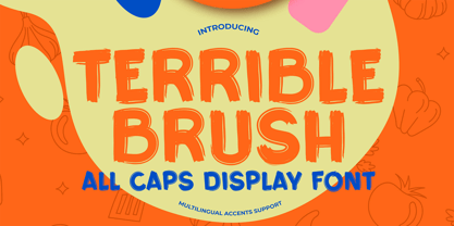 Here comes a New font,Introducing Terrible Brush It's All Caps Display Font is a Textured Natural Style and Authentic Brush style, this font is great for your creative projects such as watermark on photography, and perfect for logos & branding, invitation,advertisements,product designs, stationery, wedding designs,label ,product packaging, special events or anything that need handwritting taste. Terrible Brush is a natural Hand Drawn feel. This handmade font will make your design has a beautiful natural touch for each details. It is perfect for any design project as Invitation,logo, book cover, craft or any design purposes,photos, photography overlays, signs, window art, scrapbooking, tags and so much more! That is has charming, authentic and relaxed characteristic more natural look to your text.
 - Healing Sunday by Gassstype,
$23.00 Here comes a New font, Introducing Healing Sunday It's Fun Comic Font is a Textured Natural Style and Authentic Style, this font is great for your creative projects such as watermark on photography, and perfect for logos & branding, invitation,advertisements,product designs, stationery, wedding designs,label ,product packaging, special events or anything that need handwritting taste. Healing Sunday is a natural Hand Drawn feel. This handmade font will make your design has a beautiful natural touch for each details. It is perfect for any design project as Invitation,logo, book cover, craft or any design purposes,photos, photography overlays, signs, window art, scrapbooking, tags and so much more! It is perfect for any design project as Invitation,logo, book cover, craft or any design purposes.
 - Carilos by Gilar Studio,
$16.00 Carilos is a curly and fun serif font. This collection of scripts is perfect for gift products like a shirts or greeting cards. Also suitable for wedding invitations, branding, stationery, blog design, custom art, custom stamps, custom embossers, or any design purpose. For those of you who are needing a touch of elegant, stylish, classy, chic and modernity for your designs, this font was created for you! Carilos is with beautiful ligatures, special alternative glyphs and multilingual support. It's a very versatile font that works great in large and small sizes. This pack include are some interesting ligature and alternate options. Feature : Number And Punctuation Multi-language Alternates PUA Encoded Beautiful 60+ Ligatures Mix and Match lowercases & uppercases. Let’s play! Check my other Font here : https://gilarstudio.com/
 - Naive by S&C Type,
$8.00 Naïve is a serif handwritten font designed by Fanny Coulez and Julien Saurin in Paris. Our goal was to draw a font with finely irregular lines that give a human and whimsical feeling. The three weights of this subtle Parisian hand-drawn font can be enhanced with two alternates fancy glyphs for each letter, the “Fantaisies”, to improve your designs and bring a more poetic and unusual feeling. We hope you will enjoy our work :) You could follow us on our Instagram: instagram.com/sc.type Merci beaucoup! Note: This font is part of our Naïve superfamily that contains lot of variations: Line, Inline, Serif, Sans Serif, and a special Art Deco one. Just click on our foundry name to see them all!
 - Novante by Arterfak Project,
$28.00 Novante is a luxury display serif, a beautifully smooth and elegant typeface with high contrast of the letterforms that represents glamour and magnificence. Inspired by the luxurious Art Deco and modern minimalist of the design trends. Novante is an All-caps font equipped with lots of stylish ligatures and classy alternates that you can mix and match to get an elegant typographic look. This versatile font can be used for branding, logos, labels, quotes, magazines, cards, or short body text. The fonts features: Uppercase Small-caps Numbers Symbols Punctuations Accents (26 languages) Stylistic alternates Stylistic set 01-04 Discretionary Ligatures I hope you enjoy this elegant font as much as I was excited making it. Ramz. Check out Ranille which is a great pair for Novante.
 - Rift by Gassstype,
$25.00 Introducing Rift - All Caps Display Font latest display typeface called Rift a unique Fonts with vintage taste can make your logotype become more interesting. Best Vintage font with multilingual support. inspired by the decorative arts and architecture movement. Rift fonts is perfect for your project and allows you to create designs, headlines, posters, logos, badges, and many more that are beautiful. It is also best used for posts, posters, and more. Beautiful inspired by the famous minimalist logo, perfect for the purposes of designing templates, brochures, videos, advertising branding, and more. Perfect for adding a unique twist to word-mark , monograms or pull quotes.punctuation making it super fantastic,strong modern appearance, magazine's headers, signs or gift/post cards,cafe's and weddings.
 - The Invaders by Gassstype,
$22.00 Here comes a New font,Introducing THE INVADERS It's Unique Rough Brush Font is a Strong Style and classy style, this font is great for your creative projects such as watermark on photography, and perfect for logos & branding, invitation,advertisements,product designs, stationery, wedding designs,label ,product packaging, special events or anything that need handwritting taste. THE INVADERS a natural Hand Drawn feel. This handmade font will make your design has a beautiful natural touch for each details. It is perfect for any design project as Invitation,logo, book cover, craft or any design purposes,photos, photography overlays, signs, window art, scrapbooking, tags and so much more! That is THE INVADERS has charming, authentic and relaxed characteristic more natural look to your text.
 - Broken Dreams by Gassstype,
$27.00 Here comes a New font, Introducing Broken Dreams It's Weird Display Font is a Natural Brush Style and Authentic classy style, this font is great for your creative projects such as watermark on photography, and perfect for logos & branding, invitation,advertisements,product designs, stationery, wedding designs,label ,product packaging, special events or anything that need handwritting taste. Broken Dreams is a Brush Hand Drawn feel. This handmade font will make your design has a beautiful natural touch for each details. It is perfect for any design project as Invitation,logo, book cover, craft or any design purposes,photos, photography overlays, signs, window art, scrapbooking, tags and so much more! It is perfect for any design project as Invitation,logo, book cover, craft or any design purposes.
 - Kostanadia by Gassstype,
$23.00 Here comes a New font, Introducing Kostanadia It's Weird Display Font is a Natural Style and Authentic classy style, this font is great for your creative projects such as watermark on photography, and perfect for logos & branding, invitation,advertisements,product designs, stationery, wedding designs,label ,product packaging, special events or anything that need handwritting taste. Kostanadia is a natural Hand Drawn feel. This handmade font will make your design has a beautiful natural touch for each details. It is perfect for any design project as Invitation,logo, book cover, craft or any design purposes,photos, photography overlays, signs, window art, scrapbooking, tags and so much more! It is perfect for any design project as Invitation,logo, book cover, craft or any design purposes.
 - Penitentiary Gothic by E-phemera,
$30.00Penitentiary Gothic is a digital recreation of the letters used on California state license plates, designed in order to make props for movies and television shows. The regular style is meant to be used on its own, but the other four styles are meant to be used one on top of another in different colors to create an embossed 3D effect. For best results, use the fill style in a dark color on top of a light colored background. Put the lolite style directly on top of the fill style in 10 - 30% of the background color. Put the hilite style directly on top of that in 10 - 30% of your fill color. Put the shadow style directly on top of that using your background color plus 50 - 80% black. - FF Daxline by FontFont,
$83.99 German type designer Hans Reichel created this sans FontFont in 2005. The family has 14 weights, ranging from Thin to Black (including italics) and is ideally suited for advertising and packaging, book text, editorial and publishing, logo, branding and creative industries, poster and billboards, small text as well as web and screen design. FF Daxline provides advanced typographical support with features such as ligatures, small capitals, case-sensitive forms, fractions, super- and subscript characters, and stylistic alternates. It comes with a complete range of figure set options – oldstyle and lining figures, each in tabular and proportional widths. As well as Latin-based languages, the typeface family also supports the Cyrillic and Greek writing systems. This FontFont is a member of the FF Dax super family, which also includes FF Dax and FF Dax Compact.
 - Kris by Characters Font Foundry,
$25.00 Kris is a powerful typeface based on humanistic minuscule with a touch of Uncial script. An alphabet with an unusual appearance. It is based on the paradigm of classical handwriting. Kris is handwritten with a broad nib pen and ordinary black ink. The somewhat fanciful shapes are created by lifting the pen randomly left and right. This causes unpredictable frayed edges that make the typeface exciting. It bursts with character and is very versatile. Kris is written by the Dutch calligraphy artist Corrie Smetsers. Corrie threw all basic characters in a plastic bag and René Verkaart built the typeface and created all remaining characters. “Most special about this project was collaborating with Corrie. She's an expert in handwriting and has developed writing systems for the educational sector for decades”, René says.
 - Stevie Sans by Typefolio,
$29.00 Some years ago I had my first contact with a grotesque typeface, when handling a sample catalog of typographic specimens from the age of phototypesetting. The style eventually settled in my memory waiting for the work of time. Behind its apparent neutrality, there is a complex balance game, that almost leads to the basic principles of design which deliver such power to the grotesque style. Stevie Sans is the answer to the action of time. A bridge that allows the designer to go into the past, while being in the present and looking towards the future. It is what it’s expected from a grotesque designed in the 21st century. With 7 roman styles ranging from thin to black, support to many languages and essential opentype features, Stevie Sans is the ideal choice for your project.
 - Latitude Sans by Stiggy & Sands,
$24.00 An Uber-Black Sans Serif with a Warm Personality Latitude Sans began as a digitization of a film typeface from LetterGraphics known simply as "Free". The original specimen included standard Capitals and Lowercase, Numerals and minimal Punctuation, a bare bones character set. We've fleshed out the Latitude Sans typeface to include a full standard character set, an extended international set, and more so it can be a strong heavyweight sans typestyle. See the last graphic for a comprehensive character map preview. Opentype features include: - Full set of Inferiors and Superiors for limitless fractions. - Tabular, Proportional and Oldstyle figure sets. - Ligatures for a collection of "f" paired sets: fi, fl, ft, ffi, ffl, etc. Approx. 652 Character Glyph Set: Latitude Sans comes with a glyphset that includes standard & punctuation, international language support, and additional features.
 - Arpona Sans by Floodfonts,
$49.00 Arpona Sans is a contemporary sans serif family inspired by the work of Edward Johnston and Eric Gill for London Underground. As well as its serif companion Arpona it is a symbiosis of different design concepts. Arpona Sans combines the esthetics of a geometric Sans with the usefulness of the humanist concept and the calm of the modernist proportions. Arpona Sans is a good choice for editorial design, branding, app design and web design – a workhorse well readable even in running text on screen. The family has nine weights, ranging from Thin to Black plus corresponding italics. Each style includes 590 glyphs supporting all western-, eastern- and central-european languages including four sets of figures and various currency symbols. If you want to go into details visit the microsite: https://www.floodfonts.com/arponasans
 - Rothwood by Type-Ø-Tones,
$60.00 In 2011, while tutoring an exercise on Slab Serifs, Josema discovered Robert Thorne’s work for Thorowgood. Specifically, he was fascinated by the extraordinary density of the 6-line Egyptian Pica from 1820-21. As a simple exercise, he wanted to test the limits of readability within the context of a contemporary alphabet. Rothwood Ultra is the result of this experiment. As a way of developing the series, he found it interesting to go to the opposite end of the spectrum and discover how to evolve the extra-black Ultra’s DNA into a super lightweight model. The Hairline and Thin styles are her slim sisters. The third challenge has been the creation of the text version. Light, Book, DemiBold and Bold, including italics and Small Caps close the Rothwood cycle for editorial use.
 - Hando Soft by Eko Bimantara,
$24.00 Hando Soft is a variant of Hando neo grotesk sans family. Each letter on Hando Soft has curve strokes end, which gives a soft and more ease-looking letterforms. Hando offers a wide range of usage possibilities. It's low x-height and variety of light size options make it a good choice for reading, it's tenuous white spaces in the counter letterforms make it legible enough to be recognized remotely. It's curved tensions on the circular letterforms gave a futuristic impression. It's sleek and simple strokes make it perfect for a broad range design purposes. Hando consists of 10 styles from Hairline to Black with each matching oblique. Contains more than 440 glyphs that support a broad latin language. Also some Opentype features e.g. stylistic alternates, variation of figures, e.t.c
 - Brahma by Tall Chai,
$15.00 Brahma V2 is here. The new version has been three years in the making. It has multiple new updates and improvements based on user feedback. The focus for this version has been improved readability while maintaining the unique, modern identity of Brahma type family that has received so much love since V1 was launched in Dec 2020. Brahma is a modern geometric sans-serif font family with weights ranging from Thin (100) to Black (900). Features: Available in 9 weights Over 550 glyphs supporting extended Latin Ideal for display texts: Titles, Logos and Headlines etc. Perfect for branding and rebranding Supports OpenTypes features like Ligatures and Stylistic Alternates Tabular Numerals included Symbols for 10 major currencies including Bitcoin provided in all weights Description: The name comes from Brahmā who is known as the god of creation. And manifesting the same spirit, the Brahma font family focuses on modern creativity. Every character effortlessly integrates with current design standards and interfaces. The fonts are professional yet have a hint of informal personality in them. This makes Brahma perfect for use in modern apps and websites. Brahma is built for the designing and marketing squads. It has a trendy geometric characteristic which is ideal for any branding and rebranding. Brahma has lot of OpenType features (like ligatures and tabular numerals) and the Extended Latin character set supports over a hundred languages. Start Creating!
 - Lido STF by Storm Type Foundry,
$39.00Times with a Human Face: In my article of the same name which appeared in the magazine Font, volume 2000 I described the long and trying story of an order for a typeface for the Czech periodical Lidové noviny (People’s Newspaper). My task was to design a modification of the existing Times. The work, however, finally resulted in the complete re-drawing of the typeface. The assignment, which was on the whole wisely formulated, was to design a typeface which would enable “a smooth flow of information in the reader’s eye”, therefore a typeface without any artistic ambitions, from which everything which obstructs legibility would be eliminated. A year later Lidové noviny had a different manager who in the spring of 2001 decided to resume the cooperation. The typeface itself definitely profited from this; I simplified everything which could be simplified, but it still was not “it”, because the other, and obviously more important, requirement of the investor held: “the typeface must look like Times”. And that is why the above-mentioned daily will continue to be printed by a system version of Times, negligently adjusted to local conditions, which is unfortunately a far cry from the original Times New Roman of Stanley Morison. When I was designing Lido, the cooperation with the head of production of Lidové noviny was of great use to me. Many tests were carried out directly on the newspaper rotary press during which numerous weak points of the earliest versions were revealed. The printing tests have proved that the basic design of this typeface is even more legible and economical than that of Times. The final appearance of Lido STF was, however, tuned up without regard to the original assignment – the merrier-looking italics and the more daring modelling of bold lower case letters have been retained. The typeface is suitable for all periodicals wishing to abandon inconspicuously the hideous system typefaces with their even more hideous accents and to change over to the contemporary level of graphic design. It is also most convenient for everyday work in text editors and office applications. It has a fairly large x-height of lower case letters, shortened serifs and simplified endings of rounded strokes. This is typical of the typefaces designed for use in small sizes. Our typeface, however, can sustain enlargement even to the size appropriate for a poster, an information table or a billboard, as it is not trite and at the same time is moderate in expression. Its three supplementary condensed designs correspond to approximately 80% compression and have been, of course, drawn quite separately. The intention to create condensed italics was abandoned; in the case of serif typefaces they always seem to be slightly strained. I named the typeface dutifully "Lido" (after the name of the newspaper) and included it in the retail catalog of my type foundry. In order to prevent being suspected of additionally turning a rejected work into cash, Lido STF in six designs is available free of charge. I should not like it if the issuing of this typeface were understood as an “act out of spite” aimed against the venerable Times. It is rather meant as a reminder that there really are now alternatives to all fonts in all price categories. - Sonata Allegro by Tamar Fonts,
$35.00 “The Emperor Has Clothes” Like in music — the Allegro Sonata form consists of three main sections—the Exposition (section), the Development, and the Recapitulation — so in regard to this Allegro Sonata font family — there is an Exposition (font), a Development, and a Recapitulation—in which each theme is restated alongside its development material. While the Recapitulation font is perfect for titling and branding, the Exposition is perfect for branding {as demonstrated in the Inspiration Gallery pertaining this font} as well as being a comfortable read in long runs of text. The Exposition rounded, mono-line, with great x height, contemporary—A Synthesis Between Geometric & Hand-drawn—font, is at times geometric and at times hand drawn; in the end it all came down to finding the balance in a typeface between the robustness needed to function as a text face and enough refinement to look good as a display font. Following the Exposition, comes the Development (section), decorative, botanic-like, exuberant and playful font, signifying ABUNDANCE [of possibilities] & BENEVOLENCE—in regard to each theme/character, and to demonstrate—that 'structures' in music, are solid structures—like architecture {contrary to the words of J. W. von Goethe, who said: “Music is liquid architecture; Architecture is frozen music”}, just in some spiritual domain that is far beyond one's physical senses to grasp. Like in my art and music works in which I consider its 'Texture' element of vital importance, so is the case when it comes to type, as apparent in my previous Phone Pro/Polyphony font, as well as in this current Sonata Allegro/Development font. Each glyph has its own uniqueness, and when meeting with others, will provide dynamic and pleasing proximity. And due to the [individualistic] nature of this Development font, just a minimal amount of kerning/pairing were necessary... The development font is an extravagant design that looks best when used at large sizes—perfect for titling, logo, product packaging, branding project, wedding, or just used to express words against some [light or dark] background. Finally, “The (Exposition Font) Emperor Has (the Development Font) Clothes!” As said, there are three fonts/styles altogether in this Sonata Allegro type family, designed with the intention of harmonizing between Latin and Hebrew, which makes it an ideal font for the side-by-side use of Latin and Hebrew characters. However, they are being sold separately (kindly search for “Sonata Allegro Hebrew” on this MyFonts site), so they are economical for those interested just in either one of them. My aim is to shake up the type-design world with a range of distinctive fonts which break away from the generic letterforms, to make your design projects stand out—as a graphic designer, add this font to your most creative ideas for projects. This typeface has [lots of ligatures /] OpenType features, to enhance your designs even more — happy designing! Sonata Allegro Features: · 3 Weights/Styles · Multilingual Support · Proportional Figures & Ligatures While using this product, if you encounter any problem or spot something we may have missed, please don't hesitate to write to us; we would love to hear your feedback—in order to further fine-tune our products. Copyright Tamar Fonts/Hillel Glueck 2022 ALL RIGHTS RESERVED Any unauthorized distribution of my work is strictly prohibited, and will be prosecuted; do the right thing, and do not participate in the piracy of my typefaces; if you appreciate my work, then please pay for it and help me prosper — thank you!
 - Sonata Allegro Hebrew by Tamar Fonts,
$35.00 “The Emperor Has Clothes” Like in music — the Allegro Sonata form consists of three main sections—the Exposition (section), the Development, and the Recapitulation — so in regard to this Allegro Sonata font family — there is an Exposition (font), a Development, and a Recapitulation—in which each theme is restated alongside its development material. While the Recapitulation font is perfect for titling and branding, the Exposition is perfect for branding {as demonstrated in the Inspiration Gallery pertaining this font} as well as being a comfortable read in long runs of text. The Exposition rounded, mono-line, with great x height, contemporary—A Synthesis Between Geometric & Hand-drawn—font, is at times geometric and at times hand drawn; in the end it all came down to finding the balance in a typeface between the robustness needed to function as a text face and enough refinement to look good as a display font. Following the Exposition, comes the Development (section), decorative, botanic-like, exuberant and playful font, signifying ABUNDANCE [of possibilities] & BENEVOLENCE—in regard to each theme/character, and to demonstrate—that 'structures' in music, are solid structures—like architecture {contrary to the words of J. W. von Goethe, who said: “Music is liquid architecture; Architecture is frozen music”}, just in some spiritual domain that is far beyond one's physical senses to grasp. Like in my art and music works in which I consider its 'Texture' element of vital importance, so is the case when it comes to type, as apparent in my previous Phone Pro/Polyphony font, as well as in this current Sonata Allegro/Development font. Each glyph has its own uniqueness, and when meeting with others, will provide dynamic and pleasing proximity. And due to the [individualistic] nature of this Development font, just a minimal amount of kerning/pairing were necessary... The development font is an extravagant design that looks best when used at large sizes—perfect for titling, logo, product packaging, branding project, wedding, or just used to express words against some [light or dark] background. Finally, “The (Exposition Font) Emperor Has (the Development Font) Clothes!” As said, there are three fonts/styles altogether in this Sonata Allegro type family, designed with the intention of harmonizing between Latin and Hebrew, which makes it an ideal font for the side-by-side use of Latin and Hebrew characters. However, they are being sold separately (kindly search for “Sonata Allegro Hebrew” on this MyFonts site), so they are economical for those interested just in either one of them. My aim is to shake up the type-design world with a range of distinctive fonts which break away from the generic letterforms, to make your design projects stand out—as a graphic designer, add this font to your most creative ideas for projects. This typeface has [lots of ligatures /] OpenType features, to enhance your designs even more — happy designing! Sonata Allegro Features: · 3 Weights/Styles · Multilingual Support · Proportional Figures & Ligatures While using this product, if you encounter any problem or spot something we may have missed, please don't hesitate to write to us; we would love to hear your feedback—in order to further fine-tune our products. Copyright Tamar Fonts/Hillel Glueck 2022 ALL RIGHTS RESERVED Any unauthorized distribution of my work is strictly prohibited, and will be prosecuted; do the right thing, and do not participate in the piracy of my typefaces; if you appreciate my work, then please pay for it and help me prosper — thank you!
 - Silver Screen Deco JNL by Jeff Levine,
$29.00 A 1963 image of the New View Theater in Los Angeles with its marquee’s Art Deco neon lettering was the inspiration for Silver Screen Deco JNL, which is available in both regular and oblique versions.
 - Desk Job JNL by Jeff Levine,
$29.00 Desk Job JNL is an Art Deco-influenced typeface based on hand lettering found on the packaging of a vintage Hotchkiss No. 52 stapling pliers. The typeface is available in both regular and oblique versions.
 - Ancherr by Tama Putra,
$12.00 Ancherr is a horror brush typeface. It is suitable for any design needs, branding, art quote, cover title, t-shirts, posters and more. The Ancherr typeface includes multi-lingual and currency support, numerals, and punctuations.
 - Riverside JNL by Jeff Levine,
$29.00 The Art Deco design of Riverside JNL was based on the hand lettered title found on the 1932 sheet music for "By the River Sainte Marie", and is available in both regular and oblique versions.
 - Club Lunch JNL by Jeff Levine,
$29.00 A 1930s-era hand-lettered sign advertising a club lunch (consisting of soup, salad, dessert and coffee for 35 cents) provided not only the Art Deco lettering style but the name for Club Lunch JNL.
 - Summer Holiday JNL by Jeff Levine,
$29.00 Hand lettered production credits for the1930 film “Holiday” inspired the digital type revival Summer Holiday JNL; available in both regular and oblique versions. An Art Nouveau influence is reflected in this pleasant, casual serif typeface.
 - Rufina by TipoType,
$16.00 Rufina was as tall and thin as a reed. Elegant but with that distance that well-defined forms seem to impose. Her voice, however, was sweeter, closer, and when she spoke her name, like a slow whisper, one felt like what she had come to say could be read in her image. Rufina’s story can only be told through a detour because her origin does not coincide with her birth. Rufina was born on a Sunday afternoon while her father was drawing black letters on a white background, and her mother was trying to join those same letters to form words that could tell a story. But her origin goes much further back, and that is why she is pierced by a story that precedes her, even though it is not her own. Maybe her origin can be traced back to that autumn night in which that tall man with that distant demeanor ran into that woman with that sweet smile and elegant aspect. He looked at her in such a way that he was trapped by that gaze, even though they found no words to say to each other, and they stayed in silence. Somehow, some words leaked into that gaze because since that moment they were never apart again. Later, after they started talking, projects started coming up and then coexistence and arguments, routines and mismatches. But in that chaos of crossed words in their life together, something was stable through the silence of the gazes. In those gazes, the silent words sustained that indescribable love that they didn’t even try to understand. And in one of those silences, Rufina appeared, when that man told that woman that he needed a text to try out his new font, and she saw him look at her with that same fascination of the first time, and she started to write something with those forms that he was giving her as a gift. Rufina was as tall and thin as a reed, wrote her mother when Rufina was born. Photo (Fragilité): Karin Topolanski / Post: Raw (www.raw.com.uy) - María Pérez Gutiérrez
 - Brda by Linotype,
$29.99Brda originally designed by the Polish designer Franciszek Otto for the Powiat weekly newspaper. Powiat needed a new, dynamically drawn sans serif for its headlines, and Otto's Brda fit the bill. Combining traditional Grotesk letterforms with witty subtleties, like the notched-joint seen in the capital G, Brda displays a novel design that works best when set large. The typeface is named after the Brda river, which runs through Bydgoszcz, Poland, the city where Powiat is published. The Brda family includes three weights, each with a companion italic: Regular, Bold, and Extra Bold. The Brda family's Extra Bold weight was one of the winners selected in the 2003 International Type Design Contest, sponsored by Linotype GmbH. Franciszek Otto also teaches graphic design at the Secondary Art School in Bydgoszcz, where his typefaces rank among the students' favorites. - Private Eye JNL by Jeff Levine,
$29.00 From 1958 to 1964, one of ABC-TV’s popular shows was the detective series “77 Sunset Strip”. Based in Los Angeles, the fictional detective agency was located next door to Dino’s Lodge, (partly owned by Dean Martin and actually located at 8532 Sunset). It was originally known as the Alpine Lodge. The adjacent building where Stuart Bailey and Jeff Spencer’s private detective service was located in fact housed a popular modeling agency. The ‘77’ address did not exist outside of the realm of the series. However, a wonderful sign with Art Deco-influenced lettering graced the set (on the wall of the office foyer) saying “Bailey & Spencer Private Investigators Suites 101-102”. A screen capture of this sign served as the working model for Private Eye JNL, which is available in both regular and oblique versions.
 - LTC Village by Lanston Type Co.,
$24.95 Village was originally designed by Frederic Goudy in 1903 for Kuppenheimer & Company for advertising use, but it was decided it would be too expensive to cast. It was later adopted as the house face for Goudy's Village Press. The design was very much influenced by William Morris's 'Golden' type. Paul Hunt began working on a digital version of Frederic Goudy's Village type prior coming to P22 in 2006 for an internship (which evolved into a staff designer position at P22.) Around this time, The Tampa Book Arts Studio was looking for a digital version of Village to complement with a letterpress edition of a book called "The Rich Mouse" by JJ Lankes. Many years later the Rich Mouse project has been completed, so we decided to release the Village type on the same day as the release of the Rich Mouse Book!