10,000 search results
(0.054 seconds)
- City Wall by Hatftype,
$15.00 A graffiti display font with free style font that has the characteristics of street art that shows freedom and is filled with unique characters. Feature : * Symbol * Number * Punctuation * Multilingual support * Support in Mac and Windows OS * Support in design application (photoshop, illustrator, and more) I really hope you enjoy it.
 - Nicholia by Balpirick,
$15.00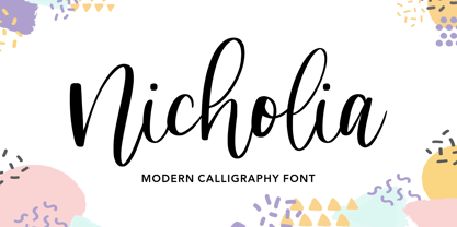 Nicholia is a cute and modern handwritten font with an incredibly friendly feel. It features gorgeous swashes and ligatures that make this script incredibly versatile. Whether you’re looking for fonts for Instagram or calligraphy scripts for DIY projects, Nicholia will turn any creative idea into a true piece of art!
 - Emalia by JprintStudio,
$10.00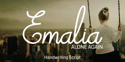 Emalia is a cute and casual handwritten font with an incredibly friendly feel. It features gorgeous swashes and ligatures that make this script incredibly versatile. Whether you’re looking for fonts for Instagram or calligraphy scripts for DIY projects, Emalia will turn any creative idea into a true piece of art!
 - Hillbear by Stringlabs Creative Studio,
$25.00 Hillbear is an incredibly charming script font that will turn any design project into a true piece of art. Hillbear Path is a flowing and elegant handwritten font, created with the help of a brush pen. Get inspired by its unique and beautiful style and add it to your favorite designs!
 - Coffee Matcha by Awan Senja,
$14.00 Coffee Matcha is a Lovely script font. It features a modern and elegant style that will take your designs to the next level. Whether you�re looking for fonts for Instagram or calligraphy scripts for DIY projects, Coffee Matcha will turn any creative idea into a true piece of art!
 - Lavineta by Balpirick,
$15.00 Lavineta is a beautiful and elegant handwritten font with an incredibly friendly feel. It features gorgeous swashes and ligatures that make this script incredibly versatile. Whether you’re looking for fonts for Instagram or calligraphy scripts for DIY projects, Lavineta will turn any creative idea into a true piece of art!
 - Bashirah by Cititype,
$14.00 Bashirah is a cute and casual handwritten font with an incredibly friendly feel. It features gorgeous swashes and ligatures that make this script incredibly versatile. Whether you’re looking for fonts for Instagram or calligraphy scripts for DIY projects, Bashirah will turn any creative idea into a true piece of art!
 - Revenge by Juncreative,
$19.00 Revenge is a cute and casual handwritten font with an incredibly friendly feel. It features gorgeous swashes and ligatures that make this script incredibly versatile. Whether you’re looking for fonts for Instagram or calligraphy scripts for DIY projects, Revenge will turn any creative idea into a true piece of art!
 - Oops by Posterizer KG,
$22.00 The initial idea for the Oops font, was to create graphemes, and by using them it could imitate a mark of a spilled liquid-stain. In an attempt to make the most convincing effect, those graphemes were written on glass. The final appearance of the graphemes, mostly remain in their basic form, and have the characteristic of a liquid, like fluidity in motion. This manuscript is expressive, but that does not affect the readability of the letters. The generated font was created by using Photoshop, Illustrator and a little bit of interventions in Font Lab. Font Oops is updated and edited version of an old version of the Art decor font, which had just basic letters. Today, Oops font contains Latin and Cyrillic letters, and it can be ideal for use in subjects like a paintball, art, expression, ink, water...
 - 112 Hours by Device,
$9.00 Rian Hughes’ 15th collection of fonts, “112 Hours”, is entirely dedicated to numbers. Culled from a myriad of sources – clock faces, tickets, watches house numbers – it is an eclectic and wide-ranging set. Each font contains only numerals and related punctuation – no letters. A new book has been designed by Hughes to show the collection, and includes sample settings, complete character sets, source material and an introduction. This is available print-to-order on Blurb in paperback and hardback: http://www.blurb.com/b/5539073-112-hours-hardback http://www.blurb.com/b/5539045-112-hours-paperback From the introduction: The idea for this, the fifteenth Device Fonts collection, began when I came across an online auction site dedicated to antique clocks. I was mesmerized by the inventive and bizarre numerals on their faces. Shorn of the need to extend the internal logic of a typeface through the entire alphabet, the designers of these treasures were free to explore interesting forms and shapes that would otherwise be denied them. Given this horological starting point, I decided to produce 12 fonts, each featuring just the numbers from 1 to 12 and, where appropriate, a small set of supporting characters — in most cases, the international currency symbols, a colon, full stop, hyphen, slash and the number sign. 10, 11 and 12 I opted to place in the capital A, B and C slots. Each font is shown in its entirety here. I soon passed 12, so the next logical finish line was 24. Like a typographic Jack Bauer, I soon passed that too -— the more I researched, the more I came across interesting and unique examples that insisted on digitization, or that inspired me to explore some new design direction. The sources broadened to include tickets, numbering machines, ecclesiastical brass plates and more. Though not derived from clock faces, I opted to keep the 1-12 conceit for consistency, which allowed me to design what are effectively numerical ligatures. I finally concluded one hundred fonts over my original estimate at 112. Even though it’s not strictly divisible by 12, the number has a certain symmetry, I reasoned, and was as good a place as any to round off the project. An overview reveals a broad range that nonetheless fall into several loose categories. There are fairly faithful revivals, only diverging from their source material to even out inconsistencies and regularize weighting or shape to make them more functional in a modern context; designs taken directly from the source material, preserving all the inky grit and character of the original; designs that are loosely based on a couple of numbers from the source material but diverge dramatically for reasons of improved aesthetics or mere whim; and entirely new designs with no historical precedent. As projects like this evolve (and, to be frank, get out of hand), they can take you in directions and to places you didn’t envisage when you first set out. Along the way, I corresponded with experts in railway livery, and now know about the history of cab side and smokebox plates; I travelled to the Musée de l’imprimerie in Nantes, France, to examine their numbering machines; I photographed house numbers in Paris, Florence, Venice, Amsterdam and here in the UK; I delved into my collection of tickets, passes and printed ephemera; I visited the Science Museum in London, the Royal Signals Museum in Dorset, and the Museum of London to source early adding machines, war-time telegraphs and post-war ration books. I photographed watches at Worthing Museum, weighing scales large enough to stand on in a Brick Lane pub, and digital station clocks at Baker Street tube station. I went to the London Under-ground archive at Acton Depot, where you can see all manner of vintage enamel signs and woodblock type; I photographed grocer’s stalls in East End street markets; I dug out old clocks I recalled from childhood at my parents’ place, examined old manual typewriters and cash tills, and crouched down with a torch to look at my electricity meter. I found out that Jane Fonda kicked a policeman, and unusually for someone with a lifelong aversion to sport, picked up some horse-racing jargon. I share some of that research here. In many cases I have not been slavish about staying close to the source material if I didn’t think it warranted it, so a close comparison will reveal differences. These changes could be made for aesthetic reasons, functional reasons (the originals didn’t need to be set in any combination, for example), or just reasons of personal taste. Where reference for the additional characters were not available — which was always the case with fonts derived from clock faces — I have endeavored to design them in a sympathetic style. I may even extend some of these to the full alphabet in the future. If I do, these number-only fonts could be considered as experimental design exercises: forays into form to probe interesting new graphic possibilities.
 - Octin Sports Free - 100% free

- Octin Prison Free - 100% free

- Octin College Free - 100% free

- Octin Vintage Free - 100% free

- Octin Spraypaint Free - 100% free

- Nordeco by Leksen Design,
$29.00 Inspired by her Scandinavian heritage, Andrea Leksen created this modern geometric sans serif reminiscent of Scandinavian design and typography. With its tall x-height and monoweight strokes, Nordeco will be best showcased at large sizes, in headlines and other display uses. It contains 100 alternates with ornamental letters, borders, paragraph separators and seamless wallpapers for your designing pleasure. Designs include stripes, dots, art deco and leopard print. See some of the creative ways Nordeco can be used in this YouTube clip. Check out its cousin, Nordique!
 - Transat Text by Typetanic Fonts,
$29.00 Transat Text is a geometric sans serif typeface, and is the more rational sibling to the unabashedly Art Deco "Transat". Transat Text has a slightly taller x-height than its counterpart, making it easier to read at small sizes, but also performs admirably in larger display settings. Transat Text includes many OpenType features, such as ligatures, small capitals, case sensitive forms, stylistic alternates, arbitrary fractions, and a full complement of proportional, tabular, and oldstyle figures. The Transat Text family includes 5 weights plus optically-corrected obliques.
 - Arctic Chunky by Fly Fonts,
$15.00Arctic Chunky is a fun font that is best used at display sizes. - Formular by Brownfox,
$44.99 If you were a grotesque in mid-20th-century Switzerland, you were expected to be serious and proper, if a little dull. Unlike its dogmatic Modernist predecessors, Formular is a hip Swiss sans serif of the new generation. Inspired by the utilitarian 19th-century grotesques, its precision and and versatility are combined with a slightly eccentric character. A child of its time, it scoffs at the ideology of ‟ideal” forms, yet it is every bit as functional for all its idiosyncrasies, as any self-respecting Swiss sans. Formular comes in five weights with corresponding italics and a monospace companion to the regular weight. Each weight includes special extra-light punctuation, lining tabular and old style figures, case-sensitive punctuation, and stylistic alternates.
 - Cinematica by Underground,
$14.90 Cinematica was specially designed for film credits in communication pieces. Due to its space saving qualities, geometric elegance of its shapes, and eight wights; it allows a wide range of uses. Its geometry makes Cinematica able to harmonize and unify any text, incorporating the necessary signs for composition in English, Spanish, Italian, French, German and Portuguese. The Regular weight also incorporates statements that usually appear in film credits (such as "directed by", "produced by", etc.) that have been programmed as predetermined ligatures and can be accessed by typing a short sequence of signs to avoid typing the full phrase. To make the most of the alternatives proposed, use applications that support Open Type. Take a look at the User Guide.
 - Cleveden by Greater Albion Typefounders,
$9.50 Cleveden was inspired by some lettering sighted on a neglected and somewhat tarnished brass plaque, affixed to an elderly office building. The elegance and character (somehow playful and formal at the same time) of the letterforms shone through the tarnished state of the plaque. As an aside the brass plaque in question was on the former business premises of a long established firm of accountants. We suspect the ethics of that profession would preclude us identifying which one. Our efforts to identify their engraver have proven unavailing. Cleveden is a family of four typefaces, Regular, Bold, Capitals and Capitals Bold. They are ideal for designs that call for distinctive formality and especially lend themselves to signage, certificates, and -dare it be said- engraved plaques!
 - Scoundrel by Comicraft,
$19.00 Leathery and Loopy Letterer of Legend, Richard Starkings has pointed his Apple Pencil at Procreate on his iPad and proceeded to raise the bar on lower case for this scandalous series of squiggles we had to call Rendered in the style of ShoutOut, this jaunty new Comicraft offering features both upper and lower case and recreates a pen lettering style of which we honestly thought Old Man Starkings was no longer capable! Suitable for jolly journal entries, hand-written notes to loved ones and sundry laundry lists, SCOUNDREL does more than Shout, and it does it quite quietly too! Scoundrel includes four weights (Regular, Italic, Bold & Bold Italic) with upper and lower case alphabets plus Western and Central European international characters.
 - Gardner Sans by Lewis McGuffie Type,
$35.00 Gardner Sans is a humanist sans serif with a range of weights, italics, small caps stylistics alternates and a set of decorative ornaments. The light and regular faces work at smaller sizes and the heavier weights are good for display lettering. It is inspired by a few historical sources including Stephenson Blakes' Granby, Gill Sans, as well as some old hand-done lettering for sales tickets. The name (and the basis for the small caps) derives in-particular from the Roy Gardner collection of sales tickets from early 20th century that can be found on spitalfieldslife.com The heavier weights were particularly influenced by a later cut of Gill Sans, Extra Bold 321. The italic is more of a contemporary mix of humanist styles.
 - Akoodi by Product Type,
$17.00 Introducing Akoodi, the ultimate superhero font for all your design projects! This bold and stylish serif font features a superhero theme that’s perfect for creating eye-catching titles and headlines for movie posters and graphic design projects. With its strong, prominent serifs and unique character design, Akoodi is a versatile font that can be used for a wide range of projects, from branding and marketing materials to book covers and packaging designs. The font includes a full set of upper and lowercase letters, punctuation, and numerals, making it a complete solution for all your design needs. With its superhero theme and stylish serifs, Akoodi is a font that will make your projects stand out from the crowd. So why wait? Grab your copy of Akoodi today and start creating designs that are as bold and daring as a superhero! Furthermore, Akoodi is equipped with advanced features that make it easy to use and customize. The font comes with a full set of alternate characters, including a range of ligatures and swashes, which add an extra touch of style to your designs. Additionally, the font is fully compatible with a wide range of design software, making it simple to use no matter what your design process looks like. What’s Included : - File font - All glyphs Iso Latin 1 - Ligature, Alternate - We highly recommend using a program that supports OpenType features and Glyphs panels like many Adobe apps and Corel Draw, so you can see and access all Glyph variations. - PUA Encoded Characters – Fully accessible without additional design software. - Fonts include Multilingual support
 - Peperoncino Vintage by Resistenza,
$29.00 Peperoncino is a sans serif font. Designed first with a marker, the irregular strokes create a fresh handmade feeling. After the big success of Peperoncino Family, we create its vintage version adding some "rusted" elements.
 - Young RIEHUM by Twinletter,
$17.00 Regards! Say hello to Young Riehum, a superhero-style display font that will bring strength and tension to your projects. If you’re looking for a strong, bold, and bold font, Young Riehum is the perfect choice for creating an electrifying look in the worlds of film, gaming, and design. With a striking presence, Young Riehum grabs attention instantly and delivers an unforgettable message to your audience. Each letter exudes electrifying energy, giving your projects a new dimension and creating an extraordinary experience. In addition to extraordinary styles, Young Riehum is also equipped with features that enrich your creativity. With the available ligatures and alternative characters, you can explore a variety of unique and interesting typography combinations. Apart from that, this font also supports multiple languages, allowing you to reach an international audience with a strong and bold message. Join the forces of Young Riehum and let your every project be an epic adventure. With its stunning superhero style and special features, this font will provide unforgettable strength and tension. Don’t miss the opportunity to own Young Riehum and create extraordinary works that inspire and amaze your audience. What’s Included : File font All glyphs Iso Latin 1 Alternate, Ligature Simple installations We highly recommend using a program that supports OpenType features and Glyphs panels like many Adobe apps and Corel Draw so that you can see and access all Glyph variations. PUA Encoded Characters – Fully accessible without additional design software. Fonts include Multilingual support
 - VAKOZI by Twinletter,
$17.00 Vakozi is a stunning classic serif font with timeless elegance and alluring modern touch. Able to be the perfect solution for various projects that require an elegant classic modernism theme. Showing the beauty of a well-proportioned serif design, Vakozi presents a visual harmony that captivates the eye. Each letter is exquisitely detailed, creating a look that embodies the luxury and sophistication of a timeless classic. In order to provide flexibility and creativity, Vakozi is equipped with impressive features. From eye-catching ligatures to alternative variations that provide a unique style, this font allows you to express ideas and concepts with complete freedom. In addition, with extensive multilingual support, Vakozi can be used in multiple languages without a hitch. Are you looking for a font that combines classic elegance with a stunning modern twist? Vakozi is the perfect choice. With a stunning classic serif style, creative features such as alternate ligatures and variations, and the ability to support multiple languages, this font will quickly grab the attention of your prospects and provide a stunning aesthetic feel in no time. What’s Included : File font All glyphs Iso Latin 1 Alternate, Ligature Simple installations We highly recommend using a program that supports OpenType features and Glyphs panels like many Adobe apps and Corel Draw so that you can see and access all Glyph variations. PUA Encoded Characters – Fully accessible without additional design software. Fonts include Multilingual support
 - FS Lola by Fontsmith,
$80.00 L-O-L-A Like the subject of the Kinks’ song, FS Lola is a little bit of both – a font with a rare combination of masculine and feminine. The font was inspired by the song, which itself was inspired by the night the Kinks’ manager spent dancing drunkenly in a Soho club with a beautiful woman... Or so he’d thought, until her stubble started to show halfway through the evening. Masculine/feminin Phil Garnham’s experience in designing FS Lola was similar to the one related by Ray Davies. Setting out to create a sans serif font, he realised along the way that he was actually dealing with a semi-serif. He went with it, though, and produced a font with the best masculine and feminine qualities: hard edges and corners tempered by shapes of softness and generosity, the outcome of what Phil calls an “organic” design process. “Initially, my designs were very graphic and hard but not very distinctive. By printing and redrawing the letters in pencil I achieved a softer and friendlier alphabet with a strong personality.” Broad Lola, as you’d expect, is very broad-minded. Available in five weights with italics – and fluent in central European languages – FS Lola offers a confident combination of feminine softness and male steeliness to any kind of design. As the song says, “It’s a mixed-up, muddled-up, shook-up world... except for Lola.
 - Odelina by Josstype,
$10.00 Odelina Script, Hand Lettered Calligraphy Font with beautiful waves and natural flow. has a unique letter style, with natural handdrawn, and has a softer and smoother character subtly connect all the characters. They have a simple elegant swashes in separate letters, you can use graphic design software to access the alternate letter. Odelina Script is perfect for weddings, invitations, greeting cards, quotations, posters, branding, business cards, stationary, title design, header blog, excerpts of art, the art of typography, letter envelopes modern or design books, occurred styles such as design handdrawn, title , letter marriage, pop vintage design, or purpose to make the project / art design we look beautiful and trendy. If you have any questions, please feel free to contact me via email: joelpopon@gmail.com
 - K&T Heidi by K and T,
$70.00 This is a well-built, functional (all caps) typeface, which is very modern in character. The use of diagonal corners in this angular typeface is inspired by the pennant numbers on British Royal Navy warships, which adds an military quality to this typeface. The gaps, which form the Stencil divisions, follow pre-established horizontal and vertical lines, they help to achieve both geometric and proportional harmony. The direction of the gaps is always at a right angle to the stroke.
 - Fugal by Pedroglifos,
$10.00 Fugil is a high-contrast flared-serif humanist typeface with art nouveau influences for elegante and edgy projects. Perfect for identity of many sorts, from concerts, festival names, art exhibitions, films and even products.
 - Potenciarte by Nasir Udin,
$25.00 Potenciarte is an all-caps display typeface inspired by the facade of old buildings from the era of Nederlandsch-Indie (1900’s) in Surabaya, where Art Deco & Art Nouveau typographic styles were widely used.
 - Carnova by Typotheticals,
$4.00This is a standard, plain face with no special distinguishing features. It was created over a period of four months for use in small text in a cartographer package. While the face was extremely suitable for the purpose it was designed for, the party who was to purchase the family outright decided upon another design, allowing me to offer it up for sale. The original design for this face is nothing new, and has been greatly influenced by many others already in existence. It was not intended to be flashy, nor eye-catching, and I believe I have managed to escape any individuality that could have affected the face. It displays well in the lower text sizes, and, in my own opinion, displays some characters more clearly than some other similar faces that are currently in use (not all, some). While individuality makes a typeface stand out from all the others, this style of design would have been compromised with it. - Multi by Type-Ø-Tones,
$60.00 Multi is an extensive sans serif typeface family that consists of two subfamilies: Multi Text that comprises three weights (roman & italic) and Multi Display (seven weights, roman & italic). Vitality bursts forth from Multi. It has a distinctive ‘phrasing’ (in the musical sense), neither humanist nor glyphic, somewhere in between, exploring uncharted territory. Its design is pragmatic, yet not rigid, slightly tinged with tiny incised touches. This is clearly noticeable in Multi Display: the roman lowercase’s asymmetric stems are very softly tapered, with bevelled, sharp upstrokes. Furthermore, all weights consistently share these idiosyncrasies from Thin to Poster. With its lower contrast, wider proportions, shorter ascenders and descenders, Multi Text was purposely adjusted to meet all the requirements of a legible typeface for newspapers in paper and screen, as they were manually hinted. It also has a few new features, such as the outstrokes of the roman ‘l’ and the italic ‘a’, which bring a subtle calligraphic feel to the text flow.
 - Cobbler by Juri Zaech,
$30.00 Cobbler is a friendly type family in six weights. With proportions of geometric type, Cobbler is a contemporary sans on the inside and an ultra soft display typeface on the outside. Not a single sharp corner and only a hand full of straights make Cobbler extra warm and huggable. In fact, the few straight horizontal lines give the typeface the stability of a workhorse while keeping the gooey playfulness that characterizes Cobbler so much. And to make all this even more fun, there is a pile OpenType features built in. For example loads of Discretionary Ligatures that make capital letters interlock left and right – just fun! Or automatic fractions, case sensitive punctuation and contextual alternates – for serious typesetting. Cobbler works great for branding, packaging, editorial or any display application – and it comes with an expansive character set that covers Underware’s Latin Plus and with it over 200 languages. Furthermore Cobbler is manually kerned and auto-hinted for crisp display on screen also in small sizes.
 - FingerSpeller BF by Bomparte's Fonts,
$40.00 Many years ago I studied American Sign Language in an effort to better communicate with some friends of mine within the deaf community. I found ASL to be a beautifully expressive language from a vibrant and active culture. Out of that attempt came this stylized depiction of the manual alphabet used in finger-spelling. Until recently it had only existed in analog form, born of pen and ink on paper. So now I'm glad to say it’s turned digital. Typing a period (.) will reveal the sign for “I Love You” (a combination of the letters I, L and Y), which fits nicely within the shape of a heart. Holding down the shift key while again typing period (greater symbol) will reveal the heart in its filled-in form, which can serve as an underlay. Use these in an application that supports layering in order to create different color combinations. There’s a stylistic alternate letter “S” and an “OO” ligature which can be accessed in OpenType-savvy apps.
 - Courtney by Latinotype,
$29.00 Courtney is a display font, unicase, with thick and irregular strokes. It contains a varied set of ligatures that makes Courtney a very dynamic font, ideal for short texts, magazines, logos, etc. It also possesses a large amount of connectors like for example: and, the, by, among other, designed to complement the font.
 - Katalina by Shape Studio,
$12.00 Katalina Font is a new modern script calligraphy font with an irregular baseline. Trendy and feminine style.Katalina Font Script looks lovely on wedding invitations, thank you cards, quotes, greeting cards, logos, business cards and more. Perfect for using in ink or watercolour. Including initial and terminal letters, alternates, ligatures and multiple language support.
 - Greatness Serif by Shape Studio,
$14.00 Greatness font is a new modern serif calligraphy font with an irregular baseline. Trendy and feminine style.Greatness font looks lovely on wedding invitations, thank you cards, quotes, greeting cards, logos, business cards and more. Perfect for using in ink or watercolour. Including initial and terminal letters, alternates, ligatures and multiple language support.
 - Cliffhanger - Unknown license


