10,000 search results
(0.051 seconds)
- Jollin Family by Creativemedialab,
$14.00 Jollin Family is a pretty, attractive and fashionable sans serif, has ton of alternates that you can use to create a simple but pretty letters. Jollin has 8 weights and 3 Widths and also available in Variable version Jollin Family Variable contain three configurable axes: weights, width, and slant, you can adjust the font axis setting to get the desire size. Jollin Perfect for Heading, logo creation, Advertisements, Christmas, Label, business card, branding and more! Get inspired by its fashionable appeal! to access alternate Adobe Photoshop go to Window - glyphs Adobe Illustrator go to Type - glyphs
 - Symbolum by Type Fleet,
$9.00 Symbolum Croatian heritage awakened. Symbolum is the first ever contemporary interpretation of Glagolitic script. This rediscovered Croatian gemstone gleams again with its unique and glorious letter shapes that give this typeface an exceptional value and meaning. The letters of this contemporary slab serif are inspired with Glagolitic script, but it is not the revival. Some letters originally don’t exist, but are invented, so the font can cover the central European character set. It is suitable for branding, game design, art and conceptual projects, but also for longer texts and more complex designs. The italics are designed at an 10° angle.
 - Floorwalker JNL by Jeff Levine,
$29.00 On February 15, 1926, the Display Material Company of St. Paul Minnesota patented a sign making outfit consisting of a series of stencils in various sizes and styles, paints, brushes, instructions for use and all stored inside a convenient wooden case. Sold to any business in need of making many signs at low cost, this versatile stencil set enabled many a merchant to produce posters, show cards and price tags for pennies over what a commercial sign shop would charge. Floorwalker JNL is the digital version of one of these stencil fonts, solidified into a pre-Art Deco-era typeface.
 - Matreshka - Unknown license

- Miso - 100% free

- DepotTrapharet - Unknown license

- SketchTools - 100% free

- Thomas Paine - Unknown license

- Coklat Sunda by Graphicfresh,
$15.00 Coklat Sunda is a monoline script family including Regular and Slant versions . It's perfect for logos, name card, magazine layouts, invitations, headers, or even large-scale artwork.
 - Cloister Open Face by Bitstream,
$29.99Designed for ATF in 1913, Morris Fuller Benton’s version of Nicholas Jenson’s roman, the best of the Venetians and a model for regularity in color and fit. - Loyola Pro by RodrigoTypo,
$30.00 It is a redesign of "Loyola". This family contains Light, Regular, Bold, ExtraBold, Black, also a set of shadows and dingbats, special for short titles and children.
 - Latin Fiesta JNL by Jeff Levine,
$29.00 The playful, casual hand lettering on the 1941 movie poster for “Blondie Goes Latin” inspired Latin Fiesta JNL which is available in both regular and oblique versions.
 - Train Car JNL by Jeff Levine,
$29.00 Hand lettering from the opening credits of Alfred Hitchcock’s “Strangers on a Train” (1951) inspired Train Car JNL, which is available in both regular and oblique versions.
 - Brochure Sans JNL by Jeff Levine,
$29.00 Brochure Sans JNL is based on Sans Serif No.7 from the 1921 Miller & Richard type specimen book, and is available in both regular and oblique versions.
 - Large OT by DSType,
$19.00First designed in 1999 Large now becomes LargeOT and it's available in Regular, Extra and Italic. Includes plenty of OpenType features, like SmallCaps, Alternates, Ligatures and Swashes. - Roundwood JNL by Jeff Levine,
$29.00 The antique wood type Gothic Tuscan [a spurred design with rounded terminals] was the basis for Roundwood JNL, which is available in both regular and oblique versions.
 - Generic Sans JNL by Jeff Levine,
$29.00 Generic Sans JNL was modeled after “Condensed Blair” from the 1907 specimen book of the Inland Type Foundry, and is available in both regular and oblique versions.
 - Alderman JNL by Jeff Levine,
$29.00 Alderman JNL is a wide slab serif typeface based on the classic wood type Antique Light Face Extended, and is available in both regular and oblique versions.
 - TE Nastaaliq by Tharwat Emara,
$59.00 TE Nastaaliq Font It is one of the Persian calligraphy or ta'liq line that appeared in Persia in the seventh century AH (thirteenth century AD), as it was extracted from the lines of naskh, patch and thuluth. It is a beautiful font whose letters are distinguished by precision and extension. It is also characterized by its ease, clarity and lack of complexity. It does not tolerate diacritics, despite its difference with the line of the patch, as it is one of the best fonts in the world and the best without a competitor and admires many Arab calligraphers, and no cultural or literary exhibition is devoid of a painting written in Persian script. It is one of the most beautiful lines that has a special character that distinguishes it from others, as it is characterized by gracefulness in its letters, so it appears as if it descends in one direction, and its beauty is increased by the soft and rounded lines in it, because it is more flexible in drawing and more flexible, especially if it is drawn with precision, elegance and good distribution, and the calligrapher may baptize In his use of decoration to reach strength in expression by taking advantage of arches and circles, in addition to the grace of painting, the artist may link the letters of one word and the two words to reach the composition of a frame or curved and wrapped lines in which he shows his genius in imagination and creativity.
 - Dancin' Pixel by LomoHiber,
$19.00 Why is this typeface 'Dancin'? Because It consists of 3 styles each represents one frame of animation. And you can easily create a nice pixel typography animation using Dancin' Pixel. Animation preview: https://www.behance.net/gallery/85743031/Dancin-Pixel-animated-typeface How to make the animation and add a sharp corner stroke in Photoshop: https://youtu.be/ZbVFzvXwqkw If you are not interested in making animation, you can also use Dancin' Pixel as a regular font. I combined hand-drawn bold letters with pixel style, and it perfectly fits for stylish pixel game headers, prints, posters, websites, and anything connected with pixel art. The Frame Three is great for glitched pixel designs, it has distorted shapes. Dancin' Pixel Features: Pixelated letterforms 3 Styles each representing one frame of animation 3rd and 2nd frame may be used as glitched pixel typeface Wide language support (Western European, Central European South Eastern European) If you have some issues, questions, please let me know: lhfonts@gmail.com Hope you'll enjoy using Dancin' Pixel!
 - Balcony by Shaily Patel,
$10.00 Balcony is a decorative display typeface inspired by the patterns of metal safety grills. Its highly geometric features may be used to identify it as Art Deco. It is a monospaced type family with all characters confined in a square frame. The main idea of Balcony is to create a grill-like pattern when letterforms are placed together. This creates an illusionary experience for the reader. The best way to use this typeface is without leading, as shown in the visuals. Balcony also comes with two stylistic sets. The first stylistic set contains most characters with more decorative elements and the second one includes Dingbats. These Dingbats are motifs with simple geometric patterns that may be used for any kind of ornamentation. The diacritics letterforms are geometrically squeezed within the square frame to include the accents. This experimental typeface comes with about 650 characters and four weights (Thin, Light, Regular and Bold). The font family supports Western and Central European languages.
 - LTC Italian Old Style by Lanston Type Co.,
$39.95LTC Italian Old Style is not to be confused with the English Monotype font also called Italian Old Style, which is an earlier design from 1911 based on William Morris’s Golden Type that is based on Nicholas Jenson’s Roman face. Goudy went back to Jenson’s original Roman and other Renaissance Roman faces for his inspiration and the result is what many consider to be the best Renaissance face adapted for modern use. Bruce Rogers was one of the biggest admirers of Italian Old Style and designed the original specimen book for Italian Old Style in 1924 using his trademark ornament arrangement. These ornaments are now contained in the pro versions of the Roman styles—Regular Pro and Light Pro. With most digitizations of old metal typefaces, one source size is often used as reference (as was Goudy’s method for his own cuttings of his Village foundry types) so that all sizes refer to one set of original artwork. The original hot metal fonts made by Lanston Monotype (from Goudy’s drawings) and other manufacturers used two or three masters for different size ranges to have optimal relative weights—smaller type sizes would need proportionally thicker lines to not appear thin and larger sizes would require thinner lines to not appear to bulky. The variations in size ranges can also be affected by the size of the cutter head in making the master patterns. The light weights of LTC Italian Old Style were digitized from larger display sizes (14, 18, 24, 30, 36 pt) and the regular weights were digitized from smaller composition sizes (8,10,12 pt). The fitting for the regular weights is noticeably looser to allow for better setting at small sizes. Very few font revivals take this approach. Italian Old Style, originally designed by Frederic Goudy in 1924, was digitized by Paul Hunt in 2007. In 2013, it has been updated by James Grieshaber and is now offered as a Pro font. The newly expanded Pro font includes all of the original ligatures, plus small caps and expanded language coverage in all 4 Pro styles. - Digital tech - Personal use only

- Lemon Press by Attype Studio,
$7.00 Lemon Press is display font of fresh lemon, come up with two font regular and display. It is suitable for any summer event! Lemon Press is perfect for branding, logo, invitation, stationery, social media post, product packaging, merchandise, blog design, game titles, cute style designs, Book/Cover Titles and more. Multilingual Support included for Afrikaans, Albanian, Catalan, Danish, Dutch, English, Estonian, Finnish, French, German, Icelandic, Italian, Norwegian, Portuguese, Spanish, Swedish, Zulu. Hope you enjoy with our font! Attype Studio
 - Aremic by Graptail,
$15.00 Aremic is a bold display font created to be used for bold headings coming in 2 shapes Regular and Rounded including Oblique. This font is inspired by the shape of the letters on sports posters. This type of font perfectly made to be applied especially in logo, headline, signage and the other various formal forms such as invitations, labels, logos, magazines, books, greeting / wedding cards, packaging, fashion, make up, stationery, novels, labels or any type of advertising purpose.
 - Era404 by Don Citarella,
$20.00 Following the development of a new identity for era404 Creative Group, Inc. (www.era404.com), Founder and Creative Director, Don Citarella, decided to expand the wordmark into a complete typeface. era404 is a soft, vertical font with a high x-height and regular stroke, combined with sweeping arches to create a modern, unique font. This display font is best used for headlines, identities, wordmarks and other instances involving minimal copy and maximal whitespace The typeface includes 256 glyphs and ligatures.
 - Voguer Sans by NREY,
$19.00 Voguer Sans is an elegant high-contrast sans-serif font inspired by the fashion glossy magazines typography. It perfectly represents modern and vintage esthetics. The font have 2 weights: regular and bold and includes uppercase and smallcase letters, alternate characters and multilingual support. The font is perfect for wedding elegant invitation cards, beauty and fashion package design, glossy posters. It have supporting for many european languages and perfect cyrillic! Thank you and have a great day!
 - Hollium by Maulana Creative,
$14.00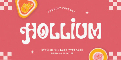 Hollium Stylish Vintage Typeface. With regular clean stroke, fun character with a bit of ligatures and alternates. To give you an extra creative work. Hollium font support multilingual more than 100+ language. This font is good for logo design, Social media, Movie Titles, Books Titles, a short text even a long text letter and good for your secondary text font with sans or serif. Make a stunning work with Hollium Stylish Vintage Typeface. Cheers, Maulana Creative
 - Dream Glory by Ergibi Studio,
$19.00 INTRODUCING, Dream Glory, A Stylish Font Duo, these fonts are of two types serif and script. This typeface has been made carefully to make sure its premium quality and luxury feel. The ligatures on serif makes this typeface unique and stands out rather than the regular serif font, perfectly for headlines, logos, posters, packaging, T-shirts,coffee shops, restaurants, magazine's headers, signs or gift/post cards,cafe's and weddings or any type of advertising purpose. Best Regards Ergibi Studio
 - Landslide by Ana's Fonts,
$12.00 Landslide is a cute handwritten font family with: 4 fonts: regular, bold, italic and bold italic, each hand-drawn separately for a true handwritten feel a bonus set of ornaments (A-Z, a-z and 0-9) to help decorate your text Each font includes: A-Z, a-z, 0-9, accents punctuation and symbols Ligatures Landslide is perfect for any design that needs a handwritten feel, such as signatures, notes and quotes, logos and branding.
 - Vikendi by Mevstory Studio,
$30.00 Introducing Thelma Classic Sans Serif Font , created by Lettercorner Studio. Thelma is a traditional font for the classic sans serif type. A simple font, with a thin size, adds an elegant and classy impression. This typeface is perfect for an elegant logo, branding, travel promotion, layout magazine, beauty product, packaging product, quotes, or simply as a stylish text overlay to any background image. What’s included? :: Regular :: Uppercase & Lowercase :: Number & Punctuation :: Multilingual Support :: Works on PC & Mac
 - Ribuah Sans by LetterMuzara,
$20.00 Ribuah Sans is a sans serif font with high contrast, inspired by the font "Bodoni" and the architecture of brutalism. Ribuah Sans consists of three styles (light, regular, bold) and includes several writing systems such as Latin (supporting all European languages and Turkish), Cyrillic (supporting all Cyrillic-based alphabets), Greek and Hebrew. By it's modern, geometric and strict nature this font will immediately draw attention to your design, thereby becoming a perfect option for heading and advertising.
 - Doubledecker by Hanoded,
$15.00 I love riding English double decker buses! I haven’t been on one lately, but for some reason I had an image of a red double decker bus in my head when I made this font. Doubledecker is a bold, cartoon-like, handmade font. It comes in regular and dots, plus a bonus doodle font called Doubledecker Stuff. Use it for any design that needs a tad of loud, a pinch of unusual and a wee bit of polka.
 - Smothy Bubble by HansCo,
$15.00 Smothy Bubble is a cute and fun display font with bubble style. You will get three types of fonts in this pack, Regular, Bubble and Shadow version. Use this display font to add that special bubble touch to any design idea you can think of! Very suitable for logotype, Stickers, Packaging design, Cricut Project, headlines, brand identity, t shirt or apparel industry, posters, magazines, books, YouTube, Instagram, websites, or any of your creative design projects. Enjoy!
 - Maryam by Outras Fontes,
$24.00 Maryam is an Outras Fontes type family designed by Ricardo Esteves Gomes. With moderate contrast, these fonts have elegant and very legible forms even in small x-height sizes. There are more then 70 ligatures in each font, providing a lot of letterform variations that make this type family looks like a real handwriting on a page. It is currently available in two versions (Regular and Alternate) that you can combine with each other as you wish.
 - Evening Event JNL by Jeff Levine,
$29.00 Hand lettering from the title credits for the 1950 film “All about Eve” were the inspiration for Evening Event JNL, which is available in both regular and oblique versions. The font’s name is an (unintended) double-homage to the film’s title, for the first part of both words include “Eve”.
 - Martin Luther by Harald Geisler,
$59.00 ❧ Useful links: Luther’s Manuscripts at the UNESCO Memory of the World at Google Arts and Culture Martin Luther font on Kickstarter (with Film about the creation) Each letter of the Martin Luther font is strictly based on original samples found in Martin Luther’s 500 year old handwritten manuscripts. Letters that occur more often for example vowels have two or more different versions stored in the font. (➶ Figure 4) These alternative forms are exchanged automatically by the font as you type, and create a vivid look that comes close to actual handwriting. The font avoids that two identical letters are placed next to each other like, for example the two “o” in the word “look”. ➸ What Historic Sources is the Font based on? Two historic documents were used to base the font on. The notes Luther took before giving his speech in Worms in 1521 and a 6 page letter he wrote immediately after to Emperor Charles V., summarising his speech (➶ Figure 2). Both documents have been added to the UNESCO “Memory of the World” and can be seen at the Google Arts and Culture website. ➸ The Creation of a Handwriting Font The creation of a handwriting font is very different from the creation of a regular font. Harald Geisler has specialised in recreating handwriting in preceding projects with Albert Einstein’s, Sigmund Freud’s and his own handwriting. His experience working with Archives and Museums has gone into this project. First Geisler analyses the movement in the writing to understand how each letter is drawn. This involves partially learning how to write like a person. In this process not the outlines of the sample are reproduced but the original movement path of the handwriting (➶ Figure 3). In a second step width and contrast is added to reproduce Martin Luther’s characteristic impetus and the writing tools used at the time. (Link: Youtube Playlist showcasing the creation of individual letters) How about signs that can’t be found in archives? Some Glyphs can not be found in 500 year old manuscripts, for example the @-sign. Towards the end of the creation one collects a profund amount of details about how a writer moves on paper and addresses certain tasks moving the pen. Keeping this knowledge in mind an improvisation can be based on similar letter forms. For example the @ sign is based on of the movement of a lowercase a and parenthesis. ➸ Features of the Martin Luther font ❶ Extensive Documentation of the creation of the font, including high quality reproduction of the used manuscripts. ❷ Additional texts from Historian Dr. Henning Jürgens and Palaeographer (and Luther handwriting expert) Prof. Ulrich Bubenheimer ❸ Alternating Letters - in handwriting every word looks a bit different. To avoid that two identical letterforms are placed next to each other (for example in the word look) the font actively changes between different versions of letters as you type. ❹ Ligatures - characteristic writing forms when two letters are combined (for example “ct”) (➶ Figure 5) ❺ Terminal Letterforms - renders a special letterform when letter is at the end of a word. (➶ Figure 8) ❻ ‘’’Initial and Medial Letterforms''' - some letterforms are different when placed in the beginning or middle of a word, for example the lowercase s. ❼ Luther Rose - is a seal Luther used to authorise his correspondence. Today it is a widely recognized symbol for Luther. When you enter the numbers of Luthers year of birth and death 14831546 using the Martin Luther PRO font, it will render a stylised version of the Luther Rose. (➶ Figure 7) ❽ Historic letter-forms - letter-forms that are specific to medieval writing around 1500. For example the long-s or h with a loop at the bottom. (➶ Figure 6) ⚑ Multi language support - see the technical information tab for a full list of supported languages. (➶ Figure 11) ➸ The different Styles explained ❋ Martin Luther PRO - this includes all features listed above and is geared towards writing texts that are more readable today. It features alternating letters to create a natural handwriting look as well as two stylistic sets accessible through the OpenType menu. Historic forms are available through the glyph picker. ❋ Martin Luther Historic - this font creates a historically correct reproduction (i.e. with long-s) of Luther’s medieval latin handwriting. It features alternating letters to create a natural handwriting look as well as two stylistic sets accessible through the OpenType menu. ❋ Martin Luther Expert-1 - Dedicated access to the first set of letters only. ❋ Martin Luther Expert-2 - Dedicated access to the second set of letters only. ❈❈❈ Family Pack - recieve all fonts at a discounted price. ❈❈❈ ➸ Kickstarter The creation and development of the Martin Luther font was financed by 500 supporters on ➸Kickstarter.
 - Elizabeth by ParaType,
$30.00 The hand composition typeface was developed at the Ossip Lehmann type foundry (St. Petersburg) in 1904-07 (after designs by Alexander Leo?). It was redeveloped at Polygraphmash in 1960s for slugcasting composition. Named after Russian Empress Elizabeth I (1709-61). Based on typefaces of George Revillon type foundry of 1840s, though some characters’ shapes were redrawn similar to Russian Academy of Sciences typefaces (mid-18th century). Sharp contrast, strong weight Modern Serif with archaic flavor. The typeface is useful in text and display composition, in fiction, historical, and art books, especially connected to the 18th or 19th centuries. It looks great in Russian classical literature such as Pushkin and Gogol works. The revised, improved and completed digital version was designed at ParaType in 2001 by Lyubov Kuznetsova.
 - Escuela by Cuchi, qué tipo,
$9.95 Escuela typeface is born in an attempt to reflect so many current influences of modern grotesque fonts that are trying to better reflect the values of today's world. Its compact proportions and high x-height, but at the same time with sort kind of modulation and open inktraps, propose a visual game that is worth enough to use it many places; Escuela can be striking and ideal for headlines in large text and heavy weights, but at the same time serious and readable in smaller bodies or regular and fine weights. Its wide range of characters, which includes a set of emoticons ideal for signage, work and evaluation documents, as well as inclusive, is ideal for educational centers, whether they are more playful (schools) or more pragmatic (universities). In fact, "Escuela" means “School” in English. For this reason, Escuela is your best ally when it comes to preparing texts that transcend students through a contemporary and different, but functional, character. Designed by Carlos Campos www.cuchiquetipo.com Dummy text from wikisource.org (1911 Encyclopædia Britannica/Universities).
 - Fantastic ML by HiH,
$12.00 Fantastic ML is an exuberant Art Nouveau font. It was originally released as “Modern Style” by Fonderie G. Peignot & Fils, Paris, France sometime before 1903. Since “Le style moderne” was the generic French name for Art Nouveau, it is possible that someone decided a less generic name was needed. The typeface became known as Fantastic. Compared to conventional text letters, it is just that. Fantastic has a whimsical, architectural feel. The typeface reminds me of a cross between Hoffmann’s Palais Stoclet in Brussels and Gaudi’s Sagrada Familia church in Barcelona. The letterforms themselves are similar to those by Ludwig von Zumbusch on the cover of “Jugend” in March, 1896, but with the addition of serifs. Fantastic ML is a decorative, all-cap font intended for display use and functions best at 18 points or larger. There are a total of 306 glyphs. In addition to the standard 1252 Western Europe Code Page with character slots up to decimal position 255, there are glyphs for the 1250 Central Europe, the 1252 Turkish and the 1257 Baltic Code Pages. However, some older applications may only be able to access the Western Europe character set (1252). The zip package includes two versions of the font at no extra charge. There is an OTF version which is in Open PS format and a TTF version which is in Open TT format. Use whichever works best for your applications.


