10,000 search results
(0.056 seconds)
- El Franco by Fonthead Design,
$19.00El Franco is a family designed by Ethan Dunham that represents what Roman lettering looked like in the 16th century. Derived from a typographic sample of Francisco Lucas, 1577, this font captures the feeling of rustic times. It comes in two versions regular and distressed. The distressed version has been weathered to appear old and worn. - Eckhardt Headline JNL by Jeff Levine,
$29.00 Eckhardt Headline JNL is a bold, condensed sans serif font. This is part of a series of typefaces popular with the sign trade. Named in honor of the late Albert Eckhardt, Jr. - a talented sign writer and a good friend of type designer Jeff Levine - it is available in both regular and "slant" for extra emphasis.
 - Quincey by AdultHumanMale,
$20.00 Quincey is a display font with the feel of old style signpainter’s works with a hint of hand drawn elements too. It has over 350 glyphs and several variations on the standard alphabet with all those €xtra pesk¥ foreign characters too. Some extra Glyphs in there too. It is available in 2 weights regular and medium.
 - Le Kick by Resistenza,
$46.00 Introducing LeKick. Inspired by Fraktur script with a contemporary flare, LeKick is a blackletter display face. This font has been designed with a flat brush and ink, choose between two styles; Brush, which demonstrates the strokes and construction of each letterform, or Regular. The perfect typeface for typographic creations such as book covers, headlines, and banners.
 - Othelie by Creativemedialab,
$15.00 Othelie - Fashionable Gothic Font Bold and Beautiful Othelie comes in Regular & Line version with tons of alternates. Othelie is Perfect for Heading, Logo creation, Clothing design, Tattoo Lettering, Advertisements, Labels, Halloween concept, Poster and much more! Get inspired by its Gothic appeal! To access alternate: Adobe Photoshop go to Window - glyphs Adobe Illustrator go to Type - glyphs
 - Sporting Event JNL by Jeff Levine,
$29.00 A British boxing film from 1953 called “The Square Ring” had its titles and credits hand lettered in a slab serif type style commonly referred to as “Egyptian”. Other familiar type fonts which share this influence are Karnak, Stymie and Beton. Sporting Event JNL was modeled from the film’s titles and is available in both regular and oblique versions.
 - Mint And Sage by Attract Studio,
$18.00 Mint And Sage is a nostalgic typeface modernized from the old style serifs of the sixties and seventies. With soft serifs suitable for many projects: invitations, postcards, posters, books, advertisements, websites, blog headers, logos, branding, magazines, fashion, photography, editorial design and many others. Typeface Features: - 3 Font Weights (Regular, Outline & Extrude) - Numerals & Punctuation - Stylistic Alternates & Ligatures - PUA Encoded Characters.
 - Western Trail JNL by Jeff Levine,
$29.00 For decades, Samuel Welo’s “Studio Handbook for Artists and Advertisers” was a source of inspiration for sign painters, graphic artists and designers. In later years, many digital revivals of Welo’s hand lettered typography have been made available. Western Trail JNL is the latest member of such digital fonts, and is available in both regular and oblique versions.
 - Breakout by Letteralle,
$23.00 Breakout is a carefully hand-lettered bold script font. Breakout comes in two styles; Regular and Rough Version. Breakout has a lots alternative of each letter to make it look unique and attractive. It is can give a solid and standout impression. Breakout is suitable for logotype, digital printing, packaging, T-shirt, social media post, Merchandise, and many more.
 - MyCard by John Moore Type Foundry,
$15.00 MyCard is a display sans serif font of modernist spirit, where uppercase letters take the height of the lowercase letters (unicase), where only ascending and descending exceed the x-height. MyCard is ideal for creating logos, packaging, labels, advertising and short titles, in texts produced interesting textures. MyCard comes in three weights Regular, Bold and Black.
 - Believe by Haksen,
$19.00 Believe is a versatile font family. Strong capitals and a smooth, open lowercase are effective in a variety of applications. The geometric, near-monoline construction lends a classic durability, tempered by softened edges and vibrant shapes. Version Including : Thin, Regular, also in slant (Italic). Every letter has been redrawn and refined, with improved kerning and expanded language support.
 - Hey Kids by Namara Creative Studio,
$9.00 Cute handwritten font with many possible combinations. Add playful and sweet style to your designs and notice how they come to life. Comes with Alternates, Ligatures, Multilingual Support & some Cute Accents. With 03 variant to choose : Regular, Shadow and Outline. Suitable for t-shirt design, quotes, logo packaging, template design, or any other projects that require a playful style.
 - Pen Lettering Sans JNL by Jeff Levine,
$29.00 A 1935 song with the unusual title of "Dinner for One Please, James" had its title hand lettered on the cover of the sheet music with simple, condensed letters made by a round point dip pen. This has been reproduced in a digital font as Pen Lettering Sans JNL, and is available in both regular and oblique versions.
 - Sovage by Mainelli,
$17.00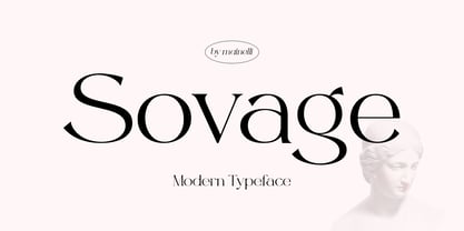 Sovage is a modern minimalist font style and clean feel. To help your creative work, Sovage comes with a regular version and an italic version and is perfect for mixing and matching your creative works harmoniously such as for magazine pictures, for wedding invitations, for branding, poster design, and many others. Sovage Features: Multilanguange PUA Encoded Alternates Ligatures.
 - Skorid by Totem,
$20.00 Skorid is a geometric condensed sans serif font family, constructed only out of straight lines. Coming in 7 weights, regular and italic, from thin to black, you have a wide array of possibilities of using Skorid for any purpose you need. Skorid speaks around 70 languages, including Cyrillic. Contains a lot of alternative letters to boost your creativity.
 - Belta by Antipixel,
$50.00 Belta is a decorative all-caps handwritten font, perfect for display use. It is available in light, regular and bold, providing a wide range of possibilities and combinations since the glyphs vary from one style to another, allowing a more informal and script look. It's glyph coverage supports languages such as English, Spanish, French, Portuguese, Italian, Swedish, among others.
 - IA Airship Captain by Invisible Art Studio,
$14.99 IA Airship Captain is a good readable comic book dialogue font made with a marker with wavy lines, giving it uniqueness and recognition. The family includes Regular, Italic, Bold, and Bold Italic. And contains a large number of kerning pairs. Added extended Latin, extended Cyrillic and contextual autoreplacing crossbar "I" in words like I, I'm, etc.
 - Silvergates by Gienlee,
$15.00 Yo! Welcome to gienlee cartoon, design, and other artworks Silvermoon is Medieval Font. Commonly used for middle ages those combined with the beauty of crystal and silver stone. Item Description Standard Glyphs (Uppercase, Lowercase, Numeral & Punctions) Works on PC & Mac No Special Software is required File Description Silvergates-Regular OTF file Silvergates-Line OTF file enjoy your download
 - Eastport JNL by Jeff Levine,
$29.00 Eastport JNL is the interpretation by Jeff Levine Fonts’ of the classic Stymie Extra Bold (a/k/a Stymie Black), designed in 1931 for American Type Founders by Morris Fuller Benton. Stymie and the somewhat similar Beton were both derivations of the popular European typeface Memphis. Eastport JNL is available in both regular and oblique versions.
 - Hipsterious by Letterhend,
$15.00 Hipsterious is casual and fun script that stands out from the crowd. Consist of two types, a regular and rough. Perfect to be used especially for logo type, signature, photography, quotes, apparel design, and any design needs. As usual, the font comes with many opentype features such as ligatures, stylistic set alternate, etc and also support multilingual.
 - Sidger Nakson by madeDeduk,
$14.00 Sidger Nakson is a display font regular and rough curly style with much alternative and ligature. Its clean and geometric letterforms make it ideal for various design applications, from corporate branding to editorial layouts. Feature Uppercase & Lowercase Number & Symbol International Glyphs Multilingual support Alternative Ligature Thanks so much for checking out my shop. Hope you enjoy it.
 - Brighter by Letterhend,
$10.00 Brighter script is a bold casual and fun script that stands out from the crowd. It contains two styles: regular and rough. It's perfect to be used especially for logo type, signatures, photography, quotes, apparel design, and any design need. As usual, the font comes with many OpenType features such as ligatures, stylistic set alternates and also multilingual support.
 - Nova Sans by This is Not Typography,
$29.00 NovaSans is a modern geometric sans-serif font which captures the spirit of Bossa Nova, a noble Brazilian music style. Music and typography presents several things in commom, so the idea behind the font is show some of bossa nova’s characteristics, like melody, cadence, softness, metric, simplicity, waves, subtleties. Some gaps in representing the source of irregular alignment scores. NovaSans also was selected for Tipos Latinos Bienal, in the Display faces category. NovaSans was built with a modular system. Its whole set offers almost 280 glyphs with alternates, dingbats and ornaments. Conceived to be used as a display typeface, NovaSans is recommended for use at large sizes.
 - Rotola TH Pro by Elsner+Flake,
$40.00 Karl-Heinz Lange presented his first drafts of Rotola during a Typoart® type design competition in 1985 under the name "Boutique". A year later, Norbert du Vinage, former manager of the type design department, integrated "Boutique" in his production plan. Due the Fall of the Wall, it took about 18 years until Lange finished this font family in cooperation with Elsner+Flake. Karl-Heinz Lange was born on July 29, 1929 in Wiesenkirch in West Prussia. He was enrolled in the Humanistic Gymnasium at Elbing from 1939 to 1945 and changed to the Wernigerode High School after his family had to flee to central Germany. From 1949 to 1951, Karl-Heinz Lange studied at the Werkkunstschule Halle, where one of his teachers was Professor Post. After 1951, he continued his studies at the Hochschule for Grafik und Buchkunst in Leipzig with an emphasis on book design. He received his diploma in 1955 with distinction based on his design of a hot metal typeface. From 1956 to 1961, Karl-Heinz Lange worked as a lecturer for Type and Commercial Graphics at the Hochschule für Angewandte Kunst in Magdeburg. From 1961 to 1963, he taught at the Hochschule für Grafik und Buchkunst in Leipzig, and finally as a freelance commercial designer in Magdeburg. He worked on a variety of assignments, one of which was the design of trick films. From 1969 to 1976 he took the position of Artistic Director of the Henschelverlag, Berlin; from 1976 to 1994 he was Professor of Type and Typography at the Fachschule für Werbung und Gestaltung in Berlin; and, until 2004, he taught at various institutes for advanced professional education. From 2005 to 2007 he taught at the Fachhochschule Magdeburg/Stendal. Karl-Heinz Lange was awarded the second prize at the "International Type Design Contest 1971" for a headline typeface, and, in 1984, at the XI. Biannual of Graphic Design in Brno, he won a Silver Medal for the design of his typeface family Publica. He created the telephone book typeface Minima and re-designed the Typoart Super Grotesk® (Arno Drescher, 1930) as well as the Newspaper typeface Magna® by Herbert Thannhaeuser for the use on digital typesetting systems. To the day of his death on June 29, 2010, Karl-Heinz Lange lived and worked as a type designer. Among others, he closely followed the designs of the typefaces which were developed under his guidance for Typoart®: "Publica®", "Typoart Super Grotesk®" and "Minima®" which he launched as "Publicala", "Minimala" and "Superla" in 2009. In cooperation with Elsner+Flake, he developed the Typeface family "Rotola" between 2006 and 2009 as well as the script families of the "Viabella®" series. To the end, he followed the development of his first typeface, the "Diplom Antiqua", which he also wanted to bring to market together with Elsner+Flake.
 - Karayel Handwritten by Tatbikililer,
$19.00 Erdogan Karayel, a master in graphic arts and a cartoon artist, has long dreamed of transforming characters made up of his own handwriting into fonts. This dream has come true with the technical support of Karayel's school friend Sabahattin Kayış, a graduate of the Istanbul School of Applied Fine Arts (Marmara University Faculty of Fine Arts). The biggest problem of handwritten fonts in the font world is the difficulty of reading in long texts due to their curved and flexible letters that create spacing problems when used side by side. The "Karayel Calligraphy", on the contrary, is created as a solution to this problem. It's a font that is sufficiently fluid, visually satisfying and easy to read. In particular, a lot of effort is made to ensure the utmost harmony between the character's spaces. The “Karayel Calligraphy” font is now available for download.
 - Fontena by Gilar Studio,
$16.00 Introducing Fontena - A Font Family ! The Fontena - A Font Family will work perfectly for fashion, e-commerce brands, trend blogs, wedding boutiques or any business that wants to appear upscale and chic. The Fontena - A Font Family also Suitable for Logo, greeting cards, quotes, posters, branding, name card, stationary, design title, blog header, art quote, typography, art, modern envelope lettering or book design, happening style like handdrawn design or watercolor design theme, craft design, any DIY project, book title, or any purpose to make your art/design project look pretty and trendy. Features : Numerals & Punctuations (OpenType Standard) Accents/Multilingual characters (AÀÁÂÃÄÅCÇDÐEÈÉÊËIÌÍÎÏNÑOØÒÓÔÕÖUÙÜÚÛWYÝŸỲŸÆŒßÞ) PUA Encoded No special software is required to use The Fontena - A Font Family Check my other Font here : https://gilarstudio.com/ Give it a try! You will surely love it! Thanks and have a wonderful day, Gilar :)
 - Dine And Dance JNL by Jeff Levine,
$29.00 Sheet music featuring a song from the 1933 film "Torch Singer" starring Claudette Colbert was the basis for Dine and Dance JNL. A multi-line Art Deco design, it epitomizes both the typographic style and the night life of the time, when supper clubs featuring big bands were at their peak. Torch Singers were female vocalists who typically sang melancholy love songs of lost love and heartbreak.
 - Otari by TK Type,
$25.00 Otari is vibrant and contemporary, but serious and built to last. Its character shines in display type, but doesn’t interfere at text sizes. Otari aims to capture the essence of Wellington, New Zealand in a single typeface. The contrast of a colorful art scene and the conservative colonial British aesthetic, which is still evident in the capital city, laid the groundwork for this design.
 - Praha Deco by Deniart Systems,
$20.00 Praha Deco was inspired by the Prague art deco movement at the turn of the 20th century. Spiced with our own creative blend, this is our tribute to that wonderful era in architecture. The Praha Deco typeface contains a large assortment of extended characters to support many of Europe's languages, including Czech, Danish, Dutch, Esperanto, Finnish, French, German, Italian, Hungarian, Polish, Portuguese, Romanian, Spanish, Swedish, Turkish & Welsh.
 - Sticky Shoes by Bogstav,
$15.00 Sticky Shoes was inspired by a sign at a local flea market. The artist behind the sign obviously didn’t care much about painting the letters “in the right way” - leaving a slobby and uneven impression. And what is wrong with that? Nothing, if you ask me. I tried my best to capture the charm and innocence behind that sign in Sticky Shoes. I even made the paint version go outside the outline in the Regular version! I added 6 different versions of each letter, and they automatically changes as you type. That goes for all 4 versions, and they even mix very nicely!
 - Olivia Sans by Stabenfonts,
$45.00 The rounded Sans with edges. Olivia Sans got curves on the outlines and edges on the inlines. So it can be very legible and space efficient at the same time: the curves keep the distinctions between the letters, the corners keep the influences from broadnibbed pens with a subtle horizontal stress for great legibility. Olivia has personality without being obtrusive. Three weights (light, regular, bold) are equipped with real italics, SmallCaps, different sets of figures, accents for almost every latin script, arrows, symbols. A fourth weight (black) comes without italics or SmallCaps, but all the other features. Olivia: with or without.
 - Gatsby Modern by Nicky Laatz,
$15.00 Gatsby Modern Serif takes its cues from the "Roaring Twenties" , an era when breaking from the norm was the order of the day, when femininity took on a charming 'boyishness', and a time when anyone who’s anyone, needed to be bold and ever so slightly, or even not so slightly, eccentric. Perfect at any size - Gatsby Modern does well from large eye-catching headlines , to large paragraphs of small text. Great for modern branding, posters, logos, social media projects, headers, advertising and so much more. Gatsby Modern is available in two weights, regular and a heavier set bold to suit your project needs.
 - Olivia Serif by Stabenfonts,
$45.00 The rounded Serif with edges. Olivia Serif got curves on the outlines and edges on the inlines. So it can be very legible and space efficient at the same time: the curves keep the distinctions between the letters, the corners keep the influences from broadnibbed pens with a subtle horizontal stress for great legibility. Olivia has personality without being obtrusive. Three weights (light, regular, bold) are equipped with real italics, SmallCaps, different sets of figures, accents for almost every latin script, arrows, symbols. A fourth weight (black) comes without italics or SmallCaps, but all the other features. Olivia: with or without.
 - Eckhardt Relaxed JNL by Jeff Levine,
$29.00 Eckhardt Relaxed JNL was modeled from an example of a casual, hand lettered alphabet from a page of a vintage textbook. This style of freehand lettering always lends itself well to posters, show card and sign work, but is equally at home in ad design or titling. The typeface is an addition to the group of type styles inspired by sign lettering, and is named for Jeff Levine's good friend, the late Al Eckhardt; whose shop turned out quality hand lettering from 1959 until his passing in 2005. Eckhardt Relaxed JNL is available in both regular and oblique versions.
 - ALS Malina by Art. Lebedev Studio,
$63.00 Malina (raspberry) is a plump, sweet-tempered display typeface. It comes in one style that includes small caps, ligatures, and ornaments. The face “speaks” several languages. Malina works wonders in titles and bite-size text nuggets. On top of the regular set of characters, the typeface hosts with ease a duck and fox, owl and crocodile, mammoth and pig. They’re irresistible when used by one or in bunches forming patterns. The typeface is ideal for signs, posters, sweets and kids product packaging; will feel at home in fun & entertainment stuff design and as a part of playful projects.
 - Tupã by Just in Type,
$19.00 Tupã is the Brazilian indigenous word for thunder, that is worshiped like God in their mithology (in Tupi language). The typeface was developed to be strong and with great impact. The UPPERCASE was carefully designed with a lot of different features, and the lowercase is a mix of small caps and traditional forms, which brings a lot of personality and uniqueness to the design. Tupã familly is composed by two weights and four styles: Regular, Italic, Bold and Bold Italic. It’s a project recommended for titles, logos, posters and everything else you think it works. Take a look at the complete Specimen here.
 - Pila by Alex Jacque,
$20.00 Pila, designed by Alex Jacque in 2014, is a modular, sans-serif stencil typeface that comes in regular and condensed formats. Crafted to be a bold, punchy, no-nonsense stencil typeface, Pila owes its unique look — as well as its name — to its adherence to the rigid modular system it is built upon. Pila is meant to be used at larger point sizes where visual impact is desired. Pila has a broad glyph set with the necessary characters to support a wide number of languages. Through the use of OpenType Pila can automatically create fractions as well as create superscript and subscript numerals.
 - Club Type by Club Type,
$37.00 Perhaps the greatest tragedy in all English history began in 1642 when, for five years, families and friends were divided by violent struggle. Respect for the monarchy was as great then as it is today; but it was squandered by Charles I and Civil War ensued. Out of Cromwell's eventual victory came a period of absolute rule just as arbitrary. In communicating the affairs of Court, Mercurius Aulicus can claim to be England's first regular newspaper, printed at Oxford and reprinted in London almost throughout the entire war. This typeface family echoes the calligraphic scripts of newspaper cartoons of the time.
 - Portello by Greater Albion Typefounders,
$14.50 Portello is a display family in the tradition of Tuscan advertising and display faces. It's a family of three 'all capital' faces. A perpendicular regular form is offered, along with an italic form (a true italic - with purpose designed glyphs-NOT merely an oblique) and a basic form for small text - which dispenses with the family's characteristic outlined look. It offers the spirit of the Victorian era with ready and distinctive legibility. It's ideal for poster work, especially at large sizes, and for signage with a period flair. Why not give your work the flair of colorful 19th century commercial design today?
 - Directors Cut Pro by Type Innovations,
$39.00 Directors Cut Pro is a compelling new font series designed by Alex Kaczun. It recently won the second place—a commendation in the Canberra Typeface Competition. This handsome Geometric Antique serif design is based on the early 19-century Moderns and Scotch styles, infused with the warm charm of traditional antique, added for interest. Capturing the best of both ages: it's warm, comforting and persuasive. Directors Cut Pro's graceful aspects naturally invite uses at large sizes, for which we have created a stunning and elegant lighter weight. But, this workhorse typeface series incorporates a solid regular weight, along with its italic—ideal for a multitude of text purposes, at varying point sizes. A robust Bold weight is available for headlines and emphasis. Director Cut Pro comes with proportional as well as tabular lining figures for quickly setting up charts and tables. It also contains an extended character set—including most Central European languages. Alex Kaczun is in the process of expanding this typeface series to include additional weights, styles and proportions. Stay tuned! The large Pro font character set supports most Central European and many Eastern European languages.