10,000 search results
(0.043 seconds)
- Hymers JNL by Jeff Levine,
$29.00 Born on May 8, 1892 in Reno Nevada, Lewis Franklin (“Lew” ) Hymers left an indelible mark as a caricaturist, cartoonist and graphic artist. At the age of twenty [in 1912] he worked for the San Francisco Chronicle. During World War I he worked for the Washington Post. He even was employed for a time by Walt Disney as an animator - but most of his life was spent in either Tujunga, California or his birthplace of Reno, Nevada as a self-employed illustrator. Hymers inked a feature for the Nevada State Journal called “Seen About Town”, which was published during the 1930s and 1940s. In this panel, he caricaturized many of the familiar faces around Reno. He also designed signs, logos, post cards and numerous other commercial illustrations for clients, but what has endeared him to a number of fans was his vast library of stock cuts (the predecessor to paper and electronic clip art) which feature his humorous characters in various professions and life situations. So popular is his work amongst those “in the know” that a clip art book collection of over seven hundred of his drawings that was issued by Dover Publications [but long out of print] commands asking prices ranging from just under $15 to well over $100 for a single copy. Lew Hymers passed away on February 5, 1953 just a few months shy of his 61st birthday. Although his artwork depicts the 1930s and 1940s lifestyles, equipment and conveniences, more than sixty years after his death they stand up amazingly well as cheerful pieces of nostalgia. The twenty-seven images (and some variants) in Hymers JNL were painstakingly re-drawn from scans of one of his catalogs and is but just a tiny fraction of the hundreds upon hundreds of illustrations from the pen of this prolific artist.
 - Savigny by insigne,
$22.00 Savigny began as an offshoot of Le Havre. Le Havre met my design objective of a geometric sans serif with a strong art deco touch. Le Havre’s primary inspiration came from the art deco titling of the 1930’s, and the lower case was just icing. The art of the 1930’s is of particular interest to me, and I love the art deco era and its art, and the simplicity of geometric shapes. I am mostly interested in designing display typefaces. In many ways Le Havre was the exact opposite of another popular insigne offering, Aviano Sans. Le Havre has very high ascenders, a lower case and is very condensed. Aviano Sans has no lowercase and extremely extended capitals. With the rise of webfonts I began to see Le Havre being used frequently online. It’s short x-height and very tall ascenders made it difficult to read in on screen text settings as it was intended as display type. With this observation, I felt that there is more room for a geometric sans in the insigne catalog. So I set about to design a new geometric sans using the successful skeleton of the Le Havre family. Although I planned to extend the Le Havre line, the new family is so drastically different I decided on a new name: Savigny. The face evolved and began to take on a few humanist touches. Designed from the very beginning as a webfont, the design is open and pleasing to the eye, with a tall x-height. To optimize it for onscreen settings, the spacing is generous. In addition, it includes extended and condensed members, making it insigne’s first superfamily. The family includes over 100 OpenType alternate characters. These include several style sets. Some are stemless, others are purely geometric, and in a nod to Savigny’s origins, Art Deco titling alternates. Please see the informative .pdf brochure to see these features in action. OpenType capable applications such as Quark or the Adobe suite can take full advantage of the automatically replacing ligatures and alternates. This family also includes the glyphs to support a wide range of languages. Savigny is a great choice for a professional designer who wants a well rounded typeface family that is ready for the web.
 - Potenciarte by Nasir Udin,
$25.00 Potenciarte is an all-caps display typeface inspired by the facade of old buildings from the era of Nederlandsch-Indie (1900’s) in Surabaya, where Art Deco & Art Nouveau typographic styles were widely used.
 - Crabs by Ardyanatypes,
$10.00 Crabs Slab Comes with a Slab Serif style typical of sturdy and elegant typography, which gives a modern, retro, and classic style but has a unique and elegant style that gives an extraordinary impression. Crabs Slab also comes with multiple languages enabling Crabs Slab to be used in all your projects. Crabs Slab is very suitable for use in various purposes or projects, including Sports, Posters, Products, Logos, Branding, and many more that you can apply with this Crabs Slab Typeface. Supports languages: Afrikaans, Albanian, Asu, Azerbaijani, Basque, Bemba, Bena, Bosnian, Breton, Catalan, Chiga, Colognian, Cornish, Croatian, Czech, Danish, Dutch, Embu, English, Estonian, Faroese, Filipino, Finnish, French, Friulian, Galician, Ganda, German, Gusii, Hungarian, Icelandic, Igbo, Inari Sami, Indonesian, Irish, Italian, Jola-Fonyi, Kabuverdianu, Kalaallisut, Kalenjin, Kamba, Kikuyu, Kinyarwanda, Latvian, Lithuanian, Low German, Lower Sorbian, Luo, Luxembourgish, Luyia, Machame, Makhuwa-Meetto, Makonde, Malagasy, Malay, Maltese, Manx, Meru, Metaʼ, Morisyen, North Ndebele, Northern Sami, Norwegian Bokmål, Norwegian Nynorsk, Nyankole, Oromo, Polish, Portuguese, Quechua, Romanian, Romansh, Rombo, Rundi, Rwa, Samburu, Sango, Sangu, Scottish Gaelic, Sena, Shambala, Shona, Slovak, Slovenian, Soga, Somali, Spanish, Swahili, Swedish, Swiss German, Taita, Teso, Thai, Turkish, Turkmen, Upper Sorbian, Vietnamese, Vunjo, Walser, Welsh, Western Frisian, Wolof, Yoruba, Zulu A guide to accessing all alternatives can be read at http://adobe.ly/1m1fn4Y Adobe Photoshop go to Window – glyphs Adobe Illustrator go to Type – glyphs Features: A – Z Character Set a – z Characters set Numerals & Punctuations (OpenType Standard) Multilingual Thank you and have a nice day
 - Polar by Daniel Uzquiano,
$150.00 Polar is a sans-serif grotesk with characteristic ink traps and rounded vertexes. Polar is a variable font. It is versatile, modern, elegant and neutral. It can be displayed in a range from 200 to 900 in its weight axe to play many different roles. The font has 5 predefined instances, Thin Display, Light, Regular, Bold and Heavy Display, in two styles, regular & italic, with 716 glyphs each of them. Polar has 25 OpenType features such as ligatures, fractions, stylistic alternates, localized forms, old-style figures, etc. It can be suitable for long texts. It also works great as a perfect display font for all caps headings, especially with its thin and heavy weight variants. Polar covers Latin, Central European characters & supports 101 languages: Afrikaans, Albanian, Asu, Basque, Bemba, Bena, Breton, Catalan, Chiga, Colognian, Cornish, Croatian, Czech, Danish, Dutch, Embu, English, Esperanto, Estonian, Faroese, Filipino, Finnish, French, Friulian, Galician, Ganda, German, Gusii, Hungarian, Igbo, Inari, Sami, Indonesian, Irish, Italian, Jola-Fonyi, Kabuverdianu, Kalaallisut, Kalenjin, Kamba, Kikuyu, Kinyarwanda, Koyraboro Senni, Koyra Chiini, Latvian, Lithuanian, Lower Sorbian, Luo, Luxembourgish, Luyia, Machame, Makhuwa-Meetto, Makonde, Malagasy, Maltese, Manx, Meru, Morisyen, Northern Sami, North Ndebele, Norwegian Bokmål, Norwegian Nynorsk, Nyankole, Oromo, Polish, Portuguese, Quechua, Romanian, Romansh, Rombo, Rundi, Rwa, Samburu, Sango, Sangu, Scottish, Gaelic, Sena, Serbian, Shambala, Shona, Slovak, Soga, Somali, Spanish, Swahili, Swedish, Swiss, German, Taita, Tasawaq, Teso, Turkish, Upper, Sorbian, Uzbek (Latin), Vietnamese, Volapük, Vunjo, Walser, Welsh, Western Frisian, Yoruba, Zarma, Zulu.
 - Salma Alfasans by Alifinart Studio,
$10.00 Salma Alfasans is a modern sans serif font, created on February 25, 2021. The main inspiration for this font is its modern geometry and bold design, but looks elegant and smooth. This font is well-crafted and has almost no contrast at all. The advantage of the Salma Alfasans font is that it is very appropriate when used as a heading, but also looks good when used as body text. With many weight options, you can freely adjust the design scenario based on your needs. Salma Alfasans is very good for logos, branding, books (headings, sub headings, and body text), invitations, business cards and others. SALMA ALFASANS UPDATE VERSION 2.0 Update Details: - New designs and mayor changes - Tabular and proportional lining figures - Tabular and proportional oldstyle figures - Stylistic set for a, l, y, and G - Numerator, denominator, and fractions - New ligatures for ff, fi, fj, ft, fk, ffk, and more - Case sensitive, and - Arrows Language Support: Afrikaans, Albanian, Asu, Basque, Bemba, Bena, Breton, Catalan, Chiga, Cornish, Danish, Dutch, English, Estonian, Filipino, Finnish, French, Friulian, Galician, German, Gusii, Indonesian, Irish, Italian, Kabuverdianu, Kalenjin, Kinyarwanda, Luo, Luxembourgish, Luyia, Machame, Makhuwa-Meetto, , Makonde, Malagasy, Manx, Morisyen, North Ndebele, Norwegian Bokmål, Norwegian Nynorsk, Nyankole, Oromo, Portuguese, Quechua, Romansh, Rombo, Rundi, Rwa, Samburu, Sango, Sangu, Scottish Gaelic, Sena, Shambala, Shona, Soga, Somali, Spanish, Swahili, Swedish, Swiss German, Taita, Teso, Uzbek (Latin), Volapük, Vunjo, Zulu. Thank you. Alifinart Studio alifinart@gmail.com Instagram | Behance
 - Algerian Mesa by FontMesa,
$25.00 Inspired by the old Stephenson Blake Caps only font Algerian from 1908, this version, named Algerian Mesa, has been freshened up with a new matching lowercase. The original Algerian, on page 142 of the 1908 Stephenson Blake specimen book, was a small caps to a more decorative lining caps and the plain black version, without the shadow line, was named Gloria. Also on page 142 of the 1908 Stephenson Blake specimen book is a shaded Latin font that gave me the idea for the Alt version of Algerian Mesa. The Alt version works well at smaller point sizes combined with the regular Algerian Mesa font on the same page. New for 2016 were Opentype features including original alternates, oldstyle numerals and case sensitive forms, also new is a fully usable Alt version. New for 2022 are the higher x-height, 90% small caps, 80% small caps and all new italic versions. Also new for 2022 are straight sided accent marks replacing the flared or curved accents. While Algerian Mesa includes some alternates our related Tavern font will still remain the version with more alternates and more weights.
 - BoiTu by Vei Vei,
$16.00 BoiTu is a typeface in the BoiTu project designed by Vei Vei. BoiTu has a strong contrast between bold bars and long sharp hook strokes inspired by pheasant feathers on the hat in Hat Boi costume. "Tuong or Hat Boi is a form of Vietnamese classic opera, combining various elements of arts such as stage, music, fine art, literature, dancing, and martial arts. Older Tuong plays are usually about historical events or tales. Allegories, melodramas, soliloquies, modes of expression, forms of performance, repartee singing and recitative conventions, etc., are constantly updated and elevated, and are quintessential elements in the art of Tuong." Boi Tu is a classic design to bring traditional art and culture closer to everyone. Boi Tu is a Vietnamese font that supports multiple languages.
 - Jump Style by Maulana Creative,
$15.00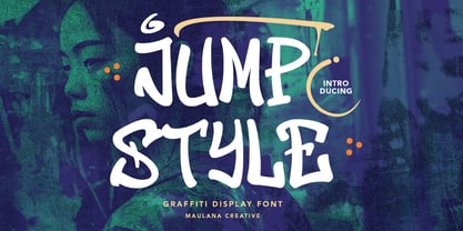 Give your designs an graffiti display Font handcrafted feel. “Jump Style Graffiti Display Font” is perfectly suited to stationery, logos and much more. Many Thanks, Maulana Creative
 - Saguenay by Jonahfonts,
$29.00 Saguenay ia very versatile font which apply to many applications including headlines,web, logos, ads, captions, packaging, bulletins, posters, and greeting cards as well as short texts.
 - Bellezza by Wilton Foundry,
$39.00 Bellezza (Italian: beautiful) is an elegant calligraphic script with many ligatures to provide great solutions for Invitations, presentations, signage, posters wherever sensitivity, legibility and elegance is essential.
 - Guy Doodles by Outside the Line,
$19.00 Fun, illustrations of guy stuff. This font is another of the many doodle fonts from Outside the Line. Goes well with Diva Doodles and Diva Doodles Too.
 - Applaud by Jonahfonts,
$20.00 Applaud is a very versatile font which apply to many applications including headlines, logos, ads, captions, packaging, bulletins, posters, and greeting cards as well as short texts.
 - Amazon Lily by Forberas Club,
$16.00 Amazon Lily font is a cute and playful font. Can be placed on many concepts. It would be more appropriate if used for something fun and funny.
 - Biscuit Recipe by Forberas Club,
$16.00 Biscuit Recipe is handwritten font with pressure style. This font is good to application for wedding, tees, simple letter, notes, invitation, celebration, cute moment and many more.
 - Novela by Jonahfonts,
$42.00 Novela is a chisel flat pen style written with overtones of Uncial, from century old scribes. Very suitable for greeting cards, headlines, packaging and many other applications.
 - Gastino by Ronin Design,
$15.00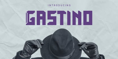 Gastino is an casual and unique display font. Gastino is designed for any project, this font is perfect for poster design, logotype design, advertising and many more.
 - Gentry by Device,
$29.00 With its strong diagonal emphasis, Gentry is a humanised techno face that manages to also incorporate some strong calligraphic touches. Powerful in short and single-word settings.
 - Black Range by Maulana Creative,
$14.00 Give your designs an authentic brush handcrafted feel. �Black Range Brush Font� is perfectly suited to stationery, logos and much more. Caps only fonts. Many Thanks! MaulanaCreative
 - Hellena by Motokiwo,
$17.00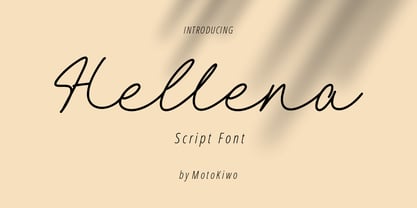 Hellena, an elegant script font that great for fashion, quote, and many more. This font was designed with uppercase, lowercase, ligature, numbers, punctuation, and also multilingual support.
 - Bantublesh by Forberas Club,
$16.00 Bantublesh is handwriting style. This font create and nice to application for wedding invitation, tees design, cover, writing text, wedding moment, logo photography , signature and many more.
 - Sambi Lemon by RahagitaType,
$15.00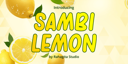 Sambi Lemon is an uppercase awesome font suitable for your many great project as branding, packaging, poster, comic, flyers, and more. Features: - Uppercase & Lowercase - Multi-lingual Support
 - Sarmal by Ahmet Altun,
$19.00 The sarmal font contains ligatures that are functional and useful. It can be a stylish font choice for your posters, t-shirts, prints and many more works.
 - Lettre D'amour by Otto Maurer,
$15.00 Lettre D'amour is an Oldstyle Handwriting Font. It comes in 11 Styles and two Angles with many OpenType Features. Alternate Caps, Alternate Ends and old style Numbers.
 - Dauphine by Device,
$39.00 Dauphine is an elegant caps and small-caps typeface that manages to be modern while still displaying perfumed good breeding. It comes with a leafy decorative variant.
 - SirClive - Unknown license

- Remora Sans by G-Type,
$39.00 Remora is an extensive new humanist sans serif which comes in 2 style variations, the effervescent Remora Sans and its corporate business partner Remora Corp . Both styles include 5 individual width sets ranging from the condensed W1 to the extra-wide W5. Furthermore, with an impressive 7 weights (Thin to Ultra) and true matching italics in each pack Remora is an ultra versatile super family comprising 140 individual fonts, perfect for any typographic assignment or design brief. Remora was designed by G-Type founder Nick Cooke. Both the Sans and Corp families share the same proportions, with the exception of certain key characters that change the overall appearance. Remora Sans is an exuberant and characterful typeface while Remora Corp, as its name suggests, is a businesslike typeface more suited to corporate typography. Quite early on in the design process Nick decided to give Remora Corp equal billing instead of incorporating these glyphs as alternates or a stylistic set that may get overlooked. “I created two separate families after learning a valuable lesson with one of my earlier typefaces, Houschka”, says Nick. “Houschka contained distinctive rounded A’s W’s and w’s, with ‘straight’ styles as character alternates. Even though style sets and alternates are easy to activate they are rarely used, so after many requests for customised versions of the fonts with the straight characters as defaults it was decided to create the separate ‘Alt’ family. So I cut straight to the chase with the two Remora variants and created two complementary families.” Both sets contain many shared letterforms, but it is the alternate characters that significantly alter the appearance of each font. Remora has been carefully designed for optimum legibility at large and very small sizes. Although fairly monolinear in appearance, especially in the lighter weights, particular attention has been paid to optical correction like the overshoots of the curved characters. Open counters and painstaking attention to detail (e.g. weight contrast between horizontal and vertical strokes, junctions of shoulders and stems etc) all boost readability and make Remora a great choice across all media. Remora Sans and Corp are ‘humanist’ rather than ‘geometric’ in style, meaning they’re not strictly based on rectangles and circles, resulting in a warm and friendlier feel. The slightly ’super-elliptical’ rounded forms create generously attractive curves. Remora has very distinctive italics in that they are only inclined by 8 degrees, but are not just based on slanted uprights. The italic styles are very alluring when used for display at large sizes and the good news is they come bundled free with their respective uprights. Each family also contains many OpenType features including proportional and tabular numbers, small caps, discretionary ligatures, plus five stylistic sets for ultra versatile typography.
 - Remora Corp by G-Type,
$39.00 Remora is an extensive new humanist sans serif which comes in 2 style variations, the effervescent Remora Sans and its corporate business partner Remora Corp. Both styles include 5 individual width sets ranging from the condensed W1 to the extra-wide W5. Furthermore, with an impressive 7 weights (Thin to Ultra) and true matching italics in each pack Remora is an ultra versatile super family comprising 140 individual fonts, perfect for any typographic assignment or design brief. Remora was designed by G-Type founder Nick Cooke. Both the Sans and Corp families share the same proportions, with the exception of certain key characters that change the overall appearance. Remora Sans is an exuberant and characterful typeface while Remora Corp, as its name suggests, is a businesslike typeface more suited to corporate typography. Quite early on in the design process Nick decided to give Remora Corp equal billing instead of incorporating these glyphs as alternates or a stylistic set that may get overlooked. “I created two separate families after learning a valuable lesson with one of my earlier typefaces, Houschka”, says Nick. “Houschka contained distinctive rounded A’s W’s and w’s, with ‘straight’ styles as character alternates. Even though style sets and alternates are easy to activate they are rarely used, so after many requests for customised versions of the fonts with the straight characters as defaults it was decided to create the separate ‘Alt’ family. So I cut straight to the chase with the two Remora variants and created two complementary families.” Both sets contain many shared letterforms, but it is the alternate characters that significantly alter the appearance of each font. Remora has been carefully designed for optimum legibility at large and very small sizes. Although fairly monolinear in appearance, especially in the lighter weights, particular attention has been paid to optical correction like the overshoots of the curved characters. Open counters and painstaking attention to detail (e.g. weight contrast between horizontal and vertical strokes, junctions of shoulders and stems etc) all boost readability and make Remora a great choice across all media. Remora Sans and Corp are ‘humanist’ rather than ‘geometric’ in style, meaning they’re not strictly based on rectangles and circles, resulting in a warm and friendlier feel. The slightly ’super-elliptical’ rounded forms create generously attractive curves. Remora has very distinctive italics in that they are only inclined by 8 degrees, but are not just based on slanted uprights. The italic styles are very alluring when used for display at large sizes and the good news is they come bundled free with their respective uprights. Each family also contains many OpenType features including proportional and tabular numbers, small caps, discretionary ligatures, plus five stylistic sets for ultra versatile typography.
 - Dream Script by Lián Types,
$49.00 One of my dreams as a type-designer was making a good looking chancery cursive. Full of life, like some of the best calligraphers around the world do on their artworks. With Julian Waters, John Stevens and Denis Brown (just to name a few of them) (1) chancery, or italic script, was transformed into a new, exciting and very fresh style of calligraphy mainly at the end of 20th Century. Dream Script may be that dream named above made true. I have been practicing chancery in the way I learnt from those calligraphers for many years now. Making a font out of my ink-sketches was a tough work, since they were closer of -being art- than of -being type-. However, this font rescues many aspects of handmade calligraphy: You have to look at it really close to notice it is actually a font, and that was one of my goals. The secret of a good looking chancery is on its subtle details: pen angle is constantly changing, even on the strokes which seem straight. Capitals and swashes have to be done a little faster than lowercase letters. The rhythm has to be even, in spite of its playful look. The fact that makes Dream look alive is that it has many alternates per glyph. This makes each word look unique like it happens in calligraphy: you will find alternates for the beginning/ending of a word/phrase, some for the middle of it, some interchangeable. Also, to accompany the script, you will find Dream Caps, which was inspired in the eternally beautiful trajan capitals. Place them like I did on the posters and you will have great results for sure. The font works great in small, middle and big sizes and can be a great selection for magazines, wedding invitations, perfumes, and posters. Close your eyes, and Dream with me... TECHNICAL Dream Script Pro is the most complete style, it contains all the alternates and ligatures (OT programmed, better if you use Adobe applications) If you plan to use the font for text, be sure to activate the less decorative capitals, which are placed in the “salt” group of alternates. Dream Script Standard has less glyphs than the Pro one, it contains just some ligatures for a better legibility. (OT programmed, better if you use Adobe applications) NOTES (1) Not only are they great artists, but also good people, who are always willing to share with their students all what they know. I would also like to thank Ricardo Rousselot, whose work inspired me this time to make “The Dream Script” exlibris; and to Alisara Tareekes, a very talented friend which international calligraphy conferences gave me: She kindly helped me with some tips to make this font better.
 - Chunkfeeder by Typeco,
$29.00Chunkfeeder was inspired by the many vernacular forms of lettering created for high speed printing and electronic displays found in our modern techie world such as postal packing slips, airline tickets and informational video displays. Many of these type of fonts are designed by engineers and interface designers who presumably do not have a background in letterform design and consequently these glyphs have many quirky idiosyncrasies. In keeping with it's mechanical inspiration, Chunkfeeder is a monospaced font, much like an OCR type font. Chunkfeeder has a rather ridged modularity but it incorporates more typographic nuance into the letterforms than most other fonts of this style, while exploiting some of the visual artefacts of high speed printing. Chunkfeeder is a versatile family of 6 fonts -- 3 weights, each with an accompanying oblique. - English Engravers Roman by Smith Hands,
$38.00 English Engravers Roman is inspired by the beauty and eccentric detailing of British stone carved lettering. After observing many beautiful inscriptions around London and southern England, Robbie Smith decided to create a font family in homage to this rich heritage. English Engravers Roman features a set of beautifully balanced uppercase Roman, and a characterful lowercase alphabet with some endearing quirks. Included in the each font are two forms of lowercase 'q', one very similar to an uppercase 'Q' with a tail, and a traditional 'q'. Each font in the family features a comprehensive character set with many ligatures, added to enhance letter spacing. The fonts all feature an additional set of old style numerals. Many extra characters and ligatures can be accessed via the 'insert glyph' functions in graphic design software.
 - NiseJSRF - Unknown license

- Deco Experiment 7 by Intellecta Design,
$9.00a art deco naive experimental typeface - LHF Bell Boy by Letterhead Fonts,
$33.00 Authentic 30s style art deco typeface.
 - Ravishing by Bogstav,
$17.00 Art Deco meets organic - don't panic! :)
 - Bvenaztre by Ilhamtaro,
$23.00 BVENAZTRE is a basic serif font, which was modified into an art deco font that looks vintage and classic. With the art deco style, it is very suitable for art-style designs or it could be with Greek and Roman styles. To enable the OpenType Stylistic alternates, you need a program that supports OpenType features such as Adobe Illustrator CS, Adobe Indesign & CorelDraw X6-X7. Cheers!
 - ITC Medea by ITC,
$40.99The designer of ITC Medea , Silvio Napoleone said: “I've always had an interest in early letter shapes, particularly how they influenced modern typographic designs. While I was on vacation in Greece, I had a chance to see, first-hand, examples of early letterforms and typography. They really made an impression on me.” The idea of combining the ancient and the modern to create something new was the primary inspiration behind ITC Medea. ITC Medea is essentially a careful blending of the modern sans serif with the elegant forms of the uncial. At first glance, Medea appears to be constructed of geometric shapes. However, closer inspection reveals many calligraphic subtleties. Stroke terminals are flared slightly in characters like the 'e' and 'c.' The top curve of the 'd' is more pronounced than the bottom, and characters like the 'o' are elliptical rather than round. “I gravitated towards the simplicity and legibility of the uncial and half-uncial,” Napoleone recalls. “I thought it would make a great titling font, and I was surprised at how attractive ITC Medea looked in a body text.” - Samaritan Lower by Comicraft,
$49.00 It's another beautiful day in scenic Astro City, home of post modern gods and ordinary mortals alike. Look into the sky and perhaps you'll get a glimpse of everyone's favorite man of the hour, if not the man of tomorrow... SAMARITAN! See the families related to Samaritan Lower: Samaritan & Samaritan Tall .
 - Bandoengsche by Gumpita Rahayu,
$14.00 Bandung is home to numerous examples of Dutch colonial architecture, most notably the tropical Art Deco architectural style. This typeface was adapted from the finest Art Deco landmarks and signage in Bandung, Indonesia and strongly added native elements of traditional Art Deco typefaces style. The main character is an example of a harmonious mixture between West and East architectural styles, repackaged into the Art Deco type design. With two different styles, it comes as regular and Deco styles, the regular style is constructed with all caps setting, with some different characters between uppercase and lowercase. The Deco style uses more stripes in the right shapes, it was naturally inspired with the most common art deco typefaces. The additional Opentype Features loaded in this typeface; some stylistic alternates, accessible catchwords in the discretionary ligatures, and the art deco ornaments, This typeface is highly usable with large scaling size and will fit with posters, movie titles, and signage designs.
 - Lexington by Canada Type,
$24.95A revival and major expansion of a 1926 Ludwig Wagner Schriftgiesserei typeface called Titanic, Lexington is the ultimate art deco expression of the high times of signage and theater during the first half of the twentieth century. Big feminine caps and cozy direct minuscules make for a unique combination rarely found in other deco faces. Topped off with the humorous and quite suave tall and pointy ascenders and descenders of the alternates, Lexington makes for a versatile and uniquely eye-catching display face beneficial to poster art, book covers, classy menus, product packaging and music paraphernalia. The original specimen Hans van Maanen worked from showed the majuscules, minuscules, figures, and 4 alternates of some ascending minuscules. This new digital version includes all of the above, plus many more additions: - Plenty more alternates, for some caps as well as for all the ascending and descending lowercase. - Three different size variations for the comma and the period. - Oldstyle figures. - A full complement of accented characters to support more Latin-based languages than ever, including Baltic, Celtic, Turkish, and Central/Eastern European languages. - A Handtooled style variation that covers both the main character set and the alternates. Lexington was named after Manhattan's Lexington Avenue, home of the some of the most famous and polished art deco architecture of the 1920s and 1930s. Lexington and Lexington Handtooled come in all popular font formats. The OpenType versions combine their respective alternates with the main character sets, for ease of use within OpenType-savvy applications.

