10,000 search results
(0.022 seconds)
- College Dropout Junior by Open Window,
$19.95 College Dropout is hand sketched, organic and reminiscent of some of those less-than academic moments at school. Its ideal use is as a display font.
 - Namata by Differentialtype,
$10.00 Namata is a sans serif font with 7 weights and 14 styles. It is suitable for use for your documents, especially at a very affordable price.
 - Bookman by Bitstream,
$29.99Bookman, a little lighter than the original, is the ATF version of Phemister’s Antique Old Style, introduced as a textface at the turn of the century. - Shishki MF by Masterfont,
$59.00 So friendly yet so naughty. A practical font family with 3 weights for all your needs: headlines, body text, signage etc. High legibility at small sizes.
 - Philadelphia by Elemeno,
$25.00Philadelphia is all stars, stripes and Fourth of July fun. It is based on the text font Aldersgate, which compliments it well. Best at large sizes. - College Dropout Senior by Open Window,
$19.95 College Dropout is hand sketched, organic and reminiscent of some of those less-than academic moments at school. Its ideal use is as a display font.
 - Protura by MIX.Jpg,
$15.00 Protura Sans Serif Masculine - 9 Font Weights With Italics Introducing Protura Sans Serif Masculine, a versatile and powerful font family designed to make a bold statement in your creative projects. With nine distinct font weights and accompanying italics, Protura offers unmatched flexibility for all your design needs. Key Features: Nine Font Weights: Protura Sans Serif Masculine boasts an extensive range of weights, from Light to Ultra Bold. Whether you're crafting a subtle headline or a powerful logo, you'll find the perfect weight to convey your message. Italics Included: In addition to the standard weights, Protura also provides elegant italic versions for each weight. These italics add a touch of sophistication to your typography, making it ideal for editorial work and branding projects. Masculine Aesthetic: Protura's design exudes strength and masculinity, making it an excellent choice for projects aimed at a bold and assertive audience. Its clean lines and sharp edges give your text a contemporary and impactful look. Versatile Usage: This font family is highly adaptable, suitable for a wide range of design applications, including branding, packaging, editorial design, posters, websites, and more. It's a true workhorse font that performs well in various contexts. Legibility: Protura prioritizes legibility without compromising on style. Its well-crafted letterforms ensure that your text remains clear and readable, even at small sizes. OpenType Features: Take advantage of OpenType features such as ligatures and alternate characters to add subtle design nuances and improve overall visual appeal. Multilingual Support: Protura Sans Serif Masculine supports a multitude of languages, making it a globally accessible font choice for your projects. Applications: Branding: Create impactful logos and brand identities that leave a lasting impression. Editorial Design: Enhance the readability and visual appeal of magazines, newspapers, and books. Web Design: Craft modern and engaging websites that resonate with your target audience. Packaging: Design packaging that stands out on the shelf and communicates product quality. Posters and Flyers: Grab attention with bold and stylish promotional materials. Unleash the power of Protura Sans Serif Masculine to elevate your design projects with a masculine, contemporary, and highly versatile typographic solution. With its extensive weight range and italics, this font family empowers you to create impactful and visually stunning designs.
 - Ice Creamery by FontMesa,
$29.00Ice Creamery is a new variation of our Saloon Girl font family complete with italics and fill fonts which may be used to layer different colors into the open parts of each glyph. We don’t recommend using the fill fonts for Ice Creamery as stand alone solid fonts, Ice Creamery Chocolate was designed as a the stand alone solid font for this font family. Fill fonts go back to the 1850's where they would design matched sets of printing blocks and the layering of colors took place on the printing press, they would print a page in black then on a second printing they would print a solid letter in red or blue over the letters with open spaces to fill them in. Most of the time the second printing didn't line up exactly to the open faced font and it created a misprinted look. With the fill fonts in Ice Creamery and other FontMesa fonts you have the option to perfectly align the fill fonts with the open faced fonts or shift it a little to create a misprinted look which looks pretty cool in some projects such as t-shirt designs. I have some ice cream making history in my family, my Grandfather Fred Hagemann was the manager of the ice cream plant for thirty years at Cock Robin Ice Cream and Burgers in Naperville IL. In the images above I've included an old 1960's photo of the Cock Robin Naperville location, the ice cream plant was behind the restaurant as seen by the chimney stack which was part of the plant. If you were to travel 2000 feet directly behind the Cock Robin sign in the photo, that's where I started the FontMesa type foundry at my home in Naperville. My favorite ice cream flavor was their green pistachio ice cream with black cherries, they called it Spumoni even though it wasn't a true Spumoni recipe. Their butter pecan ice cream was also incredibly good, the pecans were super fresh, their Tin Roof Sundae ice cream was chocolate fudge, caramel and peanuts swirled into vanilla ice cream. One unique thing about Cock Robin and Prince Castle was they used a square ice cream scoop for their sundaes. - Vertical by Alias,
$60.00 Alias Vertical is a sans serif typeface with a vertical cut-off point for letter endings. The vertical cut-offs bend round characters (b, c, o, etc) into a squarish, high-shouldered shape, suggesting Roger Excoffon’s Antique Olive. In mid-weights, the typeface mixes Antique Olive with typefaces such as Gill or Johnston, for example the shape of the t, the l borrowing Johnston’s flick. Vertical has the same minimal difference in weight between verticals and horizontals as Gill and Johnston, and the same sharp connection point where curves meet straight lines. Like Antique Olive, Vertical has a narrow connection point here, adding contrast and definition. The overall effect feels austere at lighter weights and strident and graphic at bolder weights, and sharp and incised throughout. In the Bold and Black weights, the squarish and top heavy shape of Antique Olive is most noticeable. For example the wide uppercase, with the B having almost-even width between top and bottom curves, and the almost-overhang of the top curve of the G. But Vertical does not have as extreme an aesthetic or square shape as Antique Olive. As well as its wide design, the upper case is given extra authority by being a slightly heavier weight than the lower case. This is a device borrowed from Gill, and other ‘old’ typefaces, where the upper case is presented as a titling design. Modern sensibilities are more focussed on an even colour between upper and lower case. Vertical was originally intended as a sister typeface to Ano, like AnoAngular or AnoStencil. Vertical developed into a similar but separate design. Ano was designed for use in Another Man — in its modular, circle-base design, and the way there aren’t the amendments usually made in bolder weights to ensure letter clarity. This is for layouts where different weights are used together in different sizes so that the overall letter weight is the same, a feature of the magazine. Where Ano is simple and graphic, Vertical has nuance and texture. It is a pragmatic, utility design. In the balance between graphic and typographic, its focus is the latter.
 - Asterisk Sans Pro by Eclectotype,
$45.00 The market for humanistic sans serif type families is saturated, so what can a new release add, and what does it take to stand out from the crowd? Asterisk Sans Pro (named after my favourite glyph to make) aims to be a highly versatile type family; massively useful due to its pan-European language support and bounty of OpenType features which make it the ideal choice for demanding typography. The look is contemporary; details which give the fonts character at large sizes all but disappear when small, making the middle weights suitable for large chunks of text. The family ranges from a hairline ultra light to a pretty weighty black – a must in a new typeface. Asterisk Sans Pro supports Latin, modern Greek and Cyrillic, with localized forms for Bulgarian, Serbian and Macedonian to boot. This is rare enough, but to have small caps for all these scripts in both upright and italic fonts is a big plus. Your client may not need all this language support right now, but this typeface gives them the option to grow while keeping a consistent look, and at a similar price point to families with a much narrower scope. The ability to customize Asterisk Sans Pro through the use of Stylistic Sets in OpenType savvy layout programs means you are really in control. Want more italic forms in the uprights? Go for it. A more Roman italic? Easy! The spurless m, n, r and u, accessible through SS13 give a graphic, almost bauhaus feel. The Dutch IJ glyph can be changed to a much cooler thing using SS14, and the family even supports ij-acute. Other OpenType features include a wealth of numeral styles (tabular and proportional, lining and oldstyle, plus small cap figures, numerators, denominators, subscript and superscript) and automatic fractions. There are also case-sensitive forms for all caps settings, a bunch of useful arrows, and superscript lower case Latin letters. All in, there are well over 1200 glyphs per font, making Asterisk Sans Pro an invaluable tool in your typeface arsenal, great for everything from corporate identities to editorial work, apps to cookbooks.
 - McKnight Kauffer by K-Type,
$20.00 McKnight Kauffer is a casual sans derived from poster and book cover lettering by the American designer, Edward McKnight Kauffer, who mainly worked in England through the 1920s and 1930s. The style owes much to Louis Oppenheim's Fanfare of 1927, but without the Germanic blackletter inflection. The two display fonts, regular and outline, have a playful art deco feel, and share spacing and kerning so can be overlapped for bicolor effects.
 - Assegai by Scholtz Fonts,
$19.00 Named for the Zulu traditional spear, Assegai evokes the long, slim outline of the weapon, and the strength of the Zulu warrior. The font combines the irregular shapes of tribal African art with the simple, clean elegance of contemporary design. It is especially useful for headings, subheading, for shorter passages and also works as a body font since it has both upper and lower case and is striking and readable.
 - Telenovela NF by Nick's Fonts,
$10.00Here's a retooling of the Art Deco classic Novel Gothic, designed by Morris Fuller Benton and Charles H. Becker for American Type Founders in 1929. We've added a little sparkle to this classic with a reflected-highlight treatment, to help create attractive and commanding headlines. Both versions include the complete Latin 1252, Central European 1250 and Turkish 1254 character sets, as well as localization for Moldovan and Romanian. - Roxborough CF by Connary Fagen,
$35.00 Roxborough CF is a dramatic serif, influenced by calligraphy and hand lettering. Built around a distinctive single-storey 'a' and full of rich detail, Roxborough pairs well with its expressive italics, lending an artful touch to text across print and digital. Roxborough CF pairs nicely with simple, bold headline typefaces, like Greycliff CF and Articulat CF. All typefaces from Connary Fagen include free updates, including new features, and free technical support.
 - Willow Eden by Balpirick,
$15.00 Willow Eden is a Modern Handwritten Font. Willow Eden is a magical script font carefully created with a touch of elegance. Whether you’re looking for fonts for Instagram or calligraphy scripts for DIY projects, this font will turn any creative idea into a true piece of art! Willow Eden also multilingual support. Enjoy the font, feel free to comment or feedback, send me PM or email. Thank you!
 - constructor by Fontop,
$11.00 Introducing a new bold CONSTRUCTOR font family. Perfect combination of 2 fonts (Light and Shadow) to create your own layered 3D headlines, eye-catching texts, logotypes, design, posters for sports, music, street culture, modern arts, industries and many more other themes. 2 more fonts (Emboss and Regular) have bold 3D effects thanks to their design and shapes. Fonts have extensive Latin multilingual support, uppercase, small-caps, numbers and basic punctuations.
 - Aguellera by Letterara,
$12.00 Aguellera is an elegant font with a romantic appeal; this font is for those who are in need of an elegant and appropriately modern calligraphy script. Aguellera will turn any creative idea into a true piece of art! This font is PUA encoded which means you can access all of the amazing glyphs and swashes with ease! It also features a wealth of special features including alternate glyphs and ligatures.
 - Botija by Tipo,
$69.00With a gentle, modulating effect and very neat from a formal point of view, Botija is ideal for medium sized texts: it is a font family with a unique style. Created initially as a reinterpretation of Bodoni, it maintains a sharp vertical axis and a medium level of contrast, suitable to function in smaller bodies and featuring subtle details which stand out in medium-sized bodies of text. - Village Hall JNL by Jeff Levine,
$29.00 A 1918 poster issued during World War I from the YWCA encouraged women to pitch in to the war effort by joining the “United War Work Campaign”. The Art Nouveau hand lettering of that poster was a slight throwback to the “Western” or “Victorian” style of typography because of the characters having split serifs. This is now available as Village Hall JNL, in both regular and oblique versions
 - Claycozoa by Zealab Fonts Division,
$10.00 Claycozoa is a versatile, bold and unique display font. Was inspired by Psychedelic and Art Nouveau style, Claycozoa has a unique style with stylistic, alternates, ligatures and supports multilingual languages. The organic feel of Claycozoa evokes a psychedelic vibe which you can use to take your designs to a new level. The font is great for posters, flyers, apparel, quotes, greeting cards, product packaging, album covers, movies, and more.
 - Mister Mustard by AdultHumanMale,
$12.00 MisterMustard is a chubby art deco style font, not thin or elegant, but plump and jolly. The font is available in two styles regular and italic. While it was designed to be playful, this font has both an uppercase and a lower case, so it works for practically everything (maybe not a headstone or obituary). It’s loaded with extra foreign glyphs so it gives you plenty of options. Buy. Install. Enjoy.
 - Kesto by Valentino Vergan,
$16.00 Kesto is an elegant Art Nouveau style typeface. The idea for the Kesto came from the early Nouveau type designs. Kesto is designed with creative letters, which makes it perfect for creating nostalgic and retro designs such as: posters, magazines, logos and much more. Kesto also has a variable version, which makes it easy to manually adjust the weight and slant. I hope you enjoy using the Kesto typeface.
 - De Arloy by Storictype,
$16.00 De Arloy Typeface was inspired by art nouveau style from 1890-1910 which combining classic typography with awesome features bring classic touch on this decade :), it works well with normal size text but it works even better for large displays or short words. this is suit for : wine packaging, labeling, logo, classic shop, coffee shop, movie title, etc De Arloy Features Uppercase Lowercase Numerals & Punctuations Open Type featuring Ligatures
 - Classic Fairy by Timurtype,
$14.00 Introduced by Timurtype Studio! Classic Fairy is a Monoline Handwriting Font This font showcases the art of monoline handwritten fonts – a symphony of elegance and charm. Let charming threads weave a tale of elegance in your designs, where every curve whispers sophistication and timeless appeal Classic Fairy Font also supports multilingualism. Enhance your designs with our original fonts, feel free to comment or provide feedback, Enjoy the fonts 😊 Thank You
 - Catseye by Device,
$39.00 A casual sans that harks back to the very English style of book jacket and poster art of the late 50's and early 60's. The turned-in terminals are reminicent of Stephenson Blake's Grotesque 9, and the italic provides unique cursive versions of the lowercase characters. Available in a "narrow" version as well as two standard weights, this face lends itself to the wider letterspacing that evokes hot metal.
 - Badger Valley by Heinzel Std,
$10.00 Badger Valley is an elegant and modern sans-serif font. Fall for its ravishing style and use it to create gorgeous wedding invitations, beautiful stationary art, eye-catching social media posts, and much more! This font is PUA encoded which means you can access all of the amazing glyphs with ease! Features : Badger Valley Regular, Bold, and Italic versions, sans serif font, Numerals, and more punctuations. Multilingual support for various languages
 - Bazoka by Juncreative,
$15.00 Bazoka font is a display style that mimics the look of hand-drawn graffiti lettering. The letters are rounded and bubbly in shape, with a bold appearance. This style is perfect for informal or urban-themed designs, such as posters, flyers, and street art. Overall, graffiti bubble font is a fun and energetic way to add personality to your design. and this font include 3 styles regular, outline and extrude.
 - De Sandey by Rochart,
$10.00 De Sandey is a hand brushed font, with natural authentic brush, and also provided some alternate, ligatures and Swashes Extra. Brand new stylish textured fonts and Make it easy for made logotype Handlettering Style. It will be great for Logotypes, Posters, Digital Lettering Arts, Clean Design, Branding Design, Sign, Merchandise and Social Media Posts. This font contain of Uppercase, Lowercase, Number, Symbol, Punctuation, also support multilingual and already PUA encoded.
 - Do It Yourself JNL by Jeff Levine,
$29.00 Do It Yourself JNL was modeled after self-adhesive vinyl letters and numbers manufactured by Duro Art Industries of Chicago - formerly the Duro Decal Company. The hand-drawn look of the original lettering was retained by Jeff Levine to stay true to the design, and the rectangles that border each glyph represent the pieces of self-adhesive vinyl onto which the characters were silk screened. Limited character set.
 - Realistic Harvest by Timurtype,
$14.00 Introduced by Timurtype Studio! Realistic Harvest is a Handwritten Script Font this font Captivates with elegance Handwritten font, where every curve reveals a story of elegance and every detail is a brushstroke of luxury. A visual symphony for those who appreciate the art of beauty. Realistic Harvest Font also supports multilingualism. Enhance your designs with our original fonts, feel free to comment or provide feedback, Enjoy the fonts Thank You
 - Durable JNL by Jeff Levine,
$29.00 The front page of a late-1940s sales catalog for the [now defunct] Duro Decal Company of Chicago had its company name hand-lettered in a tall, condensed chamfered sans serif type design. Although chamfered lettering had been popular for decades, the way the "R" was shaped gave the letters a bit of an Art Deco influence, and this influence was carried through in the creation of Durable JNL.
 - Laureen Zaza by Zaza type,
$29.00 Laureen zaza is an Arabic typeface that has a very particular appearance. It combines the characteristics of different genres; most notably the contrast of serif faces. While its design is influenced by Kufic and the Naskh style. Laureen zaza consists of two typefaces, text and display, and 4-weights. It’s a perfect choice for bold headlines, oversize typography, fashion logos, branding, identity, website design, album art, covers, posters, advertising, etc.
 - Haute Couture JNL by Jeff Levine,
$29.00A style of die-cut cardboard letters and numbers used for signs, displays and show cards was the basis for Haute Couture JNL, an Art-Deco flavored typeface from Jeff Levine. A direct cousin to Signboard JNL, this font shares some similar characteristics in letterforms. Both styles of die-cut lettering were manufactured by a number of companies, and were most popular from the 1940s through the mid-1960s. - Seahawk JNL by Jeff Levine,
$29.00 The 1939 sheet music for “Sea Dreams” had its title hand lettered in an unusual Art Deco style that employed many unusual character shapes and widths within the font design. A teardrop-shaped ‘D’, a slightly off-kilter ‘S’ and a number of other interesting variations became the model for Seahawk JNL, which is available in both regular and oblique versions. The term “Seahawk” is another name for an Osprey.
 - HU Roundsans by Heummdesign,
$280.00 HURoundsans is a geometric sans serif variable typeface with matching italics. It has a variable width that adapts to your needs, pushing for maximum readability. Useful for any quirky display uses. Variable is very versatile and can be used in print or on-screen environments. It's perfect for logos, posters, titling, UI/UX design, visual identity, social media, music cover art etc. * Specifications : Files included : Variable including italics Multi-language support
 - Dinomik by Mightyfire,
$10.00 Hello! Meet Dinomik, one of our best seller fonts! With a cute, playful and modern looks, Dinomik can bring happiness for both of writers and readers. If you want to write something fun, happy and cheerful, we suggest you to use Dinomik. We have four styles that can boost the appearance your text. Enjoy this font in your children book, birthday card, fun poster, comic book, and any other arts. :)
 - Leaders by Mans Greback,
$59.00 Leaders is a decorative blackletter typeface. Created by Måns Grebäck during 2020, this medieval style lettering can be used for modern contexts that require a touch of flourishing, as well as any middle age art or festive occation. OpenType functions such as ligatures and alternates are present in the typeface. It contains numbers and all symbols and punctuation you'll ever need. The font also has support for European, Latin-based languages.
 - Fantastico by Sohel Studio,
$16.00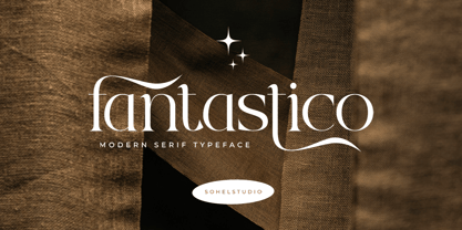 Fantastico is a Classy serif typeface Unique alternate , multilingual support with perfect kerning. This typeface is perfect for an elegant & luxury logo , classy editorial design, women's magazine, fashion brand , cosmetic brand, fashion promotion , modern advertising design, invitation card, art quote, home decoration , book/cover titles, special events, and much more. This elegant font needs to be in your collection and is perfect for your next luxury design project.
 - Vamp by Burghal Design,
$29.00A quintet of remorseless homewreckers, each member of the Vamp family contains hypnotic dingbats to lure you into their web. The Vamp family consists of the bewitching Vamp, the bigger, brasher Vamp Bold, the dangerous, psychedelic Psycho Vamp, as well as the lean (but still mean!) Vamp Slim and Vamp Slim Oblique. The Vamp family's seductive art deco form and fiendishly geometric wiles will break your heart and steal your soul. - Helttox Brush by Gatype,
$14.00 Helttox is a casual hand brush script so it has a nice texture and flow. Helttox has many alternatives to make it look like real handwriting; four sets of lowercase and two sets of uppercase. suitable for design projects; logos, branding, posters, quotes, beautiful wedding invitations, beautiful stationery art, eye-catching social media posts, and cute greeting cards and other designs. It is unique, very natural and attractive