10,000 search results
(0.021 seconds)
- Cosmetiqa by Mysterylab,
$15.00 Here's a posh serif typeface and its matching italic. Glowing with elegance, Cosmetiqa can go head to head with classic evergreens like Bodoni, Didot, or Century. And just like those go-to favorites, Cosmetiqa really shines at the huge, layout-dominating sizes which have been a staple of top-shelf fashion branding and magazine design since at least the mid-1980s. You'll also find this font to be a great workhorse at much smaller sizes and in extended text passages, as the hairline serifs don't disappear in the smaller size ranges. As its title suggests, Cosmetiqa's unique look works perfectly in cosmetics and fashion branding, but also try it with 1990s-style message forward ad headline applications if you're after a retro look with a hint of a modern twist. The semi-condensed proportions and tall x-height make it great for pull quotes, page banners, and logo design.
 - PM Showman by Paper Moon Type & Graphic Supply,
$17.00 PM Showman is based on vintage hand-painted sign writing from the 1900s through the 1960s. Seen on everything from office signs to posters, it was a staple of business communication and entertainment advertising in the early 20th century. We meticulously hand-drew each font, modeling the spacing and quirkiness of the original letterforms to give PM Showman an authentic hand-painted look.
 - Lemon And Sage by Ayca Atalay,
$16.00 Lemon And Sage | A Hand Lettered Display Serif Lemon And Sage is a charming hand lettered display serif with a high x-height. The condensed letterforms preserve the organic hand drawn look while still adhering to legible serif letterforms. Lemon And Sage works exceptionally well as a display font and is still legible and neat in smaller sizes thanks to its x-height.
 - Azsion by Okaycat,
$24.50 From Okaycat is the Azsion font, hand-lettered with loving hand in a distinctive style. This font is artistically textured with great detail, yet highly legible with a soft pleasant look. Azsion matches well with Okaycat font, Azsitra. Illustrated pen & ink, artistic typography for that hand drawing look. Azsion is extended, containing West European diacritics & ligatures, making it suitable for multilingual environments & publications.
 - Taurus by Fenotype,
$30.00 Save time and effort – choose your type wisely. Use Taurus and you’ll achieve impact without having to resort to cheap tricks. We have done the work for you: just type out words using Taurus and you’ll have a logo for a Wall Street law firm – or for that precious vintage Barolo. Refinement. Sophistication. Seriousness. Sex appeal. Taurus has it all.
 - Virago by Khoir,
$15.00 Virago Font consists of two alternative fonts namely Regular Virago which has a modern and contemporary soft impression while Virago Alternate has an old-fashioned vintage impression, both of which have their own distinct impression but have the same advantage of having lots of alternative fonts that make it easier for you to use it, so what are you waiting for?
 - Bradley Gratis - Unknown license

- Et Cetera by Scholtz Fonts,
$25.00 Et Cetera is a beautiful, hand-lettered script. It abounds in OpenType features such as terminal swashes and ligatures and is best used with OpenType savvy software with the “standard ligatures” and “contextual alternates” features turned ON. Et Cetera is comprehensive and vigorous. Most letters in the font are connected, but, as in typical handwriting fonts, not all are connected. Most characters have a consistent shape within the font, but not all. Some characters in Et Cetera are sensitive to their position in the text and change depending on the adjoining characters. This contributes to the casual and relaxed style of Et Cetera; not allowing the features of the font to get between the reader and the message. A wealth of OpenType features lie beneath the mellow exterior of Et Cetera. These Open Type features make few demands on the user which makes for a versatile script font that requires no expertise from the user, performs well at larger sizes, and remains legible even when setting copy at very small sizes. Et Cetera comes in three styles, Black, Regular & Line. Et Cetera Black is dramatic and bold, making a powerful statement. Et Cetera Regular is elegant and romantic, perfect for wedding stationery and clothing brands. Et Cetera Line is delicate and feminine, portraying a smooth, flowing effect. Et Cetera is a breezy, light, yet expressive font that is perfect for titling work, product packaging and romantic stationery.
 - New Yorker Type Pro by Wiescher Design,
$45.00 New-Yorker-Type was one of the first typefaces I tried my hand at in 1985. I meant it as a revival of the typeface used by the New Yorker magazine. I did not scan it. I just looked at the type and redrew it completely by hand. Only much later did I come to know, that there is a bundle of similar typefaces of that period. Rea Irvin's design for New-Yorker magazine was just one of them, maybe the best. In the next step I repaired some of the mistakes that I made more than thirty years ago. Now on the eve of 2020 I gave the font a complete overhaul and added a set of Swash Initials, Cyrillic and Greek glyphs and many ligatures. The font now has 1075 glyphs and is all set for most latin writing systems. On top of that I made two versions, a Classic one with rounded corners and a pointed Pro version for a more up-to-date look. Take your pick. Yours sincerely, honoring Rea Irvin a great type- and magazine-designer, Gert Wiescher
 - Ramadan Greeting by Nathatype,
$29.00 Ramadan Greeting is a captivating display font that pays homage to the graceful aesthetics of Arabic calligraphy. Ramadan Greeting is more than just a font; it's a bridge between heritage and modern design. It's a versatile tool that allows you to infuse your projects with the timeless beauty and cultural richness of Arabic calligraphy. The characters in Ramadan Greeting are thoughtfully designed with rounded, soft shapes that exude a sense of warmth and approachability. The high contrast between the strokes adds a traditional and authentic flair while maintaining legibility and clarity, even at display sizes. In addition, you can also enjoy the features here. Features: Stylistic Sets Alternates -Multilingual Supports PUA Encoded Numerals and Punctuations Ramadan Greeting fits in headlines, logos, posters, flyers, branding materials, greeting cards, print media, editorial layouts, and many more designs. Find out more ways to use this font by taking a look at the font preview. Thanks for purchasing our fonts. Hopefully, you have a great time using our font. Feel free to contact us anytime for further information or when you have trouble with the font. Thanks a lot and happy designing.
 - Cheltenham Pro by SoftMaker,
$15.99 Where most typefaces are designed by just one individual, quite a few people have been involved in perfecting Cheltenham over the times. In 1896, the architect Bertram Grosvenor Goodhue created the initial design for Ingalls Kimball at the Cheltenham Press. Just a few years later, Morris Fuller Benton devised a full family of Cheltenhams for ATF. This is the basis of the design we have today. In 1975, Tony Stan revived this classic typeface and did what was customary at the time: increase the x-height and make the Cheltenham family more regular. SoftMaker updated the design yet again in 2012. The result is Cheltenham Pro, a typeface that is exceptionally readable and holds up even in adverse printing conditions. SoftMaker’s Cheltenham Pro typeface family contains OpenType layout tables for sophisticated typography. It also comes with a huge character set that covers not only Western European languages, but also includes Central European, Baltic, Croatian, Slovene, Romanian, and Turkish characters. Case-sensitive punctuation signs for all-caps titles are included as well as many fractions, an extensive set of ligatures, and separate sets of tabular and proportional digits.
 - Pantographia by Intellecta Design,
$9.00Pantographia Collection is a Intellecta digitization, in facsimile style, without artistical interpretation of any kind, of the work of Edmund Fry (monumental book), Pantographia , a work on languages containing over 200 alphabets. We just are collecting in digital way these alphabets. Each alphabet has a short pdf description (see in the gallery). For example, in the pdf brochure of the "Saracen One" font, according to Edmund Fry, "This characters, according to Theseus Ambrosius, was used by the Saracens at the time of their conquests. Claude Duret, p. 475." Ambrosius, Theseus: Introductio in Chaldaicam lingua, Syriaca, atque Armenicam, [et] dece*. - 1539. Theseus Ambrosius or AMBROGIO, was an Italian orientalist, which born in 1469, and died in 1539 - He wrote his Introduction to the Chaldean, Syrian, Armenian, and ten other tongues, with the alphabetical characters of about forty different languages, 4to." The Pantographia font have only the original characters showed in Fry's book. There are instructions in the PDF files to get them. These fonts have no philological (or linguistic) academic pretentions. They are digitized and faithful versions of the original, like first published at Fry's book. - PTx Flowers by Pedro Teixeira,
$15.00 PTx Flowers Font Family 2 fonts: regular and silhouette each font - 6 glyphs TTF format Bear in mind that each glyph of the font PTx Flowers Regular is close to the maximum limit of points possible in ttf, which means that despite being tested in several programs, illustrator, photoshop, among others including word, some bugs may occur, depending on the rendering capability of the program you are working on. I found however that most of the time, that by the way the bugs, when tested, were only verified in word, that changing the size of the letter/glyph or even the zoom of the document, the letter/glyph was rendered correctly. These fonts have a very limited number of glyphs because, due to the glyphs having too many points, it can take some time to render. This will depend on the capacity of the machine's graphics card (computer, tablet, mobile phone). Hence a low number to take as little time as possible. See at work in word: https://youtu.be/PIMBlja2I5k See ar work in illustrator: https://youtu.be/RJp9X9TQ4so See at work in photoshop: https://youtu.be/yvrBmCJ80pc
 - New Yorker Type Classic by Wiescher Design,
$45.00 New-Yorker-Type was one of the first typefaces I tried my hand at in 1985. I meant it as a revival of the typeface used by the New Yorker magazine. I did not scan it. I just looked at the type and redrew it completely by hand. Only much later did I come to know, that there is a bundle of similar typefaces of that period. Rea Irvin's design for New-Yorker magazine was just one of them, maybe the best. In the next step I repaired some of the mistakes that I made more than thirty years ago. Now on the eve of 2020 I gave the font a complete overhaul and added a set of Swash Initials, Cyrillic and Greek glyphs and many ligatures. The font now has 1075 glyphs and is all set for most latin writing systems. On top of that I made two versions, a Classic one with rounded corners and a pointed Pro version for a more up-to-date look. Take your pick. Yours sincerely, honoring Rea Irvin a great type- and magazine-designer, Gert Wiescher
 - Last Dance by Wing's Art Studio,
$10.00 Last Dance: Redux - The 80s Feel-Good Script Font - Updated! Welcome to Last Dance: Redux, a new and improved version of my popular brush-script font inspired by 80s movie posters, VHS covers and Friday nights at the video store! This hand-drawn script aims to capture the feel-good vibes of movie blockbusters that won our teenage imaginations, while serving as the go-to font for recreating this unique and nostalgic period. The original Last Dance font features a gritty, hand-drawn texture that looks equally at home on an aerobics competition poster or steamy urban thriller - making great titles that look distinctly cinematic. Last Dance: Redux takes that original design and strips it back to it’s bare essentials resulting in a clean, uniform look that improves letter flow and readability. It’s also much lighter on system resources making it the preferred choice when using extensively across print and web projects. Both versions come with upper and lowercase characters along with punctuation, numerals and language support, plus two full sets of alternatives and a selection of underlines. Check out the visuals to see it in action!
 - Yule Like This NF by Nick's Fonts,
$-Just in time for the Holiday Season, here's a FREE font with word art, clip art and border elements to dress up your next project. Enjoy! - Marzano by FontMesa,
$35.00 Marzano is a geometric sans serif font that's ideal for headlines, logos, text and advertising, the name comes from the ever so sweet and wonderful San Marzano plum tomato grown in Italy. Marzano includes stylistic alternates, small caps, swash caps, case sensitive forms, old style figures, tabular figures, small caps figures, small caps old style figures, small caps question mark and exclamation point. Since a lot of people today like to type in code using the copyright and trademark symbols in place of a C or R we've decided, the first time to offer two registered trademark symbols, one that's the same size as the copyright symbol and an alternate version that's reduced in size and sits at the caps height. Marzano Slant is set at 6 degrees and is perfect for when you want the look of an italic but don't have the horizontal space in your page design for a full 12 degree italic. At FontMesa all of our italic fonts are cleaned up placing all nodes at extremas.
 - Historic Warehouse by Just My Type,
$25.00 Gotta tell ya: think out of the box and this font is addictingly fun to use! Introducing Historic Warehouse, a substantial, yet elegant family, invoking advertising fonts of the early 20th century. Why the name? When asked to design a banner for Tucson’s Historic Warehouse District, I couldn’t find the look I wanted from any known fonts. After drawing what I wanted in Illustrator, there were three (and in the process, four) fonts just waiting to be realized. Happy to oblige. Here’s Historic Warehouse Regular, setting the stage. It’s sturdy, bold, and plays curves against rounded angular shapes. To its left is Historic Warehouse Condensed, trim, elegant and at its best at very large sizes; to the right is Historic Warehouse Wide, with charming style and presence. Finally, there’s Historic Warehouse Extended, extravagant in its proportions, with a beautifully-crafted form like a fine carriage. As the song says, “Everything Old Is New Again,” and this family looks as fresh and clean at the beginning of this century as it might have at the beginning of the last.
 - In Love With Rome by SilverStag,
$19.00 I am so happy to introduce my brand new handwritten font that exudes chic elegance like no other - meet In Love With Rome Script. Every single letter has been lovingly crafted by hand, resulting in a stunningly unique typeface that's perfect for anyone looking to add a touch of sophistication to their designs. With 274 alternate letters and ligatures, you'll have all the tools you need to create truly one-of-a-kind pieces. But what sets this font apart isn't just its beauty - it's also incredibly versatile. Whether you're working on a wedding invitation, a branding project, or simply adding some flair to your social media posts, this font is the perfect choice. It's feminine, cool, and it strikes the perfect balance between modern and classic. So if you're looking for a font that's as beautiful as it is functional, look no further! In Love With Rome Script Font Includes: Over 274 Ligatures and Alternates Full Language Support Lowercase and Uppercase letters Numerals & Punctuation Web Font Kit is Included as Well NOTE: Ligatures are supported in most desktop programs including Photoshop, Illustrator, InDesign, Word, Pages & Keynote. Most of them will have this option automatically switched on. If you're using Canva, ligatures are not supported out of the box, however, I have included detailed instructions on how you can use them for your designs as well! Happy creating everyone!
 - Seddon Penmans Paradise Capitals by Intellecta Design,
$29.50 John Seddon (1644-1700), was a famous English writing master, the leading calligrapher of his time, and master of Sir John Johnson’s Free Writing School in Priest’s Court, Foster Lane. His portrait was drawn by William Faithorne and was engraved by John Sturt as the frontispiece for his copy-books, such as ‘The Ingenious youth’s companion’ of c.1690 and 'The pen-man’s paradise' of c.1695. These were engraved after his work by others. Your extra-rare book - "The Pen-mans Paradise Both pleasent & Profitable OR Examples of all ye usuall hands of this Kingdome. Adorn'd with variety of ffigures an Flourishes done by Command of hand. Each ffigure being one continued & entire Track of the pen most where of may be struck as well Reverse (or to answer bothwayes) as Forward", London (1965). - (YES, that is the title of the book!) was the starting point to these new extra accurated works of Iza W, a series of revivals of the penmanship Seddon’s artworks, like this highly ornamented animal kingdom inspired capitals and alphabets: the Seddon Penmans Paradise Capitals typeface. And, on the other hand, you can get the animal and human kingdon inspired penmanship forms in the Bestiario font. The “SeddonsFleurons” will complete the collection. Fantastic choice to elaborated barocque/renaissance inspired and historical accurated layouts.
 - Gaspa by La Boîte Graphique,
$19.00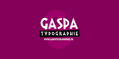 Fanciful, funny, hand-writting, decorative
 - Janda Safe And Sound by Kimberly Geswein,
$5.00 Imperfectly hand-sketched sans serif.
 - Bakersville by TypeFaith Fonts,
$6.00 Bakersville is a package of 2 hand drawn sketch serif fonts by TypeFaith Fonts. The fonts are very useable for food packaging, menu's, etc and gives your product the authentic hand made look.
 - Venio by Craft Supply Co,
$20.00 Venio – Double Line Font: Display Typography with Art Deco Flair Deco-inspired Elegance Infused with Art Deco sophistication, Venio, a double-line sans-serif font, brings timeless elegance to your designs. Distinctive Display Presence Venio ensures a bold yet refined aesthetic for logos and headlines, making your display stand out with its distinctive double-line design. Artful Symmetry Paying homage to Art Deco’s geometric precision, Venio’s symmetrical lines provide a visually pleasing experience, adding a touch of artistic flair.
 - Baltra by Galapagos,
$39.00After researching the type styles contemporary graphic designers have been using over the past few years, I noticed a consistent use of Copperplate Gothic, and its derivative designs, for various corporate advertising campaigns. That level of usage gave me the inspiration to design a display font possessing subtle characteristics of Copperplate Gothic, and various Latin Condensed designs. The font I ended up designing was semi-condensed, with more contrast between thicks and thins than in Copperplate. Baltra also has a subtle flair in its otherwise traditional lowercase, while possessing a larger than average lowercase x-height. Copperplate Gothic, on the other hand, has minimal contrast and uses small capitals for its lowercase. After examining extensive type specimens from wood type, metal type, phototype and digital type, I was not able to find a single design possessing a majority of Baltra's characteristics. Consequently, I consider Baltra to be a truly unique design, sharing with Copperplate Gothic only its flairs on stems, and having only subtle characteristics in common with traditional Latin designs. - The Artmars Script by Rastype Studio,
$12.00 The Artmars Script is inspired by a retro style in combination with hand lettering style. The Artmars Script came with OpenType features such stylistic alternates, stylistic sets & ligatures good for logotype, posters, badges, book covers, tshirt designs, handwritten quotes, product packaging, header, poster, merchandise, social media & greeting cards. To enable the OpenType Stylistic alternates, you need a program that supports OpenType features such as Adobe Illustrator CS, Adobe Indesign & CorelDraw X6-X7, Microsoft Word 2010 or later versions. How to access all alternative characters, using Windows Character Map with Photoshop: https://www.youtube.com/watch?v=Go9vacoYmBw How to access all alternative characters using Adobe Illustrator: https://www.youtube.com/watch?v=XzwjMkbB-wQ The Artmars Script is coded with PUA Unicode, which allows full access to all the extra characters without having special designing software. Mac users can use Font Book, and Windows users can use Character Map to view and copy any of the extra characters to paste into your favourite text editor/app. Thanks so much for looking and please let me know if you have any questions!
 - Brithany by Josstype,
$12.00 Brithany Script is Hand Lettered Calligraphy Font with beautiful waves and natural flow. has a unique letter style, with natural handdrawn, and has a softer and smoother character subtly connect all the characters. They have a simple elegant swashes in separate letters, you can use graphic design software to access the alternate letter. Brithany Script 427+ glyphs . including initial and terminal letters, alternates, swashes, ligatures and multiple language support. o enable the OpenType Stylistic alternates, you need a program that supports OpenType features such as Adobe Illustrator CS, Adobe Indesign & CorelDraw X6-X7, Microsoft Word 2010 or later versions. There are additional ways to access alternates/swashes, using Character Map (Windows), Nexus Font (Windows), Font Book (Mac) or a software program such as PopChar (for Windows and Mac). How to access all alternative characters: http://youtu.be/iptSFA7feQ0nn http://cuttingforbusiness.com/2016/01/28/how-to-use-opentype-fonts-in-silhouette-studio-or-cricut- design-space/ https://www.youtube.com/watch?v=Go9vacoYmBw Thank you for your purchase! and please let me know if you have any questions. via email: joelpopon@gmail.com
 - Yaungtinai by IM Studio,
$18.00 Yaungtinai is actually a unique font, I made it with the relaxed spontaneity of my hands. designing formal fonts but with a classic elements, which makes it very suitable for wedding media, book covers, greeting cards, logos, branding, business cards and certificates, even for any design work that requires a classic, formal or fancy appearance. Try Yaungtinai, enjoy the wealth of OpenType features and let the powerful yet elegant excitement delight you and increase your creativity! You can use this font very easily. There are many features in it. Yaungtinai contains the full set of lowercase and uppercase letters, punctuation, numbers, and multilingual support. This font also includes several alternative Ligature and Stylistic Set styles for those of you who have software that can work with OpenType (Corel Draw / Photoshop / Illustrator / InDesign). If you don't have a program that supports OpenType features like Adobe Illustrator and CorelDraw X Version, you can access all alternative glyphs using Font Book (Mac) or Character Map (Windows). Don't forget to see, buy, like, and share with friends.
 - Limon by Typesenses,
$49.00 Limon was entirely hand drawn and carefully digitised to get accurate curves but keeping the handmade look. The script fonts are smart scripts, plenty of alternates designed to preserve the calligraphic rhythm. Limon is a beautiful option for menus, magazine covers, wedding invitations, cards and all kind of stationery, packaging and labels. Default positional forms appear while you are writing when Standard Ligatures and Contextual Alternates features are on. Just keep them activated and let Limon Script do the rest. It warrants that all the connections will look good. Also, you can activate stylistic alternates, swash, titling and stylistic sets to have options for capitals, initials and terminals. Each Script Font reaches a total of more than 2900 glyphs (languages for every alternate included). Use professional software that widely support Open Type features. Otherwise, you may not have access to some glyphs. For further information about features and alternates, see the User Guide. Limon has extensive Western, Central and Eastern European language support. Limon Script matches very well with Dress and Chonky When life gives you Limon, make a beautiful design!
 - Papillon by Bogusky 2,
$15.00Butterfly art - Party Invite JNL by Jeff Levine,
$29.00 Party Invite JNL is a thin, condensed Art Deco sans based on lettering from a letterpress holiday stock cut (the predecessor to clip art) from the 1940s.
 - Fichte Fraktur by RMU,
$25.00 Walter Tiemann’s Fichte-Fraktur, released by Klingspor in 1934, has come to life again. This font contains the traditional long s which can be accessed by either the OT feature historical alternatives or by typing [alt] + b. Two framing elements can be reached by typing [alt] + shift + p and [alt] + p respectively.
 - HD Colton by HyperDeluxe,
$35.00 HD Colton is a 90-style super-sans from London Design Studio HyperDeluxe®. Using a combination of horizontal & vertical terminals along with squarish ovals, it is built with a confident structure that feels so much more than a neutral sans, it feels iconic. Engineered in 5 widths, compressed to extra wide, and in nine weights, HD Colton features a huge 90 styles that will offer your brand ultimate flexibility and variation in one font family. The black weights will help bring prominence to your brand while the light to mid weights will help you tell your story at a smaller size. HD Colton includes 1200+ glyphs per style, providing you with a workhorse sans that supports 200+ languages including extended Latin, extended Cyrillic and basic Greek. Also included are 5 stylistic sets, 2 arrow sets & numerous OpenType features (see last poster for complete list). The HD Colton complete family package comes with a single, 3-axis variable font so you'll have an infinite amount of combinations and uses for you to experiment with and add that touch of finesse to your visuals. Variable fonts are tech friendly providing smaller sizes for developers to work with, while also being responsive and used for motion design on the web. HD Colton key features: 3-Axis Variable Font. 90 Styles. 1200+ Glyphs Per Style. 5 Widths (Compressed, Condensed, Regular, Wide, Extra Wide). 200+ Languages Supported. Extended Latin, Extended Cyrillic, Greek Support. Stylistic Alternates for some key glyphs (J, Q, G, l, &, Arrows). Extensive OpenType features.
 - Anisette Std Petite by Typofonderie,
$59.00 Geometric font inspired by shop signs in 4 styles Anisette has sprouted as a way to test some ideas of designs. It has started with a simple line construction (not outlines as usual) that can be easily expanded and condensed in its width in Illustrator. Subsequently, this principle of multiple widths and extreme weights permitted to Jean François Porchez to have a better understanding with the limitations associated with the use of MultipleMaster to create intermediate font weights. Anisette built around the idea of two widths capitals can be described as a geometric sanserif typeface influenced by the 30s and the Art Deco movement. Its design relies on multiple sources, from Banjo through Cassandre posters, but especially lettering of Paul Iribe. In France, at that time, the Art Deco spirit is mainly capitals. Gérard Blanchard has pointed to Jean Francois that Art Nouveau typefaces designed by Bellery-Desfontaines was featured before the Banjo with this principle of two widths capitals. The complementarity between the two typefaces are these wide capitals mixed with narrow capitals for the Anisette while the Anisette Petite – in its latest version proposes capitals on a square proportions, intermediate between the two others sets. Of course, the Anisette Petite fonts also includes lowercases too. Anisette Petite, a geometric font inspired by shop signs in 4 styles So, when Jean François Porchez has decided to create lowercases the story became more complicated. His stylistic references couldn’t be restricted anymore to the French Art-déco period but to the shop signs present in our cities throughout the twentieth century. These signs, lettering pieces aren’t the typical foundry typefaces. Simply because the influences of these painted letters are different, not directly connected to foundry roots which generally follow typography history. The outcome is a palette of slightly strange shapes, without strictly not following geometrical, mechanical and historical principles such as those that typically appear in typefaces marketed by foundries. As an example, the Anisette Petite r starts with a small and visible sort of apex that no other similar glyphs such as n or m feature, but present at the end of the l and y. The famous g loop is actually inspired by Chancery scripts, which has nothing to do with the lettering. The goal is of course to mix forms without direct reports, in order to properly celebrate this lettering spirit. This is why the e almost finishes horizontally as the Rotis – and the top a which must logically follow this principle and is drawn more round-curly. This weird choice seemed so odd to its designer that he shared his doubts and asked for advise to Jeremy Tankard who immediately was reassuring: “Oddly, your new top a is fine, it brings roundness to the typeface, when the previous pushes towards Anisette Petite to unwanted austerity.” The Anisette Petite, since its early days, is a mixture of non-consistent but charming shapes. Anisette, an Art Déco typeface Anisette Petite Club des directeurs artistiques, 46e palmarès Bukva:raz 2001
 - Rough Love by Positype,
$27.50 Rough Love, it’s fair to say, came before Love Script. The brushed letter specimens that would ultimately serve as the template for the much ‘cleaner’ Love Script have now been turned into a typeface. As I packed these up, I just kept coming back to them and staring at the texture and movement caught on the page. On a lark, I decided it would be fun to let people see an almost a before and after scenario of how one led to the other and decided to produce a typeface from these specimens… Rough Love. For the most part, in typical fashion for me when I brush out a typeface idea, I try to brush the entire character set along with each of the planned variants for swashes, titling, and other alternates—the reason for that is simple -- each letter looks and acts a bit differently when the same movements are imposed on them. With Rough Love, I tried to adhere to that and made very few modifications to the originals, and only had to ‘borrow’ in a few occasions when I happened to forget to brush a variant.
 - VAG Rounded Next by Monotype,
$57.99 VAG Rounded Next brings a classic 1970s typeface up to date, keeping all of its easy going, approachable personality but adding some much-needed versatility and language support. Originally commissioned by Volkswagen, VAG Rounded remained in use by the company until the early 90s and has also been used by Apple, Skype and Myspace. Its enduring appeal lies in its appealingly rounded terminals, and its immediate, informal tone of voice. “When you look at the Volkswagen Beetle it has these curves that are timeless and legendary,” says Steve Matteson, who led the creation of VAG Rounded Next. “I think that's what stands out in this design – that friendly aesthetic, and the simple line and circle.” This new version offers 700 glyphs with pan European language support (including Greek and Cyrllic), as well as 10 weights of upright and italic styles. New display weights Shine and Rough – which create “chocolate popsicle” and “rust” effects – are begging to be used in branding, packaging and editorial projects, while the lighter weights are well suited for text. VAG Rounded Next Variables are font files which are featuring one axis and have a preset instance from Thin to Black.
 - Classical Romance by Ardyanatypes,
$10.00 Voila! This is it . . Classical Romance Decorative Serif Family Classic serif with 125 stylistic alternates for a uniquely vintage, yet modern feel. Each letterform has a slightly rough exterior that works beautifully to enhance Classical Romance’s soft, conventional details. This versatile display typeface has enough character for logos and branding, as well as headlines, apparel, alcohol labels, poster, online magazine, automotive, and much more. Keep it classic, or get decorative with ornate alternates for both uppercase and lowercase glyphs! This Classical Romance font was handwritten under the inspiration of traditional calligraphy and the wonderful magical vibe of Bali Island. Classical Romance brings more lovely old day vibes with 12 weights to matchmaking with your own style and it has Multilingual support (Western European characters) and works with the following languages: English, Danish, Dutch, Estonian, Faroese, Filipino, Finnish, French, German, Hungarian, Icelandic, Irish, Italian, Norwegian, Polish, Portuguese, Spanish, Swedish. Immerse more your arts in the classic feel with Classical Romance, and be classy! A guide to accessing all alternatives can be read at: http://adobe.ly/1m1fn4Y Features: A-Z Character Set a-z Characters set Numerals & Punctuations (OpenType Standard) Multilingual Thank you and have a nice day
 - Densit by Adtypo,
$32.00 Densit is a display mega black typeface, containing 6 styles. It aims for a ultimate density with a maximum weight on a minimum place. Glyphs therefore balances on a slim border of touch. The typeface is designed for expressive and short texts at big sizes and is suitable for photography or other visual materials underlaying. The 3 basic styles parodies ordinary type styles. They only differents from each other lays in the lenght of straight thin lines. The stencil style without these lines is intended especially for spray stencils, the sans style is imitating linear sans types and the serif style having stronger contrast and indicated serifs. The typeface contains a large set of special ligatures for playing with aesthetic qualities of text and obtain maximum space saving. Densit contains 34 special forms for members and frequently used short words in various languages. Very short terminals offer compact setting of multi-lines captions. Densit can be used for music posters, eye-catching headlines of art articles and everything in which is possible graphic impression from legibility prefered. • 6 styles (2 alternatives, 3 kinds) • 12 OT features • 1313 glyphs • sophisticated system of ligatures • support of latin languages
 - Sabio by Greater Albion Typefounders,
$11.95 I regard Sabio as an evolutionary face. By this I mean that it merges elements of script and Roman design into one elegant whole. The design was 'evolved' somewhere between these two classic approaches. The resulting family of faces makes an excellent display family, but is also clear and legible at small sizes and can be used as a text face with a distinctive flair. Sabio is a wonderfully flexible face that can sit happily alongside artwork that owes its inspiration to any era from the Art Deco onwards. The regular form is gently and subtly oblique, and the glyphs have a slight hint of swash about them. Alternate and perpendicular forms are also offered. The regular, alternate and perpendicular forms are all in turn offered in regular, and bold weights as well as in a condensed form. All in all Sabio is a humanist face with which almost anything can be done offering flair and elegance for almost any project. Whether it's a distinctive way of setting paragraph text, or poster work that's eye catching yet flowing and clearly legible, Sabio offers the answer.
 - JAF Lapture by Just Another Foundry,
$59.00 Lapture is based on the Leipziger Antiqua by Albert Kapr, released in 1971 by the East German foundry Typoart. It has been extended and carefully redesigned by Tim Ahrens in 2002-05. The strong calligraphic characteristics are a result of the design process: "The size of the counters and the width of individual characters at small optical sizes were analysed with a steel pen while the letter shapes were designed in larger size with a specially trimmed reed pen. Sometimes the hand is more innovative than the head alone," says Kapr. A unique feature of this font is the introduction of gothic shapes into a latin typeface. "The basic concept is to string together narrow white hexagons as counters and inter-letter spaces, defined by vertical stems and triangular serifs. The interior spaces are at least as important as the strokes that make up the characters." Lapture is an ideal choice if a reference to gothic style is desired, as true black letter types are often too eye-catching and not as legible as latin fonts for unfamiliar readers. "The last few years have seen a number of very elegant typefaces based on the mellow and feminine renaissance model. However, sometimes we require a font that is strong and robust, harmonic yet rigid," says designer Tim Ahrens. JAF Lapture is provided in OpenType format. Each font contains more than 600 glyphs, including true small caps, nine sorts of figures, contextual and stylistic alternates and accented characters. This means that you only need to purchase one font whereas in other families you would have to buy two or three fonts in order to get the same. Technically, they follow the Adobe Pro fonts and provide the same glyph set and OpenType functionality. JAF Lapture Basic is provided in OpenType format. Each font contains the standard sets of both MacOS and Windows. In contrast to JAF Lapture they do not provide any advanced OpenType features and no extended glyph set.
