10,000 search results
(0.036 seconds)
- Hercules by Storm Type Foundry,
$26.00Where Modern is too fragile and Century too boring, Hercules comes with its elegant forms and, at the same time, with sufficient firmness to be usable for longer texts. In its heavy, bold designs it approaches Falstaff, while in the light ones it has some features which are taken over from Didot or from Modern. The text designs have been corrected for small sizes. The range of its use is, therefore, quite extensive - from dictionaries and technical literature through magazines to art posters and advertising materials. Suitable combination: Splendid Quartett (especially recommended), Excelsor Script, Plagwitz, but also Zeppelin and Compur. - Rhythmic Revue JNL by Jeff Levine,
$29.00 The vintage sheet music for "Between the Devil and the Deep Blue Sea" yielded another bit of Art Deco-era lettering perfect for developing into a digital font. This time it wasn't the song title, but rather the name of the show it was from serving as the type inspiration - the Cotton Club's 1931 revue "Rhythm-Mania". Harlem's Cotton Club was an "exclusive, whites only" club; both famous for its talent and shows, yet infamous for hiring black acts but not allowing black patronage. On the sheet music, the show title was hand lettered in a bold, slightly stylized fashion which became the basis for Rhythmic Revue JNL; available in both regular and oblique versions.
 - Pipa by Canada Type,
$24.95 Originally made for a health food store chain we cannot name, Pipa is the embodiment of organic display typography. Although it draws inspiration from some cold type ideas, like the uncredited Atlantis from VGC and a couple of older photo-lettering faces, its overall expression is right in line with what has become today's vernacular in integrity organic display packaging. Pipa's construct approaches the thick-and-thin idea from a rarely used perspective, where the flow in form contrast naturally seeps out from within each stroke, while minimizing the amount of strokes helps the totality of the setting come positively alive. This is bead and lava lamp psychedelia for the 21st century. Pipa comes with plenty of alternates, including some very cool unicase variations, and extended Latin language support.
 - Grand Label by Gleb Guralnyk,
$14.00 Hi, presenting a bold vintage font - Grand Label. It's an old-school typeface with decorative elements, included as a separate font file for more convenient manipulating and recoloring. Grand Label font supports most of Latin European languages (check out the screenshots with available characters).
 - LeftheriaPRO by Sea Types,
$29.00 LeftheriaPRO has its structure projected from the capitals of the Greek columns of Ionian order, it is a typography condensed with vertical emphasis composed by 5 weights (light, regular, medium, semibold, bold) including ligatures, alternates, smal caps, old styles figures, fractions, superiors, inferiors. | Download Specimen
 - Haglos by Vultype Co,
$29.00 Haglos Script was inspired by Modern Vintage & Retro style in combination with old American traditional style. It's bold and has amazing swashes. In my examples I show how this script can be used. It's very well suited for logotypes, product labels, food flyer, and others.
 - Aneba Neue by Borutta Group,
$27.00 Aneba Neue is refreshed version of my old type family. It's a geometric sans serif typeface with a clean feel. The low contrast and high x height is perfect for headlines and display purposes. Aneba Neue contains 5 weights in two different styles - Bold & Slanted.
 - Sanity Wide - Unknown license

- TwentyFourNinetyOne by steve mehallo,
$19.91 TwentyFourNinetyOne [2491] is a reinterpretation of the alphabet of 1919 by Theo van Doesburg; the original a true rendering of the thinking of the Dutch-based art movement “de Stijl.” Jump forward to 1980 and prop lettering used on the Buck Rogers in the 25th Century television series; a vernacular typeface that was a utilitarian mix of geometry and pixel-based forms, used to symbolize the futuristic universe of 2491. At times it would appear on spaceships, laser guns, signage at space ports or in one episode, a Spandex tapestry. It only seemed logical to combine and rethink the letterforms, add ligatures + other extras, and see what the results would be. Futuristic, fun and bold to read! 2491: In the future, all type will look like this.
 - Citaro Voor (dubbele hoogte, midden/dubbel) - 100% free

- Cartoon Family by Ake,
$12.00 Cartoon Family Font is a cool and friendly display font that brings a playful and authentic vibe to your designs. This fun font is perfect for children activities, school projects, storybooks, posters, and more. With its chunky letter style, Cartoon Family Font adds a touch of liveliness and personality to any design. Let your creativity soar and watch your designs come alive with this captivating font.
 - Magicjar by Beary,
$13.00 Are you looking for a unique elegant font? You came to the right product. Magicjar is an elegant hand lettering look attractive and natural! Every single letters have been carefully crafted to make your text looks beautiful. Magicjar is PUA encoded, which means you could access all of the glyphs! Every letter has a unique and beautiful touch, which will make your design come alive! Thanks
 - Filet by Emily Lime,
$24.00 This font is big on 2 things: Class & Quirk. Inspired by hand-scripted menus. This modern hand-calligraphy font isn't just for one or two-word logos. Designed to make a statement when used in large amounts. Great in large & small doses alike. Slightly irregular texture for that perfect hand-lettering touch on the page. Beautiful Duo for your next event or project! Multilingual support.
 - Surakarta by Parquillian Design,
$39.00 Surakarta is a display face of western characters with numerous optional ligatures modeled after the graceful Javanese alphabet still taught in many schools on the island of Java in Indonesia, though it has been replaced by the latin alphabet for most everyday purposes. This is the second in Parquillian Design’s series of fonts inspired by some of the beautiful lesser-known native scripts of Southeast Asia.
 - Ongunkan Runic by Runic World Tamgacı,
$39.99 It is necessary to keep the memories of our ancestors alive. Although the languages and cultures of the past societies were different, in my eyes the ancestor of our humanity is. Having to experience everything in that world, no matter where in the world it is. This font is a Runic member. It is a kind of variety that belongs to different geographical regions.
 - Owly Barn by Four Lines Std,
$15.00 Owly Barn is a Friendly and Playful font. The rounded corners of Owly Barn give it a sense of joy and positivity. Also friendly and approachable vibe. Owly Barn is incredibly versatile. It can be used across various mediums, including digital and print, and it adapts seamlessly to different sizes and resolutions. This versatility makes it a go-to choice for graphic designers, marketers, and creatives alike.
 - Silver Midnight by Balpirick,
$15.00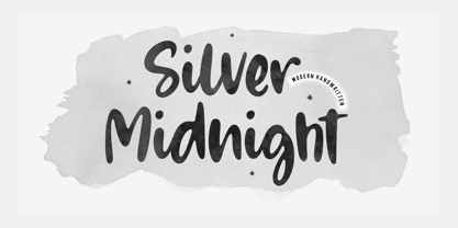 Silver Midnight is a Modern Handwritten Font. Silver Midnight is a lovely and timeless handwritten font. It is the best choice for creating eye catching logos, branding and quotes. Every letter has a unique and beautiful touch, which will make your design come alive! Silver Midnight also multilingual support. Enjoy the font, feel free to comment or feedback, send me PM or email. Thank you!
 - Misheard Lyrics by Bogstav,
$18.00 Did you ever get lyrics from a song wrong? And maybe found out years and years later, that is was wrong...but the wrong lyrics get stuck, even though you know that they are wrong! :) Misheard Lyrics is a font that most likely gets stuck in your design, because it has that bouncy and random look that makes your text come alive - without overdoing it!
 - Babycakes by Balpirick,
$15.00 BABYCAKES is a Fun Handbrushed Font. Babycakes is a cute and fun display font. It embodies playfulness and authenticity and is the perfect choice for any children activity or school project. Add this chunky lettered font to your designs and notice how it makes them come alive!. BABYCAKES also multilingual support. Enjoy the font, feel free to comment or feedback, send me PM or email. Thank you!
 - Phoenix Island by Balpirick,
$15.00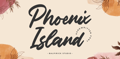 Phoenix Island is a Handwritten Font. Phoenix Island is a lovely and timeless handwritten font. It is the best choice for creating eye catching logos, branding and quotes. Every letter has a unique and beautiful touch, which will make your design come alive! Phoenix Island also multilingual support. Enjoy the font, feel free to comment or feedback, send me PM or email. Thank you!
 - SAWYA by Twinletter,
$13.00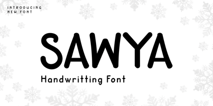 Introducing SAWYA Font – a captivating display typeface that effortlessly embodies the authenticity of handwriting! Elevate your projects with the artistic touch of SAWYA, a seamless blend of style and individuality. Explore SAWYA today to witness your creative visions come alive! What’s Included : File font All glyphs Iso Latin 1 Alternate, Ligature Simple installations PUA Encoded Characters – Fully accessible without additional design software. Fonts include Multilingual support
 - Blondie Rainbow by Balpirick,
$15.00 Blondie Rainbow is a Modern Calligraphy Font. Blondie Rainbow is a lovely and timeless handwritten font. It is the best choice for creating eye catching logos, branding and quotes. Every letter has a unique and beautiful touch, which will make your design come alive! Blondie Rainbow also multilingual support. Enjoy the font, feel free to comment or feedback, send me PM or email. Thank you!
 - Gaude by Trustha,
$19.00 Gaude is a sans-serif typeface. Crafted with care, maximizing neatness in shape. With thickness balancing with negative space. Making it fitting when strung together into words, or sentences. Added with alternative glyphs, to make it more alive. Gaude comes with 3 widths, namely: normal, wide, and expanded. And also a soft version, making it 6 styles. Gaude is perfect for branding, titling, headline, and more.
 - Ongunkan Tifinagh Berber by Runic World Tamgacı,
$45.00 It is necessary to keep the memories of our ancestors alive. Although the languages and cultures of the past societies were different, in my eyes the ancestor of our humanity is. Having to experience everything in that world, no matter where in the world it is. This font is a Runic member. It is a kind of variety that belongs to different geographical regions.
 - Christmas Sheep by Stefani Letter,
$14.00 Christmas Sheep is a modern and relaxed display font. It embodies playfulness and authenticity and is the perfect choice for any children activity, school project, Christmas, New Year, Birthday and many more. Add this playful font to your designs and notice how it makes them come alive! This font is PUA encoded which means you can access all of the cute glyphs with ease!
 - Music Course by Jeff Levine,
$29.00 The 1927 beginner’s book for Shefte’s Rapid Course in Modern Piano Playing had its title hand lettered in a bold serif typeface that reflected some of the influences of the Art Nouveau era. This became the model for Music Course JNL, which is available in both regular and oblique versions.
 - Barbaros by MoodyType,
$49.00 An Art Deco condensed display sans font with 8 styles, +800 glyphs, +100 ligatures, +30 languages and many opentype features. It is perfect for poster designs, magazines, book covers, logotypes, headlines, newspapers and press. It's bold, daring, modern, geometric and covers a good range of weights from light to block.
 - Top Tune JNL by Jeff Levine,
$29.00 The 1955 British edition of the sheet music for Frank Sinatra's hit "I'm Walking Behind You" had its title hand lettered in a sans serif design straight out of the Art Deco era. This bold, condensed type style is now available as Top Tune JNL; in both regular and oblique versions.
 - Speaker by Arendxstudio,
$15.00 Speaker - Graffiti font is a type of font typically used in street art and graffiti designs. It is a bold and expressive font, which usually features stylized and distorted letters, drips, and splatters. Some characteristics of graffiti fonts Features : • Character Set A-Z • Numerals & Punctuations (OpenType Standard) • Accents (Multilingual characters)
 - Bohemaz by Malgorzata Bartosik,
$29.00 Bohemaz is a typeface inspired by the Art Deco typography from the 1930s. It contains 4 styles - Thin, Light, Regular and Bold - Latin, Greek and Cyrillic alphabet, diacritics from Western, Central and South Eastern Europe and many decorative ligatures. Bohemaz is both classic and modern, so it can be widely used.
 - Evening Walk JNL by Jeff Levine,
$29.00 The cover of the sheet music for 1930's "Walkin' My Baby Back Home" features the title hand lettered in a bold sans serif with the slightest flair of Art Nouveau styling. This design is now available as Evening Walk JNL, which is available in both regular and oblique versions.
 - Fast Freddy NF by Nick's Fonts,
$10.00An uncredited typeface from Photo-Lettering Inc. named Palisade Graphic was the inspiration for this Art Deco fantasy. Bold and brash, it adds undeniable impact to period-themed headlines. Both versions include the complete Latin 1252, Central European 1250 and Turkish 1254 character sets, with localization for Lithuanian, Moldovan and Romanian. - Retail Shop JNL by Jeff Levine,
$29.00 Vintage New York neon signage alongside the landmark Dubrow's Cafeteria [probably circa the 1940s] of the words "retail shop" inspired the namesake digital type design. Retail Shop JNL is a bold and somewhat eccentric Art Deco font with varying widths and unusual character forms available in both regular and oblique versions.
 - Take Charge JNL by Jeff Levine,
$29.00 Take Charge JNL is based on the opening title card for the 1936 film "The Charge of the Light Brigade" starring Errol Flynn and Olivia de Havilland, Donald Crisp and David Niven. The typeface is a simple, bold titling font with the slight feel of Art Deco influence in its design.
 - Pastry Shop JNL by Jeff Levine,
$29.00 In the 1960 edition of Sam Welo’s “Studio Handbook – Letter and Design for Artists and Advertisers” you’ll find a bold, hand lettered Art Deco sans serif typeface designed by Welo with a decidedly 1930s-1940s look. This is now available as Pastry Shop JNL, in both regular and oblique versions.
 - Diverge Variable by Vishnu Sathyan,
$2.90 Introducing Diverge, a dynamic variable font with two axes - Weight and x-height. Inspired by the sleek and modern design of driveways in apartment complexes, Diverge is a font that stands out with its contemporary, yet sophisticated look. The Weight axis of Diverge ranges from Thin to Black, offering designers a wide range of options to choose from. The Thin weight is perfect for delicate and refined designs, while the Black weight commands attention with its bold and impactful appearance. The x-height axis of Diverge ranges from 420 to 800, giving designers greater control over the font's legibility and versatility. Whether used in body text or headings, Diverge's x-height axis allows for greater flexibility in design, making it a valuable addition to any designer's toolkit. Diverge's variable design is perfect for a wide range of applications, from branding and advertising to editorial design and web development. Its unique look and feel will make any design project stand out from the crowd.
 - Schneidler Latein by Spirit & Bones,
$33.00 The Schneidler Latein is a sharp and elegant Antiqua based on the ductus of the broad edged pen with a strong character. Running perfectly in paragraph text giving it something quite special and being effortlessly legible at the same time, Schneidler Latein works great in headings as well. Each glyph is a piece of art ready to be used in branding and blowup combining beauty and personality in a kick-ass blend. It is absolutely new to the digital world as it never has been digitized before. This new version digitized, further developed and extended by artist and graphic designer Lena Schmidt comes in nine styles from which there are four application-related ones like Subtext and Display and five weight-related ones like Bold and Heavy. Each style contains 948 glyphs, variations of numbers, three stylistic sets one preserving the historic forms of changed characters, small caps, open type features and superior and inferior characters. Designed by F. H. Ernst Schneidler the Schneidler Latein was released in 1916, the bold version in 1920 and the italics in 1921. Schneidler was born in 1882 in Berlin. He studied at the school for applied arts in Düsseldorf with professor F. H. Ehmcke and P. Behrens. He was as a painter, graphic designer and illustrator. In 1920 he was appointed as teacher in the school for applied arts Stuttgart. His students were Albert Kapr, Imre Reiner and Lilo Rasch-Naegele among others. Further well-known fonts from his hands are for example Legende, Amalthea, Schneidler Mediävel and Schneidler Antiqua. Lena Schmidt was born 1981 in Bremen. She is a german painter, graphic designer and illustrator mostly known for her huge wood carving paintings. From 2003 to 2011 she studied Fine Arts in Hamburg with professor Matt Mullican. From 2015 to 2019 she studied graphic design with a focus on type design at HAW Hamburg Department Design with professor Jovica Veljović. She lives and works in Hamburg, Germany.
 - Vertical by Alias,
$60.00 Alias Vertical is a sans serif typeface with a vertical cut-off point for letter endings. The vertical cut-offs bend round characters (b, c, o, etc) into a squarish, high-shouldered shape, suggesting Roger Excoffon’s Antique Olive. In mid-weights, the typeface mixes Antique Olive with typefaces such as Gill or Johnston, for example the shape of the t, the l borrowing Johnston’s flick. Vertical has the same minimal difference in weight between verticals and horizontals as Gill and Johnston, and the same sharp connection point where curves meet straight lines. Like Antique Olive, Vertical has a narrow connection point here, adding contrast and definition. The overall effect feels austere at lighter weights and strident and graphic at bolder weights, and sharp and incised throughout. In the Bold and Black weights, the squarish and top heavy shape of Antique Olive is most noticeable. For example the wide uppercase, with the B having almost-even width between top and bottom curves, and the almost-overhang of the top curve of the G. But Vertical does not have as extreme an aesthetic or square shape as Antique Olive. As well as its wide design, the upper case is given extra authority by being a slightly heavier weight than the lower case. This is a device borrowed from Gill, and other ‘old’ typefaces, where the upper case is presented as a titling design. Modern sensibilities are more focussed on an even colour between upper and lower case. Vertical was originally intended as a sister typeface to Ano, like AnoAngular or AnoStencil. Vertical developed into a similar but separate design. Ano was designed for use in Another Man — in its modular, circle-base design, and the way there aren’t the amendments usually made in bolder weights to ensure letter clarity. This is for layouts where different weights are used together in different sizes so that the overall letter weight is the same, a feature of the magazine. Where Ano is simple and graphic, Vertical has nuance and texture. It is a pragmatic, utility design. In the balance between graphic and typographic, its focus is the latter.
 - Retro Packaging JNL by Jeff Levine,
$29.00 A vintage rubber stamp alphabet and star printing set had a package header with Art Deco-inspired lettering describing the product. Sold by a company called Elvin [circa late 50's-early 1960s], these Japanese-made sets were one of many distributed by independent toy importers and made in various configurations including [at times] tiny animal stamps. The type design on this particular item was the model for Retro Packaging JNL, available in both regular and oblique versions.
 - Zena by Arabetics,
$39.00 Zena is an Arabetic typeface design with visually connected glyphs, named for designer’s younger daughter, Zena, for her twelfth birthday. Zena follows the guidelines of the Mutamathil Taqlidi type style with one glyph for every basic Arabic Unicode character or letter, as defined in Unicode Standards, and one additional final form glyph for each Arabic letter that can connect with other letters from both sides in traditional cursive Arabic strings. Zena employs variable x-height values. It includes all required Lam-Alif ligatures and selected marks. Tatweel (or Kashida) glyph is a zero width space. Keying it before any glyph will display that glyph isolated form, if desired. Keying Tatweel before Alif Lam Lam Ha will display the Allah ligature. The Zena typeface family includes both Arabic and Arabic-Indic numerals; all required diacritic marks, in addition to Standard English keyboard punctuations and major currency symbols. Zena is available in regular and italic (slated to the left) styles.

