10,000 search results
(0.036 seconds)
- Tropical Jungle by Colllab Studio,
$19.00 "Hi there, thank you for passing by. Colllab Studio is here. We crafted best collection of typefaces in a variety of styles to keep you covered for any project that comes your way! Tropical Jungle is a fun wild font, inspired by the wild life of the jungle. Inspired by the tropical rainforests of South America, Africa, and Asia, this font will inspire you to get out there and explore! Tropical Jungle is a bold, quirky typeface that captures the joyous spirit of life on earth or at least, of the parts we’re most familiar with: monkeys swinging through trees, tigers stalking their prey through the jungle, butterflies flitting from flower to flower. You can tell just from looking at it that this is going to be a fun-loving font that will bring a smile to your face and a bounce to your step. With over 500 glyphs, this stack of jungle animals will be a joy to use! We made sure our font was easy to read in any application so you don’t have to worry about your documents cluttering up. We know you can’t wait to get started using it in your next project. So go ahead! Grab Tropical Jungle now! A Million Thanks Colllab Studio www.colllabstudio.com
 - Ekko by L'île Foundry,
$30.00 Ekko is a typeface that gives you tools to be creative. Indeed, it contains more than 1300 alternate glyphs. By combining these alternate glyphs between them, you can design real vertical ligatures. The graphic possibilities are numerous and various. Ekko gives you the opportunity to play, to experiment and to discover, in order to associate the various vertical ligatures between them, in a balanced and harmonious way. Thus, Ekko makes it possible to express the musicality of each word, and to give a specific, original and unique rhythm to each composition. Following the spirit of jazz music: nothing is predefined, but everything remains open. Be creative and enjoy! We recommend that you use Ekko with a line spacing suitable to the font size with a ratio between 0,54 and 0,6. For example, if the font size is 100 pts, the best line spacing will be between 54 and 60 pts. In order to give the best flexibility to Ekko, you can also find, through other alternate glyphs, different widths for each letter (except: M, N, V and W in uppercase). Each letter, lowercase and uppercase combined, is thus available in dimensions: 3x8, 5x8 and 7x8. Ekko also contains 28 horizontal ligatures.
 - Declaration Of Independence by Celebrity Fontz,
$17.99The Signers of the Declaration of Independence font is a collection of all 56 signatures that appeared on America's Declaration of Independence. A must-have for autograph collectors, desktop publishers, lovers of history, or anyone who has ever dreamed of sending a letter, card, or e-mail to a friend or family member "signed" as if by one of the signers of America's Declaration of Independence. This unique font puts every signature on that history-altering document at your fingertips in the form of a high-quality Open Type font. Our fonts behave exactly like any other font on your system and are installed and selected the same way. No special software is needed. Each signature contained in our fonts is mapped to a regular character on your keyboard. Just as with any True Type or Open Type font, you can resize the signature, change its color, etc. Open any Windows application, select the installed font, and type a letter, and you will see the President's signature appear right there on your page where you placed your cursor. Painstaking craftsmanship and an incredible collection of hard-to-find signatures go into this one-of-a-kind font. We're confident you will enjoy it. Please note that this font is intended for entertainment purposes only. - Hex Braille by Echopraxium,
$5.62 The purpose of this monospace font is to display braille in an original although rather steganographic way. Its glyphs are built from a flat hexagon which can be read as 3 rows of 2 vertices (i.e. regular braille glyph grid). The initial design is illustrated by glyphs 'ç' (no dot) and 'û' (6 dots) as shown by poster 5. Glyphs are connected to each other, thus 6 connections for each hexagon (2 on left/right and 4 on top/bottom). In the final design many diagonal segments of the hexagon were removed for esthetical reason. Text is displayed not as a honeycomb but as a lattice instead which mixes hexagons, squares and "irregular convex octagons" (mostly unclosed), the design favored squares over octagons. The whole slightly resembling a PCB. Text can be framed with 3 sets of Frame glyphs (as shown in Poster 4): Octagonal: { €, °, £, µ, §, ¥, ~, ¢ } which can be mixed with Rectangular High Rectangular Low: { è, é, ê, ï, î, à, â, ä } Rectangular High: { Â, ù, Ä, Ê, Ë, ô, õ, ë } which can be mixed with Octagonal NB: When using Frame glyphs, it is advised to show Pilcrow (¶) and Non Breaking Space, which are replaced by empty shapes (e.g. in Microsoft Word, use CTRL+8 or use [¶] button in the ribbon).
 - Slantblaze Pro by Campotype,
$25.00 We Redesigned this Slantblaze-Pro. Slantblaze Pro is an exteme slanted display script with characteristics: Simple, Thick, Contrast, and Dynamic. First launched in 2011, and now we present it again in a new version to provide the best user experience. As italics (default), Slantblaze Pro has aloof challenge as a display font. It was designed as an alternative for headline, title in any purpose such as header, brands, packaging, identity, automotive logo, etc. What’s new and changed: This version 2.02 comes in a True Type OT-flavor version. The outline were designed to be smoother than before. Redesign of ‘C’, ‘E’, ‘F’, ‘G’, ‘T’, and some changes to all other smallcases Removed: question.sc, questiondown.sc, exclam.sc and exclamdown.sc assuming they will never be used Rewrite the features structure and adding some new related to all changes New swashed glyphs: A-Z The writing system of numbers is completed with the old-style version and each tabular and proportional method New contextual (calt) to an alternative look of “A" when combined with all lowercase. Also in this feature we have another way to access Ornaments is more interactive by combining dlig and calt features. Another new glyph may be access only in feature (salt)
 - DT Paperside by Dragon Tongue Foundry,
$15.00 Paperside: Neither Papyrus nor SSI Countryside. Inspired in some ways by the Papyrus form, but untextured and smoother, with the dimensions and proportions more open, like that of Countryside SSi, with its larger easily readable lowercase body, and more consistent, shorter stems. Paperside has an open scripted feel which is pleasing on the eye and easy to read. Paperside can enhance the first letter of most sentences automatically, and changes other letters to suit their position within words, and the letters they appear beside. Now comes in 5 weights plus italic. For best results, use this ‘smart font’ with Contextual Ligatures turned on. Mulitiple Stylistic Alternatives are included. Inspiration for this font came from two other fonts. Papyrus: was designed by Chris Costello and created in 1982, it is a hand-drawn textured typeface, emulating texts written in biblical times. One of the most used (and misused) fonts of all times. Owned by Letraset, and currently published by the Internation Typeface Corporating (ITC). Countryside SSi: The serif font of an unknown designer, is currently licensed by Southern Software Inc. Feel free to preview some of the Dragon Tongue fonts that are yet to be released, at https://www.dragon-tongue.com/fonts
 - American Presidents by Celebrity Fontz,
$19.99The American Presidents font is a collection of the signatures of all 44 U.S. Presidents. A must-have for autograph collectors, desktop publishers, lovers of history, or anyone who has ever dreamed of sending a letter, card, or e-mail to a friend or family member “signed” as if by one of America’s Presidents. This unique font puts the signatures of America’s Presidents at your fingertips in the form of a high-quality Open Type font. Our fonts behave exactly like any other font on your system and are installed and selected the same way. No special software is needed. Just as with any True Type or Open Type font, you can resize the signature, change its color, etc. Each signature contained in our fonts is mapped to a regular character on your keyboard. Open any Windows application, select the installed font, and type a letter, and you will see the President’s signature appear right there on your page where you placed your cursor. Painstaking craftsmanship and an incredible collection of hard-to-find signatures go into this one-of-a-kind font. We're confident you will enjoy it. Please note that this font is intended for entertainment purposes only. - Aljaraz by Cuchi, qué tipo,
$9.95 Aljaraz (meaning “small bell” in english) is a curvy typeface inspired on the “Fat face" letters with an extremely bold design from the early 19th century, but with an insolent touch of brave and psychedelic distortions. Aljaraz has a regular and italic variable, and in both styles the capital letters have a swash alternative where the naughty touch reaches its maximum expression. It is ideal to recall the lysergic era of the 60s, write funny words, or simply to express small texts in a display way that powerfully attracts attention. Let Aljaraz inspire you groovy kind of love! Designed by Carlos Campos cuchi@cuchiquetipo.com Secondary typeface: 'Escuela', also by Carlos Campos _ Aljaraz (“campanita”) es una tipografía curvy inspirada en las letras con un diseño extremadamente grueso y atrevido de principios del siglo XIX (las “Fat face”), pero con un toque insolente de valientes distorsiones psicodélicas. Aljaraz tiene una variable regular y cursiva, y en ambos estilos las mayúsculas tienen una alternativa súper decorada donde el toque travieso alcanza su máxima expresión. Es ideal para rememorar la época lisérgica de los años 60, escribir palabras graciosas, o simplemente expresar textos graciosos de una forma visual que llame poderosamente la atención. ¡Deja que Aljaraz te inspire su maravilloso amor!
 - BF Konkret Grotesk Pro by BrassFonts,
$39.99 BF Konkret Grotesk Pro, designed by Guido Schneider, is a contemporary grotesque with a straightforward style – but a very individual touch. Inspired by classic grotesque typefaces, Konkret Grotesk Pro impresses with its unique character and rhythm: It’s elegant and edgy, flexible and forceful. The Pro family supports up to 220 Latin-based languages. Each of the 16 fonts contains more than 1500 glyphs, including small caps, 7 figure sets, fractions, many ligatures, currency symbols, alternates, special characters and other useful symbols. 11 style sets give you the option to individualize and adjust the typeface to the requirement of your design, without changing the general visual feeling. In this way you can also switch the simply slanted styled Italic into a “real Italic”. BF Konkret Grotesk Pro is a typeface family that can adapt to many requirements without losing its character and expression. The range of 8 weights provides all possibilities. Due to the lovingly designed details, Konkret Grotesk Pro works both in small sizes as well as in display applications. Thus, Konkret Grotesk Pro is ideally suited for contemporary and demanding typographic tasks, both in the fields of editorial design, branding, posters and advertising. (The new Pro edition is the extended and optimized version of the previous BF Konkret Grotesk.)
 - Snacko by Eko Bimantara,
$22.00 Snacko is one dope display font. It’s got that casual vibe mixed with some 70s soft serif styles, and a playful italic angle that’ll make your designs move and groove! This font is perfect for titling, branding, logos, and all kinds of digital or printed materials. It’s fun and playful, so it’s perfect for designs that are targeted at a younger crowd or need a fresh and modern feel. Snacko’s funky, soft, and cool design makes it the bomb for all kinds of design fields, from advertising to packaging to social media graphics. It’s got a style that’s all its own and can make your designs pop and stand out from the crowd. This font only comes in one style, but don’t trip, it’s versatile and can be used in all kinds of ways. It’s approachable and friendly with a softness that’s off the hook, but also funky and expressive with a unique personality that can take your designs to the next level. Bottom line, Snacko is one creative and versatile font that’ll bring a playful and fun energy to all your designs. It’s got a unique style that’s perfect for any designer’s font collection, so don’t sleep on this one!
 - Gianduja by Resistenza,
$39.00 This delicious font family takes its name from the tastiest of Piemonte’s specialities. It has been designed in collaboration with Turin-based calligrapher and artisan Andrea Tardivo. Piemonte soil provides the most delectable hazelnuts, which are the key to creating a mouth-watering chocolate spread called Gianduja. This popular delicacy has a rich graphic history, with lavishly designed packaging. We sought to infuse the sweetness and tradition of Turin’s confectionary into a new font family, reinterpreting Italian models from the first quarter of the last century. All fonts were crafted by hand on paper first and then digitised in a way that retains the handmade quality and aesthetic. This family blends the Turinese touch from the old chocolatiers and the beautifully printed foils they use to wrap each exquisite creation. The extensive display family contains; Gianduja Sans a geometric font based on examples found in Italian art deco era artworks. Gianduja Script has been handwritten with a speedball pen following the standards of “Bella Scrittura” and Gianduja Capitals is a decorative font inspired by the “liberty” lettering signs from Piemonte. To complete the suite we developed an inline Capitals version, a set of icons and decorative elements all with the same handmade characters to perfect partner with each character set.
 - Parkour by Resistenza,
$39.00 Parkour Brush Font takes the repertoire of moves and free spirit of this modern sport and bring it to a graphic definition. Handwritten with authentic dry brush imperfections and a bouncy baseline to evoke the energy of this urban sport discipline which emphasizes the athlete to be strong and flexible as to be able to move quickly and efficiently through any given environment. Sounds like a fun game, right? This font comes with a full set of upper and lower case characters - giving you the extra freedom to turn your text into authentic custom-made hand lettering. Parkour Marker font Includes a large range of glyphs including numerals, punctuation & multilingual support. It comes with a perfectly paired handy set of bonus Swashes and extras perfect to complete and customize your layout. Perfect for branding, social media, stationery, advertising, logos, handwritten quotes, product packaging, header, poster, merchandise & greeting cards. Features: - OTF Font file - Punctuation & numbers - Splashes & Splatters - Alternate letters - Uppercase letters - Multi Language To enable the OpenType Stylistic alternates, you need a program that supports OpenType features such as Adobe Illustrator CS, Adobe Indesign & CorelDraw X6-X7. There are additional ways to access alternates, using Character Map (Windows), Nexus Font (Windows), Font Book (Mac) or a software program such as PopChar (for Windows and Mac).
 - JH Lea by JH Fonts,
$45.00 JH Lea cursive is a school kids typeface; it is designed based on cursive handwriting , typical for children books, first hand calligraphy experience.
 - Oceanwide Pro by California Type Foundry,
$47.00 A font perfect for not just one, but many projects! Introducing Oceanwide Pro, a sans that loves to be used in just about any situation! Designed with ultra clean lines and versatility in mind, Oceanwide wants to be your new favorite sans! Oceanwide’s ultra clean letters work anywhere you want to communicate orderliness and competence, and designed to build trust and rapport with your audience. Its wide proportions make it ideal for display and logo use. Oceanwide especially shines for white/bright letters on black/dark backgrounds! That’s because the inside shapes are nearly perfect circles in many weights. Here's a quick video tour of Oceanwide Pro by Dave Lawrence, including all the great things Oceanwide can be used for! We've tested Oceanwide for these industries, with stunning results!: Tech Arts Fashion & Style Business & Branding Corporations Logistics Architecture Food and many more... Oceanwide can be used for: Headers Subheadlines Logos Even body text, if tracked. Print & Screen The styles it can take are also many. It's great for: Modern/minimalist design Flat design Cut out design User Interface (UI) Technical designs In combination with text effects, even for grunge and other situations. And many others... DESIGN FEATURES Simplicity Tall x-height Hand-sloped obliques (italics) Narrow spacing Semi-wide proportions Expert kerning Well proportioned, usable lights & extra lights Large caps Great ALL CAPS MODE Uppercase punctuation Uppercase spacing with California Type Foundry’s Smart Tracking™ Advanced fraction support Proportional lining figures Thick joins Smooth curves Sturdy—great for textures and effects Variable font available Latin Pro character set for Central European languages. That's the writing for over 782 languages and transliterations worldwide! DESIGN STORY—THE FORGOTTEN SANS by Dave Lawrence, Lead Designer, California Type Foundry Adrian Frutiger was the 20th century master of sans, but I didn't realize he had made—not one—but TWO geometric sans! It wasn't until I had purchased the book “Adrian Frutiger: Typefaces”. I had hoped to someday meet Adrian Frutiger, but he passed away that very same year. Here is the story of Frutiger's forgotten sans. Back in 1968, Frutiger was approached by Pentagram to make a design for British Petroleum. They wanted a "new version of Futura". However, they wanted him to make a couple adjustments. First, they felt that Futura was "too fiddly." By this, they meant that it narrowed too much at the joins. (Joins are for example where the round and straight parts of the 'd' meet.) This is something that is necessary for small print text (to prevent ink clogging), but is not necessary at large sizes. Second, they wanted it to be entirely geometric, using the circular shape with minimal optical corrections. Unfortunately this font was not even used very consistently in the BP brand. A haphazard mix of Futura and Frutiger's BP font ensued. It was then replaced by another font design very soon after. My design is different in several ways. First, the commas and quotes are a more modern style. I tried his original commas, but these just didn’t work to 21st century eyes. Second, in his drawings, Frutiger went for a more standard u with a downstroke on the right. However, Oceanwide has a simpler u. Third, I made more optical adjustments. At the direction of his employer, Frutiger reluctantly put no font optical corrections into the letters. So I think my optical adjustments are similar to what Frutiger would have wanted. Fourth, I extended the weight into the light and extra light ranges. Fifth, the rest of the font I created according to the principles of Adrian Frutiger, but with no sources for inspiration. Here is Frutiger’s design philosophy, in his own words: “If you remember the shape of your spoon at lunch, it has to be the wrong shape. The spoon and the letter are tools; one to take food from the bowl, the other to take information off the page... When it is a good design, the reader has to feel comfortable because the letter is both banal and beautiful.” The words about the spoon were the ones I kept in my mind as I tried to make the curves ultra smooth, and the shapes ultra simple. Hopefully this font is a worthy successor to the font that inspired it. Released on the 93rd birthday of Adrian Frutiger, to celebrate the life and achievements of this amazing designer. ——————— Simplicity. Versatility. Oceanwide.
 - Wintery Christmas by Seemly Fonts,
$12.00 Discover Wintery Christmas, a font that embodies the spirit of the season with its sweet and approachable handwritten style. Its versatility ensures it's a perfect fit for a diverse range of design projects, limited only by your imagination.
 - Homework Dashed by DAAZ,
$9.00 Homework Dashed font was specially conceived/designed for teaching cursive writing. This resource allows tutors and parents to create worksheets for individual or class teaching. Associated with the Homework font, students can learn and exercise their handwriting abilities. All capital letters, excluding I, F, T and P, link to any following small letter: the sequence of the previous letter stroke always follows the angle of the initial stroke of the subsequent letter. This, in the real world, means that words built with the font can be handwritten without having to lift the pen from the paper (except to cross t and f and dot i and j) or interrupt the writing flow. All the letters are base aligned and all small letters have the same ‘x’ height. Homework Dashed font is a tool with which teachers and tutors can create repetitive alphabetical writing exercises that can be printed on lined sheets.
 - Medyan Script by Din Studio,
$20.00 Ready to make your branding spark? If you need to create a big, bold logo for your business, work on a poster for an event, or whatever your project may be-then this is the perfect font for you. Medyan Script-A Script Font Medyan Script is a captive font designed with strong outlines and fat strokes to bring your branding to life and add a touch of modernity, fun and style. This font features thick and angular letters that easy on the eyes and nice to look while it’s also easy to read. Medyan Script becomes more special with extruding version option. Perfect to create amazing headings, logos, menus, social media graphics, and many more. Our font always includes Multilingual Support to make your branding reach a global audience. Features: Ligatures Stylistic Sets Swashes PUA Encoded Numerals and Punctuation Thank you for downloading premium fonts from Din Studio
 - Superfont by CozyFonts,
$20.00 Superfont type family, created by Tom Nikosey, California Typographic Designer/Illustrator is based on his design and illustration for the title art for the 1984 movie Supergirl. 'I've always felt someday I would design a complete font with variations, including Euro Glyphs and dingbats and numbers based on that logo and letters'. Cozyfonts Foundry is the manifestation of a career-long desire to create fonts in 2011 with his release of Aladdin Bold font family. Superfont is the 22nd font family release. Superfont has a 1960s superhero feel and movement. The entire font family is italic by style. There's a hint of Retro-Moderne in it's overall look. The 1960s ushered in the supersonic era in travel and technology with the jetset look in fashion, product design, fabric design, and type design. Superfont is Cozyfont's take on that era with the innocent future-forward attitude in it's glyph's personality.
 - Vintage Kingdom by Nathatype,
$29.00 Are you ready to make your branding stand out? Do you dream of creating headings that stand out and inspire creativity, imagination, modernity, and endless fun? Looking for an elegant and stylish font? We've got what you want. Vintage Kingdom-A Script Font Vintage Kingdom a gorgeous font designed with strong outlines and fat strokes to bring your branding to life and add a touch of retro and fun. This font features thick and angular letters that easy on the eyes and nice to look while it’s also easy to read. Vintage Kingdom becomes more special with extruding version option. Perfect to create amazing headings, logos, menus, social media graphics, and many more. Our font always includes Multilingual Support to make your branding reach a global audience. Features: Ligatures Stylistic Sets Swashes PUA Encoded Numerals and Punctuation Thank you for downloading premium fonts from Din Studio
 - Stadia by Device,
$29.00 Stadia is designed around a series of modular units: quartercircles, teardrop shapes, squares, circles and variations thereon. The versatility of these basic shapes is such that a teardrop, for example, can represent a looped bowl, as in the lower part of the a, while also representing a curved arc at the top of the same character. The strict grid is broken for the T and the Y, and the placement of accents. The alternative – basing a T, for example, across three units – though rational, is far less aesthetically pleasing. As always with type design, one has to know when the internal structural rules should be bent for a more beautiful result. The horizontal lines appear to travel through the letters, bursting into stars in the counters of lower-case characters such as the o and p. The outline version is weighted to the same width as the gaps between the units.
 - Witch Whirlwind by Vozzy,
$14.00 Description: Step into the hauntingly nostalgic world of 80s horror films with 'Witch Whirlwind' a meticulously handcrafted font that channels the chilling essence of vintage movie posters. This font will infuse your designs with the eerie charm and crafty appeal you've been seeking. What Awaits You: Unique Font: 'Witch Whirlwind' boasts meticulously designed letters, numbers, and additional characters inspired by the spine-tingling aesthetics of the 80s. Multilingual Mastery: Your audience knows no bounds with our font, offering complete multilingual support. Why 'Witch Whirlwind' is the Choice for You: Recreate the authentic atmosphere of vintage horror films with this unique font. Elevate your poster designs, t-shirt graphics, and logos with an unmistakable crafty touch. Seamlessly adapt to different projects with multilingual support and versatile font formats. Seize this opportunity to infuse your designs with the spirit of the 80s. Download 'Witch Whirlwind' now and start creating captivating visuals.
 - Salt Debris by Nathatype,
$29.00 Are you ready to enhance you branding? Are you looking for a statement font that exudes prominence, style, and adventure? What if we told you, you only need to change one element to engage and convert your clients? Salt Debrish-A Display Font Salt Debrish is a display font designed to bring your branding to life and add a touch of elegance, cheerful, and style. We are hoping that through this playful font, you can maximize your designs! In turn, you’ll communicate the perfect idea to your audiences or clients. The best choice for branding projects, book/magazine cover, fashion designs, quotes, packaging, or even as a stylish text overlay to any background image. Our font always includes Multilingual Support to make your branding reach a global audience. Features: - Ligatures - Stylistic Sets - Swashes - PUA Encoded - Numerals and Punctuation Thank you for downloading premium fonts from Nathatype
 - Blushbutter Whimsy by Blushbutter,
$45.00I've always loved drawing faeries and I love using them in my scrapbooking pages. So after hunting around for a unique decorative fairy font for my crafts I couldn't quite find what I wanted to use, so I decided to create a whimiscal set of fairy drawings and characters that would suffice. I was influenced in the drawing of the fairies by my love of the 3D poser graphics art,several awesome comics, Alphonse Mucha and several Masters of Art. I couldn't really say what influenced me to draw the letter charaters as I did except I just sat down to draw and they appeared on my blank photoshop canvas. These decorative Fairy Uppercase letters would be great to use in fabric crafts,textiles, embroidery patterns, scrapbooking, greeting cards, Rubber stamps, name titles, Calligraphy, the possiblities I feel are endless when thinking of craft applications. - Coffin Secrets by Vozzy,
$14.00 Description: Step into the hauntingly nostalgic world of 80s horror films with 'Coffin Stories,' a meticulously handcrafted font that channels the chilling essence of vintage movie posters. This font will infuse your designs with the eerie charm and crafty appeal you've been seeking. What Awaits You: Unique Font: 'Coffin Stories' boasts meticulously designed letters, numbers, and additional characters inspired by the spine-tingling aesthetics of the 80s. Multilingual Mastery: Your audience knows no bounds with our font, offering complete multilingual support. Why 'Coffin Stories' is the Choice for You: Recreate the authentic atmosphere of vintage horror films with this unique font. Elevate your poster designs, t-shirt graphics, and logos with an unmistakable crafty touch. Seamlessly adapt to different projects with multilingual support and versatile font formats. Seize this opportunity to infuse your designs with the spirit of the 80s. Download 'Coffin Stories' now and start creating captivating visuals.
 - Burnt Dreams by Vozzy,
$14.00 Description: Step into the hauntingly nostalgic world of 80s horror films with 'Burnt Dreams,' a meticulously handcrafted font that channels the chilling essence of vintage movie posters. This font will infuse your designs with the eerie charm and crafty appeal you've been seeking. What Awaits You: Unique Font: 'Burnt Dreams' boasts meticulously designed letters, numbers, and additional characters inspired by the spine-tingling aesthetics of the 80s. Multilingual Mastery: Your audience knows no bounds with our font, offering complete multilingual support. Why 'Burnt Dreams' is the Choice for You: Recreate the authentic atmosphere of vintage horror films with this unique font. Elevate your poster designs, t-shirt graphics, and logos with an unmistakable crafty touch. Seamlessly adapt to different projects with multilingual support and versatile font formats. Seize this opportunity to infuse your designs with the spirit of the 80s. Download 'Burnt Dreams' now and start creating captivating visuals.
 - Graveyard Wind by Vozzy,
$14.00 Description: Step into the hauntingly nostalgic world of 80s horror films with 'Graveyard Wind' a meticulously handcrafted font that channels the chilling essence of vintage movie posters. This font will infuse your designs with the eerie charm and crafty appeal you've been seeking. What Awaits You: Unique Font: 'Graveyard Wind' boasts meticulously designed letters, numbers, and additional characters inspired by the spine-tingling aesthetics of the 80s. Multilingual Mastery: Your audience knows no bounds with our font, offering complete multilingual support. Why 'Graveyard Wind' is the Choice for You: Recreate the authentic atmosphere of vintage horror films with this unique font. Elevate your poster designs, t-shirt graphics, and logos with an unmistakable crafty touch. Seamlessly adapt to different projects with multilingual support and versatile font formats. Seize this opportunity to infuse your designs with the spirit of the 80s. Download 'Graveyard Wind' now and start creating captivating visuals.
 - Filistique by URW Type Foundry,
$39.99 Filistique is gracious, flexible, and stylish. In the first sketches of this typeface, the one-line drawing principle was the rule. This principal had to perish soon when more complex characters came up. But still the one-line rule was kept in tradition to maintain the behavior of the natural course of the drawing line. Once writing, the characters joined fluidly into words and slipped easily into sentences like they had always belonged there. They have these natural features maybe somewhat familiar on the first sight. Filistique approaches handwriting but likes to be straight up as well. Please, no Christmas card writing with this character! She is best in shape for finger licking good menus of classy restaurants, lyrics on an album cover of a renowned and utterly cool artist, for a letter to your precious loved one and of course for making a hell of an impression anyway!
 - Blushbutter Fairy Floss by Blushbutter,
$45.00I've always loved drawing faeries and I love using them in my scrapbooking pages. So after hunting around for a unique decorative fairy font for my crafts I couldn't quite find what I wanted to use, so I decided to create a whimiscal set of fairy drawings and characters that would suffice. I was influenced in the drawing of the fairies by my love of the 3D poser graphics art,several awesome comics, Alphonse Mucha and several Masters of Art. I couldn't really say what influenced me to draw the letter charaters as I did except I just sat down to draw and they appeared on my blank photoshop canvas. These decorative Fairy Uppercase letters would be great to use in fabric crafts,textiles, embroidery patterns, scrapbooking, greeting cards, Rubber stamps, name titles, Calligraphy, the possiblities I feel are endless when thinking of craft applications. - Temeraire by TypeTogether,
$49.00 Quentin Schmerber’s Temeraire serif font family was not designed to be invisible. It is a typographic exploration meant to be seen — with its beauty, one could even say beheld. While some fonts aim to be as easily ignored as possible, Temeraire is offered as a gift to wide-eyed readers with its anything-but-boring character and its conspicuous inconsistency in styles. Most type families increase the weight of each character to expand the family. Instead, research into 17th century sources produced Temeraire’s wide range of letterforms, from the predictable to the odd and loosely related through time. Each style is designed to work alongside the others but are also standalone homages to specific parts of English lettering tradition: gravestone cutting, writing masters’ copperplates, Italiennes, and others. Temeraire’s Regular style is a contrast-loving Transitional Serif with vertical stress, making it great for period and classic works, ironic pieces, and modern throwbacks. The weight of the Bold squares off the ends of each glyph to give it stability, and the italic style rings true: flowing, contrasting, and purposefully inconsistent. Temeraire’s Display Black style is one salvaged from expressive gravestone artistry. The details most easily noticed are the ‘g’ with its descending bowl that has been pressed back up in the centre, and the additional serif on the ‘t’ crossbar that holds its neighbouring character at bay. (The ‘g’ and ‘Q’ have loopless alternates.) The final style is the Italienne, the horizontally stressed counterpoint to the family. By design its characters flow and bend in ways not in step with the rest of the family. All the weight has been pushed to either hemisphere within each glyph, resulting in a display style that demands space and peacefulness around it so its presence can impress. As with all TypeTogether families, Temeraire meets the current designer’s needs. Not only does its five styles shine in print work, it includes alternates for when the defaults are too boisterous and has been expertly crafted for screens. The Temeraire serif font family is resurrected from echoes in time and finds its family relation through impeccable taste.
 - Bear Story by Mvmet,
$12.00 Bear Story is a cute animal themed display font. Create something with it from regular typing notes, to t-shirts, kids’ book designs, greeting cards, stickers, posters, or anything that needs a casual touch. Fall in love with its incredible style and use it to create lovely designs!
 - Sale Inline by Mvmet,
$10.00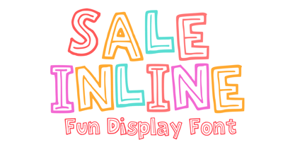 Sale Inline is a fun and playful inline font. You can use it for anything ranging from t-shirts, kids’ book designs, greeting cards, stickers, and posters, or anything that needs a casual touch. Fall in love with its incredibly versatile style and use it to create lovely designs!
 - Alright, let's dive into GUNJU by Akihiro OYA, a font that really has its own unique charm and character. At first glance, GUNJU strikes you with its combination of modernity and tradition. It has th...
- LFT Etica Mono by TypeTogether,
$35.00 Milan-based Leftloft studio has produced a third leg to its hit Etica font family: LFT Etica Mono. Meant to be a coder’s go-to font for everyday use as much as a designer’s way to invoke a certain genre, it is part of a broader and more versatile family that already contains almost 80 sans and serif fonts. LFT Etica Mono’s ten weights carry the same modern, recognisable DNA of the Etica family while hewing to the defined requirements of a coding typeface: space, density, distinct forms, and clarity. It uses the same instroke on the ‘c’ and open form of the ‘a’ for which the Etica family is famous, but adds something new in the form of an additional italic style. Monospaced fonts usually incorporate slanted letters as italics, as does LFT Etica Mono, but its default italics have warmer, cursive shapes while the alternate italics are simply slanted. The default ‘a’ is a simplified bowl and stem instead of a two storey shape; the ‘d, f, i, l, t, y’ and others gain an outstroke tail; the ‘e’ is one smooth stroke; and the default ‘k’ is looped. These characters have basic, slanted alternates if the cursive look isn’t desired, and includes a set of arrows and geometric shapes. The monospaced design, by nature, makes the typeface useful in coding and in low readability situations. And how does LFT Etica Mono work from the designer’s perspective? The starting point was the need for a monospaced Etica companion intended for technical applications: captions in graphic layouts, small text, confined or predefined space, and overall tone. Flat terminals and counters maintain the colour and versatility of the original typeface, but choosing between the organic cursive or blunt slanted alphabet will give every layout its own character. Of particular aesthetic interest may be the & and % symbols. Designed to be applied to the common visual environment, the new LFT Etica Mono font family completes a more complex system. One benefit is to give an expressive tone — less serious and more friendly — to something inherently technical, to bytes and bots, to encode the beautiful life.
 - Tequila by BA Graphics,
$45.00 A revival from the past this animated letter will fit right into todays market. With its subtle flair and Latin feeling it will surely give a feeling of pure fun. This style was very popular in the 40s and 50s then it was reborn in the 60s and 70s once again it is coming back and becoming popular again.
 - TOMO Trompa Pro by TOMO Fonts,
$12.00 TOMO Trompa (PRO) is a geometric handmade face with a retro and fun touch. Its friendly feel makes this font incredibly versatile, fitting a wide range of contexts. Add it to your creative ideas and notice how it makes them stand out!. It also comes with a shadow style to combine and generate an awesome effect.
 - Spinwash by Hanoded,
$15.00 It is amazing how much laundry I have with 3 small kids! Sometimes it feels like I spend half the week sticking laundry in the machine, or hanging it out to dry. Spinwash is a nice brush font. It smells like ‘summer breeze’, is 100% environment friendly and will take the stains out of your designs.
 - Garava - 100% free

- Seritta by Rashatype,
$10.00 Seritta is a sweet and friendly handwritten font. Its natural and unique style makes it incredibly fitting to a large pool of designs. This font is PUA encoded which means you can access all glyphs and swashes with ease!
 - Scripio A by AType,
$24.95Scripio A was the first font which I submitted to MyFonts.com. It is a decorative font. Little bit technical. I wanted to make a font which would be interesting to all. To some extent it has justified my hopes. - Mike Kunkel by Comicraft,
$29.00 Yes it's true, from time to time those awfully nice chaps at Comicraft have been known to create fonts for artists simply because We Love Their Work. Affable HEROBEAR AND THE KID kreator, Mike "He's just like your Favorite Uncle" Kunkel was lettering his beautiful children's comic strip with a font used by many, many other comic strip creators. John "JG" Roshell put a stop to all that and created a font based on Mike's own unique hand lettering style and now we make it available to you so that you can bring a little bit of Mike's Magick to your own warm and fuzzy work... because the Mike Kunkel font will help you remember your childhood... pass it on.
