10,000 search results
(0.022 seconds)
- Be Kind by Seemly Fonts,
$12.00 Be Kind is a sweet and simple handwritten font. Its friendly feel makes this font incredibly versatile, fitting a wide range of contexts. Add it to your creative ideas and notice how it makes them stand out!
 - Cute Lime by Sipanji21,
$10.00 Cute Lime is a bold and colorful display font. Its friendly feel makes this font incredibly versatile, fitting a wide range of contexts. Add it to your creative ideas and notice how it makes them stand out!
 - Banyu langits by Stringlabs Creative Studio,
$29.00 Banyu Langits is a cute and quirky display font. Its friendly feel makes this font incredibly versatile, fitting a wide range of contexts. Add it to your creative ideas and notice how it makes them stand out!
 - Avenus Type by Stringlabs Creative Studio,
$29.00 Avenus Type is a cute and quirky display font. Its friendly feel makes this font incredibly versatile, fitting a wide range of contexts. Add it to your creative ideas and notice how it makes them stand out!
 - Veto Sans by Monotype,
$50.99 Veto® Sans is both highly legible and handsomely distinctive – a rare blend in a typeface. It’s a design that stands out and fits in. Veto Sans is equally competent on screen and in print. It’s four carefully determined weights in both normal and condensed proportions, each with an italic complement, give the family an exceptionally deep range of applications. All the designs in the family are valuable design tools. None are superfluous. Advertising, brand, corporate, editorial and interactive design are all in Veto Sans’ wheelhouse. It also shines in wayfinding and other signage projects. And to all these, it brings a warmth and personality. An ample x-height, open counters, vertical stroke endings and subtly condensed capital letters enable Veto Sans fonts to perform with grace in print and digital environments while being space efficient. An added benefit is that all-capital typography set in Veto Sans is not only space saving, it’s also easy to read. Drawn as a complete reimaging of his earlier Veto design, Swiss designer Marco Ganz worked to create character shapes distilled to their purest forms while maintaining a relaxed and natural demeanor. Ganz, who is also a three-dimensional artist, is acutely aware that the negative space between letters and the internal space within letters is as important as the positive shape of the letters themselves. This dynamic balance between the negative and positive aspects of character forms gives Veto Sans a sense of immediacy without looking hurried. Ganz also took great care to draw a suite of italic designs that not only complement the roman weights perfectly, but also give the family a dynamic verve. A large international character set also ensures ease of localization. “Veto Sans,” says Ganz, “is a typeface for designers that search for a new and different solution to age-old typographic challenges.”
 - Angulosa M.8 by Ingo,
$38.00 At first glance, »Angulosa M.8« is one of those fonts that a technician or engineer would probably draw. And yet it differs fundamentally from typefaces constructed in this way. The right angle forms the basic element of the »Angulosa M.8«, but that's about it with the pure mathematics. Serif-like upstrokes and downstrokes on some letters improve readability, and carefully used slants makes the appearance a little friendlier. The proportions are not based on any mathematical principle, but are derived from freehand writing of the letterforms with a broad quill. In terms of style, »Angulosa M.8« belongs most closely to the modernist, constructivist typeface attempts, such as those undertaken at the Bauhaus in the 1930s. The styles of »Angulosa M.8« range from "Condensed" to "Expanded", from "Light" to "Black", plus the respective oblique form, which in this font is slanted to the left. All variants can be adjusted continuously in the variable font: the font width ranges from 50 to 150, font weight from 300 to 900, upright [0] and italic [1]. The »Angulosa M.8« supports all European languages including Eastern and Central European, Turkish, Greek and Cyrillic.
 - Nicolette Script by Cooldesignlab,
$13.00 Nicolette is a handwritten script font that is given a modern touch and front and back swashes. Can be used for various purposes. Suitable for Branding, Happy New Year, Logos, Greeting Cards, Stationery, Weddings and Offers. Such as titles, signatures, wedding invitations, t-shirts, letterhead, signboards, labels, music titles, news, posters, badges etc. if you want to use it for your work, this font can be used easily and simply because there are many features in it to load a lower complete set of letters and include initial letters and terminals, alternatives, binding and support for many languages. File included: Nicolette. otf To activate the OpenType Stylistic alternative, you need a program that supports the OpenType feature such as Adobe Illustrator CS, Adobe Indesign & CorelDraw X6-X7, Microsoft Word 2010 or a newer version And this Font has provided a PUA key code (special letters coded). There are additional ways to access alternatives / swash, using Character Map (Windows), Nexus Fonts (Windows), Font Books (Mac) or software programs like PopChar (for Windows and Mac). If you need help or advice, please contact me via email "cooldesignlab@gmail.com"
 - Petala Pro by Typefolio,
$39.00 Pétala Pro took its first steps almost ten years ago. Since then, the quest for perfection has forced several interruptions. It was necessary recalculate the route, tread other ways, discover new maps, and make easy curves. In the end, a new milestone on typeface design was reached. Pétala Pro combines readability with a gentle but strong personality. The smooth and balanced forms shares space with expressive ink traps. The 18 styles of the family – from Thin to Black – allow the flexibility needed to complex design briefs. When designing the different weights, rather than automated solutions, subtle adjustments were made to value the optical qualities of each style. Such care makes all the difference under extreme conditions. The wide variety of alternates makes Pétala Pro even more versatile. All the styles come with a lot of advanced OpenType features such as stylistics sets, localized forms, contextual alternates, ligatures, small caps, numbers, fractions and more. Pétala Pro brings your message with efficiency and personality for a multi-language environment and in any medium or support, such as video, mobile and computers screens. Pétala Pro is the ideal choice for editorial, advertising, branding and corporate identity.
 - FormPattern Color Two by Tarallo Design,
$14.99 FormPattern Color Two is a dingbat font for creating borders, frames, lines, and patterns. It is made up of a versatile set of interconnectable shapes that can flow together to make lines, borders, and patterns. Try different letter spacing to connect the forms into a continuous pattern or to space them apart. Explore leading (line spacing) to create large areas of pattern. Work with layering and opacity to discover the color-mixing potential of this font. Web designers can use FormPattern to make unique horizontal rules. How does FormPattern work? Install is as a regular font and as you type you will get forms instead of letters. Most design software, such as Illustrator, InDesign, and Photoshop provide a glyphs palette where you can choose the precise form you want. Color fonts are supported by Photoshop 2017, Illustrator 2018, and QuarkXPress 2018 (and later versions). A solid uncolored font comes with every purchase and can be used in applications that do not support color fonts. It will appear black and can be colored in the usual ways. FormPattern Color Two is compatible with all other FormPattern fonts from Tarallo Design.
 - Shocking Script by Suza Studio,
$11.00 Shocking Script is a calligraphic script font that comes with a lovely alternative character. mix of copper calligraphy in a handlettering style. Designed to convey an elegant style. Shocking Script is attractive because it is smooth, clean, feminine, sensual, glamorous, simple and very legible. Its classic style is very suitable to be applied to all types of formal items such as invitations, labels, menus, logos, fashion, make up, stationery, letterpresses, romantic novels, magazines, books, greeting / wedding cards, packaging, labels. Shocking Script features 395 + glyphs and 182 alternate characters. includes multiple language support. With OpenType features with stylistic alternates, ligatures and swash characters, which allow you to mix and match pairs of letters to suit your design, and also a touch of ornament makes this font look elegant. To activate the OpenType Stylistic alternative, you need a program that supports OpenType features such as Adobe Illustrator CS, Adobe Indesign & CorelDraw X6-X7, Microsoft Word 2010 or a later version. There are additional ways to access swashes, using Character Map (Windows), Nexus Fonts (Windows), Font Books (Mac) or a software program such as PopChar (for Windows and Mac). Thank You.
 - Martini at Joe's by steve mehallo,
$19.56 Googie Architecture, also known as "Midcentury Coffee Shop Modern," was born in California during the Atomic Age. Martini at Joe's is based on lettering from several historic Googie sources - many of which no longer exist. The futuristic Martini at Joe's collection was named for Northern California's famous Italian-themed "Joe's" restaurants, some of which are still serving up large portions of charbroiled beef steak, canned buttered veggies and pretty decent martinis. Martini at Joe's contains many fabulous typographic extras – and is available in single font packages or as a 15 font interchangeable Megaset (with "italic-esque" obliques and "retro obliques"). Martini at Joe's is perfect for use as commercial signage, on the menu for your coffee shop, supper club, tiki bar, fish grotto, smorgy, space port or destination casino. It also holds its own in any vintage store, on greeting cards, t-shirts, hi-brow gallery announcements, product skins, your 'zine masthead, on the faceplate of your futuristic microwave oven, tv dinner packaging, at millionaire's conferences or even embellishing the fuselage of your latest jet airline venture. Martini at Joe's: there's no better way to say, "Hold the olive, I'm having a moment."
 - Hortensia by Canada Type,
$24.95 Hortensia, designed around 1900 by Emil Gursch for his own Berlin foundry, is a typeface most expressive of the post-Victorian aesthetic that was all the rage in both Europe and America during the second half of the 19th century and up until the Great War. It is a reduced aesthetic of sharp points and natural curves that almost want to apologize for their own elegance, but clearly embody the simple excitement about the blossoming of industry and crafts during the period. This deco script trend would get a re-run for about a decade on either side of the second World War — especially in the entertainment and financial industries — before giving way to art nouveau and big brush faces. Hortensia was Gursch's most popular typeface, used extensively and prominently in many beautiful type catalogs, and a commonly seen design element in Germany for quite a while after its release. This digital version brings plenty of fixes and additions to the original metal Hortensia design, including many alternates sprinkled throughout the character set, and support for a wide range of Latin-based languages (including Central European, Baltic, Turkish and Welsh).
 - Speakeasy by Sudtipos,
$79.00 Speakeasy is a 5-font combo thematically built as a toolset for designing menus and liquor labels as well as coffees, restaurants and signs when the desire is to communicate with style. Originally put together to be used by the most famous speakeasy in Buenos Aires, this set contains a script, a minor (almost flat) wedge serif, a flare serif, a sans serif, and a bold Didone. The seed for the script was found in a German lettering book, and the other fonts reflect the familiar advertising and announcement styles of the early 20th century. The Speakeasy script comes with two different ways to connect the letterforms. Also included are many alternates, swashes, endings and flourishes — all accessible via OpenType features or glyph palettes. Speakeasy Modern and Speakeasy Flare are small cap fonts, and come with a few alternates. Speakeasy Sans and Speakeasy Gothic come with full sets of majuscules and minuscules, but contain small caps and a few alternates as well. A few rules and ornaments are also sprinkled throughout the set. This combination of fonts worked wonderfully for the project that called for it. Hopefully it will work just as well for your project.
 - Silver Raven by Ferry Ardana Putra,
$12.00 Hello there! We are introducing our new font - Silver Raven! This font is font created and inspired from the street writing of New York, and generated by creative hands of graffiti addictions. It has an incredibly unique design that can be perfect for a range of creative branding and packaging projects. Take your designs to the next level with this stunning font! You can apply this font to t-shirt designs, posters, covers, video thumbnails, merchandise, wall, and so on to make it look special. ——— Silver Raven features: A full set of uppercase and lowercase Numbers and punctuation Multilingual language support PUA Encoded Characters OpenType Features Layered Style +257 Total Glyphs Graffiti Swashes and Ornaments included! ——— Silver Raven Includes: Silver Raven (OTF/TTF) ——— ⚠️To enable the OpenType Stylistic alternates, you need a program that supports OpenType features such as Adobe Illustrator CS, Adobe InDesign & CorelDraw X6-X7, Microsoft Word 2010 or later versions. There are additional ways to access alternates/swashes, using Character Map (Windows), Nexus Font (Windows), Font Book (Mac) or a software program such as Pop Char (for Windows and Mac). ⚠️For more information about accessing alternative, you can see this link: http://adobe.ly/1m1fn4Y ———
 - Nippon Note by Hanoded,
$15.00 I just returned from a short holiday in Japan. I stayed in hostels and small guesthouses and noticed a peculiar thing they all had in common: they love little notes, telling you where to go, what to do, how to use the microwave oven and when to check out. These notes were sometimes printed, but more often they were handwritten. I found that the Japanese way of writing roman characters is a little, well, unusual. The letters are correct, but they have that typical ‘Japanese look’ - most notably the a and A the b, d and g, the p and P and the t and T. I can’t really tell you what makes them look different, maybe it’s the proportions, but I do know that a Nippon Note is highly recognisable. So, here is Nippon Note, a highly recognisable, handmade font. You don’t really have to be in Japan to use it, but it will give your designs that extra cachet. And don’t forget Nippon Note Kawaii - the cute doodle font which is free if you download the Nippon Note family! Comes with extensive language support, but unfortunately not Japanese…
 - Cavole Slab by insigne,
$22.00 Cavole Slab is a new slab serif, designed in early 2011, that has a strong influence from Dutch typography. The name is an altered form of the Portuguese word for feather, emphasizing the typefaceís soft and friendly character. Slab serifs give this face plenty of impact and make it an excellent choice for contemporary designers. The font family includes a very dark and powerful black all the way down to a hairline thin weight, giving a tremendous versatility. The family also features dynamic italics that add plenty of emphasis and momentum. Cavole Slab is suitable for both headline and text settings and should easily find its place in a number of different settings, from corporate identity to magazine body copy. There are six weights that come with complementary italics, and each font includes over 450 characters and extended Latin-based language support. The typeface family comes in OpenType format, and OpenType alternates are easily accessible through OpenType enabled applications such as the Adobe suite or Quark. Please see the informative .pdf brochure to see what OpenType features are available and to see them in action.
 - Mastering by Rhd Studio,
$15.00 Mastering Script is an aTypeface script font that comes with great alternative characters. mix of copper calligraphy in a handlettering style. Designed to convey an elegant style. Mastering Script is attractive because it is subtle, clean, feminine, sensual, glamorous, simple and very legible. Its classic style is very suitable to be applied to all types of formal items such as invitations, labels, menus, logos, fashion, make up, stationery, letterpresses, romantic novels, magazines, books, greeting / wedding cards, packaging, labels. Mastering Script features 247+ glyphs and 57 alternate characters. includes multiple language support. With OpenType features with stylistic alternates, ligatures and swash characters, which allow you to mix and match pairs of letters to suit your design, and also a touch of ornament makes this font look elegant. To activate the OpenType Stylistic alternative, you need a program that supports OpenType features such as Adobe Illustrator CS, Adobe Indesign & CorelDraw X6-X7, Microsoft Word 2010 or a later version. There is an additional way to access swashes, using the Character Map (Windows), Nexus Fonts (Windows), Font Books (Mac) or a software program such as PopChar (for Windows and Mac).
 - Black Dread by Ferry Ardana Putra,
$39.00 Introducing our first death metal font! We called it Black Dread! This brutal death metal font is can be used for logos or branding and your metal band name without having to pay for expensive logo-making services. Just by buying this font, you can immediately make your own band or brand logo name. Combine it with the death metal ornaments and make your own death metal design with ease! This black metal typeface is perfect for logotypes, t-shirts, vintage badges, branding, packaging, posters, clothing brands, posters, horror movies, album covers, and many more! ——— Black Dread features: A full set of uppercase Numbers and punctuation Multilingual language support PUA Encoded Characters OpenType Features +313 Total Glyphs +Death Metal Ornaments included! ——— Black Dread includes: Black Dread Regular Black Dread Outline ——— ⚠️To enable the OpenType Stylistic alternates, you need a program that supports OpenType features such as Adobe Illustrator CS, Adobe InDesign & CorelDraw X6-X7, Microsoft Word 2010, or later versions. There are additional ways to access alternates/swashes, using Character Map (Windows), Nexus Font (Windows), Font Book (Mac), or a software program such as Pop Char (for Windows and Mac).
 - Natura by Resistenza,
$39.00 Inspired by old nature field notebooks, Natura was born out of the passion for new modern hand-calligraphy, designed first with a flexible fountain pen and then digitalized glyph by glyph to get the natural feeling of the dry ink on smooth paper. This family includes five different fonts. Natura regular is an upright script with lots of swashes and ligatures and offers a wide range of flexibility with its many Opentype features. You will also find that its initial and terminal letters can enhance your designs in new and creative ways. Natura Slanted font offers the same functionality than Natura Regular but we changed the angle 16 degrees, creating an elegant feeling. Natura Notebook, is a narrow serif font with a stylised grunge effect with strong, legible vertical height. Natura Icons and Natura Stamps complete the whole family with incredible flourished elements and capital letters inspired by nature. Hand-drawn leaves, plants, flowers, as well as large and small animals add original detail while complementing the font perfectly. Natura is ideal to use for event invitations, special purpose cards, signatures, labels and packages. Check out also ‘Modern Love Slanted’ Turquoise Nautica
 - Blindness Graffiti by Colllab Studio,
$14.00 "Hi there, thank you for passing by. Colllab Studio is here. We crafted best collection of typefaces in a variety of styles to keep you covered for any project that comes your way! What if you could have a graffiti font collection? Or a street-inspired font collection? What if you want something clean, legible, yet still playful and fun? Searches online turn up nothing. Those popular sites only provide typical graffiti fonts. Well don't worry. What you’re looking for lies right here. We combine art and technology to bring the most extensive graffiti font collection around to your doorstep easier, faster, and cheaper than anywhere else. Introducing, Blindness Graffiti font is more than just random lettering. Its structured strokes and grungy strokes ooze its strong characteristic, inspired by urban style or cyberpunk design. It’s out of this world yet the balance between action and serenity keeps the font grounded. Blindness Graffiti is available in uppercase, lowercase, numerals, punctuations and lots of variations on each character include OpenType features, alternates, common ligatures and also additional swash to let you customize your designs. A Million Thanks www.colllabstudio.com
 - Classica Pro by URW Type Foundry,
$35.99 Classica Pro by Bernd Möllenstädt A real alternative for letterpress printing A masterpiece It was only after many years, shortly before the end of his life, Bernd Möllenstädt brought out these early drafts of his Classica Light and Light Italic from his drawer, and asked me to produce for him on the computer a Bold and Bold Italic, from which we later wanted to interpolate further cuts like Regular and so on. The boldening of letters with an oblique axis and with hairlines which should not grow to the same extent as the general line widths, is hard to cope with perfectly, even for the smartest computer program, and even more so, when it concerns an as complicated set of data as those conceived by Bernd. The automatically generated result could therefore only be a first step that had to be improved manually later. This was about the stage that we had reached when Bernd died in March 2013, leaving me behind with comprehensive corrections on proofs of this automatically generated Bold. Although I was aware that it would mean a lot of work to complete the project, I did not want to leave it unfinished and decided to finalize and publish the Classica, also in Bernd‘s honor. In the course of the two years that I worked on this font family it somewhat naturally became also my own. New details were added and some of the existing changed. A book typeface requires the supreme and forgives rarely, it represents a true masterpiece. My intention and my ambition were to create a real alternative for letterpress printing, with a font family that contains all the typographic options for an excellent typesetting, and is better readable and has a better appearance than other existing typefaces. Whether this was achieved, the reader may decide. Volker Schnebel, Hamburg, december 2014
 - Balneario by Sudtipos,
$39.00 Cities often have their own voice, a voice that can be read... in each location and each business, voice portraying a cultural fabric with an array of manifestations. Balneario Script is a small tribute to a coastal port and tourist city. Through the Sign Painters, in its golden age, a clear, friendly, practical, and functional way of making itself heard evolved. Far from wanting to be perfect, a typeface seeks to be close, warm, and casual. Inspired by the gestures of the brush, Balneario Script reverts to the use of “Casual Letters” so used by Sign Painters. In this adaptation, we sought to adjust its morphology to optimize its performance in small formats and extend the system to include lower case letters as part of the set. The set of fonts has two script weights in addition to an all caps version. The design emphasizes creating a harmonious morphological criterion. Friendly, rhythmic, and with a firm stroke Balneario Script is unique, ideal for headlines and short texts that need to be gestural but simple and highly functional. This typeface was designed to be used in promotional posters or for relaxed and fun Packagings. Balneario Script goes beyond constructive or functional aspects. It seeks to capture the smell of the sea, the warm summer breeze and the nostalgic feeling of a city that from its daily life, knew how to forge a unique personality. This atmosphere allows it to host millions of tourists year after year, and with them reinforce their spirit each summer.
 - Tchig Mono by Eclectotype,
$30.00 This is Tchig Mono, a monospaced type family that doesn't take itself too seriously. Why make a monospaced font? For coding, sure, but display? It’s my humble opinion that it’s the aesthetic choices driven by the constraints of the monospaced environment that makes them attractive. It’s a challenge for the type designer to squash and expand glyphs into a rigid bounding box, and the more unorthodox shapes that spring from this have a feel about them which lends them to postmodernist layouts and hipsterish anti-design. And the payoff for the type designer - no kerning! Yay. So what’s different about Tchig? Like I said before, it doesn't take itself too seriously. Even the name Tchig is just a stupid, fun sound (although it does show off that nice g!). There are a selection of playful alternates that give text a slightly alien feel. Stylistic set 1 chops off ascenders and descenders of lowercase letters, giving it a kind of small caps meets unicase feel (it is also accessible using the small caps feature). The other sets (or stylistic alternates if you don't have access to stylistic sets) make certain letters more twirly, more square, more “experimental”. Automatic fractions use a half-width numerator and denominator so fractions like one half and five eighths have the same width as figures (and every other glyph). There you go then - a monospaced type family not initially intended for use in the usual ways monospaced families are intended to be used. Give it a try. You could even do some coding with it if you like.
 - FF Signa Round by FontFont,
$72.99 FF Signa Rounded is a natural complement to the rest of the FF Signa super family – and can stand on its own in a variety of print and on-screen applications. The design is Ole Søndergaard’s rounded branch in his FF Signa family three. In it, he took the distinctive shapes and proportions of FF Signa Sans and created a warm, inviting design for text and display copy. Like its parent design, FF Signa Round is not a humanistic sans, nor is it based on 19th-century grotesques. Its characters are minimalist interpretations of letterforms – distinctive, yet easy to read. Thanks to FF Signa Round’s large x-height, open counters and simple character shapes, the design does not overpower the message – and draws the reader in. At substantial sizes, especially in the bolder weights, the design communicates with amiable conviction. At text sizes, FF Signa Round remains inviting and legible. It can be used as a companion to the rest of the FF Signa family, providing depth of style and breadth of reach. The collection of designs can also be used on their own for brand, brochure, publication, and way-finding design in digital and hard copy environments. Like the rest of the FF Signa family, OpenType® Pro fonts of FF Signa Round provide for the automatic insertion of ligatures and alternate characters, and also offer an extended character set supporting over 100 languages, including most Central European and many Eastern European – in addition to Cyrillic and Greek.
 - The "Tetris" font, as imagined and created by Tim Ko, is an innovative and playful typeface that directly draws inspiration from the iconic video game of the same name. This font encapsulates the ess...
- FS Sinclair by Fontsmith,
$80.00 ZX Spectrum In 1982, a home computer came on the market that would launch the UK IT industry. The ZX Spectrum sold five million units and spawned thousands of software titles. It was the must-have gadget for every teen. FS Sinclair is inspired by the memory of Sir Clive Sinclair’s greatest creation: the experience of entering its clunky command codes and reading its simple, grid-placed type. Smart, switched-on, great in text and display, FS Sinclair is a modern grid-based font, drawn with the Spectrum in mind and brought to life by well thought-out design. Formula Having completed the font for Channel 4’s brand update, the Fontsmith team defined the formula for its next font: the creative essence of the C4 work but with more structural discipline, more rigid form and a little more seriousness. The new font wouldn’t look self-consciously retro but it would reference the past and, it was hoped, influence the future. Readability Like the ZX Spectrum, it took a while for the new font to do exactly what it was meant to do. Many of the early concepts by Phil Garnham and Jason Smith were too jagged – the result of an awareness of getting too close to existing fonts of the same ilk, such as Wim Crouwel’s Gridnik. Eventually, FS Sinclair evolved into a more readable, functional grid-based type design that answered Phil and Jason’s original, self-set brief. Idiosyncratic There’s a technological, systems feel to FS Sinclair but ultimately, humans are in charge. The lowercase “a”, “n”, “m” and “r” have clean-cut “ears”, and the square-ish design is softened by round joins on the inside of the letterforms. The idiosyncratic design of letters such as “g”, “j”, “k”, “v”, “w” and “y” bring the design up to date. This is a modular font with character, and a range of weights that allow varied application.
 - Rizado Script by Kostic,
$40.00 Rizado Script is a classy one-weight script typeface, made with “dolce vita” in mind. Its high contrast and pointy tone are recalling the fine nib handwriting of a meticulous and decisive person that hasn’t got free time to spare but surely knows how to enjoy his life. No quick and dry strokes, but rather wide, elegant and strong-minded temper that will bring a long-lasting touch to your packaging layouts. Sure, if you are looking for a good fit for some more ephemeral design such as a weekend high-class cocktail promotion, or a wedding invitation – this handy display typeface won’t let you down for a second. If you happen to go to Venice and enjoy their popular Aperitivo, you’ll be asked to choose between three types of bitter-reddish base drink. Rizado will bring you the same amount of pleasure, authority and uniqueness while you pick out one of the three ampersands or other alternate characters. According to the concept of Fellini’s lifestyle, “la dolce vita” is a luxury lifestyle full of cheerful worldly pleasure. But don’t let yourself be fooled by this moto, because Italians are famous for their modesty and sagacity as well. That’s why you’re always supposed to turn on the Contextual Alternates (to activate extra positional forms — isolated, initial and final) and keep your voice down and never set this typeface in all Capital letters. There are 391 total glyphs made to support West European, Central European and South East European languages.
 - Peanutz by Matthias Luh,
$18.00 A cool font which is a bit like a comic font. It makes me remind of graffiti.
 - Highman by Eko Bimantara,
$19.00 Highman is a modern condensed bold font. Its contain all caps letter yet its have a different height between the uppercase and lowercase. Its fit for brand, titling, stacking or grid layout and all kind of display usage.
 - Kidsfun by Balpirick,
$15.00 Kidsfun is a whimsical display font. It is perfect for product packaging, branding projects, magazine, social media posts and much more. Get creative with its childlike playfulness, and use it to brighten up any kids and school project!
 - Happy Dinosaur by Sipanji21,
$10.00 Happy Dinosaur is a sweet and chunky lettered display font. Its friendly feel makes this font incredibly versatile, fitting a wide range of contexts. Add it to your creative ideas and notice how it makes them stand out!
 - Dream Island by Epiclinez,
$14.00 Dream Island is a simple, relaxed, and fine handwritten font. Its simple style makes it fitting to a wide range of designs, so add it confidently to your informal or casual ideas, and you will love the results.
 - Spooky Green by Illushvara,
$13.00 Spooky Green is an incredibly unique and quirky display font. Its friendly feel makes this font incredibly versatile, fitting a wide range of contexts. Add it to your creative ideas and notice how it makes them stand out!
 - Bright Flicks by Nathatype,
$29.00 Bright Flicks is a delightful script font that embodies a playful and whimsical spirit. With its rounded letterforms and charming swings at the ends of some letters, this typeface adds a joyful and lively touch to your designs. The defining feature of this script lies in its rounded shape, which gives the font a friendly and approachable appearance. The letterforms flow smoothly, creating a sense of fluidity and movement. Each letter flows into the next, creating a harmonious and lively composition. The uppercase letterforms are crafted with precision and creativity, maintaining legibility while embracing the playful nature of the font. Adding to its character are the swings at the ends of select letters, adding a touch of playfulness and spontaneity. Bright Flicks captures the essence of creativity and imagination. The rounded shapes evoke a sense of warmth and friendliness, while the swings at the ends of certain letters add a touch of whimsy and fun. This font brings a sense of joy and positive energy to your designs. You can also enjoy the various features available in this font. Features: Stylistic Sets Ligatures Multilingual Supports PUA Encoded Numerals and Punctuations Bright Flicks fits in logos, branding materials, packaging, and any design project that aims to evoke a sense of cheerfulness and creativity. Whether you're working on invitations, greeting cards, posters, or any project that needs a touch of playfulness, this font will bring a vibrant and lively vibe. Find out more ways to use this font by taking a look at the font preview. Thanks for purchasing our fonts. Hopefully, you have a great time using our font. Feel free to contact us anytime for further information or when you have trouble with the font. Thanks a lot and happy designing.
 - Summer Ink by Seemly Fonts,
$12.00 Summer Ink is a sweet and friendly handwritten font. Its natural and unique style makes it incredibly fitting to a large pool of designs. The only limit is your imagination!
 - Almond Cake by Epiclinez,
$14.00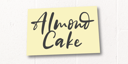 Almond Cake is a sweet and stylish handwritten font. Its natural and unique style makes it incredibly fitting for a large pool of designs. The only limit is your imagination!
 - Jumping Unicorn by Subectype,
$15.00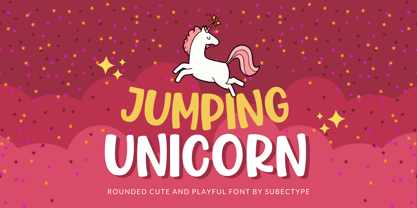 Jumping Unicorn is a sweet and friendly display font. Its natural and cute style makes it incredibly fitting to a large pool of designs. The only limit is your imagination!
 - Blue Dino by Sakha Design,
$10.00 Dino Blue is a sweet and friendly handwritten font. Its natural and unique style makes it incredibly fitting to a large pool of designs. The only limit is your imagination!
 - Delighted Panda by Seemly Fonts,
$12.00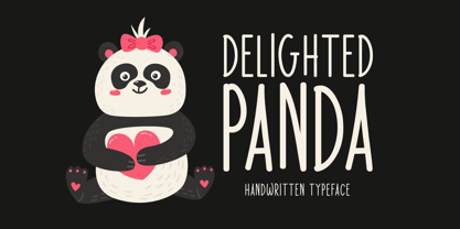 Delighted Panda is a sweet and simple handwritten font. Its natural and unique style makes it incredibly fitting to a large pool of designs. The only limit is your imagination!
 - Fruity Cake by Epiclinez,
$14.00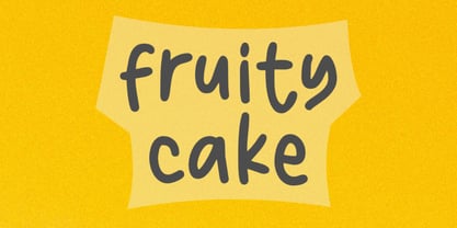 Fruity Cake is a sweet and friendly handwritten font. Its natural and unique style makes it incredibly fitting to a large pool of designs. The only limit is your imagination!