10,000 search results
(0.039 seconds)
- Callove Script by Genesislab,
$15.00 Latest styles callove script with the kind of modern hand scratches, I hope you are interested in this font, if you want to use for your work this font can be used easily and simply because there are a lot of features in it to contain a complete set of letters lower and uppercase letters, assorted punctuation, numbers, and multilingual support. font also contains alternate style Stylistic Sets, Swsh for those of you who have software that is able to work OpenType (Photoshop / Illustrator / InDesign). Callove script is suitable use for market design developed at this time, this font has a model Trendy, natural and gentle, with this font you can take advantage of the opportunity in every moment of one wonderful way to highlight the celebration of the feast of your best, because this font will be advocates for purposes such as wedding invitations, party, graduation, birthday, gathering, etc. if you have a problem? Contact me: genesislabstudio@gmail.com
 - Mrs Sheppards Pro by Sudtipos,
$45.00 The Charles Bluemlein Script Collection is an intriguing reminder of the heady days of hand lettering and calligraphy in the United States. From the early 1930s through World War II, there were about 200 professional hand letterers working in New York City alone. This occupation saw its demise with the advent of photo lettering, and after digital typography, became virtually extinct. The odd way in which the Bluemlein scripts were assembled and created - by collecting different signatures and then building complete alphabets from them - is a fascinating calligraphic adventure. Because the set of constructed designs looked nothing like the original signatures, fictitious names were assigned to the new script typefaces. The typeface styles were then showcased in Higgins Ink catalogs. Alejandro Paul and Sudtipos bring the Bluemlein scripts back to life in a set of expanded digital versions, reflecting the demands of today’s designer. Extreme care has been taken to render the original scripts authentically, keeping the fictitious names originally assigned to them by Bluemlein.
 - Herr Von Muellerhoff Pro by Sudtipos,
$45.00 The Charles Bluemlein Script Collection is an intriguing reminder of the heady days of hand lettering and calligraphy in the United States. From the early 1930s through World War II, there were about 200 professional hand letterers working in New York City alone. This occupation saw its demise with the advent of photo lettering, and after digital typography, became virtually extinct. The odd way in which the Bluemlein scripts were assembled and created - by collecting different signatures and then building complete alphabets from them - is a fascinating calligraphic adventure. Because the set of constructed designs looked nothing like the original signatures, fictitious names were assigned to the new script typefaces. The typeface styles were then showcased in Higgins Ink catalogs. Alejandro Paul and Sudtipos bring the Bluemlein scripts back to life in a set of expanded digital versions, reflecting the demands of today’s designer. Extreme care has been taken to render the original scripts authentically, keeping the fictitious names originally assigned to them by Bluemlein.
 - Mr Sheffield Pro by Sudtipos,
$45.00 The Charles Bluemlein Script Collection is an intriguing reminder of the heady days of hand lettering and calligraphy in the United States. From the early 1930s through World War II, there were about 200 professional hand letterers working in New York City alone. This occupation saw its demise with the advent of photo lettering, and after digital typography, became virtually extinct. The odd way in which the Bluemlein scripts were assembled and created - by collecting different signatures and then building complete alphabets from them - is a fascinating calligraphic adventure. Because the set of constructed designs looked nothing like the original signatures, fictitious names were assigned to the new script typefaces. The typeface styles were then showcased in Higgins Ink catalogs. Alejandro Paul and Sudtipos bring the Bluemlein scripts back to life in a set of expanded digital versions, reflecting the demands of today’s designer. Extreme care has been taken to render the original scripts authentically, keeping the fictitious names originally assigned to them by Bluemlein.
 - Miss Stephams Pro by Sudtipos,
$45.00 The Charles Bluemlein Script Collection is an intriguing reminder of the heady days of hand lettering and calligraphy in the United States. From the early 1930s through World War II, there were about 200 professional hand letterers working in New York City alone. This occupation saw its demise with the advent of photo lettering, and after digital typography, became virtually extinct. The odd way in which the Bluemlein scripts were assembled and created - by collecting different signatures and then building complete alphabets from them - is a fascinating calligraphic adventure. Because the set of constructed designs looked nothing like the original signatures, fictitious names were assigned to the new script typefaces. The typeface styles were then showcased in Higgins Ink catalogs. Alejandro Paul and Sudtipos bring the Bluemlein scripts back to life in a set of expanded digital versions, reflecting the demands of today’s designer. Extreme care has been taken to render the original scripts authentically, keeping the fictitious names originally assigned to them by Bluemlein.
 - Monsieur La Doulaise Pro by Sudtipos,
$45.00 The Charles Bluemlein Script Collection is an intriguing reminder of the heady days of hand lettering and calligraphy in the United States. From the early 1930s through World War II, there were about 200 professional hand letterers working in New York City alone. This occupation saw its demise with the advent of photo lettering, and after digital typography, became virtually extinct. The odd way in which the Bluemlein scripts were assembled and created - by collecting different signatures and then building complete alphabets from them - is a fascinating calligraphic adventure. Because the set of constructed designs looked nothing like the original signatures, fictitious names were assigned to the new script typefaces. The typeface styles were then showcased in Higgins Ink catalogs. Alejandro Paul and Sudtipos bring the Bluemlein scripts back to life in a set of expanded digital versions, reflecting the demands of today’s designer. Extreme care has been taken to render the original scripts authentically, keeping the fictitious names originally assigned to them by Bluemlein.
 - Handsome by Shinntype,
$50.00 Handsome was the first digital typeface to resemble nice, ordinary, fully cursive handwriting. Or neon. In 2005, Handsome Pro was one of the first script typefaces to utilize the OpenType format to simulate the natural quality of writing, by automatically substituting alternate contextual glyphs. The effect follows the conventional “joining rules” of calligraphy, which are a formalization of the way in which letter forms are modified in cursive handwriting for the sake of speed and efficiency—and also perhaps to make life more interesting. For the look of real handwriting, Handsome is most convincing at around 15 pts. At much smaller or larger sizes it works differently. At display size, the feel of the non-nib styles is very slick, more like a speedball Kauffman, owing to the smoothness of the finish. As script fonts go, Handsome has a relatively large x-height, which can be useful if you don't want the “writing” to look too small.
 - Hey Greysia by Black Studio,
$19.00 Hey Greysia is a modern typography with a great flow. Hey Greysia features alternate characters, including initials, final terminal sweep, ligatures, and International support for most of the included Western Languages. This one will make your designs instantly professional and stunning! Be the perfect professional in a minute and create modern designs like ads, sales, logos, branding, posters, social media text overlays today! To enable the OpenType Stylistic alternative, you need a program that supports OpenType features such as Adobe Illustrator CS, Adobe Indesign & CorelDraw X6-X7, Microsoft Word 2010 or later. and there are additional ways to access alternatives/swashes, using the Character Map (Windows), Nexus Font (Windows), Font Book (Mac) or a software program such as PopChar (for Windows and Mac). I really hope you enjoy it! I can't wait to see what you do with Hey Greysia! Feel free to use the #Black Studio tag and the #Hey Greysia font to show what you've done :) Thank you for your purchase!
 - Hacksaw Brush by Ferry Ardana Putra,
$17.00 Hacksaw is dry brush font handmade with a dedicated soul. This super condensed and trippy typeface was designed to be exclusive and is perfect for those who love condensed, wild, natural brushed feel fonts. This typeface is perfect for creating elegant branding and headlines for handmade, food & beverage, artisan goods, quotes, invites, t-shirts, logos, and, or use it to elevate your social media feed! Hacksaw features: A full set of upper & lowercase characters Numbers & punctuation Multilingual language support PUA Encoded Characters Dozen of Swashes OpenType Features ——— ⚠️To enable the OpenType Stylistic alternates, you need a program that supports OpenType features such as Adobe Illustrator CS, Adobe InDesign & CorelDraw X6-X7, Microsoft Word 2010 or later versions. There are additional ways to access alternates/swashes, using Character Map (Windows), Nexus Font (Windows), Font Book (Mac) or a software program such as Pop Char (for Windows and Mac). ⚠️For more information about accessing alternative, you can see this link: http://adobe.ly/1m1fn4Y
 - Mr Keningbeck Pro by Sudtipos,
$45.00 The Charles Bluemlein Script Collection is an intriguing reminder of the heady days of hand lettering and calligraphy in the United States. From the early 1930s through World War II, there were about 200 professional hand letterers working in New York City alone. This occupation saw its demise with the advent of photo lettering, and after digital typography, became virtually extinct. The odd way in which the Bluemlein scripts were assembled and created - by collecting different signatures and then building complete alphabets from them - is a fascinating calligraphic adventure. Because the set of constructed designs looked nothing like the original signatures, fictitious names were assigned to the new script typefaces. The typeface styles were then showcased in Higgins Ink catalogs. Alejandro Paul and Sudtipos bring the Bluemlein scripts back to life in a set of expanded digital versions, reflecting the demands of today’s designer. Extreme care has been taken to render the original scripts authentically, keeping the fictitious names originally assigned to them by Bluemlein.
 - Mr Donaldson Pro by Sudtipos,
$45.00 The Charles Bluemlein Script Collection is an intriguing reminder of the heady days of hand lettering and calligraphy in the United States. From the early 1930s through World War II, there were about 200 professional hand letterers working in New York City alone. This occupation saw its demise with the advent of photo lettering, and after digital typography, became virtually extinct. The odd way in which the Bluemlein scripts were assembled and created - by collecting different signatures and then building complete alphabets from them - is a fascinating calligraphic adventure. Because the set of constructed designs looked nothing like the original signatures, fictitious names were assigned to the new script typefaces. The typeface styles were then showcased in Higgins Ink catalogs. Alejandro Paul and Sudtipos bring the Bluemlein scripts back to life in a set of expanded digital versions, reflecting the demands of today’s designer. Extreme care has been taken to render the original scripts authentically, keeping the fictitious names originally assigned to them by Bluemlein.
 - Big Bang by Haksen,
$12.00 Big Bang! Cute Sans with Additional Swashes Introducing the elegant "Big Bang!" Cute Sans with Additional Swashes If you are needing a touch of funnies chic cute sans for your designs, this font was created for you! Big Bang was built with OpenType features cute characters for uppercase and lowercase letters, loads of different swash character for numerical, uppercase and lowercase letters in file with the name Big Bang Swashes, in other side for Bing Bang regular and slant version include numbers, punctuation, ligatures and it also supports other languages :) Accessing the swashes / opentype features / glyphs: This font works best in a program that supports OpenType features such as Adobe Indesign, Adobe Illustrator CS, or Adobe Photoshop CC. You can access the swashes and alternates from the 'Glyphs Panel' in these programs. More Questions? Here are some (potential) answers! You are not permitted to resell this font in any way. Multilingual Support is included for Western European Languages Cheers!
 - Beauty Night Script by Letterfreshstudio,
$13.00 Beauty Night Script is a calligraphic script font that comes with exquisite character changes, a kind of classic decorative copper script with a modern twist, designed with high detail for an elegant style. Beauty Night is interesting because it is smooth, clean, feminine, sensual, glamorous, simple and very easy to read, because there are many fancy letter joints. I also offer a number of decent stylistic alternatives for multiple letters. Classic styles are very suitable to be applied in various formal forms such as invitations, labels, restaurant menus, logos, fashion, make up, stationery, novels, magazines, books, greeting / wedding cards, packaging, labels or all kinds of advertising purposes. . To activate the OpenType Stylistic alternative, you need a program that supports OpenType features such as Adobe Illustrator CS, Adobe Indesign & CorelDraw X6-X7, Microsoft Word 2010 or newer versions. There are additional ways to access alternatives / swash, using Character Map (Windows), Nexus Fonts (Windows), Font Books (Mac) or software programs such as PopChar (for Windows and Mac). Thanks You.
 - Mr Canfields Pro by Sudtipos,
$45.00 The Charles Bluemlein Script Collection is an intriguing reminder of the heady days of hand lettering and calligraphy in the United States. From the early 1930s through World War II, there were about 200 professional hand letterers working in New York City alone. This occupation saw its demise with the advent of photo lettering, and after digital typography, became virtually extinct. The odd way in which the Bluemlein scripts were assembled and created - by collecting different signatures and then building complete alphabets from them - is a fascinating calligraphic adventure. Because the set of constructed designs looked nothing like the original signatures, fictitious names were assigned to the new script typefaces. The typeface styles were then showcased in Higgins Ink catalogs. Alejandro Paul and Sudtipos bring the Bluemlein scripts back to life in a set of expanded digital versions, reflecting the demands of today’s designer. Extreme care has been taken to render the original scripts authentically, keeping the fictitious names originally assigned to them by Bluemlein.
 - Mr Blaketon Pro by Sudtipos,
$45.00 The Charles Bluemlein Script Collection is an intriguing reminder of the heady days of hand lettering and calligraphy in the United States. From the early 1930s through World War II, there were about 200 professional hand letterers working in New York City alone. This occupation saw its demise with the advent of photo lettering, and after digital typography, became virtually extinct. The odd way in which the Bluemlein scripts were assembled and created - by collecting different signatures and then building complete alphabets from them - is a fascinating calligraphic adventure. Because the set of constructed designs looked nothing like the original signatures, fictitious names were assigned to the new script typefaces. The typeface styles were then showcased in Higgins Ink catalogs. Alejandro Paul and Sudtipos bring the Bluemlein scripts back to life in a set of expanded digital versions, reflecting the demands of today’s designer. Extreme care has been taken to render the original scripts authentically, keeping the fictitious names originally assigned to them by Bluemlein.
 - Kaput Black - Personal use only

- Kaput Black Black - Personal use only

- FS Emeric by Fontsmith,
$60.00 Right now! FS Emeric reconciles a pair of seemingly opposing approaches: the systematic but chilly functionalism of early modernist typography, trapped in time, and a warmer, more emotional, more optimistic spirit. What Fontsmith created was something that marries precision with expression, geometry with movement, functionality with humanity. FS Emeric has a sharp, kinetic edge that cuts across design disciplines – graphic, fashion, product, automotive. It’s about what’s happening right now. Contemporary, optimistic, distinctive – a classic working sans serif. Appetite Discussions with some of Fontsmith’s design studio clients had revealed an appetite for a new kind of typeface that could express mid-century modernist principles in a fresh, contemporary voice. As he crafted the letterforms that would form FS Emeric, Phil Garnham was guided by two central ideas. First, there was Jan Tschichold’s contention that a good letter is “one that expresses itself, speaking with the utmost distinctiveness and clarity”. Second was a belief that a font can be personally expressive without compromising its functionality. These provided the fuel that drove the project to its conclusion. Posters To mark the launch of FS Emeric, Fontsmith asked 11 eminent design studios from around the world – the likes of Pentagram, Studio Dumbar, Bibliotheque, Non-Format and Build – to create a limited edition A1 poster. Each poster celebrated a different weight of FS Emeric, and just 50 of each were screen-printed by Dan Mather onto 175gsm Colorplan stock. “We gave away a randomly selected poster every time two or more weights of the FS Emeric were purchased,” says Phil Garnham. “They’ve now become somewhat of a collector’s item in their own right.” Superfamily In the spirit of Univers, the original font superfamily, FS Emeric now comprises 22 Roman and italic typefaces overall, making it one of the most versatile and functional modern fonts across all kinds of media, as well as one of the most distinctive.
 - Treasury Pro by Canada Type,
$79.95 The Treasury script waited over 130 years to be digitized, and the Canada Type crew is very proud to have done the honors. And then some. After seven months of meticulous work on some of the most fascinating letter forms ever made, we can easily say that Treasury is the most ambitious, educational and enjoyable type journey we've embarked upon, and we're certain you will be quite happy with the results. Treasury goes beyond being a mere revival of a typeface. Though the original Treasury script is quite breathtaking in its own right, we decided to bring it into the computer age with much more style and functionality than just another lost script becoming digital. The Treasury System is an intuitive set of fonts that takes advantage of the most commonly used feature of today's design software: Layering. Please do help yourself to the PDF and images in the MyFonts gallery for a quick look at the some of the limitless possibilities Treasury has to offer, from simple attractive elegance expressed in the main script, all the way into mysteriously magnificent calligraphic plates. To date in digital type history, this is the most comprehensive and versatile work of its kind. Every designer loves many options to experiment. Experimentation has never been as much fun and productive as it is with Treasury. If you're "compudling" your initial ideas for a layout, or you're just an alphabet fan who loves spending time with letters, working with Treasury is very inspiring and fulfilling. Some of Treasury's features are: - No more endless searching for initial caps that fit your project. The Treasury System lets you build your own initial caps, in any combination of colors, fills, linings or dimensions you like, with a few simple clicks of the mouse. - With two base styles and nine layer fonts, the Treasury System set helps you produce endless possibilities of alternation and variation in dimension, color, and calligraphic combinations to fit your layout's exact needs, down to the very last detail. - 12 pre-combined Treasury fonts are also there to help and inspire layout artists who love shortcuts and don't want to fiddle with too many layers in their layout. Available in small packages on their own, or as part of the complete Treasury package, these 12 fonts can start you up on your way to discovering the perfect fit for your layout. - Every single letter in the Treasury System comes with at least one alternative. Some characters have even three or four alternates. Although the main character set is an authentic rendition of Ihlenburg's 1874 classic, we made sure to include a treasure trove of alternates for maximum usability. - The most gorgeous set of numerals we have seen in a long, long time. The Treasury numbers are what really turned us onto this project in the first place. - Treasury Pro, the incredibly sophisticated OpenType version, combines the complete Treasury System into a single font, programmed for compatibility with Adobe's latest CS and CS2 software programs. Over 2000 characters in one font, for thousands of possibilities. Setting the ideal elegant wordmark, logotype, intitial cap, or headline, no matter how simple or complex, is as easy as taking a minute or two to push a few buttons in Illustrator, Photoshop, or InDesign. We can go on endlessly about the beauty and functionality of this Treasury set, but we really cannot do it justice with words. So try Treasury for yourself and see the amazing possibilities of fun and creativity it has. It can be used pretty much anywhere - signs, book covers, certificates, music inserts, movie posters, greeting cards, invitations, etc. Much thanks are due to the generous and considerable help Canada Type received from the Harvard Library in Boston, Klingspor Museum in Frankfurt, and many type hobbyists and researchers in Canada, England, Germany, the Netherlands, and the United States. Without them it would was near-impossible to track down the lost history of Hermann Ihlenburg, the most prolific German/American type designer and punch cutter of the 19th century. We hope Mr. Ihlenburg is proudly smiling down on us from type designer heaven.
 - Prismatic Spirals Pro by MMC-TypEngine,
$182.00 PRISMATIC SPIRALS PRO FONT! The Prismatic Spirals PRO is a Decorative Type-System and ‘Assembling Game’, itself. Settled in squared pieces modules or tiles, embedded by unprecedented Intertwined Prismatic Structures Design, or intricate interlaced bars that may seem quite “impossible” to shape. Although it originated from the ‘Penrose Square’, it may not look totally as an Impossible Figures Type of Optical Illusions. More an “improbable” Effect in its intertwined Design, that even static can seem like a source of Kinetical Sculptures, or drive eyes into a kind of hypnosis. Prismatic Spirals Pro has two related Typefaces both more basic or easier to use versions, the Default Family plus its “bold” braided version Prismatic Interlaces… PRO provides a more advanced, complex, and twisted Design, plus requires to be typed alternating caps. Instructions: Use the Map Font Reference PDF as a guide to learn the 'tiles' position on the keyboard, then easily type and compose puzzle designs with this font! All alphanumeric keys are intuitive or easy to induce, you may easily memorize it all! Plus, often also need to consult it! *Find the Prismatic Spirals Pro Font Map Reference PDF Here! (!) Is recommended Print it to have the Reference or open the PDF to also copy and paste, when consulting is required or when it may be difficult to access, depending on the keyboard script or language. The 2 glyphs sets are separated in colors for facilitating. Also use the Map Font with key captions or switch to it for ensure that the characters are alternating between both uppercase and lowercase letters as other Keys as numbers, marks, and punctuation along the strings, holding Shift one by one or actually two by two. As a Tiles Type-System, the line gap space value is 0, this means that tiles line gaps are invisibly grouted, so the user can compose designs, row by row, descending to each following row by clicking Enter, same as line break, while advances on assembling characters. Background History: The first sketches of my Prismatic Knots or Spirals Designs dates back then from 2010, while started developing hand-drawn Celtic Knots and Geometric Drawings in grid paper, while engage to Typography, Sacred Geometry and the “Impossible Figures” genre… I started doing modulation tests from 2013, until around 2018, I got to unravel it in square modules or tiles from the grid, then idealized it as fonts, along with other Type projects. This took 13 years to come out since the first sketches and 6 months in edition. During the production process some additional tiles or missing pieces were thought of and added to the basic set, which firstly had only the borders, corners, crossings, nets, Trivets connectors or T parts and ends, then added with nets and borders integrations. Usage Suggestions: This type-system enables the user to ornate and generate endless decorative patterns, borders, labyrinthine designs, Mosaics, motifs, etc. It can seem just like a puzzle, but a much greater tool instead for higher purposes as to compose Enigmas and use seriously. As like also to write Real Text by assembling the key characters or pieces, this way you can literarily reproduce any Pixel Design or font to its Prismatic Spirals correspondent form, as Kufic Arabic script and further languages and compose messages easily… This Typeface was made to be contemplated, applied, and manufactured on Infinite Decorative Designs as Pavements, Tapestry, Frames, Prints, Fabrics, Bookplates, Coloring Books, Cards, covers or architectonic frontispieces, storefronts, and Jewelry, for example. Usage Tips: Notice that the line-height must be fixed to 100% or 1,0. In some cases, as on Microsoft Word for example, the line-height default is set to 1,15. So you’ll need to change to 1,0 plus remove space after paragraph, in the same dropdown menu on Paragraph section. Considering Word files too, since the text used for mapping the Designs, won't make any literal orthographical sense, the user must select to ignore the Spellcheck underlined in red, by clicking over each misspelled error or in revision, so it can be better appreciated. Also unfolding environments as Adobe Software’s, the Designer will use the character menu to set body size and line gap to same value, as a calculator to fit a layout for example of 1,000 pts high with 9 tiles high, both body size and line gap will be 111.1111 pts. Further Tips: Whenever an architect picks this decorative system to design pavements floor or walls, a printed instruction version of the layout using the ‘map’ font may be helpful and required to the masons that will lay the tiles, to place the pieces and its directions in the right way. Regarding to export PNGs images in Software’s for layered Typesetting as Adobe Illustrator a final procedure may be required, once the designs are done and can be backup it, expanding and applying merge filter, will remove a few possible line glitches and be perfected. Technical Specifications: With 8 styles and 4 subfamilies with 2 complementary weights each (Regular and Bold) therefore, Original Contour, Filled, Decor, with reticle’s decorations and 2 Map fonts with key captions. *All fonts match perfectly when central pasted for layered typesetting. All fonts have 106 glyphs, in which 96 are different keys with 2 versions of each of both caps and shift keys, plus a few repeated for facilitating. It was settled this way in order for exchanging with its Prismatic relative fonts which has only 48 different keys repeated twice. Concerning tiles manufacturing and Printed Products as stickers or Stencils, any of its repeated pieces was measured and just rotated in different directions in each key, so when sided by other pieces in any direction will fit perfectly without mispatching errors. Copyright Disclaimer: The Font Software’s are protected by Copyright and its licenses grant the user the right to design, apply contours, plus print and manufacture in flat 2D planes only. In case of the advent of the same structures and set of pieces built in 3D Solid form, Font licenses will not be valid or authorized for casting it. © 2023 André T. A. Corrêa “Dr. Andréground” & MMC-TypEngine.
 - Juan Carlos by Homelessfonts,
$49.00 Homelessfonts is an initiative by the Arrels foundation to support, raise awareness and bring some dignity to the life of homeless people in Barcelona Spain. Each of the fonts was carefully digitized from the handwriting of different homeless people who agreed to participate in this initiative. A biography/story of each homeless person captures their story, to help raise awareness and bring some dignity to the life of homeless people. Monotype is pleased to donate all revenue from the sales of Homelessfonts to the Arrels foundation in support of their mission to provide the homeless people in Barcelona with a path to independence with accommodations, food, social and health care. Juan Carlos was born in Barcelona, Spain 46 years ago. Since the age of 17 – and during eleven years – he worked double shifts of eight hours every day in a factory. Excessive work and family problems debilitated his health and he lost his job. He then faced a dilemma: to spend unemployment benefits to pay for rent or for food. For a few years, he worked helping in the kitchens of different restaurants while he lived on a pension, until he was definitively left without work and ended up living in the street for 10 years. “In the street I tried to find rest in the ATMs of banks. I preferred to be alone, and if I ran into conflictive people, I looked for somewhere else” he explains. Living in the street he was the victim of an aggression. Since then, with the help of Arrels he moved into a pension. Today, Juan Carlos is a volunteer in the shower service of Arrels, the same showers he used during years. He also collaborates with the maintenance team, helps prepare hygienic and cleaning material, and participates in activities such as the theatre group and the football team.
 - Melee - Unknown license

- Trump Mediaeval Office by Linotype,
$50.99The Trump Mediaeval Office family is designed after the model of the original serif family produced by Georg Trump in 1954. Trump released this typeface through the C.E. Weber type foundry in Stuttgart, and Linotype quickly cut the face for mechanical composition. Thereafter it became popular around the world. One of the most prolific German type designers of the 20th century, Trump created numerous typefaces in several different styles, but Trump Mediaeval is often regarded as his best work. Trump Mediaeval is an old style serif typeface, with new inherent quality that could only have come about after centuries of variation on this theme. It bears some resemblance to the classic Garamond typefaces, yet its characteristic letters set it apart in a positive way. Akira Kobayashi, Linotype’s Type Director, released his own revived design, Trump Mediaeval Office, in 2006. Trump Mediaeval Office has two weights, each with an italic companion. Unlike the original design, Kobayashi has harmonized the varying letterforms across the two weights, allowing Regular and Bold text to stand side by side harmoniously. Trump Mediaeval’s numbers now match across weights as well, optimizing their legibility in sizes large and small. Decades ago, Trump Mediaeval was a popular choice for setting book texts, because of its robust serifs. These are exactly what make the face a good choice for office application today; on lower-resolution printers, these serifs will still remain a strong feature on the letterform, increasing legibility along the line of text. - Floro by Andinistas,
$29.95 Floro is a typographic family with 3 members designed by Carlos Fabian Camargo. Its idea combines medieval ideas, grotesque, stencil and grunge for T-shirts, stickers, advertising material design. More specifically the concept of Floro join several DNAís coordinating X height, ascendant, descendant and wide, in which proportions and adaptive optics were determined to inject great visual impact when composing titles. Its forms and counter forms have imperfections controlled with vitality and consistency. Floro is useful for ranking words and phrases with corroded edges and creases between the lines of his letters. In that vein, Floro refers to improvised design, deletion and copying. For that reason, its determinants seem stencil patterns that attract the attention of the reader. Its inaccurate decisions were planned that way, in which the type of contrast seems made with a flat tip and the amount of contrast between thick and thin is medium. Its sizes, regular and italic shine by their systematic wear and terminations sometimes in pointed forms resembling medieval darkness. In short, we can say that Floro comes from the miscegenation of Gothic calligraphy texture, foundational calligraphy and some refinements of gothic writings with italic sans-serif ideas of late 19th century. Even with the blur appearance, floro has ideal proportions to pile for horizontal and vertical areas when composing titles with striking looks and robust. And finally, floro dingbats are related shields and stamps, to accompany the written resulting useful at the level of visual support and hierarchical.
 - Totemic by Canada Type,
$29.95 Jim Rimmer’s first typeface was originally published in 1970 as a basic film type alphabet through a small, independent type house in central California. Its sources of influence (now calligraphic type standards by Dair, Goudy and Zapf) are ones that remained with Jim for the rest of his career. If you squint at Totemic in just the right way, you can see some recognizable themes Jim would later flesh out and make his own in later works throughout his career as a type designer and printer. Totemic is now available for the first time as a digital font, of the refined and expanded kind now expected from Canada Type. It comes with quite a few standard advanced typography features: Small caps, caps-to-small-caps, automatic fractions and standard ligatures, stylistic alternate sets, six kinds of figures, case-sensitive forms, and extended Latin language support. It also comes with a very unique and unprecedented feature: Variably stackable totem poles. Simply enable the discretionary ligatures feature, type any unique three-digit combination using numbers between 1 and 4, and watch the magic happens. With a name like Totemic, we just couldn't help ourselves. Many thanks to Andrew Steeves of Gaspereau Press for finding Jim’s lost gem in a most unexpected place, and for helping us bring it back to life 45 years after its analog birth. 20% of Totemic’s revenues will be donated to the Canada Type Scholarship Fund, supporting higher typography education in Canada.
 - JH Hikmat by JH Fonts,
$95.00 Jh Hikmat is a modern arabic font; it is derived from the Naskh and Ruqaa calligraphy script. It is ideal for kids books, greeting cards and advertising projects.
 - Mantap by Sulthan Studio,
$10.00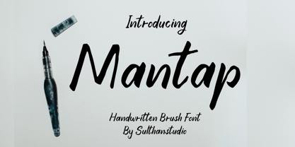 is a sweet and friendly handwritten font. Its natural and unique style makes it incredibly fitting to a large pool of designs. The only limit is your imagination!
 - Happy Dreamer by Seemly Fonts,
$12.00 Happy Dreamer is a simple handwritten font. Its natural and unique style makes it incredibly fitting to a large pool of designs. The only limit is your imagination!
 - Deco Pennant Initials JNL by Jeff Levine,
$29.00 Online auctions continue to be a surprising wealth of font design inspiration. In this instance, a number of silk embroidered Art Deco initials inside inverted triangles inspired Deco Pennant Initials JNL. The uppercase version is white lettering on a black background – similar to the originals. On the lowercase keys is a set of initials that are black on white with a black border. Since the inverted triangles resemble pennants, there’s a solid black blank on the left parenthesis key and a outlined blank one on the right parenthesis key. In this way, the initials could be used for monograms or interspersed with the blanks to form short banner messages.
 - Scala Jewel Pro by Martin Majoor,
$29.00 Scala Jewels is a set of four highly decorative typefaces, based on the bold capitals of Scala. Whereas Crystal and Pearl are modelled on historic examples, Diamond and Saphyr are original designs. Scala Jewels offers the possibility to set decorated borders, designed in the style of each of the four variations. There are corners and different sorts of long and short elements. One of the best ways to use Scala Jewels is as a two- or three-line drop cap at the start of a chapter. The award-winning Scala family (1990-1993) is a worldwide bestseller and has established itself as a ‘classic’ among digital fonts.
 - Fury by Canada Type,
$24.95 Get your goggles on. You're on your way to the Metaverse, where no subject is off limits, everyone has an avatar, and reality is subjective. The world can be turned off or on at your very whim. Never mind the markets, resource counters, national inflations, caviar-loaded barons, environmental surprise, or who will nuke whom first. In 2D it's all peace and understanding. This is the great escape, shell, shield, your real fury against furious reality. One fist in the air is the start of a revolution. Two fists are the end of a victory. You are in between. Be smooth. Stay sharp. Walk the line.
 - Sabang by Typehill Studio,
$12.00 Sabang Script is a new modern script font with an irregular baseline. Trendy and feminine style. Sabang Script looks lovely on wedding invitations, thank you cards, quotes, greeting cards, logos, business cards and more. Perfect for using in ink or watercolour. Including initial and terminal letters, alternates, ligatures and multiple language support. To enable the OpenType Stylistic alternates, you need a program that supports OpenType features such as Adobe Illustrator CS, Adobe Indesign & CorelDraw X6-X7, Microsoft Word 2010 or later versions. There are additional ways to access alternates/swashes, using Character Map (Windows), Nexus Font (Windows), Font Book (Mac) or a software program such as PopChar (for Windows and Mac).
 - Bernandes by Letterday Studio,
$20.00 Bernandes is a new modern script font with an irregular base line. Trendy and feminine style. Bernandes looks beautiful in wedding invitations, thank you cards, quotes, greeting cards, logos, business cards, and more. Perfect for use in ink or watercolors. Includes initial and terminal letters, alternatives and support for many languages. To enable the OpenType Stylistic alternative, you need a program that supports OpenType features such as Adobe Illustrator CS, Adobe Indesign & CorelDraw X6-X7, Microsoft Word 2010 or newer versions. There are additional ways to access alternatives / swashes, using Character Maps (Windows), Nexus Fonts (Windows), Font Books (Mac) or software programs such as PopChar (for Windows and Mac).
 - Songlines by Fine Fonts,
$29.00 Songlines is based upon a pen-drawn script drawn by Michael Harvey to illustrate a poem by Johannes Thurman. The expressive and rough-edged letterforms of Songlines do not have any lowercase characters. Instead, alternative uppercase characters occupy their positions. By using a mixture of upper-case and lowercase characters, text can be given a very lively and vigorous character. For example, the two versions of L are designed to overlap and interact whichever way round they are used. The augmented Songlines Plus version, has many alternative characters and ligatures added together with Opentype features to enable their automatic substitution where the application in which they are used permits.
 - Photo Developer JNL by Jeff Levine,
$29.00 An image found online of a vintage storefront sign for the Kraus Photo Shop was the inspiration for Photo Developer JNL, which is available in both regular and oblique versions. The sign featured a thick and thin Art Deco style lettering with an inline cutting through the thicker strokes. Before the advent of digital photography, and way before chain stores offered in-house processing, neighborhood photo labs were the only place for getting prints from your roll film (unless you wanted to send the film into Kodak for developing and printing). Customers of these stores could also purchase additional film, cameras and photographic accessories from the same location.
 - Bodicx by Gatra Std,
$15.00 Introducing a cute handwriting "Bodicx" Simple Fun Display Font! If you are needing a touch of casual modern San-Serif for your designs, this font was created for you! What's Included: Uppercase and Lowercase Number and Punctuation Support Language This font works best in a program that supports OpenType features such as Adobe Indesign, Adobe Illustrator CC and CS, or Adobe Photoshop CC and CS also CorelDraw More Questions? Here are some (potential) answers! Do not to resell this font in any way. Multilingual Support is included for Western European Languages If You interest this font for commercial use please contact me at : wahyuputrabangsa127@gmail.com Have a Wonderful Day, Gatra Std
 - Text by Alias Collection,
$60.00 Whereas blackletter types were hand written, Text letterforms are drawn using a series of graphic shapes that slot together in a series of permutations, one set for lower case and another for the upper case. As the link between the method of construction of the letterforms has been removed from the appearance (the quill pen with which they were written resulting in the angle and sharp stresses) there is no logic for these stylistic elements to work in any set way. As this fundamental rule of the blackletter style has been removed the typeface has become something other than a typical or derivative blackletter font.
 - Modster Script by Moovied Co.,
$15.00 Modster Script is a collective inspired by urban style created from the style of hand-lettering with love. Modster comes with a set of styles, alternatives, present and extra shadow. This font is ideal for branding, logos, handwritten quotes, product packaging, headers, posters, merchandise, social media books / cover titles, special events, etc. To enable the OpenType Stylistic alternates, you need a program that supports OpenType features such as Adobe Illustrator CS, Adobe Indesign & CorelDraw X6-X7. There are additional ways to access alternates, using Character Map (Windows), Nexus Font (Windows), Font Book (Mac) or a software program such as PopChar (for Windows and Mac).
 - Geometry Circle by Vjeko Sumic,
$39.00 Geometry circle is a heading/display type, built with the intent to illustrate and attract the viewer, not to be used for long text. The inspiration comes from the Futurist movement typefaces, especially from Marinetti’s own workshop on new age typography of that time (Italy 1920). The typeface is composed of only capital letters. The letters are of an unique geometric design taking the basic 64 grid system and subtracting the shape of a circle form each glyph in a unique way to form a letter. There is a full complement of typography symbols as well as a support for Central and Eastern European symbols and characters.
 - Esttoria by Zamjump,
$17.00 Esttoria Handwritten Script is a modern irregular baseline handwritten script font. Stylish and feminine. Esttoria looks beautiful in wedding invitations, thank you cards, quotes, greeting cards, logos, business cards, and more. Perfect for use in ink or watercolor. Includes initial and terminal letters, alternative and multiple language support. To activate the OpenType Stylistic alternative, you need a program that supports OpenType features such as Adobe Illustrator CS, Adobe Indesign & CorelDraw X6-X7, Microsoft Word 2010 or a later version. There are additional ways to alternate / swash, using the Character Map (Windows), Nexus Font (Windows), Font Book (Mac) or a software program like PopChar (for Windows and Mac).


