4,729 search results
(0.383 seconds)
- Birthy by ZetDesign,
$20.00 Birthy is a serif font that comes with an alternate style for each letter unit, this allows you to choose the shape you want. This font is made to be used in every situation, both formal and informal and is available in 2 regular and italic styles with over 300 glyphs in each style. Make your creations more awesome with BIRTHY font ... have fun creating ...
 - Sheryna Lemu by Forberas Club,
$16.00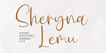 Sheryna Lemu Font is script font inspired by modern and ligature characters. It is especially designed for luxury, elegant, feminine projects, Sheryna Lemu Font is perfect for creating modern and chic designs such as logos, packaging, editorials and more. this Sheryna Lemu Font is only available for personal use. So, if you want to use its full features and license, get the premium version as well!
 - HU Malrang KR by Heummdesign,
$50.00 'HU Malrang KR' is a font that gives a round and soft feel to its tightly packed modules. This font has a variable function, allowing users to fine-tune the thickness they want. (Available only in Adobe programs.) Six basic weights are provided so that they can be used even in programs that do not apply the variable function. This fonts contain Hangul, Korean.
 - Sultan Free Bold by Sultan Fonts,
$19.99 Sultan free is an Arabic text typeface for desktop applications. Sultan free is a freestyle script. It is available in One style, calligraphic, and very dynamic. This makes it suitable for large display sizes, especially in the area of advertising, while still functioning well as a text face. The font includes a support for Arabic, Persian, and Urdu. Sultan free typeface comes with many opentype features.
 - Salty Bread by Forberas Club,
$16.00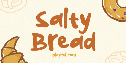 Salty Bread Font is script font inspired by modern and ligature characters. It is especially designed for luxury, elegant, feminine projects, Salty Bread Font is perfect for creating modern and chic designs such as logos, packaging, editorials and more. this Salty Bread Font is only available for personal use. So, if you want to use its full features and license, get the premium version as well!
 - Quick Meal by Jeff Levine,
$29.00 Quick Meal JNL is a ‘hand lettered’ interpretation of Morris Fuller Benton’s 1905 design “Miehle Extra Condensed Title”, no doubt named for [or on behalf of] the manufacturer of printing and die cutting presses that were used for years within the printing industry. The type face is available in both regular and oblique versions. Quick Meal JNL is a pun on the pronunciation of ‘Miehle’.
 - Bebas Neue Rounded by Dharma Type,
$4.99 Bebas Neue Rounded is the Bebas Neue with rounded corners and terminals. As you know, Bebas Neue is the most widely used free font recently. This rounded version is the new style for more widely use. The basic theory and proportion are same as Bebas Neue but rounded shape gives a warm, soft and natural impression. Softer impression than Bebas Neue SemiRounded. Available at an affordable price.
 - Morton by Deltatype,
$59.00 Morton, another modern grotesque typeface which deliver a extraordinary unique within typeface with the style of condensed let you create more impact with your design. Morton Type Family available in nine weights, the Thin weight deliver you a simple hair line stem until you reach the bold weight, you will get more dynamic with three stem weights which give you a modern, old school look and feel.
 - Bantat by Jipatype,
$20.00 ฟอนต์ Bantat เป็นแบบอักษรแซนเซอริฟ ที่มีความเรียบง่ายโดยออกแบบให้หลังคาและฐานตัวอักษรกลุ่มหนึ่งราบเรียบไปกับเส้นบรรทัด ผสมกับหลังคาแบบปกติ เพื่อให้มีไดนามิคแทนที่จะราบเรียบไปทุกตัวอักษร มีให้เลือกใช้ 18 น้ำหนัก และ 5 ความกว้าง ทั้งตัวตรงและตัวเอียงรวมแล้วมี 90 ลักษณะ เหมาะสำหรับงานทั่วไป บนสื่อได้หลากหลายขนาดไม่ว่าจะมีความกว้างหรือแคบ -- The Bantat font is a simple Sans Serif typeface designed to flatter parallel to the baselines and x-height. Available in 18 weights and 5 widths, both upright and italic have 90 Styles in total. Suitable for general work on media in a variety of sizes, whether wide or narrow.
 - Band Concert JNL by Jeff Levine,
$29.00 A poster circa 1930s-40s designed for the WPA Federal Art Project promoted free band concerts at the Brooklyn Museum in Brooklyn, New York. Its headline (“Free Band Concerts”) was hand lettered in a dual line Art Deco sans serif design. Now recreated digitally, the font takes its name after the poster’s topic. Band Concert JNL is available in both regular and oblique versions.
 - Piano Music JNL by Jeff Levine,
$29.00 A 1910 collection of piano sheet music called “Presser’s Economy Group” had that name hand lettered in a fancy serif lettering style that could fall somewhere between Art Nouveau and semi-calligraphic. No matter the label you attach to the style, it makes for a wonderful digital type revival. The end result is Piano Music JNL, which is available in both regular and oblique versions.
 - Acaraje by Latinotype,
$39.00 Acarajé is a grotesque font that stands out thanks to its versatility. Its personality blossoms through its particular modulation, which grows with weights; making it a rather jovial typeface that does not abandon the characteristics of more classic grotesques. With two styles available: normal and italic, and a variety of 7 weights that range from "Black" to "Regular", this font offers incredible flexibility for your designs.
 - Galerie by ArtyType,
$29.00 Incorporating a certain Gallic ‘je ne sais quoi’ Galerie is a chic & stylish sans serif, though you'll notice some short tails with angled terminals acting rather like serifs, lending a sophisticated characteristic to its balanced proportions. Galerie’s large x-height makes it a very legible font family, available in 4 weights: Thin, Light, Medium and Bold. See also the condensed sister family Galerie 2.
 - Suddenly by Sarid Ezra,
$13.00 Suddenly classic signature family! Suddenly is signature script with three style that contain stylistic alternate, swash, etc to create your own customised signature or logo design. This font is also support multi language. It's available in three style! For another questions, please send a mail to saridezra@gmail.com. Thank You! PS: Type underscore + number (from 1 to 5). Or copy Some_5thing in preview bellow..
 - Gutenberg C by Alter Littera,
$25.00 A slightly roughened version of The Oldtype “Gutenberg B” Font, simulating irregularities and ink spreads associated with old metal types, papers and parchments. Apart from its rough appearance, which will be clearly noticed only at large point sizes, the font is identical to The Oldtype “Gutenberg B” Font. Specimen, detailed character map, OpenType features, and font samples available at Alter Littera’s The Oldtype “Gutenberg C” Font Page.
 - Cartage Stencil JNL by Jeff Levine,
$29.00 The sheet music for the title song of the 1960 movie "Exodus" had the name hand lettered in a block stencil style with rounded corners and narrow "rails" [the breaks between the stencil parts]. Loosely based on this design and working from just the six letters of the title, Cartage Stencil JNL is available as a digital font in both regular and oblique versions.
 - Kiddie Show JNL by Jeff Levine,
$29.00 The design for Kiddie Show JNL is based on the hand lettering for a piece of sheet music from 1946 entitled "Wee Marionettes". While basically an Art Deco-flavored monoline typeface, it contains characters with intersecting lines and assembled parts that give it an eccentric, playful look. Available in both regular and oblique versions to add a bit of playfulness to your next project.
 - Spur Wide JNL by Jeff Levine,
$29.00 Spur Wide JNL was modeled from an example of hand lettering from the antique French alphabet book L'Art du Tracé Rationnel de la Lettre. Heavy Roman style letters with spurs (often referred to as Latin) were most popular with sign painters and show card writers in the early part of the 20th century. Spur Wide JNL is available in both regular and oblique versions.
 - EFCO Splandor by Ilham Herry,
$30.00 this is a revival of the Splandor font which was released in 2014. many have changed in this latest version, such as vector quality, available with lowercase, and various Opentype Features, such as Stylistic set, ligature, contextual alternate, languages support, and new ornaments. This font was created for display needs, such as headings, signage, posters, t-shirts, covers, labels, logos, etc Splandor PDF Specimen
 - Mademoiselle Magnifique PW by Patty Whack Fonts,
$29.98Just a cute little handwritten-like font, it's whimsical, classy, yet relaxed and adds flair to anything. Perfect for cards, letters, recipes, journaling and much more! Mademoiselle Magnifique PW is intended and suitable for Display use and wonderful as a journaling font. This font is meant for display, titles, beautiful signage, cards, journaling, etc. Mademoiselle Magnifique PW is available in OpenType, and TrueType format. - People Talk JNL by Jeff Levine,
$29.00 A title card with cast credits for the 1935 movie “The Whole Town’s Talking” (starring Edward G. Robinson and Jean Arthur) formed the basis for People Talk JNL. The hand lettered names were done in a slightly condensed slab serif – mostly rectangular in shape with rounded corners. A few characters take on their own unique appearance. People Talk JNL is available in both regular and oblique versions.
 - Sigwald by Good Java Studio,
$20.00 Sigwald is born from bold and fun style fonts. That's available on other file from letter A-Z and a-z. Versatile for design poster, logo, branding, label, quote, headline profil, banner, t-shirt design, packaging, magazine, brochure, and many more your amazing work with this fonts. Features: - Included file: Sigwald Regular (OTF) - Simple installation - Support for MAC and PC - PUA encoded - Stylistic Alternates
 - Presswork JNL by Jeff Levine,
$29.00 Sheet music for the 1939 song “On the Paraña” featured Art Deco hand lettering in a classic “thick and thin” style, with many stylized characters. The publisher of the song was the Theodore Presser Company of Philadelphia, so the name “Presswork” aptly fit this typographic design. Presswork JNL is available in both regular and oblique versions. For trivia buffs, the Paraña is a river in Brazil.
 - Integrity JY Pro by JY&A,
$49.00 Because of the need for a new condensed serif font family, Jack Yan created this individualistic style of typefaces complete with one of the largest collections of unusual ligatures available at the time of launch in the mid-1990s. As well as the usual selection of double-f and ct, JY&A has provided gr, gt, ty, and other ligatures for JY Integrity Roman and Italic.
 - Velveteen Round NF by Nick's Fonts,
$10.00This fresh face takes a number of design cues from Tomás Vellvé Mengual's eponymous design for Barcelona's Neufville Type Foundry in 1971. This version softens many of the lines of the original, and warms the design up overall with rounded terminals. Available in three weights, this font contains the complete Latin language character set (Unicode 1252) plus support for Central European (Unicode 1250) languages as well. - Peppermill JNL by Jeff Levine,
$29.00 A bold sans serif with occasional rule-breaking vertical serifs on some characters was found within page examples from the book "100 Alphabets Publicitaires" ("100 Advertising Alphabets"). Although a few of those vertical serifs extended above the cap height in the hand lettering, they were made more uniform to keep a consistency in the digital version known as Peppermill JNL. Available in both regular and oblique versions.
 - Yanice by Viaction Type.Co,
$20.00 Yanice is a semi-condensed sans serif font that has a strong and subtle character. Perfect for modern & industrial themed designs. Yanice is available in 4 styles that you can use according to your needs. Get the Yanice font now at a great price to speed up your work. Feature Font : Standard Ligature Multilingual Support Symbol & Punctuation I hope you enjoy and thank you. Viaction Type
 - Laguna Vintage by Aiyari,
$25.00 Introducing Laguna Font Collection. Inspired from American motor inn signs and vintage restaurant signs in 50s-70s. Laguna comes with open type features such stylistic alternates, stylistic sets, contextual alternates & ligatures. Also available in variable font format. Laguna Font Collection is best uses for headings, Logo type, quotes, apparel design, invitations, flyer, poster, greeting cards, product packaging, book cover, printed quotes, cover album, movie, etc
 - Seizieme by URW Type Foundry,
$49.99 In 1905 the Parisian typefounders Peignot & Cie. issued their Série 16. This clear roman with a large x-height and an italics soon enjoyed a great popularity. Coen Hofmann’s drawings made for the Seizième follow the original Peignot Série 16 as close as possible. The regular font has the original small caps, while all members of the family are enhanced, next to the ranging ones, with old style figures. Also superior and inferior figures are available. The original series did not have a bold version. This was, however, carefully drawn for this digital rendition. The Série 16 and its versions for the composing machines were much used for the type setting of scientific publications. That is why a comprehensive set of mathematical and sundry characters are added to the Seizième fonts. Next to the accented characters for the several West and East European languages the Seizième was also enhanced with a Cyrillic, also available in regular, italic and bold versions.
 - Quaint Gothic SG by Spiece Graphics,
$39.00 Distinctively Art Nouveau with a touch of Arts & Crafts, Quaint Gothic is a typographic gem from the late nineteenth century. Also known as Desdemona, this undulating and organic typeface is a versatile and refreshing alternative to many of the font designs on the market today. Quaint Gothic comes complete with an alternate set of caps and a new set of lowercase characters. And for your convenience, a nifty set of small caps and small figures are included in this version. You may also want to access the word-on-a-wave logotypes like “to” and “and” located in the special character slots. They’re great for constructing provocative headlines and titles. Quaint Gothic is also available as an OpenType font. It contains lining and oldstyle figures, prebuilt fractions, stylistic alternates, a wide variety of discretionary ligatures and word ornaments. These advanced features currently work in Adobe Creative Suite InDesign and Illustrator. Check for OpenType advanced feature support in other applications as it gradually becomes available with upgrades.
 - Helen Bg by HS Fonts,
$19.00 The font package Helen Bg Family is in 5 weights and two widths, 18 styles: Thin, Thin Italic, Light, Light Italic, Regular, Italic, Bold, Bold Italic, Black, Black Italic, Light Condensed, Light Condensed Italic, Condensed, Condensed Italic, Bold Condensed, Bold Condensed Italic, Black Condensed and Black Condensed Italic. Helen Bg is made with Bulgarian Design of Cyrillic and is recommended for the publications for Bulgaria. Other version with standard Cyrillic is available from HermesSoft Limited. Typeface design: Vassil Nikolov. Release date: 1991 - 96, HermesSOFT Design notes and Technical data Helen belongs to the typefaces from the humanistic sanserif grotesk fonts. The font is for wide use – from the classical typesetting to the display typography. In the Bulgarian Code Page are included all vowels with accents that are really necessary for the typesetting in Bulgarian language, and are not included in the Cyrillic Code Page: Helen Is available in OpenType PostScript and WEB font formats.
 - Retail Packaging JNL by Jeff Levine,
$29.00 The retail storage box for a vintage metal numbering stamp manufactured by the American Numbering Machine Company had its brand name hand lettered in an Art Nouveau style that most likely went back to the 1920s, as the company was in existence from 1908 to around 1971. Numbering machines were used in offices, schools, libraries, and anywhere a series of numbers needed to be marked onto printed items. Similar to what was called a ‘crash numberer’ used in letterpress shops, the machines could be set to do a run of digits [for example: 4000, 4001, 4002] or repeat numbers for forms used as carbon copies. As computers took over most forms of printing, the use of numbering machines dwindled, but they are still available. The American Numbering Machine Company was one of several Brooklyn, New York companies that specialized in the manufacture of these machines. Retail Packaging JNL replicates the lettering from their packaging, and is available in both regular and oblique versions.
 - Grand Slam SG by Spiece Graphics,
$39.00 Grand Slam is based on an old cardwriting style known as Poster Gothic. This dynamic letterstyle was used in the heyday of the Hollywood movie poster because of its powerful and snappy appeal. The face is of uniform thickness and made as wide as possible without interfering with legibility. Its vertical strokes seem to be thickened slightly where normal serifs would be. It is interesting to note that another group of tiny little serifs populate the entire design. Grand Slam comes with a complete set of alternates including small caps and small figures. A lowercase has been added for greater versatility. Grand Slam is now available in the OpenType format. In addition to small caps, lining figures, oldstyle figures, petite lining figures, and swashes, this expanded OpenType version contains some new stylistic alternates. These advanced features work in current versions of Adobe Creative Suite InDesign, Creative Suite Illustrator, and Quark XPress. Check for OpenType advanced feature support in other applications as it gradually becomes available with upgrades.
 - Absentia Slab by DR Fonts,
$19.00 Conceived as a slab serif companion to the Absentia Sans family, this typeface complements its sibling with charisma and style. Built on the same geometric framework, they combine and harmonize gracefully. Yet Absentia Slab stands on its own as a novel alternative to conventional options. Anchored by blocky serifs, it presents an appearance of stability and steadiness. Its audacious design integrates unique features such as vertical terminals in glyphs ‘a’, ‘e’ and ‘6’. To make optimal use of available space, one-sided serifs (and in some cases, simple strokes without any serifs) help maintain an airy, uncluttered footprint as seen in letters ‘m’, ‘E’ and ‘N’. This forward-looking typeface is well suited for a variety of projects: understated yet spirited, technical yet welcoming. It has a modernist appeal, while reminiscent of XIXth Century woodblock lettering. Designed by Daniel Robichaud, Absentia Slab is available in ten weights with matching italics and two variable fonts.
 - FS Rufus by Fontsmith,
$80.00 Ligatures FS Rufus is an outgoing, likable sort of font with an eccentric streak. Wide letterforms and curious ink-traps make for an engaging personality, and a set of discretionary ligatures make FS Rufus irresistible to designers wanting to play. Not a small set, either: there are some 80 different options available. Wide The decision was made early on to make the letterforms of FS Rufus luxuriously wide. This generates a distinctive visual texture when the font is used for text. With other weights available for headlines, FS Rufus brings a curiously engaging look to editorial, magazine covers and advertising. Just look at my ink traps Ink traps are normally the preserve of fonts intended for printing at small sizes, in newspapers or directories – extra notches necessary to prevent ink from pooling. FS Rufus turns the ink trap into a beautiful eccentricity, flaunting it in both its lowercase and capitals. Take a look at the “h”, “a” and “k”, and the “B” and “N”. Attention-seeking? Moi?
 - Milroy Upright SG by Spiece Graphics,
$39.00 As a beautiful yet eccentric unconnected script, Milroy Upright SG Regular can be a refreshing alternative to the formal upright scripts seen on so many anniversary and wedding announcements today. This nineteenth century classic was designed by Max Rosenow and Julius Schmol for Barnhart Brothers & Spindler in 1895. Milroy Upright was originally known as Oliphant. It was later renamed Advertisers Upright Script in 1925. This new version, Milroy Upright, contains many new alternative characters including a modified cap X and cap Z, a two-story lowercase g, and a matching set of oldstyle figures. Milroy Upright SG Regular is now available in the OpenType format. Some new characters have been added to this OpenType version including stylistic alternates, discretionary ligatures, and oldstye figures. Advanced features currently work in Adobe Creative Suite InDesign, Creative Suite Illustrator, and Quark XPress. Check for OpenType advanced feature support in other applications as it gradually becomes available with upgrades.
 - Emilio by Narrow Type,
$35.00 Emilio is a modern serif family available in 14 styles. It's an elegant typeface with friendly and warm personality which seeks a balance between traditional and modern. Emilio is inspired by the visuality of the 1980s and the typefaces that were widely used in advertising at the time, such as Times and Garamond. However, Emilio offers a contemporary take on the serif font family, adding new elements such as reductive, calligraphy-inspired details or the "K" and "R" legs shape. If you want a more traditional look, you can achieve it with the stylistic alternatives available. Of course, the typeface also provides standard and discretionary ligatures and many other Open Type features. In addition, it offers support for most Latin languages. The big headlines and titles are where Emilio shines the most, but due to large x-height and decent contrast will work for smaller text as well. Emilio is the ideal typeface for editorial design, posters, covers, branding and much more.
 - Egyptian Slate by Monotype,
$34.99 Just as the camera adds weight to human faces, serifs can add weight to typographic faces. Rod McDonald trimmed and adjusted his new Egyptian Slate design as it emerged from its sans serif predecessor, the Slate typeface family. Slate is a great sans serif design, and the addition of his Egyptian Slate to your typeface library will make it even more versatile. Egyptian Slate is a solid and stylish slab serif design that will look superb in the spotlight of your choosing. Available in six weights – from a svelte light to a commanding black – each upright member of the Egyptian Slate family has a complementary italic. Egyptian Slate fonts are available as either OpenType Std or OpenType Pro fonts; the later options offers an extended character set that supports most Central European and many Eastern European languages. Egyptian Slate™ font field guide including best practices, font pairings and alternatives. Featured in: Best Fonts for Logos, Best Fonts for Websites
 - Dutch Mediaeval Book ST by Canada Type,
$39.95 Dutch Mediaeval Book ST is a special version of the popular Dutch Mediaeval Book text fonts, engineered specifically for science writing. It is equipped with SciType, a combination of additional characters and OpenType programming included in the fonts to help in typesetting science text. For more information about SciType, please consult the SciType FAQ available in the Gallery section of this page. The Dutch Mediæval design is the historically renowned one made in 1912 by S. H. de Roos. It stands out as one of the most classic Dutch text faces. This Book version comes in two weights and an italic, optimized for body copy use between 8 and 12 pt. Aside from the SciType additions, all the fonts contain OpenType features for ligatures, ordinals, automatic fractions, eight kinds of figures, and a few ornaments. For details about the functionality of Dutch Mediaeval Book ST, please consult its Access Chart PDF available in the Gallery section of this page.
 - FWD Egyptian Tower by Fontwright Design,
$39.99 FWD Egyptian Tower is a designers stack-able Display family best purchased as one package. The four versions can be manipulated in your favorite graphics or sign making application to achieve the different effects as shown in the font family ad designs. All fonts are tightly spaced and are very often intentionally overlapped creating a balance for each very unique wider bottomed character. Being stack-able, the designer can duplicate the original text layer and by changing the font on the lower of the two layers to another of the family can then add another available effect. This can be repeated to add other of the available effects. Then by converting the text of the lower text layers to curves or outlines and welding the characters of the words together, the overlaps can be eliminated. This process is fairly common practice for a graphic designer and quite easy once done a few times.