8,191 search results
(0.026 seconds)
- Juby Rounded by Fontsphere,
$12.00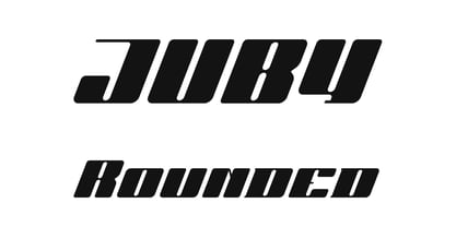 Juby Rounded - Heavy, visible and distinctive display font, rounded brother of the Juby Font. Designed especially for display purposes. Can be used successfully in posters, headlines, visual identities, and everything needs to stand out. Font containing uppercase and lowercase characters, numerals and a large range of punctuation. The family has 3 weights with matching italics.
 - MPI Aldine Extended by mpressInteractive,
$5.00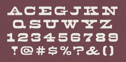 Based on wood type designed by William H. Page & Company in 1872, Aldine Extended is one of many variations within the Aldine family. The characters are extremely wide relative to their height, and have heavy, thick serifs. Aldine was extremely popular in broadside printing during the late 19th century and conveys America’s enthusiastic westward expansion.
 - DF Ko by Dutchfonts,
$33.00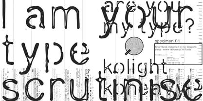 The Ko family was developed for the text posters at the Holland Festival in 1997, based on the filling of a lettering stencil with different pen thicknesses. Ko Heavy and the Ko KAP were the first weights; the family was completed in 2002 with a Ko Light, a second Ko KAP and two italics.
 - Malabar eText by Linotype,
$103.99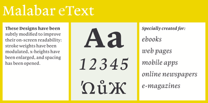 A clear and enjoyable reading experience hinges on the legibility of text copy, especially when reading on screen. This is why Monotype has developed the eText collection of fonts specifically tailored for the text-heavy display environments of e-readers, tablets, mobile devices, and the Web. The original Malabar was designed by Dan Reynolds.
 - Unytour by NicolassFonts,
$25.00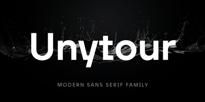 Unytour is a modern sans serif font family of 54 fonts. It includes nine weights with italics from Extra Light to Heavy. Each weight includes alternatives (A,G,I,R,a,l) and OpenType features. Unytour is easy to read and perfect for logotypes, advertising, packaging, book covers and magazines, headings, corporate identities, and more.
 - Snoserose Blackmetal by Madhaline Studio,
$34.00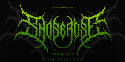 We RECOMMEND that you purchase both of these fonts to get the look like in the font preview image. Tutorial : https://www.youtube.com/@madhalinestudio Snoserose is a carefully crafted font, which features a very heavy black metal feel. Snoserose suitable for metal band logos, merchandise, clothing, apparel, or anything that needs a black metal feel.
 - Calhoun by Josh Grzybowski,
$19.99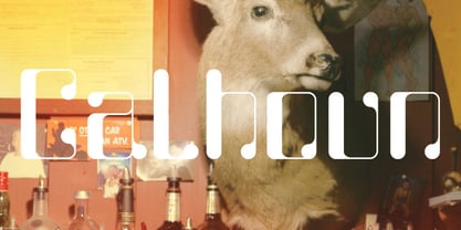 Built with both thick and thin lines this display font uses heavy round terminals giving this almost didone-style font a more playful and slightly stylish look. Perfect for magazines and publications as well as for identity and branding. The character set contains typical OpenType features in addition to small caps, and old style numbers.
 - Snemand by Hanoded,
$15.00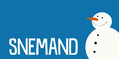 Snemand, in Danish, means Snowman. Quite appropriate for the last month of the year! The font is all caps, but upper and lower case letters can be interchanged and it includes alternates for all lower case letters. Snemand is a very legible font and has that great 'unevenish' look - making it a great typeface for packaging and books. Enjoy the snow - while it lasts and go out. You might even build a Snemand!
 - Hors by Dima Pole,
$21.00 Hors is name of Arian God, also it is an ancient name of Mercury. Hors is display font font family with 6 styles, including filled, outline, shadowed and others. Hors is a handmade type. Here are more than 500 glyphs and opentype features.
 - Linotype Pegathlon by Linotype,
$29.99Linotype Pegathlon is an unusual, eye-catching typeface, perfect for headlines and short texts. The bold strokes have a mystical, Asian touch and allow a large range of applications. Whether a text should look exotic or esoteric, Linotype Pegathlon is an excellent choice. - Martial Arts JNL by Jeff Levine,
$29.00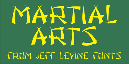 The 1946 foreign publication entitled "100 Alphabets Publicitaires" ("100 Advertising Alphabets") collects a number of interesting and attractive lettering samples for design inspiration. One such example is Asian-inspired and was re-drawn as the digital type face now named Martial Arts JNL.
 - Message Of The Birds by chicken,
$14.00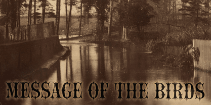 A handful of these spiky, sprightly letters made up the twittering title page of 'Message Of The Birds', a song by one Flora Warner, found in stacks of crumbling scores on an old upright piano in the basement of a favorite London bookstore.
 - Daisy by Ludwig Type,
$45.00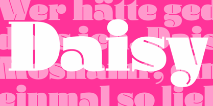 Daisy is an ultra-fat serif typeface with very fine counters.
 - Lastman - Unknown license

- Piss off the Professor - Unknown license

- Sport Shaded JNL by Jeff Levine,
$29.00Sport Shaded JNL is a classic block font with a cast shadow, perfect for any project for sports teams, college life or high school activities. - Kodaro by Vultype Co,
$39.00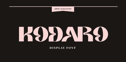 Kodaro font is an unique and quirky display typeface with unique curves and a dreamy flow. It loops and swoops in a delicate dance that is never boring. Use this dainty serif as a memorable logotype or header and pair it with something contrasting and clean. ( My suggestions: Futura/Lato/Montserrat )
 - Wiggles - Unknown license

- Wobbles - Unknown license

- Wibbles - Unknown license

- Bad Rascal by Mans Greback,
$69.00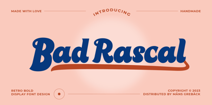 Bad Rascal is a script typeface. This flowing brush font in a fat style gives any project the attention it deserves. Use it for a bold logotype or headline to give your work that extra-bold look. Use underscore _ to make a swash underline. Example: Powers_ Use multiple underscores to make a swashes of different lengths. Example: Baddest_______ (Download required.) The Bad Rascal family consists of the fonts Regular and Italic. The font is built with advanced OpenType functionality and has a guaranteed top-notch quality, containing stylistic and contextual alternates, ligatures and more features; all to give you full control and customizability. It has extensive lingual support, covering all Latin-based languages, from Northern Europe to South Africa, from America to South-East Asia. It contains all characters and symbols you'll ever need, including all punctuation and numbers.
 - Artisoul Signature by Almeera Studio,
$15.00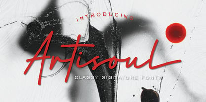 Artisoul is a handwritten signature script with a classy & natural flow. This collection of script characters is perfect for personal branding. Artisoul works well for many applications. Everything from personal branding and wedding invitations to advertising could benefit from this signature font such as photographers signature, cosmetics, watermark, liquor labels, signage, and any type of signature-styled logo. Artisoul Signature is a must-have script that has a diverse set of alternates that will surely be used many times in various projects in the future. Thanks and happy design.
 - Midnight Asylum by Kitchen Table Type Foundry,
$15.00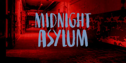 I have no fantastic story on how I came up the name to share with you. I am currently not in an asylum, nor will I be in the near future. I also finished this font way before midnight, so it is just a crazy name for a scary looking font! Midnight Asylum was made with a pencil and Chinese ink. It comes with a full set of alternates for the lower case letters, extensive language support and a cute .notdef character, which is also the alternate asterisk glyph.
 - Steampipe by Just My Type,
$25.00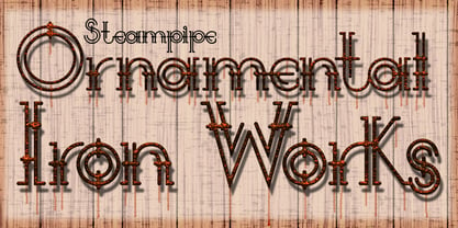 Jules Verne. Wild, Wild West. Tomorrowland. The Past’s extrapolation of the Future. So it was wrong, it’s still romantic. Steampipe is a font constructed of bits and pieces, reminiscent of the ironwork construction of the Crystal Palace or the inner workings of The Time Machine. Although it works fine as is, it comes alive with some Photoshop Layer Styles. Steampipe has the most extensive kerning of any font I've designed, just so (most) letters fit together as if they were constructed as a unit; use them in a program that supports special kerning.
 - Autoray by PizzaDude.dk,
$16.00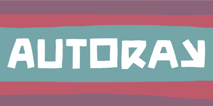 Usually fonts that are related to computers, space, future are not handmade, but rather digital made. Autoray is 100% handmade, and I am not sure which category it fits in. It has this futuristic and intergalactic look, but at the same time the handmade details are pointing in a more grafitti and comic way. I will let you decide where to go with Autoray! I have added 5 different versions of each letter, and they automatically changes as you type - and of course, there's multilingual support - and even intergalactic gravity! :)
 - Finocchio by The Ampersand Forest,
$45.00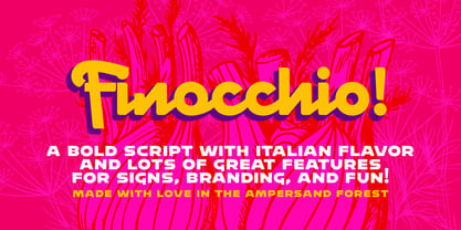 Finocchio (yes, we know — wink) has the playful, round shapes of a French Ronde with the sharp angles of Italian Futurism. It's a bold, fun, excellent branding face — wherever you need some gusto or brio or forza! Finocchio comes with a large number of ligatures for fluidity. It also comes with a solid, readable set of non-script small caps, so all you need for that sign is one coordinated font! It also comes with loads of fun alternates! Finocchio is made with love in The Ampersand Forest.
 - Hypers Techno by Sipanji21,
$24.00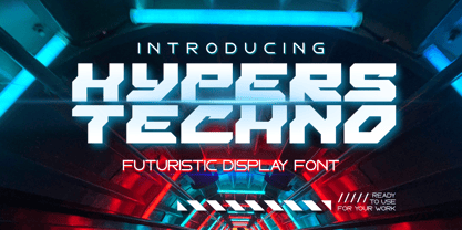 "Airwars" is a display font with a modern, space, and futuristic theme. This font reflects elements of technology and innovation often associated with modern and futuristic designs. The use of a space theme can also add a sense of space exploration and cosmic wonder to your design. "Airwars" is suitable for a variety of design projects that aim to emphasize these aspects, including space-themed designs, advanced technology, advertisements for futuristic products, and much more. With "Airwars," you can create designs that reflect a vision of the future and space exploration.
 - Fright Hours by Sarid Ezra,
$15.00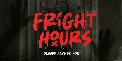 Fright Hours is a rough handwritten font with horror & freaky vibes! This font contains the regular and the bloody versions that you can combine to get the best result. This font is very suitable for poster movies especially thriller & horror movies. With unique lowercase, this font will make your poster or your craft more creepy and stunning! You also can use this font for any design because of the versatility in this font. Also, this font support multi language. This is your next halloween font for your future event!
 - Linotype Alphabat by Linotype,
$29.99Jan Tomáš studied at the Universität der Künste, Berlin. He is a multi-talent – the author of many ideas, a font creator, designer, modeller, technician and web designer. In 2011, he founded Future Typo, the first web portal for advanced typography with original design typefaces and 3D typefaces. When you look closely to Linotype Alphabat, the figures start to change from letters into flying bats and scary faces. Linotype Alphabat can be used for very short texts however it is particularly effective for headlines in larger point sizes so that its details are emphasized. - Marco Polo by Linotype,
$29.99Franko Luin, Marco Polo's designer, on this typeface: Marco Polo is a 'massacrated' oldstyle typeface that can be used in the same way as, e.g., Caslon Antique. I designed it - if the word design is appropriate in this case - to give the users an alternative so that they are not always directed to the same choice. For the same reason I made Marco Polo rounder. The name comes from the famous Venetian globetrotter, who has nothing at all to do with the typeface, since printing and punchcutting were still an invention of the future. - Gunterz by Locomotype,
$22.00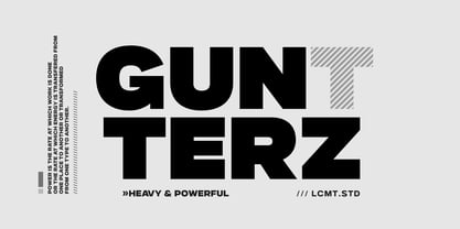 If you like a bold and powerful all-caps sans-serif font to make your message stand out, Gunterz can be the choice to maximize your goals. Available in four weights and its matching italics, Gunterz is designed to meet font needs in a variety of different situations. To make it more attractive, Gunterz also provides opentypes features such as stylistic alternates and a stylistic set. Others, this font also supports Cyrillic language. Gunterz is suitable for poster titles, packaging design, headlines, logotypes, motion graphics, movie titles, sports promotion and future technology.
 - Dryer Grain by Patrick Dewenter,
$-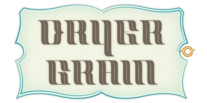 This typeface is intended for use with single words or phrases at a large point size. Suggesting some sort of calligraphic inspiration, I sketched a couple of these letters while creating a logo concept and decided to make a complete alphabet. The stroke through the letterforms adds some interest and elegance, although I believe this typeface expresses a sort of vehement or serious character. This is my new, and first, typeface. I plan to create more in the future. If you use it for anything interesting, I'd love to see!
 - Spacepod by astroluxtype,
$20.00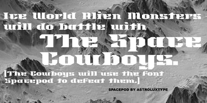 astroluxtype’s Spacepod is a headline display font set. The font contains uppercase and lowercase letterforms with a minimum glyph set. The style suggests weird sci fi from the 1970’s or the far future... you decide? Is this the font for your sci fi western book cover title with a nod to The Matrix in the story or a poster for the movie remake of Westworld? Wherever your ship takes you in the universe Spacepod should be the letterforms on the side of your craft that states, “No rides for damn dirty apes!”
 - Uncencored Halloween by Ably Creative,
$12.00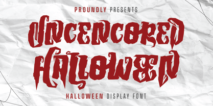 Uncensored Halloween is a cute font for Helloween. Expertly designed to become a true favorite, this font has the potential to take your every creative idea to the highest level! Add it to any of your Halloween-related designs and see how to make it come alive, add this font to your creative ideas and see how to make it so scary. An uncensored Halloween font, eye-catching, cute horror-style font for you to use in your future projects. With this unique font, you're sure to make your designs stand out!
 - Relic Forest Island 3 by Jehansyah,
$9.00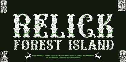 Relic forest island III, This is the newest font from the previous generation, Relic island I and Relic Island II, this design comes with a more detailed touch with very charming carvings, comes with several families that you can make your best design choice for later this year and in the future, with several monograms and families that you can choose according to your design, this design will add inspiration to your project, and see, how it will work for you, and make this font your best choice thank you very much
 - Spark Sans by Primitive Spark,
$5.00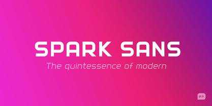 Spark a revolution for a better future with Spark Sans. Super clean and geometric, this display typeface is ideal for tech, transportation, electronic music, revolutionary products or other disruptive ideas that move us beyond the present. Spark Sans has a relatively high x-height and squared off curves that give it a distinctive look while still maintaining a minimalist aesthetic. The design originated with custom lettering for the Primitive Spark identity, which became the foundation for the bold style. With 260 glyphs, Spark Sans is a great choice for many languages with Latin characters.
 - Wavelength by Mysterylab,
$8.00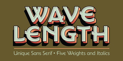 Wavelength is a unique sans serif family of five weights and italics. For all of it's unusual detailing and arc-shaped strokes, this typeface is a solid workhorse, and is highly legible at all sizes. It's an excellent starting point for a unique logotype or offbeat headline, and is able to cross genres and styles because of its essential letterform simplicity. Wavelength is contemporary, but with a nod to 1930s art deco, streamline, and even 1990s tech futurism. It's great all-arounder that works well with shadows, outlines, extrusions added within vector editing programs.
 - AT Bubley by Amera Type,
$20.00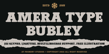 Inspired by the archive of music flyers and skateboarding magazine created in the early 90s. Bubbley is made for the purposes of making posters, magazine headers, book titles, flyers and other print media. Bubbley is made for digital needs that are more modern but still have a vintage feel Every line and curve in letterform is made for the needs of the future industry, the latest version in the modern lettering industry. Bubbley is very suitable to be combined with the illustrations that we provide for free, to complete your needs
 - Cute - Personal use only

- Aukim ExtraBold - Personal use only


