10,000 search results
(0.046 seconds)
- Problematic Piercer - Personal use only

- We2000 - Unknown license

- HVD Rowdy - 100% free

- Lady Ice - 3D - Unknown license

- Solange - Unknown license

- Future Imperfect - Unknown license

- Behrensschrift - Unknown license

- Daybreaker - Unknown license

- Levity - Unknown license

- Alfabetix - Unknown license

- Tikitype - Unknown license

- Obey Obey Obey by Comicraft,
$19.00
- SF Droob Pro by Sultan Fonts,
$19.99
- Ametrine by Tanincreate,
$16.00
- Home Address JNL by Jeff Levine,
$29.00
- Flower Shop JNL by Jeff Levine,
$29.00
- Single Line Deco JNL by Jeff Levine,
$29.00.png)
- Chedros by Surotype,
$15.00
- Evening Dress JNL by Jeff Levine,
$29.00
- Crayon Hand by Letters&Numbers,
$28.00
- Tattoo Master by Vozzy,
$10.00
- Beverage Stencil JNL by Jeff Levine,
$29.00
- French Geometric JNL by Jeff Levine,
$29.00
- Lino by Kmaz,
$10.00
- Lenolove by Balevgraph Studio,
$10.00
- Scratchedman by OCSstudio,
$12.00
- Page Printer JNL by Jeff Levine,
$29.00
- Old Spur Stencil JNL by Jeff Levine,
$29.00
- Upbeat by Jeff Levine,
$29.00
- Cut by Turtle Arts,
$20.00 - My Aunt Celia by Quadrat,
$25.00
- Flowrite by VP Creative Shop,
$15.00
- Stand By Me by Natural Ink,
$12.00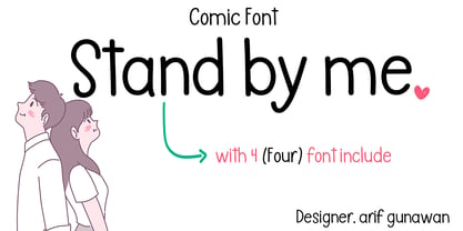
- Stencil Product JNL by Jeff Levine,
$29.00
- Fresh Orange by Lettersams,
$12.00
- Junglegym by Atlantic Fonts,
$26.00
- Amity Signature by Lemonthe,
$13.00
- Penwrite JNL by Jeff Levine,
$29.00
- Sluggo by Patricia Lillie,
$29.00 - Dea Githa by Gatype,
$12.00


