893 search results
(0.035 seconds)
- Fashion Didot by BA Graphics,
$45.00 Exquisite design, delicate but yet strong enough to make a statement. Just right for that special occasion.
 - Firmin Didot by URW Type Foundry,
$35.00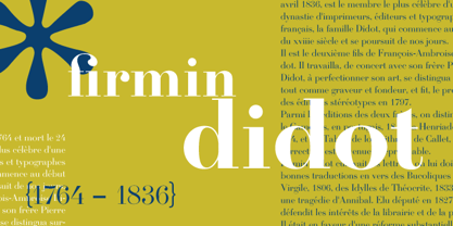
- Linotype Didot by Linotype,
$29.00 Linotype Didot™ was drawn by Adrian Frutiger in 1991, and is based on the fonts cut by Firmin Didot between 1799 and 1811. Frutiger also studied the Didot types in a book printed by the Didots in 1818, "La Henriade" by Voltaire. This beautifully drawn family is the right choice for elegant book and magazine designs, as well as advertising with a classic touch.
 - Didot Headline by Canada Type,
$24.95 In spite of its name, this font family embodies the ultimate classic modern advertising typeface, rather than concern itself with revivalism or Didone authenticity. Naturally the spirit of the original Didot faces still exists in this family, but over twelve years of work on it have made it more fitting to the luxurious expression of our day and age, rather than nineteenth century Europe. Upscale and stylish, Didot Headline is an essential tool for any designer involved in magazines, books, tasteful music, or overall luxury packaging that requires clean and large classic typography with an unmistakable modern spin. We recommend the use of Didot Headline between 12 and 48 points. For larger display use, check out its sister family, Didot Display.
 - Didot Display by Canada Type,
$24.95 In spite of its name, this font family embodies the ultimate classic modern advertising typeface, rather than concern itself with revivalism or Didone authenticity. Naturally the spirit of the original Didot faces still exists in this family, but over twelve years of work on it have made it more fitting to the luxurious expression of our day and age, rather than nineteenth century Europe. Upscale and stylish, Didot Display is an essential tool for any designer involved in magazines, books, tasteful music, or overall luxury packaging that requires clean and large classic typography with an unmistakable modern spin. We recommend the use of Didot Display at 48 points and over. For 12-48 pt. use, check out its sister family, Didot Headline.
 - Aviano Copper Variable by insigne,
$199.99 The retro-inspired design of Aviano Copper Variable echos the bold style of America’s Gilded Age. Inspired by the copper-inscribed intaglio printing designs of the early 20th century, the powerful, wide character shape of this font walks softly across your page while carrying a big stick. To create the right balance, small wedge serifs were added onto Aviano Sans, giving you a sophisticated style that looks and acts like it belongs nowhere short of Boardwalk. Developed to a new level of excellence, this design offers a wide range of weights from thin to black. There's full multilingual support of all Latin-based languages and five stylistic sets, swash designs, and 1000 glyphs per weight, including some unique ligatures. Number options include old style figures, tabular figures, and superscripts. Unique median spur alternates, swashes, and ligatures will help you customize every single design. The feel of last century’s personal and business correspondence is waiting for you in this member of the Aviano family. While ideal for headings, displays, logos, and short texts, Aviano Copper’s use for everything from letterhead to wine labels may just give you the monopoly you’re looking for.
 - Aviano Sans Layers by insigne,
$19.00 With this charismatic new type system, the possibilities are as large as your vision behind them. Achieve the impact you're looking for by layering the different fonts and colorations for a custom, hand-drawn look that likes to be noticed. Play around with the potential. Create effects such as realistic 3D looks by adding centerlines, dotted centerlines, and shadow variations. Inspired by the affable look of vintage handmade signage, the Aviano Sans Layers spacing accommodates these shadows and other features well with its generous width and helps you hit your message home. Try mixing it with the other members of the Aviano Hyperfamily, too. There are lots of funky options for you to explore. See what you can create with Aviano Sans Layers!
 - Aviano Future Variable by insigne,
$99.99 Because you demanded it, the Aviano series is back with a variable version of the futuristic sans serif Aviano Future. Aviano Future’s strong letterforms will make you look like a rock star. Aviano Future Variable is a medium-contrast sans serif titling face that has a bold and futuristic look. It has a bowed square shape which gives it an interesting appearance that is both unique and eye-catching. Given that it has a variable axis any weight can be selected with no loss of clarity or legibility. Aviano Future's expanded forms give the letterforms heft and intensity. Aviano Future is a powerful yet adaptable title face that builds on the award-winning traits of Aviano and elevates them. Aviano Future Variable contains a ton of OpenType capabilities and comes in ten different defined weight instances with "fast" italic forms for emphasis. Want to use more traditional rounded forms? Need swash forms? Art Deco alternates? Aviano Future includes 400 alternate characters. Twelve style sets are available, two sets of art deco inspired alternates, small forms, tough swash, constructivist titling and traditional stylistic alternates. Aviano Future also includes 40 discretionary ligatures for artistic typographic compositions. Additionally, there are glyphs in this family to accommodate a variety of languages, and Cyrillic support was added in 2022. An extensive selection of sans serif typographic systems can be found in the Aviano family. The typefaces can be used alone or in combination to suit the needs of any project. The family's fonts have all been meticulously designed to assist ensure maximum impact and usability at any size. Aviano, Aviano Serif, Aviano Sans, Aviano Didone, Aviano Flare, Aviano Copper, and Aviano Slab are presently part of the Aviano collection. A skilled designer who wishes to create a technological, futuristic, or epic design should consider Aviano Future. Aviano Future Variable will make your design stand out from the competition, regardless of whether you are designing a logo, poster, flyer, website header, or banner ad. Why wait? With the exciting and versatile Aviano Future Variable at your disposal, reach new heights and create a brand that stands out from the rest.
 - Avain - Personal use only

- Amano - Unknown license

- Viant by Mecanorma Collection,
$45.00 - Aviator by T-26,
$25.00 - Arian by Linotype,
$187.99 For decades, the Persian-born Naghi Naghashian has been working as a graphic designer and illustrator in Germany. Arian™ is his first commercial Arabic typeface. Named after his mother, Naghi created the Arian typeface family after years of systematically analyzing the Arabic script. The Arian design is sought to fulfill the many needs and was developed for multiple languages and writing conventions. It's extremely legibilitable not only in small sizes, but also when the type is filtered or skewed. This typeface offers a fine balance between calligraphic tradition and the contemporary sans serif aesthetic now common in Latin typography.
 - Avayo by Fontop,
$11.00 Avayo is a modern sans serif typeface. It is perfect for creating alphabet logos, branding, titles, headlines, but also looks great when being used casually, in copies and texts. Avayo looks simple but special and distinct and is defined by its round cut design. Avayo font family comes in five weights to help you choose the best option depending on your purpose.
 - Viant by URW Type Foundry,
$35.99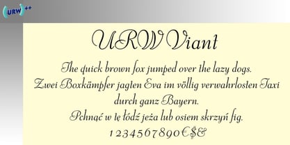
- Amino by Cadson Demak,
$35.00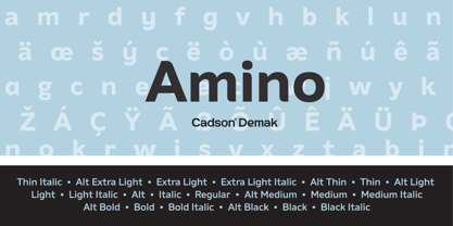
- Avion by Fenotype,
$25.00 Despite what some might say, you can’t just always go for that most ubiquitous font in the world, can you? Avion font family channels those cool modernist vibes yet brings something new to the table. With a slightly more rectangular approach and some clever detailing, Avion has a distinct look of its own, yet provokes a calming familiarity of neutrality and objectiveness. As goes without saying, it’s also equipped with a sensible amount of features that make it a true, versatile workhorse. Get on board.
 - Anino by ActiveSphere,
$30.00
- Avionic by Grype,
$16.00 The aviation world contains loads of stylish logotypes, from handwritten scripts to geometric styles and so on. The Avionic Condensed family finds its origins of inspiration in the Air China company logotype, and from there has been expanded upon to create a large stylistic family of 40 fonts. Avionic celebrates the geometric sans serif styling of the original logotype, evolving beyond the condensed all capital set logo to include a lowercase designed in parity with the original design style, as well as many weights and widths to offer a fresh diversity. Each subfamily includes a full standard character set with expansive international support of latin based languages, and 5 weights jumping from book to black, along with 5 accompanying obliques. This family is ready to chart a course for your design destination, whatever it may be. Here's what's included with the Avionic Family bundle: 370 glyphs per style - including Capitals, Lowercase, Numerals, Punctuation and an extensive character set that covers multilingual support of latin based languages. 5 weights in each subfamily: Book, Regular, Bold, Heavy, & Black. • 4 widths in the collection: Condensed, Regular, Wide, and Extra Wide. Accompanying Obliques with each weight/width style. Fonts are provided in TTF & OTF formats. The TTF format is the standard go to for most users, although the OTF and TTF function exactly the same. Here's why the Avionic Collection is for you: You're in need of a dynamic geometric font with a variety of weights and widths for your designs You're an aviation junkie and have to have anything inspired by Air China You love the style of Bank Gothic, but really want something just a little different You are looking for a pseudo-techno style font family with versatility You just like to collect quality fonts to add to your design arsenal
 - Alian by T-26,
$19.00 - Arinoe by Azzam Ridhamalik,
$10.00 Arinoe is a cool display font that embodies uniqueness and authenticity in every character. Get inspired by its rustic feel, and use it for your lovely creative projects! FEATURES : Uppercase Lowercase Number Punctuation Multilingual PUA Encode Opentype
 - Dijon Stencil JNL by Jeff Levine,
$29.00 A vintage French metal marking stencil for Comandon and Company was the inspiration for the 1400th type design from Jeff Levine Fonts. Dijon Stencil JNL is a condensed serif design with thin stroke weights and is available in both regular and oblique versions.
 - HiH Firmin Didot by HiH,
$10.00 Before Bodoni, there was Didot. With the publication by Francois Ambroise Didot of Paris in 1784 of his prospectus for Tasso’s La Gerusalemme Liberata, the rococo typographical style of Fournier de Jeune was replaced with a spartan, neo-classical style that John Baskerville pioneered. The typeface Didot used for this work was of Didot’s own creation and is considered by both G. Dowding and P. Meggs to be the first modern face. Three years later, Bodoni of Parma is using a very similar face. Just as Bodoni’s typeface evolved over time, so did that of the Didot family. The eldest son of Francois Ambroise Didot, Pierre, ran the printing office; and Firmin ran the typefoundry. Pierre used the flattened, wove paper, again pioneered by Baskerville, to permit a more accurate impression and allow the use of more delicate letterforms. Firmin took full advantage of the improved paper by further refining the typeface introduced by his father. The printing of Racine’s Oeuvres in 1801 (seen in our gallery image #2) shows the symbiotic results of their efforts, especially in the marked increase in the sharpness of the serifs when compared to their owns works of only six years earlier. It has been suggested that one reason Bodoni achieved greater popularity than Didot is the thinner hairlines of Didot were more fragile when cast in metal type and thus more expensive for printers to use than Bodoni. This ceased to be a problem with the advent of phototypesetting, opening the door for a renewed interest in the work of the Didot family and especially that of Firmin Didot. Although further refinements in the Didot typeface were to come (notably the lower case ‘g’ shown in 1819), we have chosen 1801 as the nominal basis for our presentation of HiH Firmin Didot. We like the thick-thin circumflex that replaced the evenly-stroked version of 1795, possible only with the flatter wove paper. We like the unusual coat-hanger cedilla. We like the organic, leaf-like tail of the ‘Q.’ We like the strange, little number ‘2’ and the wonderfully assertive ‘4.’ And we like the distinctive and delightful awkwardness of the double-v (w). Please note that we have provided alternative versions of the upper and lower case w that are slightly more conventional than the original designs. Personally, I find the moderns (often called Didones) hard on the eyes in extended blocks of text. That does not stop me from enjoying their cold, crisp clarity. They represent the Age of Reason and the power of man’s intellect, while reflecting also its limitations. In the title pages set by Bodoni, Bulmer and Didot, I see the spare beauty of a winter landscape. That appeals to a New Englander like myself. Another aspect that appeals to me is setting a page in HiH Firmin Didot and watching people try to figure out what typeface it is. It looks a lot like Bodoni, but it isn't!
 - Linotype Didot eText by Linotype,
$50.99 A clear and enjoyable reading experience hinges on the legibility of text copy, especially when reading on screen. This is why Monotype has developed the eText collection of fonts specifically tailored for the text-heavy display environments of e-readers, tablets, mobile devices, and the Web.
 - Ariana Script by Zane Studio,
$20.00 Introducing a new, elegant Ariana Script Font! If you need a casual chic calligraphic touch to your designs, this font is made for you! Ariana Script is built with OpenType features and includes start and end swashes, alternative characters for lowercase and uppercase letters, lots of different swash alternatives for lowercase, numbers, punctuation, alternatives, ligatures and also supports other languages :) More than 400 engines fly! If you don't have opentype capable software, you can still access all ligatures, alternatives and swash alternatives by installing all the supporting fonts included in the download. From there, you can switch between the two as you type for a handwritten, professional look. Take a look at the character map to help you along the way! Thank you very much for visiting my shop! All the best,
 - Ariana Pro by Mostardesign,
$25.00 Ariana Pro is a geometric font family. It provides advanced typographical support with features such as case sensitive forms, small caps, ligatures, alternate characters, fractions, circled gures, pro kerning…This typeface comes with a complete range of ligature set options. It comes in 9 weights with corresponding italics and it’s suited for multiple purposes including editorial use, web font, apps, digital ads and also for advertising, long text and branding. As a modern sans serif font family, Ariana Pro has also an extended character set to support Central and Eastern European as well as Western European languages.
 - Anziano Pro by MAC Rhino Fonts,
$59.00 Anziano follows the direction staked out with Delicato. When creating traditional typefaces, it is inevitable to be influenced by earlier designs. Anziano does show touches of another classic typeface – Weiss (by Emil Rudolf Weiss, 1926). Weiss is often misjudged and overlooked. Perhaps the most well known Swedish typeface – Berling (by Karl-Erik Forsberg, 1914–1995) is actually based largely on Weiss. MRF have appreciated the design of Weiss uprights for a long time. When Stefan Hattenbach bought the first Swedish edition of The Lord of the Rings (1959–61), in 2004, he was amazed by the excellent flow of the text presented on each page. Despite the very original character that Weiss has, it was a pleasure to read a book set in such a typeface. MRF realized that several major foundries had already done interpretations of Weiss, more or less true to the original. MRF didn’t want to add on to that list! Instead Stefan tried to find his own path. Anziano consists of three core styles, Regular, Italic and Bold; each with small caps, ornaments, stylistic ligatures, and extended Latin accents. Lining, tabular, oldstyle and smallcap numerals help round out Anziano’s typographic range and function.
 - Avante Go - Personal use only

- Asian Girl - Unknown license

- Avante Return - Unknown license

- Asian Dings - Unknown license

- Piano Teacher by Haksen,
$14.00 This font is about fleeting vision, touch of moments. some letters may be illegible, but their shapes arouses emotions. sometimes in design emotions are more important. our brain can uncode the letter shapes.It includes full set of uppercase and lowercase letters, multilingual symbols, numerals, punctuation and ligatures. The font has bold texture. Thanks and have a great day, Haksen Studio
 - Asian Scroll by Okaycat,
$29.50 Asian Scroll contains many kanji symbols laid out in the regular English keyboard layout for easy access to these special characters. In your capitals, you'll see each symbol here is subtitled with a small English translation indicating the meaning of the symbol. Asian Scroll brings these symbols to you in dry brush and wet. Please see the gallery picture to see which keys are used to access the kanji symbols.
 - FF Avance by FontFont,
$65.99 Dutch type designer Evert Bloemsma created this serif FontFont in 2000. The family contains 4 weights: Regular, Italic, Bold, and Bold Italic and is ideally suited for book text, editorial and publishing, small text as well as web and screen design. FF Avance provides advanced typographical support with features such as ligatures, small capitals, alternate characters, case-sensitive forms, fractions, and super- and subscript characters. It comes with a complete range of figure set options – oldstyle and lining figures, each in tabular and proportional widths.
 - Piano Keybuild by Type Minds,
$5.00 Piano Keybuild is a small font designed for creating piano keyboard layouts. It was inspired by my Yamaha CLP-840, a wonderful digital piano. The face consists entirely of keyboard keys that can be combined to form realistic keyboards. These keys come in four styles: basic outlined keys, filler keys (for adding a second color inside the outlines), keys with note names, and pre-made sets of keys. Keys of a given kind will kern with one another, but only in the order that they would naturally occur on a keyboard. (This makes it easier to spot incorrect key sequences.) It also includes digits 0 through 9 inspired by numerals used in traditional music notation. The user guide (PDF under Gallery tab) demonstrates the locations of all the glyphs as well as how to use them together effectively.
 - Accia Piano by Mint Type,
$39.00 Accia Piano is a quiet, friendly serif typeface. Its relatively short serifs, low contrast and large x-height will make a perfect appearance in newspapers as well as branding projects. The font family contains 8 weights from Thin to Extra Bold, with matching true italics. It supports extensive language support including Cyrillic, as well as numerous OpenType features such as small caps, ligatures, several sets of figures, case-sensitive punctuation, ordinals. Accia Piano is a member of Accia Type System. It encompasses five typefaces ranging from sans-serif to expressive serif, giving you the possibility to create sophisticated cohesive designs. Accia Type system consists of Accia Sans, Accia Flare, Accia Piano, Accia Moderato, and Accia Forte.
 - Pollana Giano by Javanice Studio,
$16.00 Introducing Pollana Giano by Javanice Studio Pollana Giano is A Handwritten Font Pollana Giano is perfect for branding project, apparel, labels, magazines, books, greeting / wedding cards, packaging, fashion, make up, stationery, and any type of advertising purpose or just used to express words above the background. This font includes OTF&TTF&Woff, Pollana Giano also multilingual support. Enjoy the font, feel free to comment or feedback, send me PM or email.
 - Reluctant Aviator by Hanoded,
$15.00 I read something interesting the other day: in 1910 a cat called Kiddo snuck on board an airship and was found by aeronaut Walter Wellman - after he had already taken off in an attempt to cross the Atlantic Ocean. Wellman and Kiddo spent 71 hours aboard the airship, but never completed the journey, due to engine problems and foul weather. Luckily, they were both rescued. It was a funny story, so I decided to name a font after it. Reluctant Aviator is a handmade font (pen and paper). It has a rough edge, some shaky glyphs and a lot of bravado. Comes with diacritics and swashes.
 - Par Avion by Greater Albion Typefounders,
$15.00 Par Avion's design draws something of its inspiration from the wings of the old BSA Motorcycles logo and was developed in parallel with our Vinea typeface family. “Par Avion” means ‘By Air’ - remember those little blue stickers in the Post Office - for sending Air Mail? We think this typeface design has a lovely streamlined feel of the early jet-era about it.
 - Asian Sumi by Mvmet,
$15.00 Asian Sumi is a beautiful and playful sumi brush ink on paper handmade font. You can use it for anything ranging from t-shirts, book designs, and greeting cards to stickers and posters, packaging designs or anything that needs a casual touch, it will be your perfect font to pick. Fall in love with its incredibly versatile style, and use it to create lovely designs!


