10,000 search results
(0.052 seconds)
- Displatter by Sronstudio,
$15.00 Displatter is a natural hand-brushed font, this font is perfect for logo, invitation, stationery, wedding designs, social media posts, advertisements, product packaging, product designs, label, photography, watermark, special events or anything. Displatter comes with full set of uppercase and lowercase letters, multilingual symbols, numerals, punctuation and ligatures. Thank You, Sronstudio
 - Aromi by Atom,
$15.00 Aromi is a modern and cool script font with amazing swashes. Use it to turn any design project into a standout! Just perfect for those who love to create whimsical collages, e-newsletters, web banners and quotes to skyrocket on social media, especially Pinterest! Have a great day! Thank you :)
 - Midspicy by Allouse Studio,
$16.00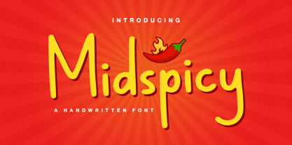 Midspicy A Handwritten Font. It is perfect for any titles, logo, product packaging, branding project, magazine, social media, wedding, or just used to express words above the background. Midspicy also come with Multi-Lingual Support. Enjoy the font, feel free to comment or feedback, send me PM or email. Thank You!
 - Vanny Orewa by Kaidosan,
$18.00 Vanny Orewa is a cool display font with 900 glyphs in it, consisting of a modern and unique style with elegant alternates and leagues. Fall in love with its incredibly versatile style and use it to create beautiful wedding invitations, beautiful stationary art, eye-catching social media posts, and more
 - Mystica by Aestherica Studio,
$12.00 Introducing the new Fun Handwritten Font by Aestherica Studio. Proudly Present, Mystica Mystica is perfect for product packaging, branding project, megazine, social media, wedding, or just used to express words above the background. Mystica also multilingual support. Enjoy the font, feel free to comment or feedback, send me PM or email.
 - Polar Press by Attype Studio,
$14.00 Polar Press is a vintage all caps font with 2 styles: clean and rough, and includes 22 ligatures. Polar Press is a strong font and is perfect for branding, logos, invitations, stationery, social media posts, product packaging, merchandise, blog design, game titles, retro style design, Book/Cover Titles and more.
 - Agave Azul by Fat Hamster,
$25.00 Agave Azul - Hand made old typewriter font Agave Azul Artisan font is perfect for tequila & mezcal label and packaging design, social media quotes, logo & branding design, apparel design, whiskey, beer label and packaging design, heading, scrapbooking, calendars, book covers. Don't forget to use bonus logos, marks and labels for your designs.
 - Playcute by Patria Ari,
$15.00 Introducing, Playcute - a fun kids display typeface with solid shapes but still fun. With uppercase and lowercase option, you can play different glyph shapes to get the best combination. With this font, you can use it for book and magazine cover, social media, headline, logo, digital products, and more. Thank You!
 - Jaosamnak by Jipatype,
$17.00Introducing Jaosamnak, an exquisite typeface that inspiration from Chinese brush calligraphy. With its graceful curves, fluid lines, and simplify, Jaosamnak brings a timeless elegance to your designs. This typeface is tailored for versatility, making it perfect for various applications such as text headlines, sub-headlines, packaging, posters, and other print media. - Realistic Theory by Figuree Studio,
$18.00 Introducing Realistic Theory! Realistic Theory! is strong hand-drawn brush font that combines attractive curves with a fresh urban edge; delivering a stylish brush font that is guaranteed to add an eye-catching appeal to your logo designs, brand imagery, handwritten quotes, product packaging, merchandise, social media post, or website font.
 - Avoiste Laverta by Ilhamtaro,
$19.00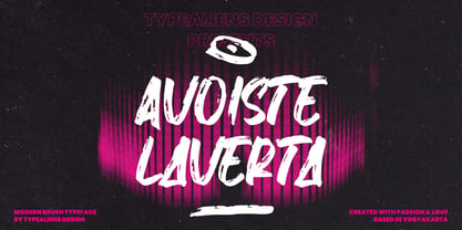 AVOISTE LAVERTA is a display font with a brush texture. Modern in nature suitable for social media design and branding. This font is allcaps font. To enable the OpenType Stylistic alternates, you need a program that supports OpenType features such as Adobe Illustrator CS, Adobe Indesign & CorelDraw X6-X7. Cheers!
 - Jingle Binder by Balpirick,
$15.00 Jingle Binder is a Modern Handwritten Bold Font. Jingle Binder is perfect for product packaging, branding project, magazine, social media, wedding, or just used to express words above the background. Jingle Binder also multilingual support. Enjoy the font, feel free to comment or feedback, send me PM or email. Thank you!
 - Uncle Hours by Adante Creative,
$23.00 Introducing by Adante.Creative Proudly Present, Uncle Hours Uncle Hours is A Bold Display Typeface Font Uncle Hours is perfect for product packaging, branding project, megazine, social media, wedding, or just used to express words above the background. Enjoy the font, feel free to comment or feedback, send me PM or email.
 - Southen by Garisman Studio,
$20.00 SOUTHEN combines attractive curves with a fresh urban edge; delivering a stylish script which is guaranteed to add an eye-catching appeal to your logo designs, brand imagery, handwritten quotes, product packaging, merchandise & social media posts Advantages: - Simple installation - Works for PC and MAC - Multilingual Support - Extra Swashes - Detailed dry brush
 - Oyscake by Allouse Studio,
$16.00 Proudly Present, Oyscake a Handwritten Font. Oyscake is perfect for any titles, logo, product packaging, branding project, megazine, social media, wedding, or just used to express words above the background. Oyscake also come with Multi-Lingual Support. Enjoy the font, feel free to comment or feedback, send me PM or email.
 - Waston by Burnoth Design Co.,
$19.00 Waston is a beautiful and inspiring set of classical typography glyphs based on a minimal and simplistic approach to elegance Waston is a classic serif font made for headlines, titles, and is well-suited for advertising, fashion mood board, branding, logotypes, packaging, titles, editorial design and modern and social media.
 - Forsty Candy by Balpirick,
$15.00 Forsty Candy is a Fun Display Hand-brushed Font. Forsty Candy is perfect for product packaging, branding project, megazine, social media, wedding, or just used to express words above the background. Forsty Candy support multilingual. Enjoy the font, feel free to comment or feedback, send me PM or email. Thank you!
 - ITC Legacy Serif by ITC,
$40.99 ITC Legacy¿ was designed by American Ronald Arnholm, who was first inspired to develop the typeface when he was a graduate student at Yale. In a type history class, he studied the 1470 book by Eusebius that was printed in the roman type of Nicolas Jenson. Arnholm worked for years to create his own interpretation of the Jenson roman, and he succeeded in capturing much of its beauty and character. As Jenson did not include a companion italic, Arnholm turned to the sixteenth-century types of Claude Garamond for inspiration for the italics of ITC Legacy. Arnholm was so taken by the strength and integrity of these oldstyle seriffed forms that he used their essential skeletal structures to develop a full set of sans serif faces. ITC Legacy includes a complete family of weights from book to ultra, with Old style Figures and small caps, making this a good choice for detailed book typography or multi-faceted graphic design projects. In 1458, Charles VII sent the Frenchman Nicolas Jenson to learn the craft of movable type in Mainz, the city where Gutenberg was working. Jenson was supposed to return to France with his newly learned skills, but instead he traveled to Italy, as did other itinerant printers of the time. From 1468 on, he was in Venice, where he flourished as a punchcutter, printer and publisher. He was probably the first non-German printer of movable type, and he produced about 150 editions. Though his punches have vanished, his books have not, and those produced from about 1470 until his death in 1480 have served as a source of inspiration for type designers over centuries. His Roman type is often called the first true Roman." Notable in almost all Jensonian Romans is the angled crossbar on the lowercase e, which is known as the "Venetian Oldstyle e."" Featured in: Best Fonts for Logos
 - ITC Legacy Sans by ITC,
$40.99 ITC Legacy¿ was designed by American Ronald Arnholm, who was first inspired to develop the typeface when he was a graduate student at Yale. In a type history class, he studied the 1470 book by Eusebius that was printed in the roman type of Nicolas Jenson. Arnholm worked for years to create his own interpretation of the Jenson roman, and he succeeded in capturing much of its beauty and character. As Jenson did not include a companion italic, Arnholm turned to the sixteenth-century types of Claude Garamond for inspiration for the italics of ITC Legacy. Arnholm was so taken by the strength and integrity of these oldstyle seriffed forms that he used their essential skeletal structures to develop a full set of sans serif faces. ITC Legacy includes a complete family of weights from book to ultra, with Old style Figures and small caps, making this a good choice for detailed book typography or multi-faceted graphic design projects. In 1458, Charles VII sent the Frenchman Nicolas Jenson to learn the craft of movable type in Mainz, the city where Gutenberg was working. Jenson was supposed to return to France with his newly learned skills, but instead he traveled to Italy, as did other itinerant printers of the time. From 1468 on, he was in Venice, where he flourished as a punchcutter, printer and publisher. He was probably the first non-German printer of movable type, and he produced about 150 editions. Though his punches have vanished, his books have not, and those produced from about 1470 until his death in 1480 have served as a source of inspiration for type designers over centuries. His Roman type is often called the first true Roman." Notable in almost all Jensonian Romans is the angled crossbar on the lowercase e, which is known as the "Venetian Oldstyle e."" ITC Legacy® Sans font field guide including best practices, font pairings and alternatives.
 - Copperplate New by Caron twice,
$39.00 Imagine America in the 1930s. A gangster flick with Al Capone, a crime novel featuring Philip Marlowe. Our hero in a fedora sits in a classy bar, orders a double bourbon, lights a cigar and eyes the evening paper. He turns the pages, reading about a bank heist over on Third Avenue, a scandal involving a baseball player, a small ad for a general practitioner and a large spread about a famous law firm. What do the bottle of booze and the majestic facade of the bank have in common? The elegant baseball uniform and trustworthy attorneys? - Copperplate Gothic - When Frederick William Goudy created his legendary typeface in 1901, it went on to literally become the symbol of early 20th century America. Tiny serifs, characteristically broad letterforms, and particularly bold titles decorated calling cards at 6-point size, enormous bronze-cast logos, newspaper headlines, restaurant menus and more. This was the golden age of Copperplate, lasting up until the arrival of die neue Typografie and monospaced grotesques in the 1960s. Then the typeface almost completely disappeared. It made a partial comeback with the advent of the personal computer; digitizations of varying quality appeared, and one version even became a standard font in Adobe programs. This may have played a role in Copperplate later being used in DIY projects and amateur designs, which harmed its reputation. Copperplate New has been created to revive the faded glory of the original design. Formally, the new typeface expands the existing weight and proportional extremes. The slight serifs are reduced even further, making the typeface sans-like at smaller point sizes and improving readability. In contrast, at large point sizes it retains all of its original character. Decorative inline & shadow styles have been added and both have been created in all five proportions, making it easy to adapt the typesetting to the format you need. Despite these changes and innovations, Copperplate New remains true to Goudy’s original design and represents a snazzy way to evoke a golden era in American culture. Specimen: http://carontwice.com/files/specimen_Copperplate_New.pdf
 - This Notes by Afkari Studio,
$13.00 Introducing This Notes - Handwritten Marker Note Font is a delightful testament to the artistry of handwriting, meticulously crafted to infuse your designs with an authentic, hand-drawn aesthetic. With a distinctive yet versatile style, This Note is poised to enhance a diverse array of design projects, serving as a conduit for creativity and expression. At its core, This Note embodies the charm of handwritten notes, capturing the nuances and imperfections that make each stroke unique. It's a natural flow and effortless elegance make it an ideal choice for a multitude of graphic endeavors, ensuring its relevance across various platforms and applications. Highlighted Features: - Complete set of uppercase and lowercase letters, numerals, and punctuation marks - Unique alternates and ligatures for added character variation - Compatible with both PC and Mac platforms - Hassle-free installation process - Seamless integration with Adobe Illustrator, Adobe Photoshop, Adobe InDesign, and Microsoft Word - No additional design software is required for full accessibility - Multilingual support encompassing characters such as ä, ö, ü, Ä, Ö, Ü, ß, ¿, and ¡ This Note transcends mere functionality; it becomes a catalyst for innovation and inspiration. Its versatility knows no bounds, seamlessly integrating into digital notes, quote designs, book covers, logos, posters, menu layouts, apparel designs, scrapbooks, comic illustrations, magazine headers, and numerous other creative avenues. The font’s adaptability is matched only by its ability to breathe life into every project it graces. Whether adorning a playful children's illustration or adding a touch of personality to a sophisticated magazine title, This Note lends an air of authenticity that captivates audiences. In conclusion, This Note Handwritten Marker Note Font isn’t merely a font; it's a conduit for creativity, a bridge between imagination and realization, poised to elevate your projects to new heights. Embrace its charm, leverage its versatility, and allow it to become the catalyst for your creative journey. Unlock the boundless potential of This Note, where each stroke tells a story and every design bears the mark of authenticity.
 - Manises by Eurotypo,
$32.00 Located in the Valencian Community, Spain, Manises is very famous for its pottery. In the Middle Ages and the Renaissance, Manises was the most important production center for Spanish-Moresca ceramics, which was exported throughout Europe. At the beginning of the 16th century, Manises tiles were very commercially successful, especially of the heraldic type. Much appreciated by the Aragonese crown, Manises ceramics was also exported to France, Italy, and especially to Naples. As a big fan of Paterna and Manises ceramics, Naples influenced other Italian courts. Calixto III and Alejandro VI continuously commissioned Valencian pieces and tiles for the halls of the Vatican. The export also extended to Sicily, Venice, Turkey, Cyprus and even Flanders and the Baltic countries. The palaces of all the courts of Europe were enriched with this art. Many painters reproduced it in his paintings. It can be seen in the work of Hubert and Jan Van Eyck, and in the central panel of a triptych by Hugo Van der Goes (Uffizi Gallery, Florence). In this city there are also some frescoes by Domenico Ghirlandaio in which the Arabic-Valencian earthenware appears. Manises font is inspired by a text written on a 16th century tile, but adapting it to our times and giving it a very modern air. It is characterised by being able to combine uppercase and lowercase letters in a conventional manner, or use only capitals, or only lowercase letters, or, a random combination of both. It comes with an extra of many ligatures, stylistic alternates, and a set of very useful catchwords, to give more modernity to your text. This OpenType features may only be accessible via OpenType-aware applications, or the Character Map to view and copy any of the extra characters to paste into your favourite text editor/app. Manises looks lovely on wedding invitations, greeting cards, logos, posters, labels, t-shirt design, logos, children's material, in ink or water-colour based designs, fashion, magazines, food packaging and menus, book covers and whatever your imagination holds!
 - Gothic Tuscan One by HiH,
$12.00 Gothic Tuscan One is a all-cap condensed gothic with round terminals and decorative “tuscan” center spurs. It was first shown by William H. Page of Norwich, Connecticut among his wood type specimen pages of 1859. Gothic Tuscan One exemplifies the strength of decorative wood types: large, simple type forms that provide the visual boldness sought by advertisers of the Victorian period. While our marketing has gotten so very sophisticated, there is always a place for simple, visually strong typeface. Although about 14 miles inland, Norwich lies at the head of the Thames River. The river is both wide and deep, and therefore was not bridged in the early 20th century. From the 17th century until then, if you wanted to get from Groton on the west bank to the whaling port of New London on the east bank by land, you had to had to go by way of Norwich. Because of its size, the Thames is navigable all the way from Norwich to New London. Docks were built in Norwich around 1685 and the city became Connecticut’s 2nd largest port by 1800. With the construction of the Norwich & Worcester Railroad in 1835, Page could easily ship his wood type north by rail or south by coastal schooner. Included with our font, Gothic Tuscan One, are two 19th century printer’s ornaments of sailing ships similar to those that sailed up the Thames to Norwich. There is also a more contemporary glyph of a whale, looking quite pleased that the only whaling ship left in Connecticut is the Charles W. Morgan, permanently moored at Mystic Seaport. Reference: Moon’s Handbooks, Connecticut 2nd Edition (Emeryville CA 2004). Gothic Tuscan One ML represents a major extension of the original release, with the following changes: 1. Added glyphs for the 1250 Central Europe, the 1252 Turkish and the 1257 Baltic Code Pages. Added glyphs to complete standard 1252 Western Europe Code Page. Special glyphs relocated and assigned Unicode codepoints, some in Private Use area. Total of 332 glyphs. 2. Added OpenType GSUB layout features: pnum, ornm and dlig. 3. Added 330 kerning pairs. 4. Revised vertical metrics for improved cross-platform line spacing. 5. Redesigned mathamatical operators 6. Included of both tabular (std) & proportional numbers (optional). 7. Refined various glyph outlines. Please note that some older applications may only be able to access the Western Europe character set (approximately 221 glyphs). The zip package includes two versions of the font at no extra charge. There is an OTF version which is in Open PS (Post Script Type 1) format and a TTF version which is in Open TT (True Type)format. Use whichever works best for your applications.
 - Leaders by Mans Greback,
$59.00 Leaders is a decorative blackletter typeface. Created by Måns Grebäck during 2020, this medieval style lettering can be used for modern contexts that require a touch of flourishing, as well as any middle age art or festive occation. OpenType functions such as ligatures and alternates are present in the typeface. It contains numbers and all symbols and punctuation you'll ever need. The font also has support for European, Latin-based languages.
 - Landsknecht by Kaer,
$21.00 Hey! I'm happy to introduce to you my new font. Landsknecht is a blackletter style calligraphy font. Do you need to design perfect alcohol labels, retro style logos, music album covers, circus posters, luxury packaging identity, etc.? If you want dark and strong medieval style concepts, please try it. You’ll get: * Uppercase and lowercase * Multilingual support * Numbers * Symbols * Punctuation * Ligatures Please feel free to request any help you need. Best, Roman.
 - Angars Runes by Mans Greback,
$59.00 Angars Runes is a Middle Age style rune typeface. With engraved letterforms and gothic curves, this font is the perfect addition to a medieval project. The font was drawn and created by Måns Grebäck in 2019. Use the symbols plus + period . multiply × colon : for decorative separators. Angars Runes contains all characters you will ever need, as well as numerals and alternate letters. This is a font with multilingual support.
 - Al Baratheon by Aluyeah Studio,
$125.00 Hello Aluyeaholics! Be the King or Queen of your project with Baratheon. This display font is inspired by Medieval Knights and crafted with attention to detail. Feel like a Lord or Lady and show your inner King or Queen with Baratheon. Coming with 200+ stunning and super easy to use alternates and ligatures with quick access. To get results like the preview just type B.2a.7r.ath.17eo.2n.14
 - Numancia NF by Nick's Fonts,
$10.00This elegant and somewhat edgy typeface is a faithful revival of Numantina, designed by Carl Winkow amd released by Madrid's Fundición Tipográfica Nacional in the 1940s. The lowercase letters take their design cues from medieval Spanish uncial lettering, making this face a natural choice for intriguing headlines and subheads. Both versions feature the complete Latin 1252, Central European 1250 and Turskish 1254 character sets, with localization for Lithuanian, Moldovan and Romanian. - Taurunum Ferrum by Kostic,
$40.00 Taurunum Ferrum is a version of Taurunum family, made to feel like it’s been cast in iron or cut out of steel plates. It is meant to be used in a bold display setting where raw and strong look is a priority. The Iron style has an medieval (blackletter) flavour, while Steel has more of a contemporary look. Taurunum Ferrum has a character set to support Western and Central European languages.
 - Middle Earth by Mans Greback,
$59.00 Middle Earth is a Medieval calligraphy serif font. With the historic charm of ancient manuscripts and the ethereal beauty of elven realms, Middle Earth typeface weaves tales of valor and legends. Its calligraphic allure is accentuated by rounded contours, reminiscent of Tolkien's enchanted worlds. The unusually large lowercase, almost circular in its form, seems to echo the undulating hills of the Shire, while its Irish-inspired design lends a timeless elegance.
 - Spotted Fever - Unknown license

- Slightly Hollow - Unknown license

- Knocked Around - Unknown license

- Enagol Math by deFharo,
$12.00 The Enagol Math family consists of 4 weight plus True italics. It is a typeface with rounded Slab-Serif of Semi-Condensed proportions. I have composed all the proportions of the character based on a study of mathematical proportions related to the golden sequences of Perrin, Lucas and Fibonacci. From an initial matrix of golden proportions applied in the letters 'H' for capital letters and 'n' for lowercase letters, calculated for the versions of the extremes of the Light and Bold type, below I do the whole calculation of proportions using my formula of three axes and by interpolation I generate the intermediate versions Regular and Medium. For the Italic versions I have drawn a complete set of lowercase letters that give these fonts an aspect close to the Italic writing. In these versions I have also applied many optical corrections to balance the deformations created in many curves by the mere inclination of the letters, which in the case of this type is 11°.
 - ITC Officina Display by ITC,
$29.99When ITC Officina was first released in 1990, as a paired family of serif and sans serif faces in two weights with italics, it was intended as a workhorse typeface for business correspondence. But the typeface proved popular in many more areas than correspondence. Erik Spiekermann, ITC Officina's designer: Once ITC Officina got picked up by the trendsetters to denote 'coolness,' it had lost its innocence. No pretending anymore that it only needed two weights for office correspondence. As a face used in magazines and advertising, it needed proper headline weights and one more weight in between the original Book and Bold."" To add the new weights and small caps, Spiekermann collaborated with Ole Schaefer, director of typography and type design at MetaDesign. The extended ITC Officina family now includes Medium, Extra Bold, and Black weights with matching italics-all in both Sans and Serif -- as well as new small caps fonts for the original Book and Bold weights. - Core Sans B by S-Core,
$20.00 The Core Sans B Family is a part of the Core Sans Series, such as N, NR, N SC, M, E, A, D, G, R and BR. The family has very small x-heights and large ascenders(descenders) which give an elegant feeling in body text. It is a sans-serif family but it’s structure is similar to serif fonts, so you can make paragraphs beautiful with this font family. It is very legible and readable even in small size because of its open counters and distinctive shapes. This font family consists of 7 weights (Thin, Light, Regular, Medium, Bold, Heavy, Black) and Italics for each format. Core Sans B supports complete Basic Latin, Cyrillic, Central European, Turkish, Baltic character sets. Each font includes proportional figures, tabular figures, oldstyle figures, numerators, denominators, superscript, scientific inferiors, subscript, fractions and case features. We highly recommend it for use in books, web pages, screen displays, and so on.
 - Sicret Mono by Mans Greback,
$29.00 Sicret Mono is a monospaced and geometric typeface family. It was drawn by Måns Grebäck in 2020, and was created by following a strict mathematical pattern consisting of only two basic shapes, in four different combinations, set on a 2 by 3 grid. The resulting product is a font with a serious and solid character, with an official look while yet going towards sci-fi because of its digital nature. The family consists of nine weights: Thin, Extra Light, Light, Regular, Medium, Semi Bold, Bold, Extra Bold and Black. The range of weights makes it very adaptable, and all the weights works very well together to give a sentence or graphic tone and emphasization. As Sicret Mono is a font with over 850 glyphs, it is guaranteed to contain all characters you'll ever need, including all punctuation and numbers. It has a very extensive lingual support, covering Greek, Cyrillic, Hebrew as well as European and American languages.
 - Apparel by Latinotype,
$35.00 Inspired by the MacFarland series in the 1912 ATF catalog, Apparel is a typeface that shares similar functional characteristics with Times New Roman and Caslon fonts yet it has its own personality: A great choice for high-impact design. Apparel is a contemporary, classy and fresh serif typeface with a laid-back attitude that best suits your design needs. Its medium-large x-height makes it ideal for headlines and brand identity design. Apparel also includes a version, with a greater contrast between thick and thin strokes, for use in even larger sizes. The font comes with italic styles which can be used individually or in combination with the upright variant. Moderately slanted italics are also available as OpenType Stylistic Alternates. Each font style supports more than 200 Latin-based languages, as you would expect from Latinotype fonts. Apparel also includes a basic Cyrillic set, old style & lining figures, fractions and alternates, among other OpenType features.
 - Coumins by ryan creative,
$10.00 Coumins has soft, elegant brushstrokes, with typography that looks like handwriting. The brushstrokes appear to be produced by fluid, skillful hand movements, giving the font an artistic and handcrafted feel. Medium to large typography sizes will display brush stroke details clearly. This lettering font is perfect for designs that require a personal and organic touch. Coumins is supported with additional characters that have Alternate forms and swashes that will help you achieve beautiful styles with your own creations. FEATURES; -Uppercase, Lowercase, Foreign Support, Numbers and Punctuation -Alternative, Swash -Works on PC -Simple installation -Accessible in Adobe Illustrator, Adobe Photoshop. Adobe InDesign, even works in Microsoft Word - Fully accessible without additional design software. Coumins is encoded with Unicode PUA, which allows full access to all additional characters without having to design special software. Mac users can use the Font book, and Windows users can use the Character map to view and copy any extra characters to paste into your favorite text editor/app. Thank you for visiting:)
 - Hoyle by Mans Greback,
$49.00 Hoyle is a dynamic high-quality serif typeface. Drawn and created by Måns Grebäck between 2019 and 2020, this classic design makes use of the fact that timelessness is the best manner to achieve modernity; the letters are of such composition that they will always be simultaneously contemporary and traditional. Hoyle is a family containing five weights: Thin, Light, Medium, Bold and Black. Each weight is also provided as Italic, resulting in 10 unique styles. The weights are harmonic and created to balance perfectly agaist each other. Try the included Variable Font! A format where you can set any weight manually, and any slant, resulting in more than 5000 variations. More info: https://www.mansgreback.com/variable-fonts This slab serif typeface is also filled with OpenType features such as ligatures, alternates, oldstyle, superscript, subscript, fractional and alternate numbers. It has a very extensive lingual support, covering European Latin, Vietnamese, Zulu and many more scripts. The font contains all characters you'll ever need, including all punctuation and numbers.


