10,000 search results
(0.042 seconds)
- Amrys by Monotype,
$65.00 There's an appealing quirkiness about Amrys, which offers a confidently unusual alternative to more conventional designs. Its charm lies in its tapering tips, flexing stems, and unexpected notches, which combine to suggest something of the chiseller's tool at work. As a modulated serif, its letter shapes live between serif and sans serif, lending the design a sense of pleasing irregularity – something that's really highlighted at larger sizes. However this is also a typeface that works for text, injecting rhythm and texture into reading. “It's distinctive, idiosyncratic, and weird,” says its designer, Ben Jones. He started designing Amrys while studying an MA at Reading University, creating it in response to a brief for a magazine typeface. Amrys features an extensive and impressive character set. In addition to Latin, Amrys covers several scripts including Cyrillic, Greek, Arabic and Armenian. The family consists of 8 weights, from Light to Black, with matching italics.
 - Monday Boulevard by VP Creative Shop,
$20.00 Introducing Monday Boulevard - Art Deco Typeface - 4 weights Monday Boulevard is retro, Art Deco typeface with 4 weights, ligature glyphs, alternates and multilingual support. It's a very versatile font that works great in large and small sizes. Monday Boulevard is perfect for branding projects, home-ware designs, product packaging, magazine headers - or simply as a stylish text overlay to any background image. Uppercase, lowercase, numeral, punctuation & Symbol Light Regular Bold Black Alternate glyphs Ligatures Multilingual support How to access alternate glyphs? To access alternate glyphs in Adobe InDesign or Illustrator, choose Window Type & Tables Glyphs In Photoshop, choose Window Glyphs. In the panel that opens, click the Show menu and choose Alternates for Selection. Double-click an alternate's thumbnail to swap them out. Feel free to contact me if you have any questions! Mock ups and backgrounds used are not included. Thank you! Enjoy!
 - Norden Display by Asgeir Pedersen,
$19.99 The name Norden means “the Nordic”, as in the geographical area or its countries. Inspired by the simplicity of Nordic and Scandinavian design, the Norden fonts give you clarity of expression, beyond the usual geometric look and feel of traditional sans-serifs. Open and spacious, the shapes of the glyphs play both with and against each other. Round and soft versus square and solid, a basic curve versus a straight line, creating a detached yet distinct style of expression, from the light-as-air Hairline to dark and Bold. The Display variant has diagonal as well as slightly rounded ends, similar to the Standard version but with and edge, so to say. As its name suggests, this font is intended for use in headlines and/or for small chunks of text at medium and large sizes. Norden comes in three variants: Standard, Round and Display.
 - ITC New Rennie Mackintosh by ITC,
$50.99 Looking to add a little Arts & Crafts flavor to your next project? Perhaps you just need a distinctive, new sans serif design? And one with a large international character set. In either case, ITC New Rennie Mackintosh™ may be the typeface for you. Its narrow proportions saves space, and the design shines at large sizes. While it can be an excellent typeface for Art Nouveau flavored labels, name tags and chapter call-outs, this is a suite of fonts that you can also turn to for a bevy of print and on screen uses. Games and apps, as well as print headlines and menus all benefit from ITC New Rennie Mackintosh’s vintage vibe. Based on Phill Grimshaw’s original 1996 design, Monotype Studio designers reimagined the iconic family, added lowercase characters, a new weight structure of light, regular and a more robust bold design; each with an italic counterpart. In addition, a large international character set that include support for many Western and Eastern European languages – including Cyrillic and Greek – give the family a deep typographic bench. An added benefit: the new designs can also be combined with Grimshaw’s original ornament and initial character fonts.
 - Kinryu - Unknown license

- Monopoint by Volcano Type,
$19.00Monopoint is the little brother of Doublepoint. By overlaying the single weights from light to bold you will get a nice outline-in-outline look. - Lucia by Bitstream,
$29.99A light roundhand with mildly clubbed terminals on the capitals. It was expertly transferred from an engravers’ pattern plate to the Fotosetter Intertype about 1955. - Judlebug by Atlantic Fonts,
$26.00 Confident, endearing and youthful, Judlebug is brimming with personality that’s hard to deny. Now available in 3 weights, Judlebug is ready to light things up!
 - Lordish by Creativemedialab,
$17.00 introducing Lordish Blackletter, a unique blackletter for your design. Lordish consists of 3 weights thin, light, and regular Including uppercase, lowercase, punctuation, and international characters
 - Kinsley by Nissa Nana,
$22.00 Kinsley Script is a beautifully light script font with a silky smooth feel. It will add plenty of class and character to any design project!
 - Grave Digger - Unknown license

- Ellington Manor by BA Graphics,
$45.00A great look for formal announcements, book work, business, high-end ads and terrific for text as well as headlines. - DotLinDot by Pankabre,
$9.00 Accurate handwritten font with dots and lines. In small sizes it looks especially good in the texts of history books.
 - Grotesque Bold Italic by Wooden Type Fonts,
$15.00 Based on a revival of one of the popular type fonts of the 19th century, suitable for display, or text.
 - Relaxed Fit by BA Graphics,
$45.00A casual gothic easy-to-read font. Relaxed Fit works for so many applications: text, Headlines and anything in between. - Vetrena MF by Masterfont,
$59.00 A square san serif font family for short texts and headlines. Inspired by old hand-painted signs in Tel Aviv.
 - Hebrew Meyer by Samtype,
$39.00 This is a new beautty classic font. This font is usually use in invitattions, small texts, book covers and monograms
 - Umbria by TipografiaRamis,
$29.00 Umbria is a decorative display typeface ideal for use in titles, logos, magazines, posters, as well as short text paragraphs.
 - Jayce by Michael Browers,
$25.00 Jayce is a hand-drawn, upbeat display font family featuring two fonts: a text face and a set of fleurons.
 - Imata by FadeLine Studio,
$15.00 Imata Script is a new modern calligraphy script in an elegant italic style, and contains soft and neat glyph characters.
 - Abiding by Suomi,
$35.00 A Slab Serif font family of five weights for headline and text use, with old style numerals and small caps.
 - Counterfact by Haiku Monkey,
$10.00Counterfact is a bold, two-pronged, handwritten font that combines informality and neat imprecision. Especially effective at large point sizes. - PowerUp by Grype,
$19.00 The gaming world is loaded with so many cool logotypes that never see the full font light of day. The PowerUp family finds its origins of inspiration in the Super Mario Bros. logotype, and been expanded upon to create its two unique styles and extruded shadow typefaces. PowerUp celebrates the geometric sans serif stylings of the original logotype, both in its condensed and heavyweight forms, and gives them the full character set they deserve. It's fun and functional. Each font includes a full standard character set with expansive international support of latin based languages, and 2 weight/width styles and three shadow styles. This highly stylized family is ready to electrify design urges, both digital and beyond. Here's what's included with the PowerUp Family: 480 glyphs per style - including Capitals, Lowercase, Numerals, Punctuation and an extensive character set that covers multilingual support of latin based languages. 5 styles: Regular, Black, Shadow, Black Shadow One, & Black Shadow Two. Layered Black & Black Shadow Two can be scaled down to 62% to match inspiration logotype. Here's why the PowerUp Family is for you: You're in need of a dynamic geometric font with extruded shadow layerable fonts You're a huge Super Mario Brothers fan You're a gamer, obsessed with all gaming related things You are looking for a techno style font family with Condensed AND Uber Black styles You just like to collect quality fonts to add to your design arsenal
 - Relagina by Muksal Creatives,
$12.00 Introducing Relagina is a elegant and classy serif typeface – This font is both modern and nostalgic and works great for logos, magazine, social media. Already matched up and ready to be used together for your next design! For those of you who are needing a touch of elegant, stylish, classy, chic and modernity for your designs, this font was created for you!
 - Necosmic by limitype,
$21.00 Elevate your design to the next level with Necosmic – a display font that radiates futuristic and modern style. Specifically designed to seamlessly integrate into technology, futuristic, and outer space themes, each character reflects innovation, creating an extraordinary impression in every design. Perfect your visual presentation with the sophistication of Necosmic – where progress meets inspiring typography. Necosmic comes complete with : - Multilingual - Allcaps Font & - Symbols
 - Sleepless by Gassstype,
$27.00 Introducing of our new product Sleepless is a hand drawn Horror Brush font and dramatic movement. This font is great for your next creative project such as logos, printed quotes, invitations, cards, product packaging, headers, Logotype, Letterhead, Poster, Label, and etc. Best for project that need horror vibes , horror poster, childrenbook, cartoon, comic . You can activate Ligature OpenType panel design more interesting.
 - Ethique by Zealab Fonts Division,
$18.00 Ethique is a minimalist, luxury and gorgeous font that is both classically elegant and inherently modern. Create unique word mark logos, beautiful wedding invitations, use it as an elegant solution for your next magazine layout, or choose Ethique for any graphic design that require a sleek look with an elegant flair. Ethique features a unique style of design and contains multi-lingual support.
 - Restless Heart by Bhubbiberry Studio,
$16.00 Restless Heart is serif font features a mixed modern-classic design inspired by the Art Nouveau era. Restless Heart support multilingual languages, numbers, punctuation and alternative-ligatures. Create gorgeous & beautiful logotype, use it as an elegant solution for your next magazine layout, or choose Restless Heart for any graphics that require a catchy look with a elegant flair. Warm regards.
 - Eastgood by Wacaksara co,
$12.00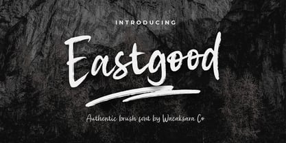 Eastgood Font is a hand brush script font and dramatic movement. This font is great for your next creative project such as Logotype, printed quotes, invitations, cards, product packaging, headers, Letterhead, Poster, Apparel Design, Label, and etc. Eastgood comes with uppercase, lowercase, numerals, punctuations and so many variations on each character include OpenType alternates, and common ligatures to let you customize your designs.
 - Woody Goodies NF by Nick's Fonts,
$10.00A diverse assortment of woodtype adornments, including bishop’s fingers, vignettes, border elements, flourishes and other what-nots, all thoughtfully redrawn from authentic historical sources, and ready to grace your next project with their vintage charm. Please note: for reason known only to the font gods, the Mac Postscript version of Woody Goodies 2 had to be named More Woody Goodies. - Kaprice NF by Nick's Fonts,
$10.00This unusual sans typeface was inspired by a serif face called Faust, designed by Albert Kapr for the Institut für Buchgestaltung in 1959. Its mix of medieval, Jugenstil and Bauhaus influences makes it an intriguing choice for your next project. Both versions of this font include the Unicode Latin 1252 and 1250 Central European character sets, with localization for Moldovan and Romanian. - Flowess by Gassstype,
$29.00 Hello Everyone, introduce our new product Font Flowess This Is Brush Font.This is a Textured Natural Style and classy style with a clear style and dramatic movement. This font Flowess is great for your next creative project such as logos, printed quotes, invitations, cards, product packaging, headers, Logotype, Letterhead, Poster. You can activate 23 Ligatures and 34 Alternate glyphs OpenType panel.
 - Art Club by Open Window,
$- Like Marker Felt or Comic Sans, Art Club has that informal/playful feel. Only this time its made to look and feel like it was written using a paint brush at your local after-school art club. Next time you want to add that cheerful spice to your Art Club Syllabus, or ANY syllabus, look no further than Art Club (the font).
 - Sol Supremo by Prestige Artsy Studio,
$19.00 Introducing "Sol Supremo," a stunning all caps serif font that combines elegance and modernity with a touch of nostalgia. With its clean lines and confident curves, this aesthetic typeface brings a fresh perspective to any design project. Whether it's for a sleek logo, striking headlines, or stylish print materials, Elevate adds a touch of sophistication, elevating your visuals to the next level.
 - Refresh Screen by Arendxstudio,
$18.00 Refresh Screen contains 3 script weights (clean, rough, alternative) and 1 solid display weight. Give your new brand, wedding invitations, and quotes a fresh hand painted look with realistic texture. Refresh Screen was created to give a natural yet stylistic look to your next project! Works Great For: Logos Labels Signage Signature Logo Title Website Etsy Product Quotes Instagram Packaging Business Card & More
 - Heartland by NREY,
$25.00 Heartland font family is a pack of the bold connected script and rounded sans. Font is great to use for logotype, menu and product labels, prints, posters, branding, social media. This pack include 3 fonts: - Heartland Script - Heartland Sans - Heartland Sans Condensed - Heartland Italic Sans - Heartland Bold Sans Download Heartland for your next project today! Thank you and have a great day!
 - Old Millerstown by Greater Albion Typefounders,
$16.00 Millerstown is full of that solid, 19th Century, transatlantic spirit of enterprise. It is an all capitals face, decorative but clear and legible, ideal for signage, posters and banners. "Old Millerstown" has been treated to capture the look of heavily used, weathered type, adding another vintage element to the typeface. Bring a touch of American inspired flair to your next design project!
 - Million by Subectype,
$15.00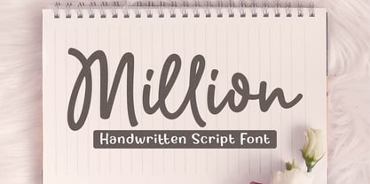 Million is a natural handwritten Script font. Its unique flow and easy signature style makes it perfect to use for invitations, logos, signatures, quotes, wedding, labels, packaging design, blog headlines or simply use it in your next design project. I hope you enjoy this font. If you have any questions please don't hesitate to drop me a message :) Thank You, Subectype
 - Rextions by Java Pep,
$15.00 Rextions is our new font, made in the style of basic hand writing. Every stroke and shape is created with natural handwriting, so that the elegant feel is more pronounced and prominent. Rextions is perfect for your next design project. Thanks for watching, If you have a technical support question, don't hesitate to drop me a message. Have a nice day :)
 - Agness by Gassstype,
$29.00 Hello Everyone, introduce our new product Font AGNESS This Is Hand Drawn Font Simple.This is a Textured Natural Style and classy style with a clear style and dramatic movement. This font AGNESS is great for your next creative project such as logos, printed quotes, invitations, cards, product packaging, headers, Logotype, Letterhead, Poster, Design. You can activate 52 Alternate glyphs OpenType panel.

