10,000 search results
(0.133 seconds)
- Something New by wearecolt,
$16.00 Something New has been designed with logo designers and typographers firmly in mind. This feature-packed display font is a perfect addition to your design arsenal, ready for your next logotype, heavy heading or beer label. "A stylish mix of serif and blackletter" Great for; logos, branding materials, business cards, gift cards, t-shirt, print, posters, quotes, etc.
 - Brideway by MJType,
$15.00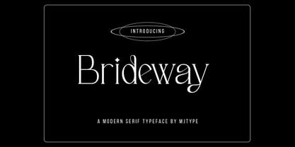 Brideway Typeface is a serif font that combines elegance and simplicity in its letter shapes, with playful ligatures to enhance its legibility. Use this font to create unique and sophisticated logos, headlines for your next project, designs for posters, t-shirts and business cards. Bridger Typeface is a versatile font that can elevate the look of any design project.
 - Transmogrified by PintassilgoPrints,
$24.00 Transmogrified started out as a special project for a client. It's a lovely sans serif font, casual, with sweet swirls over here and there. It is based on Transmogrifier , from which uppercase glyphs were selected. Next, new lowercase glyphs were drawn and a bold cut was also developed for added flexibility. Let your messages be transmogrified!
 - Amerta by Eotype,
$9.00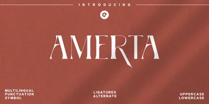 Amerta is a versatile, modern and unique serif font. Designed by Eotype Studio, It has a unique style with stylistic, alternates, ligatures and supports multilingual languages. Create unique & beautiful logotype, use it as an elegant solution for your next magazine layout, or choose Amerta for any graphics that require a bold look with a elegant flair.
 - Sabrina Zaftig NF by Nick's Fonts,
$10.00This charming, disarming, roly-poly typeface is based on handlettering discovered on a Sabena Airlines travel brochure of the 1930s. Include it in your next project, and a good time will be had by all. Both versions of this font contain complete Unicode 1252 (Latin) and Unicode 1250 (Central European) character sets, with localization for Romanian and Moldovan. - Pinky Scream by Illushvara,
$18.00 Pinky Scream is the ideal for for any crafting project during the scariest time of the year. It will take any Halloween craft with the sweet feeling to the next level! Font includes: All caps glyphs, numbers, basic punctuation, and international characters. If you have any question, don’t hesitate to contact me. Happy Designing !!! Thank You, Bayu Suwirya
 - Crosseur by Eotype,
$9.00 Crosseur is a versatile, modern and unique condensed san serif font. Designed by Eotype Studio, It has a unique style with stylistic, alternates, ligatures and supports multilingual languages. Create unique & beautiful logotype, use it as an elegant solution for your next magazine layout, or choose Crosseur for any graphics that require a bold look with a unique.
 - Millerstown Races by Greater Albion Typefounders,
$16.00 Millerstown is full of that solid, 19th Century, transatlantic spirit of enterprise. It is an all capitals face, decorative but clear and legible, ideal for signage, posters and banners. "Millerstown Races" is a carefully constructed oblique which brings a sense of speed and motion. Bring a touch of American inspired flair to your next design project!
 - Tara Bulbous NF by Nick's Fonts,
$10.00This new and improved version of this chunky classic by Paul Carlyle and Gus Oring includes the lowercase letters not found in earlier versions. Use it to add a little—or a lot of—panoramic panache to your next project. Both versions of the font include 1252 Latin and 1250 CE (with localization for Romanian and Moldovan) character sets. - Brumers by Trustha,
$17.00 Brumers is a fun sans serif font. Inspired by the curves of a bear. The basic concept is actually hand-drawn. Then, I developed and improved it in the next process. It comes in six styles, which makes it easy to choose according to the project you are working on. Brumers is perfect for headlines, branding, and many more.
 - NT Novo by Novo Typo,
$26.00 An unordinary type of family: Novo Alla is part of the Novo Family (together with Novo Alla, Bila, Cela, Dada, Enno, Fika and Gigo). Although all members are also strong individuals, Novo Family is an exclusive selection which allows you to design beautiful typographic combinations. The Novo Family will take typography into a next phase of legibility.
 - Fomo by Gassstype,
$23.00 Hello Everyone, introduce our new product Font FOMO This Is Simple Sans Display Font .This is a Textured Natural Style and classy style with a clear style and dramatic movement. This font FOMO is great for your next creative project such as logos, printed quotes, Design this font is great for your creative projects such as watermark on photography.
 - Phat Boi by Comicraft,
$19.00 Word up! DJ Dongboi and triple threat "JG" Roshell has been bustin' out for all the young font gunnahs out there. He bein' crazy, givin' out the love and non-stop dope moves... You feel it? Be showin' ya respect and holla at the Phat Boi an' y'all be cool. Aiiiigggghhht?! Phatboi is Da Next Big Thang! Stay bent.
 - Cagila by Eotype,
$12.00 Cagila is a versatile, modern and elegant serif font. Designed by Eotype Studio, It has a unique style with stylistic, alternates, ligatures and supports multilingual languages. Create unique & beautiful logotype, use it as an elegant solution for your next magazine layout, or choose Cester for any graphics that require a bold look with a elegant flair.
 - Bomber Urban by Nirmana Visual,
$22.00 Bomber Urban Inspired by Graffiti Street Art, Bomber Urban is a fun, urban-style display font. This font is suitable for designs like logos, advertising, apparel, jerseys, sportswear, skateboard designs, and more. Take your concepts to the next level with this stunning font! Make your designs stand out with the urban and edgy look of our Graffiti font.
 - Olpal by Bunny Dojo,
$16.00 A Display Serif, a Monoweight Sans, and an Inline form combining the two, Olpal is a versatile companion for your next adventure. With surprising vitality for a workhorse font, Olpal embraces any job – and whistles while it works. Neutral – with a hint of pizzazz – the font's strong legibility and compressed footprint make it a brilliant fit in any environment.
 - Thierry by Olivetype,
$18.00 Thierry is an elegant signature script font. This versatile script font has a wide spectrum of applications ranging from logotype, product branding to headlines. Add a romantic feel to your next project with this modern calligraphy-styled font. So what's included : Basic Latin A-Z & a-z Numbers, symbols, and punctuations Ligatures Accented Characters : ÀÁÂÃÄÅÆÇÈÉÊËÌÍÎÏÑÒÓÔÕÖØŒŠÙÚÛÜŸÝŽàáâãäåæçèéêëìíîïñòóôõöøœšùúûüýÿžß Thank you
 - FS Pele by Fontsmith,
$50.00 Iconic Conjuring memories of chunky typefaces from the late-60s and early-70s, and named after the world’s greatest footballer of that and probably any other era, FS Pele is one of a set of Fontsmith fonts designed specifically for headlines and other prominent applications. “We wanted to create fonts that could be integral to the design of posters, album covers and magazines,” says Jason Smith. Welcome to FS Pele, iconic, like its namesake (though, perhaps, a little less nimble). Big Pele, little Pele There was only one Pele. But there are two sizes of FS Pele. FS Pele One, with the finer counters and details, adds considerable weight and style at large sizes, especially in big block headlines on posters. FS Pele Two’s thicker “slots” make it a better choice for smaller-sized text. A load of blocks FS Pele began as an exercise by Phil Garnham in turning squares into legible letters, via the least means necessary. The idea extended his ideas about logo-making, and the search for a stamp-like brand mark that lends authority, stability and instant identification. “The thought that the type was a 2D/3D jigsaw of slotted, architectural pieces was almost an after-thought. I wanted to create a strong, stacking, block aesthetic for the most contemporary poster design. “At the time there were a lot of designers creating their own versions of the same thing but I wanted to take the blocker forms to the next step, and infer a more legible text without sacrificing the idea.”
 - FS Pele Variable by Fontsmith,
$199.99Iconic Conjuring memories of chunky typefaces from the late-60s and early-70s, and named after the world’s greatest footballer of that and probably any other era, FS Pele is one of a set of Fontsmith fonts designed specifically for headlines and other prominent applications. “We wanted to create fonts that could be integral to the design of posters, album covers and magazines,” says Jason Smith. Welcome to FS Pele, iconic, like its namesake (though, perhaps, a little less nimble). Big Pele, little Pele There was only one Pele. But there are two sizes of FS Pele. FS Pele One, with the finer counters and details, adds considerable weight and style at large sizes, especially in big block headlines on posters. FS Pele Two’s thicker “slots” make it a better choice for smaller-sized text. A load of blocks FS Pele began as an exercise by Phil Garnham in turning squares into legible letters, via the least means necessary. The idea extended his ideas about logo-making, and the search for a stamp-like brand mark that lends authority, stability and instant identification. “The thought that the type was a 2D/3D jigsaw of slotted, architectural pieces was almost an after-thought. I wanted to create a strong, stacking, block aesthetic for the most contemporary poster design. “At the time there were a lot of designers creating their own versions of the same thing but I wanted to take the blocker forms to the next step, and infer a more legible text without sacrificing the idea.” - fightDurden - Unknown license

- Duralith - Unknown license

- Rider Wide - Personal use only

- Newgate by Factory738,
$15.00 Introducing NEWGATE, a trendy font that is both retro and contemporary, is now available. Its thick curves give it a 70s groovy vibe, while the serifs return it to tradition. NEWGATE fits right in with those vintage moodboards and logos. It has separate lower and uppercase letters, as well as numbers, punctuation, and multilingual letters. The Ligature fonts will come in handy for anything your imagination can dream up! 5 Weights (Light, Regular, Semibold, Bold, Black) Basic Latin A-Z and a-z Numerals & Punctuation Stylistic Ligatures Multilingual Support for ä ö ü Ä Ö Ü ... Free updates and feature additions Thanks for looking, and I hope you enjoy it. Check out Leonardo Sans which is a great pair for Newgate.
 - Stayola by Mans Greback,
$49.00 Stayola is a beautiful calligraphic typeface. This script font has strong contrasts and wonderful flow. Its feminine twists and swirls makes for a lettering with a charming style and quirky personality. The Stayola family consists of eight distinct font styles: The weights Light, Bold, Black, each as the cute Heart style and the decorative Swash variation. The font is built with advanced OpenType functionality and has a guaranteed top-notch quality, containing stylistic and contextual alternates, ligatures and more features; all to give you full control and customizability. It has extensive lingual support, covering all Latin-based languages, from North Europe to South Africa, from America to South-East Asia. It contains all characters and symbols you'll ever need, including all punctuation and numbers.
 - ITC Conduit by ITC,
$45.99 A no-nonsense modern sans serif design, the ITC Conduit type family embodies an earnest vernacular spirit. Its designer, Mark Van Bronkhorst, explains: “It’s the kind of lettering you might find on boilers, assembly diagrams, and desiccant packets,” he explains. “It’s plain, grid-based, visually incompetent, yet legible and direct.” Brilliantly assembled from a typographic kit of parts, ITC Conduit's letterforms project a coolness, without feeling austere or unapproachable. It's an excellent choice for publication, packaging, or even wayfinding design systems. The ITC Conduit collection is available in 14 styles, with weights from extra light to black—all with matching italic designs. An easy, efficient way to bolster your go-to typographic arsenal, add it to your type library today!
 - Silian Calligraphy by Mans Greback,
$49.00 Silian Calligraphy is a sharp serif typeface. With classy letterforms and an organic appearance, this calligraphic lettering has a proper look, yet a vivid personality. Use [ ] { } for decorative elements. Example: [Silian Calligraphy] The Silian Calligraphy typeface family consists of eight high-quality styles: Light, Regular, Bold and Black, and each style as Italic. The font is built with advanced OpenType functionality and has a guaranteed top-notch quality, containing stylistic and contextual alternates, ligatures and more features; all to give you full control and customizability. It has extensive lingual support, covering all Latin-based languages, from North Europe to South Africa, from America to South-East Asia. It contains all characters and symbols you'll ever need, including all punctuation and numbers.
 - Dubbo by Factory738,
$15.00 I present to you Dubbo, a new retro serif! Dubbo is a fashionable font that is both retro and bold. Its thick curves give it a 70s groovy vibe, while the serifs bring it back to traditional. Dubbo fits right in with those retro mood boards and vintage logos. It includes a distinct lower and uppercase, as well as numbers, punctuation, and multilingual letters. The Ligature and Alternate fonts are sure to come in handy for whatever your imagination can conjure up! 5 Weights (Light, Regular, Semibold, Bold, Black) Basic Latin A-Z and a-z Numerals & Punctuation Stylistic Alternates & Ligatures Multilingual Support for ä ö ü Ä Ö Ü ... Free updates and feature additions Thanks for looking, and I hope you enjoy it.
 - Graphite Club by Comicraft,
$19.00 The eight rules of Graphite Club: You do not talk about Graphite Club… You do NOT talk about Graphite Club. If someone types "Stop" taps out “Limp,” the Graphite is over. Only two -- Waitasecond! EVERYBODY wants to talk about Graphite Club! It's the font for rough and tough typesetting that looks as etchy and sketchy, sleek and sexy as Brad Pitt on an off day. It's Light as a featherweight, it's as Regular as wetwork and as Bold as Brass Knuckles. And don't let anyone tell you this font is not special. It's as beautiful and unique as a snowflake. And so are you. Features six weights with alternate uppercase alphabets, language support for Western & Central Europe, Automatic alternates, Stylistic Alternates & Crossbar I Technology™
 - The GOLFABET font, designed by the font creator known as SpideRaY, is a unique and intriguing typographic creation that merges the timeless allure of the sport of golf with the expressive power of th...
- The font "West Point" captures the essence of strength, discipline, and tradition, mirroring the values associated with its namesake, the United States Military Academy at West Point. The typeface em...
- Just Pixo by Latinotype,
$29.00 Inspired by the streets of Brazil, Just Pixo is a display typeface that mimics pixação, Brazilian graffiti. In his book Pixação: São Paulo Signature, François Chastanet says, “This alphabet, with its vertical inscriptions axis, is to be directly classified in the king-size, monumental category; the systematic use of capitals, meticulously aligned and justified, their extreme verticality, are symptomatic of this architectural dimension”. As such, we designed Just Pixo for monumental type sizes and vertical alignments—a family with seven weights, alternate glyphs, multiple ligatures and is provided as a Variable Font too. Unique decorative serif capitals and lowercase sans serif versions make Just Pixo the perfect option for large displays, strong headlines, urban logos, and contemporary concepts. Despite its controversial use on the streets, this often politically charged style will typeface will take your next project to the next level.
 - Binggo Wood Display by Genesislab,
$20.00 Bingo Wood Display in totality and elegance. One of my newest first releases, hand drawn with pinpoint accuracy. Bingo Wood has the perfect amount of simplicity and subtlety for your next project. It perfectly represents retro and vintage aesthetics. I recommend this font for logos, invitations, and your next home decor project that requires a touch of compact alternative combinations! Include Format: - Bingo Wood Display. otf Bingo Wood appears with a total of 593 Glyph characters available: Basic Latin, Extended Latin A, Punctuation, Open & Close Punctuation, Dashes & Quotes, Super Script & Sub Script, Currency, Numbers, Math Symbol, Designer Favorites Case Sensitive Forms, Discretionary Ligature, Denominators, Standard Ligature, Numerators Stylistic Alternates Set, 1, 2, 3, Sup Script, Super Script, Swash Get inspired by the images above and feel free to share with me what you get using this font.
 - Mr Moustache by FaceType,
$19.00 Handmade Mr Moustache™ is designed for Great Type. · Extra thin letters, condensed and with a handwritten touch, Mr Moustache gives a warm and friendly feeling to your layout. Mix upper- and lowercase letters according to your own liking. Furthermore, choose between a hand-drawn Unicase and an almost Unicase appearance. Use Mr Moustache Display for headlines and anything BIG. Use Mr Moustache Text for small type sizes or large volumes of text. · Mr Moustache is accompanied by frames, ornaments and dingbats in regular and solid, that can be layered for multicolored effects, providing endless design-possibilities. Please download MrMoustacheAccessories.pdf to get a complete overview. If you prefer the document in Indesign, please send an email to office@buerofliegenpilz.at · Mr Moustache offers OpenType features, including contextual alternates and stylistic sets. The font family works best with frame-based layout programs that support full OpenType functionality. · For Mr Moustache Frames please note: The glyph preview in your design application may be a bit confusing due to the size of the "letters". Please download the MrMoustacheAccessories.pdf which shows all possible frame parts. Here you can easily copy and paste all the parts you need. · View other fonts from Georg Herold-Wildfellner: Sofa Serif | Sofa Sans | Mila Script Pro | Pinto | Supernett | Mr Moustache | Aeronaut | Ivory | Weingut · Language Report for MrMoustache / 175 languages supported: Abenaki, Afaan Oromo, Afar, Afrikaans, Albanian, Alsatian, Amis, Anuta, Aragonese, Aranese, Aromanian, Arrernte, Arvanitic, Asturian, Aymara, Basque, Bikol, Bislama, Bosnian, Breton, Cape Verdean, Catalan, Cebuano, Chamorro, Chavacano, Chickasaw, Cimbrian, Cofan, Corsican, Croatian, Czech, Danish, Dawan, Delaware, Dholuo, Drehu, Dutch, English, Estonian, Faroese, Fijian, Filipino, Finnish, Folkspraak, French, Frisian, Friulian, Galician, Genoese, German, Gooniyandi, Greenlandic, Guadeloupean, Gwichin, Haitian Creole, Han, Hiligaynon, Hopi, Hungarian, Icelandic, Ido, Ilocano, Indonesian, Interglossa, Interlingua, Irish, Istroromanian, Italian, Jamaican, Javanese, Jerriais, Kala Lagaw Ya, Kapampangan, Kaqchikel, Karelian, Kashubian, Kikongo, Kinyarwanda, Kiribati, Kirundi, Klingon, Ladin, Latin, Latino Sine, Lojban, Lombard, Low Saxon, Luxembourgish, Makhuwa, Malay, Manx, Marquesan, Meglenoromanian, Meriam Mir, Mohawk, Moldovan, Montagnais, Montenegrin, Murrinhpatha, Nagamese Creole, Ndebele, Neapolitan, Ngiyambaa, Norwegian, Novial, Occidental, Occitan, Oshiwambo, Ossetian, Palauan, Papiamento, Piedmontese, Polish, Portuguese, Potawatomi, Qeqchi, Quechua, Rarotongan, Romanian, Romansh, Rotokas, Sami Lule, Sami Southern, Samoan, Sango, Saramaccan, Sardinian, Scottish Gaelic, Serbian, Seri, Seychellois, Shawnee, Shona, Sicilian, Silesian, Slovak, Slovenian, Slovio, Somali, Sorbian Lower, Sorbian Upper, Sotho Northern, Sotho Southern, Spanish, Sranan, Sundanese, Swahili, Swazi, Swedish, Tagalog, Tetum, Tok Pisin, Tokelauan, Tshiluba, Tsonga, Tswana, Tumbuka, Tzotzil, Uzbek, Venetian, Vepsian, Volapuk, Voro, Walloon, Waraywaray, Warlpiri, Wayuu, Wikmungkan, Wiradjuri, Xhosa, Yapese, Yindjibarndi, Zapotec, Zulu, Zuni
 - Leenyx by ActiveSphere,
$30.00 Leenyx is a geometric display font family and works best in display applications, such as posters, signage, logos and label. The Leenyx family comes in 2 versions: Leenyx AX and Leenyx BX. Leenyx AX has lines of even width and no serifs. Leenyx BX has lines of even width with slight curve on the ends of the strokes. Each Leenyx font version has two weights: regular and bold, each available in italic, making a total of eight styles for. Each style has a full upper and lower-case, accents, punctuation and a selection of monetary symbols.
 - The Eurofurence Light font is part of the Eurofurence type family, which is known for its clean lines, modern look, and versatility. As suggested by its name, Eurofurence Light presents a lighter wei...
- Mantika Sans Paneuropean by Linotype,
$67.99With its well-defined characters that are readily legible even in the small font sizes, Mantika Sans by Jürgen Weltin is ideal for typesetting. The elaborately designed and highly individual set of italics enhances the attractiveness of the font.Jürgen Weltin developed the Mantika™ Sans sans serif font using older designs for an serif font as his inspiration. Nothing more than the merest suggestion of the original serifs has survived. Bevelled line endings and the slight variation in thickness of verticals, in particular, provide Mantika Sans with a very dynamic character that evokes manuscript. Short ascenders and descenders give the font a compact appearance that is also underscored by its condensed proportions. Weltin has achieved his aim of producing a typeface with excellent legibility even in small sizes not just by means of the x-height, which is tall in comparison with the capital letters, but also by using clearly defined and well differentiated designs for critical letters, such as i", "I" and "l". Lower case "i", for example, has a serif while the "l" has a curved base.In addition to uppercase numerals, Mantika Sans also has lowercase or old style numerals that have been designed so that they can be used in both tabular and proportional settings. The uppercase numerals are slightly shorter than the uppercase letters, ensuring that the latter can be sympathetically incorporated within continuous text.The Mantika Sans italics are very unusual. They are inclined at only 4.5° (the usual angle for italics is 10 - 12°) and so appear to be almost upright. In addition, they also have quite distinctive forms. The overall effect calls attention to their curvilinear, manuscript character, enhances contrasts and further emphasizes the terminals. Weltin explains: "Within the variety of forms of the italics there are many contrasting terminal elements that create dynamism. The result is a diversity of interaction between the rounded and angular forms". Mantika Sans Italic thus has all the features of a display typeface, but can also be happily used on its own to set longer text passages. Mantika Sans is available in two weights; Regular and Bold, both of which have corresponding italics sets. Mantika Sans has been designed so that the widths of the four related cuts are identical, meaning that a change of font within a single layout will have no effect on justification. In addition, the members of the Mantika Informal font family, designed by Jürgen Weltin in 2010, also have the same thickness. Other font families having weights with equal thickness can be found in the "Linotype Office Alliance series".The Mantika Sans character sets are paneuropean. There are characters for setting texts in Eastern European languages, Greek and Cyrillic. There is also a range of special symbols, including right-angled brackets, subscript and superscript lower case letters, together with numerals, arrows and many different bullet points.As a vibrant and highly legible text font, Mantika Sans has a broad spectrum of potential applications. Its unusual italics are not just perfect for use in display text. The fact that it has only four cuts means that Mantika Sans is particularly suitable for office use or for the setting of business reports. Its excellent legibility even in the small font sizes also makes it ideal as a text for electronic reading devices; this also applies to Mantika Informal.At the 3rd International Eastern Type Design Competition Granshan 2010, Mantika Sans was awarded in the category Greek text typefaces." - Mantika Sans by Linotype,
$50.99 With its well-defined characters that are readily legible even in the small font sizes, Mantika Sans by Jürgen Weltin is ideal for typesetting. The elaborately designed and highly individual set of italics enhances the attractiveness of the font.Jürgen Weltin developed the Mantika™ Sans sans serif font using older designs for an serif font as his inspiration. Nothing more than the merest suggestion of the original serifs has survived. Bevelled line endings and the slight variation in thickness of verticals, in particular, provide Mantika Sans with a very dynamic character that evokes manuscript. Short ascenders and descenders give the font a compact appearance that is also underscored by its condensed proportions. Weltin has achieved his aim of producing a typeface with excellent legibility even in small sizes not just by means of the x-height, which is tall in comparison with the capital letters, but also by using clearly defined and well differentiated designs for critical letters, such as i", "I" and "l". Lower case "i", for example, has a serif while the "l" has a curved base.In addition to uppercase numerals, Mantika Sans also has lowercase or old style numerals that have been designed so that they can be used in both tabular and proportional settings. The uppercase numerals are slightly shorter than the uppercase letters, ensuring that the latter can be sympathetically incorporated within continuous text.The Mantika Sans italics are very unusual. They are inclined at only 4.5° (the usual angle for italics is 10 - 12°) and so appear to be almost upright. In addition, they also have quite distinctive forms. The overall effect calls attention to their curvilinear, manuscript character, enhances contrasts and further emphasizes the terminals. Weltin explains: "Within the variety of forms of the italics there are many contrasting terminal elements that create dynamism. The result is a diversity of interaction between the rounded and angular forms". Mantika Sans Italic thus has all the features of a display typeface, but can also be happily used on its own to set longer text passages. Mantika Sans is available in two weights; Regular and Bold, both of which have corresponding italics sets. Mantika Sans has been designed so that the widths of the four related cuts are identical, meaning that a change of font within a single layout will have no effect on justification. In addition, the members of the Mantika Informal font family, designed by Jürgen Weltin in 2010, also have the same thickness. Other font families having weights with equal thickness can be found in the "Linotype Office Alliance series".The Mantika Sans character sets are paneuropean. There are characters for setting texts in Eastern European languages, Greek and Cyrillic. There is also a range of special symbols, including right-angled brackets, subscript and superscript lower case letters, together with numerals, arrows and many different bullet points.As a vibrant and highly legible text font, Mantika Sans has a broad spectrum of potential applications. Its unusual italics are not just perfect for use in display text. The fact that it has only four cuts means that Mantika Sans is particularly suitable for office use or for the setting of business reports. Its excellent legibility even in the small font sizes also makes it ideal as a text for electronic reading devices; this also applies to Mantika Informal.At the 3rd International Eastern Type Design Competition Granshan 2010, Mantika Sans was awarded in the category Greek text typefaces."
 - As of my last knowledge update in early 2023, the font "Lightmorning" by BRIDGEco might not have been widely recognized or it could be a new or less-documented typeface that hasn't yet made a signifi...
- Peridot - Unknown license

- Streamliner by Zang-O-Fonts,
$25.00Inspired by the typefaces used for company insignia on aircraft in the 1930's and 1940's, Streamliner is light, friendly and open.


