10,000 search results
(0.045 seconds)
- Villarys by Maulana Creative,
$16.00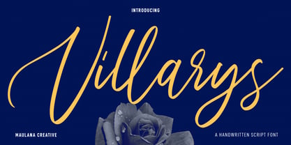 Villarys is an beautiful Script font. With high contrast stroke, fun character with a bit of ligatures. To give you an extra creative work. Villarys font support multilingual more than 100+ language. This font is good for logo design, Social media, Movie Titles, Books Titles, a short text even a long text letter and good for your secondary text font with sans or serif. Make a stunning work with Villarys font. Cheers, Maulana Creative
 - MC Marshim by Maulana Creative,
$15.00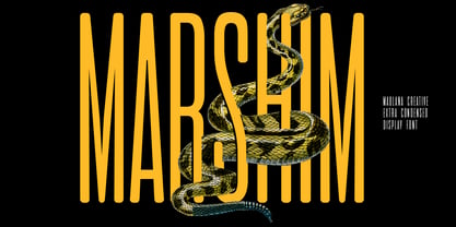 Marshim is a Condensed Display font. Regular stroke, fun character with a bit of ligatures and alternates. To give you an extra creative work. Marshim font support multilingual more than 100+ language. This font is good for logo design, Social media, Movie Titles, Books Titles, a short text even a long text letter and good for your secondary text font with script or serif. Make a stunning work with Marshim font. Cheers, Maulana Creative
 - Res Publica by Linotype,
$29.99Res Publica is a workhorse. It is quite anonymous as typeface, without any distinctive marks. But it gives a harmonious text body, well suited for large amounts of text, such as official public reports, magazines based mainly on text, school books, and so on. The public" concept is part of the name. Res Publica is Latin for "public matters". The word republic has the same origin. Res Publica was released in 1992. - Crunchyes by Maulana Creative,
$12.00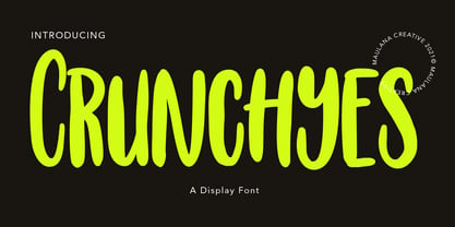 Crunchyes is a casual handwritten font. With rough stroke, Condensed and fun character with a bit of ligatures. To give you an extra creative work. Crunchyes font support multilingual more than 100+ language. This font is good for logo design, Social media, Movie Titles, Books Titles, a short text even a long text letter and good for your secondary text font with sans or serif. Make a stunning work with Crunchyes font. Cheers, MaulanaCreative
 - MC Sarscy by Maulana Creative,
$15.00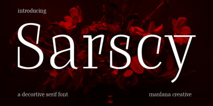 Sarscy is a decorative serif font. Regular stroke, fun character with a bit of ligatures and alternates. To give you an extra creative work. Sarscy font support multilingual more than 100+ language. This font is good for logo design, Social media, Movie Titles, Books Titles, a short text even a long text letter and good for your secondary text font with script or serif. Make a stunning work with Sarscy font. Cheers, Maulana Creative
 - Blinkest by Maulana Creative,
$13.00 "Blinkest" is a casual signature script font. With light mono-line stroke, fun character with a bit of ligatures. To give you an extra creative work. "Blinkest" font support multilingual more than 100+ language. This font is good for logo design, Social media, Movie Titles, Books Titles, a short text even a long text letter and good for your secondary text font with sans or serif. Make a stunning work with "Blinkest" font. Cheers, MaulanaCreative
 - Blountsville by Maulana Creative,
$14.00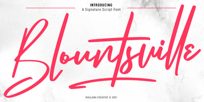 Blountsville is a signature script font. With regular contrast stroke, fun character with a bit of ligatures and swashes. To give you an extra creative work. Blountsville font support multilingual more than 100+ language. This font is good for logo design, Social media, Movie Titles, Books Titles, a short text even a long text letter and good for your secondary text font with sans or serif. Make a stunning work with Blountsville font. Cheers, MaulanaCreative
 - MC Race Timo by Maulana Creative,
$14.00 Race Timo Sport Display Font. Regular stroke, fun character with a bit of ligatures and alternates. To give you an extra creative work. Race Timo font support multilingual more than 100+ language. This font is good for logo design, Social media, Movie Titles, Books Titles, a short text even a long text letter and good for your secondary text font with script or serif. Make a stunning work with Race Timo font. Cheers, Maulana Creative
 - Noobys Display by Maulana Creative,
$14.00 Noobys is a fun decorative display font with natural hand drawn, clean stroke, uprights and fun character. To give you an extra creative work. Noobys font support multilingual more than 100+ language. This font is good for logo design, Social media, Movie Titles, Books Titles, a short text even a long text letter and good for your secondary text font with sans or serif. Make a stunning work with Noobys font. Cheers, MaulanaCreative
 - Polyfonics by Maulana Creative,
$12.00 Polyfonics is a natural hand drawn decorative display font, with fill and hollow stroke, uprights and fun character. To give you an extra creative work. Polyfonics font support multilingual more than 100+ language. This font is good for logo design, Social media, Movie Titles, Books Titles, a short text even a long text letter and good for your secondary text font with sans or serif. Make a stunning work with Polyfonics font. Cheers, MaulanaCreative
 - Jillstone by Maulana Creative,
$12.00 Jillstone is an Exspressive slanted signature script font. With regular felt-tip stroke, fun character with some of ligatures. To give you an extra creative work. Jillstone font support multilingual more than 100+ language. This font is good for logo design, Social media, Movie Titles, Books Titles, a short text even a long text letter and good for your secondary text font with sans or serif. Make a stunning work with Jillstone font. Cheers, MaulanaCreative
 - Mollafest by Maulana Creative,
$14.00 Mollafest is a modern script font. With high contrast stroke, fun character with a bit of ligatures. To give you an extra creative work. Mollafest font support multilingual more than 100+ language. This font is good for logo design, Social media, Movie Titles, Books Titles, a short text even a long text letter and good for your secondary text font with sans or serif. Make a stunning work with Mollafest font. Cheers, Maulana Creative
 - MC Muizhell by Maulana Creative,
$18.00 Muizhell horror display font. Heavy stroke, fun character with a bit of ligatures. To give you an extra creative work. Muizhell horror display font support multilingual more than 100+ language. This font is good for logo design, Social media, Movie Titles, Books Titles, a short text even a long text letter and good for your secondary text font with script or serif. Make a stunning work with Muizhell horror display font. Cheers, Maulana Creative
 - Solomon by Fontfabric,
$40.00 The new Solomon type family includes 12 very unique design styles. These twelve designs are divided into two main style groups—text family and display (or decorative) family. The Solomon text pack is characterized by excellent legibility, well-finished geometric designs, optimized kerning etc. Solomon is most suitable for headlines of all sizes, as well as for text blocks that come in both maximum and minimum variations. The Solomon deco pack is created using ornamental work with organic forms at the heart of the design base. The use and combination of both groups - deco and text family, is highly recommended in order to attain maximum desired effects.
 - Quick Tracer by Keristyper Studio,
$14.00 introduce Quick Tracer font with sporty modern cutouts and dynamic tilt. Ideal for fast car racing sports titles, running matches, cycling, automotive, and other modern dynamic monograms or texts. This font is good for logo design, Social media, Movie Titles, Books Titles, short text even long text letters, and good for your secondary text font with sans or serif. **Featured:** * Standard Uppercase & Lowercase * Numeral & Punctuation * Multilingual : ä ö ü Ä Ö Ü ß ¿ ¡ * Alternate & Ligature * PUA encoded We recommend programs that support the OpenType feature and the Glyphs panel such as Adobe applications or Corel Draw. so you can use all the variations of the glyphs. Hope you enjoy our fonts!
 - They Killed Kenny! - Unknown license

- LD Harry by Illustration Ink,
$3.00This fun font has a lightning bolt on many of the uppercase letters. It's magical! - KG This Is Not Goodbye by Kimberly Geswein,
$5.00 Neat, calligraphy-style handwriting using a chisel-tipped marker.
 - KG Thinking Out Loud by Kimberly Geswein,
$5.00 A neat upright font with a small x-height.
 - Buddy Suit by PizzaDude.dk,
$15.00A drippy text font, or slimy if you prefer! - ADD by Sea Types,
$20.00 A minimalist typography for short texts and individual words.
 - Zugarbody by PizzaDude.dk,
$20.00Zugarbody is brushdrawn and compliments all kinds of texts! - LOVE-BOX - Personal use only

- WetPaint - Unknown license

- Gabardina - Personal use only

- bowellberalta - Personal use only

- Bionic Comic Condensed - Unknown license

- Fh_Ink - Personal use only

- OXIDISASTER - Personal use only

- Natom Pro by Mostardesign,
$25.00 A family of fonts with rhythm. Natom Pro is a modern and geometric font family adapted to the professional requirements of graphic designers, web designers and mobile application developers. Comprised of 19 styles including 8 styles designed especially for the design of headlines, Natom Pro is a very versatile family of fonts that can be used in many projects such as editorial design, branding or corporate identity creation, design of posters or logos, the creation of websites or the development of mobile applications. This font, with a resolutely contemporary aspect, also hides a unique typographic design since it has 2 distinct styles (Title and Roman) which have 2 different typographic rhythms in order to graphically differentiate the appearance of titles, subtitles and long paragraphs. With this design of rhythmically differentiated glyphs according to the styles, the headlines have a very graphic aspect while the long texts have a more classic aspect in order to keep optimal readability in all scenarios. Its architecture is also very modern since it was designed and drawn with particular attention to the geometry of the forms with clear and open endings cut at 90 degrees. The number of styles has also been simplified with the most used thicknesses (Extra Light, Light, Regular, Medium, Bold and Black) in order to speed up your graphic design process. For the more experienced designers, Natom Pro is also available in a variable version. Natom Pro is also equipped with powerful OpenType features like case sensitivity, true small caps, full ligature set, tabular figures for tables, « old styles figures » to elegantly insert figures into your sentences, numbers circled or even alternative characters to satisfy the most demanding professionals.
 - Trakya Rounded by Bülent Yüksel,
$19.00 Thrace (/θreɪs/; Greek: Θράκη, Thráki; Bulgarian: Тракия, Trakiya; Turkish: Trakya) is a geographical and historical region in Southeast Europe, now split among Bulgaria, Greece, and Turkey, which is bounded by the Balkan Mountains to the north, the Aegean Sea to the south, and the Black Sea to the east. It comprises southeastern Bulgaria (Northern Thrace), northeastern Greece (Western Thrace), and the European part of Turkey (East Thrace). Trakya Rounded is a modern sans serif with a geometric touch. It has a modern streak which is the result of a harmonization of width and height especially in the lowercase letters to support legibility. Trakya Rounded is softer and rounder than it's sibling Trakya Sans. They're both ideally suited for advertising and packaging, editorial and publishing, logos, branding and creative industries, posters and billboards, small text, way-finding and signage as well as web and screen design. Trakya Rounded provides advanced typographical support for Latin-based languages. An extended character set, supporting Central, Western and Eastern European languages, rounds up the family. The designation “Trakya Rounded 500 Regular” forms the central point. The first figure of the number describes the stroke thickness: 100 Thin to 900 Bold. "Trakya Rounded" comes in 5 weights and italics and has the company of "Trakya Rounded Alt" that also comes in 5 weights and italics for a total of 20 styles. The family contains a set of 630+ characters. Case-Sensitive Forms, Classes and Features, Small Caps from Letter Cases, Fractions, Superior, Inferior, Denominator, Numerator, Old Style Figures are easily accessible in all graphic programs. Trakya Rounded is the perfect font for web use. Enjoy using it.
 - Marzano by FontMesa,
$35.00 Marzano is a geometric sans serif font that's ideal for headlines, logos, text and advertising, the name comes from the ever so sweet and wonderful San Marzano plum tomato grown in Italy. Marzano includes stylistic alternates, small caps, swash caps, case sensitive forms, old style figures, tabular figures, small caps figures, small caps old style figures, small caps question mark and exclamation point. Since a lot of people today like to type in code using the copyright and trademark symbols in place of a C or R we've decided, the first time to offer two registered trademark symbols, one that's the same size as the copyright symbol and an alternate version that's reduced in size and sits at the caps height. Marzano Slant is set at 6 degrees and is perfect for when you want the look of an italic but don't have the horizontal space in your page design for a full 12 degree italic. At FontMesa all of our italic fonts are cleaned up placing all nodes at extremas.
 - Bernhardt Standard by Linotype,
$40.99Bernhardt Standard, which was designed in 2003 by Julius de Goede, is a flowing Bastarde script. Bastarde is one of the sub-categories of Blackletter typefaces. The term Blackletter refers to typefaces that have evolved out of Northern Europe’s medieval manuscript tradition. Often called gothic, or Old English, these letters are identifiable by the traces of the wide-nibbed pen stroke within their forms. Of all of the various sorts of Blackletter styles, Bastarde scripts are the most flowing, or Italic. The first Bastarde typefaces, cut in the late 1400s, were based on French handwriting styles, especially those styles popular in Burgundy. The flowing nature of Bernhardt Standard makes it similar to some other sorts of Blackletter typefaces as well. Bernhardt Standard, because of its handwritten roots, is also similar to Kurrent, a style of handwriting that was popular in Germany prior the 20th Century. Bernhardt Standard is a very calligraphic face, suitable for formal applications. This typeface would be an excellent choice for certificates or awards. The old style figures in the font allow for nice short settings of text as well. - 112 Hours by Device,
$9.00 Rian Hughes’ 15th collection of fonts, “112 Hours”, is entirely dedicated to numbers. Culled from a myriad of sources – clock faces, tickets, watches house numbers – it is an eclectic and wide-ranging set. Each font contains only numerals and related punctuation – no letters. A new book has been designed by Hughes to show the collection, and includes sample settings, complete character sets, source material and an introduction. This is available print-to-order on Blurb in paperback and hardback: http://www.blurb.com/b/5539073-112-hours-hardback http://www.blurb.com/b/5539045-112-hours-paperback From the introduction: The idea for this, the fifteenth Device Fonts collection, began when I came across an online auction site dedicated to antique clocks. I was mesmerized by the inventive and bizarre numerals on their faces. Shorn of the need to extend the internal logic of a typeface through the entire alphabet, the designers of these treasures were free to explore interesting forms and shapes that would otherwise be denied them. Given this horological starting point, I decided to produce 12 fonts, each featuring just the numbers from 1 to 12 and, where appropriate, a small set of supporting characters — in most cases, the international currency symbols, a colon, full stop, hyphen, slash and the number sign. 10, 11 and 12 I opted to place in the capital A, B and C slots. Each font is shown in its entirety here. I soon passed 12, so the next logical finish line was 24. Like a typographic Jack Bauer, I soon passed that too -— the more I researched, the more I came across interesting and unique examples that insisted on digitization, or that inspired me to explore some new design direction. The sources broadened to include tickets, numbering machines, ecclesiastical brass plates and more. Though not derived from clock faces, I opted to keep the 1-12 conceit for consistency, which allowed me to design what are effectively numerical ligatures. I finally concluded one hundred fonts over my original estimate at 112. Even though it’s not strictly divisible by 12, the number has a certain symmetry, I reasoned, and was as good a place as any to round off the project. An overview reveals a broad range that nonetheless fall into several loose categories. There are fairly faithful revivals, only diverging from their source material to even out inconsistencies and regularize weighting or shape to make them more functional in a modern context; designs taken directly from the source material, preserving all the inky grit and character of the original; designs that are loosely based on a couple of numbers from the source material but diverge dramatically for reasons of improved aesthetics or mere whim; and entirely new designs with no historical precedent. As projects like this evolve (and, to be frank, get out of hand), they can take you in directions and to places you didn’t envisage when you first set out. Along the way, I corresponded with experts in railway livery, and now know about the history of cab side and smokebox plates; I travelled to the Musée de l’imprimerie in Nantes, France, to examine their numbering machines; I photographed house numbers in Paris, Florence, Venice, Amsterdam and here in the UK; I delved into my collection of tickets, passes and printed ephemera; I visited the Science Museum in London, the Royal Signals Museum in Dorset, and the Museum of London to source early adding machines, war-time telegraphs and post-war ration books. I photographed watches at Worthing Museum, weighing scales large enough to stand on in a Brick Lane pub, and digital station clocks at Baker Street tube station. I went to the London Under-ground archive at Acton Depot, where you can see all manner of vintage enamel signs and woodblock type; I photographed grocer’s stalls in East End street markets; I dug out old clocks I recalled from childhood at my parents’ place, examined old manual typewriters and cash tills, and crouched down with a torch to look at my electricity meter. I found out that Jane Fonda kicked a policeman, and unusually for someone with a lifelong aversion to sport, picked up some horse-racing jargon. I share some of that research here. In many cases I have not been slavish about staying close to the source material if I didn’t think it warranted it, so a close comparison will reveal differences. These changes could be made for aesthetic reasons, functional reasons (the originals didn’t need to be set in any combination, for example), or just reasons of personal taste. Where reference for the additional characters were not available — which was always the case with fonts derived from clock faces — I have endeavored to design them in a sympathetic style. I may even extend some of these to the full alphabet in the future. If I do, these number-only fonts could be considered as experimental design exercises: forays into form to probe interesting new graphic possibilities.
 - OldHaroldRee by Ingrimayne Type,
$12.95 OldHaroldRee is a modification of PhederFrack, a calligraphic fraktur face. It keeps the lower case letters and inserts a completely different set of upper-case letters, which is in the “Old English” rather than the “Old German” or fraktur style. It comes in two weights, a bit unusual for an Old-English style typeface.
 - Simplo by Durotype,
$49.00 Simplo: the ‘Italian Futura’. Simplo is a geometric sans serif typeface, built in sixteen styles. It is a tribute to the 1930s typeface Semplicità, designed by Nebiolo’s Alessandro Butti. Although many details of Simplo differ from Semplicità, it preserves the spirit of the original. Simplo is ideal for use in display sizes. It is also quite legible in text, and is well suited for graphic design and corporate identity design. Simplo has sixteen styles, extensive language support, eight different kinds of figures, sophisticated OpenType features — so it’s ready for advanced typographic projects. The most notable characteristics of this typeface are the ‘t’ and the ‘f’. The ‘t’ is the culmination of simplicity: a vertical line with just a simple right-side crossbar. The ‘f’ also has just a right-side crossbar, and is really tall: it reaches both the highest and lowest vertical position of the typeface. The top of the distinctive ‘s’, is much narrower than its bottom. The ‘a’, ‘b’, ‘d’, ‘g’, ‘p’, ‘q’, and ‘u’ are spurless, and show a family resemblance with Hans Reichel’s 1990s typeface Dax. However, these letters are rounder and more geometric than Dax’s counterparts, because of Dax’s higher x-height and narrower design. In Paul Shaw’s Imprint article about typefaces that have been overlooked and/or underappreciated, “Overlooked Typefaces”, he concluded his discussion of Semplicità as follows: “These idiosyncrasies suggest that Semplicità might find a warm reception today, given the current love affair with Gotham, Neutraface and Proxima—and the resurgence of ITC Avant-Garde Gothic.” Free demo font available. For more information about Simplo, download the PDF Specimen Manual.
 - TheAntiqua by LucasFonts,
$49.00 Although the members of the Thesis family have proven to work well as text faces, nothing beats a medium-contrast oldstyle for comfortable immersive reading. Hence TheAntiqua, an all-purpose text face whose name refers to the traditional Dutch/German word for oldstyle.
 - Crubster by Joey Maul,
$12.00 Crubster is a digitally natured font with a bolder and slightly wider presence. Its Linear/rounded corner features give it a modern style which is suitable for logos, web graphics, headlines and text. Crubster works nicely with white text on a darker background.
 - Mile High by Letters by Wordsworth,
$29.00 Mile High is an airy and elegant font featuring exceptionally thin and tall characters suitable for text as well as display. Featuring 4 weights and italics, Mile High offers versatility for cohesive graphics applications. Especially lovely is text set in all caps.
 - Stencil Label JNL by Jeff Levine,
$29.00 In the 1943 Three Stooges comedy short “Higher than a Kite”, Curly reaches into a box with the label “hand grenades” painted on its side and pulls out one of the devices. The bold, squared stencil hand lettering on that prop inspired Stencil Label JNL, which is available in both regular and oblique versions.


