10,000 search results
(0.041 seconds)
- Recycled by Kerry Colpus Designs,
$25.00 Recycled was created by creating letters from bits of recycled materials such as cardboard, newspapers etc. and then taking parts of those letters to create new letters.
 - Olga by ParaType,
$30.00 Based on informal pen handwriting. A set of Western and Central European characters was added in 2011 by Gennady Fridman. For use in advertising and display typography.
 - F2F TechLand by Linotype,
$29.99Inspired by the Techno sound of the 1990s, Alexander Branczyk designed a series of new, wild and controversial fonts which mark a complete departure from typographic traditions. - Eshkol MF by Masterfont,
$59.00 This font designed by Elan Ronen, consists mainly from geometric, to forms make this elegant font family a great companion for invitations and signs, indoor and outdoor.
 - Bell Centennial by Linotype,
$40.99Bell Centennial was created by Matthew Carter in 1976 for the American telephone company Bell. Its bold, clear characters make it an extremely legible and distinctive font. - Gothic Revival Layered by Intellecta Design,
$20.90 Gothic Revival Layered is a new layered font by Chyrllene K - Intellecta Design. Whith it you have three wonderful ways to use and apply in yours projects.
 - Foliage Ornaments by Gerald Gallo,
$20.00 Foliage Ornaments was inspired by the foliage designs used in historic art and architecture. There is an assortment of 47 ornaments located under the character set keys.
 - S&S Baldwins by Spencer & Sons Co.,
$35.00 Baldwins was inspired by the beauty lettering of ephemera prints. Ideal for product names, packages, labels, old fashioned signs and everything with specific characteristics of past times.
 - Pinback by FaceType,
$20.00 Pinback was inspired by the science fiction movies of the 60s and 70s. The name is taken from one of the protagonists of John Carpenter’s Dark Star.
 - Drawzing by Fonthead Design,
$19.00 Drawzing is a font designed by Ethan Dunham that mimics the looks of either chalk or crayon. The font is well balanced and is not overly childish.
 - Glide by Typedepot,
$35.00 Elegant custom font with rounded corners, great for logos, posters, motion graphics and t-shirts. The name is inspired by the sleek curves and its smooth look.
 - Suki by Joachim Frank,
$22.00 Sookie is a hand designed font for posters, invitations, headlines, lettering of nursery hooks, signs, young, fresh and round. Designed in March 2022 by Joachim Frank, Germany.
 - Albiol by Mr. Typeman,
$14.00 Create your own design by choosing this wonderful handwritten font. Albiol has an effortless yet refined quality, making it an excellent fit for projects of all types.
 - crosswordBill by JOEBOB graphics,
$19.00 CrosswordBill was created by scanning a finished crossword puzzle, done with a failing ballpoint. A complete character set with numbers and most (but not all) special signs.
 - Millesime by Chank,
$99.00 Inspired by printed texts from 18th century France, Millesime has a gritty grainy texture that adds a natural and sentimental feel to this stylish rusty style font.
 - Syage by Nirmana Visual,
$19.00 Syage a classy, contemporary of Serif font, inspired by Art Deco Era. Ideally suited for advertising and packaging, festive occasions, editorial and publishing, creative industries and posters.
 - Gorgeous Cultural by Graphicxell,
$19.00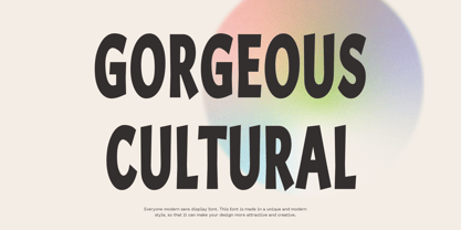 inspired by the famous minimalist logo perfect for the purposes of designing templates, brochures, videos, advertising branding, logos, invitation, layout design, elegant crafting, beauty design and more.
 - F2F Entebbe by Linotype,
$29.99Inspired by the Techno sound of the 1990s, Alexander Branczyk designed a series of new, wild and controversial fonts which mark a complete departure from typographic traditions. - Folk Art Flowers by Gerald Gallo,
$20.00 Folk Art Flowers was inspired by the flowers used in many folk art designs. There is an assortment of 47 ornaments located under the character set keys.
 - Kircher by Turto Studio,
$10.00 Kircher is a typography inspired by old building facade letterings. It is a vintage style geometric sans serif typography great for logos, banners, posters and graphic artists.
 - Jimbo by Adobe,
$29.00First used by the designer on his personal letterhead, Jimbo has an informal modern style. Use the Jimbo font family on posters, in advertisements and on packaging. - Trybuna by RMU,
$30.00 Inspired by Thannhaeuser's Liberta, completely fresh drawn and designed, Trybuna is a pronounced, freestyle serif font family, intended for body texts in print and for the web.
 - Phosphor by Monotype,
$29.99 The Phosphor font was designed by Jakob Erbar and released in 1930. This inline headline face was designed to look like glowing letters, hence its name Phosphor.
 - Buncher Georgia by Fargun Studio,
$16.00 Buncher Georgia is a vintage display typeface inspired by the art of ancient decoration which is suitable for retro-style designs with ancient concepts. File Included Multilingual
 - Kartago by DSType,
$35.00Kartago was inspired by the inscriptions in the Roman ruins in the city of Cartago in Tunisia. Designed with plenty of uppercase ligatures for better design possibilities. - Shepherd by Letterara,
$12.00 Shepherd is a beautiful calligraphy font with an incredibly luxurious feel. It will add a romantic touch to any crafting project! Get inspired by its whimsical charm!
 - LTC Californian by Lanston Type Co.,
$24.95 Frederic Goudy designed Californian as a private commission for the University of California at Berkeley in 1939. The first Commercial release was by Lanston Monotype in 1958.
 - Braaains BB by Blambot,
$20.0053 all-original, all-terrifying zombie illustrations by Nate Piekos and Lee Morin! Also included is a character map so you can pick that perfect undead dingbat! - TAN Marjorie by TANTypeCo.,
$17.00 TAN - MARJORIE is a display sans serif. Bold and groovy. Inspired by fonts you can find in 80s book covers, it gives a modern yet retro vibes.
 - Algeko by Sakha Design,
$12.00 Algeko is a simple, adaptable and vintage syled sans serif font. Add it confidently to your favorite creations and let yourself be amazed by the outcome generated.
 - TWT Pavane by Three Islands Press,
$29.00TWT Pavane is based on the calligraphy of Art Nouveau designer Rudolph Koch. Chelsea Studio is based on hand lettering from architectural sketches by Charles Rennie Mackintosh. - Brev Script by Mans Greback,
$59.00 Old style handwriting, inspired by 1800-1900's letters. Contains hundreds of alternate glyphs; each lower case letter has four variations, accessible through contextual and standard alternates.
 - Beckenham by Red Rooster Collection,
$45.00Digitally engineered by Steve Jackaman. The x-heights are radically different; the x-height on the light version is small, and gets larger as the weights progress. - Giglio Rosso by Reel Hood,
$- Giglio Rosso is a decorative typeface with a floral design. The font is named giglio rosso, “red lily,” because it is inspired by the symbol of Florence.
 - RTCO Fransworth by Roams Type Co,
$12.00 RTCO Fransworth Inspired by Vintage Horror Novel & Movies Poster Typograhphy This font is suitable for graphic designs such as logotypes, merchandise, printed stickers, and other branding needs.
 - Floe by Jolicia Type,
$20.00 This is the one and only Floe designed by Jolicia Type in 2021 every single letters have been carefully crafted to make your text looks value typhography
 - Handsta Signature by Nirmana Visual,
$19.00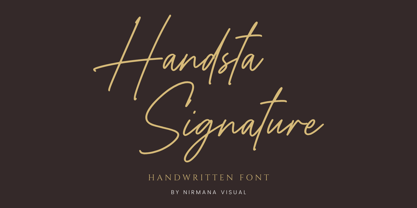 Handsta Signature a classy, contemporary of script font, inspired by Handwriting Signature. Ideally suited for advertising and packaging, festive occasions, editorial and publishing, creative industries and posters .
 - Manual Typewriter JNL by Jeff Levine,
$29.00 Manual Typewriter JNL was modeled from an example of the 1933 design originally created by Morris Fuller Benton, and is available in both regular and oblique versions.
 - Gallero Vintage by Nirmana Visual,
$24.00 Gallero Vintage Inspired by Renaissance Design Era. Gallero offers beautiful typographic harmony for a diversity of design projects, including logos & branding, social media posts, advertisements & product designs.
 - TT Tsars by TypeType,
$39.00 TT Tsars useful links: Specimen | Graphic presentation | Customization options The TT Tsars font family is a collection of serif display titling fonts that are stylized to resemble the fonts of the beginning, the middle and the end of the XVIII century. The project is based on title fonts, that is, the fonts that were used to design book title pages. The idea for the project TT Tsars was born after a small study of the historical development of the Cyrillic type and is also based on Abram Shchitsgal’s book "Russian Civil Type". At the very beginning of the project, we had developed a basic universal skeleton for the forms of all characters in all subfamilies of the family, and later on, we added styles, visual features, artifacts and other nuances typical of the given period onto the skeleton. Yes, from the historical accuracy point of view it might be that such an approach is not always justified, but we have achieved our goal and as a result, we have created perfectly combinable serifs that can be used to style an inscription for a certain time period. The TT Tsars font family consists of 20 fonts: 5 separate subfamilies, each of which consists of 4 fonts. Each font contains 580 glyphs, except for the TT Tsars E subfamily, in which each font consists of 464 characters. Instead of lowercase characters in the typeface, small capitals are used, which also suggests that the typeface is rather a display than text one. In TT Tsars you can find a large number of ligatures (for Latin and Cyrillic alphabets), arrows and many useful OpenType features, such as: frac, ordn, sinf, sups, numr, dnom, case, onum, tnum, pnum, lnum, salt (ss01), dlig. Time-related characteristics of the subfamilies are distributed as follows: • TT Tsars A—the beginning of the 18th century (Latin and Cyrillic) • TT Tsars B—the beginning of the 18th century (Latin and Cyrillic) • TT Tsars C—the middle of the 18th century (Latin and Cyrillic) • TT Tsars D—the end of the 18th century (Latin and Cyrillic) • TT Tsars E—conditionally the beginning of the 18th century (only Latin) TT Tsars A and TT Tsars B families (both the beginning of the 18th century) have different starting points: for TT Tsars A it is Latin, for TT Tsars B it is Cyrillic. The development of the TT Tsars A family began in Latin, the font is based on the royal serif Romain du Roi. The Cyrillic alphabet is harmoniously matched to the Latin. The development of the TT Tsars B family began in Cyrillic, which is based on a Russian civil type. Characteristic elements are the curved one-sided serifs of triangular characters (A, X, Y), drops appear in the letter ?, the middle strokes ? and P are adjacent to the main stroke. Latin was drawn to pair with Cyrillic. It is still based on the royal serif, but somewhat changed: the letters B and P are closed and the upper bar of the letter A rose. This was done for the visual combination of Cyrillic and Latin and at the same time to make a distinction between TT Tsars A and TT Tsars B. TT Tsars C is now the middle of the 18th century. Cyrillic alphabet itself did not stand still and evolved, and by the middle of the 18th century, its forms have changed and become to look the way they are shown in this font family. Latin forms are following the Cyrillic. The figures are also slightly modified and adapted to the type design. In TT Tsars C, Cyrillic and Latin characters are created in parallel. A distinctive feature of the Cyrillic alphabet in TT Tsars C is the residual influence of the flat pen. This is noticeable in such signs as ?, ?, K. The shape of the letters ?, ?, ?, ? is very characteristic of the period. In the Latin alphabet, a characteristic leg appears at the letter R. For both languages, there is a typical C characterized by an upper serif and the appearance of large, even somewhat bolding serifs on horizontals (T, E, ?, L). TT Tsars D is already the end of the 18th century when with the development of printing, the forms of some Cyrillic characters had changed and turned into new skeletons of letters that we transposed into Latin. The figures were also stylized. In this font, both Cyrillic and Latin are stylistically executed with different serifs and are thus logically separated. The end of the century is characterized by the reduction of decorative elements. Straight, blueprint-like legs of the letters ?, R, K, ?. Serifs are very pronounced and triangular. E and ? are one-sided on the middle horizontal line. A very characteristic C with two serifs appears in the Latin alphabet. TT Tsars E is a steampunk fantasy typeface, its theme is a Latinized Russian ?ivil type (also referred to as Grazhdansky type which emerged after Peter the Great’s language reform), which includes only the Latin alphabet. There is no historical analog to this typeface, it is exclusively our reflections on the topic of what would have happened if the civil font had developed further and received a Latin counterpart. We imagined such a situation in which the civil type was exported to Europe and began to live its own life.