10,000 search results (0.036 seconds)
  1. Neue Werner Paperclip by Funk King, $5.00
    Neue Werner Paperclip is inspired by the 70s classic.
  2. Hobo No2 by SoftMaker, $9.99
    Herlekin is a decorative script typeface published by SoftMaker.
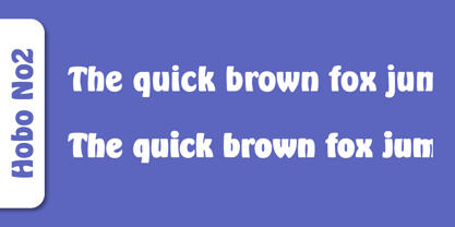
  3. Bluff No2 by SoftMaker, $9.99
    Bluff No2 is a brush font published by SoftMaker.
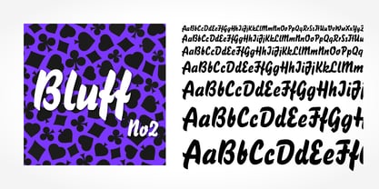
  4. Portobello by Red Rooster Collection, $45.00
    Loosely based on Pontecorvo, a design by Aldo Novarese.
  5. Dom by SoftMaker, $9.99
    Dom is an informal brushwritten typeface published by SoftMaker.
  6. Looking Glass by SoftMaker, $9.99
    Looking Glass is a serif typeface published by SoftMaker.
  7. Durango No2 by SoftMaker, $9.99
    Durango No2 is a decorative typeface published by SoftMaker.
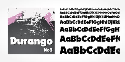
  8. Glossy by Volcano Type, $19.00
    Glossy, a font for starlets designed by Sandra Hofacker.
  9. Fraktur No2 by SoftMaker, $9.99
    Fraktur No2 is a blackletter typefont published by SoftMaker.
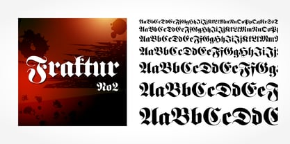
  10. Harlekin by SoftMaker, $9.99
    Herlekin is a decorative script typeface published by SoftMaker.
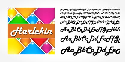
  11. Japanette by SoftMaker, $9.99
    Japanette is a vaguely oriental typeface published by SoftMaker.
  12. Disco by SoftMaker, $9.99
    Disco is a disco-era typeface published by SoftMaker.
  13. Balloon No2 by SoftMaker, $9.99
    Balloon No2 is a decorative typeface published by SoftMaker.
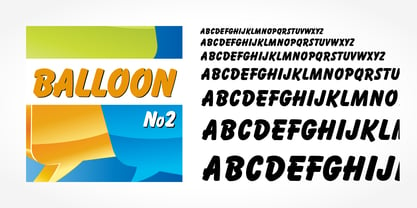
  14. Hudson by SoftMaker, $9.99
    Hudson is a brush script typeface published by SoftMaker.
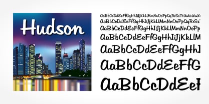
  15. Mister Big by SoftMaker, $9.99
    Mister Big is a decorative typeface published by SoftMaker.
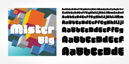
  16. As of my last update in 2023, Pungen is not a well-documented or widely recognized font in mainstream typography resources. This seems to suggest that Pungen may either be a niche, bespoke creation b...
  17. Wakefield by Galapagos, $39.00
    A gentle breeze caressed his face as his body took on the easy posture of a dancer on break. Flickering sparklets of light sprinkled the glass-smooth surface of the aqua liquid on which he floated. His mind wandered; he was only days away from his scheduled departure date. This day was no different from a hundred other days he had spent melded to his windsurfer, skittering along the breadth of the modest lake, soaking up the sun's rays and forgetting about the entire rest of the world. Lake Quannapowitt, and the town of Wakefield, Massachusetts, were familiar to Steve, a long-time resident of the picturesque New England town. This is where he grew up; this is where he married and lived for many years; and this is the place he was preparing to leave, not one week hence. Not generally prone to nostalgia, it was in just such a state he nonetheless found himself once Zephyrus retreated, as was his custom, periodically, while patrolling the resplendent lake. Steve was going to miss the lake, and he was going to miss the town. How many hours of how many days had he spent exactly like this, standing on his motionless board, waiting for his sail to fill, and staring at the lake's shores, its tiny beach, the town Common with its carefully maintained greenery, and equally well-tended gazebo, the Center church - its spire shadow piercing the water's edge, like a scissor-cut the better to begin a full-fabric tear? Yes, he was going to miss this place - this town which all of a sudden had become a place out of time, just as he was about to become a person out of place. Once this idea struck him, he couldn't shake it. He was transported back in time four score years, now watching his ancestors walk along the shore. Nothing in view belied this belief - not the church's century old architecture, not the gazebo frozen in time, nor the timeless sands of the beach, nor the unchanging Common. Everything belonged exactly where it was, and where it always would be. This, he decided, was how he would remember his hometown. And this is when it occurred to Steve to design a typeface that would evoke these images and musings - a typeface with an old-fashioned look, reflected in high crossbars, an x-height small in size relative to its uppercase, and an intangible quality reminiscent of small-town quaintness. Wakefield, the typeface, was born on Lake Quannapowitt in the town for which it was named, shortly before Steve moved away. It is at once a tribute to his birthplace and a keepsake.
  18. Nefertiti by JAB, $12.00
    As you can see, Nefertiti is a font based on ancient Egyptian hieroglyphs and could be classified as a fun-font. I've always been really interested in Egyptology and a couple of years ago I thought it would be great to be able to write in hieroglyphs. I started to study them but soon realized it would take me a long time to be able to do this. Still, I was determined to find a way around this problem. At some point I came up with the idea of rearranging and reforming the hieroglyphs so as to resemble the English alphabet. During this process I tried as much as possible to preserve their ethos and appearance. However, since they are designed to write in English with, it's obvious that they are not always going to look like the real thing. Despite this, I'm really happy with the final result and I think many Pharaohphiles who just want to have some fun will be also. The only difference in this font between lower and upper case characters, is that the latter are set between two parallel, horizontal lines. These are for use with brackets (motif ends) to form cartouches - elongated ovals for names and/or titles. Try typing the following using the upper case in the sample text box. e.g. (JOHN} The zigzagged vertical lines at each end, separate the motifs from the hieroglyphs. Note the three types of ends/brackets. These lines are also used to separated words from one another and to give a more authentic appearance. So pressing the space bar gives a zigzagged line - not a space. They can also be used at any point within a cartouche to separate first and last names or titles. e.g. ; (JOHN;BROWN} walked straight home after work. Notice the eye glyph (period/full stop) at the end of the sentence. This is the only punctuation mark which can be used within a cartouche, e.g. after Mr. or to add a more Egyptian appearance to a name or title. e.g. (MR>;JOHN;BROWN} Parallel lines dividing hieroglyphical inscriptions and writing into rows or columns are very common. To incorporate these in a body of text, simple use the underline U. e.g. (OSIRUS) and {ISIS} were important gods of the ancient Egyptians. (HORUS) {HATHOR} and [RA],the sun god, were also highly revered deities. The punctuation marks available are shown below. . , " " ' ! ? "where is the king?" The font also includes the numbers 0-9, the following mathematical symbols and the hash sign(Scarab beetle). Once again, I've tried to make them look as Egyptian as possible; whether I've succeeded or not is open to debate. e.g. + - x / = # This font is named after Akhenaten's beautiful wife, Nefertiti, who's image can be seen in the graphic on this page.
  19. Elektronik - Personal use only
  20. ALIENS GT - Unknown license
  21. KG Holocene - Personal use only
  22. HAWAIIAN DREAMS PERSONAL USE - Personal use only
  23. Santa'sSleighFull - Unknown license
  24. Promocyja - 100% free
  25. MY TURTLE - Personal use only
  26. Gypsy Tarot-Major Arcana - Unknown license
  27. Skratch - 100% free
  28. FARSCAPE - Personal use only
  29. Cubiculo Gallery) - Personal use only
  30. Cubiculo Gallery) - Personal use only
  31. Utusi Star - Unknown license
  32. Behrensschrift - Unknown license
  33. Nostra 2003 J - Unknown license
  34. Alfabetix - Unknown license
  35. Scalactic J - Unknown license
  36. Inverness by Red Rooster Collection, $45.00
    In the 1930s, it was popular to take day-trips by train to the seaside in the British Isles. Many posters were designed by the various regions to advertise these excursions; it is from one of these posters that Inverness was created.
  37. Behrens Schrift by Solotype, $19.95
    A simplified blackletter designed by Peter Behrens, architect and graphic artist who came into prominence around 1900. Issued by Rudhard's Typefoundry, Offenbach A. M., this face was typical of many in the Jugendstil period. Its squarish look works well in Craftsman period layouts.
  38. Syntax by Linotype, $29.99
    Syntax was developed by Hans Eduard Meier in 1968 and presented by the font foundry D. Stempel AG. Its figures are based on Old Face characters but have a distinctive, modern design. The inclination to the right lends the font a dynamic feel.
  39. Lino by Kmaz, $10.00
    Lino is a unique typeface with elegant modern edge, designed by Khalid Al-Mazrouei and published by Kmaz. Lino packs a complete set of uppercase and lowercase letters, numbers and punctuation, it comes in 5 weights: Regular, Thin, Extra Thin, Bold and Solid.
  40. Paz by Sudtipos, $29.00
    Paz, a squarish 4-weight industrial family, ranging from extreme hairline to black. It is ideal for editorial headlines where type plays a major role in the overall design. The fonts were designed by Ariel Di Lisio and digitized by Alejandro Paul.
Looking for more fonts? Check out our New, Sans, Script, Handwriting fonts or Categories
abstract fontscontact usprivacy policyweb font generator
Processing