10,000 search results
(0.034 seconds)
- Hello Sister by Haffastudio,
$12.00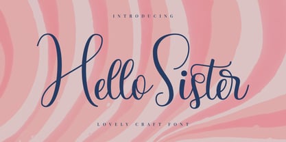 Hello Sister is a beautiful and refined script font. It has a classy, elegant and modern look that can be used for logos, branding, invitations, stationery, wedding designs, social media posts, and much more!
 - Capetown Signature by MJB Letters,
$15.00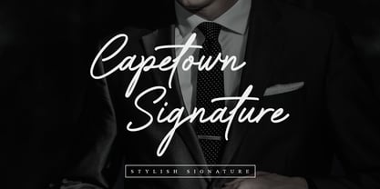 Capetown Signature is a modern and classic script font, perfect for signatures, branding, logos, photography, looks very clean and elegant, it will give the impression of luxury to your design. What’s include: – Ligature – Swash
 - Gladsome Morning by Seemly Fonts,
$14.00 Gladsome Morning is a cool, clean, and simple display font. It will look stunning on any food packaging design, poster, flyer, or print. Use this font for your designs and explore its endless possibilities.
 - Second Song by Supfonts,
$16.00 Here's my new experiment, Second Song. This font breaks the boundaries even more. Now the inscription looks as authentic as possible. Includes: Regular Script Uppercase and lowercase Numbers and punctuation Foreign language support Ligatures
 - Remind Him by Seemly Fonts,
$12.00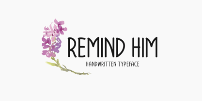 Remind Him is a cute and simple lettered handwritten font that can be used for all chalkboard quotes or teaching material! Its authentic look will add a personal and realistic feel to your designs.
 - Sofya by Gaslight,
$30.00 This funny script font based on the logo which we did. It will look great on the package, restaurant menus, logos and magazine headlines. A large number of ligatures help you vary your design.
 - Angkasa Script by Struggle Studio,
$16.00 Looking for vintage script fonts? Angkasa is a vintage handwritten font inspired by traditional Calligraphy, Angkasa font includes a full set of Classic upper and lower case letters, multilingual symbols, numbers, punctuation and ligatures.
 - Solleno by AEN Creative Studio,
$12.00 Solleno is a great font for your projects. It's an elegant script font that carries a personal look & feel. Get inspired by its unique charm, and turn any design idea into a true standout.
 - Winter Wonderland by Ake,
$12.00 Winter Wonderland is a cute and simple lettered handwritten font that can be used for all chalkboard quotes or teaching material! Its authentic look will add a personal and realistic feel to your designs.
 - Vintage Badges by Decade Typefoundry,
$28.00 An awesome premium quality set of 26 layered badges. It’s a very versatile, “old timey” look, vintage and that can be used as logos, member badges, company badges, stamps, price reductions and much more.
 - Wood Factory by Kustomtype,
$25.00 Wood Factory is a western styled typeface created by Kustomtype. Wood Factory is an old Wood Type favorite. It was designed specifically for display, headlines and titles where a wanted poster look is desired.
 - Never Give Up by Seemly Fonts,
$14.00 Never Give Up is a simple and friendly handwritten font, featuring the perfect amount of trendiness. This original look will appeal to a wide range of crafty ideas, from letterheads and titles to stationery.
 - Ames' Weathered by Greater Albion Typefounders,
$16.00 Ames’ Weathered is the ‘antique’ accompaniment to our Ames’ typeface families. It has that ‘tumbled’, weather knocked about look. Just the thing for posters, headings and signage where there’s a need to suggest age.
 - Regiola Script by Lucky Type,
$16.00 Regiola Font Duo is an elegant serif typeface paired with natural handwritten script. By presenting a luxurious and chic look, for websites, modern logos, social media quotes, brand identities, wedding stationery and much more.
 - Igor by A New Machine,
$19.00 Igor is a hand drawn font designed for display use - it is mainly all cap with different glyphs for capitals and lowercase. Its purposefully messy design will look great on invitations, posters and headlines.
 - Bumbbled by Viswell,
$19.00 Bumbbled is a rounded monoline script featuring 2 styles and is well suited for your design project with a playful and fresh look. Features: Uppercase & Lowercase Characters Numerals & Punctuation Standard Multi-ligual Support Alternates
 - Tangent Slice by The Arborie,
$11.00 Looking for a structured font that screams elegance? You've found it. This handmade font is modern yet is a tinge of retro to give you a unique combination that is sure to stand out.
 - Uyuni by Alejandro Arrojo,
$20.00 An imperfect handwriting and retro style font. Informal, authentic and very versatile. Lover of adventure travel, alternative sports, and home cooking. It feels more comfortable in large sizes but also can tell little stories.
 - Freeform 721 by Bitstream,
$29.99Auriol font was the basis for the lettering used by Hector Guimard for the entrance signs to the Paris Metro. Bitstream’s Freeform 721 with his brush stroke look, is well-suited to display settings. - Lancashire Stencil JNL by Jeff Levine,
$29.00 The Butterfly Brand [from the UK] manufactured some lettering stencils (circa the 1950s) with a distinctively British look and feel. These inspired Lancashire Stencil JNL, which is available in both regular and oblique versions.
 - Rache Rache by Daylight Fonts,
$50.00 This is a modern font with a new interpretation of the classic font. It has sharp serifs, delicate hairlines, and beautiful curves that will make your typographic work look vinegar-lidded, stylish, and sexy.
 - Well Hope by Seemly Fonts,
$12.00 Well Hope is a cute and simple lettered handwritten font that can be used for all chalkboard quotes or teaching material! Its authentic look will add a personal and realistic feel to your designs.
 - Pretty Berelly by MJB Letters,
$17.00 Pretty Berelly is a beautiful and cursive script font. It has a lively, elegant and modern look that can be used for logos, branding, invitations, stationery, wedding designs, social media posts, and much more!
 - Butter Carney by Zeenesia Studio,
$16.00 Introducing Butter Carney, Butter Carney is handwritten font with a modern calligraphy feel, Looks amazing on wedding invitations, thank you cards, quotes, greeting cards,tshirt design, mugs, logos, business cards and any other design.
 - Splendid Moment by Seemly Fonts,
$12.00 Splendid Moment is a cute and simple lettered handwritten font that can be used for all chalkboard quotes or teaching material! Its authentic look will add a personal and realistic feel to your designs.
 - Happy Moment by Seemly Fonts,
$12.00 Happy Moment is a cute and tall lettered handwritten font that can be used for all chalkboard quotes or teaching material! Its authentic look and feel will add a realistic feel to your designs.
 - Pumpkin Smile by Sakha Design,
$12.00 Pumpkin Smile is a spooky and cool-looking display font. No matter the topic, this font will be an incredible asset to your fonts’ library, as it has the potential to elevate any creation.
 - Gianna by Jonahfonts,
$35.00 Gianna is designed for many applications for that calligraphy look. Invoking Contextual-Alternates all lower case text followed by a space will automatically prompt its Glyph Terminal, including many ligatures complete with latin diacritics.
 - Contraform by Gleb Guralnyk,
$14.00 Hello! Introducing a high contrast font named Contraform. It's a geometric shape bold typeface with modern creative look. This font includes lots of multilingual characters (check out a screenshot with available letters and signs).
 - Oboe by Graviton,
$4.00 Oboe font family has been designed for Graviton Font Foundry by Pablo Balcells in 2012. It is display typeface with a geometric rounded look. Oboe consists of 6 styles, 2 of which are free.
 - Cindy FA by Fontarte,
$39.00 Imelda Marcos, Cinderella - welcome to the club ... A picture font containing over sixty shoes, slippers and boots, fashionable yesterday, today and maybe tomorrow. Hand drawn by a designer Magdalena Frankowska. Not only for fetishists.
 - Arzachel by CAST,
$45.00 Arzachel is a humanistic sanserif with a big x-height and a specific organic look. Its design is scientifically sharp and efficient in small type sizes as well as rugged and dramatic in headlines. Arzachel’s essential feeling comes from several features: all the letters are slightly sloped, stem terminations are flared at the top, and the terminals in letters a, c, e, f… are widening with the inside parts completely flat. The stroke contrast is low in the regular weight while it increases in the black; finally the capitals have an inscriptional flavor. Despite being a sanserif (thus a product of recent typography) Arzachel’s roots stretch back to the Renaissance tradition: Olocco took inspiration from some of the early and rather weird types cut in Venice in the 15th century. Arzachel was conceived during Olocco’s MA in Reading to provide a companion for his Zenon for use in small type sizes. But instead of expanding the Zenon family with optical sizes, the designer decided on a sans with its own personality rather than a sanserif version of Zenon with chopped-off serifs.
 - Varietta by Sudtipos,
$39.00 Varietta is the result of my fascination with photographing the type designs of some marquees in Spanish markets. In them you can see many letter designs with reversed contrast and in different widths, probably based on the possibilities of photocomposition. At the same time I was working on the expansion of the Hastile typeface designed by Alessandro Butti for the Nebiolo foundry in Italy in the late 1930s, of which I had not seen any digitization. As I am not a fan of perfect revivals, I thought it could be interesting to connect Spain and Italy in a single typeface. The first step was to expand Butti's design to 27 styles, ranging from thin condensed to black expanded. To look for the Spanish connection and its characteristic inverse contrast I took advantage of the current technology that allows variable typefaces with many axes. From this, three scenarios of horizontal contrast were incorporated (top, bottom and mixed) which allows infinite possibilities of use. The final result is a collection of 108 static typefaces or a single variable file.
 - Elegy by ITC,
$29.99In the early 1970s Ed Benguiat drew the International Typeface Corporation's logo, a flowing script that many have hoped would one day be expanded into a complete font. From 2008, Jim Wasco of Monotype Imaging - with Benguiat's blessing - took up the challenge. After two challenging years, Elegy™ was completed. I knew that developing the typeface would present many challenges, but I felt strongly that Ed Benguiat's lettering deserved to be preserved as a font that graphic designers could take creative advantage of." - Jim Wasco Elegy makes good use of modern OpenType features to really make this script shine, and introduces some of the spontaneity of Ed Benguiat's original logotype. And what did Ed Benguiat have to say about the completed typeface?"WOW! It's absolutely beautiful. Jim Wasco has done a magnificent job of turning my logo into a great typeface design."A glowing tribute for a very fine typeface. Do take a closer look at this elegant and very accomplished script." Featured in: Best Fonts for Tattoos - Cactus Flower SG by Spiece Graphics,
$39.00 Cactus majestically blooming in the desert is truly a wondrous event! As the landscape cools, nature blossoms into a beautiful rainbow of colors. These same harmonies and contours, plus a dash of ruggedness and legibility, help to make Cactus Flower Open a superb choice for display work. This cowboy boot style is an old Speedball favorite originated by lettering artist Ross F. George. It’s especially useful for creating distinctive headlines and titles where a Tuscan look is desired. The engraved appearance of the open style adds a delightful touch to this Old West typeface. A solid version is also available. You will find small caps, petite figures, and various alternates included for your convenience. Cactus Flower Open is also available in the OpenType format. Some new characters have been added to this OpenType version including stylistic alternates, discretionary f-ligatures, and initials. These advanced features work in current versions of Adobe Creative Suite InDesign, Creative Suite Illustrator, and Quark XPress. Check for OpenType advanced feature support in other applications as it gradually becomes available with upgrades.
 - Xkanz by Xuveki,
$10.00 XKANZ is a futuristic, robotic, variable display font geared towards cyberpunk poster text, cover text, and futuristic UI. It can easily shine as both as header and body. Wide glyphs, high weight and corner contrast, and "connectors" that bridge the gap between the stems, it's this mix of elements that give XKANZ its unique look. The purchase includes two static styles, regular and oblique, and a variable font file with a interpolatable 0-12 degree slant axis. Extensive multilingual support covering most latin characters 4 stylistic sets that include alternates for the D, I, R, and E glyphs, along with symbol/punctuation alternates such as the parenthesis, brackets, and more. Possible updates include condensed versions. The updates will be free and available to everyone who has already purchases XKANZ. This one was a wild and weird journey. It took A LOT of iteration to get to this end product. I'm proud to share it. Enjoy All questions, requests, or inquiries can be sent to abe.xuveki@gmail.com or DM'd to Xuveki on Instagram (https://www.instagram.com/xuveki)
 - Brody by Linotype,
$40.99Not to be confused with the prolific, 1980s British super-star graphic and type designer Neville Brody, this brush script typeface was designed in 1953 by the American type designer Harold Broderson. Broderson worked for ATF (the American Type Founders), who were the original publishers of this design. Body is a brush script face that mimics the show card style of lettering, which was very popular throughout the United States during the first half of the 20th Century. The letters appear as if they were drawn quickly and spontaneously with a wide, flat lettering brush. The lowercase letters connect to each other, cursive script style. Brody is the perfect display face to provoke a nostalgic feeling for the 1950s. Anything having to do with apple pie, home cooking, or last minute sales would look great in this face. You could outfit a whole supermarket signage system in a snap with Brody. If you need the original version with more lettered characters then Brophy Script is a good alternate, - Mr Eaves Modern by Emigre,
$59.00 Mr Eaves is the often requested and finally finished sans-serif companion to Mrs Eaves, one of Emigre’s classic typeface designs. Created by Zuzana Licko, this 2009 addition to the Emigre Type Library expands the versatility of the original Mrs Eaves with two complimentary families: Mr Eaves Sans and Mr Eaves Modern. Mr Eaves was based on the proportions of Mrs Eaves, but Licko took some liberty with its design. One of the main concerns was to avoid creating a typeface that looked like it simply had its serifs cut off. And while it matches Mrs Eaves in weight, color, and armature, Mr Eaves stands as its own typeface with many unique characteristics. The Sans version relates most directly to the original serif version, noticeably in the roman lower case letters a, e, and g, as well as in subtle details such as the angled lead in strokes, the counter forms of the b, d, p, and q, and the flared leg of the capital R, the tail of the Q. The distinctly loose-fitting letter spacing of Mrs Eaves was applied also to the Sans version. This, together with generous built-in line spacing due to a small x-height and extended ascenders and descenders, renders the same kind of lightness and airiness when setting text that is so characteristic of Mrs Eaves. Deviations from the original Mrs Eaves are evident in the overall decrease of contrast, as well as in details such as the flag and tail of the f and j, and the finial of the t, which were shortened to maintain a cleaner, sans serif look. And the lower case c had to be balanced out differently after it lost its top ball terminal. And with the loss of serifs, Mr Eaves set width is slightly narrower. Mr Eaves Italic also carries over many forms from its Mrs Eaves model, most notably the v, w, and z, which are unusually flamboyant for a sans italic design. It also utilizes lead in and terminal tails that are reminiscent of the serif italic. The biggest departure here is the width of the characters. The extra narrow gauge and delicate features seemed more appropriate for the Serif than the Sans. To allow for a comfortable fit, Mr Eaves Italic has a more robust design and wider character width. Meanwhile, the Modern family provides an overall less humanistic look, with simpler and more geometric-looking shapes, most noticeably in the squared-off terminals and symmetric lower case counters. This family has moved furthest from its roots, yet still contains some of Mrs Eaves’ DNA. The Modern Italic is free of tails, and overall the Modern exhibits more repetition of forms, projecting a cleaner look. This provides stronger differentiation from the serif version whenever a more contrasting look is desired. Each version (Sans and Modern) contains its own set of alternates providing unique options for applications such as headlines, word logos, letterheads, pull quotes, and other short text settings. Both the Sans and Modern come in six weights. The simpler forms of a sans-serif provide the opportunity of more weights than do serif letter forms, which are more complex in structure, making it difficult to accommodate additional weight without distortions. Regular and Bold match the original Mrs Eaves weights, while the Heavy provides an additional weight for extra emphasis.
 - Mr Eaves Sans by Emigre,
$59.00 Mr Eaves is the sans-serif companion to Mrs Eaves, one of Emigre’s classic typeface designs. Created by Zuzana Licko, this 2009 addition to the Emigre Type Library expands the versatility of the original Mrs Eaves with two complementary families: Mr Eaves Sans and Mr Eaves Modern. Mr Eaves was based on the proportions of Mrs Eaves, but Licko took some liberty with its design. One of the main concerns was to avoid creating a typeface that looked like it simply had its serifs cut off. And while it matches Mrs Eaves in weight, color, and armature, Mr Eaves stands as its own typeface with many unique characteristics. The Sans version relates most directly to the original serif version, noticeably in the roman lower case letters a, e, and g, as well as in subtle details such as the angled lead in strokes, the counter forms of the b, d, p, and q, and the flared leg of the capital R, the tail of the Q. The distinctly loose-fitting letter spacing of Mrs Eaves was applied also to the Sans version. This, together with generous built-in line spacing due to a small x-height and extended ascenders and descenders, renders the same kind of lightness and airiness when setting text that is so characteristic of Mrs Eaves. Deviations from the original Mrs Eaves are evident in the overall decrease of contrast, as well as in details such as the flag and tail of the f and j, and the finial of the t, which were shortened to maintain a cleaner, sans serif look. And the lower case c had to be balanced out differently after it lost its top ball terminal. And with the loss of serifs, Mr Eaves set width is slightly narrower. Mr Eaves Italic also carries over many forms from its Mrs Eaves model, most notably the v, w, and z, which are unusually flamboyant for a sans italic design. It also utilizes lead in and terminal tails that are reminiscent of the serif italic. The biggest departure here is the width of the characters. The extra narrow gauge and delicate features seemed more appropriate for the Serif than the Sans. To allow for a comfortable fit, Mr Eaves Italic has a more robust design and wider character width. Meanwhile, the Modern family provides an overall less humanistic look, with simpler and more geometric-looking shapes, most noticeably in the squared-off terminals and symmetric lower case counters. This family has moved furthest from its roots, yet still contains some of Mrs Eaves' DNA. The Modern Italic is free of tails, and overall the Modern exhibits more repetition of forms, projecting a cleaner look. This provides stronger differentiation from the serif version whenever a more contrasting look is desired. Each version (Sans and Modern) contains its own set of alternates providing unique options for applications such as headlines, word logos, letterheads, pull quotes, and other short text settings. Both the Sans and Modern come in three weights. The simpler forms of a sans-serif provide the opportunity of more weights than do serif letter forms, which are more complex in structure, making it difficult to accommodate additional weight without distortions. Regular and Bold match the original Mrs Eaves weights, while the Heavy provides an additional weight for extra emphasis.
 - Lava-Lava - Unknown license

