10,000 search results
(0.057 seconds)
- Umbertone by Mysterylab,
$21.00 Umbertone is a modern sans serif with roots in classic hardcover book design and the Art Nouveau movement. It takes the inventiveness of the early 20th century designers and brings it a century forward with some unique letterforms and a collection of subtle but elegant ligatures. Excellent for typographic book cover concepts, and also great for high-end branding for luxury and fashion products.
 - Rockets Battle by Rochart,
$10.00 Rockets Battle is my hand drawn brush font, and makes with original brush paint, by using high resolution brush stroke images with incredible definition. Its look natural. It will be great for Logotypes, Posters, Digital Lettering Arts, Clean Design, Branding Design, Sign, Merchandise and Social Media Posts. This font contain of Uppercase, Lowercase, Number, Symbol, Punctuation, also support multilingual and already PUA encoded.
 - Kangmas by Azzam Ridhamalik,
$12.00 Introducing Kangmas, a nostalgic retro serif font with regular and true italic style. This font has rounded serif inspired by all the retro aesthetics making a comeback and the awesome classic "Cooper Black" typeface, but includes more modern letter shapes in it. The combination make it has a nostalgic retro vibes and also gives modern looks at the same time.
 - Wordwalker by Cititype,
$16.50 Wordwalker is a freehand casual marker script that designed to appear as if it was written by wide marker. This original look will appeal to a wide range of crafty ideas, from letterheads and titles, to stationery. A clean legible style yet friendly & fun. Wordwalker features extended characters, containing West European diacritics & ligatures, making it suitable for international environments & publications.
 - Murisa Alexenia by Murisa Studio,
$10.00 Have you ever wanted a pattern in your font?, so it will look unique and attractive?. We present to you the Alexenia font. Murisa Alexenia is a font inspired by fallen leaves in winter. A font full of aesthetics in it. A font that will take you into a calming atmosphere. Use this font in your best design, and feel the sensation..
 - Sylphide by Scriptorium,
$24.00Sylphide is based on poster lettering from France in the 1890s. It has a very authentic Art Nouveau look with some unusual features, including the decorative-initial style capital letters and the cut-out look of the standard characters. It's an excellent and unusual font for uses like restaurant menu titles, poster designs or other decorative purposes. - Rastogas by Gatype,
$14.00 Rastogas Brush, is tightly spaced, and retains all brush imperfections. It has a nice contrast with the opaque and transparent parts. This will give your work an authentic and realistic brush look! It's the ultimate font for a fresh new branding look and create eye-catching designs for ads, social media posts, product packaging, fashion apparel, posters & more.
 - Logotype Frenzy by Decade Typefoundry,
$40.00 Logotype Frenzy is a display typographer’s guilty pleasure. It’s one of the very few fonts ever made that can take intense abuse and still look natural. It comes with over 1000 characters, including a lot of alternates and extended language support. In OpenType savvy applications, some letter combinations are automatically replaced with ligatures for a more natural look.
 - Vaccine by ParaType,
$30.00 Vaccine is a slab serif font family with a mixture of the usual and one-sided serifs. We call it ‘semi semi slab serif’. Serifs and terminals have soft rounded shapes, but stem junctions on the contrary use hard constructions. Such combination of basic design features makes the font distinct and strong in a setting and delicate and soft in appearance. This design peculiarity, together with low contrast and strong serifs, produces the qualities needed for using the font in small sizes, in low quality print, and in bad reading conditions. Vaccine got modern stylish design and has a prominent place in the set of popular faces. The family consists of 10 members - five weights with the corresponding italics. It can be used in a wide range of applications - magazines, advertising, corporate identity, urban navigation, packaging, children books, etc. Design by Manvel Shmavonyan with the help of Gayane Bagdasaryan as a consultant. Released by ParaType in 2013.
 - Hot Pursuit by Wing's Art Studio,
$18.00 Hot Pursuit: A Hand-Drawn Grind-house Roller Derby Font A grungy hand-drawn font with attitude inspired by comic books, Roller Derby and bad Grindhouse movies. Hot Pursuit is a boiling pot of pop-culture references ranging from 70s chase movies to Roller Derby, horror comics to Grindhouse cinema. All combining to create a hand-drawn font for grungy designs with maximum punch. Supplied in regular and italic styles, it creates titles that race off the page, perfectly suited for dynamic movie posters and headlines. Along with the 4 font styles you’ll also find a host of original comic art by Christopher King, plus symbols and underlines to compliment your type. Hot Pursuit contains unique uppercase and lowercase characters, numerals, punctuation and language support. It’s a bad-ass font ready for your t-shirts, posters, stickers, movie titles, YouTube videos and more! Check out the visuals to see it in action for yourself.
 - Beethink by Gassstype,
$25.00 Bee Think This is a Rough Brush Typeface that is written casually and quickly. comes in two mode Standart this font are made with brushes on Procreate. Then crafted carefully drawn into vector format. That is why Bee Think has Rough and strong characteristic more natural look to your text with a more modern look to your text. You can activate Ligature OpenType panel to make these two styles. Bee Think is perfect for homeware designs,branding projects, Logo design, Quotes product packaging, especially with horror and scary themes Bee Think a natural Hand Drawn feel. This handmade font will make your design has a beautiful natural touch for each details. It is perfect for any design project as Invitation,logo, book cover, craft or any design purposes,photos, photography overlays, signs, window art, scrapbooking, tags and so much more! That is has charming, authentic and relaxed characteristic more natural look to your text.
 - Kamerik 205 by Talbot Type,
$19.50 Kamerik 205 is inspired by the classic, geometric sans-serifs such as Futura and Avant Garde, but has shallower ascenders and descenders for a more compact look, and features a traditional double-storey lower case a and g. It's a versatile, modern sans, highly legible as a text font and with a clean, elegant look as a display font at larger sizes. It includes old style non-aligning (lower case) numbers, both proportional and tabular as well as accented characters for Central European languages. The Kamerik 205 family comprises of six weights, and is closely related to Kamerik 105. The most notable differences between the two variations, are the two-storey lower case a and g in Kamerik 205, where they are single-storey in Kamerik 105.
 - Piolin by JVB,
$13.00 Piolin So new. So different. Piolin is a memorable display font inspired by the circus universe. This typeface, which has the same name of the most renowned brazilian clown, is full of magical tricks like several characters alternates, swashes and discretionary ligatures. Please, explore the opentype features included in this typeface at their best and go deep inside the circus imaginary. Piolin is suitable for brand identities, book design, editorial design, campaigns, exhibitions and other promotional materials that seek a special flavour to stand out an astonishing message. If used in big sizes, Piolin reveals its marvellous details which make us feel bewitched by how carefully it is designed. Feel the magic up close!
 - Joanna by Monotype,
$40.99 The English stone carver, artist, and typographer Eric Gill conceived the Joanna typeface as a personal design for use in books printed at his Joanna Press."" Gill saw his press work there as a continuation of the British Arts and Crafts Movement, pioneered in the 19th Century by William Morris. Joanna is notable for its almost vertical ""upright"" italics, and the unusally small size of its italic characters. Joanna is versatile and extremely legible. The letterforms are a bit narrow, so the face is very economic as well. A lot of text may be packed densely together onto a page with Joanna. Joanna mixes very well with other typefaces designed by Eric Gill; especially Gill Sans.
 - Kreis by Kateryna Korolevtseva,
$19.00 KREIS is a modular typeface created by Ukrainian designer Kateryna Korolevtseva. KREIS has a modern sharp character inspired by the shape of an old-school CD disk. It consists of three simple modules with the roots in square and circle shapes. Letterforms create a geometric typographic pattern, but at the same time, it remains readable. KREIS works best in headings, logos, and strong messages. If you want to look strong — use KREIS. If you want to protest — use KREIS. If you want to be heard — use KREIS.
 - Ellington MT by Monotype,
$29.99 Ellington was designed by jazz lover, Michael Harvey for Monotype in 1990, and named after the great band leader, Duke Ellington. From experience gained carving letters in stone and drawing them for book jacket designs, Michael Harvey has created a condensed typeface combining the clear-cut sparkle of a modern face with some of the lively features of the broad-edged pen. Ellington has a fresh elegance that is particularly effective in display, while its compressed forms will prove economical in text settings. The Ellington font family has narrow characters with strong vertical strokes and angular calligraphic traits. Ellington is a lively face and an appropriate font choice for advertising and book work. Ellington has a sans serif companion family, Strayhorn.
 - Space 101 by Azure Studio,
$11.00 Introducing the first typeface by Azure studio, Space 101! Space 101 is a handcrafted chalkboard reminiscent typeface with irregular slender lines and a quirky personality. This typeface is perfect to add character and charm to bodies of text and heading where the slight imperfections tie your whole design together. The inspiration for Space 101 was found in an old signwriting book. The character shapes were updated and improved while still retaining the same charm. The typeface gave me interstellar space travel vibes reminiscent of early books based around space travel, which is why I decided to call it Space 101. I hope you enjoy this typeface and if you have any questions or comments get in touch. I'd love to hear from you. fonts@azurestudio.co.nz
 - Humble Hearts by Joanne Marie,
$20.00 Humble Hearts is a mono script font designed to look handlettered and unique. With over 700 glyphs you will have lots of fun designing beautiful logos, t-shirts, wedding stationery, menus - the list is endless! Anyone can access the alternate glyphs via Font Book on a mac or Character Map in Windows to copy and paste into non designer software. Please take a look at all of the pictures to see this font at work. You can use the basic glyphs as a lovely script on it's own or you can make your designs really fancy using the alternates and swashes. You can choose to have the breaks in the swashes (as shown) or solid swashes. In addition to the multilingual characters included in this font are the following styles and glyphs: Alternates Ligatures Swashes Ornaments & Premade words
 - Malik by Zetafonts,
$39.00 Taking its name from the arabic word for "king", Malik is a flared sans serif typeface family designed in 2020 by Andrea Tartarelli. The designer wanted to find a way to bridge the classical letterforms of Roman Old Style typefaces with the readability of contemporary sans typefaces. This was achieved by using the so-called flared serif that emerges gradually from the stem of the letter, ending in a sharp angle. It's something that also reminds of the peculiar shapes of the Simoncini Method, invented by italian type designer Francesco Simoncini to get a sharper definition of letterforms. To this blend of classical elegance and modernist expertise, Malik adds the calligraphic influence of modern masters like Frederic Goudy or Ed Benguiat, visible in signature details like the reverse contrast uppercase B, or the calligraphic lowercase k. Malik also means "owner", and this font surely wants to rule the page. It manages to be extremely readable when used in body text size, but looks surprising and expressive in display use. The inclusion of the Malik Heavy Display weight, with its black texture balanced by deep inktraps, allows for striking logo design. The weight range of the family is extremely wide, including a Book alternative to the Regular weight for fine-tuning readability, a range of light display weights and a solid choice of bold weights for branding, all coming with matching true italics. The 16 cuts of Malik have been equipped with all the features you need to solve your editorial and design challenges, including a wide language coverage (thanks to over one thousand latin and cyrillic characters) and a complete set of open type features (including small capitals, positional numbers, case sensitive forms). Alternate characters and stylistic sets allow you to fine-tune your editorial and branding design by choosing variant letter shapes. Malik is the typeface for everyone who wants to design like a king...or like he doesn't care who the king is!
 - Camelleon by Balpirick,
$15.00 Camelleon is a monoline handwritten font. Its casual charm makes it appear wonderfully down-to-earth, readable and, ultimately, incredibly versatile. Camelleon will look outstanding in any context, whether it’s being used on busy backgrounds or as a standalone headline!
 - Fertigo Pro by exljbris,
$- Enjoy Fertigo Pro. The font nobody was waiting for. It’s a bit like Laphroaig; they say that the more you’ll get to know it, the more you will (probably) appreciate it. Don't forget to have a look at the script version.
 - Technik by CarnokyType,
$25.00 Technik is a constructed typeface, which is almost strictly designed from basic geometrical elements consisting of mainly circles, also squares and diagonal shapes. Another characteristic is the connection of diagonals, verticals and diagonals, and also of some circle shapes touching each other at one point. It gives this type an original look, and prevents the problematic dark places in some letters. The technical feeling of the type (mainly in uppercase letters) is balanced by the design of lowercase which looks more friendly and fresh. Technik is not designed as a text typeface, it is recommended mainly for display typesetting. You can use it for example in fashion industry or in branding typography, or everywhere where you need the technical feeling of the constructed typefaces to look less cold and more friendly.
 - Equipage by Kitchen Table Type Foundry,
$16.00 Équipage is a French word meaning ‘crew’. It is used for the crew on boats, airplanes, but it also applies to horse-drawn carriages and all that goes with it. Originally the word means ‘to fit out’ and it is probably derived from the Norse word ‘skipa’, which means ‘arrange, fit out a ship’. Then, if you’re really interested, the word ‘ship’ hails from this same word, just like the Danish ‘skib’, Middle Dutch ‘ship’, Dutch ‘schip’ and German ‘Schiff’. See? You learn something every day! Équipage is a really nice, handmade serif font. It is quite elegant and would look fantastic on labels, postcards and book covers. Comes with extensive language support and a set of alternates for the lower case glyphs.
 - Restora by Nasir Udin,
$22.00 Restora is a mix of old-style roman serif styles. The combination of beautiful letterforms and old style serif makes Restora a versatile type family that can be used in many different themes of design projects. It comes in eight weights from thin to black with matching italics. Its mixture of weights provide a wide range of styles that will help you find the best vibe for your projects, from body text to big headlines, from classic style to modern, bold, and a bit funky style. It is well suited for book covers, editorial, branding, advertising and more. Its OpenType features provide a number of swash, beautiful ligatures and stylistic alternates that give your typography a unique look. RESTORA NEUE is available now! Check it out!
 - Persian Grunge by Si47ash Fonts,
$19.00 The only Persian Arabic font featured on Behance [Graphic Design / Typography] Published in multiple books including New Illustration With Type and DesignAndDesign Vol. II Carefully and meticulously designed by selecting, choosing, vectorizing and editing so many different Persian and Arabic calligraphic scripts and old typefaces glyphs forms to create this one of a type [pun intended!] font. And if it's not enough, it's got patterns, textures, artistic elements, ornaments, in a grunge and dirty style. But it not over yet! Persian Grunge [Dirty] font has two styles: Dirty and Neat. Not only the Neat style is cleaner, but also a lot of same glyphs are different from the Dirty style. This Arabic grunge font is a great choice for all graphic designers, typographers and visual artists. Your posters, banners, artistic typographic projects are gonna be awesome with these fonts! Shahab Siavash, the designer has done more than 30 fonts and got featured on Behance, Microsoft, McGill University research website, Hackernoon, Fontself, FontsInUse,... Astaneh text and headline font which is one of his latest designs, already got professional typographers, lay-out and book designers' attention as well as some of the most recognizable publications in Arabic/Persian communities.
 - Queen Sea by HansCo,
$12.00 Queen Sea is a fun script font with a curly alternate and swash look that is perfect for multipurpose projects. This font looks feminine and will fit well in any design and very recommended for crafts, posters, books, branding, quotes, print templates, packaging, invitations, music labels, product labels, logos and more. This typeface comes in uppercase and lowercase, with punctuation, symbols, numerals, swashes, alternates and also has multilingual support. Swashes is alternate from numeral 0 - 9, You can access swashes from your OpenType panel in your design software. Tutorial how to Install & use Alternate / Special Character : https://hanscostudio.com/tutorial/ Enjoy !
 - Bavaria Gates by Nathatype,
$29.00 Ready to enhance your branding? Looking for that “something” that’ll make your audience go WOW and clients get on board immediately? Bavaria Gates-A Serif Font Bavaria Gates is a serif typeface that is made all characters in uppercase. An excellent choice to add the right amount of modern touch. With style looks very interesting for loads of different projects and promotions. A great all-in-one package for your logo, book cover, poster, t-shirt, branding, and advertisement needs. Features: Ligatures Alternates Swashes PUA Encoded Numerals and Punctuation Thank you for downloading premium fonts from Nathatype
 - Meridian Beauty by Letterhend,
$17.00 Meridian Beauty is a handwritten with clean and chic looks. The natural flow make this font looks like a real hand writing. This font perfectly made to be applied especially in logo, and the other various formal forms such as invitations, labels, logos, magazines, books, greeting / wedding cards, packaging, fashion, make up, stationery, novels, labels or any type of advertising purpose. Features : Uppercase & lowercase Numbers and punctuation Alternates & Ligatures Multilingual PUA encoded We highly recommend using a program that supports OpenType features and Glyphs panels like many of Adobe apps and Corel Draw, so you can see and access all Glyph variations.
 - MFC Voyeur Monogram by Monogram Fonts Co.,
$24.95 The source of inspiration for Voyeur Monogram is the 1934 "Book of American Types" by American Type Founders. Found in that specimen book was a charmingly sophisticated diagonal monogram alphabet known as “Broadway Monogram Initials”. This wonderful typeface is now digitally recreated, revived, and updated for modern use. Download and view the MFC Voyeur Guidebook if you would like to learn a little more. MFC Voyeur comes complete with Pro format fonts. You will require with programs that can take advantage of OpenType features contained within the Pro fonts.
 - Tokugawa by Vozzy,
$10.00 Introducing a vintage Japanese style all caps font named Tokugawa. This font was inspired by Japanese hieroglyphs. All available characters you can see at the screenshots. This font has six styles: Regular, Shadow, Light, Aged, Shadow FX and Light FX. This font will look good on any retro and Japanese styled designs like a poster, T-shirt, label, logo, etc.
 - Sam Suliman by K-Type,
$20.00 Sam Suliman is a condensed display face supplied in three weights – Regular, Medium and Bold – plus a set of handy italics (obliques). All six fonts are included in the value family pack. The fonts are inspired by lowercase lettering on a Sarah Vaughan album cover designed by Sam Suliman in 1962, a style which contrasts sharp tight outer corners with soft rounded counters. The letters were perhaps influenced by a Solotype font called Herald Square, but without that font’s aversion to diagonals, and adding distinctive perky ascenders/descenders on the lowercase r, a, u, g and n. The Sam Suliman fonts also add the nubs to d, m, p, and q. Suliman was born in Manchester, England in 1927. After working for McCann Erikson in London, he moved to New York where he took on freelance work designing album covers, particularly celebrated are his striking minimalist designs for jazz records. He moved back to England in the early 1960s, designing many book jackets, film titles and fabrics, also working in Spain and India before settling in Oxford in the 1980s.
 - Pantera by Lián Types,
$39.00 ROARRR! THE STYLES -Pantera Pro is the most complete style, and although its default look is mono-rhythmic it gets really playful and crazy like the examples of the posters by just activating the Decorative Ligatures button in the Open-type Panel of Adobe Illustrator. However, I recommend using also the Glyphs Panel because there you'll find much more variants per letter. Pantera Pro is in fact, coded in a way the combination of thicknesses will always look fantastic. -Pantera Black Left, and Pantera Black Right are actually “lite” versions of Pantera Pro: They have very little Open-Type code, so what you see here is what you get. Pantera Black Left has its left strokes thick, while Pantera Black Right has its right strokes thick. -Pantera White is a lovely member in this family that looks lighter and airy, hence its name. With the feature Standard Ligatures activated (liga) the font gets very playful. -Pantera Caps is based on sign painters lettering and since it follows the same pointed brush rules as the other styles, it matches perfectly. -Pantera Claws like its name suggests, is a set of icons that were done by our dear panther. THE STORY It is said that typography can never be as expressive as calligraphy, but sometimes it can get close enough. I tend to think that calligraphic trials, in order to work well as potential fonts, need first to go through very strict filters before going digital: While calligraphy is synonym of freedom (once its rules are mastered), type-design, in the other hand, has its battlefield a little tighter and tougher. When I practice pointed brush lettering, there are so many things happening on the paper. And most of them are delicious. The ones who know my work may see that although many of my fonts are very expressive, my handmade brush trials are much more lively than them. With that in mind, this time I tried to go further and rescue more of those things that are lost in the process of thinking type when first sketches are calligraphic. I wondered if I could create something wild, hence its name Panther, by understanding the randomness that sometimes calligraphy conveys and turning it to something systemic: With Pantera, I created an ordered disorder. Like it happens a lot in many kinds of lettering styles, in order to enrich the written word the scribe mixes the thickness of the strokes and the width of the letters. Like one of my favorite mentors say (1), they make thoughtful gestures Some lively strokes go down with a thick, while some do that with a thin. Some letters are very narrow, meaning some of them will need to be very wide to compensate. Why not?. The calligrapher is always thinking on the following letters, and he/she designs in his head the combination of thicks and thins before he/she executes them. He/she knows the playful rhythm the words will have before writing them. It takes time and skill to master this and achieve graceful results. Going back to the font, in Pantera, this combination of varying thicknesses and widths of letters were Open-Type coded so the user will see satisfactory results by just enabling or disabling some buttons on the glyphs panel. I'm very pleased with the result since it’s not very easy to find fonts which play with the words' rhythm like Pantera does, following of course, a strong calligraphic base. I believe that if you were on the prowl for innovative fonts, this is your chance to go wild and get Pantera! NOTES (1) Phrase by Yves Leterme. In fact, it’s the title of a book by him. EPILOGUE Esta fuente está dedicada a mi panterita
 - Classical Melody by Putracetol,
$28.00 Classical Melody - Vintage Display Font. Classical Melody is a family Sans Serif font designed with vintage handcrafted, Classical Melody is a tall and skinny font perfect for your home decor and display designs Classical Melody inspired by music design, Classical Melody is a vintage font that is perfect for story books, illustrations, comic books, t-shirts, posters, greeting cards, logos, branding, stickers, svg, crafting and all for display purposes. The alternative characters were divided into several Open Type features such as Swash, Stylistic Sets, Stylistic Alternates, Contextual Alternates, and Ligature. The Open Type features can be accessed by using Open Type savvy programs such as Adobe Illustrator, Adobe InDesign, Adobe Photoshop Corel Draw X version, And Microsoft Word. This font is also support multi language.
 - Retro Couture by Putracetol,
$20.00 Retro Couture - Vintage Bold Font. Retro Couture inspired by vintage poster design, Retro Couture is a family script font designed with carefully handcrafted, Retro Couture is a bold font perfect for your home decor and craft designs Retro Couture is a vintage font that is perfect for story books, illustrations, comic books, t-shirts, posters, greeting cards, logos, branding, stickers, svg, crafting and all for display purposes. The alternative characters were divided into several Open Type features such as Swash, Stylistic Sets, Stylistic Alternates, Contextual Alternates, and Ligature. The Open Type features can be accessed by using Open Type savvy programs such as Adobe Illustrator, Adobe InDesign, Adobe Photoshop Corel Draw X version, And Microsoft Word. Retro Couture is also support multi language.
 - Adverse Stencil JNL by Jeff Levine,
$29.00If you're old enough to remember having a lettering stencil in school, then you might have tried to save all of the waste paper punched out of the letters and numbers; hoping to do something with them later on. Jeff Levine took his Tramp Steamer JNL stencil font and gave it the look of those waste paper pieces - lined up to form erratic characters with a personality all their own. - Poniard by Hackberry Font Foundry,
$24.95 Cutlass was just for fun. Poniard is the working version. Sleek, slender, sharp, to the point! A bit of decorative fun. This is the first font used in teaching Fontographer in my new Practical Font Design Book. I thought I better release it for those who enjoyed the journey. It's just an 8-bit font for fun. Enjoy!
 - Arfindes Orthem by madeDeduk,
$12.00 Introducing Arfindes Orthem is a brush handwritten font and will be perfect for all your project design book, title branding, product packaging, invitation, quotes, label, poster, logo etc. Feature Uppercase & Lowercase Number & Symbol International Glyphs Multilingual support Alternative Ligature Feel free to drop us a message any time and follow my shop for upcoming updates Hope you enjoy it.
 - Little Brownie by The Ocean Studio,
$10.00 Little Brownie is playful font family which puts a smile on your projects and will inspire you to create something fun and memorable. It is perfect for headings, flyer, greeting cards, product packaging, book cover, printed quotes, logotype, apparel design, album covers, etc. Features: – Multilingual Support – PUA Encoded – Numerals and Punctuation Thank you for downloading from Ocean Stud.
 - Suiren by Scratch Design,
$9.00 Suiren is a handwritten font with a casual style. Suiren made for a casual design theme like summer vibes, sports, kids, food, beverage, quote, novel, book, etc. Feature: Uppercase & Lowercase Number Punctuation. Multilingual Support (ÀÁÂÃÄÅÇDÐEÈÉÊËIÌÍÎÏNÑOØÒÓÔÕÖUÙÜÚÛWYÝŸỲŸÆŒßÞþ) Support in Mac and Windows OS Easy to install We hope you like it and thank you so much for your purchase :) Scratch Design
 - Grongert by Oleg Gert,
$25.00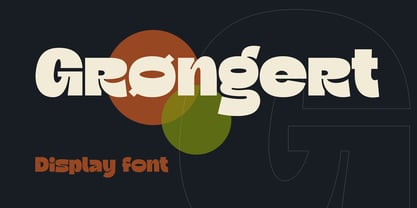 Decorative font Stonegert equipped with alternative characters, ligatures, and multi-language support. This font equipped with several features such as alternative characters, ligatures, and multi-language support that makes it easier for you to design. This font is perfect for your design needs such as poster design, logo design, branding, social media design, book, magazine, etc.