10,000 search results
(0.041 seconds)
- Raspberry Jam by CounterPoint Type Studio,
$29.99 A whimsical and fun calligraphy style font that is perfect for informal and fun occasions. The design was inspired by a series of scrapbooking style fonts that I have been exploring over the past couple of years. Inspired by a hand lettered sample in a lettering how to book. Contains language support for both Latin-based and most Eastern European languages.
 - Crane Titling NF by Nick's Fonts,
$10.00This multipurpose display alphabet combines medieval-inspired uppercase letters drawn by famed book illustrator Walter Crane with charming, if somewhat quirky, lowercase letters by J. W. Weekes. The net effect is a typeface which can add style and warmth to any project. Both versions of this font include the complete Unicode 1252 Latin and Unicode 1250 Central European character sets. - Ukiyo Mind by Kitchen Table Type Foundry,
$15.00 By chance I stumbled upon an unfinished font in my fonts folder (while looking for something else). It had a stupid working name, but when I opened it, the font looked really nice! I have no idea why I never finished it. I renamed it Ukiyo Mind, because the font looked a bit like Japanese brush strokes. Ukiyo is a Japanese term which roughly translates as ‘the fleeting/transient world’. In mediaval Japan, the word was associated with Buddhism, but later it was used to describe the urban lifestyle and the pleasure seeking aspects of it. Nowadays it refers to a ‘living in the moment’ state of mind. Ukiyo Mind is a really nice brush font, which I probably made using Chinese ink and a brush. It comes with extensive language support and a set of alternates for the lower case glyphs.
 - Valverde by Jehoo Creative,
$20.00 Valverde is a super-serif font family with 2 widths condensed and normal, each width consists of 18 fonts and has a complete weight from thin to black combined with beautiful italic cuts to meet the needs of any design in any format. Inspired by the type of vintage look that has recently become a trend, this letter character has an elegant, sharp impression. Opentype features such as Stylistic Alternate and Ligature on the Valverde family make it look more aesthetic so that it fits in a classy modern look. Stunningly beautiful and modern serifs make them an essential addition to any type of tool kit.
 - Brandan by Andfonts,
$69.00 If you're looking for the perfect font to make your logo stand out, then look no further than Brandan font. This modern and cool font is sure to give your logo, text, or any other design element a unique and eye-catching look. Whether you're looking for a font for a logo, lettering, website, or something else entirely, Brandan font has got you covered. Plus, it looks great on both light and dark backgrounds, so you know your design is going to look nice no matter where it's seen. Check out Brandan font today and give your design a professional edge!
 - Wolverhampton by Greater Albion Typefounders,
$12.50 Wolverhampton is a new Neo-Victorian face from Greater Albion Typefounders. It's something of an example of starting with a small idea and running with it. This family of three typefaces (Regular, Small Capitals and Capitals) was inspired by a line of lettering seen on a late 19th Century enamel advertisement made by Chromo of Wolverhampton (hence the family name). The family grew, topsy-like, from a recreation of these initial fifteen capital letterforms to the three complete typefaces offered here. The three typefaces are ideal for advertising and poster work with a Victorian, Edwardian, or 'Steam-punk' theme. They would also be eminently suitable for signage inspired by the same eras or (as we've seen a number of our other typeface families prove very popular) for book covers of period related novels and historical works. Finally, these slender elegant display faces are just plain fun!
 - EraMax Radial by Our House Graphics,
$16.00 EraMax Radial is a geometric sans serif meant to be set BIG, for big statements. It's the perfect face for signage, packaging posters, branding and so on and on, where a strong voice is needed. It has a modern look that will work in a retro setting. Or, should that be a vintage look that will work in a modern setting. This is the first of what is to be a series to typefaces inspired by the original hand painted signage found in the TH&B train station in Hamilton Ontario. This classic Art Deco, Or, more precisely, Art Moderne building designed by the New York architectural firm of Fellheimer and Wagner and completed in 1933. The original lettering included about 75% of the uppercase letters only, so the balance of the uppercase and the lowercase plus all the other glyphs were extrapolated from the look and feel of the existing uppercase letters. Figures are based on the numerals on the station clock, with adjustments made to harmonised with the letters.
 - Gallicide by MuSan,
$12.00 Gallicide is a Handmade Modern Vintage Textured Display Typefaces. This fonts is combining the style of modern handwritten style and classic vintage looks. It comes with 3 Styles (Rough, Reglar and Outline). This font will look good on any retro design like poster, t-shirt, label, logo etc.
 - Newfangle NF by Nick's Fonts,
$10.00 The 1892 MacKellar, Smiths & Jordan specimen book featured this jaunty little face, designed by profilic in-house designer Herman Ihlenburg. Happy, hoppy fun. Both flavors of this font feature the 1252 Latin, 1250 Central European, 1254 Turkish and 1257 Baltic character sets.
 - French Geometric JNL by Jeff Levine,
$29.00 An Art Deco geometric alphabet found within the pages of the 1939 French lettering book "Modèles de lettres modernes par Georges Léculier" ("Models of Modern Letters by Georges Léculier") is the basis for French Geometric JNL; available in both regular and oblique versions.
 - Neon by Monotype,
$29.99Neon Extra Condensed was designed by Giulio da Milano and released in 1935. This all-capital typeface is similar to designs released in the early 1990s. The Neon Extra Condensed font is good as a headline face for magazines and book covers. - Happy Cookies by Tlatous Type,
$19.00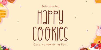 Introducing Happy Cookies Font by Tlatoustype Happy Cookies is a Modern Handwritten Font. Happy Cookies is perfect for book cover, product packaging, branding project, megazine, social media, wedding, or just used to express words above the background. This font also multilingual support.
 - Ailee Sofia by Tlatous Type,
$19.00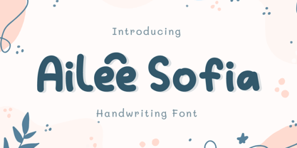 Introducing Ailee Sofia Font by Tlatoustype Ailee Sofia is a Playful Thick Display Font. Ailee Sofia is perfect for book cover, product packaging, branding project, megazine, social media, wedding, or just used to express words above the background.This font also multilingual support.
 - Avney Gad MF by Masterfont,
$59.00 Geometric forms make this elegant font family a great companion for invitations signs, indoor and outdoor. Useful when you design book jackets, posters etc.
 - Fedorro by Leeza Chepugova,
$13.00 We are proud to present to you our new Latin+Cyrillic font Fedorro! Fedorro typeface is a classy example of a modern Ukrainian style of type design. It is inspired by traditional fonts of the past, but with a strong modern twist to its appearance. The main feature of this font are round and playful letters combined with a relatively tiny negative space, making it unique like no other: many typeface elements were borrowed from historical exemplars of Ukrainian handwritten letters and redesigned with modern trends in mind. Fedorro is perfect for all the situations when you need the text to pop and catch the viewer's eye: posters, books and magazine covers, headlines, banners and ads, logotypes, corporate branding, lables, ads etc.
 - CA Capoli by Cape Arcona Type Foundry,
$29.00 CA Capoli is a fine script typeface with a vintage touch. Perfect for illustrative titles or logotypes. It comes in two styles, Regular and Stroke. The inspiration came during our trip to Italy, where we took a short rest in a bar during a hot day. We discovered a simple ceramic ashtray on the table. The word “Nido” was inscribed in a typeface that looked like it dated back to the 1950s. We made some investigations about the word, its meaning and origin but it still remains a big mystery. Was it the name of a hotel or a restaurant or some vintage Italian cigarettes? We don’t know. We were so amazed about the design of the logo that we decided to create a typeface out of it. A sophisticated endeavor because we just had four letters. How could the rest of the letters – if it ever existed – have looked like? Our hypothesis is CA Capoli. A typeface with a full Central European character set and some nice alternative letters to chose from. When we thought about “Nido” and its possible derivation of hotel business, we felt like creating a small side project for this typeface, a brand for a fictional hotel called Hotel Capoli with business cards, letterheads, a reception book, key fobs and embroidered patches for the service dress of the hotel service stuff. The Hotel Capoli is located at the wonderful beach of Cape Arcona on the fictional country of Arcona Islands where our type foundry is located.
 - Ongunkan Death Space by Runic World Tamgacı,
$50.00 Dead Space is a science fiction/horror media franchise created by Glen Schofield and Michael Condrey, developed by Visceral Games, and published and owned by Electronic Arts. The franchise's chronology is not presented in a linear format; each installment in the Dead Space franchise is a continuation or addition to a continuing storyline, with sections of the storyline presented in prequels or sequels, sometimes presented in other media from the originating video game series, which includes two films and several comic books and novels. This font is related to the video game Death Space, I redrawn this font to make it a font with a minimum character set.
 - Lunatique Rounded by The Flying Type,
$20.00 Lunatique Rounded is the soft version of Lunatique, a highly decorative font, available in three widths, with extended language coverage as well as alternates for some glyphs. And quite a seventies flair, isn't it? This font is inspired by Lucky typeface, designed in 1972 by André Pless for the Mecanorma permanent type contest. The style was later released as Letter-Press transfer sheets. Transfer sheets... Sounds quite nice, definitely. But hey, these digital ones will be waaaaaay smoother to use, you bet. Packaging, posters, books & album covers, applications are endless. Give them a go and make your text shine! [Amazing illustration on the first graphic by our equally amazing neighbor @pedrocorrea84]
 - Wood Bonnet Grotesque No.4 by astype,
$46.00 After release of Wood Bonnet Antique No.7 some of my clients asked for a sans serif version. So I printed my second batch of old wood type. I transferred these wood type into a digital font and tried to preserve the warm vintage look. » pdf specimen « The font offers up to four glyph variations of all the Latin base letters, figures and some additional letters - It has an build in letter randomizer. Please check you have turned on contextual alternates in your application. If you prefer a more common look and need more weights or to use the font in smaller text sizes I have done clean and sharp font family called Bonnet Grotesque Nr. It’s the preferred version for all the usages on websites, apps or ebooks. Have fun!
 - Koi by Talbot Type,
$19.50 Koi is a highly original, outline display font. Each character is represented by a single continuous line to create a fluid and rhythmic look. The result is something of a hybrid, sitting somewhere between an outline and an inline style, and with an asymmetrical look — something quite rare in a typeface. Many of the characters look like ready made logotypes. Further customisation is easily achieved by extending the end strokes of characters, possibly aligning them and joining them to others to create bespoke arrangements.
 - Oun by Ezzazebra,
$15.00 Inspired from Cambodia’s alphabet, Khmer. I tried to explore the visual of the original character in Latin characters. Inspired by 2 gothic fonts, Old London (for the modern/straight feel) and Berliner (for the dynamic between thin and bold line). The letters are made with pencil in a millimeter block book, then scanned into clean vector format. And the result can be use for Display or a Headline with traditional or ethnic theme, including film, game, event, etc.
 - Kraken Ink by Fat Hamster,
$20.00 Kraken Ink & Kraken Script fonts were inspired by mystery of ocean and sea, their secrets and creatures. As unique, rustic, frivolous and fun as a wind! With Kraken Ink font you can give your project it's own trendy and stylish feel. Kraken Ink typeface is perfect for your label and packaging design, social media quotes, logo and branding design, t-shirt design, heading, scrapbooking, calendars, book covers. Enjoy using the illustrations and elements in your design projects.
 - Friends by W Type Foundry,
$25.00 Friends is a complete and contemporary language system for postmodern graphics. Inspired by the idea of making new art and graphic design keeping in mind new ways of visual language like emojis as a formal way of communication and contemporary graphic arts. Friends is perfect for web design, postmodern arts, book design, posters, editorial design, branding, advertising, headlines, and short texts. Friends includes 14 style typeface plus italics, icons, emojis, arrows, ligatures, fractions, special numbers, etc.
 - Sol De Jalisco by Fat Hamster,
$25.00 Sol de Jalisco inspired by view of blue agave valley in Jalisco, Mexico. With Sol de Jalisco font you can give your project it's own unique and stylish feel. Sol de Jalisco typeface is perfect for your tequila and mezcal label and packaging design, social media quotes, logo and branding design, t-shirt design, whiskey, beer label and packaging design, heading, scrapbooking, calendars, book covers. Enjoy using the logos and little marks in your design projects.
 - Qinzy by Attype Studio,
$10.00 Introducing Qinzy - Inspired by typeface on 70s era, Qinzy has the vintage font & retro font style. with 3 font style, It's super easy to use 3D effect wint Qinzy family font. Three style Font: Handwritten, texture & Extrude Qinzy is perfect for children product, branding, logo, invitation, stationery, product packaging, merchandise, monogram, blog design, game titles, cute style design, Book/Cover Title and more. Features : - Qinzy - Qinzy Extruded - Qinzy Rough - Multilingual Support --- Hope you enjoy with our font! Attype Studio
 - Seferis by Sudtipos,
$39.00 «Seferis» is an uppercase typeface with a wide repertoire of ligatures, stylistic alternatives, and some swashes. It also has an important language coverage based on Latin. Although the «Seferis» family is mainly influenced by the classical imprint of the incised typefaces, its structure, proportions and aesthetic proposal show modern features, which give it elegance, sophistication, inner strength and an epic character. Designed by Edwin Moreira, with the invaluable support of Ale Paul in the expansion and production of the family. Seferis works perfectly in spaces as diverse as posters, logos, magazine headlines, album and book covers, packaging and many other environments where it can highlight its qualities. Available in 5 weights and a variable file that is included with the full package.
 - Cold Snowflake by Putracetol,
$16.00 Cold Snowflake - Quirky Ice Cream And Candy Theme Font is a delightful typeface designed to capture the essence of ice cream and candy in a playful and fun manner. The font features quirky, bold, and chubby letterforms, mirroring the sweet and indulgent theme it represents. It can be effectively used alone or in combination with its twelve charming variations. With twelve distinctive variations inspired by ice cream, candy, cones, sprinkles, sticks, melting treats, and chocolate, Cold Snowflake is the perfect choice for children's projects, crafting, and any design that seeks to evoke a sense of fun, playfulness, and a vibrant, colorful aesthetic. This font suits a wide range of applications, including logos, crafting projects, invitations, packaging, posters, titles, businesses, greeting cards, stickers, children's books, magazines, and any design related to the delightful world of ice cream and candy. With its sweet and cheerful theme, Cold Snowflake adds a touch of whimsy to your creative work, making it perfect for all things sweet and playful.
 - HGB Unik by HGB fonts,
$23.00 For many years I had repeatedly written names on certificates or designed texts for certificates of honor with a pen. I later digitized a font written with a broad pen from 1988 to make it easier to use. After the technical possibilities for this had developed, I made a PostScript font out of this document font. The "HGB-Unik" is a humanistic antiqua that arose from this written type. In 2009 Unik was chosen as the text font for a book. However, the book designers wanted to have an italic and a bold style as well. The cursive was developed from written texts that I also wrote for various occasions in the 1980s. The resulting font family was thoroughly revised several times until a usable text font with four weights was created. Although the Unik looks very idiosyncratic in display size, it shows a surprisingly balanced, pleasant typeface in read size.
 - VLNL Gaufre by VetteLetters,
$35.00 VLNL Gaufre is a pixel-based font with holes designed by Donald Roos. Each character is built on a grid of doughnut-like elements, which makes it look like a kind of dried dog food, or Belgian waffles. Despite the grid Gaufre still has enough warmth due to the doughy, slightly rounded corners. And because it’s prepared with a hot waffle iron of course. The end result is a merry, chunky typeface that smells of doughnut. Use it for logos or headlines, just add butter and sugar or, better still, top it with whipped cream and cherries. Yummie!
 - Sanuroemi by Azetype,
$19.00 Presenting Sanuroemi Font! A Display San Serif with more alternates. This font is made with the perfect combination of each character. You can type by Mix & Match to get a unique combination. It looks original and can be used for all your project needs. Each glyph has its own uniqueness and when meeting with others will provide dynamic and pleasing proximity. This font can be used at any time and on any project. So, Sanuroemi Font can't wait to give its touch to all your design projects such as quotes, poster design, personal branding, promotional materials, logotype, product packaging, etc. Happy Creating! www.azetypestudios.com
 - Badwulf by Oleg Stepanov,
$11.00 Badwulf is a hand-lettered display font. It is good for cartoons, children's books and games.
 - Allerlei Zierat by Intellecta Design,
$14.90 Ornaments family with four different sets plus a decorative capitals font from the rare, valuable and amazing Allerlei Zierat book from Schelter & Gieseck (1902). A research and free interpretation by Intellecta Design. This encyclopedic specimen book of the Leipzig, Germany type foundry and printing supply house J.G. Schelter & Giesecke features, as the title indicates, all kinds of decoration for supplying printing of every type. On the title page, the firm boasts winning grand prize in 1900 in Paris (presumably at the Exposition Universelle). It is hard to do justice in a short description to the variety of styles (traditional, Jugenstil, etc.) and categories (certificates, letterheads, borders, ornaments, exotic motifs, flowers, animals, silhouettes, menus, greeting cards, vignettes humorous and otherwise, images of bicyclists, occupational symbols, portraits, Classical figures, religious art, heraldry, ships, trains, athletes, etc., etc.) offered in this volume. Some of the examples are printed in color, most are in black-and-white. The Jugenstil cover of this copy shows minor wear and soiling. The plate of “Gust. Carlsson & Co., Stockholm” is attached to the front pastedown. A small fraction of pages show minor soiling, a pencil notation or a short closed tear. Two of the fold-outs at the back have a little more damage-one is missing a 1x2 inch piece along the margin, the other has a 3-inch closed tear and an edge which is crumpled. A rare specimen from the Intellecta rare books library.
 - Maple Street by Okaycat,
$29.00 Maple Street is a great looking traditional serif font composed by the Okaycat design team, Luke Turvey & Natsuko Hayashida, in 2014. Bold didone forms with structural seriffed detail combine at Maple Street to offer a cozy familiar style, without looking dated. This nicely balanced serif is designed to look outstanding for display or printed publication.
 - Pewter by KC Fonts,
$14.00 KC Fonts would like to present its latest creation: Pewter. Pewter is a three weight font (including italics) with four grungy family members (also with italics) for a total of 14 OpenType/TrueType fonts. The Pewter family allows you to freely mix and match between the weights and the grunge variants as it’s not just the same erosion over and over. The Original Trio: Regular, Bold & Black - they're perfect for your more front page useage and anywhere you need a more traditional look. The Grunge Family: each is different from one another - there is Corroded for the caked on dirty look, Scuffed for a mild abrasion with a worn and washed feel, Stamped for printing press & your rubber stamp effect and Trashed for a destroyed (but not over the top) look to your work. It looks great in all cases: UPPERCASE, lowercase, Title Case & MiXeDcAsE, whether it’s printed LARGE or small it will look great!
 - Mr Brown by Hipopotam Studio,
$20.00 Mr Brown is a typeface based on hand drawn letters to our new book for children. It has up to four alternate glyphs for each character. You can switch them manually or use OpenType Contextual Alternates feature. It will automatically set alternate glyphs de-pending on frequency of appearance of the same character. The script doesn’t throw random glyphs. For example in the word “HIPPOPOTAMUS” you will automatically get three different “P” glyphs and two “O” glyphs. It really works great but of course you can always fine tune it by hand.
 - Giant Boys by Sipanji21,
$13.00 "Giant Boys" is a cute display font characterized by thick and rounded letterforms, making it a great choice for design projects aimed at children, such as children's games, book covers, and any projects related to schools. With its playful and friendly appearance, this font adds a touch of whimsy and charm to your designs, making them more engaging and enjoyable for young audiences. The simplicity and clarity of "Giant Boys" make it easy to read and understand, making it an excellent choice for educational materials and other projects aimed at young learners.
 - Custer RE by Font Bureau,
$40.00 A book in the library of University of Wisconsin caught David Berlow’s attention. It was set in a clear text face - a predecessor of Bookman, cast by the Western Type Foundry who called it Custer. Upon noting how well the typeface worked in 6 and 7 points, he developed it into a member of the Reading Edge series specifically designed for small text on screen. Custer RE was a broad and approachable typeface drawn large on the body with a tall x-height to maximize its size when set very small.
 - TE HAFS2 Tharwat Emara2 by Tharwat Emara,
$49.00 It is known as the Hafs Quraan2 Font for its extensive use in the copying and transmission of books because it helps the writer to write more quickly than any other font since the Islamic times and then Alnaskh Quraan font wrote the "Quran"And the advantages of Alnaskh Quraan font are clarifying the letters and show their beauty and splendor. Naskh Font for writing the Holy Qur’an by Raweya Hafs, for the first time, the possibility of coloring all its letters to learn Tajweed - The possibility of coloring letters, various forms of one letter
 - Bold Galde by Sipanji21,
$15.00 "Bolde Galde" is a cute display font characterized by thick and rounded letterforms, making it a great choice for design projects aimed at children, such as children's games, book covers, and any projects related to schools. With its playful and friendly appearance, this font adds a touch of whimsy and charm to your designs, making them more engaging and enjoyable for young audiences. The simplicity and clarity of "Bolde Galde" make it easy to read and understand, making it an excellent choice for educational materials and other projects aimed at young learners.
 - Back jones by Sipanji21,
$15.00 "Back Jones" is a cute display font characterized by thick and rounded letterforms, making it a great choice for design projects aimed at children, such as children's games, book covers, and any projects related to schools. With its playful and friendly appearance, this font adds a touch of whimsy and charm to your designs, making them more engaging and enjoyable for young audiences. The simplicity and clarity of "Back Jones" make it easy to read and understand, making it an excellent choice for educational materials and other projects aimed at young learners.