10,000 search results
(0.094 seconds)
- Nextrue by Asenbayu,
$12.00 Nextrue font is a sans serif font with a sleek and sporty look. This font is shaped as a professional multipurpose font with a strong look in upright and a dynamic look in slant letter. You can use it in modern youth design, adventure, hobbies and sports. This font is perfect for a variety of projects, such as branding, poster displays, logo design, magazine covers, product labels, clothing and more. This font is perfect for taking your designs to the next level! Nextrue fonts feature opentype, kerning, ligatures, and alternative styles packed in 12 fonts (Condense, Extend, Slant). Nextrue fonts include uppercase, lowercase, numbers, punctuation and multilingual support.
 - Asikue by Kereatype,
$14.00 Asikue is a soft serif font family inspired by the 70’s retro styles that bring chunky retro typography to the modern era. Asikue consists of 10 styles from Regular to Extra Bold with each matching Oblique. Asikue includes Asikue have Opentype features: Alternate, Ligature, Swashes, etc providing you with a variety of captivating custom text arrangements. Whether it's a fancy retro-inspired, logo, or engaging bold header text Asikue is able to deliver.
 - Kahlo by Latinotype,
$25.00 Kahlo is a latin-style hipster type family. It's a formal and elegant option for designers. The family has four weights and italics, initial capital letters, and some alternate characters. This typeface is most suitable for magazine headlines, posters, logos, cosmetics packaging, advertising etc. Photography by Damien Vignaux (www.elroy.fr) Languages include: Basic Latin, Western European, Euro, Catalan, Baltic, Turkish, Central European, Romanian and Pan Africa Latin. Kahlo is a renaming of Frida.
 - Times Eighteen by Linotype,
$29.00In 1931, The Times of London commissioned a new text type design from Stanley Morison and the Monotype Corporation, after Morison had written an article criticizing The Times for being badly printed and typographically behind the times. The new design was supervised by Stanley Morison and drawn by Victor Lardent, an artist from the advertising department of The Times. Morison used an older typeface, Plantin, as the basis for his design, but made revisions for legibility and economy of space (always important concerns for newspapers). As the old type used by the newspaper had been called Times Old Roman," Morison's revision became "Times New Roman." The Times of London debuted the new typeface in October 1932, and after one year the design was released for commercial sale. The Linotype version, called simply "Times," was optimized for line-casting technology, though the differences in the basic design are subtle. The typeface was very successful for the Times of London, which used a higher grade of newsprint than most newspapers. The better, whiter paper enhanced the new typeface's high degree of contrast and sharp serifs, and created a sparkling, modern look. In 1972, Walter Tracy designed Times Europa for The Times of London. This was a sturdier version, and it was needed to hold up to the newest demands of newspaper printing: faster presses and cheaper paper. In the United States, the Times font family has enjoyed popularity as a magazine and book type since the 1940s. Times continues to be very popular around the world because of its versatility and readability. And because it is a standard font on most computers and digital printers, it has become universally familiar as the office workhorse. Times™, Times™ Europa, and Times New Roman™ are sure bets for proposals, annual reports, office correspondence, magazines, and newspapers. Linotype offers many versions of this font: Times™ is the universal version of Times, used formerly as the matrices for the Linotype hot metal line-casting machines. The basic four weights of roman, italic, bold and bold italic are standard fonts on most printers. There are also small caps, Old style Figures, phonetic characters, and Central European characters. Times™ Ten is the version specially designed for smaller text (12 point and below); its characters are wider and the hairlines are a little stronger. Times Ten has many weights for Latin typography, as well as several weights for Central European, Cyrillic, and Greek typesetting. Times™ Eighteen is the headline version, ideal for point sizes of 18 and larger. The characters are subtly condensed and the hairlines are finer. Times™ Europa is the Walter Tracy re-design of 1972, its sturdier characters and open counterspaces maintain readability in rougher printing conditions. Times New Roman™ is the historic font version first drawn by Victor Lardent and Stanley Morison for the Monotype hot metal caster." - Times Europa LT by Linotype,
$29.99In 1931, The Times of London commissioned a new text type design from Stanley Morison and the Monotype Corporation, after Morison had written an article criticizing The Times for being badly printed and typographically behind the times. The new design was supervised by Stanley Morison and drawn by Victor Lardent, an artist from the advertising department of The Times. Morison used an older typeface, Plantin, as the basis for his design, but made revisions for legibility and economy of space (always important concerns for newspapers). As the old type used by the newspaper had been called Times Old Roman," Morison's revision became "Times New Roman." The Times of London debuted the new typeface in October 1932, and after one year the design was released for commercial sale. The Linotype version, called simply "Times," was optimized for line-casting technology, though the differences in the basic design are subtle. The typeface was very successful for the Times of London, which used a higher grade of newsprint than most newspapers. The better, whiter paper enhanced the new typeface's high degree of contrast and sharp serifs, and created a sparkling, modern look. In 1972, Walter Tracy designed Times Europa for The Times of London. This was a sturdier version, and it was needed to hold up to the newest demands of newspaper printing: faster presses and cheaper paper. In the United States, the Times font family has enjoyed popularity as a magazine and book type since the 1940s. Times continues to be very popular around the world because of its versatility and readability. And because it is a standard font on most computers and digital printers, it has become universally familiar as the office workhorse. Times™, Times™ Europa, and Times New Roman™ are sure bets for proposals, annual reports, office correspondence, magazines, and newspapers. Linotype offers many versions of this font: Times™ is the universal version of Times, used formerly as the matrices for the Linotype hot metal line-casting machines. The basic four weights of roman, italic, bold and bold italic are standard fonts on most printers. There are also small caps, Old style Figures, phonetic characters, and Central European characters. Times™ Ten is the version specially designed for smaller text (12 point and below); its characters are wider and the hairlines are a little stronger. Times Ten has many weights for Latin typography, as well as several weights for Central European, Cyrillic, and Greek typesetting. Times™ Eighteen is the headline version, ideal for point sizes of 18 and larger. The characters are subtly condensed and the hairlines are finer. Times™ Europa is the Walter Tracy re-design of 1972, its sturdier characters and open counterspaces maintain readability in rougher printing conditions. Times New Roman™ is the historic font version first drawn by Victor Lardent and Stanley Morison for the Monotype hot metal caster." - Times Ten by Linotype,
$40.99In 1931, The Times of London commissioned a new text type design from Stanley Morison and the Monotype Corporation, after Morison had written an article criticizing The Times for being badly printed and typographically behind the times. The new design was supervised by Stanley Morison and drawn by Victor Lardent, an artist from the advertising department of The Times. Morison used an older typeface, Plantin, as the basis for his design, but made revisions for legibility and economy of space (always important concerns for newspapers). As the old type used by the newspaper had been called Times Old Roman," Morison's revision became "Times New Roman." The Times of London debuted the new typeface in October 1932, and after one year the design was released for commercial sale. The Linotype version, called simply "Times," was optimized for line-casting technology, though the differences in the basic design are subtle. The typeface was very successful for the Times of London, which used a higher grade of newsprint than most newspapers. The better, whiter paper enhanced the new typeface's high degree of contrast and sharp serifs, and created a sparkling, modern look. In 1972, Walter Tracy designed Times Europa for The Times of London. This was a sturdier version, and it was needed to hold up to the newest demands of newspaper printing: faster presses and cheaper paper. In the United States, the Times font family has enjoyed popularity as a magazine and book type since the 1940s. Times continues to be very popular around the world because of its versatility and readability. And because it is a standard font on most computers and digital printers, it has become universally familiar as the office workhorse. Times™, Times™ Europa, and Times New Roman™ are sure bets for proposals, annual reports, office correspondence, magazines, and newspapers. Linotype offers many versions of this font: Times™ is the universal version of Times, used formerly as the matrices for the Linotype hot metal line-casting machines. The basic four weights of roman, italic, bold and bold italic are standard fonts on most printers. There are also small caps, Old style Figures, phonetic characters, and Central European characters. Times™ Ten is the version specially designed for smaller text (12 point and below); its characters are wider and the hairlines are a little stronger. Times Ten has many weights for Latin typography, as well as several weights for Central European, Cyrillic, and Greek typesetting. Times™ Eighteen is the headline version, ideal for point sizes of 18 and larger. The characters are subtly condensed and the hairlines are finer. Times™ Europa is the Walter Tracy re-design of 1972, its sturdier characters and open counterspaces maintain readability in rougher printing conditions. Times New Roman™ is the historic font version first drawn by Victor Lardent and Stanley Morison for the Monotype hot metal caster." - Times Ten Paneuropean by Linotype,
$92.99In 1931, The Times of London commissioned a new text type design from Stanley Morison and the Monotype Corporation, after Morison had written an article criticizing The Times for being badly printed and typographically behind the times. The new design was supervised by Stanley Morison and drawn by Victor Lardent, an artist from the advertising department of The Times. Morison used an older typeface, Plantin, as the basis for his design, but made revisions for legibility and economy of space (always important concerns for newspapers). As the old type used by the newspaper had been called Times Old Roman," Morison's revision became "Times New Roman." The Times of London debuted the new typeface in October 1932, and after one year the design was released for commercial sale. The Linotype version, called simply "Times," was optimized for line-casting technology, though the differences in the basic design are subtle. The typeface was very successful for the Times of London, which used a higher grade of newsprint than most newspapers. The better, whiter paper enhanced the new typeface's high degree of contrast and sharp serifs, and created a sparkling, modern look. In 1972, Walter Tracy designed Times Europa for The Times of London. This was a sturdier version, and it was needed to hold up to the newest demands of newspaper printing: faster presses and cheaper paper. In the United States, the Times font family has enjoyed popularity as a magazine and book type since the 1940s. Times continues to be very popular around the world because of its versatility and readability. And because it is a standard font on most computers and digital printers, it has become universally familiar as the office workhorse. Times™, Times™ Europa, and Times New Roman™ are sure bets for proposals, annual reports, office correspondence, magazines, and newspapers. Linotype offers many versions of this font: Times™ is the universal version of Times, used formerly as the matrices for the Linotype hot metal line-casting machines. The basic four weights of roman, italic, bold and bold italic are standard fonts on most printers. There are also small caps, Old style Figures, phonetic characters, and Central European characters. Times™ Ten is the version specially designed for smaller text (12 point and below); its characters are wider and the hairlines are a little stronger. Times Ten has many weights for Latin typography, as well as several weights for Central European, Cyrillic, and Greek typesetting. Times™ Eighteen is the headline version, ideal for point sizes of 18 and larger. The characters are subtly condensed and the hairlines are finer. Times™ Europa is the Walter Tracy re-design of 1972, its sturdier characters and open counterspaces maintain readability in rougher printing conditions. Times New Roman™ is the historic font version first drawn by Victor Lardent and Stanley Morison for the Monotype hot metal caster." - Times by Linotype,
$40.99In 1931, The Times of London commissioned a new text type design from Stanley Morison and the Monotype Corporation, after Morison had written an article criticizing The Times for being badly printed and typographically behind the times. The new design was supervised by Stanley Morison and drawn by Victor Lardent, an artist from the advertising department of The Times. Morison used an older typeface, Plantin, as the basis for his design, but made revisions for legibility and economy of space (always important concerns for newspapers). As the old type used by the newspaper had been called Times Old Roman," Morison's revision became "Times New Roman." The Times of London debuted the new typeface in October 1932, and after one year the design was released for commercial sale. The Linotype version, called simply "Times," was optimized for line-casting technology, though the differences in the basic design are subtle. The typeface was very successful for the Times of London, which used a higher grade of newsprint than most newspapers. The better, whiter paper enhanced the new typeface's high degree of contrast and sharp serifs, and created a sparkling, modern look. In 1972, Walter Tracy designed Times Europa for The Times of London. This was a sturdier version, and it was needed to hold up to the newest demands of newspaper printing: faster presses and cheaper paper. In the United States, the Times font family has enjoyed popularity as a magazine and book type since the 1940s. Times continues to be very popular around the world because of its versatility and readability. And because it is a standard font on most computers and digital printers, it has become universally familiar as the office workhorse. Times™, Times™ Europa, and Times New Roman™ are sure bets for proposals, annual reports, office correspondence, magazines, and newspapers. Linotype offers many versions of this font: Times™ is the universal version of Times, used formerly as the matrices for the Linotype hot metal line-casting machines. The basic four weights of roman, italic, bold and bold italic are standard fonts on most printers. There are also small caps, Old style Figures, phonetic characters, and Central European characters. Times™ Ten is the version specially designed for smaller text (12 point and below); its characters are wider and the hairlines are a little stronger. Times Ten has many weights for Latin typography, as well as several weights for Central European, Cyrillic, and Greek typesetting. Times™ Eighteen is the headline version, ideal for point sizes of 18 and larger. The characters are subtly condensed and the hairlines are finer. Times™ Europa is the Walter Tracy re-design of 1972, its sturdier characters and open counterspaces maintain readability in rougher printing conditions. Times New Roman™ is the historic font version first drawn by Victor Lardent and Stanley Morison for the Monotype hot metal caster." - Citizen Kern by Pierre Tur,
$9.00 Citizen Kern is a modern, geometrical grotesk typeface. It comes in 5 different styles and opentype features for a better use of typography: it’s good for both headlines and body copy. It was made from the simplest geometrical shapes for a universal appearance, with enhanced overlaps to ensure an offbeat look. Citizen Kern is meant to work for any graphic project. You can use it for branding, editorial design, signage or even motion design : its simple shapes make it super easy to animate. Do you love the classic sans serif fonts? We all do. But what if you could add some singularity to your projects? Then Citizen Kern is the ideal pick for you. It will never be as perfect as the classics but will definitely offer an alternative, and freshness to your work.
 - Long Rider by Wing's Art Studio,
$10.00 Long Rider - The Cowboy Font A compressed slab font forged from grit and leather. Inspired by a nostalgic cowboy style this font stands tall and ready for your titles, logos and social media layouts. Particularly suited to portrait designs, this text looks great filling the screen of Instagram stories or epic widescreen productions. Includes bonus extras that help you to add texture to your type - first are the forever useful grit textures for Adobe Illustrator. Set up as seamless patterns you can easily fill any size text with an authentic broken look. Next are high-resolution leather textures for creating those rugged backgrounds. Contents: - Long Rider Regular (Standard uppercase and and lower characters) - Long Rider Alternate (Features Alternative lowercase characters)
 - Shablon by Context Foundry,
$6.00 Shablon is a Stencil style serif typeface. The family consists of 6 fonts: Shablon Regular, Shablon Italic, Shablon Condensed Regular, Shablon Condensed Italic, Shablon Extended Regular, Shablon Extended Italic. Every font includes uppercase and lowercase letters. You can use Shablon for graphic designs that call for a rough-and-ready look, a military look, or even to create real stencils for signs and marking boxes or luggage. Shablon continues the design of Shablon CYR, created in 1994 by Zhivko Stankulov. A number of shortcomings in the construction of the glyphs have been eliminated, and the typeface as a whole has been updated. Shablon is available with active support and upgradeability. Licensees will receive all new versions of the font free of charge.
 - Flicker by PizzaDude.dk,
$20.00 Handpainted font with attitude! An attitude which will help you when designing posters, packaging, headline, invitations and alike, that needs that authentic brush-look! I haven't got the count of how many pieces of paper I used to make this font. It was a lot! Comes with “contextual alternates” which means that the font has 6 different version of each letter. These different versions cycle as you type, and makes the font look more realistic!
 - Kathy Style by Creativemedialab,
$20.00 Kathy Style is a modern, elegant, classic typeface with a timeless look. It comes with five weights with matching italic. Kathy Style has many alternative characters that can be adjusted to create a pretty heading, title or logotype. Kathy Style is perfect for fashion-related concepts, Luxury and Elegant design, Classy or high-end branding, logo, and many more. Try to combine the regular and italic styles for a modern and elegant look.
 - Verilet by Azzam Ridhamalik,
$10.00 Verilet is elegant and vintage display typeface that looks stunning in just about every context. Very suitable as to make a design choice such as logos, branding, magazines, headlines, websites, packaging, wedding cards and more creative project! All-caps characters, with over 400 glyphs VERILET’s also has a lot of alternative characters. It looks really cool when elegant meet vintage to any piece. FEATURES : Uppercase Lowercase Number Punctuation Multilingual PUA Encode Opentype
 - Sword Art by Sipanji21,
$10.00 Sword Art is a cute display font that has 2 different styles, namely the slice look and the solid look. Sword Art is a good font to use for various graphic designs, such as poster titles, banners, advertisements, logotypes, and is good for combining various types of icons. This font is also good for packaging, crafting, children's and adult clothing. apply this font for your various designs to make it more powerful
 - Giraffe Skin by Scholtz Fonts,
$19.00 GiraffeSkin is an exciting, contemporary font. The popularity of the "animal skin" look in contmporary clothing and soft furnishing design make GiraffeSkin a must for designers on the cutting edge. It is best used for headings and where you intend to make a strong impact, with an African wildlife look. The font comes in two versions, one based on the popular Kassena font, the other based on Zim, one of Scholtz Fonts new designs.
 - Kelvingi Rodrige by Letterena Studios,
$10.00 Hi, Everyone! If you’re looking for a gorgeous font to attract your audiences or customers then we’ve got the font for you! Introducing Kelvingi Rodrige - A Serif Font This handmade font typeface with modern style looks very interesting for loads of different projects and promotions. It is perfect to be used on your website, for your social media branding, Pinterest banners, printed products, and more! Features: Multilingual Support Ligatures Alternates PUA Encoded Numerals and Punctuation
 - Knocky by Jehoo Creative,
$23.00 Knocky is a display typeface that is complete and versatile with a bold round condensed look with unique flexibility. We've added solid alternatives to letters, numbers, and some symbols, plus an outline style that will make the graphic look unique and stand out. With 8 styles and more than 530 glyphs in each. knocky has multi-language support, it will be perfect for many projects from editorial design to branding, advertising, publicity and digital.
 - PrestonScript - Unknown license

- Winter Swash by Illushvara,
$14.00 Hello, Introducing a new font Winter Swash inspired by graffiti style. It's bold, dramatic, urban styled display font. Add this font to your favorite creative ideas and notice how it makes them come alive like a poster, kids flyer, merchandise, quotes, branding, cartoon, comic and more. If you have any question, don’t hesitate to contact me. Happy Designing !!! Thank You, Bayu Suwirya
 - General by Juraj Chrastina,
$29.00 It's all about these subtle nuances that make a neutral sans typeface different. Pure geometry with a human touch is a recipe that works in every generation. Inspired by classical fonts from the early 20th century, General rides the line between traditional and modern styles. With its 5 light weights, the General family is a strong tool for a clean design.
 - Broline Script by Tebaltipis Studio,
$15.00 Introducing, Broline Bold Script is a typeface with personality. You can use it as a logo, badge, insignia, packaging, headline, poster, etc The alternative characters in this font were divided into several OpenType features such as Stylistic Alternates, Stylistic Sets, and Ligature. The OpenType features can be accessed by using OpenType program such as Adobe Illustrator, Adobe Photoshop, and Adobe InDesign. Thank you!
 - Chewing Gum by Gleb Guralnyk,
$14.00 Hello! Introducing a decorative font named Chewing Gum. It's an abstract shape smooth typeface with curly elements. For the English alphabet, there are alternative characters included. It basically simplified letters that are more readable in small sizes (You can access these letters by activating a "Stylistic Alternates" on your OpenType panel). Twelve fancy ligatures will make your lettering more organic and natural.
 - Duesenberg NF by Nick's Fonts,
$10.00The 1930s produced many distinctive and stylish autos. One was the Auburn, and this typeface was suggested by a period poster for the make. Another fine car of the time gives the font its name, because “it’s a Duesie!” Both versions of this font contain the Unicode 1252 Latin and Unicode 1250 Central European character sets, with localization for Romanian and Moldovan. - Relate by Panritype Studio,
$20.00 Relate is modern, elegant, beautiful script. it is made by real pen brush, and shaping carefully. It's perfect for logotype project, wedding invitation, social media headlines, birthday card, quotes, t-shirt and also match with other design project. Relate comes with natural handwriting ligatures and extra final word alternates and swashes that can make your project more beautiful and elegant.
 - Barinde Brush by Tebaltipis Studio,
$12.00 Barinde Brush is a typeface with personality. You can use it as a logo, badge, insignia, packaging, headline, poster, etc The alternative characters in this font were divided into several OpenType features such as Stylistic Alternates, Stylistic Sets, and Ligature. The OpenType features can be accessed by using OpenType program such as Adobe Illustrator, Adobe Photoshop, and Adobe InDesign. Thank you!.
 - Redters Brush by Tebaltipis Studio,
$12.00 Redters Brush is a typeface with personality. You can use it as a logo, badge, insignia, packaging, headline, poster, etc The alternative characters in this font were divided into several OpenType features such as Stylistic Alternates, Stylistic Sets, and Ligature. The OpenType features can be accessed by using OpenType program such as Adobe Illustrator, Adobe Photoshop, and Adobe InDesign. Thank you!
 - JF Matisse by The Jumping Foxes,
$60.00 A font inspired from Henri Matisse’s cutouts and color palette. The font was created from outlining forms without being constrained by any reason or rational proportions. It has a deliberately disorienting and unsettling tone. Tension exists throughout sometimes clear and abrupt lines, creating a vibrant and rebellious font. It’s best used for short and bold headlines or titles. This font shouts attention.
 - Braylend Script by Tebaltipis Studio,
$15.00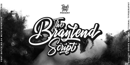 TebTipsudio, Braylend is a script typeface with personality. You can use it as a logo, badge, insignia, packaging, headline, poster, etc The alternative characters in this font were divided into several OpenType features such as Stylistic Alternates, Stylistic Sets, and Ligature. The OpenType features can be accessed by using OpenType program such as Adobe Illustrator, Adobe Photoshop, and Adobe InDesign.
 - Maas by Mike Zuidgeest,
$15.00 Introducing Maas, a new font collection designed by the passionate designer Mike Zuidgeest in Rotterdam. Each letter of the font was created in Illustrator and handcrafted to perfection. The font is named after the river de Maas, and it's perfect for advertising and branding. As the designer, I'm thrilled with the result and can't wait for you to try it out!
 - Melange by Calamar,
$18.00 Melange is my new serif font inspired by the good old past, but it still has a strong modern appearance. The font includes stylish alternate upper and lowercase characters. And that is why it's perfect match for logotypes, branding, wedding monograms and invitations, blog headlines, posters and much more. Font is available for Western European, Central European and South Eastern European Languages.
 - Lafisken Signature by Tebaltipis Studio,
$12.00 Lafisken Signature is a typeface with personality. You can use it as a logo, badge, insignia, packaging, headline, poster, etc The alternative characters in this font were divided into several OpenType features such as Stylistic Alternates, Stylistic Sets, and Ligature. The OpenType features can be accessed by using OpenType program such as Adobe Illustrator, Adobe Photoshop, and Adobe InDesign. Thank you!
 - Angkora Volk by Skinny Type,
$18.00 Angkora Volk - a stylish OpenType rich serif with letters that seem to dance and swirl in harmony - to form a unique & elegant typographic design. A large selection of interwoven Opentype binders and replacements, meaning lots of choice and variety in your final look. To access these OpenType features, you need Opentype-enabled software such as: Word, Textedit, Photoshop, Sketch, Pages, Keynote, Numbers, iBooks Author, QuarkXPress, Indesign and Illustrator. A wide variety of useful glyphs are included - see preview images of all glyphs. Angkora Volk also includes the full set: -uppercase and lowercase letters -multilingual symbols -number -punctuation -alternative style -fastener
 - Benefits by Mchcrafter,
$18.00 Benefits font – a stylish OpenType rich serif with letters that seem to dance and twist harmoniously together – to form unique & elegant typography designs. A large selection of interwoven Opentype ligatures and alternates, means ample selection and variety in your finished look. To access these OpenType features, you will need Opentype capable software such as : Word, Textedit, Photoshop, Sketch, Pages, Keynote, Numbers, iBooks Author, QuarkXPress, Indesign and Illustrator. A wide range of useful glyphs are included – see preview image of all glyphs. Benefits includes: All uppercase & lowercase letters All numbers 0-9 & Punctuation Ligatures & Alternates Symbols Multiligual Letters
 - Anomalia by AlefAlefAlef,
$85.00 Anomalia is an eccentric & geometric trilingual typeface (Latin, Cyrillic and Hebrew). It contains many glyphs and fully supports 229 Latin and Cyrillic languages - which makes it an ideal font for the side-by-side use of Latin/Cyrillic and Hebrew characters. Cyrillic design by Anna Khorash.
 - Geotype by Say Studio,
$10.00 Geotype is typeface inspired by circle shapes simple but significant, and defined by its crisp edges and modern touches. It is designed for optimal legibility. An lowercase is unique with some alternates, Geotyface makes a statement without making a scene. Three weights, four very different personalities.
 - Merlo by Typoforge Studio,
$25.00 Font Merlo is the younger sister of Cervo. Font Merlo is characterized by eight different varieties – lower and uppercase characters. It is inspired by a You And Me Monthly published by National Magazines Publisher RSW "Prasa” that appeared from May 1960 till December 1973 in Poland.
 - Gvardia by ParaType,
$30.00 Type family of two weights was designed in 2000-2001 by Oleg Karpinsky and licensed by ParaType. Similar to Ariergard face in letterforms but differs from it by slab serifs, which always project to the center of an em square. For use in advertising and display typography.
 - Arcano by Resistenza,
$39.00 After four long months of work, Arcano Type has finally been released. It was completely designed by hand, letter by letter, using Chinese ink on Japanese calligraphy paper. Arcano is inspired by nature, symbols, icons, jewels, hand-drawn designs and much more... Modern Love Slanted-Turquoise-Nautica
 - Pelican by Monotype,
$29.00Pelican was designed by Arthur Baker and released by Agfa Compugraphic in 1989. Pelican is a calligraphic typeface that is distinguished by the irregular shapes of the lowercase letters. The rough-edged quality of Pelican makes it a good choice for informal display work and short texts.
