7,466 search results
(0.026 seconds)
- Rough Owl - Personal use only
- GauFontRoot - Unknown license
- Umbles - Unknown license
- bubblii - Unknown license
- Chaotic Circuit - Unknown license
- Static Cling - Unknown license
- Fire Wood - Unknown license
- Mister Hand by Chank,
$39.00Mister Hand was created in 1998 from a found object. Chank scanned it in, cleaned it up a little and voila! It's a retro version of the American Sign Language finger spelling alphabet. Uppercase is only the hand shapes, lowercase has the hand shape with the corresponding letter beside it. - Plz Print by Outside the Line,
$19.00 - Kolesom by Frantic Disorder,
$12.00Kolesom is bold display font that inspired from classic rusty stuff like old signage and poster. This typeface has various styles of font that includes Clean, Alt, Texture, and Western. I found it perfect for poster design, t-shirt design, and other display design needs. Works best in 100pt and above. - Singularity Type by Davide Mascioli,
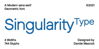
$15.00Singularity Type is a Modern sans-serif Geometric font with homogeneous thickness, based on essential geometric shapes. Built around 4 different widths, ranging from Extra Light up to Bold, the font contains 744 glyphs and supports more than 30 Latin alphabet languages. Singularity Type is Designed by Davide Mascioli ©2021 - F2F Shakkarakk by Linotype,
$29.99The Techno sound of the 1990s, a personal computer, a font creation software and some inspiration had been the sources to the F2F (Face2Face) font series. Thomas Nagel and his friends had the demand to create new unusual faces that should be used in the leading german techno magazine Frontpage"." - Symbol by Adobe,
$35.00The Symbol PS font contains Times New Roman Greek capitals and lowercase, figures and basic punctuation together with a collection of mathematical signs and general purpose Pi characters. Use the Symbol PS font for setting mathematical and scientific work and as a complement to the symbols found in standard fonts. - Elkdale by Matteson Typographics,
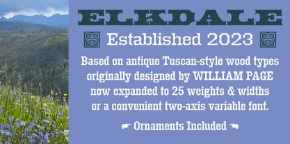
$19.99Elkdale is an Antique Tuscan typeface based on a series of wood types designed in the 19th century. Elkdale exudes the impactful ornamental designs found in posters, newspapers and signage of the day. With its wide complement of weights and widths, Elkdale should fill any space with attention-grabbing delight. - Art Techno JNL by Jeff Levine,
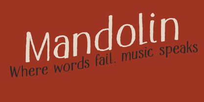
$29.00 - Mandolin by Hanoded,
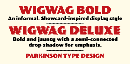
$15.00 - Wigwag by Parkinson,
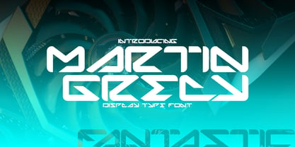
$15.00WigWag Bold and Wigwag Deluxe are bold, informal lettering styles inspired by mid-20th century Showcard Lettering. Especially by the work of Speedball lettering artist Ross George, and also the work of Cecil Wade and Samuel Welo. Designed around 2001 by Jim Parkinson, Wigwag has recently been refreshed and re-released. - Martin Grely by Sipanji21,
$17.00"Martin Grely" is a sleek display font with a futuristic theme. It is well-suited for a variety of design projects that revolve around futuristic or space-related themes. Whether used in headlines, posters, advertisements, or other design applications, "Martin Grely" brings a futuristic and streamlined aesthetic to your typography. - F2F Shpeetz by Linotype,
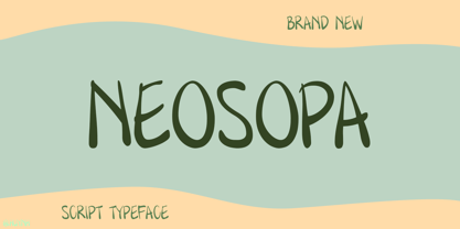
$29.99The Techno sound of the 1990s, a personal computer, a font creation software and some inspiration had been the sources to the F2F (Face2Face) font series. Thomas Nagel and his friends had the demand to create new unusual faces that should be used in the leading german techno magazine Frontpage"." - Neosopa by Sayurihuynh,
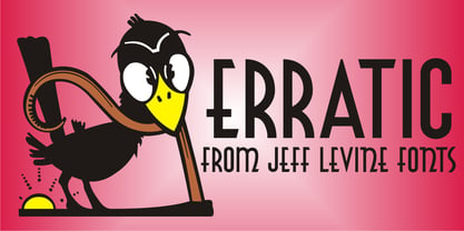
$12.00BRAND NEW FONT!! Neosopa is here. Neosopa is an incredible font that has a unique style which is inspired by comic sound-fx characters, combining a few soft lines, creating eye-catching characters. Neosopa will make your designs more attractive and stand out. It's perfect for display use, print and posters… - Erratic JNL by Jeff Levine,
$29.00 - FTY SKORZHEN by The Fontry,
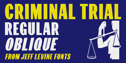
$25.00 - Criminal Trial JNL by Jeff Levine,
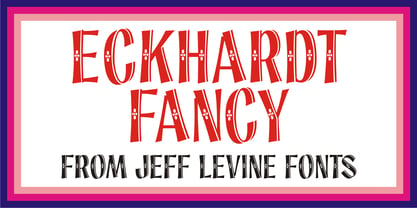
$29.00 - Eckhardt Fancy JNL by Jeff Levine,
$29.00 - Movie Arts JNL by Jeff Levine,
$29.00 - F2F Twins by Linotype,
$29.99The Techno sound of the 1990s, a personal computer, a font creation software and some inspiration had been the sources to the F2F (Face2Face) font series. Heike Nehl and her friends had the demand to create new unusual faces that should be used in the leading german techno magazine Frontpage"." - RM Signwriter by Ray Meadows,
$19.00 - F2F Lovegrid by Linotype,
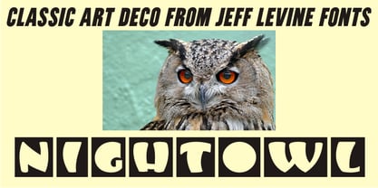
$29.99The Techno sound of the 1990s, a personal computer, a font creation software and some inspiration had been the sources to the F2F (Face2Face) font series. Heike Nehl and her friends had the demand to create new unusual faces that should be used in the leading german techno magazine Frontpage"." - Nightowl JNL by Jeff Levine,
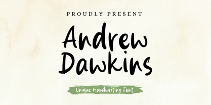
$29.00 - Andrew Dawkins by Violatype,
$14.00Introducing the "Andrew Dawkins" font, a handwritten style font created directly by hand, resulting in beautiful, natural, and unique writing. Andrew Dawkins font is very suitable for branding, logotypes, magazines, quotes, wedding invitations, crafts, printed designs, and others. Andrew Dawkins font supports many languages around 90 languages, amazing isn't it? - Fulcanelli by Illuminaut Designs,
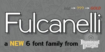
$10.00 - New Victoria by Gartype Studio,
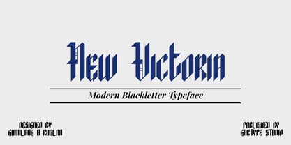
$10.00A modern blackletter typeface, designed by combining an old english style & modern style. It can be used for textbook, display text, headlines, logotype, and more. Within support by multilingual glyphs (characters), & lot of punctuations to support many people around the world with their unique languange and accent. Thank you very much. - Roma Initial Caps JNL by Jeff Levine,
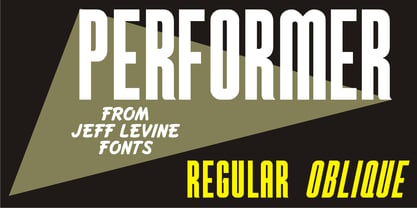
$29.00Roma Initial Caps JNL is a set of alphabet caps drawn from elegant lettering found in an old sign painter's manual. The upper case keys have the letters in white on black backgrounds, while the lower case has the letters in black on a white background with a black border. - Performer JNL by Jeff Levine,
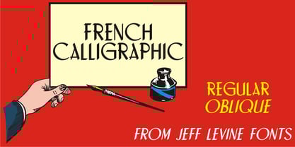
$29.00 - French Calligraphic JNL by Jeff Levine,
$29.00French Calligraphic JNL is actually more semi-calligraphic in nature. Its name takes a descriptive liberty because of the sharp, angled pen strokes of the original hand lettered example found in the 1930s publication "100 Alphabets Publicitaires" by M. Moullet. The design is available in both regular and oblique versions. - Moonshine Script NF by Nick's Fonts,
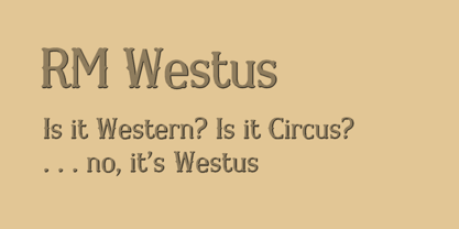
$10.00This casually elegant script, similar to the logotype lettering found on Mason jars (hence the name), is patterned after an offering from the 1930s chapbook 60 Alphabets by The Hunt Brothers. The Opentype version of this font supports Unicode 1250 (Central European) languages, as well as Unicode 1252 (Latin) languages. - RM Westus by Ray Meadows,
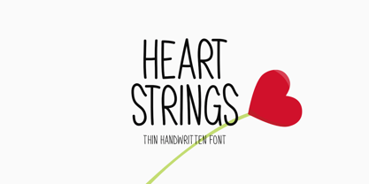
$19.00 - Heart Strings by Seemly Fonts,
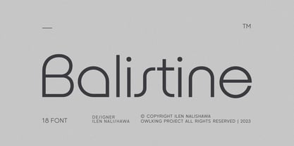
$12.00Heart Strings, a charming and warm handwritten font, brings a delightful touch to designs centered around Valentine's Day. Its simplicity and distinctive style make it a perfect match for a wide range of creative projects. Let your imagination run wild—there's no limit to the sweetness this font can add! Uppercase - Balistine by Owl king project,
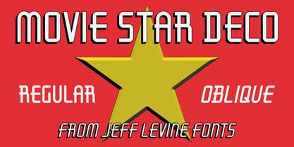
$39.00 - Movie Star Deco JNL by Jeff Levine,
$29.00


