10,000 search results
(0.025 seconds)
- Cooked by Sudtipos,
$79.00 Koziupa and Paul are just as good in the kitchen as they are on the drawing board. Cooked is their choice offering of stir-fried and juicy alphabet ready to complement any visual stew you can put together. This meaty course, with even meatier OpenType programming, was designed to crank up the volume on the viewer's senses of smell and taste, and induce drooling at a mere glance. Cooked is just as suitable in packaging as it is on posters, books or music stressing the wild, adventurous and extremely pleasurable side of life. Lot of alternates of each letter are included. Enjoy!
 - Biokes by Imoodev,
$20.00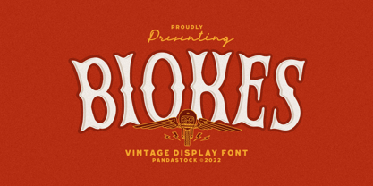 Biokes is a vintage font with visual elegance, smooth curves, and beautiful ligatures clear, making your work look true and attractive. A versatile font that works in both large and small sizes. This font is suitable for a wide variety of projects such as invitations, logos, branding, magazine, photography, card, product packaging, mugs, quotes, poster, labels, signatures, and more. Font which is perfect for all business sectors including personal projects, studio, corporate, creative agency, industrial, company, etc.
 - Look by insigne,
$25.00 Look, folks! From what may just be the vernacular sign capital of the world, Chattanooga, Tennessee, it’s a brand new hyperfamily from insigne! Look includes three different related fonts, with three weights each. That’s over 70 fonts! Imagine: you turn onto a stretch of open country road. On the distressed, red background of an old barn wall, a large block of crisp white letters shout out: “See Rock City.” You soon realize this barn is not alone in competing for the passing eye. Far from it, ladies and gentlemen. This is just one of the many pieces of historic, hand-painted advertisements dotting the great Southern United States. Yes, these are the pieces of true Americana--the barns, the roadside signs, the machinery, the soda fountains, and more--that now inspire this splendid new set of three font families. This new, easily readable type from insigne digs deep to capture the very heart and passion of this splendid country’s lettering of the post-war era. Look’s compact frame quickly draws the audience to your headline, logo, subheading, or pull quote, working well in those compact spots of text without overpowering your content. You'll easily put the feeling of those days gone by into every piece with the natural beauty and simple usefulness of the Look hyperfamily. Each of the individual sub-families incorporates a variety of font weights with distressed attributes. Think Woodtype. Jeans. Antiques, folks. That deep, ingrained texture--that quality that will stand the test of time. And Look is flexible, too. Take, for example, Look Script. This powerhouse of a font offers thinner weights to give your work an easy-going, down-to-earth design. But bring in those heavier weights, and you'll have a muscular, assertive font that will go the whole nine rounds. Combine any of the Look families with Ornaments to really give your layouts a zing. Build an extraordinary design as well with Look’s swashes and alternates. To activate any of these alternates, just click on Swash, Stylistic or Titling Alternates in any OpenType-savvy application, or choose from the Glyph Palette. Explore hundreds of included extras to find that “cherry on top” for your one-of-a-kind project. There are over 70 fonts to choose from, including subfamily sans, serif, script and ornament fonts! You can't go wrong. To get the most bang for your buck, order the whole Look family now! Note on SHADOWS: Increase depth and make your designs pop! Add shadows to any of the Look fonts by duplicating the text content layer in place and switching it to its corresponding shadow. Color and offset to taste. Look shadows are offset automatically. In Illustrator, you may need to turn on Em Box Top for proper shadow alignment.
 - Oook by FSD,
$329.00 oook is a sans serif variable font designed to be used at very low size but it works with great personality also as display font. Uppercases and lowercase heights ratio is designed to improve readability at very very small texts. A feature that can’t be ignored in the smartphone era. With its wide eyes on letters and numbers you’ll be surprised by the improved readability of Excel or LibreOffice spreadsheets.
 - Blok by Studio Few,
$10.00 Built on a square grid, Blok's variable axis conforms to your canvas. With pre-defined weights ranging from 2x1, through to 1x16, Blok is as flexible as it is structured. Character Set: A-Z, Period & Exclamation Mark Weights: 6 Normal & 6 Rounded
 - Boop Boop NF by Nick's Fonts,
$10.00Here’s another wild and wacky typeface based on handlettering found on Hallmark Studio Cards of the 1950s. All possible letter combinations have been kerned, so you can mix and match upper and lowercase letters to create just the balance you’re looking for. All versions of this font include the Unicode 1250 Central European character set in addition to the standard Unicode 1252 Latin set. - Boos by Fontex,
$29.00 A lot of time and effort has been put into the process of creation the Boos Font. A careful analysis of the current font market and overly increasing customer needs have shaped Boos' final appearance and content. We don't have a precise target audience for Boos, since the amazing amount and structure of the chosen characters enables a very wide utilization. It will be best suited for headlines for classy magazines. It's look and feel came from a different designing approach, so that it can successfully satisfy the needs of even the neediest. Shining with calm and dignity, while in the roots being aggressive, it has successfully connected classic and modern styles - representing it's largest value. Medium, bold, black and light versions are included in the complete package, at a discounted price!
 - Comic Book Commando - Personal use only

- Sales Book JNL by Jeff Levine,
$29.00 Sales Book JNL was recreated from sample letters found in the wood type section of an old printer's supply catalog.
 - Funny Book Sans by G. Alex Gonzalez,
$20.00 Funny Book Sans includes these codepages: 1252 Latin 1; 1250 Latin 2: Eastern Europe; 1251 Cyrillic; 1253 Greek; 1254 Turkish; 1255 Hebrew; 1257 Windows Baltic; 1258 Windows Vietnamese.
 - Book Report JNL by Jeff Levine,
$29.00Here's another stencil font designed from and inspired by the lettering guides used for years by teachers, school children, merchants and others. - Dutch Mediaeval Book by Canada Type,
$29.95This is the elaborately expanded version of what is arguably the most classic and popular of all historic Dutch faces: Sjoerd Hendrik de Roos's Hollandse Mediaeval from 1912. Over the decades, many pressmen and typography connoisseurs have gushed loving prose about this typeface. An extended family of two weights, corresponding italics, small caps, four condensed fonts, four book fonts, a set of initials and some very Dutch ornaments, Dutch Mediaeval is a versatile workhorse that flows comfortably and artistically, with the elegance of the main weights nicely complemented by the sturdiness of the bolds. Very few text faces are this clean and inviting while being crafty as well. The Dutch Mediaeval family comes with quite a few OpenType features and extended Latin language support. - Specimen Book JNL by Jeff Levine,
$29.00 A thin Roman typeface with slab serifs shown in various editions of the American Type Founders’ Specimen Book as either Lining Antique or Lining Central Antique was the model for Specimen Book JNL which is available in both regular and oblique versions. This is the 1700th design released by Jeff Levine Fonts since its inception in January, 2006 and was named Specimen Book JNL to celebrate the era when metal type and letterpress were the modern technology of their time.
 - Open Book ING by Ingrimayne Type,
$9.00 OpenBookING is a gimmick or novelty font that has letters on pages of a book. It is caps only and monospaced. The letters on the upper-case keys are on the left-handed pages of an open book and the letters on the lower-case keys are the same letters but on the right-handed pages of an open book. One could alternate upper and lower case keys to get letters on complete books, but the Opentype feature of contextual alternatives (calt) does this automatically. Several previous typefaces from IngrimayneType used the calt feature to alternate shapes that fit together in an interlocking pattern, such as alternating concave and convex shapes. OpenBookING uses the calt feature in a different way, to alternate two halves of a symmetrical shape. To provide two copies of numbers and common symbols, some non-alphabetical characters are unavailable because their slots were taken by the second form of the number or common symbol. If stylistic set one (ss01) is turned on, spaces are replaced with empty pages. This may leave you with unwanted spaces at the end of lines, and to eliminate them, turn off the feature (or change the font) for these spaces. The empty pages can be used in a layer to add color to the text. There is also a second set of empty pages with a filled page that can also be used in layers. (See poster for examples.) These pages are on the (logicalnot multiply) and (register divide) characters for the first set and on the (ordmasculine ellipsis) and (macron trademark) keys for the second set. Finally, OpenBookING has a large set of accented characters if anyone should need them. The letters used on the books were derived from the font Myhota-Bold. For a related typeface of letters on book covers, see NewLibrary. OpenBookING has limited uses and is priced accordingly.
 - Kids Book olst by Olexstudio,
$8.00 KIDS BOOK olstd Font will look gorgeous on all your designs, kids invitation, kids poster design, kids book design, branding materials, kids logo's, and all project design other. WHAT'S INCLUDED KIDS BOOK olstd Font contains standard characters, Uppercase, Lowercase, numbers, punctuation, ligatures and international glyphs. Happy Designed.! regard olexstudio
 - BB book Mono by bb-bureau,
$65.00 bb-book mono is a monospaced version of bb-book A and bb-book B . language: all latin glyphs
 - BB book B by bb-bureau,
$65.00 A font family in continuation of the bb-book A , also kicking up weight, width and contrast, but upside down. 4 styles: condensed, regular, expanded and ultra-expanded.
 - BB book A by bb-bureau,
$65.00 bb-book A — breaking rules typeface Expressive book serif (triangular and curved) kicking up weight, width and contrast — in 4 styles: light, regular, medium and bold.
 - Date Book JNL by Jeff Levine,
$29.00 The pen lettered opening credits for the 1937 film “The Awful Truth” inspired Date Book JNL, which is available in both regular and oblique versions. A hybrid of both Art Nouveau and Art Deco influences, this casual type design is perfect for any project that wants to convey its message in a pleasant, informal manner.
 - Mantika Book Paneuropean by Linotype,
$67.99Mantika Book expands the Mantika super family: a contemporary serif font with a soft, yet robust character and a classic lookMantika Book, an Antiqua, is the third member of the Mantika super family, which consists of the Mantika Sans and Mantika Informal. Designer Jürgen Weltin has gone back to the roots of his font, which he had originally derived from a Renaissance Antiqua. These origins are recognizable in the first member of the Mantika family, Mantika Sans, in the form of carefully suggested line use and a contrast in the weights that recalls the Antiqua. This solid sans serif, optimized for use in text, also has a particularly energetic and dynamically designed italic. Mantika Informal also brings to mind a cursive font at first glance; ultimately, however, it is not easily categorized. Its light, organic shapes combine the informally flowing style of cursive handwriting with the open and airy form and contrast of a humanist sans serif. The shapes in the serif Mantika Book are also based on the Renaissance Antiqua, just like the other members of the Mantika super family. However, the contrast in the weights is somewhat stronger than is conventional for this genre, and the serifs are characteristically asymmetrical, with slanted ends. Lightly grooved stems with an implied curvature in the lower-case letters as well as dots whose shape flirts with a fountain pen lend the Mantika Book a dynamic and particularly friendly character. Details like the open "g" or the contoured foot of the "k" emphasize this dynamism. The letters of Mantika Book have the same large x-height as the other members of the super family, but are equipped with somewhat longer ascenders and descenders. - Monkton Book Condensed by Club Type,
$36.99 Packing more copy in a narrow space is the main reason for using a condensed type. Characters with a more ovular shape tend to be less wide than their circular counterparts and will allow for more letters per line. In narrow columns for example, this typeface can provide up to 25% more copy than the regular typeface in the same space. Another reason is when a larger type size is called for — used sparingly it is useful for headings or headlines. For emphasis, narrower letters can provide a stark contrast in the flow of reading, creating impact while retaining typographic character. Condensed types can specially useful in tables and charts because typically both use few words in each block. If space now allows, you may think about the luxury of a larger point size. This optimizes space while keeping your typography more easily legible.
 - BB book Text by bb-bureau,
$65.00 bb-book text is a text version of bb-book A and bb-book B . language: all latin glyphs
 - BB book Contrasted by bb-bureau,
$65.00 bb-book contrasted is a display and contrasted version of bb-book A .
 - Stinky School Book by Nerfect,
$15.00Stinky School Book was created to letter the adventures of a particular Mr. Stinky the Elf, but you can use it for that informal look when used for body copy or as a display face for headlines. - Lettering Book JNL by Jeff Levine,
$29.00 A circa-1940s textbook for the Esterbrook Drawlet Pens (similar to Speedball pens) offered numerous samples of lettering that could be obtained by following the simple directions and using the book as a guide. One example was a classic Art Deco design made with a round nib pen, and it has been redrawn digitally as Lettering Book JNL in both regular and oblique versions.
 - Boo Boo Kitty by Lauren Ashpole,
$15.00 Boo Boo Kitty is a blocky font with a halftone style gradient texture. One of the big inspirations for this font was retro comic printing so I tried to keep the background slightly messy to capture that look. It was originally released in 1997 as an all-caps font with mixed plain and textured characters but was recently updated it to include lowercase letters and full versions of both background options.
 - ITC Eras by ITC,
$40.99 ITC Eras font is the work of French designers Albert Boton and Albert Hollenstein. It is a typical sans serif typeface distinguished by its unusual slight forward slant and subtle variations in stroke weight. ITC Eras is an open and airy typeface inspired by both Greek stone-cut lapidary letters as well as Roman capitals.
 - ITC Cerigo by ITC,
$29.99ITC Cerigo is the result of a challenge which designer Jean-Renaud Cuaz set for himself: to create a typeface with the grace of Renaissance calligraphy but different from the numerous Chancery scripts. He calls Cerigo a 'vertical italic' and based it on 15th century calligraphic forms. The weights are carefully designed to complement each other and are made more flexible by a number of italic swash capitals. The flexible ITC Cerigo is suitable for both text and display. - ITC Photoplay by ITC,
$29.99ITC Photoplay is another gem from Nick Curtis. Unearthed from the 1927 edition of Samuel Welo's Studio Handbook for Artists and Advertisers, the design's original suggested use was for title and caption cards for silent movies. A monoweight design that bridges the gap between turn-of-the-century decorative type and Art Deco, ITC Photoplay is both casual and stylish. And, yes, the cap S" is supposed to look that that. To expand this already handy typeface's versatility, a Black weight has been added to the original design. Curtis has also created an array of alternate characters, a couple of conjunctions, and a handful of "bishop's fingers" to help make your point. ITC Photoplay is eminently suitable for all those occasions when you need to say, "Unhand that fair damsel, you dastardly cad!", and really mean it." - ITC Gargoonies by ITC,
$29.99 - ITC Johnston by ITC,
$29.00ITC Johnston is the result of the combined talents of Dave Farey and Richard Dawson, based on the work of Edward Johnston. In developing ITC Johnston, says London type designer Dave Farey, he did “lots of research on not only the face but the man.” Edward Johnston was something of an eccentric, “famous for sitting in a deck chair and carrying toast in his pockets.” (The deck chair was his preferred furniture in his own living room; the toast was so that he’d always have sustenance near at hand.) Johnston was also almost single-handedly responsible, early in this century, for the revival in Britain of the Renaissance calligraphic tradition of the chancery italic. His book Writing & Illuminating, & Lettering (with its peculiar extraneous comma in the title) is a classic on its subject, and his influence on his contemporaries was tremendous. He is perhaps best remembered, however, for the alphabet that he designed in 1916 for the London Underground Railway (now London Transport), which was based on his original “block letter” model. Johnston’s letters were constructed very carefully, based on his study of historical writing techniques at the British Museum. His capital letters took their form from the best classical Roman inscriptions. “He had serious rules for his sans serif style,” says Farey, “particularly the height-to-weight ratio of 1:7 for the construction of line weight, and therefore horizontals and verticals were to be the same thickness. Johnston’s O’s and C’s and G’s and even his S’s were constructions of perfect circles. This was a bit of a problem as far as text sizes were concerned, or in reality sizes smaller than half an inch. It also precluded any other weight but medium ‘ any weight lighter or heavier than his 1:7 relationship.” Johnston was famously slow at any project he undertook, says Farey. “He did eventually, under protest, create a bolder weight, in capitals only ‘ which took twenty years to complete.” Farey and his colleague Richard Dawson have based ITC Johnston on Edward Johnston’s original block letters, expanding them into a three-weight type family. Johnston himself never called his Underground lettering a typeface, according to Farey. It was an alphabet meant for signage and other display purposes, designed to be legible at a glance rather than readable in passages of text. Farey and Dawson’s adaptation retains the sparkling starkness of Johnston’s letters while combining comfortably into text. Johnston’s block letter bears an obvious resemblance to Gill Sans, the highly successful type family developed by Monotype in the 1920s. The young Eric Gill had studied under Johnston at the London College of Printing, worked on the Underground project with him, and followed many of the same principles in developing his own sans serif typeface. The Johnston letters gave a characteristic look to London’s transport system after the First World War, but it was Gill Sans that became the emblematic letter form of British graphic design for decades. (Johnston’s sans serif continued in use in the Underground until the early ‘80s, when a revised and modernized version, with a tighter fit and a larger x-height, was designed by the London design firm Banks and Miles.) Farey and Dawson, working from their studio in London’s Clerkenwell, wanted to create a type family that was neither a museum piece nor a bastardization, and that would “provide an alternative of the same school” to the omnipresent Gill Sans. “These alphabets,” says Farey, referring to the Johnston letters, “have never been developed as contemporary styles.” He and Dawson not only devised three weights of ITC Johnston but gave it a full set of small capitals in each weight ‘ something that neither the original Johnston face nor the Gill faces have ‘ as well as old-style figures and several alternate characters. - ITC Atmosphere by ITC,
$29.00The Algerian designer Taouffik Semmad created the fonts in 1997. Taouffik Semmad grew up speaking Algerian-Arabic dialect and French, studied Russian, and is now living in Montreal. This could perhaps explain his current passion, to "find a universal writing", which he admits is a Utopian idea. Created with brush and Chinese ink, the characters of ITC Atmosphere came from Semmad's hand but only after they were fully formed in his mind's eye. - ITC Jamille by ITC,
$29.99Mark Jamra based the design for Jamille on the forms of the 18th century Modern Face fonts of Didot and Bodoni, but was also influenced by the work of artists like Adrian Frutiger, who reworked such fonts to adapt to the demands of modern technology. A very legible font, Jamille will give text a classic, elegant feel. - ITC Clearface by ITC,
$45.99 The Clearface types were originally designed by Morris Fuller Benton in 1907. Their forms expressed the Zeitgeist of the turn of the 20th century; typical and distinguishing characteristics are the forms of the a" and the "k." The ATF version did not include an accompanying Italic. In 1978, ITC's Victor Caruso was licensed by ATF to develop a new serif typeface and matching italic based on the forms of Clearface. The result was ITC Clearface, a serif typeface with marked stroke contrast and italic weights. The teardrop-formed endings of the lowercase a, c and f (also found in Caslon) define the character of the face. The type's design is also distinguished by its small -- almost slab -- serifs, a large x-height, and little stroke contrast. ITC Clearface, with its historical touch, is good for both texts and headlines, but its slightly condensed nature performs at its best when it is allowed its space.
 - ITC Ballerino by ITC,
$29.99Vienna designer Viktor Solt has a love affair with handwriting. “Usually” he says “when I start with a specific calligraphic style I take some historic specimens and try to integrate their main features into my own handwriting.” Although there are hints of various 18th-century calligraphic styles in Ballerino it was not based on any historical model. The swash ascenders and descenders on the lowercase are all slightly different; this and the rough texture of the edges gives Ballerino a distinctly hand-written feel. The swash caps are meant to be used only in conjunction with the lowercase not to be combined with each other. - ITC Newtext by ITC,
$40.99ITC Newtext was designed by Ray Baker, who created a well designed and legible typeface and built into it every design refinement which could optimize its usefulness. The expanded shapes are generous and legible and the economical vertical set results in more lines to the page. - ITC Mixage by ITC,
$29.99Mixage font is the work of Italian designer Aldo Novarese, who cleverly combined the character shapes and proportions like those of Syntax and Antique Olive with the grace and warmth of a calligraphic typeface. Mixage font is a good alternative to more traditional sans serif designs. - ITC Garamond by ITC,
$34.99 Drawn by Tony Stan, ITC Garamond was first released in 1975 in Book and Ultra weights only. These were intended as display faces to complement existing text designs from other foundries. (In fact, many of ITC’s interpretations of traditional typefaces began as display counterparts for existing text designs.) These first weights of ITC Garamond became so popular, however, that ITC released the Light and Bold weights and a suite of condensed faces in 1977. Now, the complete ITC Garamond family features sixteen members: four weights of roman and italic in normal width and four weights of roman and italic in companion condensed versions. The family resemblance is there, but ITC Garamond’s unique provenance gives it an unmistakable, one-of-a-kind appeal.
 - ITC Isadora by ITC,
$29.99This calligraphic typeface, designed by Kris Holmes in 1989, manages to look both confident and relaxed, while showing great intricacy and beauty upon closer inspection; it is named after the dancer Isadora Duncan. - ITC Angryhog by ITC,
$29.00The name Angryhog came out of nowhere out of free association. "When you're working on a typeface on the Mac it demands a name from you which I find a bit confrontational" says Donaldson. ITC Angryhog brings together Roman and Gothic influences in a quirky and sophisticated display face. Characteristic of this typeface are its sharp, pointed forms, especially noticeable in the serifs, which give ITC Angryhog a restless, almost aggressive feel. It is as though the letters have a mind of their own and ignore all rules and regulations. ITC Angryhog is a perfect typeface for comics or satire, best suited to short to middle length texts and headlines.
