10,000 search results
(0.061 seconds)
- Cork Screw by ErlosDesign,
$17.00 CorkScrew - Quirky Handwritten Font by erlosDESIGN CorkScrew is quirky calligraphy script, with swash and extra doodle. It can be used for various purposes such as headings, logos, birthday invitation, t-shirt, letterhead, posters and much more.
 - Liebelei Variable by Wannatype,
$138.00 The typeface Liebelei has its roots back in 1932, when Vienna-based painter Rudolf Vogl created the poster for a movie called Liebelei after the popular play by Arthur Schnitzler. Now also available as Variable font!
 - PXL3287 by BW90,
$25.00 PXL3287 is pixel art font inspired by '80s space and sci-fi cartoons and arcade games. It contains more than 220 glyphs (capitals, lower-case letters, numbers, plus many other characters) and supports many european languages.
 - Oktah Round by Groteskly Yours,
$25.00 Oktah Round Overview: 1600+ characters per font 16 static fonts 1 variable fonts Extensive OpenType features Support for 220+ Languages (Latin & Cyrillic) Special Symbols, Alternate Sets, and Features Free Trial Fonts Available Oktah Round is a rounded version of Oktah Neue. Oktah Round is soft and friendly, modern and warm. It's a typeface that combines human touch with high functionality. Oktah Round comes equipped with 1600+ characters per font and is available in 16 styles (from Thin to Black), and as a variable font that allows you to change weight and slant angle. Oktah Round supports more than 200 Latin languages and has amazing support for Cyrillic languages like Bulgarian, Serbian, Ukrainian, Macedonian, Russian, and others. Relying heavily on the geometric forms and proportions first introduced in Oktah, this rounded version does more than just smooth out a few corners. To make curves sharper and more uniform, some terminals were modified. Other visual features (like curving tails in 'l' and 't') were dropped to create more clear cut look. Oktah Round is perfectly balanced and finely tuned to be the font you'd want to use again and again. The variety or styles and availability of a variable font give Oktah Round a potential to be used across multiple mediums. Oktah Round supports most Latin based languages, it also has support for Extended Cyrillic. The remainder of the extensive 1600+ glyph character set is reserved for punctuation, numbers, special symbols, and all sorts of additional symbols like squared numbers, geometric shapes, etc. All characters are evenly spaced and carefully kerned, so that there are no overlaps or glaring gaps in any language. OpenType features include Legible Alternates, Case Sensitive Punctuation, Fractions, Sub- and Superscript, Black and White Circled Figures, Ligatures, Oldstyle Figures, Tabular Figures and many others. The variable font incorporates both axes (Weight and Slant) and can be used for web and graphic design alike. 16 static font styles can be purchased separately or as part of Oktah Round family. Two fonts can be downloaded free of charge.
 - Handel Gothic by URW Type Foundry,
$35.00 The Handel Gothic? typeface has been a mainstay of graphic communication for over 40 years - all the while looking as current as tomorrow. Designed by Don Handel in the mid-1960s, and used in the 1973 United Airlines logo developed by Saul Bass, Handel Gothic was an instant success when released to the graphic design community. Its generous lowercase x-height, full-bodied counters and square proportions make the design highly readable at a wide range of sizes. Handel Gothic's slightly idiosyncratic character shapes gave the face a futuristic look 40 years ago that retains its power today. In addition, its Uncial-like lowercase is instantly identifiable - and unique among sans serif typestyles.
 - News Crew JNL by Jeff Levine,
$29.00 It seems that after the 1960s, very few display typefaces were being produced that had the desirability to transcend generations, as did many type designs of the past. In 1970, a local television station embraced a lettering style for its logo that was a cross between round point pen nib lettering and the modular, techno look complete with squared characters in a futuristic "space age" style. News Crew JNL was inspired by the few examples found of this particular font [in use by the station at the time] and was pretty much created from scratch in order to capture the 1970s era of experimental typography. It is available in both regular and oblique versions.
 - Via Sans by Latinotype,
$26.00 Via sans is a font inspired by classics like Steile Futura and Din 1451, with neo-humanist characteristics. It was designed as a font for fast reading from a distance, which saves horizontal space in the text composition, making it a very good alternative when composing long phrases in reduced spaces, with high readability in various sizes due to its ample counters. With round corners that reduce the irradiation that reflective materials in signs produce. This family is composed by 8 fonts, 4 weight variations and 4 inclination variations, which include European accents marks, ligatures, fractions, ordinals and tabular numbers, in addition to a pictogram set that complement applications for wayfinding and maps.
 - Maxim by profonts,
$39.99Splendor was originally produced and released in 1930 by Schriftgu� AG, Dresden. The typeface was designed by Berlin designer Wilhelm Berg. Ralph M. Unger, who in the last few years has created a whole series of revivals and redesigns from the hot metal era, ?retrieved? this jewel of a typeface design, redesigning, complementing and digitally remastering it for profonts. Splendor is a broad nip, non-connecting handwriting script of timeless elegance, charm and beauty. It needs tight setting with plenty of space around it. The font contains a number of alternate characters: Two uppercase As, Ss (with descender); in addition, two uppercase Ms, Ns and Zs as well as two lowercase zs. - Orbi by ParaType,
$30.00 The Orbi type system is a low contrast antiqua of elegant design with a well developed set of members. It consists of 10 roman and italic faces of different proportions and weights and 3 decorative calligraphic fonts. It also contains 3 additional fonts with various decorated initials. The roman includes small capitals. Thanks to its variety of styles the font is suitable for a wide range of applications - the basic styles are good for books and periodicals; the narrow styles work well in the columns and tables of business papers; the decorative styles are ideal for ceremonial typography where swashes, calligraphy and initials are usual. The fonts were designed by Natalia Vasilyeva. Released by ParaType in 2010.
 - Westside by Linotype,
$29.99 Westside was designed by Adrian Frutiger in 1989 and is a kind of wood type. It is reminiscent of dusty streets, Wild West heroes and swinging saloon doors. The origins of this kind of typeface can be found in the early 19th century. Called Italian or Italienne, these typefaces quickly became very popular. They are distinguished by square serifs whose width is larger than the stroke width of the characters. When the letters are set together, the heavy serifs build dark horizontal bands. Westside is a particularly decorative typeface which will have a marked effect when used expertly. It is perfect for headlines in larger point sizes, which will highlight its special character.
 - Handel Gothic by Linotype,
$40.99The Handel Gothic™ typeface has been a mainstay of graphic communication for over 40 years - all the while looking as current as tomorrow. Designed by Don Handel in the mid-1960s, and used in the 1973 United Airlines logo developed by Saul Bass, Handel Gothic was an instant success when released to the graphic design community. Its generous lowercase x-height, full-bodied counters and square proportions make the design highly readable at a wide range of sizes. Handel Gothic's slightly idiosyncratic character shapes gave the face a futuristic look 40 years ago that retains its power today. In addition, its Uncial-like lowercase is instantly identifiable - and unique among sans serif typestyles. - Titla by ParaType,
$25.00 The name of the font Titla emphasizes it heading and display functionality. At the same time low contrast, narrow proportions, wide variety of weights and clear glyph constructions make it possible to use it for long texts as well. Combination of modern serifs with flexing stems (see n, p,…) brings to the font fresh, informal and noticeable appearance. The character set includes alternative variations and specific 'vertical ligatures' for paired letters that are built with the help of diacritical forms of letters placed above basic ones. This feature also was reflected in the name of the font as Greek 'titlos' means diacritical mark. The font was designed by Oleg Karpinsky and released by ParaType in 2009.
 - Splendor by profonts,
$41.99 Splendor was originally produced and released in 1930 by Schriftgu� AG, Dresden. The typeface was designed by Berlin designer Wilhelm Berg. Ralph M. Unger, who in the last few years has created a whole series of revivals and redesigns from the hot metal era, ?retrieved? this jewel of a typeface design, redesigning, complementing and digitally remastering it for profonts. Splendor is a broad nip, non-connecting handwriting script of timeless elegance, charm and beauty. It needs tight setting with plenty of space around it. The font contains a number of alternate characters: Two uppercase As, Ss (with descender); in addition, two uppercase Ms, Ns and Zs as well as two lowercase zs.
 - Metairie by insigne,
$24.99 Get in the swing with Metairie. This high-contrast script from Jeremy Dooley sets the rhythm for your next headline or short phrase with its fresh, expressive forms. Metairie’s (sometimes exaggerated) scrawled letterforms play on the colorful world of calligraphy to bring you a fully developed personality of its own. Inspired by elixirs and pharmaceuticals of the 1800s, this design has forms that dig down deep to the soul. It brings a unique, vibrant feel for your next message. The typeface supports all major Latin languages, and the expanded OpenType capabilities let you slide elements easily and quickly into your design. Metairie also includes a number of distressed options. Improv a bit, too, with Metairie’s decorative ornaments, variations on the fleur de lis. Ornaments and tails are accessed through the glyph palette or using the Swash function. An extensive set of ligatures gives you more options for humanizing the handwriting on the page. Then take it up a notch by using the glyph palette to find the perfect solution for project. You have full access to this amazing capability with InDesign, Illustrator, QuarkXpress and similar software. We recommend that you explore what this font can offer by using the glyph palette. Get a glimpse of the font’s strength by looking over the brochure in PDF format in the "Gallery" section. Ready to step in? Take a stab at your next design with Metairie. It could be just the color you need.
 - Arazatí by TipoType,
$9.99 Arazatí was inspired by Edward Johnston’s typefaces, although its design is not based on a literal reconstruction. It has 48 variants of 422 glyphs each. In addition, it offers two monospaced variants for free. Arazatí is the name of the place where Johnston was born in 1872, located in San José, Uruguay. This typeface is a tribute to his birthplace.
 - Arial by Monotype,
$45.99 Arial is one of the most widely used designs of the last 30 years. Drawn in 1982 by Robin Nicholas and Patricia Saunders for use in an early IBM® laser printer, Arial has become a staple for textual content. While it is widely believed that Arial's design was based on Helvetica, it is more accurate to consider Monotype Grotesque as its ancestor.
 - Chicken Feet by BA Graphics,
$45.00An irresistible design by my (11 year old) Granddaughter; it brings that child innocence to font design. When she first showed it to me I was so impressed I could not resist I had to make it into her very own font. Alexandra is also the designer of the font flag and says she is working on new font ideas. - Bulgary Rose by Heinzel Std,
$18.00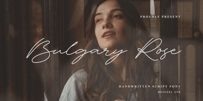 Bulgary Rose is a Signature Script Font, described by an elegant touch, perfect for your favorite projects. It looks stunning on wedding invitations, thank you cards, quotes, greeting cards, logos, business cards, social media, magazines, marketing materials, and every other design which needs a handwritten touch. Fall in love with its incredibly distinct and timeless style and use it to create spectacular designs!
 - Bulgatty Signature by Balevgraph Studio,
$12.00 Bulgatty Signature is an elegant script font with a contemporary atmosphere and impeccable form, inspired by timeless classic calligraphy. It has a clean, thin and smooth vibe and it will be a hit for any design that you want to add it to.. What's Included : - Uppercase, Lowercase, Numerals & Punctuations - Ligature - Works on PC & Mac - Simple installations - Multilingual support - PUA Encoded
 - Necia by Graviton,
$20.00 Necia font family has been designed for Graviton Font Foundry by Pablo Balcells in 2014. It is a modular, geometric and slightly condensed typeface which has been conceived to be primarily a display typeface, but given its clarity it can also be used for composing short and intermediate length texts. Necia consists of 8 styles. Each containing small caps and several alternate characters.
 - Pocket Px by Letradora,
$18.00 Inspired by illustration lettering, Pocket has a contemporary, quirky feel. Its combination of narrow and round forms give it a humorous feel.It has support for most western and central European languages, and has alternates for most letterforms, allowing for variations that make it look authentically hand-drawn. Check out other fonts in the Pocket family: Pocket Serif and Pocket Swash
 - Damonte by IbraCreative,
$17.00 Damonte is an extraordinary adventure style font that embodies a sense of exploration and wonder. Its distinct letterforms are inspired by rugged landscapes and daring expeditions, making it a perfect choice for projects that seek to evoke a spirit of adventure and discovery. With its unique and captivating design, Damonte adds a touch of mystique to logos, book covers, and outdoor-themed designs.
 - Aguda by Graviton,
$20.00 Aguda font family has been designed for Graviton Font Foundry by Pablo Balcells in 2014. It is a modular, geometric typeface which has been conceived to be primarily a display typeface, but given its clarity it can also be used for composing short and intermediate length texts. Aguda consists of 8 styles. Each containing small caps and several alternate characters.
 - Arazatí by Underground,
$9.99 Arazatí was inspired by Edward Johnston’s typefaces, although its design is not based on a literal reconstruction. It has 48 variants of 422 glyphs each. In addition, it offers two monospaced variants for free. Arazatí is the name of the place where Johnston was born in 1872, located in San José, Uruguay. This typeface is a tribute to his birthplace.
 - Sensor by Tour De Force,
$25.00 Square "robocap" typeface containing some little bit of experimental letters such as "t" or "f". Designed by Dusan Jelesijevic who wanted to make a font that would look heavy as building construction printed on your shirts. Even if it looks strong and stable, it is surprisingly very readable at small sizes which make it perfect for titles, posters or logotypes.
 - Srostky by Nikita Kanarev,
$25.00 The Srostky font is willful and stubborn. It is rude, but it is as natural as a country boy. The characters of this font were inspired by an image of the Russian countryside. The letters look as if they were felled with an ax. It is named after the village in Altai region. This font is suitable for short sayings and titles.
 - Redoneta Rounded by Rafael Jordan,
$30.00 Redoneta Rounded is an extension of Redoneta font family created by Rafael Jordan, adding kindness to the rational geometry, keeping its workhorse vocation mixing efficiency and the beauty of simplicity. Redoneta Rounded is available in 6 weights and its matching italics. It has an extended collection of OpenType features, including seven stylistic sets to customize how performs in multiple ways.
 - Ciao Mamma by Comics Font Store,
$19.00 CIAO MAMMA is a vintage-style font, inspired by old almanacs and classic comics. It is ideal for auteur comics as well as commercial products. It is made with a marker, has contrast-free letters and regular spacing helping its legibility and clarity. The font is elegant and graceful and is reminiscent of the history of comics, evoking great, timeless comic strips.
 - Eliptik by Yock Mercado,
$9.00 Eliptik is a typeface with disruptive shapes, inspired by the aesthetics of technology from the 80s and 90s, when they had a very particular style of seeing the future. It is an ideal typeface for large size display texts and wordmarks, designed in upper and lower case, it also has many stylistic variables (OpenType features) that give it more memorable and unique personality.
 - Playthings by Fikryal,
$23.00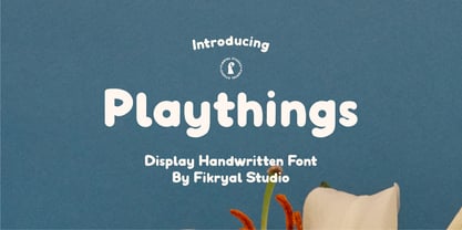 Playthings Handwritten Display Font is a type of font designed by hand to provide a unique and personal touch to your design projects. With its cheerful and gentle handwriting style, this font brings about a relaxed yet captivating ambiance, making it suitable for various creative endeavors. With its soft line details and natural characteristics, the Playthings Handwritten Display Font exudes warmth and familiarity.
 - Paveline by Greater Albion Typefounders,
$19.95 Paveline is a punctuated script; by which we mean it has the look and character of handwriting, but the glyphs are discrete entities to aid legibility. It is actually based on a moderately stylized adaptation of our chief designer's handwriting. Use it to give a handwritten touch to your work. Paveline works well as small handwriting or large scale poster captions.
 - Howdy by Ben Buysse,
$45.00 Howdy is a modern French Clarendon revival typeface inspired by late 19th-century woodblock type and sign painting. Its ties to the American West evoke a distinctive western and retro flair. It was designed with flexibility in mind. Intended for use as a display type, its reverse contrast forms make an impact from tall or wide headlines and anything in between.
 - Novadam Obese NF by Nick's Fonts,
$10.00This typeface derives both its style and its name from a logotype design for an eponymous magazine, executed in the 1940s by Catalán type designer Joan Trochut Blanchard, of Supertipo Veloz fame. Its strong geometric forms and large x-height make for commanding headlines. Both versions of this font include the complete Unicode 1252 Latin and Unicode 1250 Central European character sets. - FatmanLight - Unknown license

- British Classical by TypeClassHeroes,
$19.00 Really excited to introduce British Classical and British Classical Neue is a Classic serif family. It's clean and smooth with 9 variable weight combining the regular and italic and much alternative inside. Suitable to create any branding, product packaging, invitation, quotes, t-shirt, label, poster, logo etc. If you need anything else just shoot me on email at: Suandana_Ipandemade@hotmail.com Hope you enjoy it.
 - Fantique Four - Unknown license

- Spawned - Unknown license

- Enjoy by Andinistas,
$26.00 Enjoy is a font family designed by CFCG. Its 5 fonts work in groups or independently. When used to complement illustrations or spontaneous projects requiring organic fonts, in Enjoy you will find expressive attributes reflected in uppercase, lowercase and numbers written with brush and fluid ink. Its strategies were carefully written providing greater handcrafted realism in its bonds and alternatives to create with eloquent letters at the beginning, middle or end of the word without losing order and readability. Enjoy contains many special textures to maximize its typographical benefits activating opentype buttons. Enjoy contains an authentic worn texture reflected in a variety of alternate characters and ligatures. Due to its maximum and coordinated cursive logic, captivates the interest in graphic design or advertising for cafeterias, sales of plants, bakeries, etc. When complement illustrations or spontaneous projects requiring organic fonts, with Enjoy you will find expressive attributes reflected in uppercase, lowercase and numbers written with brush and fluid ink.
 - Wasted Youth by Wing's Art Studio,
$12.00 Wasted Youth: A 90s Grunge Inspired Brush Font by Wingsart Studio Wasted Youth is a versatile brush font with shades of grunge, punk and horror. The font comes in three styles including a clean-edged original, plus two additional versions drawn with inky brush and marker pen. It takes inspiration from 90s grunge bands, with a hand-made punk aesthetic that’s equally at home in music videos, album covers, horror movies and skate culture. It aims to combine the best of these popular looks into one versatile font. Along with its unique uppercase and lowercase characters, Wasted Youth also comes with a host of custom ligatures, underlines and alternatives, along with numerals, punctuation and language support. It’s a truly flexible font that can be shaped into titles and headlines that look authentically hand-made. Try it on t-shirts, posters, stickers, movie titles, YouTube videos and more! Check out my visuals to see it in action.
 - Scottsdale Desert by Adam Fathony,
$39.00 Scottsdale Desert is inspired by a classic contemporary Display combined with a simple modern Serif look. It's a versatile font, it can be used for a lot of design styles. Characteristic for Scottsdale are the small to bigger rounded serif strokes that make it look sharp and comfy. Thin, light strokes define the modernity and simplicity of the typeface itself. The OldStyle Numerical match with the characteristic of this fonts. Using Scottsdale Desert's lowercases for a long text will work, but it is at its best as Header or Display. Scottsdale Desert comes with most OpenType Features: - Powerful ligatures as Discretionary Ligatures - Stylistic Alternates on Uppercase and Lowercase - Contextual Swashes adding a Terminal (first swash) on the First Uppercase letters - Small Capitals (can be operated with the Titling Alternates button) - Catchword are created with Contextual alternates (see the images to show how it works). - Punctuation and Symbol are perfectly matched with all letters - Numerical features are available : Tabular Figures Numerator Denominator Superscript/Superior -Subscript/Inferior and Fraction.


