10,000 search results
(0.032 seconds)
- Fou Serif CN by URW Type Foundry,
$49.99 The "Fou" typeface family was designed as an alternative to "Trade Gothic condensed bold". During the design process of a normally wide font variant a system developed that responds to white space and changing proportions. Thus, round transitions become rectangular and vice versa, space is made and space is taken away. This system and the associated changes are continued on a model with semi-serifs. "Fou" can also be used as an alternative to Din or the wider Q-Type, but in comparison offers more room for emphasis with its italics and condensed styles, expert sets and numerous special characters.
 - Neo Latina by deFharo,
$12.00 Neo Latina is a classic sans serif typography in small caps of square proportions and rectilinear character with the ends of the rounded horns and a semi-stencil design that gives a futuristic aspect and of science fiction. Neo Latina is the right heiress of geometric fonts from the early 20th century inspired by the Bauhaus school and is specially designed for use in any size for both screen and print. Neo Latina is a very versatile typography for graphic design, you can use it in advertising posters, video games, film titles, logos, editorial design, etc. The Commercial version includes: - Two fonts: Regular & Bold - 460 glyphs. Latin Extended-A • OTF & TTF - Neo Latina fonts can be used unlimited for both Commercial and Personal projects. - The download file includes a PDF with the specimen sheet of typography. - OpenType features compatible with: Photoshop, Illustrator, QuarkXpress, Indesign. - OpenType Features: Subscript, Additional languages, Alternate Annotation Forms, Capital Spacing, Denominators, All Alternates, Oldstyle Figures, Superscript, Superiors, Superior letters, Standard Ligatures, Kerning, Extended Fractions, Small Capitals, Historical Forms, Inferiors, Fractions, Localized Forms, Numerators, Ordinals, Discretionary Ligatures, Scientific Inferiors, Slashed Zero. - Bitcoin & Chaos symbol: b# - a#(ligatures)
 - FF Real Text by FontFont,
$50.99 FF Real is a convincing re-interpretation of the German grotesque style from between 1998 and 1908, but with much more warmth and improved legibility as well as a hint towards the warmer American grotesques. Later on, not just slanted styles, but a “proper” italic version was added inspired by the way Roman and Italic are distinguished in traditional serif faces. NEW: a specially created set of obliques were added in 2018 to give designers more design flexibility, for those looking for a less calligraphic look. In 2020 the family was extended with matching condensed weights. FF Real was originally conceived by Erik Spiekermann as one text weight and one headline weight to be used as the only faces in his biography ‘Hello I am Erik’, edited by Johannes Erler, published in 2014. While Spiekermann drew the alphabets, he passed on the font data to Ralph du Carrois and Anja Meiners who cleaned it up and completed it. In the meantime, FF Real has been extended to a family of two styles and 65 weights each. The design of FF Real is rooted in early static grotesques from the turn of the century. Several German type foundries – among them the Berlin-based foundries Theinhardt and H. Berthold AG – released such designs between 1898 and 1908. The semi-bold weight of a poster-size typeface that was lighter than most of the according semi-bolds in metal type at the time, gave the impetus to FF Real’s regular weight. In the words of Spiekermann, the historical example is “the real, non-fake version, as it were, the royal sans serif face“, thus giving his new typeface the name “Real” (which is also in keeping with his four-letter names, i.e. FF Meta, FF Unit). FF Real is a convincing re-interpretation of the German grotesque style, but with much more warmth and improved legibility. With a hint towards the warmer American grotesques, Spiekermann added those typical Anglo-American features such as a three-story ‘g’ and an ‘8’ with a more defined loop. To better distinguish characters in small text sizes, FF Real Text comes in old style figures, ‘f’ and ‘t’ are wider, the capital ‘I’ is equipped with serifs, as is the lowercase ‘l’. What’s more, i-dots and all punctuation are round.
 - FF Real Head by FontFont,
$50.99 FF Real is a convincing re-interpretation of the German grotesque style from between 1998 and 1908, but with much more warmth and improved legibility as well as a hint towards the warmer American grotesques. Later on, not just slanted styles, but a “proper” italic version was added inspired by the way Roman and Italic are distinguished in traditional serif faces. NEW: a specially created set of obliques were added in 2018 to give designers more design flexibility, for those looking for a less calligraphic look. In 2020 the family was extended with matching condensed weights. FF Real was originally conceived by Erik Spiekermann as one text weight and one headline weight to be used as the only faces in his biography ‘Hello I am Erik’, edited by Johannes Erler, published in 2014. While Spiekermann drew the alphabets, he passed on the font data to Ralph du Carrois and Anja Meiners who cleaned it up and completed it. In the meantime, FF Real has been extended to a family of two styles and 65 weights each. The design of FF Real is rooted in early static grotesques from the turn of the century. Several German type foundries – among them the Berlin-based foundries Theinhardt and H. Berthold AG – released such designs between 1898 and 1908. The semi-bold weight of a poster-size typeface that was lighter than most of the according semi-bolds in metal type at the time, gave the impetus to FF Real’s regular weight. In the words of Spiekermann, the historical example is “the real, non-fake version, as it were, the royal sans serif face“, thus giving his new typeface the name “Real” (which is also in keeping with his four-letter names, i.e. FF Meta, FF Unit). FF Real is a convincing re-interpretation of the German grotesque style, but with much more warmth and improved legibility. With a hint towards the warmer American grotesques, Spiekermann added those typical Anglo-American features such as a three-story ‘g’ and an ‘8’ with a more defined loop. To better distinguish characters in small text sizes, FF Real Text comes in old style figures, ‘f’ and ‘t’ are wider, the capital ‘I’ is equipped with serifs, as is the lowercase ‘l’. What’s more, i-dots and all punctuation are round.
 - Tenby by Paragraph,
$12.00 Tenby is a series of modular geometric display sans serif fonts with a hint of Art Deco combined with a 1980s finish. The fonts' underlying grid is ten squares high. Their widths correspond to condensed (Tenby Four), normal (Tenby Five) semi-extended (Tenby Six), extended (Tenby Seven), and extra-extended (Tenby Eight). Each contains two weights, light and regular. Although smaller text sizes are still quite legible, the fonts work better at large sizes.
 - Relaxy by HIRO.std,
$11.00 Relaxy is a Brush Handwritten Script. This font describes about funny, dynamic, informal, humanist, easy going, and will bring a good combination for your works. FEATURES - 3 alternates Uppercase and Lowercase letters - Numbering and Punctuations - Multilingual Support - Works on PC or Mac - Simple Installation - PUA Encoded Characters USE Relaxy works great in any poster, book, magazine, typeface, quotes, print, social media posts, e-book , and any projects that need semi casual and informal taste.
 - Fragola by Fenotype,
$35.00 Fragola is a bold and groovy script family with plenty of OpenType features and extra swashes. Combine Swash, Stylistic or Titling Alternates or manually select from even more alternates in any OpenType savvy program to create groovy headlines and spice up your design with Fragola Extras. Fragola Demo is a free version of Fragola Printed with some extra ink drops spilled in the mix. For the absolutely best price purchase the whole family pack!
 - MC Abigar by Maulana Creative,
$15.00 Abigar is a semi serif font. Contrast Regular stroke, fun character with a bit of ligatures and alternates. To give you an extra creative work. Abigar font support multilingual more than 100+ language. This font is good for logo design, Social media, Movie Titles, Books Titles, a short text even a long text letter and good for your secondary text font with script or serif. Make a stunning work with Abigar font. Cheers, Maulana Creative
 - Servat by Maulana Creative,
$14.00 Servat is a retro semi slab serif font. With medium stroke, fun character with a bit of ligatures and alternates. To give you an extra creative work. Servat font support multilingual more than 100+ language. This font is good for logo design, Social media, Movie Titles, Books Titles, a short text even a long text letter and good for your secondary text font with sans or script. Make a stunning work with Servat font.
 - Graviola by Harbor Type,
$30.00🏆 Selected for Tipos Latinos 7 with a Certificate of Excellence. With semi-rounded terminals, Graviola is soft and friendly. The family consists of 16 fonts, from Thin to Black and matching italics. While the intermediate ones are suited for body text, the extreme weights look specially beautiful at display sizes. Each font contains 530+ glyphs, supporting more than 90 languages. Stylistic sets provide alternates in two groupings (a, v, w, y and G, g, &). - Hero Sandwich Pro by Comicraft,
$19.00 As comic book readers know all too well, team ups are every super hero’s bread and butter... when the brave and the bold are in a pickle, and super villains are running onion rings around them, here’s how they roll: They Meat! They Team-Up with your taste buds! They Fight Hunger! Our original Hero Sandwich font has become a go-to for video game and app graphics, due to its easy readability and friendly demeanor. The new Pro version adds nine weights from Thin to Heavy, with matching italics, plus a versatile Variable Font to dial in your preferred combination of weight and italic slant. Each weight includes four numbering options and support for 222 languages, including Cyrillics. So take a footlong bite out of crime, and make the subways safe again with our mouthwatering Hero Sandwich! Prepared with care and plastic gloves by those awfully nice chaps at the Comicraft deli.
 - Gridiot by Peter Bain,
$10.00 Gridiot is a constructed, semi-serif, two-weight stencil family that expands an approach taken by Josef Albers. Intended for display or headline setting, it features chamfered or bevel-cut corners, used instead of curves. The individual letter components sometimes vary in depth, avoiding a strictly modular approach, while the widths are kept consistent. The lining figures provide a standard set of numbers, and the oldstyle figures align with the lowercase, encouraging lowercase-only setting. Currency and other useful numerical symbols are provided in both versions. The zero is intentionally lighter, following early Renaissance types; there are filled versions as stylistic alternates. While horizontal scaling distorts the relationship between verticals and horizontals in a typeface, since every chamfer in Gridiot is at 45°, changing the horizontal scaling of the type will affect all diagonals equally. When used at a large size, or for a just few words, Gridiot can be very tightly spaced. Remember, any idiot can design a typeface on a grid: Gridiot.
 - Kaput Black - Personal use only

- Kaput Black Black - Personal use only

- Axeo Sans by Asritype,
$15.00 As mentioned on previous released font Axeo (freeform serif), now, the original sanserif font is released with similar name, Axeo Sans. Axeo was release first when Axeo sans is still in minimal glyphs and font weights. However, Axeo sans is released with more fonts, 7 font in roman and 7 in italic/oblique versions, instead of semi condensed. 7 fonts is in roman form of weight: Light, Regular, Medium, Semi Bold, Bold, Extra Bold and Black; and 7 fonts in italic/oblique versions of its weight, respectively. This font weight offers the user to use the best fit to the usage. Axeo sans is neutral typeface, designed for general use. This font has also more glyphs variations and OpenType features. More than 700 glyphs for each cut. While the OpenType is equipped with: Large unmarked Basic Latin caps (ss02-ss05); normal character variation for some letters (ss01); Small caps (c2sc and smcp); superscript for 1, 2, and 3; ordinals for a and o; 5 basic fractions; standard and discretionary ligature; kerning; case sensitive and ornaments. Large Caps is unique setting, additional letters for font variations lover/user, applicable for first letter of paragraph, sentences, for design mean, just for fun or other usage.
 - Coffee and Danish JNL by Jeff Levine,
$29.00 In the collection of vintage and historic images available online from the Library of Congress is one of the exterior of the Town Talk Diner in Minneapolis, Minnesota. Regrettably, on May 28, 2020, the Town Talk Diner was damaged by vandalism, and subsequently destroyed by a fire that engulfed the building early on the morning of May 29th due to civil unrest following the death of George Floyd. The restaurant first opened in 1946, closed in 2011 and subsequently re-opened under new ownership in 2014 with French cuisine, then from 2016 until its demise as an American bistro. While this was not known at the time of selecting the image for a typographic model, subsequent research on the diner turned up these facts. The large vintage sign above the entrance was in big, bold Art Deco letters with rows and rows of bulbs for illuminating the name at night. Coffee and Danish JNL, modeled from the image of that sign, is available in both regular and oblique versions. Perhaps, in a way, the type design will serve as a bit of historic recognition for a popular eating spot.
 - Ripe Mango by Sohel Studio,
$14.00 Ripe Mango is a retro display serif font that exudes a classic charm and bold character. With its design inspired by retro styles, this font brings an elegant touch and evokes a sense of the past. Each letter is meticulously crafted with careful attention to detail and proportion, resulting in a visually appealing and unique appearance. Ripe Mango is perfect for projects that require a vintage feel, such as posters, logos, packaging, and promotional materials that aim to capture a nostalgic and sophisticated atmosphere. This font will add a special touch to your designs and captivate viewers with its retro allure and distinctiveness. Ripe Mango Features: - 4 Weight (Regular, Slant, Semi Bold, Outline) - Uppercase And Lowercase - Alternates And Ligature - Numerals & Punctuation - Accented characters - Multilingual Support - Unicode PUA Encoded While using this product, if you encounter any problem or spot something we may have missed, please don't hesitate to drop us a message. We'd love to hear your feedbacks in order to further fine-tune our products. Thanks and have a wonderful day .
 - Boxed Round by Tipo Pèpel,
$18.00 Boxed Round is a rounded version of the popular Boxed font, a typeface whit 18 weights, brightly conceived and designed to look good on small screen devices, but offering also enlightened looks on paper. The semi-modular geometric font shapes seek to be fully responsive to the grid of screen’s pixels to deliver a crisp, fluid reading rate. The rounded version offers a more warm, sweet, edible appearance that will give more freshness to your texts. Due to its extensive range of weights and subtle difference in thickness, compensating for the stain of characters between different CSS styles is really easy. It offers an extensive set of Latin characters, even the Cyrillic.
 - CamingoMono by Jan Fromm,
$45.00 CamingoMono is a modern monospaced typeface family of seven weights with matching italics, from ExtraLight to Black. Predominantly humanist in character, the typeface also has a technical feel thanks to the fixed proportions, while its semi-condensed width means CamingoMono is a great space saver in long passages of text. The default figures are noticeably lower than the uppercase letters, making them clearly distinguishable from one another. The typeface’s additional features include three different figure sets, slashed zeros and currency symbols, arrows and a handful of stylistic alternates. It is ideal for any technically-flavored text where an individual touch is desired, from advertising to corporate design. With CamingoMono, private and commercial correspondence alike will look neat and credible.
 - Matahari Sans by Studio Sun,
$36.00 Matahari (English : Sun) is the power source of life. The symbol of power and energy that synergies with other part of daily lives. It is one of the most fundamental thing us humans need, just like communication. And like Matahari itself, words are powerful enough to make a living. Referring to Grotesque Font and influenced by the works of Eric Gill, Matahari Typeface is available in 3 widths and 7 weights, also in Oblique version in each font. The font uses oldstyle and transitional letters (double-story ‘a’ and ‘g’). It has a humanist gesture, the thickness of the font is semi-monolinear where the horizontal and vertical size is almost equal, making the font reach its maximum optical readability even in small sizes. The font anatomy refers to the basic geometric square-sized of the letter ‘M’, while the letters of S/C/G/c/e have uneven curve shape which give the sense of humanist and flexibility. This typeface is ideal for various design needs, from Printing to On-Screen/Digital Reading, from Brand Identity, Posters, Caption, Headline, to Body Text. With the numbers of widths available, the font can be used for all kinds of purposes (Label, Signage, Packaging, Website, etc). Supported well over 75+ languages, including Greek & Cyrillic, Matahari Typeface will give you an excellent way in aesthetic communication and message-delivering.
 - Chalk Hand Lettering by Fontscafe,
$39.00 If you are into the vintage feel, you will love this one. This is as vintage as it probably gets. There are probably only a handful of places in the world where schools still use blackboards and chalk – they’ve given way to their white board and marker counterparts for decades now. White boards are definitely more practical and less messy when compared to chalk, but then if you are creatively inclined you will agree that a little bit of mess is worth it if you are going to get the effects that you desired! Well, we can give you the effects minus the mess with our chalk hand lettering fonts! As the name suggests, this font gives you that distinctly unique chalk on slate feel, and if you are wondering what’s distinct about it; writing on slate or blackboard was a slow process which required deliberated and concentrated efforts resulting in a handwriting which was usually quite different to a person’s handwriting on paper. Typography of chalk on slate was an everyday event in the classrooms of yesterday, and today we hardly ever get to see one of these if it all. Writing on a black board with chalk was quite an interesting achievement in its own right, if you ended up with anything legible and if your writing remained focused and ‘in-line’! But of course like everything else, his took time to master and when you did get it right, chalk hand lettering was quite an enjoyable experience! For semi-permanent designs, say for example an eventful day at school; students of the day would create beautiful typography on the boards, and add a solidarity to it sometimes by shading one side of the lettering – usual y the right side towards which the lettering leaned. This is the effect our chalk hands lettering shaded variation gives you. You could get this font individually, but we strongly advise you check out the “chalk hand lettering pack” font. It includes the simple “chalk hand lettering” (minus the shading effect) and also a “chalk hand elements” bag of tricks. The elements is a collection of graphic art which resemble shapes and designs that used to be added to chalk art, to beautify the typography. If you enjoyed seeing the effects of our Chalk Hands font, and the shaded variant – you are simply going to go gaga over Chalk Hand Elements! The chalk hand font of course enables you to make typographic art similar to the effect of chalks on slates and black boards. This was quite the art form in the days gone by! The shaded variation added a bit of solidarity and the technique was commonly used to make semi-permanent designs say for example a welcome note when somebody important was to visit. Classic chalk hand designs, especially the semi permanent ones often had little pieces of art to help beautify the creation as a whole. It could simply be symmetrical graphics appearing before and after the title and headings, maybe just an interesting shape to fill in an empty area on the board, and such…our Chalk Hand Elements offers you a ton of such graphics. The two chalk hand variations and the elements are all included in the Chalk Hand Family, and this is strongly recommended if you want to make designs that are truly reminiscent of the days of chalk on slate.
 - Mallorca Dirty Numbers by TypoGraphicDesign,
$25.00 The typeface “Mallorca Dirty Numbers Vol 1” is designed for the Typo Graphic Design font foundry in 2017 by Manuel Viergutz. The playful display font is designed on holiday photos of different numbers (house numbers, graffitis, handwritten menu cards …) from Mallorca. An alphabet built with numbers. 524 glyphs with A–Z, a–z, 0–9 and 99+ decorative extras like ornaments, arrows, dingbats, emojis, symbols, geomatric shapes, catchwords, decorative ligatures (type the word “LOVE” for ❤ or “SMILE” for ☺as OpenType-Feature dlig ) and of course many many numbers (20+ stylistic sets). For use in logos, magazines, posters, advertisement plus as webfont for decorative headlines. The font works best for display size. Have fun with this font & use the DEMO-FONT (with reduced glyph-set) FOR FREE!
 - Netherlands Dirty Numbers by TypoGraphicDesign,
$25.00 The typeface “Netherlands Dirty Numbers Vol 1” is designed for the Typo Graphic Design font foundry in 2017 by Manuel Viergutz. The playful display font is designed on holiday photos of different numbers (house numbers, graffitis, handwritten menu cards …) from the Netherlands. An alphabet built with numbers. 342 glyphs with A–Z, a–z, 0–9 and 40+ decorative extras like arrows, dingbats, emojis, symbols, geomatric shapes, catchwords, decorative ligatures (type the word “LOVE” for ❤ or “SMILE” for ☺as OpenType-Feature dlig ) and of course many many numbers (20+ stylistic sets). For use in logos, magazines, posters, advertisement plus as webfont for decorative headlines. The font works best for display size. Have fun with this font & use the DEMO-FONT (with reduced glyph-set) FOR FREE!
 - Rare Bird Specimen III by Rare Bird Font Foundry,
$100.00 RARE BIRD SPECIMEN III Rare Bird Specimen III is a graceful hand by Karla Lim of Written Word Calligraphy. This all lowercase font feels both modern and feminine. While uppercase letters are still lowercase in shape, they are larger and read as caps. OBSERVATIONS Specimen III has a dancer-like form; supple and lithe. Willowy letters are nimble and lissome, content alone or paired with a stronger, more masculine specimen. DEFINING CHARACTERISTICS Opentype programming, formal title and preposition word art, 7 alternate lowercase t cross-strokes, Roman numerals, old-style numerals, seamlessly semi-connecting calligraphic letters, realistic double-letter ligatures, in and out-stroked letters at the beginning and end of words where appropriate, basic Latin encoding. POTENTIAL SIGHTINGS Bridal + baby shower stationery, logo design, gourmet food packaging, clothing labels.
 - Avenir Next Paneuropean by Linotype,
$99.00 Avenir Next Paneuropean is a new take on a classic face—it’s the result of a project whose goal was to take a beautifully designed sans and update it so that its technical standards surpass the status quo, leaving us with a truly superior sans family. This family is not only an update though, in fact it is the expansion of the original concept that takes the Avenir Next design to the next level. In addition to the standard styles ranging from UltraLight to Heavy, this 56-font collection offers condensed and semi condensed faces that rival any other sans on the market in on and off—screen readability at any size alongside heavy weights that would make excellent display faces in their own right and have the ability to pair well with so many contemporary serif body types. Overall, the family’s design is clean, straightforward and works brilliantly for blocks of copy and headlines alike. Akira Kobayashi worked alongside Avenir’s esteemed creator Adrian Frutiger to bring Avenir Next Pro to life. It was Akira’s ability to bring his own finesse and ideas for expansion into the project while remaining true to Frutiger’s original intent, that makes this not just a modern typeface, but one ahead of its time. Complete your designs with these perfect pairings: Dante™, Joanna® Nova, Kairos™, Menhart™, Soho® and ITC New Veljovic®.
 - Nazare by Ndiscover,
$39.00 It all started with a Portuguese soap packaging from the first half of the 20th Century. The 5 uppercase letters that spell NAZARÉ were sufficient to drive the creation of this design. Nazaré fits in a semi-serif category and it has a large contrast. It works outstandingly in display use specially in the bolder weights that have even more contrast. The regular weights have a more moderate contrast and an overall less extravagant design, fitting best in the typographical conventions. this provides a better render in text use. You can use this font in large headlines, logos, posters, book covers, and general display use as well as short strings of text. Nazaré is the name of a small Portuguese fishing village known for its giant waves and peculiar people.
 - Basurero Humano by Woodcutter,
$49.00 "Basurero Humano" is a bold and avant-garde typeface that defies conventions. Its irregular and captivating letters are framed within rectangles, creating a unique and eye-catching visual effect. With influences from the poster Punk style, this typeface stands out for its rebellious energy and its ability to break boundaries. "Basurero Humano" is ideal for projects that aim to convey a sense of rebellion, challenge, and originality. Whether it's in posters, fashion designs, album covers, or urban art projects, this typeface becomes the focal point, capturing the viewer's attention and leaving a lasting impression. With its striking style and deconstructed shapes, "Basurero Humano" becomes a versatile tool to communicate provocative messages and break away from conventional aesthetics. This typeface is perfect for those who want to push boundaries and make a bold statement in their designs. Discover the power of "Basurero Humano" and elevate your projects to a new level of originality and expression. Let this unique typeface be your ally in creating designs that stand out and leave a lasting impression in the minds of your audience.
 - Junkyard by Victory Type,
$-Inspired by the local city dump is Junkyard, a fat, chunky, boxy and delightful font made by Victory Type. It's surprisingly easy and enjoyable to read! It adds pizzazz to any document - URW Akropolis by URW Type Foundry,
$39.99 The design of this display face is based on the hot metal typeface Acropolis, issued by the German type foundry Ludwig Wagner in Leipzig in 1940. To further increase its usefulness a Cyrillic was added to it: URW Akropolis, redrawn and digitally remastered by Coen Hofmann for the URW Font Forum, is a true display design that should not be set below 48 point if you want to preserve it's fine details like the open triangular sections, e.g. in L, G, S, T etc. and gain the full typographic splendidness of this beautiful typeface.
 - Gardenia by W Type Foundry,
$25.00 Gardenia is a grotesk sans-serif. It comes in 9 weights with matching italics. It was designed by Salvador Rodríguez in 2015/2016. It is characterized by legibility in the medium sizes, black and thin weights are great performers in display sizes. Gardenia is well suited for longer texts and headlines. It’s perfect for graphic design, web, print, motion graphics, interaction design etc… Gardenia is equipped with a wide range of opentype features. Learn about upcoming releases, work in progress and get to know us better! On Instagram W Foundry On facebook W Foundry Check out our website!
 - Chiripa by Huy!Fonts,
$25.00 Chiripa is a casual, handcrafted, display font that gets a semi-random effect rotating between three different sets of characters (with Contextual Alternates on). Chiripa means luck in Spanish, but if you do not trust in your Chiripa you can turn Contextual Alternates off and change the glyphs switching between sets in the OpenType menu of your application or in the Glyphs list. Chiripa is perfect for children's books, fresh advertising, food packaging and any use in large sizes.
 - MC Rilego by Maulana Creative,
$17.00 Rilego is a semi monospaced with serif font. Regular stroke, fun character with a bit of ligatures and alternates. To give you an extra creative work. Rilego font support multilingual more than 100+ language. This font is good for logo design, Social media, Movie Titles, Books Titles, a short text even a long text letter and good for your secondary text font with script or serif. Make a stunning work with Rilego font. Cheers, Maulana Creative
 - Sirkle by Invasi Studio,
$19.00 Sirkle is a semi-serif typeface for display, constructed with sharp and curvy characters. All Letters are handcrafted and made to fit each other perfectly without exception, with a modern and edgy style that gives them a unique look. Sirkle comes with ligatures, alternates, and supports 60+ Latin-based languages. The Sirkle is ideal for logotype, signage, posters, packaging, and much more! Features: Uppercase & Lowercase Numerals & Punctuation Alternates and Ligatures Multilanguage Supports 60+ Latin based languages
 - Sueno by Mix Fonts,
$13.00 Looking for a font that's chic, stylish, and oh-so-slightly handwritten? Look no further than MIX SUENO! This monoline semi-script was crafted with care using an iPad Pro and Apple Pencil, and is the perfect addition to any design project. Whether you're creating invitations, social media graphics, or just sprucing up your website, MIX SUENO will bring a touch of sophistication and personality to your work. So don't hesitate - give MIX SUENO a try today!
 - MC Blitez by Maulana Creative,
$19.00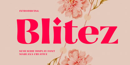 Blitez is a modern semi serif display font. Bold stroke, fun character with a bit of ligatures and alternates. To give you an extra creative work. Blitez font support multilingual more than 100+ language. This font is good for logo design, Social media, Movie Titles, Books Titles, a short text even a long text letter and good for your secondary text font with script or serif. Make a stunning work with Blitez font. Cheers, Maulana Creative
 - Chiffon by SilkType,
$35.00 Chiffon is a serif, display typeface. With high contrast and elegant curves. Chiffon includes three different versions of ‘c’ and ‘e’, which are carefully placed throughout the typeface, paired seamlessly with the following glyph. However, OpenType features and stylistic sets make the alternate forms available for the user to choose from as they see fit. Velour is available in 5 weights, from Extra light to Semi Bold, and supports Western, Central, and South-Eastern European languages.
 - Softeal by Maulana Creative,
$17.00 Softeal is a simply semi-geometric sans serif font. With regular consist stroke, fun character with a bit of ligatures and alternates. To give you an extra creative work. Softeal font support multilingual more than 100+ language. This font is good for logo design, Social media, Movie Titles, Books Titles, a short text even a long text letter and good for your secondary text font with sans or serif. Make a stunning work with Softeal font. Cheers, Maulana Creative
 - MC Brakely by Maulana Creative,
$17.00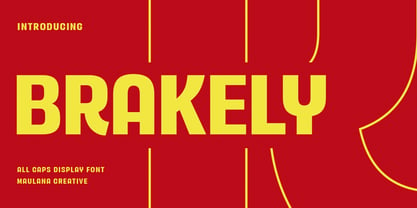 Brakely is a semi humanist sans Display font. ExtraBold stroke, fun character with a bit of ligatures and alternates. To give you an extra creative work. Brakely font support multilingual more than 100+ language. This font is good for logo design, Social media, Movie Titles, Books Titles, a short text even a long text letter and good for your secondary text font with script or serif. Make a stunning work with Brakely font. Cheers, Maulana Creative
 - Goofley by Maulana Creative,
$22.00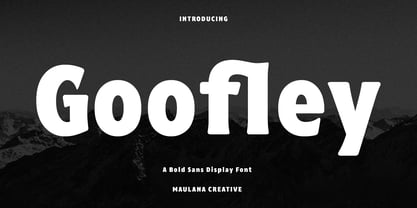 Goofley is a Display semi serif font. With medium low contrast stroke, fun character with a bit of ligatures and alternates. To give you an extra creative work. Goofley font support multilingual more than 100+ language. This font is good for logo design, Social media, Movie Titles, Books Titles, a short text even a long text letter and good for your secondary text font with sans or serif. Make a stunning work with Goofley font. Cheers, Maulana Creative
 - Afterword JNL by Jeff Levine,
$29.00 At the end of the 1931 gangster film “The Public Enemy” a hand lettered card offers up an afterword on the demise of Tom Powers (James Cagney’s character in the film) and how a “public enemy” is neither a man nor a character but a problem society must deal with. The text is in an Art-Deco influenced sans serif, and has been digitally recreated as Afterword JNL, which is available in both regular and oblique versions.

