10,000 search results
(0.034 seconds)
- Monstrosity by Comicraft,
$19.00 It breathes fire and its leathery hide is impervious to rocket propelled grenades and drone warheads! It destroys everything in its path! Is it a terrifying sound effect font or does it just want to be loved? One thing's for sure – no one is safe!
 - Zonnig by Hanoded,
$15.00 Zonnig means 'Sunny' in Dutch. Of course, this particular font has a rather sunny disposition; it looks good, it feels good and if it had a scent, it would smell good too! Use it for all your projects, as it comes with accents galore!
 - European Soft Pro Variable by Bülent Yüksel,
$99.00 EUROPEAN SOFT PRO VARIABLE ABOUT FAMILY: What makes "European Soft Pro Variable" elegant, friendly and contemporary is its very rounded curves with very open terminals. "European Soft Pro Variable" has been designed with a higher "x-height" than other fonts in its class to make tiny readability more obvious in any use situation. It will be ideal for use in small sizes such as business cards or mobile applications. This typeface is also equipped with powerful OpenType features to satisfy the most demanding professionals. It has solid features like case sensitivity, small, true capitals, full ligatures, tabular figures for tables, old style figures to elegantly insert numbers into your sentences and more alternative characters to give personality to your projects. The extended, "European Soft Pro Variable" supports around 85 languages in the Latin, Cyrillic and Greek scripts, and its non-Latin components were developed with native consultants. With over 1200+ glyphs per style, "European Soft Pro" cares about localised letterforms and has the OpenType features to match. FEATURE SUMMARY: - 9 weights: Thin, ExtraLight, Light, Book, Regular, Medium, Bold, ExtraBold, and Black. - 4 widths: Normal, Narrow, Condensed, and Extra Condensed. - Matching italics (12º) for all weights and widths . - Matching small caps for all weights and widths. - Lining and old style figures (proportional and tabular). - Alternate characters (A, G, M, N, R, U, a, g, l, m, n, u, y). - Unlimited fractions. - Automatic ordinals (1st, 2nd, 3rd, etc.). - 24 Dingbats + 19 Social Media and Block Chain icons. - Extended language support: Most Latin-based scripts (including Vietnamese), Cyrillic, and Greek. - Extended currency support. You can contact me at buyuksel@hotmail.com, pre-purchase and post-purchase with questions and for technical support. You can enjoy using it.
 - Cabrito Inverto by insigne,
$- Life’s always more fun when you reverse the stress. The same goes for the new member of the Cabrito family. Cabrito itself is a recently developed slab serif made for the kid’s book The Clothes Letters Wear. Cabrito proved to be more popular than I thought, and I promised I would create an inverted style for this new addition to the font world--a variant that would pair well with the original or even stand well on its own. And so now, here it is. Cabrito Inverto, which features the reversed stress of the strokes from a font’s “normal” traits. Inverted stress fonts are most often associated with cowboys and the Old West. The inverted stress gives it a happy-go-lucky appearance, not to be taken too seriously. It’s a pleasantly rounded, not-so-strictly geometric typeface with handwriting-inspired forms. Whew, that’s a mouthful! Inverto’s bundle of alternates is accessible in any OpenType-enabled program. It contains a workforce of alternates, swashes, and alternate titling caps to embellish the font. Also bundled are swash alternates, aged design and style figures, and compact caps. Peruse the PDF brochure to examine out these solutions in action. OpenType-enabled purposes such as Adobe suite or Quark will allow ligatures and alternates. This font family also includes the glyphs for 72 different languages. Cabrito Inverto does pair well with Cabrito. There is even an extra font weight, Black, for when you want to punch it up a bit. Jeremy Dooley designed Inverto to be a welcoming, day-to-day font family. Use it to express friendliness on just about anything, from candy to food to children’s toys. Cabrito Inverto’s one-of-a-kind visual appearance brings a bundle of fun to the party. Buy Cabrito Inverto to give a boost to your designs every day of the week.
 - European Sans Pro Variable by Bülent Yüksel,
$99.00 EUROPEAN SANS PRO VARIABLE ABOUT FAMILY: What makes "European Sans Pro Variable" elegant, friendly and contemporary is its very rounded curves with very open terminals. "European Sans Pro Variable" has been designed with a higher "x-height" than other fonts in its class to make tiny readability more obvious in any use situation. It will be ideal for use in small sizes such as business cards or mobile applications. This typeface is also equipped with powerful OpenType features to satisfy the most demanding professionals. It has solid features like case sensitivity, small, true capitals, full ligatures, tabular figures for tables, old style figures to elegantly insert numbers into your sentences and more alternative characters to give personality to your projects. The extended, "European Sans Pro Variable" supports around 85 languages in the Latin, Cyrillic and Greek scripts, and its non-Latin components were developed with native consultants. With over 1200+ glyphs per style, "European Sans Pro" cares about localised letterforms and has the OpenType features to match. FEATURE SUMMARY: - 9 weights: Thin, ExtraLight, Light, Book, Regular, Medium, Bold, ExtraBold, and Black. - 4 widths: Normal, Narrow, Condensed, and Extra Condensed. - Matching italics (12º) for all weights and widths . - Matching small caps for all weights and widths. - Lining and old style figures (proportional and tabular). - Alternate characters (A, G, M, N, R, U, a, g, l, m, n, u, y). - Unlimeted fractions. - Automatic ordinals (1st, 2nd, 3rd, etc.). - 24 Dingbats + 19 Social Media and Block Chain icons. - Extended language support: Most Latin-based scripts (including Vietnamese), Cyrillic, and Greek. - Extended currency support. You can contact me at buyuksel@hotmail.com, pre-purchase and post-purchase with questions and for technical support. You can enjoy using it.
 - MMC Insignia by MMC-TypEngine,
$30.00 MMC Insignia, is an Iconic & Emblematic Neogothic Geometric Capitals Display… Assembled by Trivial Squares and Diagonals Symbols Pattern from a puzzled grid Aftermath!! Includes Stylistic Alternates!! +Extra Monospaced Figures. In 22 styles, with Obliques, both for single display and layer Typesetting, plus OpenType Features & Bonus Blocks Fonts! MMC Insignia is a Small Caps Typeface, which default lowercases character set is included in the Pro family, its cursive version, apart from it, has also Exclusive Stylistic Alternates… Its atmosphere stands by on both Corporative to Decorative, Modern, Fashion, Federalist, Bohemian, Romantic, Ludic, Treasured Look, Etc. This Display font-family is the result of the repeated applications of this unique infamous Icon or Symbol, of two counterpointed triangles, implicit as hourglasses, in order to compose an innovative and unprecedented typographic pattern and modulation concept through the letterforms, in an extremely Geometric style. The Graphic Sign used throughout this type, is a remarkable trend used already in Logos of different businesses, whose most famous case refers to a famous International Bank, which doesn’t need to be mentioned, as it is instantly associated! This characteristic innovation was the main motivation while creating this type. Usage Suggestions: Type Fancy Titling texts, Display Remarkable Logos, Branding Projects, Labels, Emblems, Fashion Patterns, or in everything Noble and designed for Excellence as a type of Insignia, or distinguished marks and attributes of Royalty and Power!! That’s also forwardly, the reason why it was named MMC Insignia… TIPS: 1-Combine styles into innumerous possibilities of Chromatic Typesetting, by ‘central pasting’ layers… You may dislocate layers for improvisations! 2-USE BLOCK “FREE-STYLES” 1 & 2 also to add default 3D! Change 3D directions by switching Block 1 to Block 2, that way you can Zig-Zag words and lines. *Also shift the block layer up to bottom limit, it makes the 3D direction turn upside down. Greetings! André, MMC-TypEngine.
 - Umbles - Unknown license

- UnitedStates - Unknown license

- Jefferson - Unknown license

- RDHoney - Unknown license

- Coffeehouse - Unknown license

- Westminster - Unknown license

- Revx by OneSevenPointFive,
$5.00 • Excellent choice for Logo designing, Main body text, Headings, Titles, etc. • Rounded corners for calm yet attractive typeface.
 - Blind Date MF by Masterfont,
$59.00A practical handwriting font for all your day by day fresh and crazy design needs: headlines, signage etc. - Fried Coteret MF by Masterfont,
$59.00 A practical font family for all your needs: headlines, body text, signage etc. High legibility at small sizes.
 - Hand Of Joy by Open Window,
$19.95 Fantastic, elegant, informal handwriting. It's Hand of Joy! Comes with alternate (end of word) characters with extra swooshes.
 - Market by URW Type Foundry,
$35.99 DTC Black Market is best used for price tags and signs in shops, especially in stores and markets.
 - Momcake Pro by Rivian,
$15.00 Modern geometric sans serif typeface. Suitable for many projects such as logo, printing, social media, website, apps, etc.
 - Charliedog by studiocharlie,
$24.00 Charliedog is a font made of various dogs. It’s ideal for graphics works like posters, flyers and similar.
 - Pretty Lily by Epiclinez,
$18.00 Pretty Lily is a dry brush handwritten script font. Very cool if use for logos, headlines, branding, etc.
 - Gatha by Khaiuns,
$15.00 Gatha is a fun font duo that includes signature scripts and elegant, soft sans that grab 4 styles – it's fit and ready to go together for your next design! Gatha includes a complete set of beautiful upper and lowercase letters, numbers, a wide variety of punctuation marks, ligatures, and super pretty prefixes as well as a final sweep thus providing a realistic handwriting style. These typefaces are versatile and can be used successfully in Magazines, Posters, Branding, Websites, etc. Fonts include multilingual support. Please message me if you're unsure of any language support. Ligatures • Are also available for several lowercase characters (double-letters which flow more naturally). These are only accessible via software with opentype capability or a glyphs panel, e.g. Photoshop/Illustrator. I hope you have a blast using Gatha. Thanks for use this font ~ Khaiuns X zelowtype
 - Tusque by Eclectotype,
$40.00 Tusque is a layered chromatic type family with a Tuscan flavor. Regular, Circus and Tooled can stand alone, while Highlight and Deco are purely for layering up multicolored gorgeousness. Tusque lends itself to fairy tales, wine labels and boutique logos, and makes some particularly delectable drop caps. Although it’s all caps, the lower case slots are all different from the upper case so you can mix and match to your heart’s content. There are also a bevy of swash alternates and ligatures at your disposal. The contextual alternates feature cleverly substitutes alternate versions of more triangular glyphs like A and V to give a better fit. The ordinal feature changes ‘a’ and ‘o’ to the feminine and masculine ordinals for Spanish etc. but also changes ‘c’ and ‘ac’ to superscript lowercase versions for names like McBride and MacDonald.
 - Allister Rough by Ksenia Belobrova,
$29.00 Allister Rough is a handmade font family based on Oldstyle English and Transitional fonts, modern typography and lettering. It’s a kit of joyful fonts that can be used for cards, posters, books, t-shirts, etc. Allister Rough has three font Styles and Extras. “Decor 1” is an expressive font which has three sets for each letter. “Decor 2” has two sets and “Caps” has Capital letters and Small Capitals. So you can choose what you need or combine Styles to create different typography compositions. All contextual alternates are built into the ‘Liga’ feature and duplicated into the ‘Calt’ feature. So when you work with the fonts, please make sure that ‘Liga’ or ‘Calt’ is turned on. Font family also supports OpenType features like Titling, Oldstyle Figures, Fractions, Ordinals. Please take a look at the User Guide in the Gallery.
 - Shandy BF by Bomparte's Fonts,
$40.00 Shandy is a cheerful, free-spirited font that dances jauntily along an undulating baseline. Like Gene Kelly merrily cavorting through that rain-soaked street, in the famous dance scene from Singin’ in the Rain. Curiously, it’s got the liveliness of a bouncy brush script, with some elements of a robust Copperplate-style script, that appear to have been defined by a funhouse carnival mirror. In order to promote variety, no two letters are identical within most occurrences of typical lowercase double-letter pairings (bb, dd, ee, ll, nn, oo, tt, etc.) To enhance your typography, Shandy features many automatic OpenType ligatures, beginning and terminal lowercase forms and Stylistic Alternates for letters E, M and N which are accessible in OpenType-capable applications. Suitable for Branding, Logos, Product Packaging, T-shirts, Magazine headlines, Fashion Glossies, and Food Advertising to name a few arenas.
 - Porcupine Pickle by Hanoded,
$20.00 Porcupine Pickle - a weird font with a weird name. It is loose, it is girly, it is fun. It has an uneven baseline, yet is very easy to read. It comes with all the accents. Yay!
 - Bonewire by astroluxtype,
$20.00 Thin, Ultra Condensed, Burned. Bonewire is distressed, shaky, rough, hand drawn. Title with it. Create graphics with it. Create patterns with it. Backgrounds. Frontgrounds. Double page spreadgrounds with it. Design with it. Headline with it. Text copy with it… no. Let it disappear like a signal at small sizes with Bonewire Burned (some call that Thin, or Ultra Condensed?) Bonewire Regular is the heavy version and Burned is the vampire thin version.
 - America Line by Kustomtype,
$30.00 Since its foundation in 1901, the iconic building in the Rotterdam neighborhood Kop van Zuid, is shining. Where previously the Holland America Line was housed, you will now find Hotel New York. A building with a tremendous history. We’re glad to take you back in time with captivating memories. In 1991, catering entrepreneurs Daan van der Have, Hans Loos and Dorine de Vos refurbished the at the time vacant property into a hotel/restaurant. To honor its 25 years existence, we celebrate this happening with a brand-new font, ‘America Line’. A tribute to Wim ten Broek, the multi-talented Dutch Graphic Designer. As early as the 1930’s before the Second World War, Wim ten Broek made the famous posters for the Holland-America Line. The influence of A.M. Cassandre here in, is clearly recognizable. Wim ten Broek also worked for HAL with large surfaces and fixed lines in which primary colors dominate, accentuated with shadows acquired by spraying technique. He also made graphic works for, among others, the World Exhibition in New York, the Dutch railway company ‘Werkspoor’ and the royal Dutch steel factory ‘Hoogovens’. His drawings and lettering gave me a love for the trade and naturally gave me a completely different view on fonts. That’s how I slowly but surely made my way to the trade. Based on the letters I had at my disposal from the Holland – America Line poster, I started to complete the alphabet in the same style as the original text. I digitized everything in order to acquire a usable and modern font. The Holland America Line Font comes with uppercase and lowercase with all the needs of modern times to create a good digital font and to be able to use it for all graphic purposes. The font is ideal for headtext, posters, logos, etc... Don't hesitate and use this unique historical font! It will give your work that glamour that you will find in few fonts. Enjoy the Holland America Line. The Holland America Line Font comes with uppercase, lowercase, numerals, punctuations so you can use the Holland America Line font to customize all your designs. The Holland America Line font is designed by Coert De Decker in 2018 and published by Kustomtype Font Foundry. The Holland America Line Font can be used for all graphic purposes. It is ideal for headtext, posters, logos, logos, letterhead, apparel design, package design, label design etc... Don't hesitate any longer and enjoy this unique historical font! It will give your work the glamour that you will only find in a few fonts. Enjoy your journey with the Holland America Line!
 - Rocket Queen by Ferry Ardana Putra,
$19.00 Unleash your inner street artist with Rocket Queen! The definitive font for urban self-expression. Inspired by the bold strokes of tagging graffiti markers found on city walls, this font encapsulates the raw energy of the streets. Its uppercase and lowercase characters ensure versatility, while support for foreign languages guarantees global appeal. Graffiti artists worldwide adore its iconic rounded tip marker style for its unique and entertaining aesthetics. Rocket Queen's "Urban Tags" font is more than just a typeface; it's an urban art form. Designed with a nod to the vibrant world of graffiti scenes, this font embodies the spirit of tagging graffiti markers, creating a gritty, authentic experience. With full support for foreign languages and both uppercase and lowercase characters, Rocket Queen empowers your creativity. Its iconic rounded tip marker style, favored by graffiti artists globally, offers a unique and entertaining touch to your designs. Plus, it's enriched with street graffiti ornaments for that added urban flair. Rocket Queen is more than a font; it's the language of rebellion and urban creativity. Drawing inspiration from the bustling streets and tagging graffiti markers, this font captures the raw spirit of street art. Its iconic rounded tip marker style, beloved by graffiti artists worldwide, sets your designs apart with a unique and captivating aesthetic. Supporting foreign languages and featuring a complete set of uppercase and lowercase characters, Rocket Queen is your canvas for bold, edgy statements. Step into the world of street art with Rocket Queen, a font that embodies the raw spirit of urban graffiti. Inspired by the legendary rounded tip marker style, this font captures the essence of tagging in the streets. Its captivating, one-of-a-kind design is favored by graffiti artists across the globe. With support for foreign languages and a full set of uppercase and lowercase characters, Rocket Queen is the ultimate choice for artists who want their work to resonate with the vibrant, rebellious energy of the graffiti scene. And, don't forget to explore the collection of street graffiti ornaments to take your designs to the next level! "Rocket Queen" font is perfect for a wide range of creative and artistic applications. Here are some ideal uses for this unique and edgy font: Graffiti Artwork: Use "Rocket Queen" to create authentic graffiti-style artwork on canvas, walls, or digital platforms. Its street-inspired design will add an urban, edgy vibe to your work. Streetwear Brand Logos: Design logos and branding materials for streetwear clothing lines or urban fashion brands. The font's bold and expressive style is a great match for this niche. Event Posters and Flyers: Create eye-catching event posters and flyers for music concerts, art exhibitions, or street festivals. "Rocket Queen" will help your event materials stand out and evoke a gritty, streetwise feel. Album Covers: Design album covers for music genres like hip-hop, rap, punk, or any style that demands a rebellious and energetic look. The font can give your cover artwork an authentic street vibe. Tattoo Lettering: Tattoo artists and enthusiasts can use "Rocket Queen" for lettering in tattoos. Its unique graffiti-inspired characters can create distinct and personalized tattoos. Skateboard Deck Graphics: Use the font to design custom graphics for skateboard decks, reflecting the rebellious and urban culture of skateboarding. Street Art Installations: If you're creating street art installations, "Rocket Queen" can be used for text elements within the artwork, giving it an authentic urban graffiti feel. Urban Magazine Titles: "Rocket Queen" can be an ideal choice for magazine titles and headlines in publications that focus on urban culture, street art, or graffiti. Video Game Titles and Graphics: Design video game titles, logos, or in-game graphics for games with an urban or street culture theme. The font's distinctive style can enhance the game's visual appeal. YouTube Channel Branding: Content creators with a street art or urban lifestyle focus can use "Rocket Queen" for their channel logos, banners, and thumbnails. Product Packaging: For products targeting a youthful, urban audience, the font can be used in product packaging design, making the brand and product look fresh and exciting. Digital and Print Advertisements: Incorporate "Rocket Queen" in advertising campaigns that aim to connect with a young, rebellious, or urban demographic. The "Rocket Queen" font is versatile and can be adapted to a wide range of applications where a bold, streetwise, and artistic look is desired. It's all about bringing an authentic graffiti vibe to your creative projects. ——— Rocket Queen features: A full set of uppercase and lowercase Numbers and punctuation Multilingual language support PUA Encoded Characters OpenType Features Layered Style +345 Total Glyphs +100 Graffiti Swashes and Ornaments included!
 - Santhana by Rochart,
$10.00 Santhana is a font collection that contains more of alternate and some Ornament. The collection of fonts that are designed to complement each other in their use. Santhana is perfect for logo design, t-shirts, flyers, apparel, packaging, advertising, Wedding Invitation etc. This typeface contain of Uppercase, Lowercase, Alternate, Swash, Number, Symbol, Punctuation, Ligature etc. Also support multilingual and already PUA encoded.
 - Maliska Script by Gatype,
$12.00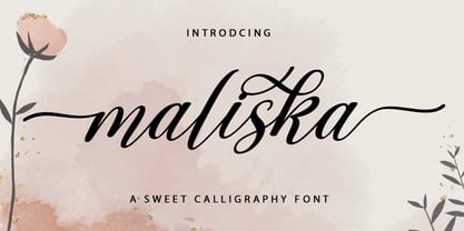 Maliska Script is a handwritten style calligraphy font featuring a varied baseline, smooth lines, a classic and elegant touch. Can be used for various purposes such as headings, signatures, logos, wedding invitations, t-shirts, letterheads, signage, labels, osters, badges etc. This typeface comes in uppercase, lowercase, punctuation, symbols & numbers, alternative style sets, ligatures, etc. also supports multilingual and is PUA encoded.
 - Creamy Mango by Olivetype,
$18.00 Creamy Mango is a bold and super cute display font. This font is suitable for headlines and branding! It's unique and attention-grabbing, while still maintaining a cute aesthetic. It's super fun! So what’s included : Basic Latin Uppercase and Lowercase Numbers, symbols, and punctuations Multilingual Support. Fully accessible without additional design software Simple Installations Works on PC & Mac Thank You.
 - Anna Nicole NF by Nick's Fonts,
$10.00 This statuesque semiscript is based on Mirabelle, an in-house design from the German foundry of Wagner & Schmidt, released in 1926. Round, firm and fully-packed, it's sure to get attention anywhere it's used. The PC Postscript, Truetype and Opentype versions contain the complete Latin language character set (Unicode 1252) plus support for Central European (Unicode 1250) languages as well.
 - Dear Diary by Comicraft,
$19.00 Dear diary, what a day it's been. Dear diary, it's been just like a dream. Woke up late. Wasn't where I should have been. For goodness sake what's happening to me? Write lightly, yours truly, dear diary. At last, a font to help you overcome those moody blues… Features: Four fonts (Regular, Underline, Strikethrough & Small caps) with upper and lower case alphabets.
 - Turpentine Kisses by Bogstav,
$18.00 Based loosely on Clarendon, Turpentine Kisses breaks all the rules of the classic serif fonts. It's jumpy and bouncy with a clear handmade look. It's playful yet legible, and full of personality. I've added 3 different versions of each lowercase letter, and they automatically cycle as you type. Or you can just select the one you prefer from the glyph menu.
 - Pebl by Formation Type Foundry,
$25.00 Pebl is inspired by the naturally simplified and smoothed shapes of beach pebbles. The result is a bold, super-rounded display typeface. It's pared back to just the most basic, smooth outlines without counters, for a friendly and organic look. It’s ideal for logos, branding, headlines or just abstract type shapes in print, in displays, on the web, on T-shirts, wherever. Enjoy.
 - Suomi Hand Script by Suomi,
$60.00 This script is made for mimicking handwriting with a fair amount of ligatures: there are more than 700 ligature pairs (or even more characters; I never really counted them) to help you to make very, very convincing lines of text without ever lifting a pen! It’s been a bestseller in FontShop for years, and now it’s available here as well!
 - Koara by Rosario Nocera,
$14.99 Koara is a handmade font family inspired by nature. It's composed of two versions, (rough and wild) and available in the weights, light, regular and bold, with an alternative capital K, linear lowercase and capital numbers. It's recommended for large titrations, small paragraphs, typographic compositions and logotype, Koara shines on several backgrounds like leafs, jungle, nature images and even organic food.
 - Bowling Script by Sudtipos,
$69.00 There is plenty of lyric and literature about looking over one's shoulder in contemplation. What would you have done differently if you knew then what you know now? This is the kind of question that comes out of nowhere. When it does and whether its context is personal or professional make very little difference. It's a question that can cause emotions to rise and passions to run hot. It can trigger priority shifts and identity crises. It's never easy to answer. Three years ago, I published a font called Semilla. My aim with that was to distill the work of Bentele, a lettering artist from early 1950s Germany. Picking such an obscure figure back then was my way of pondering the meaning and efficiency of objectivity in a world where real human events and existences are inevitably filtered through decades of unavoidably subjective written, printed and oral history. And maybe to pat myself on the back for surviving surprises mild and pleasant. Having been fortunate enough to follow my professional whims for quite some time now, I took another, longer look at my idea of distilling Bentele's work again. I suppose the concepts of established history and objectivity can become quite malleable when personal experience is added to the mix. I say that because there I was, three years later, second-guessing myself and opining that Bentele's work can be distilled differently, in a manner more suited to current cultural angles. So I embarked on that mission, and Bowling Script is the result. I realize that it's difficult to reconcile this soft and happy calligraphic outcome with the introspection I've blathered about so far, but it is what is. I guess even self-created first world problems need to be resolved somehow, and the resolution can happen in mysterious ways. Bowling Script is what people who like my work would expect from me. It's yet another script loaded with all kinds of alternation, swashing and over-the-top stuff. All of that is in here. These days I think I just do all that stuff without even blinking. But there are two additional twists. The more noticeable one is ornamental: The stroke endings in the main font are of the typical sharp and curly variety found in sign painting, while the other font complements that with ball endings, sometimes with an added-on-afterwards impression rather than an extension of the actual stroke. In the philosophical terms I was mumbling earlier, this is the equivalent of alternate realities in a world of historical reduxes that by their very nature can never properly translate original fact. The second twist has to do with the disruption of angular rhythm in calligraphic alphabets. Of course, this is the kind of lettering where the very concept of rhythm can be quite flexible, but it still counts for something, and experimenting with angular white space in a project of a very dense footprint was irresistible. After playing for a bit, I decided that it would interesting to include the option of using optically back-slanted forms in the fonts. Most scripts out there, including mine, have a rhythm sonically comparable to four-to-the-floor club beats. So the weirdly angled stuff here is your chance to do the occasional drumroll. Everyone knows we need one of those sometimes. Bowling Script and Bowling Script Balls fonts comes with 1600 characters and features extended Latin-based language support. There are also a basic version of both fonts without all the alternates and extra OpenType features. Bowling family ships in cross-platform OpenType format. We also want to present “Mute”, a visual essay narated by Tomás García and Valentín Muro, about digital life created specially to introduce Bowling Script.
 - Sortie Super by Lewis McGuffie Type,
$40.00 Sortie Super is a take on one of the kings of display lettering - Caslon's high-contrast, reversed stress 'Italian' style. It looks great at big sizes and in short flurries... and shouldn't be used in confined spaces. When compared with the original face, the weight and contrast of Sortie Super has been exaggerated. To add gravity to the letters I've increased their width overall and reduced the spacing to a hair-line fracture for added visual impact. Characters like 'S', 'E','O' and 'Z' are relatively close to their historical precedents - however the terminals on the 'C-G-S-З-Є', which have been drawn so to be more consistent. Other aspects, such as the leg of the 'R' and 'Я', the apex of the 'A' and the spur of the 'G' are revised and simplified, to help spacing and optical weight across the alphabet. Also, to reduce visual noise terminals in characters like 'C', 'J' and 'R'' are horizontally aligned. Meanwhile, the central horizontal strokes in the 'B', 'P' and 'R' etc are reduced to a hairline, so as to create a more simplified system of thick-to-thin. The temptation when drawing this kind of esoteric display alphabet is to start to rely on modular components. Which, while copy-paste-repeat is a sure-fire way to make the face more visually consistent, it's a lazy method that risks allowing the font become soulless and mechanical. An early experiment I made was making a monospaced version, which was useful in headlines, but it lost that loving feeling. So, by maintaining a handful of flourishes – the tail of the '?', the inky drop of the '!', the bulbous gloop of arms of the 'Ж' and 'К', the swirling legs in the 'R', 'Я' and 'Л', the big-bowling weight of the 'J' and 'U' – plus a few in-built inconsistencies and a bit of its own silliness, Sortie Super retains some of the organic warmth of its ancestor. Conversely, the counters, apertures and negative space are largely rigidly geometric, which helps give the revival font a bit of a modern touch. Sortie Super is an uppercase-only display font that comes with Western, Central and East European Latin, extended Cyrillic, Pinyin, as well as a set of hairline graphic features and symbols.
 - Plumage by Wilton Foundry,
$29.00Plumage is somewhat unusual in that it has elements of calligraphy as well as script in a semi-loose form that gives it a pleasing appearance for both large and small sizes, and interesting flare finish strokes add to its unique character. As I read a dictionary description of "plumage", I realized that in many ways there is a parallel between a bird's plumage and how it is utilized in the context of writing: Plumage varies in pattern and arrangement for different purposes; what it expresses can of course be even more interesting. Plumage is disposable after a season, as new ones become available... imagine, a self-sustaining quill! - I guess that's equivalent to a refill or disposable pen. Historically, quill pens were made from feathers of a variety of birds, each chosen for its special characteristics. The sturdiest and most reliable feathers, however, come from turkeys, swans and geese. Feathers used to make pens are the stiff-spined flight feathers on the leading edge of the bird's wing. Pens for right-handed writers come from the left wing, and pens for left-handers, from the right! Each bird yields 10-12 good quills, and sometimes only 2 or 3 - so small a yield that the geese reared in England could not furnish nearly enough for local demand, and quills were imported from the Continent in large quantities. At one point St Petersburg in Russia was sending 27 million quills a year to the UK. It is said that geese were specially bred by US President Thomas Jefferson (1743-1826) to supply his own vast need for quills - in his lifetime he wrote almost 20,000 letters. The name "Plumage" was selected to pay homage to the noble birds that supplied countless quills for centuries of literary works. Plumage is recommended for any formal or informal invitation, decorations, awards, poetry, plaques, etc. We hope you will have the pleasure of using Plumage.


