10,000 search results
(0.041 seconds)
- Irendy by Gatype,
$10.00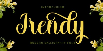 Irendy is a sweet calligraphy font and includes pretty swashes. It can be used for various purposes such as logos, product packaging, wedding invitations, branding, headlines, signage, labels, signature, book covers, posters, quotes and more.
 - Koska Esko by Jehansyah,
$9.00 Koska Esko This is a font with a very bold and elegant look, perfect for designs with a modern look it's time for you to try a new style for a new design include : numeric latin ligatures alternate And Thank you very Much
 - Quirky Quill by Mix Fonts,
$13.00 MIX QUIRKY QUILL is not your average font. Inspired by the old archival books and documents from the days of yore, MIX QUIRKY QUILL brings a touch of history and tradition to your designs. With its clean, slightly italicized letters, this font is the perfect choice for projects that aim to evoke a sense of timelessness. Think of the old record books in church archives, the documents from Ellis Island, and pre-technology paperwork. MIX QUIRKY QUILL is reminiscent of these timeless pieces, making it ideal for art events, classic artwork, theatre posters, and anything that demands an air of tradition and classic sophistication. But don’t let its historical roots fool you. MIX QUIRKY QUILL is a perfectly imperfect digitized handwriting font, with a playful and fun flair that makes it stand out. Its clean lines and slightly italicized letterforms provide a touch of sophistication, while its charming imperfections add a touch of personality. This font is perfect for use in earthy, classic palettes such as browns, creams, and ink greens. Whether you’re looking to create a vintage-inspired design or a modern, quirky take on tradition, MIX QUIRKY QUILL is the font for you. Add Quirky Quill to your design arsenal today and see what story you can tell! MIX QUIRKY QUILL comes with the following glyphs: ABCDEFGHIJKLMNOPQRSTUVWXYZ abcdefghijklmnopqrstuvwxyz 0123456789 !@#$%^&*()`~♥✿•· ÷×+−±≈=≠≥≤[]<>:;'”,.\|/ {}“”‘’-–—_…‚„©®™‹›«»°¹²³¡¿₱¢€£¥¶§№† ÁÀÂÄȦÃÅĂĀĄÆĆĈČĊÇÐĐÉÈÊËĖĒĘḞǴĜǦḠĠĤȞḦḢIÍÌÎÏĪĮĴḰǨŁḾṀŃÑŇ ÓÒÔÖÕŌŐØŒṔṖŔŘṘŚŜŠŞȘŤṪȚÚÙÛÜŨŮŬŪŰŲẂẀŴẄẆÝŶŸŹẐŽŻƵ áàâäȧãåăāąæćĉčċçðđéèêëėēęḟǵĝǧḡġĥȟḧḣıíìîïīįĵḱǩłḿṁńñň óòôöõōőøœṕṗŕřṙśŝšşșťṫțúùûüũůŭūűųẃẁŵẅẇýŷÿźẑžżƶ Alternates/Ligatures: & j gg kk ll lt mm nn oo th tt
 - Bremer Presse by Schraube,
$29.00 As most successful German private press, «Bremer Presse» has strongly influenced German book art. It was founded 1911 in Bremen to print and produce books in perfection. The role model of the press’ typeface was the english Doves Press. Willy Wiegand drew three versions of the «Bremer Presse» antiqua font, starting with the regular weight in 16 pt and adding later the regular weights in 11 and 12 pt. The revival of this beautiful font is based on the 12 pt weight. During the design process, the focus was laid on finding the elegance and strength of original prints. As it was designed to print books, the typeface is optimally used for texts. And with the revival’s new weights «medium» and «bold» and OpenType features like ligatures or old style figures, you can design sophisticatedly typographical compositions.
 - Sortie Super by Lewis McGuffie Type,
$40.00 Sortie Super is a take on one of the kings of display lettering - Caslon's high-contrast, reversed stress 'Italian' style. It looks great at big sizes and in short flurries... and shouldn't be used in confined spaces. When compared with the original face, the weight and contrast of Sortie Super has been exaggerated. To add gravity to the letters I've increased their width overall and reduced the spacing to a hair-line fracture for added visual impact. Characters like 'S', 'E','O' and 'Z' are relatively close to their historical precedents - however the terminals on the 'C-G-S-З-Є', which have been drawn so to be more consistent. Other aspects, such as the leg of the 'R' and 'Я', the apex of the 'A' and the spur of the 'G' are revised and simplified, to help spacing and optical weight across the alphabet. Also, to reduce visual noise terminals in characters like 'C', 'J' and 'R'' are horizontally aligned. Meanwhile, the central horizontal strokes in the 'B', 'P' and 'R' etc are reduced to a hairline, so as to create a more simplified system of thick-to-thin. The temptation when drawing this kind of esoteric display alphabet is to start to rely on modular components. Which, while copy-paste-repeat is a sure-fire way to make the face more visually consistent, it's a lazy method that risks allowing the font become soulless and mechanical. An early experiment I made was making a monospaced version, which was useful in headlines, but it lost that loving feeling. So, by maintaining a handful of flourishes – the tail of the '?', the inky drop of the '!', the bulbous gloop of arms of the 'Ж' and 'К', the swirling legs in the 'R', 'Я' and 'Л', the big-bowling weight of the 'J' and 'U' – plus a few in-built inconsistencies and a bit of its own silliness, Sortie Super retains some of the organic warmth of its ancestor. Conversely, the counters, apertures and negative space are largely rigidly geometric, which helps give the revival font a bit of a modern touch. Sortie Super is an uppercase-only display font that comes with Western, Central and East European Latin, extended Cyrillic, Pinyin, as well as a set of hairline graphic features and symbols.
 - Treves Sans by AdultHumanMale,
$15.00 Treves Sans is a scratchy, messy, hand written display font. It has the look of charcoal or a brass rubbing, reversed in lighter tones it looks like chalk. It reminds me of Edward Gorey's or Eddie Campbell's styles of sketching. It has about 200 glyphs including all those extra pesky foreign features.
 - Authenticity by Doehantz Studio,
$20.00 Authenticity is an authentic signature font. It made with a neat touch making it easy to read. This font is suitable for use as web logos, signatures, invitation, prints, headers, magazines, book covers, t-shirt prints, craft, product brand, business card, logo, and gift card
 - Tubby by Suomi,
$19.00 Tubby came about when I made a book with Cooper Black as a headline font. I started playing with heavy forms, and as a result was Tubby. It has a fat and friendly feel, and with swash italics it is fairly versatile in use.
 - Goodie Bag by Hanoded,
$15.00 The correct spelling, apparently, is Goody Bag. But I like it with an ‘ie’ ending. Goodie bag is a 4 member display font family. Use it for your book designs, magazines or websites - maybe even for the goodie bag you want to hand out!
 - Brandzet by ahweproject,
$14.00 Brandzet is a unique display font. Its random shape makes it outstanding and great for titles. This type of font is perfectly made to be applied to logos, headlines, labels, logos, magazines, books, packaging, fashion, makeup, stationery, novels, labels, or any type of advertising purpose.
 - Pallada by ParaType,
$25.00 A decorative face of freestyle flowing letterforms, it is stylized a little under wide brush calligraphy. Its letterforms are characterized with one-side serifs. For use in book heading, advertising and display matter. The face designed by Natalya Vasilyeva and licensed by ParaType in 2007.
 - Bad Medicine by Hanoded,
$15.00 Bad Medicine is a rough Western slab serif font. It was made with a brush and China ink. Bad Medicine is quite a beefy typeface, so use it for your posters, product packaging and book covers! Comes with a herd of diacritics as well.
 - Cherry Parsley by Abo Daniel,
$13.00 introducing CHERRY PARSLEY - swirly handwritten font - It is great for quotes, cards, banners, books, cutting, silhouettes, social media content, and anything about craft projects. This font is all uppercase. Features: - Uppercase - Number & punctuation - Multilingual - PUA encoded I hope you love it. regards, Abo Daniel Studio
 - Castre by Nathatype,
$25.00 Be a trendsetter and stand out with bold and sophisticated style font. The epic Castre. Castre is a serif font family to better charm your designing experiences. This package package to please you with a variety of choices for your own project consisting of eight different choices of thickness level. It is designed to be simple and easy to read without losing the modern feels. The uppercases design is paired with thin lines allow us to dive more into the world of modernity. Included: Castre Thin Castre Extra Light Castre Light Castre Regular Castre Medium Castre Semi Bold Castre Bold Castre Extra Bold Slay your design with Castre’s best features so you’ll look your best on what ever your design is, all the time. Features: Ligatures Multilingual Supports PUA Encoded Numerals and Punctuations Castre fits best for any design projects, such as posters, banners, logos, book covers, album covers, quotes, invitations, greeting cards, name cards, headings, printed products, merchandise, social media, etc. Find out more ways to use this font by taking a look at the font preview. Thank you for purchasing our premium fonts. If you have any further question or issues, don’t hesitate to contact. We’re happy to help! Happy Designing.
 - Angel Paradise by Attract Studio,
$13.00 -INTRODUCING- Angel Paradise Script is a modern calligraphy font. Here you will get a beautiful script font. This font is available some modern swirl that can make your work look elegant, sweet and perfect. Can be used for various purposes.such as headings, signature, logos, wedding invitation, t-shirt, letterhead, signage, lable, news, posters, badges etc. Angel Paradise Script features OpenType stylistic alternates, ligatures and International support for most Western Languages is included. To enable the OpenType Stylistic alternates, you need a program that supports OpenType features such as Adobe Illustrator CS, Adobe Indesign & CorelDraw X6-X7, Microsoft Word 2010 or later versions.How to access all alternative characters using Adobe Illustrator: https://www.youtube.com/watch?v=XzwjMkbB-wQ Angel Paradise Script is coded with PUA Unicode, which allows full access to all the extra characters without having special designing software. Mac users can use Font Book , and Windows users can use Character Map to view and copy any of the extra characters to paste into your favourite text editor/app.How to access all alternative characters, using Windows Character Map with Photoshop: https://www.youtube.com/watch?v=Go9vacoYmBw If you have any question, don't hesitate to contact me. Thanks so much for looking and Enjoy it!
 - Throll by Skiiller Studio,
$18.00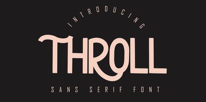 THROLL Modern sans serif font. It has a elegant, classy look and modern. It’s a great font for fashion, apparel projects, signature, album cover, logo, branding, magazine, social media, & advertisements. What's include: Stylistic alternate PUA Encoded Characters - Fully accessible without additional design software. Basic Latin Language Support (AÀÁÂÃÄÅCÇDÐEÈÉÊËIÌÍÎÏÑOØÒÓÔÕÖUÙÜÚÛWYÝŸÆß )
 - Alemoric Vintage by HansCo,
$15.00 Alemoric vintage font is a vintage decorative typeface which is inspired by lettering sign and art. While this font has a victorian touch, it still looks bold and solid. Very suitable for for packaging, headline, logotype, apparel, branding, advertising etc. How to access alternate / ornament ? : https://hanscostudio.com/tutorial/ Enjoy!
 - Horse Puckey JNL by Jeff Levine,
$29.00Horse Puckey JNL is a lighthearted and fun, Western-styled font based on Halavah Twist JNL by Jeff Levine. This font lends itself to the less-serious side of Cowboy life... rodeos, barbecue cookouts, barn dances, etc. Use it liberally wherever the Western look is needed for informal headlines. - Mockerel Vintage by HansCo,
$15.00 Mockerel Vintage font is a vintage decorative typeface which is inspired by lettering sign and art. While this font has a victorian touch, it still looks bold and solid. Very suitable for for packaging, headline, logotype, apparel, branding, advertising etc. How to access alternate / ornament ? : https://hanscostudio.com/tutorial/ *Enjoy!
 - Sticky Rush by Bogstav,
$16.00 This is my and it's handmade super legible sans font. Very suitable for anything that needs a clearly handmade look, but not overdoing it. I've added several different versions, and they all fit on top of each other - or you can use them just fine as individual fonts.
 - Montern Vintage by HansCo,
$15.00 Montern Vintage font is a vintage decorative typeface which is inspired by lettering sign and art. While this font has a victorian touch, it still looks bold and solid. Very suitable for for packaging, headline, logotype, apparel, branding, advertising etc. How to access alternate / ornament ? : https://hanscostudio.com/tutorial/ Enjoy!
 - Thunder Ragnarok by Letterara,
$14.00 Thunder Ragnarok is a stylish modern brush script. It has an unique, striking look which can be used to make any design stand out. It’s perfect for logos, fashion designs,stationary, quotes, and much more!. This font is PUA encoded which means you can access all of the glyphs.
 - Thornton by Arendxstudio,
$18.00 Thornton is a bold script that looks elegant when used for your design. It's also elegant and modern and works well with your design interests, be it for logos, branding names, posters, podcasts and so on. Features 1.Uppercase & Lowercase 2.Numbers & Punctuation 3.Multilingual Support 4.Ligatures
 - Campeche by Latinotype,
$29.00 Campeche is an expressive yet functional typeface family. Seeking to express its beauty, it twists the conventions of classic typography when necessary. Campeche finds its inspiration in the grotesque typefaces of the late 19th century coupled with a typical Latin American playful sense that gives it a modern freshness. The initial form arises from the idea of expanding Seriguela, evolving along the way, becoming its own system with a unique personality. Campeche is designed for today's requirements. It is available in two styles and three widths, from condensed to extended, with 9 weights each, totaling 54 fonts, in addition to the variable version. Campeche is a comprehensive typographic system that provides versatility for almost any use. It can be used for packaging, editorial, branding... etc. The mix of widths and between the normal and display versions can generate complex graphic parts or systems with different levels of hierarchy, without losing unity.
 - Superb by Resistenza,
$49.00 Superb is a new typeface based on real brush pen script and also influenced by lettering shapes from the sixties and seventies. The font includes various swashes with volume and curls.. Superb’s letters got high contrast and some psychedelic curves. This font includes negative figures and a full alphabet set with cut out shapes. Take a look at the Superb Video https://vimeo.com/94062611 It’s designed with high contrast and enhanced legibility regardless its artistic look. Superb’s original letterforms are a beautiful piece of art and elegance no matter you observe them as separate symbols or as words, text paragraphs etc. Their appropriate use could be found therefore in many different aspects – from decorative greeting card, fresh packaging or expressive headline, to artistic t-shirt design, poster or distinguished brand name. Superb has a lot more to show when you access its OpenType features.
 - Mrs Ant by Hipopotam Studio,
$20.00 Hand drawn serif typeface designed for one of our books. It has upper and lowercase characters with up to three alternate glyphs. Build in OpenType Contextual Alternates feature will automatically set alternate glyphs depending on frequency of appearance of the same character (even in web font but only in HTML5 browsers). The script doesn’t throw random glyphs. For example in the word “HIPPOPOTAMUS” you will automatically get three different “P” glyphs and two “O” glyphs. It really works great but of course you can always fine tune it by hand. Mrs Ant has an older brother. Mr Anteater was designed for headers for the same book.
 - WL Rasteroids by Writ Large,
$5.00 Rasteroids is a typographic flashback to computing of the mid 1980s, when 9-pin dot-matrix printers were the state of the art, and most home computer displays were TVs hooked up to RF modulators. Rasteroids not only captures the dot-matrix printer look, but recreates the rasterized appearance of text on those lower-resolution monitors. Unlike that dot matrix type of yore, Rasteroids does have some variation in character width, and is legible in small blocks of copy. Still, it is best used sparingly, or as a special effect.
 - Ghibli by Eyad Al-Samman,
$- The word ‘Ghibli’ per se refers to a Saharan hot and dry wind commonly known as the Sirocco. In Arabic language, ‘Ghibli’ is known as ‘Qibli or Kibli’, meaning ‘Southern’ for those Arabic nations who live in the North of Africa. The ‘Ghibli’ wind is most common during spring and autumn, and can blow at almost 60mph; it is this wind which is responsible for the dry, dusty conditions on the Mediterranean coast of North Africa. ‘Ghibli’ can last for days making life miserable and is therefore feared by the desert dwellers in that region. It can also have profound effect on the landscape by moving vast quantities of sand and dunes. Inspired by the Studio Ghibli’s unique and magical characters, the ‘Ghibli’ typeface is designed as a Latin free and literary serif typeface. It strongly expresses transition, imagination, sharpness, characterization, and modernization. It is a literary type that can capture the eyesight of readers and other observers with its acute and stylistic letterforms, dots, and numerals. It has transitional serifs and it is generally based upon the Latin printing style of the 18th and 19th centuries, with a pronounced vertical contrast in stroke emphasis (i.e., vertical strokes being heavier than the horizontal strokes). It has more regular forms in which serifs are bracketed and more symmetrical. The main characteristic of ‘Ghibli’ typeface is in its new designed serif letters. Special letters that can be described as having modern designs include small ‘g’, ‘p’ (with their open ends), ‘x’, and capital ‘B’, ‘P’, ‘Q’, and ‘R’ (with their open ends). ‘Ghibli’ typeface has also both of lining and old-style numerals which makes it more suitable for any literary and printing purposes. This gratuitous font comes in only two weights (i.e., Ghibli Regular and Ghibli Bold). It is absolutely preferable to be used in the wide fields related to literature and publication industry. This includes typing titles of diverse literary and academic books, readable texts of novels, novellas, short stories, prose, poetry, textbooks, newspapers, and magazines. It is also notable if chosen for designs that include movies’ titles, logos of academic institutions such as colleges and universities, organizations and associations’ names, medical packages such as those dedicated for tablets and syrups, and also other different educational and social materials. ‘Ghibli’ is simply a free literary typeface dedicated for all who want to write and read using a modern and stylish serif font. Enjoy it.
 - Aster Sphin by Krakenbox Studio,
$15.00 Aster Sphin is a fashionable sophisticated signature-style script with its own unique curves and an elegant inky flow. Its elegant, classy, and modern look. It looks stunning on wedding invitations, thank you cards, quotes, greeting cards, logos, business cards and every other design which needs a customized touch.
 - Sharplion by Zeki Michael,
$30.00 Sharplion is a typeface family designed by Zeki Michael and Leyla Melis Aslan. It’s a simple, but sharp display typeface with a clear yet powerful personality, created to not only optimize space, but also build contrast on the printed page and on the screen. Sharplion, coming in two weights and a matching slanted version, is designed to give that neo-vintage industrial feel in 'titles and hierarchic subheadings, logotypes and cases of short and simple copywriting for the artisan, hand-made and small batch look.’ The first 4 letters for what is now Sharplion, were designed in 2018 by Zeki Michael to be used as a logotype for Depo Coffee Roasting’s branding project. In early 2019 after Zeki designed all the letters, numbers and glyphs, he teamed up with talented designer, Leyla Melis Aslan to add strength to the project. The full Sharplion type system includes Regular, Black and Slanted styles – providing a simple but sharp contrast type solution for digital and print design work.
 - Jungle Bones by Phat Phonts,
$10.00Fun font suitable for children's books. - Black Palm by Just Lett,
$17.50 Black Palm is handwritten font. Black Palm will be perfect for greeting cards, story books, posters, child books, handwritten notes, stand out brandings, and others. FEATURES: UPPERCASE lowercase Numeral and Puncuation Multilingual Accent Happy creating...
 - Scriptonite by Jonahfonts,
$30.00 A freehand OpenType face, including 20 ligatures as well as the most popular discretionary ligatures. (ft, ct and st) Usage recommendations: Posters, titles, book covers, books, greeting cards, packaging, invitations, magazine articles, titling and advertising.
 - Sky Clipper JNL by Jeff Levine,
$29.00 Sky Clipper JNL is a bold, Art Deco sans serif typeface derived from the hand lettered title on a 1940s-era “Big Little Book” entitled “Flying the Sky Clipper with Winsie Atkins”. The design is available in both regular and oblique versions. “Big Little Books” were published by the Whitman Publishing company and featured short stories printed in a tiny sized book format for young children.
 - Slimedunk by Mozatype,
$11.00 SLIMEDUNK is a sans serif display font, which contains 4 styles and It features a unique and modern sans serif. This font would be perfect for E-sport Logo, film posters, games, sports, and any project. It’s also perfect for that delicate look that you want in your invitations, poster Use this font for any crafting project that requires a personalized look! What’s Included : - Works on PC & Mac - Easy to use ( Installations ) - Compatibility Windows, Apple, Linux, Cricut, Silhouette, and Other cutting machines Thank you for purchasing this font. Please appreciate, if you like this. ENJOY it :)
 - The Morshine by Letterhend,
$19.00 Morshine is a typeface which is inspired by vintage lettering sign and art. While this font has a victorian touch, it still looks bold and solid. Very suitable for for headline, logotype, apparel, invitation, branding, packaging, advertising etc with old school / vintage theme. This typeface looks great combined with decorative ornaments. It comes in uppercase, lowercase, punctuations, symbols & numerals, stylistic set alternate, ligatures, etc also support multilingual and already PUA encoded. Features : uppercase & lowercase numbers and punctuation multilingual alternates and ligatures swashes PUA encoded We highly recommend using a program that supports OpenType features and Glyphs panels like many of Adobe apps and Corel Draw, so you can see and access all Glyph variations. How to access opentype feature : letterhend.com/tutorials/using-opentype-feature-in-any-software/
 - Richsten by Letterhend,
$17.00 Richsten is a typeface which is inspired by vintage lettering sign and art. While this font has a victorian touch, it still looks bold and solid. Very suitable for for headline, logotype, apparel, invitation, branding, packaging, advertising etc with old school / vintage theme. This typeface looks great combined with decorative ornaments. It comes in uppercase, lowercase, punctuations, symbols & numerals, stylistic set alternate, ligatures, etc also support multilingual and already PUA encoded. Features : numbers and punctuation multilingual alternates and ligatures swashes PUA encoded We highly recommend using a program that supports OpenType features and Glyphs panels like many of Adobe apps and Corel Draw, so you can see and access all Glyph variations. How to access opentype feature : letterhend.com/tutorials/using-opentype-feature-in-any-software/
 - Ciseaux by Wilton Foundry,
$29.00 Ciseaux was inspired and is dedicated to the art of paper cutting. Early paper cutting artists were often royalty, but it soon became a folk art practiced by commoners whose cutouts decorated their homes. By the seventeenth century it had spread throughout the world. The Japanese called it Mon-kiri, the German's Scherenschnitte and Turkey even boasted a guild devoted to the art form. In Poland the designs were traditionally symmetrical and often used layers of colors to form pictorial collages. When Russian invaders confiscated scissors, villagers were found to cut their intricate designs with sheep shears! The art form later developed into cutting out elaborate designs of nature scenes and people, celebrating special occasions and even decorating legal documents. Ciseaux letterforms mimic paper cutting art in its shapes with a rather loose and almost joyous rhythm. The overall effect is somewhat earthy and natural yet it has an element of sophistication that cannot be ignored. Just like paper cutting, Ciseaux can be used for special occasions like invitations, brochures, identities, restaurant menus, and if you dare, some awesome looking paper graffiti. Available in TT, PS and Opentype for Mac and Windows.
 - Graphit by HVD Fonts,
$40.00 Graphit is a typeface designed by Lit Design Studio & curated by HvD Fonts. It combines clear, geometric shapes with edgy yet finely-crafted details. Graphit features uncompromising characters such as G, Q, f, k and 1. It works well both for impactful headlines and for reading sizes. The type family consists of six weights plus matching italics. In early 2018, Livius Dietzel & Tom Hoßfeld started developing the typeface’s essential character and released a free font named after the studio, Lit. Just a few months later, Hannes von Döhren had a look at the typeface and suggested expanding it into a family – then publishing it with HvD Fonts. They drew every single letter from scratch, and also decided to give the font a new name — Graphit. The family features six low-contrast weights, ranging from Black to Thin. Every character has been crafted to give it a distinctive and individual feel. Medium, Regular and Light are optimized for usage in copy text. For smaller font sizes & longer body copy, the alternate character set features a double-story a and a simplified Q, f, r and t for improved legibility. All fonts are manually hinted for optimal performance on digital devices.
 - Spleeny by Galapagos,
$39.00A gentle breeze on a warm summer's day. A cozy gathering of friends and family around a crackling fire. The sweet aroma of freshly baked cinnamon bread. A slow walk in the autumn woods, light sparkling down through the multi-colored leaves. Billowing white clouds against a stark azur sky, leisurely floating past the tops of palm trees. What do these idyllic scenes all have in common? A: Most people can never find the time to enjoy any of them. B: These are just some of the things you would never try to describe using a crankish font like Spleeny Decaf GD. Just as ITC Fontoon was designed to be used with the many critters that populate the "Toonie" series of fonts, Spleeny Decaf GD was created by Steve Zafarana for use in the balloned dialogue portions of a new panel cartoon feature currently under development. Spleeny Decaf GD is the first completed font in a family that ranges from the jittery san serif Spleeny Espresso GD to the sedate and serifed Spleeny Asleep GD. Each font in the series appears a little more relaxed and staid than its predecessor. None of them however, will find themselves being used for the text of any legal documents. Spleeny Decaf GD is the perfect font to use when the weight of the message is leaning towards the light and jocular side of things. So remember, if your documents are starting to put you on edge, it may be time to switch to decaf. Spleeny Decaf GD that is.