10,000 search results
(0.393 seconds)
- Black Ornaments Four by Intellecta Design,
$17.90 Black Ornaments is a family of ornament/dingbat fonts, inspired by the CalligraphiaLatina font series. Is excellent for use in editorial works of art and publishing, as the cover of books, headpieces, packaging, magazines and many other solutions.
 - Siarons by Maulana Creative,
$15.00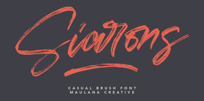 Give your designs an authentic brush handcrafted feel. "Siarons" is perfectly suited to signature, stationery, logo, typography quotes, magazine or book cover, website header, flyer, clothing, branding, packaging design and more. Thanks for use this font. Maulana Creative
 - Gottar Adsset by Maulana Creative,
$12.00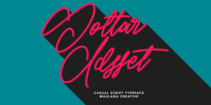 Give your designs an authentic brush handcrafted feel. "Gottar Adsset" is perfectly suited to signature, stationery, logo, typography quotes, magazine or book cover, website header, flyer, clothing, branding, packaging design and more. Thanks for use this font. MaulanaCreative
 - Fancy Kingdom MS by Redcollegiya,
$9.00 Fancy Kingdom is elegant serif font family wich great for wedding invitation, greeting cards, book covers or any fairy design. This kit includes 3 typefaces: - Regular - without curls; - Decorative - uppercase and lowercase with curls; - Combined - uppercase with curls.
 - Cattle Town JNL by Jeff Levine,
$29.00 In the 1946 French lettering book “100 Alphabets Publicitaires” (“100 Advertising Alphabets”) is a hand-lettered “Western” font called “Italian". This served as the basis for Cattle Town JNL, which is available in both regular and oblique versions.
 - Johto by Superpencil,
$32.00 Finally, a font that’s ready for your pixel adventures. Johto is a hand-crafted, pixelated font that captures the excitement of 1990s Tokyo for today’s developers, designers, and video-game makers. We all love the pixelated games we played as kids. Now, as programmers, video makers, and creators of side projects that make our hearts pound with passion, there is nothing more satisfying than imagining ourselves in the shoes of the people that inspired us. We want to feel like we're right back there in the excitement of 1990s Tokyo, as an artist or engineer. Johto was created because of our disappointment with the pixel fonts we found online. And for people like us, who care deeply about the quality of our work - especially the work we do for ourselves - we realized we needed a high-quality pixel font to give our work the look it deserves. With over six hundred characters plus support for dozens of languages, including Japanese, tons of fun hand-crafted ligatures to get the look right, Johto is an authentic nostalgia trip. It has all those missing details you didn't notice, but your brain did.
 - Beast Energy by Ditatype,
$29.00 Beast Energy is a brush-copying-script font in letter designs having uneven edges as its artistic and organic characteristics. This brush script font can express dramatic, fun impressions through its capital letters making the brush wipe details clearer. The edges will look wider and thicker on certain parts of the letters. The color applications in this brush script font will also give amazing, artistic effects. For example, brighter colors will live up the letters, while darker ones will have dramatic and mysterious effects. Above all, you need to make sure the letters remain legible even in bigger text sizes. Furthermore, you can enjoy the available features here. Features: Multilingual Supports PUA Encoded Numerals and Punctuations Beast Energy fits best for various design projects, such as brandings, quotes, printed products, merchandise, social media, etc. Find out more ways to use this font by taking a look at the font preview. Thanks for purchasing our fonts. Hopefully, you have a great time using our font. Feel free to contact us anytime for further information or when you have trouble with the font. Thanks a lot and happy designing.
 - Feeling Together by Nathatype,
$29.00 It can be troublesome to create a natural-looking design using a clean, modern font. A badly designed font can damage the whole project display and produce a very unexpected result. For such a reason, we are glad to introduce you to our handwritten font to help you create personal nuances on your projects. This is the Feeling Together, a handwritten font carefully created to ensure its natural, unorganized display for a handwriting-like design. Each letter is interconnected in contrast, thin, thick wipes. For a maximum legibility, Feeling Together is suitably applicable for big text sizes. You can enjoy the available features here as well. Features: Stylistic Sets Ligatures Multilingual Supports PUA Encoded Numerals and Punctuations Feeling Together fits best for various design projects, such as brandings, posters, banners, headings, magazine covers, quotes, printed products, merchandise, social media, etc. Find out more ways to use this font by taking a look at the font preview. Thanks for purchasing our fonts. Hopefully, you have a great time using our font. Feel free to contact us anytime for further information or when you have trouble with the font. Thanks a lot and happy designing.
 - Theatre by Jeremia Adatte,
$39.00 Display typeface originally created by French graphic designer Marcel Jacno in 1950. Digitised, designed and expanded by Jeremia Adatte with Małgorzata Bartosik from original source material and typeface specimens. THEATRE is inspired by stencil letters found on cargo warehouse wooden crates. "With this unexpectedly-shaped alphabet, I wanted the words to take center stage and create an image in the printed matter" said Mr. Jacno. THEATRE has a second version of each of its letters, painted by hand by Jeremia Adatte and meticulously vectorised and implemented in the font to create words with a hand-made and random effect with no two letters alike, thanks to an opentype feature (enable CALT feature in your favourite design program). Carefully designed ultra detailed letters, for ultra large headlines use without the cheap made-on-a-computer look, but painted-by-hand look, just as it was originally made. THEATRE has more than 50’000 kerning pairs and speaks more than 80 languages. Use THEATRE in your packaging design, like roasted coffee, natural wine or craft beer labels, film or cultural posters and anything you like that needs a unique graphic design voice.
 - Play Leaves by Yumna Type,
$25.00 Play Leaves is a plant leaves-inspiring display font. Its simple, round letters have natural, organic leaf ornaments along with the unique characteristics of elegant, modern displays in natural looks. For that reason, it is suitable to apply for simple, yet elegant designs with which you can emphasize the delivery of messages in your graphic designs. Such font is perfectly applicable for any related natural, environmental, organic product designs and expresses fresh, cool, natural nuances to apply for health and natural element products such as cosmetics and food. Moreover, Play Leaves provides a clipart in accordance with the font theme as a bonus and features you can enjoy. Features: Multilingual Supports PUA Encoded Numerals and Punctuations Play Leaves fits best for various design projects, such as brandings, headings, magazine covers, quotes, printed products, merchandise, social media, etc. Find out more ways to use this font by taking a look at the font preview. Thanks for purchasing our fonts. Hopefully, you have a great time using our font. Feel free to contact us anytime for further information or when you have trouble with the font. Thanks a lot and happy designing.
 - Outside Voice by Molly Suber Thorpe,
$13.99 Outside Voice is a handwritten, all-caps typeface, created as an homage to the robust history of handwritten protest signs. It's a beautiful display font for a huge range of projects, from poster art to holiday cards. With contextual alternates enabled, this font will automatically cycle through three sets of handwritten alphabets as you type. The result is type that looks as imperfect and handmade as a digital font can get. This makes Outside Voice a wonderful choice for pairing with hand-drawn illustrations. Consider varying the size, slant, and/or color of each line in your layouts. These adjustments make Outside Voice look even more handmade and organic, which is great for fun designs like posters and quotes. This typeface is quirky and ligature-rich, with over 600 glyphs and icons. It supports Latin and Modern Greek alphabets, and includes all European language diacritical markings. It includes a set of decorated word ligatures comprised of common protest words like 'peace,' 'vote', and 'yes!'. Additionally, you'll get a full set of common protest icons, such as a raised fist, planet, dove, and peace sign.
 - Strawberry Junkies by Yumna Type,
$15.00 Choosing the right display font can make your designs look more attractive and stunning, so that your designs gain more popularity. This is the Strawberry Junkies for you. It is a rather circled display font of which prone circled letters express soft, fun nuances in order that the company becomes more easily recognized by customers and audience. This font’s main characters are the consistent geometry, proportion, and line thickness on every letter to make it legible for big text sizes. In addition, Strawberry Junkies provides an extra clipart as a special bonus. Furthermore, you can enjoy the available features here. Features: Multilingual Supports PUA Encoded Numerals and Punctuations Strawberry Junkies fits best for various design projects, such as brandings, posters, banners, headings, magazine covers, quotes, printed products, merchandise, social media, etc. Find out more ways to use this font by taking a look at the font preview. Thanks for purchasing our fonts. Hopefully, you have a great time using our font. Feel free to contact us anytime for further information or when you have trouble with the font. Thanks a lot and happy designing.
 - Bacode by Ditatype,
$29.00 Your design tells who you really are and should represent your personality. Without the right font, it will be hard to be prominent and to impress your audience. Therefore, Bacode is the answer to your necessity. Bacode is a font type to produce manual brush-looking displays to show natural, casual, informal impressions to make people feel close to the brand or design displayed. Its letter proportions are equal, yet high in contrast to be more visually attractive. However, brush fonts are less legible in lengthy texts. As a result, they are more suitable to apply for short texts. You can also enjoy the available features here. Features: Multilingual Supports PUA Encoded Numerals and Punctuations Bacode fits best for various design projects, such as brandings, posters, banners, headings, magazine covers, quotes, invitations, name cards, printed products, merchandise, social media, etc. Find out more ways to use this font by taking a look at the font preview. Thanks for purchasing our fonts. Hopefully, you have a great time using our font. Feel free to contact us anytime for further information or when you have trouble with the font. Thanks a lot and happy designing.
 - Hickory by FontMesa,
$25.00Hickory is the revival of an old unnamed font dating back to 1852 and was sold through a few different type foundries including Bruce, MacKellar Smiths & Jordan and James Conner's Sons. By the year 1900 this font disappeared from the major type foundries, now with the digital age of type we're proud to revive this old classic font that hasn't been used in over one hundred years. The original font was only available as an uppercase with punctuation and an ampersand. Today the character set has been updated to include a new lowercase, numbers and accented characters for Eastern, Central and Western European countries. Three fill fonts have been created for the Hickory font making it easier for you to add different colors, textures and patterns to the letters. You will need an application that works in layers such as Adobe Photoshop or Illustrator in order to use the fill fonts, some fill fonts may look good as a stand alone font, the Hickory fill fonts however do not look good used apart from the Hickory main font. I hope you enjoy this old font as much as I did making it. - Nippon Note by Hanoded,
$15.00 I just returned from a short holiday in Japan. I stayed in hostels and small guesthouses and noticed a peculiar thing they all had in common: they love little notes, telling you where to go, what to do, how to use the microwave oven and when to check out. These notes were sometimes printed, but more often they were handwritten. I found that the Japanese way of writing roman characters is a little, well, unusual. The letters are correct, but they have that typical ‘Japanese look’ - most notably the a and A the b, d and g, the p and P and the t and T. I can’t really tell you what makes them look different, maybe it’s the proportions, but I do know that a Nippon Note is highly recognisable. So, here is Nippon Note, a highly recognisable, handmade font. You don’t really have to be in Japan to use it, but it will give your designs that extra cachet. And don’t forget Nippon Note Kawaii - the cute doodle font which is free if you download the Nippon Note family! Comes with extensive language support, but unfortunately not Japanese…
 - Finest Vintage by Din Studio,
$20.00 Choosing fonts for design projects can be a daunting task because there’s thousands of fonts out there all over the web that you could use. Here it is. A font that can add touch of magic whether you’re looking to create a big, bold logo for your business, work on a poster for an event, or whatever your project may be. Finest Vintage-A Retro Script Font Finest Vintage is a beautiful font, employing the iconic bubble style with strong outlines and fat strokes. This font features thick and angular letters that easy on the eyes and nice to look while it’s also easy to read. It is well suited for making your logos really stand out. The font comes with a range of multilingual glyphs and is one of those bubble fonts styles that’s hard to take your eyes off. Finest Vintage becomes more special with extruding version option. Perfect to create amazing headings, logos, menus, social media graphics, and many more. Our font always includes Multilingual Support to make your branding reach a global audience. Features: Ligatures Stylistic Alternates Swashes PUA Encoded Numerals and Punctuation Thank you for downloading premium fonts from Din Studio
 - Vito by Dots&Stripes Type,
$70.00 Vito is a strong and elegant sans serif family in 60 styles. A wide range of weights and widths offering tremendous typographic flexibility. Perfect to mix in magazines or packaging, corporate designs or movie titles. Masculine and sporty for adrenaline junkies, reliable and elegant for serious typographers, but with a touch of bling for high snobiety. Vito was selected as one of Typographica’s favorite typefaces of 2015. The Vito Family sets its goal to stay very functional but with a strong and unique look. Neutrality is good, but sometimes you need a bit more edge. The extreme weights and widths work great in title sizes, while the normal weights make longer texts deliciously readable. The classic and elegant outlook in all sizes make the family suitable for everything high quality. While the family looks great on the outside, it is even greater on the inside. Loads of OpenType-Features, a big amount of language support, and the flexibility of alternative letters, make working with Vito easy and exciting. And the big range of widths invite you to mix all together, and find new ways to express your designs. We would love to see, what you come up with!
 - Diary Writing by Redy Studio,
$19.00 Diary Writing – Modern Calligraphy Font Attention designers and bloggers! We created a new and fresh font that will add some life to your designs. Diary Writing font is a modern calligraphy font that has been created by 100% handwritten and contains basic letter characters, numerals, and symbols and comes with a full range of punctuation. Diary writing font is a modern calligraphy font with varying stroke thickness, inspired by love and passion. With its modern character, you can use this font for wedding invitations, formal events, quotes. It is a good choice for high fashion and luxury products, premium logos and branding, editorial designs. This handwritten font will give your designs an attractive appearance and will liven up even the most boring text. Take a look! Diary Writing features: A full set of upper & lowercase characters Numbers & punctuation 76 Gorgeous ligatures A full set of alternate lowercase characters Multilingual symbols PUA Encoded Characters – Fully accessible without additional design software. Feel free to give me a message if you have a problem or question. Thank you so much for taking the time to look at one of our products.
 - Radio Volna by Supfonts,
$12.00 This is my new font, a classic calligraphic script, made with a thick brush. The font is super versatile and suitable for any project. You want to post on instagram? The menu in the cafe? A banner or sign on the website? It's easy! Classic never gets old, your design will always look fresh. And one more thing, this font fully supports Cyrillic! Oh Yes, this is cool news for Russian-speaking designers. Fresh font in the piggy Bank, and satisfied customers. --- Здравствуйте, друзья. Это мой новый шрифт, классическая каллиграфия толстой кистью. Шрифт супер универсальный и подойдёт для любых проектов. Хочешь пост в инстаграм? Меню в кафе? Баннер или надпись на сайт? ЛЕГКО Классика никогда не стареет, ваш дизайн будет выглядеть свежо всегда И еще одна фишка, этот шрифт полностью поддерживает кириллицу! О да, это крутая новость для русскоязычных дизайнеров. Свежий шрифт в копилку, и довольные клиенты --- Test it out below to see how it could look for your next project! Includes: Ful Cyrillic support Latin language support Uppercase and lowercase Numbers and punctuation Ligatures Check out my blog: https://www.instagram.com/zloillev pinterest.com/dmitriychirkov7
 - Real Dreams by Gie Studio,
$12.00 Hello Everybody Hurry up and take handwritten works with natural scribble effects to design your product to make it look more memorable & attract everyone's first glance ! Real Dreams is a stylish and brushed handwritten font. This gentle font will look gorgeous on a variety of design ideas. It will add a joyful and romantic touch to each of your projects! Features: – Swash Collection – Unique Ligatures – Special Underline – Multilingual Support 83 Country – PUA Encoded – Numerals and Punctuation Language Support : Afrikaans, Albanian, Asu, Basque, Bemba, Bena, Breton, Catalan, Chiga, Colognian, Cornish, Croatian, Czech, Danish, Dutch, Embu, English, Esperanto, Estonian, Faroese, Filipino, Finnish, French, Friulian, Galician, Ganda, German, Gusii, Hungarian, Inari Sami, Indonesian, Irish, Italian, Jola-Fonyi, Kabuverdianu, Kalaallisut, Kalenjin, Kamba, Kikuyu, Kinyarwanda, Latvian, Lithuanian, Lower Sorbian, Luo, Luxembourgish, Luyia, Machame, Makhuwa-Meetto, Makonde, Malagasy, Maltese, Manx, Meru, Morisyen, Northern Sami, North Ndebele, Norwegian Bokmål, Norwegian Nynorsk, Nyankole, Oromo, Polish, Portuguese, Quechua, Romansh, Rombo, Rundi, Rwa, Samburu, Sango, Sangu, Scottish Gaelic, Sena, Serbian, Shambala, Shona, Slovak, Soga, Somali, Spanish, Swahili, Swedish, Swiss German, Tait, Teso, Turkish, Upper Sorbian, Uzbek (Latin), Volapük, Vunjo, Walser, Zulu. Thank you and happy design !
 - Old Thunder by FontMesa,
$25.00Old Thunder is a revival of an 1800’s Tuscan style font called Lavinia, we've expanded the original font to include a lowercase, an Open faced version, a very attractive Black face and last this set just wouldn't be complete without a Fill font. When you see the word Fill in a fonts name this describes its purpose which means the font is intended to be used for filling in the open space of its parent font or the Open faced shadowed version from that font family or group. Some Fill fonts look as if they may be used as stand alone fonts but others simply do not look good used as a plain font. The Fill font for Old Thunder was designed to work as both a fill and a regular font, although when used as a regular font the letter spacing will appear a little wide. If needed the spacing can be adjusted in some applications font settings, check the help file in your application for further information on spacing. You will need an application that allows layering of your fonts in order to take advantage of FontMesa Fill fonts. - Galiano by DearType,
$49.00 Galiano is an elegant combination of a script and a narrow modern serif. It is slender, feminine and classy, while still maintaining a friendly feel. Galiano is versatile and will work perfectly for fashion, e-commerce brands, trend blogs, wedding boutiques or any business that wants to appear upscale and chic. With its 1500+ glyphs the Galiano Script is perfect for creating original and functional designs. It has extensive language support and tons of ligatures, alternates, stylistic sets and swashes that add visual interest to every letter. The Galiano Font Family in a nutshell: - Galiano - a dancing baseline script with signature loops for ascenders and descenders - Galiano Inline - similar feel to Galiano, notably featuring a standartized x-height - Galiano Text - a simpler version of the script with no fancy loops for ascenders and descenders and no swashes and alts. - Galiano Serif + Italics - perfect for headlines - Galiano Ornaments - a set of 80 beautiful ornaments to embellish your typography. You can use the Galiano Family for high-end logotypes and magazine headlines, but let’s not forget greeting cards, invitations, posters, book covers, ads and the various web and screen usages. The overall feel of the font is elegant, sophisticated with a touch of informal and it is ideal if you want to convey a sense of class and style.
 - Rainy Stars by Mans Greback,
$59.00 Rainy Stars is an irresistibly adorable, naive sans-serif font that captures the magic of a child's imagination. With its round, cute, and cartoon-like letterforms, this font adds a touch of whimsy and playfulness to your designs, perfect for projects aimed at children, nature, or rustic themes. The soft, bold strokes and charming personality of Rainy Stars make it a delightful choice for comic books, illustrations, and any creative work that aims to evoke the innocent joy of a toddler's world. The Rainy Stars font family includes six delightful styles to suit various design needs: The weights Light, Regular and Bold for balancing and impact, as well as each thickness as Italic for a touch of movement. Use asterisk * to make a star. Use multiple asterisks to make different space symbols. Example: Magic**Planet (Download required) Built with advanced OpenType functionality, Rainy Stars ensures top-notch quality and provides you with full control and customizability. It includes stylistic and contextual alternates, ligatures, and other features to make your designs as unique and enchanting as the font itself. Rainy Stars offers extensive lingual support, covering all Latin-based languages, from Northern Europe to South Africa, from America to South-East Asia. It contains all the characters and symbols you'll ever need, including all punctuation and numbers.
 - Altheria by Ardyanatypes,
$23.00 Altheria Font is a script font with an exquisite handwriting style. Designed with meticulous attention to detail, Altheria offers various alternate characters that allow you to create unique, captivating, and embellishing letterforms in your designs. With its diverse character collection, Altheria provides numerous options to add a personal touch to your design works. The ability to choose from different letter variations grants unlimited flexibility and creativity, making it perfect for crafting attractive and distinctive visuals. One of Altheria's main features is its abundance of ligatures, which enhance the font's appeal and aesthetic quality. Ligatures are specially designed character combinations that produce a smoother, more harmonious impression in writing. Thus, Altheria offers not only beautiful letter shapes but also provides exceptional visual balance among interconnected characters. Furthermore, Altheria supports multiple languages, allowing you to utilize this font in various multilingual projects. This makes it an incredibly versatile option for design purposes that aspire to exude a luxurious and elegant impression. Altheria is highly suitable for a wide range of design projects, including but not limited to book covers, fashion magazines, business cards, wedding invitations, and much more. The font imparts a unique luxury and elegant appeal to every applied design. With Altheria, you can create attention-grabbing works that elevate the aesthetic value of each design project you undertake.
 - Serapion by Storm Type Foundry,
$39.00Another variation on the Renaissance-Baroque Roman face, it extends the selection of text type faces. In comparison with Jannon, the contrast within the letters has been enhanced. The dynamic elements of the Renaissance Roman face have been strengthened in a way which is illustrated best in the letters "a", "b" and "s". These letters contain, in condensed form, the principle of this type face - in round shapes the dark stroke invariably has a round finial at one end and a sharp one at the other. Another typical feature is the lower-case "g"; the upper part of this letter consists of two geometrically exact circles, the inner of which, a negative one, is immersed down on the right, upright to the direction of the lower loop and the upright knob. The vertical strokes slightly splay out upwards. Some details of the upper-case letters may seem to be too daring, but they are less apparent in the text sizes. It has to be admitted that typographers tend to draw letters in exaggerated sizes, as a result of which they stick to details. Serapion Italic are italics inspired partly by the Renaissance Cancelleresca. This is obvious from the drop-shaped finials of its lower-case descenders. The type face is suitable for illustrated books, art posters and short texts. It has a rather ugly name - after St. Serapion. - Sworded by Fabulous Rice,
$35.00 Sworded is a font family of 8 fonts that was inspired by such diverse things as architecture, tombstones, video games, watching old movies or reading comic books. The art of creating beautiful letters has slowly declined with the rise of the digital age and its solid-colour, 2D fonts. And most of the time, the care given to typography in cultural products just isn't what it used to be anymore. This was the inspiration for Sworded, a family of 4 layerable fonts that can bring a feeling of depth to its letters, and offers endless possible combinations. Sworded Regular is the basic shape of all the characters. Sworded Deep gives an impression of depth to characters or acts on its own as an illusion. Sworded Bright can be used as the bright side of a bevel. Sworded Dark can be used to flesh out the dark side of a bevel. Sworded Shadowed is a contour font with a shadow effect. Sworded Wire is a wire font without depth indication. Sworded Outline is an outline font. Sworded Hatched is a variation of Sworded Shadowed with lines giving a gradient illusion. But of course, any font can be combined with any other font(s) to obtain various results. There are hundreds possible combinations with these eight fonts. Have fun!
 - Octin Sports by Typodermic,
$11.95 Octin Sports is a typeface that commands attention and exudes a sense of strength and resilience. The seven available weights—light, book, regular, semi-bold, heavy, and black—provide a range of options for designers looking to add a bold, dynamic element to their work. But make no mistake, this typeface is not just for the sports world. Octin Sports has a versatility that extends beyond the playing field and can lend a rugged, no-nonsense vibe to a variety of themes. Whether you’re designing for a school, construction site, or law enforcement agency, Octin Sports is up to the challenge. The sleek, angular lines of this typeface give it a distinct sporty feel, making it an ideal choice for designs that seek to convey energy and excitement. The bold weight options are particularly striking and provide a strong visual impact that demands attention. Overall, Octin Sports is a solid choice for designers who want to infuse their work with a sense of toughness and vitality. Its versatility and sporty design make it a font that can rise to any challenge, whether it’s on the field or in the boardroom. Check out the rest of the Octin families: Octin College, Octin Prison, Octin Stencil, Octin Vintage & Octin Spraypaint. Most Latin-based European writing systems are supported, including the following languages. Afaan Oromo, Afar, Afrikaans, Albanian, Alsatian, Aromanian, Aymara, Bashkir (Latin), Basque, Belarusian (Latin), Bemba, Bikol, Bosnian, Breton, Cape Verdean, Creole, Catalan, Cebuano, Chamorro, Chavacano, Chichewa, Crimean Tatar (Latin), Croatian, Czech, Danish, Dawan, Dholuo, Dutch, English, Estonian, Faroese, Fijian, Filipino, Finnish, French, Frisian, Friulian, Gagauz (Latin), Galician, Ganda, Genoese, German, Greenlandic, Guadeloupean Creole, Haitian Creole, Hawaiian, Hiligaynon, Hungarian, Icelandic, Ilocano, Indonesian, Irish, Italian, Jamaican, Kaqchikel, Karakalpak (Latin), Kashubian, Kikongo, Kinyarwanda, Kirundi, Kurdish (Latin), Latvian, Lithuanian, Lombard, Low Saxon, Luxembourgish, Maasai, Makhuwa, Malay, Maltese, Māori, Moldovan, Montenegrin, Ndebele, Neapolitan, Norwegian, Novial, Occitan, Ossetian (Latin), Papiamento, Piedmontese, Polish, Portuguese, Quechua, Rarotongan, Romanian, Romansh, Sami, Sango, Saramaccan, Sardinian, Scottish Gaelic, Serbian (Latin), Shona, Sicilian, Silesian, Slovak, Slovenian, Somali, Sorbian, Sotho, Spanish, Swahili, Swazi, Swedish, Tagalog, Tahitian, Tetum, Tongan, Tshiluba, Tsonga, Tswana, Tumbuka, Turkish, Turkmen (Latin), Tuvaluan, Uzbek (Latin), Venetian, Vepsian, Võro, Walloon, Waray-Waray, Wayuu, Welsh, Wolof, Xhosa, Yapese, Zapotec Zulu and Zuni.
 - Lady Rene by Sudtipos,
$59.00 Looking back on my production to date, neither so little nor so large, it does not come as a surprise to find myself now introducing Lady René. A brief review of my career would read as follows: graphic designer graduated from Buenos Aires University, a 10-year professorship in Typography in the same institution, an illustrator in the making. For almost 15 years now my work has focused on the design of editorial pieces, predominantly books and CD sleeves. Typography proper has always been central to my research projects. All my obsessions eventually embodied as much the search for a perfect, spotless text as for a daring and provoking one. In my view, "how-to-say-something" ranks highest amongst a graphic designer’s responsibilities. It was in this vein that I called in the written word to illustrate, to draw, to narrate. Why not reverse the saying and proclaim that “a word is worth a thousand images”? If so, one single word could trigger endless meanings, associations, ideas, and memories in every reader’s mind. Language, we know, has a strong power and is a living expression of a culture. In my illustrations, letters and drawings reunite in one synergy said and unsaid, the finiteness of the message and the freedom of the free reading. And this is how and when, Lady René, my first born type font sees the light of day conceived out of a love of illustration and a reverence for the written word, recalling the whimsicality of the handmade drawing and reflecting its sensitive, warmth and spontaneity. Enabled by the characteristics of Open Type and the hard, outstanding work of designer Ale Paul, Lady René succeeds in composing texts in a simple, organic way by means of its contextual and stylistic alternates, swash characters, ligatures and connecting words. A bundle of decorative miscellanea completes the set of signs, enabling the user considerable freedom to create new typographic landscapes. Lady René is then prepared, very much like a character in a short story, to come to life in the reader’s mind. I expect you will enjoy her as much as I did creating her. Laura Varsky
 - Ongunkan France Glozel Runic by Runic World Tamgacı,
$100.00 In March 2010, Émile Fradin, a modest peasant farmer from central France, died at the age of 103. To his grave he took the secret behind one of the most controversial archaeological discoveries of the 20th century. A discovery which put into question the very origins of the written word and the paternity of European culture. It was the uncovering of peculiar artefacts would come to be known as the Glozel runes. The discovery of the Glozel runes On the first day of March 1924, a not yet 18-year-old Fradin was ploughing his family’s field in the hamlet of Glozel, when his cow stumbled into a hole. When he and his grandfather, Claude, looked closer, they discovered a mass of broken stone, under which lay an underground chamber. Within, they discovered pottery fragments, carved bones, and a peculiar clay tablet covered in bizarre characters that neither of the two could decipher. The family requested a subsidy for excavation works to be carried out, but were refused by the regional authority. With that disappointment, it seemed as though the discovery would fade into obscurity. However, the following year, news of Fradin’s unusual clay tablet reached the ears of the physician and amateur archeologist, Antonin Morlet. By the end of May 1925, Morlet began the first of his excavations.4 Within the first two years alone, he had amassed some 3,000 finds.
 - Strichcode by Volcano Type,
$19.00The new digital look. - Istanbul Type by Bülent Yüksel,
$19.00 "Istanbul Type" has a modern streak which is the result of a harmonization of width and height especially in the lowercase letters to support legibility. "Istanbul City" has the modernity of the west and the orientalist texture of the east as the city that unites the Asian and European continents. "Istanbul Type" also includes these features. It is a unique character that reflects the spirit of "Istanbul City". Many letter alternatives prepared with care have been created for all letters. You can make dozens of combinations from a word using these alternative letters. "Istanbul Type" is an effective set for creating identities for branding, posters, book covers, headlines, logotypes, restaurants, menu cards, wedding invitations and so on. "Istanbul Type" provides advanced typographical support for Latin-based languages. An extended character set, supporting Central, Western and Eastern European languages, rounds up the family. The designation “Istanbul Type 500 Regular” forms the central point. The first figure of the number describes the stroke thickness: 100 Thin to 900 Bold. "Istanbul Type" 5 weights and italics total 10 types. The family contains a set of 2.200+ characters. Case-Sensitive Forms, Classes and Features, Fractions, Superior, Inferior, Denominator, Numerator, Old Style Figures just one touch easy In all graphic programs. Attention! "Typography Line" is not suitable for use. When using it for special effects, it may be necessary to "Convert / Create Outlines" it first and then "Pathfinder Unite" it. You might have a crush on this typeface :) Do not hesitate to consult me for information about fonts before, during and after purchasing. You can contact me at "buyuksel@hotmail.com". Enjoy using it.
 - Istanbul Type Variable by Bülent Yüksel,
$69.00 "Istanbul Type Variable" has a modern streak which is the result of a harmonization of width and height especially in the lowercase letters to support legibility. "Istanbul City" has the modernity of the west and the orientalist texture of the east as the city that unites the Asian and European continents. "Istanbul Type Variable" also includes these features. It is a unique character that reflects the spirit of "Istanbul City". Many letter alternatives prepared with care have been created for all letters. You can make dozens of combinations from a word using these alternative letters. "Istanbul Type Variable" is an effective set for creating identities for branding, posters, book covers, headlines, logotypes, restaurants, menu cards, wedding invitations and so on. "Istanbul Type Variable" provides advanced typographical support for Latin-based languages. An extended character set, supporting Central, Western and Eastern European languages, rounds up the family. The designation “Istanbul Type Variable 500 Regular” forms the central point. The first figure of the number describes the stroke thickness: 100 Thin to 900 Bold. "Istanbul Type Variable" 5 weights and italics total 10 types. The family contains a set of 2.200+ characters. Case-Sensitive Forms, Classes and Features, Fractions, Superior, Inferior, Denominator, Numerator, Old Style Figures just one touch easy In all graphic programs. Attention! "Typography Line" is not suitable for use. When using it for special effects, it may be necessary to "Convert / Create Outlines" it first and then "Pathfinder Unite" it. You might have a crush on this typeface :) Do not hesitate to consult me for information about fonts before, during and after purchasing. You can contact me at "buyuksel@hotmail.com". Enjoy using it.
 - European Soft Pro by Bülent Yüksel,
$19.00 EUROPEAN SOFT PRO ABOUT FAMILY: What makes "European Soft Pro" elegant, friendly and contemporary is its very rounded curves with very open terminals. "European Soft Pro" has been designed with a higher "x-height" than other fonts in its class to make tiny readability more obvious in any use situation. It will be ideal for use in small sizes such as business cards or mobile applications. This typeface is also equipped with powerful OpenType features to satisfy the most demanding professionals. It has solid features like case sensitivity, small, true capitals, full ligatures, tabular figures for tables, old style figures to elegantly insert numbers into your sentences and more alternative characters to give personality to your projects. The extended, "European Soft Pro" supports around 85 languages in the Latin, Cyrillic and Greek scripts, and its non-Latin components were developed with native consultants. With over 1200+ glyphs per style, "European Soft Pro" cares about localised letterforms and has the OpenType features to match. FEATURE SUMMARY: - 9 weights: Thin, ExtraLight, Light, Book, Regular, Medium, Bold, ExtraBold, and Black. - 4 widths: Normal, Narrow, Condensed, and Extra Condensed. - Matching italics (12º) for all weights and widths . - Matching small caps for all weights and widths. - Lining and old style figures (proportional and tabular). - Alternate characters (A, G, M, N, R, U, a, g, l, m, n, u, y). - Unlimited fractions. - Automatic ordinals (1st, 2nd, 3rd, etc.). - 24 Dingbats + 19 Social Media and Block Chain icons. - Extended language support: Most Latin-based scripts (including Vietnamese), Cyrillic, and Greek. - Extended currency support. You can contact me at buyuksel@hotmail.com, pre-purchase and post-purchase with questions and for technical support. You can enjoy using it.
 - European Sans Pro by Bülent Yüksel,
$19.00 EUROPEAN SANS PRO ABOUT FAMILY: What makes "European Sans Pro" elegant, friendly and contemporary is its very rounded curves with very open terminals. "European Sans Pro" has been designed with a higher "x-height" than other fonts in its class to make tiny readability more obvious in any use situation. It will be ideal for use in small sizes such as business cards or mobile applications. This typeface is also equipped with powerful OpenType features to satisfy the most demanding professionals. It has solid features like case sensitivity, small, true capitals, full ligatures, tabular figures for tables, old style figures to elegantly insert numbers into your sentences and more alternative characters to give personality to your projects. The extended, "European Sans Pro" supports around 85 languages in the Latin, Cyrillic and Greek scripts, and its non-Latin components were developed with native consultants. With over 1200+ glyphs per style, "European Sans Pro" cares about localised letterforms and has the OpenType features to match. FEATURE SUMMARY: - 9 weights: Thin, ExtraLight, Light, Book, Regular, Medium, Bold, ExtraBold, and Black. - 4 widths: Normal, Narrow, Condensed, and Extra Condensed. - Matching italics (12º) for all weights and widths . - Matching small caps for all weights and widths. - Lining and old style figures (proportional and tabular). - Alternate characters (A, G, M, N, R, U, a, g, l, m, n, u, y). - Unlimeted fractions. - Automatic ordinals (1st, 2nd, 3rd, etc.). - 24 Dingbats + 19 Social Media and Block Chain icons. - Extended language support: Most Latin-based scripts (including Vietnamese), Cyrillic, and Greek. - Extended currency support. You can contact me at buyuksel@hotmail.com, pre-purchase and post-purchase with questions and for technical support. You can enjoy using it.
 - Supertanker by Bogstav,
$11.00 Here's my tall and thin sans handmade font! It's lively, rough and quite organic looking - and to boost the natural organic look, I have added 6 different versions of each letter!
 - Rahere Roman Display by ULGA Type,
$30.00 Rahere Roman Display is an elegant design with flared stems and subtle old style features, influenced by Berthold Wolpe’s wonderful Albertus font and (to a lesser extent) fonts based on Roman square capitals. It’s a classic design for the modern age, appealing to serious typographers, graphic designers and anyone looking for a beautiful, multipurpose font that also offers value for money. Originally conceived as a display companion for the Rahere Sans typeface family, Rahere Roman harmonizes perfectly with its sans counterpart: use it for headings, sub-headings or pull-out quotes. Want an eye-catching introduction? The small caps have been sized to optically align with the x-height of Rahere Sans or start a paragraph with a swash drop cap. There are also ornaments and devices on hand to spice things up. Of course, Rahere Roman Display works beautifully as a standalone font too. Although predominantly a display font, with a quick flick of its lowercase switch, Rahere Roman transforms effortlessly into a readable text font. Like a Swiss Army Knife, this is a hugely versatile font, capable of conveying different messages from classic and romantic to historical and modern. It’s suitable for a wide range of applications including: branding, posters, advertising, packaging, labels, signage, wedding stationery, museums, art galleries and book covers. Weighing in at well over 2,000 glyphs, Rahere Roman contains a myriad of alternative characters (mostly capitals) including two sets of small caps that allow certain letter combinations - such as RO, LA, LI, TY, etc. - to mimic ligatures. The advantage of this is that if letter spacing is increased or decreased, the letter combinations aren’t fixed and can move too, which helps the space between letters to remain even. However, for lovers of ligatures there is still a bucketload of goodies to play with, including the obligatory ‘OO’ ligature. If that’s not enough, the font also contains start & end swashes, alternative numerals, seven ampersands, ornaments and devices. .ss01 - Initial swash capitals .ss06 - Superior small capitals (aligned to the cap height) .ss07 - Small capitals (sitting on the baseline)
 - Malik by Zetafonts,
$39.00 Taking its name from the arabic word for "king", Malik is a flared sans serif typeface family designed in 2020 by Andrea Tartarelli. The designer wanted to find a way to bridge the classical letterforms of Roman Old Style typefaces with the readability of contemporary sans typefaces. This was achieved by using the so-called flared serif that emerges gradually from the stem of the letter, ending in a sharp angle. It's something that also reminds of the peculiar shapes of the Simoncini Method, invented by italian type designer Francesco Simoncini to get a sharper definition of letterforms. To this blend of classical elegance and modernist expertise, Malik adds the calligraphic influence of modern masters like Frederic Goudy or Ed Benguiat, visible in signature details like the reverse contrast uppercase B, or the calligraphic lowercase k. Malik also means "owner", and this font surely wants to rule the page. It manages to be extremely readable when used in body text size, but looks surprising and expressive in display use. The inclusion of the Malik Heavy Display weight, with its black texture balanced by deep inktraps, allows for striking logo design. The weight range of the family is extremely wide, including a Book alternative to the Regular weight for fine-tuning readability, a range of light display weights and a solid choice of bold weights for branding, all coming with matching true italics. The 16 cuts of Malik have been equipped with all the features you need to solve your editorial and design challenges, including a wide language coverage (thanks to over one thousand latin and cyrillic characters) and a complete set of open type features (including small capitals, positional numbers, case sensitive forms). Alternate characters and stylistic sets allow you to fine-tune your editorial and branding design by choosing variant letter shapes. Malik is the typeface for everyone who wants to design like a king...or like he doesn't care who the king is!
 - Grava by Positype,
$35.00 Grava is Neil Summerour’s injection of warmth within the geometric sans font category. Historically, geometric sans families have been based on primal shapes — triangle, circle, square — and the more closely they held to those rigid rules, the more internal inconsistencies they showed. Angles won’t match up correctly, letters will lean, overshoots complicate clean typesetting, and idealized circles become grotesque and unwieldy in some weights. Because of issues like these, geometric sans fonts have a reputation of being cold, austere, even a bit “off”. Grava was made to hold a T-square and triangle in one hand while giving a welcoming handshake with the other. The Grava font family comes in two styles (a normal and a Display), each with 20 weights (Thin to Ultra) and paired with italics. Its design allowed the three scripts of Latin, Cyrillic, and Greek to emerge seamlessly, ensuring Grava will find its home in multilingual publications. Even better, each character in the three scripts is spaced with every other character for a beautifully matched fit, and it’s a buy-one-get-all-three deal since they are all packaged together. The normal style’s large x-height won’t let you down in paragraphs, headings, and any call-out text. And have you seen the angles on those numerals? Pairing Grava’s numerals on a jersey is sure to catch some eyes, just sayin'. Grava Display is purposefully quirky and sharp, and made for poster sizes, book and album covers, and those websites with a well-defined character — somewhere between playfully self-aware and overtly vintage. Flat edges are abandoned to make way for sharp points and conspicuousness, for geometrical attitude and respectful expressiveness. Corporate reports use Grava Display to take on a professional and current look. The optional ligatures (N–T, L–L, G–A, C–O, almost anywhere an ‘A’ is placed, and more) in both the normal and Display styles invoke a midcentury modernist and high art feel. Now that introductions are done, you can let go of Grava’s hand and put it to work for you.
 - Romantic Jets by Typodermic,
$11.95 Introducing Romantic Jets—a display typeface that breaks all the rules and challenges the traditional norms of typography. Inspired by the raw and rugged beauty of brutalist architecture, Romantic Jets infuses an unconventional and futuristic appeal to your designs. With its sharp edges and unconventional shapes, this typeface injects a unique technical aesthetic to your message. The way Romantic Jets uses negative space will not only make your text stand out, but also create a mesmerizing visual experience for your audience. But what truly sets Romantic Jets apart is its peculiar index holes. These little cutouts add a touch of quirkiness and playfulness to an otherwise bold and brutal typeface. Use them to add character to your designs, or make them the focal point of your message. Whether you’re looking to create a bold, eye-catching poster, a sleek and modern logo, or a futuristic sci-fi book cover, Romantic Jets is the typeface that will make your designs truly stand out. Try it out today and experience the power of unconventional typography. Most Latin-based European writing systems are supported, including the following languages. Afaan Oromo, Afar, Afrikaans, Albanian, Alsatian, Aromanian, Aymara, Bashkir (Latin), Basque, Belarusian (Latin), Bemba, Bikol, Bosnian, Breton, Cape Verdean, Creole, Catalan, Cebuano, Chamorro, Chavacano, Chichewa, Crimean Tatar (Latin), Croatian, Czech, Danish, Dawan, Dholuo, Dutch, English, Estonian, Faroese, Fijian, Filipino, Finnish, French, Frisian, Friulian, Gagauz (Latin), Galician, Ganda, Genoese, German, Greenlandic, Guadeloupean Creole, Haitian Creole, Hawaiian, Hiligaynon, Hungarian, Icelandic, Ilocano, Indonesian, Irish, Italian, Jamaican, Kaqchikel, Karakalpak (Latin), Kashubian, Kikongo, Kinyarwanda, Kirundi, Kurdish (Latin), Latvian, Lithuanian, Lombard, Low Saxon, Luxembourgish, Maasai, Makhuwa, Malay, Maltese, Māori, Moldovan, Montenegrin, Ndebele, Neapolitan, Norwegian, Novial, Occitan, Ossetian (Latin), Papiamento, Piedmontese, Polish, Portuguese, Quechua, Rarotongan, Romanian, Romansh, Sami, Sango, Saramaccan, Sardinian, Scottish Gaelic, Serbian (Latin), Shona, Sicilian, Silesian, Slovak, Slovenian, Somali, Sorbian, Sotho, Spanish, Swahili, Swazi, Swedish, Tagalog, Tahitian, Tetum, Tongan, Tshiluba, Tsonga, Tswana, Tumbuka, Turkish, Turkmen (Latin), Tuvaluan, Uzbek (Latin), Venetian, Vepsian, Võro, Walloon, Waray-Waray, Wayuu, Welsh, Wolof, Xhosa, Yapese, Zapotec Zulu and Zuni.
 - Clockpunk by Typodermic,
$11.95 Welcome to a world where the past and future collide, where vintage meets modern in a glorious display of Clockpunk. This industrial grotesque typeface is not your ordinary typeface. Inspired by early twentieth-century boxy railroad signage, Clockpunk is the perfect fusion of steampunk and sci-fi. Its sharp serifs and straight lines bring to mind memories of vintage ads painted on brick walls, adding an air of nostalgia and history to your designs. But don’t be fooled by its retro look, Clockpunk is a versatile font that can be used for both small print and headlines. Its Regular and Small Cap styles are perfect for bringing your vision to life, whether you’re designing a poster for a steampunk festival or creating a sci-fi book cover. With Clockpunk, the possibilities are endless. Get ready to take your designs to the next level with this unique and eye-catching typeface. Clockpunk is here to make a statement and leave a lasting impression. Most Latin-based European, Greek, and some Cyrillic-based writing systems are supported, including the following languages. Afaan Oromo, Afar, Afrikaans, Albanian, Alsatian, Aromanian, Aymara, Bashkir (Latin), Basque, Belarusian (Latin), Bemba, Bikol, Bosnian, Breton, Bulgarian, Cape Verdean, Creole, Catalan, Cebuano, Chamorro, Chavacano, Chichewa, Crimean Tatar (Latin), Croatian, Czech, Danish, Dawan, Dholuo, Dutch, English, Estonian, Faroese, Fijian, Filipino, Finnish, French, Frisian, Friulian, Gagauz (Latin), Galician, Ganda, Genoese, German, Greek, Greenlandic, Guadeloupean Creole, Haitian Creole, Hawaiian, Hiligaynon, Hungarian, Icelandic, Ilocano, Indonesian, Irish, Italian, Jamaican, Kaqchikel, Karakalpak (Latin), Kashubian, Kikongo, Kinyarwanda, Kirundi, Komi-Permyak, Kurdish (Latin), Latvian, Lithuanian, Lombard, Low Saxon, Luxembourgish, Maasai, Macedonian, Makhuwa, Malay, Maltese, Māori, Moldovan, Montenegrin, Ndebele, Neapolitan, Norwegian, Novial, Occitan, Ossetian, Ossetian (Latin), Papiamento, Piedmontese, Polish, Portuguese, Quechua, Rarotongan, Romanian, Romansh, Russian, Sami, Sango, Saramaccan, Sardinian, Scottish Gaelic, Serbian, Serbian (Latin), Shona, Sicilian, Silesian, Slovak, Slovenian, Somali, Sorbian, Sotho, Spanish, Swahili, Swazi, Swedish, Tagalog, Tahitian, Tetum, Tongan, Tshiluba, Tsonga, Tswana, Tumbuka, Turkish, Turkmen (Latin), Tuvaluan, Uzbek (Latin), Venetian, Vepsian, Võro, Walloon, Waray-Waray, Wayuu, Welsh, Wolof, Xhosa, Yapese, Zapotec Zulu and Zuni.
PreviousPage 250 of 250