10,000 search results
(0.063 seconds)
- Regalhisa by Stringlabs Creative Studio,
$25.00 Regalhisa is a script Font with modern beautiful calligraphy Style. Whether you’re looking for fonts for calligraphy scripts for DIY projects, Styll Love will turn any creative idea into a true piece of art! This font is PUA encoded which means you can access all of the cute glyphs with ease! It also features a wealth of special features including stylistic alternate glyphs and ligatures.
 - Rigrofe by Rvandtype,
$9.00 Rigrofe is a slab serif font designed to add a touch of nostalgia to any project. It has a cool and playful look that can be used for logos, branding, invitations, stationery, wedding designs, social media posts, and so much more. Featuring the perfect amount of trendiness, this font will make your designs come to life. Features : uppercase & lowercase numbers and punctuation multilingual Alternate Characters PUA encoded
 - Bergurau by Zealab Fonts Division,
$14.00 BERGURAU is a versatile and unique serif typeface, a result of half side curved serif and half side straight serif experiment. BERGURAU has a unique style with stylistic, alternates, ligatures and supports multilingual languages. Create unique & beautiful logotype, use it as an elegant solution for your next magazine layout, or choose BERGURAU for any graphics that require a sleek look with a elegant flair.
 - Beckinslade by Greater Albion Typefounders,
$15.95 Beckinslade is a lovely elaborate blackletter face, released just in time for Christmas, but useable at any time of the year. It is in the best traditions of Victorian Gothic revival, drawing inspiration from a range of sources and marrying them into one homogenous whole. The emphasis is on aesthetics rather than historical accuracy. Great fun though for anywhere ‘ye olde’ look is desired.
 - South Sand by Viswell,
$17.00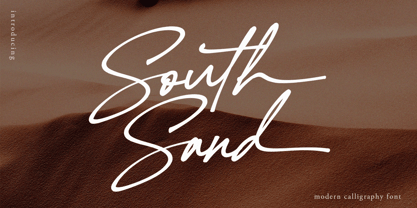 South Sand is a stylish and lovely script font. It looks stunning on wedding invitations, thank you cards, quotes, greeting cards, logos, business cards and every other design which needs a handwritten touch. This font is PUA encoded which means you can access all of the glyphs and swashes with ease! South Sand features : Uppercase & Lowercase Character Numeral & Punctuation Alternate & Ligatures Ending Swash Lowercase Multilingual
 - Zenon by CAST,
$50.00 Zenon is a compact text font in four weights. Zenon is a sum of different styles, from Francesco Griffo to Granjon, from modern typefaces to the first sketches of Times New Roman. Zenon is an apparently Renaissance revival with modernish proportions. A closer look reveals that it is a typographic potpourri. Zenon was design as part of the MATD program at the University of Reading.
 - Starbounder by Kustomtype,
$25.00 Kustomtype's "Starbouder" font is a cool stencil font family with a regular & oblique version. It contains all upper & lower cases. The "Starbouder" family is coordinated into letterforms, metrics, and weights to work better together. Why still looking for cool and decorative army, stencil and graffiti fonts for your posters, advertising, text, design, artwork, headtext, editoral design, magazines, etc. 'Starbouder is a decorative stencil & graffiti font'
 - Slim Pro by WAP Type,
$25.00 This font is stylish, clean, clear, firm and still looks luxurious. Slim Pro is a fine and all round sans serif font. No matter the topic, this font will be a genuine asset to your fonts’ library, as it has the potential to elevate any creation. Slim Pro is a modern and futuristic sans serif font. The combination of futuristic and geometric elements renders a modern design.
 - Graela by Muksal Creatives,
$15.00 Graela is a Display Sans Serif A new Display Sans serif that we created special for branding needs, with extra ligature in unique shape add value of your brand. It so nice to leverage designer or product owner that need solutions to make their design look more stylish and modern.We prepared any ligatures, characters to help you create unlimited variations for your creative needs.
 - Piked by Lemonthe,
$13.00 Piked is an elegant handwritten font, featuring 90 ligatures and swashes for a truly unique and personalized look. This font showcases a beautiful script style that captures the beauty and charm of hand-drawn calligraphy, ideal for adding a personal touch to any design project. It is perfect for many different projects such as logos & branding, invitation, stationery, signature, product designs, labels, photography, and much more!
 - Benedetta by Designova,
$23.00 Benedetta is a beautiful and lovely handwritten font for luxury / signature / branding / logotype / personal invites / greeting cards / promotional graphics. Benedetta is completely handmade with perfection and aesthetics at its level best. Advanced Kerning & Essential Ligatures: We have performed advanced, in-depth kerning to make sure the font looks amazing on all possible letter combinations. The font includes extended language support including Western European & Central European sets.
 - Antario by Locomotype,
$15.00 Antario is a high-contrast sans-serif font with a classic rounded style so it looks elegant and attractive. Available in two styles, Regular and Bold including various OpenType features such as disrectional ligatures, swashes, stylistic sets, fraction etc. Antario font also supports multilingual including Cyrillic. With more than 600 glyphs, you can be more creative in creating various types of typography in graphic design.
 - 3D Techno by Okaycat,
$24.50 3D Techno is a font made entirely of little cubes! Combine 3-D and flat styles, or use these styles separately..... many different looks can be created! There is a sprinkling of dingbats scattered around the alternates, just there to make this font extra fun and useful . Check it out! 3D Techno contains West European diacritics and ligatures, suitable for multilingual environments and publications.
 - Albertho by NJ Studio,
$19.00 Hi...Thank for your visit :) Albertho A Bold Fonts are font designs that are made for various vector designs, printing such as digital wedding invitations, blogs, online shops, social media, while printing can be used in the field of product clothing, accessories, bags, pins, logos, business cards, watermarks and many others ... so it can make your product look elegant and attractive, and also Multilingual support!!! Happy design ...
 - Glence by Nine Font,
$25.00 Glence family is a geometric sans-serif type family with 9 weights, from thin to black,with corresponding italics. Glence is designed based on geometric shapes that looks simple and clean. Each font includes opentype features such as Stylistic Alternates, Proportional Figures, Tabular Figures, Numerator, Superscript, Subscript, Case-Sensitive, Denominators, Scientific Inferiors, Ordinals, Ligatures and Fractions. Glence will make your artworks better with its simple & clean shapes.
 - Gotica Lumina by Omine Type,
$24.00Gotica Lumina is a an attempt to make blackletter more legible to the 21st century's eye. It is available in two styles: soft (for text) and sharp (for display). Both of them have an alternate font, which contains stylistic alternate forms for several characters, for a more “traditional” look. Opentype features: four styles of figures and currencies, ligatures (f-ligatures and c-ligatures), historical forms (long-s). - Laura by ITC,
$29.00Laura is the work of British designer Tony Watson, a brush style typeface with an effective three-dimensional look. The forms are a little more formal than those of many other brush style typefaces but this only adds to its flexibility. Capital and lowercase letters should be set closely. Laura is well-suited to a variety of uses, wherever a strong, eye-catching typeface is needed. - Geometrisk by Daniel Brokstad,
$29.00 Geometrisk is a modernist futuristic font combining geometrical outer shapes with rounded inner curves, to create an interesting contrast. The funky italics are created through an offset of the regular type, giving it an almost pixelated look. Well fitting within a cyberpunk world, and an interesting pairing with the standard font. Five different weight and italics of each. Multi-language support. Stylistic alternatives. Designed for headline use.
 - Pecking Order by Hanoded,
$15.00 I keep chickens for eggs and meat, but the ones that have names cannot be eaten. ;-) As I was busy working on this font, the chickens were sitting in the window, looking at me and hoping they'd get a treat! Pecking Order is a cartoon and kids font. It comes with a wholesome, homemade goodness and extensive language support, including Sami, Greek and Vietnamese.
 - Easter Risen by Letterara,
$14.00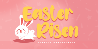 Easter Risen is a new, fresh, sweet, and unique handcrafted font. It's ideal for branding and decorate your projects. Easter Risen font has a classy and modern look that can be used for logos, branding, easter, invitations, posters, advertisements, stationery, animated films, social media posts, youtube channel, and much more! It is PUA coded which means you can access all the glyphs and sweeps easily!
 - Alexa by Adobe,
$29.00In 1994, John Benson designed Alexa, Caliban and Balzano, three typefaces with a similar style. Characteristic of all of them is their calligraphic touch and the likeness to handwriting. Alexa shows a hint of a broad tipped pen style and its legible figures are reserved yet lively. Alexa is best for short and midsized texts as well as headlines and gives texts a personal, classic look. - Fake Limp by Bogstav,
$17.00 Fake Limp is my layered handmade sans font - use it for your craft project, or anything that needs a handcrafted and organic look. I've added 5 different versions of each lowercase letter, and they automatically cycle as you type. Furthermore There are 4 versions of the font (each with the same amount of lowercase letters!) - mix and match these versions for the result you like! Enjoy! :)
 - Squadzone by DePlictis Types,
$29.00 SQUADZONE it’s a young & sportive unicase style font, having both uppercase and a few smallcase alternating letters that gives it a unique look. It’s geometric anathomy of the letters may have two different types of endings or detail: straight and sharp cut out angles at 45 degrees. This offers a few alternatives in headlines or even logotype purposes that are realy encouraged to use for.
 - Castel by HansCo,
$12.00 Castel is a handwritten font made with natural watercolor texture. The solid texture makes it look modern and simple, strong and feminine at the same time. Some purposes you can use Castel for are logos, product branding, wedding invitations, quotes, flyers, magazine, Instagram templates or for text overlay to any background image. Thank you for your purchase! I hope you have fun with Castel. Enjoy!
 - Uncle Oscar by Hanoded,
$15.00 I don't have an Uncle Oscar, so the font is not named after someone I know. The name just kind of stuck. Uncle Oscar is a pencil font, made with a black ‘Lamy’ pencil I took from my son Sam’s pencil box. It is a little rough, but very legible and comes in Regular and Italic. Of course, Uncle Oscar speaks a lot of languages.
 - Toons by Bohloul Arabic Type Design,
$30.00 A very cheerful font. This font is very thick and suitable for use in children's games or animations. With this font, write very attractive, happy and comic titles and use it easily in graphic works. The design of this font looks sloppy and messy, but when you write your own text or title, while each letter is messed up, the text is completely connected.
 - Grisha by Grontype,
$14.00 Grisha is a futuristic and modern retro look. Each uppercase and lowercase letter has its own characteristics, plus some alternates and ligatures. This font is bold and tight kerning, very suitable for your design projects such logo tagline, logotype, name card, flyers invitation, magazine header etc. Features: Uppercase glyphs Lowercase glyphs Numeral and Punctuations Standard Ligatures Stylistic Alternates Thankyou for choosing this font Regard, Grontype
 - Cassandra by Wiescher Design,
$49.50 Cassandra has two kinds of letters, wide Capitals on the (shift) capitals and narrow ones on the (no shift) lowercase. You can match them as you like. Take one narrow S and a wide one or two wide ones, whatever turns you on. It will almost always look good. Cassandra is my "bow" to Adolphe Mouron Cassandre. Yours sincerely mixing things up for you Gert Wiescher
 - Cold Cuts by Good Gravy Type Co,
$12.00 Cold Cuts is an assorted spread of delicious fonts pre cooked to perfection. This 10 weight font family is $30 for a limited time it is the perfect way to stock your font fridge. Cold Cuts a lean upright font family with a lowercase caps option to give you bonus typesetting choices. A sleek modern vintage style which has a wide variety of display uses. Bon Appétit!
 - Holocene Typewriter by Ana's Fonts,
$16.00 Holocene Typewriter is a soft typewriter font sampled from old documents, for an authentic vintage look. Holocene Typewriter includes: a Typewriter font in Regular, Slant, Underlined and Crossed-out styles SVG fonts of the Regular and Slant styles Use this font in any designs that needs a vintage touch. Use it in long or short texts, in digital collages, branding and packaging, social media posts, logotypes, etc.
 - Benn Beckman by Factory738,
$15.00 Beckman is a modern and minimalist sans-serif font family. The combination of minimal and geometric elements renders a modern design. Beckman includes 6 fonts, clean and modern caps, thereby creating more variability. This is irreproachable sans serif to diversify your headlines, branding visual identity, poster, logo, magazines and etc. Six weights Alternate glyphs Latin alphabets Thanks for looking, and I hope you enjoy it.
 - Wasp by NaumType,
$29.00 Wasp is a super-display typeface, which in a few words can be described as well-structured calligraphic humanist sans. It's come to life as an idea to make calligraphy-oriented sans but consciously avoid any horizontal middle strokes. Wasp has a few alternates for each letter, which (despite its unruly nature) allows for finding a good-looking solution in almost any typographic situation.
 - Costa Mala by Larin Type Co,
$14.00 Costa Mala feels playfully nostalgic and delivers an incredible vintage aesthetic.this font will look outstanding in both formal and non-formal designs. It will add charm and create a unique atmosphere in your design project. This font includes two styles: regular and outline, and also has alternatives that you can use to play with font dynamics. This font is easy to use and has OpenType features.
 - Toddler Toys by NJ Studio,
$19.00 Hi...Thank for your visit :) Toddler a handmade fonts are font designs that are made for various vector designs, printing such as digital wedding invitations, blogs, online shops, social media, while printing can be used in the field of product clothing, accessories, bags, pins, logos, business cards, watermarks and many others ... so it can make your product look elegant and attractive, and also Multilingual support!!! Happy design ...
 - Times Eighteen by Linotype,
$29.00In 1931, The Times of London commissioned a new text type design from Stanley Morison and the Monotype Corporation, after Morison had written an article criticizing The Times for being badly printed and typographically behind the times. The new design was supervised by Stanley Morison and drawn by Victor Lardent, an artist from the advertising department of The Times. Morison used an older typeface, Plantin, as the basis for his design, but made revisions for legibility and economy of space (always important concerns for newspapers). As the old type used by the newspaper had been called Times Old Roman," Morison's revision became "Times New Roman." The Times of London debuted the new typeface in October 1932, and after one year the design was released for commercial sale. The Linotype version, called simply "Times," was optimized for line-casting technology, though the differences in the basic design are subtle. The typeface was very successful for the Times of London, which used a higher grade of newsprint than most newspapers. The better, whiter paper enhanced the new typeface's high degree of contrast and sharp serifs, and created a sparkling, modern look. In 1972, Walter Tracy designed Times Europa for The Times of London. This was a sturdier version, and it was needed to hold up to the newest demands of newspaper printing: faster presses and cheaper paper. In the United States, the Times font family has enjoyed popularity as a magazine and book type since the 1940s. Times continues to be very popular around the world because of its versatility and readability. And because it is a standard font on most computers and digital printers, it has become universally familiar as the office workhorse. Times™, Times™ Europa, and Times New Roman™ are sure bets for proposals, annual reports, office correspondence, magazines, and newspapers. Linotype offers many versions of this font: Times™ is the universal version of Times, used formerly as the matrices for the Linotype hot metal line-casting machines. The basic four weights of roman, italic, bold and bold italic are standard fonts on most printers. There are also small caps, Old style Figures, phonetic characters, and Central European characters. Times™ Ten is the version specially designed for smaller text (12 point and below); its characters are wider and the hairlines are a little stronger. Times Ten has many weights for Latin typography, as well as several weights for Central European, Cyrillic, and Greek typesetting. Times™ Eighteen is the headline version, ideal for point sizes of 18 and larger. The characters are subtly condensed and the hairlines are finer. Times™ Europa is the Walter Tracy re-design of 1972, its sturdier characters and open counterspaces maintain readability in rougher printing conditions. Times New Roman™ is the historic font version first drawn by Victor Lardent and Stanley Morison for the Monotype hot metal caster." - Times Europa LT by Linotype,
$29.99In 1931, The Times of London commissioned a new text type design from Stanley Morison and the Monotype Corporation, after Morison had written an article criticizing The Times for being badly printed and typographically behind the times. The new design was supervised by Stanley Morison and drawn by Victor Lardent, an artist from the advertising department of The Times. Morison used an older typeface, Plantin, as the basis for his design, but made revisions for legibility and economy of space (always important concerns for newspapers). As the old type used by the newspaper had been called Times Old Roman," Morison's revision became "Times New Roman." The Times of London debuted the new typeface in October 1932, and after one year the design was released for commercial sale. The Linotype version, called simply "Times," was optimized for line-casting technology, though the differences in the basic design are subtle. The typeface was very successful for the Times of London, which used a higher grade of newsprint than most newspapers. The better, whiter paper enhanced the new typeface's high degree of contrast and sharp serifs, and created a sparkling, modern look. In 1972, Walter Tracy designed Times Europa for The Times of London. This was a sturdier version, and it was needed to hold up to the newest demands of newspaper printing: faster presses and cheaper paper. In the United States, the Times font family has enjoyed popularity as a magazine and book type since the 1940s. Times continues to be very popular around the world because of its versatility and readability. And because it is a standard font on most computers and digital printers, it has become universally familiar as the office workhorse. Times™, Times™ Europa, and Times New Roman™ are sure bets for proposals, annual reports, office correspondence, magazines, and newspapers. Linotype offers many versions of this font: Times™ is the universal version of Times, used formerly as the matrices for the Linotype hot metal line-casting machines. The basic four weights of roman, italic, bold and bold italic are standard fonts on most printers. There are also small caps, Old style Figures, phonetic characters, and Central European characters. Times™ Ten is the version specially designed for smaller text (12 point and below); its characters are wider and the hairlines are a little stronger. Times Ten has many weights for Latin typography, as well as several weights for Central European, Cyrillic, and Greek typesetting. Times™ Eighteen is the headline version, ideal for point sizes of 18 and larger. The characters are subtly condensed and the hairlines are finer. Times™ Europa is the Walter Tracy re-design of 1972, its sturdier characters and open counterspaces maintain readability in rougher printing conditions. Times New Roman™ is the historic font version first drawn by Victor Lardent and Stanley Morison for the Monotype hot metal caster." - Times Ten by Linotype,
$40.99In 1931, The Times of London commissioned a new text type design from Stanley Morison and the Monotype Corporation, after Morison had written an article criticizing The Times for being badly printed and typographically behind the times. The new design was supervised by Stanley Morison and drawn by Victor Lardent, an artist from the advertising department of The Times. Morison used an older typeface, Plantin, as the basis for his design, but made revisions for legibility and economy of space (always important concerns for newspapers). As the old type used by the newspaper had been called Times Old Roman," Morison's revision became "Times New Roman." The Times of London debuted the new typeface in October 1932, and after one year the design was released for commercial sale. The Linotype version, called simply "Times," was optimized for line-casting technology, though the differences in the basic design are subtle. The typeface was very successful for the Times of London, which used a higher grade of newsprint than most newspapers. The better, whiter paper enhanced the new typeface's high degree of contrast and sharp serifs, and created a sparkling, modern look. In 1972, Walter Tracy designed Times Europa for The Times of London. This was a sturdier version, and it was needed to hold up to the newest demands of newspaper printing: faster presses and cheaper paper. In the United States, the Times font family has enjoyed popularity as a magazine and book type since the 1940s. Times continues to be very popular around the world because of its versatility and readability. And because it is a standard font on most computers and digital printers, it has become universally familiar as the office workhorse. Times™, Times™ Europa, and Times New Roman™ are sure bets for proposals, annual reports, office correspondence, magazines, and newspapers. Linotype offers many versions of this font: Times™ is the universal version of Times, used formerly as the matrices for the Linotype hot metal line-casting machines. The basic four weights of roman, italic, bold and bold italic are standard fonts on most printers. There are also small caps, Old style Figures, phonetic characters, and Central European characters. Times™ Ten is the version specially designed for smaller text (12 point and below); its characters are wider and the hairlines are a little stronger. Times Ten has many weights for Latin typography, as well as several weights for Central European, Cyrillic, and Greek typesetting. Times™ Eighteen is the headline version, ideal for point sizes of 18 and larger. The characters are subtly condensed and the hairlines are finer. Times™ Europa is the Walter Tracy re-design of 1972, its sturdier characters and open counterspaces maintain readability in rougher printing conditions. Times New Roman™ is the historic font version first drawn by Victor Lardent and Stanley Morison for the Monotype hot metal caster." - Times Ten Paneuropean by Linotype,
$92.99In 1931, The Times of London commissioned a new text type design from Stanley Morison and the Monotype Corporation, after Morison had written an article criticizing The Times for being badly printed and typographically behind the times. The new design was supervised by Stanley Morison and drawn by Victor Lardent, an artist from the advertising department of The Times. Morison used an older typeface, Plantin, as the basis for his design, but made revisions for legibility and economy of space (always important concerns for newspapers). As the old type used by the newspaper had been called Times Old Roman," Morison's revision became "Times New Roman." The Times of London debuted the new typeface in October 1932, and after one year the design was released for commercial sale. The Linotype version, called simply "Times," was optimized for line-casting technology, though the differences in the basic design are subtle. The typeface was very successful for the Times of London, which used a higher grade of newsprint than most newspapers. The better, whiter paper enhanced the new typeface's high degree of contrast and sharp serifs, and created a sparkling, modern look. In 1972, Walter Tracy designed Times Europa for The Times of London. This was a sturdier version, and it was needed to hold up to the newest demands of newspaper printing: faster presses and cheaper paper. In the United States, the Times font family has enjoyed popularity as a magazine and book type since the 1940s. Times continues to be very popular around the world because of its versatility and readability. And because it is a standard font on most computers and digital printers, it has become universally familiar as the office workhorse. Times™, Times™ Europa, and Times New Roman™ are sure bets for proposals, annual reports, office correspondence, magazines, and newspapers. Linotype offers many versions of this font: Times™ is the universal version of Times, used formerly as the matrices for the Linotype hot metal line-casting machines. The basic four weights of roman, italic, bold and bold italic are standard fonts on most printers. There are also small caps, Old style Figures, phonetic characters, and Central European characters. Times™ Ten is the version specially designed for smaller text (12 point and below); its characters are wider and the hairlines are a little stronger. Times Ten has many weights for Latin typography, as well as several weights for Central European, Cyrillic, and Greek typesetting. Times™ Eighteen is the headline version, ideal for point sizes of 18 and larger. The characters are subtly condensed and the hairlines are finer. Times™ Europa is the Walter Tracy re-design of 1972, its sturdier characters and open counterspaces maintain readability in rougher printing conditions. Times New Roman™ is the historic font version first drawn by Victor Lardent and Stanley Morison for the Monotype hot metal caster." - Times by Linotype,
$40.99In 1931, The Times of London commissioned a new text type design from Stanley Morison and the Monotype Corporation, after Morison had written an article criticizing The Times for being badly printed and typographically behind the times. The new design was supervised by Stanley Morison and drawn by Victor Lardent, an artist from the advertising department of The Times. Morison used an older typeface, Plantin, as the basis for his design, but made revisions for legibility and economy of space (always important concerns for newspapers). As the old type used by the newspaper had been called Times Old Roman," Morison's revision became "Times New Roman." The Times of London debuted the new typeface in October 1932, and after one year the design was released for commercial sale. The Linotype version, called simply "Times," was optimized for line-casting technology, though the differences in the basic design are subtle. The typeface was very successful for the Times of London, which used a higher grade of newsprint than most newspapers. The better, whiter paper enhanced the new typeface's high degree of contrast and sharp serifs, and created a sparkling, modern look. In 1972, Walter Tracy designed Times Europa for The Times of London. This was a sturdier version, and it was needed to hold up to the newest demands of newspaper printing: faster presses and cheaper paper. In the United States, the Times font family has enjoyed popularity as a magazine and book type since the 1940s. Times continues to be very popular around the world because of its versatility and readability. And because it is a standard font on most computers and digital printers, it has become universally familiar as the office workhorse. Times™, Times™ Europa, and Times New Roman™ are sure bets for proposals, annual reports, office correspondence, magazines, and newspapers. Linotype offers many versions of this font: Times™ is the universal version of Times, used formerly as the matrices for the Linotype hot metal line-casting machines. The basic four weights of roman, italic, bold and bold italic are standard fonts on most printers. There are also small caps, Old style Figures, phonetic characters, and Central European characters. Times™ Ten is the version specially designed for smaller text (12 point and below); its characters are wider and the hairlines are a little stronger. Times Ten has many weights for Latin typography, as well as several weights for Central European, Cyrillic, and Greek typesetting. Times™ Eighteen is the headline version, ideal for point sizes of 18 and larger. The characters are subtly condensed and the hairlines are finer. Times™ Europa is the Walter Tracy re-design of 1972, its sturdier characters and open counterspaces maintain readability in rougher printing conditions. Times New Roman™ is the historic font version first drawn by Victor Lardent and Stanley Morison for the Monotype hot metal caster." - Protura by MIX.Jpg,
$15.00 Protura Sans Serif Masculine - 9 Font Weights With Italics Introducing Protura Sans Serif Masculine, a versatile and powerful font family designed to make a bold statement in your creative projects. With nine distinct font weights and accompanying italics, Protura offers unmatched flexibility for all your design needs. Key Features: Nine Font Weights: Protura Sans Serif Masculine boasts an extensive range of weights, from Light to Ultra Bold. Whether you're crafting a subtle headline or a powerful logo, you'll find the perfect weight to convey your message. Italics Included: In addition to the standard weights, Protura also provides elegant italic versions for each weight. These italics add a touch of sophistication to your typography, making it ideal for editorial work and branding projects. Masculine Aesthetic: Protura's design exudes strength and masculinity, making it an excellent choice for projects aimed at a bold and assertive audience. Its clean lines and sharp edges give your text a contemporary and impactful look. Versatile Usage: This font family is highly adaptable, suitable for a wide range of design applications, including branding, packaging, editorial design, posters, websites, and more. It's a true workhorse font that performs well in various contexts. Legibility: Protura prioritizes legibility without compromising on style. Its well-crafted letterforms ensure that your text remains clear and readable, even at small sizes. OpenType Features: Take advantage of OpenType features such as ligatures and alternate characters to add subtle design nuances and improve overall visual appeal. Multilingual Support: Protura Sans Serif Masculine supports a multitude of languages, making it a globally accessible font choice for your projects. Applications: Branding: Create impactful logos and brand identities that leave a lasting impression. Editorial Design: Enhance the readability and visual appeal of magazines, newspapers, and books. Web Design: Craft modern and engaging websites that resonate with your target audience. Packaging: Design packaging that stands out on the shelf and communicates product quality. Posters and Flyers: Grab attention with bold and stylish promotional materials. Unleash the power of Protura Sans Serif Masculine to elevate your design projects with a masculine, contemporary, and highly versatile typographic solution. With its extensive weight range and italics, this font family empowers you to create impactful and visually stunning designs.