10,000 search results
(0.076 seconds)
- Storica by Arkitype,
$15.00 Storica is a display typeface with roman style serifs that create a sense of history and culture. The Storica family has 7 weights as well as a Heavy Rough and Heavy Hand version that give you an option for a more rustic or hand style approach to you projects. The character set is expansive and has a wide range of language support. Storica has a great selection of Stylistic alternates, ligatures, small-caps, old-style numbers and more packed into the opentype features. This typeface is an excellent choice for branding, particularly in the beverage industry, it is also perfect for typographic layouts for magazines, poster, books etc. Storica has been designed to make it easy for a designer to create beautiful typography with creative flair quickly and easily.
 - SK Anatolia by Salih Kizilkaya,
$3.50 SK Anatolia is a mono decorative font designed inspired by the cultural structure of Anatolia. It was designed by Salih Kızılkaya in 2021. It offers full support for the Latin alphabet and meets all the typographic elements you will need. It contains 12 individual fonts and 4236 glyphs in total.
 - Verger by David Engelby Foundry,
$25.00The inspiration behind the design of the Verger typeface family comes from the classic Golden Type, which was originally crafted by William Morris. Although Verger is inspired by this classic typeface, it has several modern, expressive and distinctive styles of its own, especially in the design of its italic versions. - Torpedo by Red Rooster Collection,
$60.00 Torpedo is a five-weight rounded, compressed sans serif font family. It was designed by Steve Jackaman over a several-year period, and was released in 2017 alongside its sister typefaces Coliseum Pro and Clydesdale. Torpedo, whose name was inspired by round torpedo warheads, is a visually sturdy font that maintains excellent legibility. Torpedo is flexible in its applications, like its violent namesake; it is explosive at large sizes, and still works efficiently at low profiles.
 - Turer by Eurotypo,
$28.00 Turer is a display font with a strong artistic personality. It is inspired by some works of Rudolph Koch (1876 - 1934) such as Wallau, Original Neuland or Koch Antiqua. It is characterised by its vertical strokes that thicken towards the ends, which hints at a serif without actually having it. Turer is composed of capitals; the lower case being small caps. It also has a great set of ligatures. Presented in two weight: Regular and Bold.
 - Mechacore by takoliko,
$9.00 Mechacore is a variable modern sans serif display typeface designed by Takoliko Studio. It comes with regular and stencil style, it have 5 weights and expanded width. Its inspired by a mecha cyberpunk sub genre. the modern and unique characteristics makes it suitable for attention grabbing design projects such as a engineering, technology, cyber media, army stuff, headlines, posters, social media displays and editorials.
 - Bageurville by Alvian Hasby,
$9.00 Bageurville is a modern serif inspired by a transitional style. Built with curved characters and rounded shapes on the ears and terminals that are formed based on circles, making them have kindness and historical touch. Bageurville has more than 250 glyphs, basic ligatures, and support multilingual. Nicely suitable for title or body purposes such as books, editorials, invitations, greeting cards, and branding.
 - Statue Of Liberty's Underwear by Vic Fieger,
$6.99Inspired by a handwritten Cyrillic placard seen in a book about the Soviet Union, Statue of Liberty's Underwear was envisioned as having been written with a very thick pen with a flat tip held horizontally. Additionally, the letterforms were sculpted to resemble lettering common in early 20th-century Russian constructivism pieces. A Cyrillic alphabet, or "azbuka", set was included in the font. - Biomorph by Rillatype,
$20.00 Proudly Introducing, Biomorph! Biomorph is a brand new condensed sans font family released by us. This font is very suitable for your projects especially for brandingm publishing, titles, book, magazine, website, etc. Biomorph is font family that comes from thin, extra light, light, regular, medium, semibold, and bold version, with all of these styles gives yoiu freedom to design as you like!
 - Quaderno Slanted by Resistenza,
$39.00 Quaderno Slanted is a light and monolinear script, accompanied by the heavier weights. This connected script combining elements of the traditional Italian script Bella Scrittura. Quaderno is suited for middle length texts and headlines and evokes both vernacular and commercial lettering of the 20th century and a typeface for school book purposes. You can also overlap them and get a double stroke effect.
 - Roundwell by Javanice Studio,
$16.00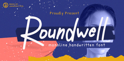 Introducing Roundwell by Javanice Studio Roundwell is A Moniline Handwritten Font Roundwell is perfect for branding project, apparel, labels, magazines, books, greeting / wedding cards, packaging, fashion, make up, stationery, and any type of advertising purpose or just used to express words above the background. This font includes multilingual support. Enjoy the font, feel free to comment or feedback, send me PM or email.
 - Overland Brush by Gatype,
$10.00 Overland Brush is a beautiful uppercase display brush font, designed with a modern vibe. The Overland Brush is best suited for any design project, such as posters, banners, logos, book covers, album covers, quotes, invitations, greeting cards, business cards, titles, print products, merchandise, social media, etc. Find out more ways to use this font by previewing the font. Thank you and happy designing
 - Artvod by Tour De Force,
$25.00 The Artvod font family is a graduate project of Dusan Jelesijevic on the topic Museum of Digital Art. The whole project included a 15 minute interactive presentation through building of Artvod Museum, consisting of 15 posters and the font in two weights (Regular and Bold). The Artvod font family also appears in IndexBook's book Homage of Typography by Pedro Guitton.
 - Onitsha by Arendxstudio,
$14.00 Introducing a new font called Onitsha - Handwritten Font inspired by urban fonts with sharp and beautiful letters that create fonts that are modern, trendy and elegant. Onitsha came with opentype features such stylistic alternates, stylistic sets & ligatures good for logotype, poster, badge, book cover, tshirt design, packaging and any more. Features : • Character Set A-Z • Numerals & Punctuations (OpenType Standard) • Accents (Multilingual characters) • Ligature
 - Rockadelic by Blankids,
$18.00 Introducing a new retro bold script called Rockadelic. Bring back to the 70's era Rockadelic inspired by posters and album covers of funk, disco and rockabilly music with bold and fun style. Rockadelic comes with OpenType features such stylistic alternates, stylistic sets, swash & ligatures and is good for logotype, poster, badge, book cover, t-shirt design, packaging and any more.
 - Xanthippe NF by Nick's Fonts,
$10.00Extrabold and exuberant caps from a blackletter face rendered by Ross George in his perennial Speedball Text Book have been combined with a more restrained and traditional lowercase to create a unique and striking typeface that will definitely get noticed. Both versions of this font include the complete Latin 1252 and CE 1250 character sets, with localization for Romanian and Moldovan. - Micromoon by Neoglyph Studio,
$15.00 Inspired by futuristic vehicle print designs like seen in Star Trek, Blade Runner, Altered Carbon and the Alien franchise. The goal was a clean, abstract design where horizontal, vertical and diagonal 45 degree lines are the primary guidelines. Features : uppercase and lowercase numbers and punctuation multilingual Ideal for: Logo design Movie promotion Book & magazine print Package design Vehicle print designs Game design
 - Catty Wumpas NF by Nick's Fonts,
$10.00Ross F. George, the lettering wizard behind many an edition of Speedball lettering books, called this quirky creation "Spatter and Spot Roman". In this version, the spatters go, but the spots remain, and a good time is had by all. Both versions of the font include the 1252 Latin and 1250 CE character sets (with localization for Romanian and Moldovan). - Fort Yukon by Larin Type Co,
$15.00 Inspired by wildlife, Fort Yukon is a bold and authentic vintage family font. This will inspire any design project that needs a vintage style. This font family is composed of 14 styles which perfectly complement each other. You can use them to create a logo or use for your business, branding, t-shirts, book covers, stationery, marketing, blogs, magazines and more.
 - Henares Street by Arendxstudio,
$15.00 Heares Street - Brush Font inspired by urban fonts with sharp and beautiful letters that create fonts that are modern, trendy and elegant. Heares Street came with opentype features such stylistic alternates, stylistic sets & ligatures good for logotype, poster, badge, book cover, tshirt design, packaging and any more. Features : • Character Set A-Z • Numerals & Punctuations (OpenType Standard) • Accents (Multilingual characters) • Ligature • Alternate
 - Plottage by Arendxstudio,
$14.00 Introducing a new font called Pottage - Handwritten Font inspired by urban fonts with sharp and beautiful letters that create fonts that are modern, trendy and elegant. Pottage came with opentype features such stylistic alternates, stylistic sets & ligatures good for logotype, poster, badge, book cover, tshirt design, packaging and any more. Features : • Character Set A-Z • Numerals & Punctuations (OpenType Standard) • Accents (Multilingual characters) • Ligature
 - Eerie Lake County by The Design Speak,
$100.00 This is another scary font by the good fellows at The Design Speak. Meant to be eerie but also had a stylistic rock and roll vibe. We have you covered for things like thriller book covers and movie posters. Or anything you want to have an eerie feel. This was a hand-crafted font using a Wacom tablet and adobe illustrator.
 - Relaxy by HIRO.std,
$11.00 Relaxy is a Brush Handwritten Script. This font describes about funny, dynamic, informal, humanist, easy going, and will bring a good combination for your works. FEATURES - 3 alternates Uppercase and Lowercase letters - Numbering and Punctuations - Multilingual Support - Works on PC or Mac - Simple Installation - PUA Encoded Characters USE Relaxy works great in any poster, book, magazine, typeface, quotes, print, social media posts, e-book , and any projects that need semi casual and informal taste.
 - Funny Business JNL by Jeff Levine,
$29.00 The hand lettered title on the sheet music for "Gee, But I'd Like to Make You Happy" (from the 1930 MGM motion picture "Good News") presented a conundrum. Some of the lettering was a classic Art Deco "thick and thin" design while the others resembled comic book title lettering. Leaning toward the comic book style, the conflicting letters were revised and the finished result became Funny Business JNL; available in both regular and oblique versions.
 - Classic Grotesque by Monotype,
$40.99 Classic Grotesque by Rod McDonald: a traditional font with a modern face. The growing popularity of grotesque typefaces meant that many new sans serif analogues were published in the early 20th century. Setting machines were not compatible with each other but all foundries wanted to offer up-to-date fonts, and as a result numerous different typeface families appeared that seem almost identical at first glance and yet go their separate ways with regard to details. One of the first fonts created with automatic typesetting in mind was Monotype Grotesque®. Although this typeface that was designed and published by Frank Hinman Pierpont in 1926 has since been digitalised, it has never achieved the status of other grotesque fonts of this period. But Monotype Grotesque was always one of designer Rod McDonald’s favourites, and he was overjoyed when he finally got the go-ahead from Monotype in 2008 to update this “hidden treasure”. The design process lasted four years, with regular interruptions due to the need to complete projects for other clients. In retrospect, McDonald admits that he had no idea at the beginning of just how challenging and complex a task it would be to create Classic Grotesque™. It took him considerable time before he found the right approach. In his initial drafts, he tried to develop Monotype Grotesque only to find that the result was almost identical with Arial®, a typeface that is also derived in many respects from Monotype Grotesque. It was only when he went back a stage, and incorporated elements of Bauer Font’s Venus™ and Ideal Grotesk by the Julius Klinkhardt foundry into the design process, that he found the way forward. Both these typefaces had served as the original inspiration for Monotype Grotesque. The name says it all: Classic Grotesque has all the attributes of the early grotesque fonts of the 20th century: The slightly artificial nature gives the characters a formal appearance. There are very few and only minor variations in line width. The tittles of the ‘i’ and ‘j’, the umlaut diacritic and other diacritic marks are rectangular. Interestingly, it is among the uppercase letters that certain variations from the standard pattern can be found, and it is these that enliven the typeface. Hence the horizontal bars of the “E”, “F” and “L” have bevelled terminals. The chamfered terminal of the bow of the “J” has a particular flamboyance, while the slightly curved descender of the “Q” provides for additional dynamism. The character alternatives available through the OpenType option provide the designer with a wealth of opportunities. These include a closed “a”, a double-counter “g” and an “e” in which the transverse bar deviates slightly from the horizontal. The seven different weights also extend the scope of uses of Classic Grotesque. These range from the delicate Light to the super thick Extrabold. There are genuine italic versions of each weight; these are not only slightly narrower than their counterparts, but also have variant shapes. The “a” is closed, the “f” has a semi-descender while the “e” is rounded. Its neutral appearance and excellent features mean that Classic Grotesque is suitable for use in nearly all imaginable applications. Even during the design phase, McDonald used his new font to set books and in promotional projects. However, he would be pleased to learn of possible applications that he himself has not yet considered. Classic Grotesque, which has its own individual character despite its neutral and restrained appearance, is the ideal partner for your print and web project.
 - Bargo by Look Minus Today,
$10.00 Introducing Bargo - Sans Serif 3 Styles by Look Minus Today. Behind these 3 styles, we want to combine a typeface that can provide a different perspective. Regular which gives
 - Cachalote by PintassilgoPrints,
$19.00 Positively bold, Cachalote was drawn by subtracting negative space. The resulting glyphs show unexpected, original forms, packed in an unicase font. Suited for impact. For the coolest looks. Positively.
 - VLNL Melk by VetteLetters,
$29.99 At VetteLetters we like food but we also appreciate our drinks. Yes, of the non-alcoholic kind as well. Like milk. Contrary to what Arnold Schwartzenegger once said, Milk is not just for babies. It contains a whole lot of stuff that is genuinely good for you. Like proteins, carbohydrates, minerals (calcium a.o.) and many vitamins. One time visiting The Hague, Donald DBXL spotted a tile tableau on a brick wall, advertising a dairy factory called ‘De Sierkan’. Yellow sans serif letters on a bright blue background, dating back to the late 19th century, immediately grabbed DBXL’s attention. Especially because the tableau showed both regular and bold letters with some lovely peculiarities here and there. De Sierkan appeared to have been a milk factory solely operating in The Hague from 1879 until 1961. A number of these wall adverts are still to be seen in The Hague streets today. Photos were taken for later reference. Later is now, the lettering has been digitized, missing characters added, and VLNL Melk sees the light of day. VLNL Melk is an all-caps geometric display sans serif family of three weights, Regular, Bold and Black. The basic shape of the letters is a rectangle with rounded corners, leaving a sturdy no-nonsense look and feel. It has a distinct historic aura, but with both feet in this digital day and age. It can equally well be used for the logo of a hipster coffee place, as the cover of a historic novel. Actually, VLNL Melk kan be applied in a wide range of designs like logos, posters, flyers, book covers and magazine headlines.
 - Crunchy Cookies by Putracetol,
$28.00 Crunchy Cookies - Bold Quirky Display Font. Crunchy Cookies is a playful and bold quirky display font. This font will easily add a fun touch to any craft Crunchy Cookies perfect for any fun quirky design work! This font can be used for anything such as story books, illustrations, comic books, t-shirts, posters, greeting cards, logos, branding, stickers, svg, crafting and all for display purposes. The alternative characters were divided into several Open Type features such as Swash, Stylistic Sets, Stylistic Alternates, Contextual Alternates, and Ligature. The Open Type features can be accessed by using Open Type savvy programs such as Adobe Illustrator, Adobe InDesign, Adobe Photoshop Corel Draw X version, And Microsoft Word. This font is also support multi language.
 - Calsera by Ironbird Creative,
$15.00 Calsera is a vintage display font duo. Inspired by 50s-60s signages, this font made to bring back the good ol' days. This type of font perfectly made to be applied especially in logo, headline, signage and the other various formal forms such as invitations, labels, logos, magazines, books, greeting cards, packaging, fashion, make up, stationery, novels, labels or any type of advertising purpose. ADDITIONAL INFORMATION : For upgrading license please contact me. Upgraded licenses are required for apps, books, television, commercial exhibition, film, gaming, print on demand products, etc. simply email me to : ironbirdcreative@gmail.com We hope you enjoy the font, please feel free to comment if you have any thoughts or feedback. Thanks for purchasing and have fun! Regards, Ironbird Creative
 - Sabiya by MrLetters,
$18.00 Dogma Script font is a kind of handwriting calligraphy with new and modern hand scratches. This typeface has been added with various alternative characters up to 439 glyphs. This type of writing is perfect for logos, fashion, stationery, magazines, menus, books, invitations, greeting cards, packaging, labels, apparel, marketing, business cards, etc. Features: Basic Latin A-Z and a-z Numbers Symbols Stylistic Sets Stylistic Alternates Ligatures Swash/Swirls PUA Encode If you don't have a program that supports OpenType features such as Adobe Illustrator and CorelDraw X Versions, you can access all the alternate glyphs using Font Book (Mac) or Character Map (Windows). If you have any question, don't hesitate to contact me by email hello.mrletters@gmail.com Thanks and happy designing :-) Thank You for purchase!
 - Rangen by Letterfreshstudio,
$12.00 Rangen was inspired by Retro style in combination with hand lettering. Rangen has many alternative swashes and ligatures characters and has OpenType features such as alternative styles, ties and swashes so you can mix and match as you wish. Rangen is perfect for logos, posters, badges, book covers, t-shirt designs, handwritten quotes, product packaging, headers, posters, merchandise, social media & greeting cards. Rangen is coded with Unicode PUA, which allows full access to all additional characters without having special design software. Mac users can use the Font Book, and Windows users can use the Character Map to view and copy any of the additional characters to paste into your favorite text editor / application. Let me know if you have any questions.
 - Dienstag Variable by insigne,
$100.00 Introducing Dienstag Variable, the latest addition to insigne's popular Montag family of fonts! With its extended sans-serif style, Dienstag boasts a sleek and sophisticated look that's perfect for a wide range of projects. Whether you're designing a website, creating branding materials, or producing print publications, Dienstag's refined elegance is sure to make a lasting impression. Compared to Montag, Dienstag has a slightly more formal feel, thanks to its lack of rounded terminators. But that doesn't mean it's any less versatile – in fact, Dienstag's four original weights have now been expanded to ten, giving you even more flexibility in your designs. With OpenType features that include simplified versions of many characters, you can easily create unique and eye-catching titles that stand out from the crowd. But Dienstag is just one part of the larger Montag superfamily, which also includes Mittwoch, and Donnerstag. Each font in this collection offers its own unique style and flair, giving you a wealth of options to choose from when it comes to your next project. Whether you're looking for a bold and dynamic font or a more refined and understated style, you're sure to find the perfect fit in the Montag family. So why wait? Check out Dienstag and the rest of the Montag superfamily today, and start creating designs that are sure to captivate and inspire! With its elegant style and versatile functionality, Dienstag is the perfect choice for designers who demand the best.
 - Orto by LetterPalette,
$20.00 Orto is a type family of sans serif fonts in eight weights. It's a humanist typeface with real cursive, containing both Roman and Italic styles. The letters are designed to look good on screen, they have a bit narrower proportions and simple shapes. Their structure is based on flat horizontal and vertical strokes, which are emphasized wherever possible. That’s where the name comes from: Orto is an abbreviation of the word orthogonal. Thanks to its narrow width, the typeface is less space-consuming and adapts well to the screens of smaller devices. It is legible in small sizes, thanks to the larger x-height. The characteristic details, like bent ends of diagonal strokes, stand out when used in larger sizes. Orto can be used equally good in print and its overall neutral look fits different contexts. However, its character is pretty recognizable. Orto contains Latin and Cyrillic script and covers six codepages: Latin 1, Latin 2, Cyrillic, Turkish, Windows Baltic and MacOS Roman. It has basic OpenType features like ligatures, oldstyle numerals, proportional and tabular lining figures, fractions, superiors, etc. Capital German sharp S shows up when the lowercase is typed between two uppercase letters, and the Contextual Alternates feature is turned on. The Stylistic Set 01 changes the shape of the Cyrillic b. The Stylistic Set 02 is a shortcut for using Serban Cyrillic alternatives that differ from Russian in cursive.
 - Van den Velde Script by Intellecta Design,
$68.90 Iza and Paulo W (Intellecta Design) are proud to announce Van den Velde Script. A free interpretation of the work of the famous master penman Jan van den Velde, to be found in the “Spieghel der schrijfkonste, in den welcken ghesien worden veelderhande gheschrifften met hare fondementen ende onderrichtinghe. ” (Haarlen, 1605). Van den Velde Script has evocative ancient ligature forms from the XVII Century Dutch master penman Jan van den Velde. Your indescritible writing-book was important not only with regard to the specific period it represents, but also in relationship to the entire history of calligraphy as an art: Van den Velde is rightly credited with having introduced and perfected a new trend in Dutch calligraphy. Our font, Van den Velde Script merges modern necessities o better legibility without loose the taste of his archaic origins. This enhanced OpenType version is a complete solution for producing documents and artworks whith a evocative and voluptuous style of calligraphic script: - dozens of stylistic alternates for each letter (upper- and lowercase), accessed with the glyph palette; - historical ornaments and fleurons in the typical style (and motifs) from the XVII century at the Lower Countryes accessed with the glyph palette using the Ornaments feature); - an extensive set of ligatures (100s of contextual alternates plus discretionary ligatures) providing letterform variations that make your designs really special, resembling real handwriting on the page; - a tour-de-force kerning work: over 700 gliphs in this font was adjusted to your kern pairs handly. In non-OpenType-savvy applications it works well as an unusual and beautiful script style font. Because of its high number of alternate letters and combinations (over 700 glyphs), we suggest the use of the glyph palette to find ideal solutions to specific designs. The sample illustrations will give you an idea of the possibilities. You have full access to this amazing stuff using InDesign, Illustrator, QuarkXpress and similar software. However, we still recommend exploring what this font has to offer using the glyphs palette: principally to get all the power of the Contextual Alternates feature. You can has an idea of the power of this font looking at the “Van den Velde User Guide”, a pdf brochure in the Galçlery section. Two last things: take a special look at the Van den Velde Words (ready words) font and another super script font, Penabico. Van den Velde Script has original letters designed by Iza W and overall creative direction plus core programming by Paulo W.
 - Sitcom by GroupType,
$19.00 If there was an American Typeface Hall of Fame, Bank Gothic, designed by the great Morris Fuller Benton would hold a place of special distinction considering this design has survived so many trends in typographic fashion since being introduced in 1930. It's just as desirable today as it was over eighty years ago; arguably more. Today, Bank Gothic is a very popular choice as a titling face for science fiction books, posters and countless television and movie titles. It is also a popular typeface for use in computer games and digital graphics. GroupType’s 2010 revival of this American classic is true to the design, the period, and Benton’s aesthetic. GroupType worked with some of the most talented and experienced type designers that were historically grounded and sensitive to this design project. Fortunately, Mr. Benton has left us a large selection of other great typefaces for insight and guidance. GroupType’s new revival includes the original three weights in regular and condensed style but also a new small cap and lowercase in each font necessary for 21st century typography.
 - Jingo by Canada Type,
$39.95 This is the digital makeover and major expansion of a one-of-a-kind melting pot experiment done by VGC and released under the name Mardi Gras in the early 1960s. It is an unexpected jambalaya of Art Nouveau, Tuscan, wedge serifs, curlycues, ball endings, wood type spurs and swashes, geometry and ornamental elements that on the surface seem to be completely unrelated. But the totality works in a surprisingly loud and playful way that really defies categorization. Jingo is really five fonts in one: Over 1000 glyphs, four character sets, ornaments, swashes and ligatures. The forms are interchangeable in uppercase, lowercase and unicase settings. There is nothing low-key about this typeface. It is well suited for use on posters and book covers that require happy weirdness. But most of all it's great for those who like to fiddle with their type setting until amazingly conicidental pleasantnesses ensue. If you're that kind of designer and you know what you're doing, get Jingo, start up that glyph palette, and play away.
 - Banana Yeti by Zetafonts,
$29.00 Banana Yeti is a brush script typeface with a condensed vertical slant, inspired by a handmade sample drawn by the calligrapher Ross Frederic George and depicted in Speedball 1947 Textbook Manual. Banana Yeti has a vintage brush script look, perfect for food packaging, display and logo design and period advertising. The original design has been completely reworked and extended by the Zetafonts Masterclass 2016 Team to provide three lighter weights, and a monoline variant, as well as to produce an extended character set with open type support for ligatures, alternates, European languages and ending swashes. Banana Yeti covers over 40 languages that use the Latin alphabet, with a full range of accents and diacritics. It comes in four weights plus a special monoline weight. Banana Yeti makes full use of Open Type ligatures to provide swashes, arching letters and a wide array of ligature characters for a more handmade, natural look. Swashes can be accessed through glyph palette or by typing one to six underscores after the letter. Typing an underscore before a phrase creates arching text; close arch with another underscore. Variant ampersands can be accessed through glyph palette or by typing multiple ampersand characters. Take care: open type features are developed using open type technology, fully compatible with Adobe software and major design softwares and OS, but not supported by every software. Check before buying!
 - Floro by Andinistas,
$29.95 Floro is a typographic family with 3 members designed by Carlos Fabian Camargo. Its idea combines medieval ideas, grotesque, stencil and grunge for T-shirts, stickers, advertising material design. More specifically the concept of Floro join several DNAís coordinating X height, ascendant, descendant and wide, in which proportions and adaptive optics were determined to inject great visual impact when composing titles. Its forms and counter forms have imperfections controlled with vitality and consistency. Floro is useful for ranking words and phrases with corroded edges and creases between the lines of his letters. In that vein, Floro refers to improvised design, deletion and copying. For that reason, its determinants seem stencil patterns that attract the attention of the reader. Its inaccurate decisions were planned that way, in which the type of contrast seems made with a flat tip and the amount of contrast between thick and thin is medium. Its sizes, regular and italic shine by their systematic wear and terminations sometimes in pointed forms resembling medieval darkness. In short, we can say that Floro comes from the miscegenation of Gothic calligraphy texture, foundational calligraphy and some refinements of gothic writings with italic sans-serif ideas of late 19th century. Even with the blur appearance, floro has ideal proportions to pile for horizontal and vertical areas when composing titles with striking looks and robust. And finally, floro dingbats are related shields and stamps, to accompany the written resulting useful at the level of visual support and hierarchical.
 - Zarathustra by Etewut,
$30.00 'Zarathustra' family is black lettered gothic font with multi-language support. It was inspired by middle age cathedrals and its sculptures.