10,000 search results
(0.021 seconds)
- SpeedSwash by Greater Albion Typefounders,
$16.00 SpeedSwash is a stylised oblique script-fraktur hybrid. That description could should bizarre - lets face it, it does - but the result is actually rather splendid we think. Lovely for poster work where a sense of life and motion is required.
 - Gashouse Gang by Solotype,
$19.95This font was adapted from an old lettering book, circa 1900. The book got away from us many years ago, but we had made stats of all the potentially useful fonts. Original had no lowercase or numerals, so we designed them. - Heart Quarter by Rometheme,
$16.00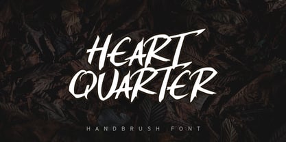 Heart Quarter is a brush font, hand-drawn typeface. It has an elegant, classy look and cool. It’s a great font for fashion, apparel projects, signature, album cover, logo, branding, magazine, social media, & advertisements, but also works great for other projects.
 - Bushwhacked NF by Nick's Fonts,
$10.00Central Type Foundry of St. Louis issued this quirky little gem under the name of Quaint Roman around the turn of the twentieth century. This version is a little less gnarly than the original, but retains all of its eccentric charm. - Snappy Patter NF by Nick's Fonts,
$10.00The pattern for this delightful gem was found in Dan X. Solo's "Rustic and Rough-Hewn Alphabets" book under the name "Antique No 14." For this font, the rough-hewn lines have been cleaned up, but the underlying fun remains. - Mango Smoothie by Hanoded,
$15.00 Summer's almost here, so it's time for some mango smoothies! Mango Smoothie is a tall, all caps, hand drawn font. A little shaky, a little uneven, but with a big taste and some creamy glyphs. Comes with multi-language support.
 - Fertigo Pro by exljbris,
$- Enjoy Fertigo Pro. The font nobody was waiting for. It’s a bit like Laphroaig; they say that the more you’ll get to know it, the more you will (probably) appreciate it. Don't forget to have a look at the script version.
 - Machi by MendozaVergara,
$14.00 Machi is a font, clean, mystic and contemporary geometric sans for titling. The uppercase is simple and clean, but in the lowercase have ornamental characters. It is perfect for headlines, apparel, fashion, album artwork, posters and logos. Photos by Claudio Sepulveda.
 - Roniq by Negara Studio,
$19.00 RONiQ is a display font. A type which should not be taken too seriously, a mixture in styles as per usual. this one is also quite juicy. Ready to be used in fun projects. Supports some languages, a lil bit multingual.
 - Ignorant by Bogstav,
$14.00 Ignorant was actually drawn on a grid. But due to the loose strokes of the pen, Ignorant has a lively look. I was thinking products for kids, packaging, organic products or something alike that needs a slightly rough and handmade font!
 - Dungeons by Rometheme,
$18.00 Dungeons font is vintage monoline script font. It has vintage, elegant, old school, classy, and cool. It’s a great font for fashion, apparel projects, signature, album cover, logo, branding, magazine, social media, & advertisements, but also works great for other projects.
 - Autobahn Std by AVP,
$18.00 Autobahn is a robust masculine sans of near monoline thickness and angular characteristics. Autobahn Std has a full Latin 1 character set but no CE, Cyrillic or Opentype features. For the extended character set and Opentype features, see Autobahn Pro.
 - Beachside by Epiclinez,
$17.00 Beachside is a cool handwritten font. Clean and a little bit quirky, this font is suitable for all of your logos, branding, social media, and crafty DIY projects. This font beachside contains 194 glyphs, supporting 66 languages from English to Zulu.
 - Magisk Time by Bogstav,
$11.00 This is my roughly handprinted typewrite-ish font. It has all the cool and classic moves of the traditional typewriter look, but with a more rough attitude due to the contextual alternates (which offer 6 different versions of each letter!)
 - Deco Neue Wilde by Open Window,
$- Deco Neue Wilde is a filter font based on Deco, an original Open Window classic. It sort of speaks for itself but it reminds me of a lava lamp and the countless shapes that you could waste time watching appear.
 - Retroid by Gleb Guralnyk,
$15.00 Hello! Introducing a vintage style font — Retroid. It's a pixelated old-school typeface that imitates 8-bit console graphics. Retroid font has multilingual support (check out a screenshot with available letters and signs). Thank you and wish you a peaceful sky!
 - Huntsman by Solotype,
$19.95Issued from the Haddon Foundry in England. Most of their original faces had names beginning with H, like their own name. Some of their types were designed by Phil May, but we cannot guarantee that this is one of them. - Kelly Signature by Ake,
$15.00 Kelly Signature is a unique handwritten font. A little bit quirky, this font looks incredibly adept on a wide variety of contexts! This font is PUA encoded which means you can access all of the glyphs and swashes with ease!
 - Thinkerbery by Mightyfire,
$15.00 Need a semi-formal yet unique font? Thinkerbery is the answer! The look of Thinkerbery is like a digital typing style but still has its uniqueness. We bring a strong looks for your text. Enjoy in creating unique arts using Thinkerbery! :)
 - Lady Cleo by Solotype,
$19.95This started out to be a font with an Egyptian hieroglyphic look, but took a detour just beyond the first pyramid. A young lady we know said many of the letters reminded her of the hooks on a bra strap. Whatever. - Almost Broken by Rillatype,
$17.00 Almost Broken is a modern display font with bold and strong personality but charmful. this font comes with two version, regular and slanted. Almost Broken is perfect for headlines, logotypes, magazine, advertising, etc. this font also comes with multilingual support.
 - Sunbeat by PintassilgoPrints,
$26.00 Sunbeat is a quite groovy face, but that's not all: this upbeat family is packed with cool interlocking pairs for adding that twist when you need it. Available in three tones, suitable only for projects that sound great. Hell yes!
 - Heldustry by URW Type Foundry,
$35.99 Heldustry is a sans serif design with letterforms partway between Helvetica and Eurostile. The Heldustry font family has a large x-height and wide characters, making it ideal for situations where there is not much copy but pages must be filled.
 - Lotus Petal by Mysterylab,
$18.00 With firm roots in the groovy '60s and '70s — but with a modern twist — Lotus Petal is all whimsical and funky lines, coils, and curls. Just the right vibe for a vintage eye-catching banner headline or retro psychedelic poster graphics.
 - Nosy Note by PizzaDude.dk,
$16.00 Nosy Notes is originally handdrawn, but I digitally traced my sketches and the result is this font - a smooth, super steady and legible comic font. I've added multilingual support, in order for you to be nosy in all kinds of languages! :)
 - Zinc by K-Type,
$20.00 Zinc is a clean, distinctive family which is essentially a monoline sans serif but with horizontal and diagonal nubs that add a subtle script quality to display type and an easy-to-read rhythm to the flow of ordinary text.
 - Inlet JNL by Jeff Levine,
$29.00 An interesting bit of Art Deco influenced serif hand lettering was found on the cover of the sheet music for 1938's "Boatman's Serenade". This became the model for the digital font Inlet JNL; available in both regular and oblique versions.
 - Sevoya by Jonahfonts,
$42.00 Sevoya a captivating robust script font designed with fat strokes for those strong brands and logos. Featuring short ascenders and descenders making it a bit more legible. Sevoya is perfect to create outstanding headings, logos, menus, graphics, and many more applications.
 - Bitelephant by Kah Khiong Design,
$13.00 Bitelephant is a type of pixel font with Slab Serif. It's unique pipeline characteristic, result a bold & simple font. It's bitmap give a retro game looks, but with a futuristic feel. Suitable for any fun, sci-friction, techno, game & digital theme.
 - Wicked Steam by Krakenbox Studio,
$16.00 Wicked Steam is a handwritten script font. This stunning handwritten font is cute, fun, classy, and Cool. It’s a great font for fashion, apparel projects, signature, album cover, logo, branding, magazine, social media, & advertisements, but also works great for other projects.
 - Bodoni Unique by Monotype,
$29.99This Bodoni caps only font was an experiment from Dave Farey how tall such a Bodoni could be elongated in its design. It reminds to the look of a fence, but in large sizes it may fit on a narrow window. - Kitcat by Solotype,
$19.95This was a favorite of the old time job printers; decorative but readable. The MacKellar foundry was the largest and most creative of the old foundries, and decorative fonts like this one came out at the rate of several every year. - Husky by Trim Studio,
$12.00 Husky is a sweet and playful handwritten font, clean and a little bit quirky, this font is the perfect fit for crafter and graphic artist to complete their design such as invitation, advertisement, poster, logo, birthday, product sign, and many more!
 - Infidel by Barnbrook Fonts,
$50.00 Infidel is based upon letterforms from the Lindisfarne Gospels and other manuscripts and bibles from across the Middle Ages. These are wonderfully idiosyncratic forms; some beautiful, others unsightly, but all far away from what we recognise as legible letterforms, today.
 - LT Cushion Light - 100% free

- Fan Script by Sudtipos,
$99.00 A friend of mine says that sports are the ultimate popular drug. One of his favorite things to say is, “The sun’s always shining on a game somewhere.” It’s hard to argue with that. But that perspective is now the privilege of a society where technology is so high and mighty that it all but shapes such perspectives. These days I can, if I so choose, subscribe to nothing but sports on over a hundred TV channels and a thousand browser bookmarks. But it wasn't always like that. When I was growing up, long before the super-commercialization of the sport, I and other kids spent more than every spare minute of our time memorizing the names and positions of players, collecting team shirts and paraphernalia, making up game scenarios, and just being our generation’s entirely devoted fans. Argentina is one of the nations most obsessed with sports, especially "fútbol" (or soccer to North Americans). The running American joke was that we're all born with a football. When the national team is playing a game, stores actually close their doors, and Buenos Aires looks like a ghost town. Even on the local level, River Plate, my favorite team where I grew up, didn't normally have to worry about empty seats in its home stadium, even though attendance is charged at a high premium. There are things our senses absorb when we are children, yet we don't notice them until much later on in life. A sport’s collage of aesthetics is one of those things. When I was a kid I loved the teams and players that I loved, but I never really stopped to think what solidified them in my memory and made them instantly recognizable to me. Now, thirty-some years later, and after having had the fortune to experience many cultures other than my own, I can safely deduce that a sport’s aesthetic depends on the local or national culture as much as it depends on the sport itself. And the way all that gets molded in a single team’s identity becomes so intricate it is difficult to see where each part comes from to shape the whole. Although “futbol” is still in my blood as an Argentinean, I'm old enough to afford a little cynicism about how extremely corporate most popular sports are. Of course, nothing can now take away the joy I got from football in my childhood and early teens. But over the past few years I've been trying to perceive the sport itself in a global context, even alongside other popular sports in different areas of the world. Being a type designer, I naturally focus in my comparisons on the alphabets used in designing different sports experiences. And from that I've come to a few conclusions about my own taste in sports aesthetic, some of which surprised me. I think I like the baseball and basketball aesthetic better than football, hockey, volleyball, tennis, golf, cricket, rugby, and other sports. This of course is a biased opinion. I'm a lettering guy, and hand lettering is seen much more in baseball and basketball. But there’s a bit more to it than that. Even though all sports can be reduced to a bare-bones series of purposes and goals to reach, the rules and arrangements of baseball and basketball, in spite of their obvious tempo differences, are more suited for overall artistic motion than other sports. So when an application of swashed handlettering is used as part of a team’s identity in baseball or basketball, it becomes a natural fit. The swashes can almost be visual representation of a basketball curving in the air on its way to the hoop, or a baseball on its way out of the park. This expression is invariably backed by and connected to bold, sleak lettering, representing the driving force and precision (arms, bat) behind the artistic motion. It’s a simple and natural connective analysis to a designer, but the normal naked eye still marvels inexplicably at the beauty of such logos and wordmarks. That analytical simplicity was the divining rod behind Fan Script. My own ambitious brief was to build a readable yet very artistic sports script that can be a perfect fit for baseball or basketball identities, but which can also be implemented for other sports. The result turned out to be quite beautiful to my eyes, and I hope you find it satisfactory in your own work. Sports scripts like this one are rooted in showcard lettering models from the late 19th and early 20th century, like Detroit’s lettering teacher C. Strong’s — the same models that continue to influence book designers and sign painters for more than a century now. So as you can see, American turn-of-the-century calligraphy and its long-term influences still remain a subject of fascination to me. This fascination has been the engine of most of my work, and it shows clearly in Fan Script. Fan Script is a lively heavy brush face suitable for sports identities. It includes a variety of swashes of different shapes, both connective and non-connective, and contains a whole range of letter alternates. Users of this font will find a lot of casual freedom in playing with different combinations - a freedom backed by a solid technological undercurrent, where OpenType features provide immediate and logical solutions to problems common to this kind of script. One final thing bears mentioning: After the font design and production were completed, it was surprisingly delightful for me to notice, in the testing stage, that my background as a packaging designer seems to have left a mark on the way the font works overall. The modern improvements I applied to the letter forms have managed to induce a somewhat retro packaging appearance to the totality of the typeface. So I expect Fan Script will be just as useful in packaging as it would be in sports identity, logotype and merchandizing. Ale Paul
 - Maus - Personal use only

- Polynesiac by Poole,
$22.50Polynesiac was discovered deep in the jungle on a cave wall on Gilligan's Island. "I was looking for ancient pictographs, and I find this crap instead!" says designer Wesley Poole. "But, the more I looked at it, the more I appreciated its charms." Sort of tropical, but not strictly Polynesian, this sans serif face never stoops to caricature, and achieves instead, a mysterious new flavor of the South Pacific Islands. Fun as it is, there's a certain dignity to it. "Living in Hawaii you just absorb this stuff. This is a fun loving culture. I hope I captured that, along with some Island Aloha." - Mathieu Sans by Borutta Group,
$39.00 I really like the moments when classic meets modern. Mathieu was inspired, by the proportions, texture and elegance of Renaissance typefaces, and by the works of Dutch typographers, in whom I have always appreciated the balance between the traditional approach and experiment. Mathieu has the features of a sans-serif typeface, but you can feel delicate notes of calligraphy through humanistic details. The whole family has several width options complemented by a slightly slanted but expressive italics – making it suitable for both longer texts and for use in visual identities. Karol Mularczyk and Małgorzata Bartosik worked on the project creatively directed by Mateusz Machalski.
 - New Yorker Type by Wiescher Design,
$55.00 NewYorkerType was one of the first typefaces I tried my hand at in 1985. I meant it as a revival of the typeface used by the New Yorker magazine. I did not scan it in, I just looked at the type and redrew it completely by hand. So it is not just a copy, but rather a redesign. Only much later did I come to know, that there is a bundle of similar typefaces of that period. Rea Irvin's design for New-Yorker magazine was just one of them, but the best. Yours, sincerely honoring Rea Irvin a great type- and magazine-designer Gert Wiescher

