10,000 search results
(0.026 seconds)
- Modulus Pro by Arkitype,
$16.00 Modulus Pro, the extensive update to Modulus. This update was built around the original Modulus Font. This rounded sans-serif has a larger glyph set which covers many languages. Modulus Pro now comes in 8 weights from Extra-Light to Black. This updated version was designed with the designer in mind, you have many stylistic alternates to get creative with and make some really cool customised typography. A large range of examples have been designed to show just how versatile and creative you can get with this font family. It's fun but has a cool, edginess to it at the same time. Modulus Pro is not just another rounded sans-serif, you are going to want this in your font list.
 - Eroika Slab by Eclectotype,
$40.00 Eroika Slab is a robust, display serif, intended to be set large. While for most serifs, display means high contrast, Eroika's "displayness" stems from its wide stance, tight spacing, equal cap and ascender heights, flared stems and large x-height. The italics in particular are quite unorthodox, with their vertical serif cut-offs and foot serifs where most fear to tread ('scuse the pun). All fonts feature a useful array of stylistic sets, oldstyle figures, automatic fractions and case sensitive forms. All ligatures are in the discretionary section, as it's my belief that this typeface looks better without them, but I like to offer the choice. Perfect for book covers, craft beer logos, boxing paraphernalia and tattoo magazine pull quotes. And probably a whole lot more besides!
 - Bladesmith by Hanoded,
$15.00 I have always had a keen interest in forging; I used to be a silversmith, and I love working with metal. Some time ago I forged my first axe (a skeggøx or bearded axe), sharpened it and fitted it with a handmade ash handle. It isn’t perfect, but it is my first ever forged axe and I’m pretty proud of it. All of this went through my head when I started drawing the glyphs for this font. And to be honest, I couldn’t find a more suitable name for it! Bladesmith is a handmade font, forged in fire (haha). It was actually made with an old sharpie. It is a rough and ready font, quite suited for headlines, book covers and posters.
 - Anultra Slab by Eclectotype,
$40.00 Anultra Slab is, you guessed it... An ultra bold slab serif! Anultra Slab is a hard hitting headliner, designed to be set LARGE. Because it's a single weight typeface, no compromises were necessary to get it interpolatable with other weights, so it is as bold and tight as I intended. Features include automatic fractions, case-sensitive forms, ligatures, stylistic alternates for non-descending J and Q, and a 3D 'xtrude' style, which can be layered behind the regular to create two colour, photo-lettering style text. Very seventies. Very cool. A companion typeface, Alight Slab , is available at the other end of the weight scale, but there are no weights in between. You're no middle-weight designer, so why use middle-weight fonts?!
 - Libertad by TipoType,
$24.00 Design can do without images, but not without typefaces. Libertad is a sans-serif typeface that mixes humanist and grotesk models. It’s most interesting feature is the combination of balanced regulars with dynamic italics, which makes it a very versatile font for different uses. This typeface follows the Luc(as) de Groot’s Interpolation Theory, that’s why it has seven specially-calculated weights plus their matching italics, from thin to extra-bold. This allows it to be useful in big headlines and also small texts. It has more than 800 characters per weight and support for more than 70 languages. WARNING: This does not work with most Office suites; you only have access to R/I/B/BI. Credits: Photos by Lu-Lee.com - Web template by EleganThemes.com
 - 1538 Schwabacher by GLC,
$38.00 This 1538 Schwabacher was based on a font used by Georg Rhau in Wittemberg (Germany) to print Des Babsts Hercules [...], a German pamphlet against roman catholicism written by Johannes Kymeus. The original font has a relatively complete set of characters including “long s”, but also the special german types like k, fl or ‰, ˆ, ¸.... A few omissions were remedied, and accented letters were added. A render sheet, enclosed with font files, help to identify them on keyboard. It can be used as web-site titles, posters and fliers, editing ancient texts, menus or greeting cards as a very decorative font... Although this font remains clear and easy to read from 8 or 9 points on screen, it is clearly designed for print works.
 - Boldoy by Ardyanatypes,
$15.00 Boldoy is here everyone~ an attractive Typeface with agile and energic character See the beefy trunk? it will attract more attention like telling "hug me" ;) Boldoy come up with many decoration in multilanguage When you put it on the boom cover, it will stopping eye from others. The joyful shape impress a cheerful, clingy, gentle, cute, elephant, which super fit for your summer season Big Boy Boldoy also including alternates and ligatures that will make your idea never run out. It was so playful font but also easy to read and applied in various design styles such as traveling snacks, packaging, logos, event poster, animal lovers, cool T-shirts, and many more design projects. So, ready for play? Enjoy your design playground with BOLDOY
 - Echelon by Barnbrook Fonts,
$50.00 Echelon is based upon 1970s Eastern European ‘pipe-style’ typefaces. This style of Communist consumer typography came from what, at the time, seemed like a bizarre mirror universe: Existing alongside the West, similar-but-different, essentially unknowable. Even though the letterforms had the same historical origins as their Western equivalents, they also had their own bizarre fashionable/unfashionable aesthetic. The parallels between the surveillance practices of the Soviet Union and those of today’s Western governments informed the naming of this typeface. Echelon is the codename for a massive international surveillance system that collects and processes data from communications satellites. It can eavesdrop on telecoms and computer systems, it can track bank accounts. It can record and store information on millions of individuals.
 - Amboy by Parkinson,
$20.00 Amboy is a two-font family. Amboy Inline and Amboy Black. Amboy Black is a recent addition. It can be used alone, but it is carefully tailored to fit behind the Inline font to add color to the inline. There are alternate characters: A, M & N in the caps and lowercase key positions. Amboy is a square gothic style typical of Mid-20th Century Showcard Lettering. A lettering genre known as “Gaspipe.” Signage samples similar to this still exist on buildings in my home town, Oakland, California. I have designed over a half dozen variations of this form over the years. Including Golden Gate Initials, Matinee, Motel, Hotel and Fresno. Designed in 2001 by Jim Parkinson, Amboy has been refreshed, enhanced, and re-released.
 - Zt Chablis by Khaiuns,
$14.00 Chablis is a serif font with two different design colors including a cyliric typeface. Chablis comes in 2 styles, and each style has 5 weights, Chablis Basic shape with a harmonious and classic look that makes you feel nostalgic for precious memories from the golden years that have passed, Chablis Slow shape with a sharp look at the bottom corner of small letters but very elegant and classy, very suitable for presenting a new atmosphere of corporate identity design, websites, publications, titles, books, magazines, business cards, logos, product labels, packaging or any kind of purpose advertising. Includes: Numbers & punctuation Classic Numbers Ligature Foreign language support I hope you have fun using zt Chablis Thanks for using this font ~ Khaiuns X zelowtype
 - Skribblugh by Tom Chalky,
$12.00 This was a creative experiment. Writing for a long period of time prior to starting erased any inhibitions that prohibited forming natural, authentic letters and by adding more duration the hands became sore and weak. Allowing minimal control, and a more eccentric outcome. It was a real slog, but totally worth it. Skribblugh is a wobbly, aesthetically pleasing, and obviously handwritten typeface full of character and versatility. Within a modern design; It adds a human’s touch, a final note, a signature. And within a playful, colorful one it helps exaggerate the atmosphere, bringing playfulness and warmth to the center of the stage. With four choices for every uppercase and lowercase letter, there are plenty of opportunities to make designs look personal and relatable!
 - Sandia Mangon by Gold Type,
$12.00 Sandia Mangon is a beautiful, versatile serif font. This font is characterized by a luxurious serif style in cute and lovely shapes, but also has a friendly and playful style in bold, Sandia Mangon has glyphs to give crafters more options in designing. This cute style will make a design look more classy, elegant, unique and edgy. Sandia Mangon is a font suitable for many projects, for modern or even retro vintage designs, branding, logos, crafts, stickers, sublimation, wedding invitations, and more. This font is suitable for a variety of projects such as logos, branding, magazines, signage, fashion, and many more. what will you have: Uppercase and lowercase letters Numbers and punctuation Multilingual support PUA encoded fonts Alternative styles and ligatures Thank You
 - Directa Serif by Outras Fontes,
$30.00 Directa Serif is a text type family designed to save space with the maximum readability. Because of its general forms and proportions (a little bit condensed, big x-height, low contrast) it can be used in smaller sizes than usual for body text. It is highly recommended for newspapers, magazines, corporate communication and so on. Directa Serif Family is composed by 14 fonts (7 weights and its italics) with a large set of characters, including Western, Central European, Baltic, Scandinavian, Icelandic, Romanian and Turkish unicode ranges. Each font also includes several ligatures, a complete set of Small Caps, sets of lining, old style and tabular figures, as well as fractions, superior and inferior numbers. These features can be easily accessed using any OpenType-compatible software.
 - Schooner Script by Three Islands Press,
$39.00 I happened to mention to the proprietor of an antique barn near here that I'd be interested in any old typewriters she happened to come across. A conversation ensued, the proprietor withdrew into a back room, and she re-emerged with an old handwritten letter, dated 18 Sept. 1825 and spanning nearly three pages. The letter, penned by Samuel Clarke, a Princeton, Mass., pastor, sought donations for the victims of an accident at sea. I thought his script unique, stylistic, and definitely something worth digitizing, so I bought the old letter and took it home. Had to come up with several uppercase characters to round out the set, but the results seem good and proper. Full release has complete character set.
 - Bonhomme Richard by Three Islands Press,
$39.00 Bonhomme Richard evokes the cursive penmanship of Chevalier John Paul Jones (1747–1792), celebrated Continental Navy commander during the American Revolution, in letters from the late 18th century. The font’s name comes from Jones’s famous frigate, lost during his victorious engagement with the British in the Battle of Flamborough Head in 1779. During this battle Jones is said to have exclaimed, when urged to surrender, “I have not yet begun to fight!” (In fact, his likely words were, “I may sink, but I’ll be damned if I strike!” – i.e., surrender.) A legible script, Bonhomme Richard has an elegance about it while also conjuring the colonial era of its source material. Use to simulate historical handwriting in film props, games, formal invitations, product labels, and the like.
 - Popcorn by Fenotype,
$19.00 Popcorn is a brush script family of Regular and Bold weight and a set frisky caps, Casuals. Popcorn is a strikingly clear and smooth display face with short descenders and ascenders—it’s great for stacked layouts too. Popcorn scripts are equipped with plenty of contextual alternates and ligatures, all set in Standard Ligatures to keep the smooth flow. Besides that there’s also Swash alternates for every standard letter. Popcorn scripts are PUA encoded so you can access alternates with most design softwares. Popcorn Print is a rugged version of Popcorn with rough outlines and nice print texture. Popcorn is a great display family with roots in the past but smooth polished contemporary features. For the best price grab the whole pack!
 - Forked Tongue by Comicraft,
$19.00 Are you Troubled by Ghostly Voices in the night? Do you hear the Terrifying Tones of Demons and Ghouls in your Attic or Cellar? Have you or any of your family spoken with "Forked Tongue? Well, talk of the devil, Forked Tongue happens to be the latest offering brought to you buy our courteous and efficient staff this month (now on call twenty-four hours a day to serve all your supernatural lettering needs). If it Sounds Spooky, it most probably speaks with Forked Tongue. Oh, but if you really have got ghosts or poltergeists, well, um, we don't know who you gonna call. Features: Four weights (Regular, Italic, Bold & Bold Italic) with upper and lower case alphabets. Includes Western and Central European international characters.
 - Puffypuff by Konstantine Studio,
$16.00 Introducing the Puffypuff - A new experimental display typeface inspired by the pillow and cloud shape and behavior. Interpreted into a bunch of letters, so it can be a font that you can't resist to have. Usage tips: Play with strokes to give bold comical and vintage vibes. Duplicate the word and make it all black for the back one, and slide it down a little bit to make a shadow effect. Mix the letters with other fonts in one word to make such an experimental visual concept with it (see 3rd poster). Perfectly fit for logo, branding, poster, music project, album cover, cover artwork, events, y2k concept, graffiti concept, brutalism, modern aesthetic, graphic design project, fashion, apparel, merchandise, and many more.
 - Grande Sans by Type Innovations,
$39.00 Say hello to Grande Sans—a geometric typeface that features highly stylized capitals with sharp corners, circular forms and generous proportions. Specifically created for visual impact—use Grande Sans when you want your words to stand out from the rest of the crowd. The concept is modern, futuristic and non-traditional. Perfect for display text, logos and headlines. The development of Grande Sans started in 1997, inspired by Alex Kaczun’s best selling grotesque font family called Contax Pro. Grande Sans is specifically introduced here as a black weight, but Alex plans to expand the design to include many weights, styles and alternative design treatments. Stay tuned! If you like Grande Sans—check out Alex Kaczun’s Decrypt fonts as well as all of Type Innovations fonts here.
 - Rocket Pilot by Forberas Club,
$16.00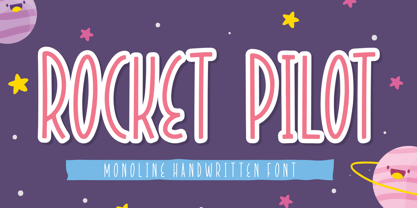 Introducing Rocket Pilot by Forberas Club Rocket Pilot is a Handwritten Script font that will make your designs look classic, Farmhouse, Boho, and Feminine. It is a great font for events, Wedding Project, fashion, apparel projects, signature, album covers, logos, branding, magazines, social media posts, advertisements, but it also works great for other projects. Add it to your fonts’ library, and it will enhance your creativity! Rocket Pilot is best for: - logos, branding, & Signatures. - Flyers, Album cover, Magazine, & Advertisements. - Website design , design blogs, & fashion. - Quote graphics for social media. - and also it works great for other projects. Whats included : - Character Set - Numerals and Punctuation (OpenType Standard) - Accents (Multilingual characters) If you have any questions, before or after purchase, please feel free to get in touch.
 - Foot Print by Bureau Bunk,
$14.95 While Walking along the shore of our Main Port to Europe in Rotterdam, The Netherlands, my 14 year old son Jules first hardly dared to step in the mud for he was wearing his brand new sneakers. Concentrating in where he put his feet, he noticed he made a character! The FootPrint-Regular was born! The FootPrint-Regular is a powerful header-typeface, but funny enough it's usable as small copy too! Blaze your Trail! Anything you can imagine on Police investigations, Bloodhound Thrillers, Trails, Tracks and Traces, anything about Outdoor Stores, Tracking or even maybe Pedestrian Clubs, or things like Survival Sports, Walking Events or Hiking Gear; Blaze'm your FootPrint-Regular Trail on all Banners, Blimps, Ads and Doormats!
 - Hustony Extrude by MJB Letters,
$16.00 Hustony is a layered retro bold script that comes with a regular and extrudes version which will make it easier for you to make a retro effect on a design, this font is designed carefully to be used for many purposes such as logo design, poster design, branding, labels, covers, magazine, wedding design, fashion design and more. You will get : Hustony Regular Hustony Extrude In order to use the beautiful swashes, you need a program that supports OpenType features such as Adobe Illustrator CS, Adobe Photoshop CC, Adobe Indesign, and Corel Draw. but if your software doesn’t have a Glyphs panel, you can install additional swash font files: if you have questions about the latest fonts, please provide a short message to us Thank You! MJB Letters
 - Leco 1983 by CarnokyType,
$15.00 LECO 1983 is a headline display OpenType typeface with its three styles: LECO 1983: regular LECO 1983 Blind: without interiors of signs LECO 1983 Negative: in its inverse form. The inspiration for creating this font came from the label on a 1983 bottle of Lečo. The characteristic feature of this font is an embedded diacritic. The monolinear character of drawings is dominant. This font is drawn as capital letter type for both: upper case and lower case letters. It contains alternatives of some signs (e, f, g, m, n, y) and (& and a glyph No) but it consists several interesting alternatives (ligatures) of pairs as (in, on, of, by) as well. This font is best used on strong posters or as a headline display typeface.
 - Rotten Banquet by Subqi Studio,
$35.00 Introducing Rotten Banquet, our first victorian display font. This font inspired by 1800s typography design with some modern touch at it. We made this font without too much swashy efefct on the letterform. Just gave it two bold ripple floral effect at the tail is enough. So this font will more readable and not too complicated thus you could make any kind of projects with this font. In the preview we give you a sample ideas. We made it with one style design for the continuity but of course you could make your own style display for your own project purposes. This font contained with 370+ total glyphs. Each uppercase and lowercase have their own stylistic alternate at least one.
 - Raleigh Gothic Condensed by GroupType,
$29.00 In 1932, the great American type designer, Morris Fuller Benton was busy directing the creative departments of ATF and designing type. Big on his plate during that period was the development of the Bank Gothic® family among other typefaces like Raleigh Gothic. Bank Gothic and Raleigh Gothic share some very similar design traits. The most obvious difference being the ultra condensed style of Raleigh Gothic. Although the Bank Gothic family was released with a condensed, Raleigh Gothic could have originally been planned as an ultra condensed Bank Gothic but for reasons we can only speculate, the Ultra Condensed Bank became its own design. So, If you like Bank Gothic, you may also like Raleigh Gothic. Separated at birth? Fun to speculate.
 - Alternate Gothic Pro by SoftMaker,
$14.99 Alternate Gothic Pro is one of the fonts of the SoftMaker font library. Designed by Morris Fuller Benton in 1903 as a complement to his Franklin Gothic type, Alternate Gothic was created to solve a common problem: fitting headlines in narrow columns. For that purpose, it comes with three similar styles of varying widths. SoftMaker’s Alternate Gothic Pro typeface family contains OpenType layout tables for sophisticated typography. It also comes with a huge character set that covers not only Western European languages, but also includes Central European, Baltic, Croatian, Slovene, Romanian, and Turkish characters. Case-sensitive punctuation signs for all-caps titles are included as well as many fractions, an extensive set of ligatures, and separate sets of tabular and proportional digits.
 - Dalgona Bestolen by Forberas Club,
$16.00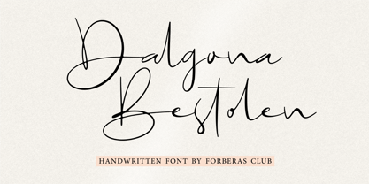 Introducing Dalgona Bestolen by Forberas Club Dalgona Bestolen is a Handwritten Script font that will make your designs look classic, Farmhouse, Boho, and Feminine. It is a great font for events, Wedding Project, fashion, apparel projects, signature, album covers, logos, branding, magazines, social media posts, advertisements, but it also works great for other projects. Add it to your fonts’ library, and it will enhance your creativity! Dalgona Bestolen is best for: - logos, branding, & Signatures. - Flyers, Album cover, Magazine, & Advertisements. - Website design , design blogs, & fashion. - Quote graphics for social media. - and also it works great for other projects. Whats included : - Character Set - Numerals and Punctuation (OpenType Standard) - Accents (Multilingual characters) If you have any questions, before or after purchase, please feel free to get in touch.
 - Harond by Arterfak Project,
$29.00 Introducing Harond font, a bold serif font with a retro touch. Inspired by the dynamic and chubby typography style of the 70s, this font exudes a delightful, playful, yet elegant impression, making it ideal for various design themes, especially in the realm of food-related design. Harond is a display font best suited for larger sizes. Its plump form and tight spacing offer a delightful design experience and captivate attention. It's the perfect choice for use in posters, decals, logos, branding, flyers, promotional materials, motion graphics, packaging, and much more! But that's not all you get with this font. In addition to the standard alphabet, Harond also comes with multilingual support and numerous special characters, making it easier to enhance your designs.
 - Eastilo by Forberas Club,
$16.00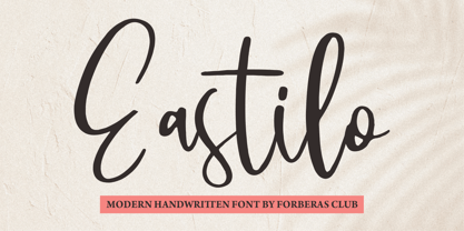 Introducing Eastilo by Forberas Club Eastilo is a Handwritten Script font that will make your designs look classic, Farmhouse, Boho, and Feminine. It is a great font for events, Wedding Project, fashion, apparel projects, signature, album covers, logos, branding, magazines, social media posts, advertisements, but it also works great for other projects. Add it to your fonts’ library, and it will enhance your creativity! Eastilo is best for: - logos, branding, & Signatures. - Flyers, Album cover, Magazine, & Advertisements. - Website design , design blogs, & fashion. - Quote graphics for social media. - and also it works great for other projects. Whats included : - Character Set - Numerals and Punctuation (OpenType Standard) - Accents (Multilingual characters) If you have any questions, before or after purchase, please feel free to get in touch.
 - Abort Mission by PizzaDude.dk,
$12.00 This is the kind of letters I drew in school back in the 1980ies. I would never have guessed that I would do the same thing like 40 years later! I remember making a simple space game for my VIC-20 computer, and I needed some "data letters" (as I called it) - as far as I can remember, this is close to what I made 40-like years ago. Also, I was inspired by the well known series "Stranger Things" - you know, all that 80ies theme stuff took me down memory lane! :) Anyway, all the letters are handdrawn, using a squared paper as guide - at it may look simple, but it took me quite some time to finish this font (hence the name!)
 - Nyfors by Linotype,
$29.99Nyfors was a sudden idea. I noticed an ad in a magazine, with some handtexted words. I don't recall what the ad was about, neither the words. When I later on tried to remember how the single characters looked like and began to draw them, the result wasn't bad at all. I am not longer sure that they resemble the characters in the ad, but it doesn't matter. Nyfors is a nice handtexted typeface, whatever its origin. There is a small stream in Tyresö where I live and work, called Nyfors. During some centuries there was a center of small scale industries along it, and they used its water to run their machinery. The typeface has its name from that stream. Nyfors was released in 1995. - LTC Nicolas Cochin by Lanston Type Co.,
$24.95 Nicolas Cochin (not to be confused with another font named simply "Cochin") was originally designed by Georges Peignot in the early 20th Century and was based on engraved letters of the 17th Century artist Charles Nicholas Cochin. Many foundries including Lanston released versions in the 1920s. Several digital versions can now be found, but none have kept the irregular details of the metal type which include strokes that cross over each other as if hand drawn (see letters K & y). The new Lanston digitization is the only digital version to retain the idiosyncratic treatment which makes the metal type so alluring. The Opentype version included an expanded Central European character set as well as ligatures, alternates, fractions, superior/inferior numerals (the Italic also has swash characters).
 - Speed Bump by Three Islands Press,
$19.00 I, uh, don't know quite what to say. I'd toiled so long over Pumpkinseed back in '96 that I guess I needed a good, wild ride to shake out the head cramps, or something. Whatever grabbed me, it forced me to sit down and design a typeface real fast directly in Fontographer (had never done that before). Took less than two hours to finish the regular character set. No way to explain it, but the exercise actually paid off -- I think. And now that there was Speed Bump, there simply had to be a companion dingbat set. (Beats the heck out of me.) So check out Speed Bump's wacky character(s) and, if you're really bored, the 200-some-odd little pictures in Speed Bump Pi.
 - Mouser by Sharkshock,
$100.00 Mouser has been an ongoing project that originated as a geometric sans of the same name before morphing into a similar, but entirely different family called TypoGraphica. It retains much of its earlier character such as limited contrast, high legibility, and tight spacing. Major changes were made for a simplistic, more cohesive look. This was done to maximize its usefulness for body text while keeping characteristics used for display purposes. Slices to top strokes are much more subtle with styling dialed down to a minimum. This family comes in 6 different versions to meet a variety of needs. Mouser is equipped with Basic and Extended Latin/diacritics, Cyrillic, kerning, ligatures, and fractions. Try it for website text, applications, or headlines.
 - Decorate The Tree by Ingrimayne Type,
$9.00 DecorateTheTree is a festive novelty font family containing two styles designed to be used in layers. Each style has letters on Christmas-tree lights. The regular style has clear bulbs and the bold style has filled bulbs. Some characters are on standing bulbs and others on hanging bulbs and these two sets are made to alternate with the OpenType contextual alternatives (calt) feature. To use only one set of bulbs, this feature must be turned off and character spacing adjusted, though why anyone would want to use only one set is a mystery. These fonts are monospaced. They are useful to display a holiday message not just in words but in the lettering itself. (The characters on the bulbs are derived from the font SansduskiMono.)
 - Alderney by Fontelan,
$18.99 Alderney is a friendly font family in three weights, Light, Regular and Bold, designed by Stephen E Rowe for the foundry Fontelan. It is a gentle script crafted for more relaxed display needs, but, being oblique in character, it gives an air of excitement to many projects, especially in all caps situations. Unlike many scripts, the capitals can be successfully used as a great display option. All glyphs have a smooth curve and a broad, flowing, low aspect. The light version lends itself to airy design possibilities, again, especially when the caps are used for display purposes. The regular version is a well balanced script that remains spacey and elegant, and the bold version is excellent for a display that suggests excitement.
 - Dienilla by Abo Daniel,
$16.00 Dienilla is a luxury handwritten font that comes in 3 weights: Thin, Regular and Bold. Dienilla is great for branding, logos, wedding invitations, cards, quotes, T-shirt design, and many other projects that need a simple but elegant feel. Dienilla has multi-lingual support and is PUA encoded. I created 2 styles of ending swashes to make this product so perfect and very easy to use. To access the first style you can add underscore twice after the lowercase character: for example : a _ _ and to access another one you can add underscore twice and put a 1 after the lowercase character: for example : a _ _1 Dienilla is really beauty, and very very user friendly. Hope you love it, and let's grab it...
 - Artifex CF by Connary Fagen,
$35.00 Designed for easy reading of long passages, Artifex CF's smoothed-off serifs help the flow of text without unnecessary visual noise. Artifex's even rhythm and mellow tone make it an excellent option for books, magazines, articles, blogs, captions, and longform texts. A near-upright italic adds emphasis and urgency with elegance. Artifex also doubles as a handsome display typeface, scaling gracefully with charming details revealing themselves at large sizes. Artifex CF pairs nicely with bold, clean sans-serifs, such as Greycliff CF and Visby CF. Artifex also has a sibling typeface, Artifex Hand CF, cut from the same cloth, but with subtle flares in place of the serifs. All typefaces from Connary Fagen include free updates, including new features, and free technical support.
 - OakPark by Ingrimayne Type,
$9.00 OakPark is a decorative or display family with an Art-Deco feel. It has high contrast with very thick stems that invite decoration. Eight members of the family have interior decoration and can be used individually or in layers over the regular style and under hollow style to create colorful text displays. These ten members are all-caps, but about half of the letters on the lower-case keys differ in some way from their counterparts on the upper-case keys. There is also a shadowed style and it can be layered with a shadowinside style. Completing the family are a style that has true lower case characters with an accompanying italics, and a style that has small caps on the lower-case keys.
 - Breve Text by DSType,
$50.00 Breve was designed for use in editorial projects. Simple but with enough personality to stand by is own, in a quest for a more forceful and contemporary appearance. All the fonts in Breve superfamily, share the same exact structure, both in terms of anatomy and functionality. The Text versions provide a softer and warm feel to the typographic palette and is intended for use in much longer passages of text, while the Title versions are distinguished by non-descending letterforms, making the titles and headlines much more uniform and interesting. The News version is more classic, with ball terminals and classic proportions, while the Display is, somehow, the set of fonts we had to design: extra-black, ultra-contrasted, proud-display fonts.