10,000 search results
(0.128 seconds)
- Odradeck by Harvester Type,
$20.00 Odradeck is a typeface that originated from the idea of creating a tall, but narrow font, while combining brutalism and technogenic. The difficulty was not to go to extremes and make the font moderately neutral in order to significantly increase the range of font applications. Odradeck came out with a strict, industrial, geometric, but moderately neutral semi-mono font with two axes of variability: height and slant. To all this, + 300 glyphs were added and, as a result, support for +80 languages. The structure of the font allows you to use it in a limited space, and its flexibility will allow you to fill and use this space to the maximum. You can apply it in a very wide range of designs. Whether it's a logo, packaging, banner, title, text, poster, merchandising, identity, branding or product design. Language support: Afrikaans, Albanian, Asu, Basque, Bemba, Bena, Breton, Catalan, Chiga, Colognian, Cornish, Croatian, Danish, Dutch, Embu, English, Esperanto, Estonian, Faroese, Filipino, Finnish, French, Friulian, Galician, Ganda, German, Gusii, Icelandic, Inari Sami, Indonesian, Irish, Italian, Jola-Fonyi, Kabuverdianu, Kalenjin, Kamba, Kikuyu, Kinyarwanda, Lower Sorbian, Luo, Luxembourgish, Luyia, Machame, Makhuwa-Meetto, Makonde, Malagasy, Manx, Meru, Morisyen, North Ndebele, Norwegian Bokmål, Norwegian Nynorsk, Nyankole, Oromo, Portuguese, Quechua, Romansh, Rombo, Rundi, Rwa, Samburu, Sango, Sangu, Scottish Gaelic, Sena, Serbian, Shambala, Shona, Soga, Somali, Spanish, Swahili, Swedish, Swiss German, Taita, Teso, Uzbek (Latin), Volapük, Vunjo, Walser, Zulu.
 - Glorial by Runsell Type,
$17.00 Introducing Glorial - An Elegant Script Font The handwritten calligraphy script works perfectly for classy designs. Glorial Script includes a full set of uppercase & lowercase letters with beginning swashes , a full set of lowercase letters with ending swashes, a full set of contextual alternates lowercase letters , 50+ ligatures features that makes the font look more natural. Glorial fonts that special for fashion and matches applies in some designs such as the logotype, brand, magazine, website or blog headlines, packaging, branding, quotes, invitation cards, greeting cards, business cards, and wedding more. Glorial is coded with PUA Unicode, which allows full access to all the extra characters without having special designing software. Mac users can use Font Book, and Windows users can use Character Map to view and copy any of the extra characters to paste into your favorite text editor/app. Glorial Includes: - 50+ Ligatures, Contextual alternates, Stylistic alternates, and Swash - Uppercase, lowercase, numeral, punctuation and symbol - .OTF format files - PUA Encoded Characters - Fully accessible without additional design software - Multilingual support for English, French, Italian, Spanish, Portuguese, German, Swedish, Norwegian, Danish, Dutch, Finnish, Indonesian, Malay, Hungarian, Polish, Croatian, Turkish, Romanian, Czech, Latvian, Lithuanian, Slovak, Slovenian How to get access alternate glyphs with designing software to open type fonts check this link : http: //adobe.ly/1m1fn4Y If you have any question please do not hesitate to contact me. Happy creating!
 - Snowdrop by Supfonts,
$17.00 Thanks for checking out Snowdrop Script! A fabulously fun yet elegant script font with tons of energy, allowing you to create beautiful hand-made typography in an instant. With extra bouncy curves & alternates, Snowdrop Script is guaranteed to make your text stand out - perfect for wedding invitations, printed quotes, cards, product packaging, headers and whatever your imagination holds. By the way, you can make your own design IN ANY language What's really awesome is that Snowdrop Script comes with a complete set of lowercase alternates, which allows you to create even more authentic custom-feel text. Another great feature is the bonus ornaments font, which allows you to add some really unique and elegant finishing touches to your script text. Here's what you get in the download: 1. Snowdrop Script - A handwritten script font containing upper & lowercase characters, numerals and a large range of punctuation. Fully support of all Latin and Cyrillic languages 2. Snowdrop Swirls - The set of small letters with swirls at the beginning and end of the letter. You can use A-Z and A-z to get to them 3. Snowdrop Alt - The set of small letters with special endings + a set of letters with special curls for the middle of words Fonts are provided in TTF / OTF / WOFF formats. You do not need a special design program. Font easy and convenient to use.
 - Shout by HiH,
$12.00 Shout is a “Hey, Look at ME” font. It is an attention-getting font for posters, flyers and ads. Its lineage includes the Haas Type Foundry’s 19th century advertising font, Kompakte Grotesk, which Jan Tschichold (1902-1974) dryly described as “extended sans serif” and which graphic designer Roland Holst (1868-1938) would have disapprovingly referred to as a “shout,” as opposed to the quiet presentation of information that he believed was the proper function of advertising. In 1963 Letraset released what appears to be an updated variation in multiple weights designed by Frederick Lambert called Compacta. Shout draws heavily on Compacta, as well as other similar fonts of the 50s and 60s like Eurostile Bold Condensed and Permanent Headline. In weight, it falls about halfway between Compacta Bold and Compacta Black, but with a relatively heavier lower case that is not so easily pushed around by the upper case. After all, one can shout while sitting down. Shout is the first font released with our new encoding, as noted in the All_customer_readme.txt. The Euro symbol has been moved to position 128 and the Zcaron/zcaron have been added at positions 142/158 respectively. Otherwise, Shout has our usual idiosyncratic glyph selection, with the German ch/ck instead of braces, a long s instead of the Greek mu and our usual Hand-in-Hand symbol. There are also left and right glyphs of a big mouth ]ing (135/137) and left and right glyphs of an angry man shouting (172/177). Please use Shout with discretion. Folks get tired of being yelled out. After awhile, they stop listening. Shout ML represents a major extension of the original release, with the following changes: 1. Added glyphs for the 1250 Central Europe, the 1252 Turkish and the 1257 Baltic Code Pages. Add glyphs to complete standard 1252 Western Europe Code Page. Special glyphs relocated and assigned Unicode codepoints, some in Private Use area. Total of 355 glyphs. 2. Added OpenType GSUB layout features: pnum, ornm, liga, hist & salt. 3. Added 266 kerning pairs. 4. Revised vertical metrics for improved cross-platform line spacing. 5. Revised hyphen, dashes & math operators. 6. Minor refinements to various glyph outlines. 7. Inclusion of both tabular & proportional numbers. Please note that some older applications may only be able to access the Western Europe character set (approximately 221 glyphs). The zip package includes two versions of the font at no extra charge. There is an OTF version which is in Open PS (Post Script Type 1) format and a TTF version which is in Open TT (True Type)format. Use whichever works best for your applications.
 - ION A by Setup,
$19.95 ION A is a part of the ION superfamily, which consists of 3 families: condensed (ION A), normal (ION B) and wide (ION C), each having a compelling range of 10 weights. Styles Thin to Black have 436 glyphs supporting more than 70 Latin-based languages and the three heaviest weights, named U1, U2 and U3 have 94 basic glyphs. ION glyphs are based on the classic 7-segment display, but for readability and aesthetic reasons, some alphabetic characters don't follow this matrix strictly. In case you like things in order, don't worry, there's a stylistic set that replaces all characters with their strict alternatives. The special characters, such as #, @ or % are composed of special segments, but are designed to fit seamlessly within the whole character set. ION was designed with the needs of contemporary graphic design in mind. There are alternative characters, discretionary ligatures, slashed zero, superior & inferior numbers, fractions, ordinals and three handy stylistic sets. The ten styles of ION A are accompanied with a special 11th style called Cells, allowing you to design a special underlying layer of black or outlined cells. This way you can create various containers and boxes for your text, highlight what's important or go wild and draw a space invader, using the cells as building blocks. Learn more about the OpenType features and Cells at www.urtd.net/ion.
 - Weiss Rundgotisch by Linotype,
$67.99The German designer Emil Rudolf Weiss originally created Weiss Rundgotisch for the Bauer typefoundry in 1937. In their catalog for the typeface, Bauer began with this quote from Leonhard Wagner: The round gothic (rundgotisch) script is the most beautiful kind of script; she is called the mother and the queen of all the rest." While designing Weiss Rundgotisch, Weiss was inspired by Renaissance types cut by the Augsberg printer Erhard Ratdolt. Ratdolt had spent some time in Venice, which is most likely where he became familiar with round gothic letters. This sort of letterform was never as popular in Germany as Fraktur or Gotisch may have been, but round gothic types were used there for centuries to represent arts and craft feelings, as well as old-fashioned handwork. For a blackletter typeface, Weiss Rundgotisch is very similar to normal serif and sans serif designs, especially its uppercase letters, which seem to have some uncial influence in them as well. Therefore, Weiss Rundgotisch is more legible for contemporary readers, making this an excellent choice for anyone looking to set text, logos, or headlines with in blackletter. Weiss Rundgotisch was apparently quite a difficult typeface to design, even for a master designer like Weiss. He began work on the face in 1915; Weiss Rundgotisch's development took over 20 years to complete." - ION C by Setup,
$19.95 ION C is a part of the ION superfamily, which consists of 3 families: condensed (ION A), normal (ION B) and wide (ION C), each having a compelling range of 10 weights. Styles Thin to Black have 436 glyphs supporting more than 70 Latin-based languages and the three heaviest weights, named U1, U2 and U3 have 94 basic glyphs. ION glyphs are based on the classic 7-segment display, but for readability and aesthetic reasons, some alphabetic characters don't follow this matrix strictly. In case you like things in order, don't worry, there's a stylistic set that replaces all characters with their strict alternatives. The special characters, such as #, @ or % are composed of special segments, but are designed to fit seamlessly within the whole character set. ION was designed with the needs of contemporary graphic design in mind. There are alternative characters, discretionary ligatures, slashed zero, superior & inferior numbers, fractions, ordinals and three handy stylistic sets. The ten styles of ION C are accompanied with a special 11th style called Cells, allowing you to design a special underlying layer of black or outlined cells. This way you can create various containers and boxes for your text, highlight what's important or go wild and draw a space invader, using the cells as building blocks. Learn more about the OpenType features and Cells at www.urtd.net/ion.
 - Broadside Text by Device,
$39.00 Broadside Text is a companion to Broadside, and is optimised for use at smaller sizes. More open counters, more generous letter-spacing and additional fractions increase legibility. The original Broadside family is suitable for headlines and larger sizes, and also comes with condensed and extended versions. Broadside is a versatile, authoritative and functional family inspired by the sans serifs seen on ’40s and ’50s patriotic posters and period advertising. It is available in seven weights across condensed, normal and extended widths, each with reweighed italics. The type from this period was very often hand-drawn, and so differs considerably from poster to poster. Many American examples of this period use a Photo-Lettering style called Murray Hill and its derivatives, although their UK counterparts, designed by such luminaries as Abram Games or Tom Eckersley, are more stylistically diverse. Even though no single model is available to base a digitisation on, there are certain recurring stylistic quirks that give the type its unique flavour, and so the most interesting examples from several sources were be combined for the final family. Alternate short descenders, allowing for tighter line spacing, can be toggled on or off in the Opentype panel of Indesign or Illustrator. Tabular and lining numerals and a single-story ‘a’ are also available in all weights and styles.
 - ION B by Setup,
$19.95 ION B is a part of the ION superfamily, which consists of 3 families: condensed (ION A), normal (ION B) and wide (ION C), each having a compelling range of 10 weights. Styles Thin to Black have 436 glyphs supporting more than 70 Latin-based languages and the three heaviest weights, named U1, U2 and U3 have 94 basic glyphs. ION glyphs are based on the classic 7-segment display, but for readability and aesthetic reasons, some alphabetic characters don't follow this matrix strictly. In case you like things in order, don't worry, there’s a stylistic set that replaces all characters with their strict alternatives. The special characters, such as #, @ or % are composed of special segments, but are designed to fit seamlessly within the whole character set. ION was designed with the needs of contemporary graphic design in mind. There are alternative characters, discretionary ligatures, slashed zero, superior & inferior numbers, fractions, ordinals and three handy stylistic sets. The ten styles of ION B are accompanied with a special 11th style called Cells, allowing you to design a special underlying layer of black or outlined cells. This way you can create various containers and boxes for your text, highlight what’s important or go wild and draw a space invader, using the cells as building blocks. Learn more about the OpenType features and Cells at www.urtd.net/ion.
 - Reisar by Konstantine Studio,
$17.00 Reisar is inspired by the vintage sign of motels, automotive logos, and badges, mixed up with urban modern cross-culture of contemporary visuals and brutalism. It makes Reisar born with a fresh vibe combined with the past and future for your visual graphic design needs. Perfectly fit for your logo, branding, clothing, apparel, merchandise, music project, album artwork, cover, book, music video, serial title, movie title, poster, animation, stickers, event, festival, magazine, and many more.
 - Mavericks by BoxTube Labs,
$24.00 Maverick, noun, /ˈmæv.ɚ.ɪk/ a person who thinks and acts in an independent way, often behaving differently from the expected or usual way. Mavericks is a condensed small caps serif with focus on strength and power. It comes in two styles, Regular & Vintage, and features a fair amount of alternate characters to make each design a little more unique. It's perfect for logotypes, sports branding, posters, apparel design, magazine headlines, labels and so much more.
 - Master Press by Fenotype,
$25.00 A stalwart vintage serif, Master Press displays rounded features and a resolute character in its design. Ideal for book covers, posters, labels, and any application requiring a sense of sturdiness and safety, Master Press delivers precisely that. Master Press boasts a generous x-height and slightly exaggerated proportions, situating it in the realm of "intellectual pizza" on the cultural spectrum. Enhanced with 46 Swash, Stylistic, and Titling Alternates, Master Press offers a versatile typographic toolkit.
 - Pocomoke JNL by Jeff Levine,
$29.00 Two pieces of vintage sheet music (“Honeymoon Hotel” and “By a Waterfall”) from Warner Brothers' 1933 musical “Footlight Parade” featured a hand-lettered bold alphabet with a touch of the 1930s Art Deco influence. These song sheets served as the basis for Pocomoke JNL. As informal and casual as the design is, its strength is in the boldness of the letter forms (which showcases the era of pen-and-ink display lettering).
 - Lavah Pro Arabic by Protype,
$50.00 Lavah Pro is the upgrade from old version of Lava Arabic 1.0. It's Arabic condensed/narrow with grunge and rough style for vintage style posters, brands or ads maybe for food ads or movie poster. Lavah Pro is supported by OpenType Features with many Stylistic Alternates and Discretionary Ligatures and It's support Arabic, Persian, Urdu and Latin. Designed and Created by Ibrahim Hamdi Copyright © 2019 by Protype Foundry. All rights reserved.
 - Technical Lettering JNL by Jeff Levine,
$29.00 A set of vintage lettering templates manufactured by Albert Nestler in Germany yielded this Art-Deco flavored typeface with many unusual letter forms. Lettering templates were used for decades by architects and draftsmen prior to other advanced lettering methods to label renderings, blueprints and layouts. Although they are similar to stencils in the fact that the lettering is traced, templates are designed to produce solid lettering with the use of a technical pen.
 - Hamer by madeDeduk,
$18.00 I'm really excited to introduce Hamer, a new old school typeface with a vintage look! Hamer is available in 2 different styles, solid and rough. Hamer is perfect for poster design, book covers, merchandise, fashion campaigns, newsletters, branding, advertising, magazines, greeting cards, album covers, and quote designs and more. Features UPPERCASE Lowercase Numbers & Symbol International Glyphs Alternative UPPERCASE Alternative Lowercase Ligatures If you need anything else, just shoot me on email at: dedukvic@gmail.com
 - Tall And Narrow JNL by Jeff Levine,
$29.00 Let Me Call You Sweetheart was one of the most popular songs of the early 20th Century, and a piece of vintage sheet music for this tune had its title hand lettered in a square, narrow block lettering style. With a few adjustments and adaptations, this led to the creation of Tall and Narrow JNL, a digital version of the type design which is a perfect alternate to the more conventional condensed faces.
 - Natural Horizon by Mevstory Studio,
$25.00 Natural Horizon is a typeface that has a vintage, bold, clean, simple look. The basic shape of this typeface arranged side by side with simple, unique joints and accents. Perfect for logo, brand and apparel projects. Gatka Typeface Include : Letters Alternates Numeral Multilingual Support We highly recommend using a program that supports OpenType features and Glyphs panels like many of Adobe apps and Corel Draw, so you can see and access all Glyph variations.
 - HiFi by Pelavin Fonts,
$25.00 HiFi is a geometric script whose genesis lies in drive-in movie theaters, vintage auto emblems and radio dials. It embraces the stylistic tenets of retro futurism and proposes that the evolution of design styles, rather than being linear, is a circular process, continually revisiting and reshaping itself. It evokes the 40s & 50s and pre-transistor electronics when you turned your radio on and waited patiently for the tubes to warm up.
 - Stovepipe Stencil JNL by Jeff Levine,
$29.00 Stovepipe Stencil JNL was not directly designed from a vintage source, but it does draw its influences from classic sans serif lettering of the past. Even its name borrows (somewhat gratuitously) from the "stovepipe" lettering so popular with sign painters. True stovepipe letters tend to be squarer with rounded corners, but the name has also been loosely associated with some tall, condensed type styles. The typeface is available in both regular and oblique versions.
 - Monograph by Pelavin Fonts,
$25.00 Monograph conjures ancient typewriters, telephone switchboards, vintage office machines past visions of the future. As though it were drawn with the rounded nib a of a Speedball "B" style pen, the soft curves and rounded serifs speak of a gentler less complicated time. It is nuanced with traces of the Arts and Crafts movement at the turn of the 20th Century which stressed craftsmanship and preserving and emphasizing the qualities of construction and materials.
 - Routerline by Viaction Type.Co,
$15.00 Routerline is a script monoline with 4 styles, nice applied in various products. Complete with multilingual characters, ligature and alternate. It is suitable for quote, clothing design, vintage logo, label, poster, packaging design and other designs. File Include (All Family) : Routerline.otf Routerline.ttf Routerline Slant.otf Routerline Slant.ttf Routerline Bold.otf Routerline Bold.ttf Routerline Bold Slant.otf Routerline Bold Slant.ttf Features (PUA Encoded) : UPPERCASE. LOWERCASE. MULTILINGUAL. PUNCTUATION & SYMBOL. STYLISTIC SET. LIGATURE. I hope you enjoy and thank you.
 - Indiana Script by Mans Greback,
$59.00 In a classic logotype style, Indiana Script is a sharp and steady typeface created by Måns Grebäck. With its bold brush strokes and vintage tilt, this typeface works great in old-style logos and headlines. It contains ligatures and alternate characters, and supports a very wide range of languages. Write _ after a word to get a swash. Example: Indiana_ With ligatures activated, write _ and a number for more swashes. Example: Visual_2 Music_6
 - PiS LIETZ Berlham by PiS,
$38.00 Need a perfect typeface for your post-apocalyptic shooting game? A documentary about suffragettes? Your vintage themed coffeeshop? PiS Lietz Berlham! Boom! Just as his straighter brother LIETZ Lindham, Lietz Berlham evokes the spirit of the 1920s and 30s. Hand-drawn and rough, it is perfect for large scale use in all things retro, but legibility is given also in smaller sizes. It features over 370 glyphs, ligatures and special characters. Have fun!
 - Marble Cutter JNL by Jeff Levine,
$29.00 A set of vintage dies for stamping text into marble headstones or other monuments manufactured by The Vermont Marble Company was the basis for Marble Cutter JNL. The Vermont Marble Company was in business from the 1880s until 1976, when the company was acquired by OMYA, Inc. The original company (also known as Vermarco) supplied marble for everything from the Jefferson Memorial to the United Nations building and dozens of other historic structures in-between.
 - Belmont JNL by Jeff Levine,
$29.00 Belmont JNL is named for an avenue in the Bronx, New York famous for once being the location of the Belmont Estate, which was the home of the Lorrillard tobacco family. The Art-Deco-era hand lettering from some vintage sheet music is the basis for this type design. During the 1950s a quartet of teenaged Italian-American singers took the street's name for their vocal group, naming themselves Dion and the Belmonts.
 - Bekof by Twinletter,
$15.00 Bhekof is typography with strong characteristics. Explore several other eras of art and combine them into a strong Bhekof characteristic. A great typeface for your next design project. Looking for a typestyle that has strong characteristics? Look no further than Bhekof! This awesome typeface has a vintage look that will make your designs stand out from the rest. With strong characteristics like this, it’s no wonder it makes your design very popular.
 - North End Stencil JNL by Jeff Levine,
$29.00 An image of a vintage British lettering stencil set [probably circa 1960s] spotted in an online auction inspired North End Stencil JNL. The original lettering was a hybrid of both stencil and solid letter forms, but for the digital version all of the characters were given the stencil treatment. North End Stencil JNL is named after a district in London, and the type face is available in both regular and oblique versions.
 - Luckiest Softie Pro by Stiggy & Sands,
$29.00 Our Luckiest Softie Pro is a softened variation of our Luckiest Guy Pro typeface, inspired by hand-lettered vintage 1950's advertisement. The charm of the original typeface is enhanced with softened corners to give the typeface a more cuddly charisma. Opentype features include: - SmallCaps. - Full set of Inferiors and Superiors for limitless fractions. - Tabular, Proportional, and Oldstyle figure sets (along with SmallCaps versions of the figures). - Stylistic Alternates for Caps to SmallCaps conversion.
 - Marchens by Ironbird Creative,
$20.00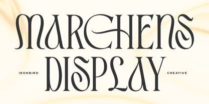 Introducing Marchens, a stylish and modern display serif, making it a versatile and elegant typeface. With a touch of vintage vibes, it will make your presentation looks amazing and sophisticated! You can use this typeface for logo, poster, event, or your social media post. Also support Multi Language and already PUA Encoded! Features: Uppercase & Lowercase Number & Symbol Multi language Ligatures Alternates PUA Encoded Thanks for purchasing and happy creating! Regards, Ironbird Creative
 - Troops Display by Genetype,
$21.00 Introducing Troops Display Typeface: Where Vintage Meets Bold! Inspired by the rugged charm of the past, this slab serif typeface exudes strength and character in every letterform. From striking headlines to impactful branding, Troops Display commands attention with its rough lines and distinctive serifs. Whether you're reviving a classic look or adding a touch of timeless flair, Troops Display is your go-to choice for designs that stand the test of time.
 - Boxer Punch by Putracetol,
$28.00 Boxer Punch - Soft Bold Font Boxer Punch - Soft Bold Font is a stylish and modern font designed to catch the attention of your audience. The font's unique design combines a soft bold shape with a cute sans serif, making it perfect for creating eye-catching designs. The idea behind creating Boxer Punch was to incorporate the concept of understated realism into the font. This is evident in the font's smooth and elegant lines, which make it perfect for a variety of design projects. The font is ideal for those looking to create a professional touch in their designs, while also maintaining a stylish and modern feel. Boxer Punch is an excellent choice for anyone looking for a font that is versatile and can be used in a variety of different contexts. It is perfect for sports-themed work projects, as well as branding, packaging, logo design, album covers, posters, and social media graphics. One of the standout features of Boxer Punch is its versatile OpenType features, including alternates and ligatures, which allow for even more creative freedom when designing with the font. Additionally, the font comes with uppercase and lowercase characters, as well as support for multilanguage, numbers, punctuation, and symbols. Inside the font package, you'll find three different file formats: Boxer Punch otf, Boxer Punch ttf, and Boxer Punch woff. This means that no matter what platform you are using, Boxer Punch will work seamlessly with your software. Boxer Punch is a font that is sure to make your designs stand out from the crowd. Its unique design and versatile features make it perfect for anyone looking to add a touch of elegance and style to their work. If you're looking for a stylish and modern font that is perfect for sports-themed work projects or a variety of other design projects, then Boxer Punch is the font for you. In summary, Boxer Punch - Soft Bold Font is a versatile and modern font that combines a soft bold shape with a cute sans serif to create a unique and stylish design. With its versatile OpenType features, multilanguage support, and uppercase and lowercase characters, Boxer Punch is perfect for a wide range of design projects.
 - Christmas Carol by Mans Greback,
$79.00 Christmas Carol is a classic typeface that embraces the holiday spirit. The flowing script's formal nuances evoke the joyful melody of your favorite festive tunes, making it an ideal choice for capturing the essence of familiar warmth and merriment. Infused with a touch of nostalgia, Christmas Carol brings a traditional yet beautiful aesthetic to your seasonal greetings and designs. Whether you're crafting invitations for a celebratory dinner or creating a banner for a winter wonderland event, this typeface wraps your words in the comfort of yuletide cheer. Using the Star version, use parenthesis characters ( ) [ ] { } to make surrounding stars. Example: (reindeer) [sleigh] Use underscore _ to make a swash, or multiple underscores to make them longer. Example: Santa Claus______ The Christmas Carol font family consists of four styles: Regular Script, the decorated Star 1 and Star 2, as well as a Xmas symbol version. Beyond its seasonal charm, Christmas Carol is crafted with precision and quality, offering a suite of OpenType features that include stylistic alternates, contextual ligatures, and additional flourishes, ensuring your creations are as unique as a snowflake. It supports a wide range of languages, covering the all Latin-based scripts, from the frosty tips of Scandinavia to the diverse cultures of Southeast Asia. Designed by Mans Greback, a designer renowned for his dedication to craftsmanship and detail, Christmas Carol is more than a font—it's a celebration of the birth of Jesus Christ.
 - Tempting by RGB Studio,
$19.00 Tempting Script is one of the Elegant script fonts that comes with a very beautiful character change, a kind of classic copper decorative script with a modern touch, designed with high detail to present an elegant style. Files Include : Basic Latin A-Z and a-z Numbers Symbols PUA Encode Multilanguage Support Tempting Script is interesting because the typeface is pleasing to the eye, clean, feminine, sensual, glamorous, simple and very easy to read, because of the many luxurious letter connections. I also offer a number of decent stylistic alternatives for some of the letters. This font perfectly made to be applied especially in logo, and the other various formal forms such as invitations, labels, logos, magazines, books, greeting / wedding cards, packaging, fashion, make up, stationery, novels, labels or any type of advertising purpose. Tempting has 349+ , including multiple language support. With OpenType features with alternative styles and elegant. The OpenType features don't work automatically, but you can access them manually and for best results your creativity will be required in combining variations of these Glyphs. I highly recommend using a program that supports OpenType features and the Glyphs panel such as Adobe Illustrator, Adobe Photoshop CC, Adobe InDesign, or CorelDraw, so that you can view and access all variations of Glyphs. Thanks and have a wonderful day, If you have any questions, please get in touch with us Don't forget to check out our other products.
 - Distefano Slab by Tipo,
$60.00 Designed from the perspective of a multi-purpose font family, comprehending the slab-serif and humanist-sans subtypes, the Distéfano typefaces were specifically developed and subsequently tested considering the needs of editorial products, for both print and digital media. Includes a comprehensive program where formal, style, thickness and slant attributes are especially indicated for the composition of text and headings in newspapers, journals and magazines. For that reason, in addition to the more traditional weights, others, ranging from Light to Black were added. The identity and systemic criteria of this font family doesn’t fall short on diversity of specific solutions, flair and quirks for each variant, especially noticeable in the contrast of the italics to the roman styles. The original drawings of Distéfano date back to 1983; embodied in pencil on paper, provided only the alphabetical characters and punctuation signs for Spanish, and the Sans Serif family. By digitalizing them, their possibilities of use were widened, the set of characters of each typeface were considerably completed considering the current requirements for the majority of the latin and germanic languages, and the slab-serif family was developed. This type family bears the name of the most notable argentinian designer, and it is a homage to his work, that influenced the youth of the 50’s decade of the 20th century, and especially to him, whom I have always recognized as a friend, and a teacher.
 - Distefano Sans by Tipo,
$60.00 Designed from the perspective of a multi-purpose font family, comprehending the slab-serif and humanist-sans subtypes, the Distéfano typefaces were specifically developed and subsequently tested considering the needs of editorial products, for both print and digital media. Includes a comprehensive program where formal, style, thickness and slant attributes are especially indicated for the composition of text and headings in newspapers, journals and magazines. For that reason, in addition to the more traditional weights, others, ranging from Light to Black were added. The identity and systemic criteria of this font family doesn’t fall short on diversity of specific solutions, flair and quirks for each variant, especially noticeable in the contrast of the italics to the roman styles. The original drawings of Distéfano date back to 1983; embodied in pencil on paper, provided only the alphabetical characters and punctuation signs for Spanish, and the Sans Serif family. By digitalizing them, their possibilities of use were widened, the set of characters of each typeface were considerably completed considering the current requirements for the majority of the latin and germanic languages, and the slab-serif family was developed. This type family bears the name of the most notable argentinian designer, and it is a homage to his work, that influenced the youth of the 50’s decade of the 20th century, and especially to him, whom I have always recognized as a friend, and a teacher.
 - Orelia Display by Orenari,
$20.00 Introducing our latest retro font design: Orelia Display font, a modern take on classic mid-century typography. Our simple retro font is designed to be humble yet eye-catching, with clean lines and simple shapes that evoke a sense of nostalgia while remaining relevant and contemporary. This font is perfect for projects that require a touch of retro charm without overwhelming the design. Its understated appearance makes it ideal for minimalist designs, logos, and branding, while the bold letterforms ensure that it still catches the eye. Crafted with care and attention to detail, our simple retro font is available in a variety of weights and styles, allowing you to customize your design and make it truly unique. Whether you're creating a retro-themed website, designing a product with a vintage twist, or simply want to add a touch of nostalgia to your work, our simple retro font is the perfect choice. With its timeless appeal and modern design, our simple retro font is sure to become a go-to choice for designers and creatives who appreciate the beauty of simplicity. Purchase now and add a touch of retro charm to your next project!
 - Koni by Anastasia Kuznetsova,
$17.00 Get to know the beautiful natural and neat font "Koni"! This beautiful neat retro sans-serif font with imperfect ink edges and a little sloppy shading is inspired by nature. This is a textured font in vintage style with capital letters. The letters here are clearly distinguishable, and interesting touches give it uniqueness. Eco-friendly fashion takes into account the health of consumers, the health of the planet. The font "Koni" is perfectly combined with any stylized graphics, watercolors, and also looks great on its own as part of a minimalist design. Play with letters to get different effects. Great for branding, invitation design, packaging design, quotes, label design and more. Font features: - A-Z; character set a-z; - 1 language (English); - numbers and punctuation marks, symbols. Fonts can be opened and used in any software that can read standard fonts, even in MS Word. No special software is required, and to get started. It is recommended to use it in Adobe Illustrator or Adobe Photoshop Made with love and magic ♡ Thank you for checking this out and feel free to write me a message if you have any questions! ~ Anastasia
 - Rafaella by Lián Types,
$37.00 To Rafaella, a menina dos cachos. We, designers, have grown accustomed to seeing that lowercase letters—not only in calligraphy but also in typography (1)—may be very playful and decorative. Almost every part of them can become a potential swash, ligature or decorative accolade (2) if the designer has some expertise regarding this matter. However, since we are living in an era that elevates the status of handcrafts, lettering has gained a lot of ground in different kinds of mediums, and with it there’s a sort of overuse of capitals. This may be due to the reason that lettering pieces need a high impact to convey their messages and many times why big capitals are the only solution. With this in mind, I started Rafaella: A font consisting entirely of capitals which go from unadorned to very decorative. Rafaella has ductus and forms vaguely based on the 1970s Bookman-like styled fonts. The presence and behaviour of serifs and ball terminals in this style were the perfect excuse to make really attractive aternates which the user can choose from the glyphs panel. The result is a font full of life. Able to be both very playful and formal due to its roman style which can be combined with (and between) a wide range of other styles of expressive scripts or geometric fonts with nice results (3). Also try Rafaella Shade Solo combined with Rafaella or Rafaella Bold for a layer effect to emphasize any given word or phrase. NOTES (1) See my fonts Erotica from 2013 or Dream from 2014. (2) Accolades is a wonderful word that refers to the ornaments made around the words in the spencerian style of calligraphy (3) Combinations often seen in different pieces of lettering were usually a contrast of style is wanted.
 - Coffee Beans Time by TypoGraphicDesign,
$9.00 The typeface Coffee Beans Time is designed from 2018–2022 for the font foundry Typo Graphic Design by Manuel Viergutz and Annelena Grascht as a graphic design and photography project. The display font based on the original coffee beans and create a dingbat pattern. 3 font-styles (Dingbats, Mix, Coffee Ground) with 304 glyphs (Adobe Latin 2) incl. decorative extras like icons, arrows, dingbats, emojis, symbols, geometric shapes (type the word #LOVE for ♥︎ or #SMILE for ☺ as OpenType-Feature dlig) and stylistic alternates (2 stylistic sets). For use in logos, magazines, posters, advertisement plus as webfont for decorative headlines. The font works best for display size. Have fun with this font & use the DEMO-FONT (with reduced glyph-set) FOR FREE! ■ Font Name: Coffee Beans Time ■ Font Styles: 3 (Dingbats, Mix, Ground) + DEMO (with reduced glyph-set) ■ Font Category: Display for headline size ■ Glyph Set: 304 glyphs (Adobe Latin 2) incl. extras like icons (decorative extras like arrows, dingbats, emojis, symbols) ■ 93 languages: Afrikaans Albanian Asu Basque Bemba Bena Breton Catalan Chiga Cornish Danish Dutch English Estonian Faroese Filipino Finnish French Friulian Galician German Gusii Indonesian Irish Italian Kabuverdianu Kalenjin Kinyarwanda Luo Luxembourgish Luyia Machame Makhuwa-Meetto Makonde Malagasy Manx Morisyen North Ndebele Norwegian Bokmål Norwegian Nynorsk Nyankole Oromo Portuguese Quechua Romansh Rombo Rundi Rwa Samburu Sango Sangu Scottish Gaelic Sena Shambala Shona Soga Somali Spanish Swahili Swedish Swiss German Taita Teso Uzbek (Latin) Volapük Vunjo Welsh Western Frisian Zulu ■ Design Date: 2018–2022 ■ Type Designer: Manuel Viergutz und Annelena Grascht