10,000 search results
(0.046 seconds)
- Calling Code by Dharma Type,
$- Calling Code — very nice monospaced font — 1. is a monospaced font family for coding and tabular layout. 2. simply consists of 4 style, Regular, Italic, Bold and Bold Italic. 3. is ready in both OpenType and TrueType formats. 4. has slightly condensed width for more useful space. 5. has good distinguishability and legibility and cute curly tails. 6. brings a fresh sensitivity to boring old existing monospaced fonts. You can try Regular style for free.
 - Errorism by Gassstype,
$25.00 Errorism - Original Handmade Brush Font is an Authentic brush Font that is written casually and quickly. Letters are made with Procreate. Then trace down into vector format, and carefully crafted into a typeface. That is why Errorism has a rough, authentic, and strong characteristic more natural look. You can activate Ligature OpenType panel. Errorism Perfect for designs, branding projects, Logo design,Quotes product packaging and another Project that require cool strong brush font.
 - Pixter by Matt Grey Design,
$12.99 Pixter straddles the lines between the extreme forms of grid based pixel fonts, and more conventional grotesque fonts. Its array of styles create a palette of textures to work with multiple scenarios, from large format display to oversized passages of copy. Inspiration for Pixter initially grew from old computer bitmap fonts, but branched out into Swiss and Dutch graphic design, such as the graphic work of Josef Müller-Brockmann and typography of Wim Crouwel.
 - Callingstone by Heinzel Std,
$12.00 Callingstone is an elegant and modern sans serif font. Fall for its ravishing style and use it to create gorgeous wedding invitations, beautiful stationary art, eye-catching social media posts, and much more! This font is PUA encoded which means you can access all of the amazing glyphs and ligature with ease! Features : Callingstone Regular, sans serif font All Caps, Numerals and more punctuations. Multilingual support for various languages Open Type Format
 - Hyugos by Fateh.Lab,
$20.00 Hyugos is a condensed type of font that has a different character from the previous condensed font, Hyugos has a strong but soft character, with a cheerful and fresh theme, supported by 24 choices of font types. Hyugos is able to answer your current needs who are designing something great. Its weight is superior in posters, social media, headlines, magazine titles, clothing, large print formats - and wherever you want to see it.
 - Salute SS by Sensatype Studio,
$15.00 Salute is a Modern Vintage Beauty Font A new font that we created special for branding needs, with unique characters and awesome alternative characters are ready to add value of your brand. It so nice to leverage designer or product owner that need solutions to make their design look more beauty and modern. And specially for Salute font, We prepared any swash and any alternate characters to help you create unlimited variations for your creative needs. Salute Modern Vintage Beauty font ready with: Any options to get creative variations (combination of Alternate and Swash) Preview as a inspirations that you can do with Salute font Ready with Lowercase and Uppercase characters Wish you enjoy our font. :)
 - Raqmi Monoshape by Arabetics,
$39.00 Raqmi Monoshape is a simplified version of the Raqmi font family with unified (non-varying) shapes. This font family supports all Arabetic scripts covered by Unicode 6.1, and the latest Arabic Supplement and Extended-A Unicode blocks, including support for Quranic texts. It includes two weights: regular and light, each of which has normal and left-slanted Italic versions. The script design of this font family follows the Arabetics Mutamathil style utilizing varying x-heights. The Mutamathil type style utilizes only one glyph per Arabic Unicode character or letter, as defined by the Unicode Standards. Raqmi Monoshape includes the required Lam-Alif ligatures in addition to all vowel diacritic ligatures. Soft-vowel diacritic marks (harakat) are selectively positioned with most of them appearing on similar high and low levels—top left corner—, to clearly distinguish them from the letters. Tatweel is a zero-width glyph.
 - Tanger Serif by Typolar,
$72.00 Inspired by New Transitional and Egyptian fonts, Tanger Serif has elements of a sturdy work-horse text face and finely detailed headline font. A wide variety of widths and weights support many text sizes. Typically Narrow is used in headlines, Medium in body and Wide in smaller print. Nothing is predefined, though. By combining the right widths with the right weights this traditional approach can easily be challenged. Let’s take an oversized (over 10 pt) body copy for instance. In conjunction with using a bigger size to enhance readability, a narrow and slightly lighter weight will save space and brighten text color. Tanger Serif Narrow is a slim normal rather than a condensed face. As an Open Type “Pro” font each weight includes an expanded character set, small caps, old style figures, tabular figures, ligatures, fractions etc. All these are easily accessible through OpenType features.
 - Nourishe by Arterfak Project,
$12.00 Nourishe is our our brand new minimalist font, made with the combination of duo-line. A sans serif font which is suitable for branding and editorial design. As we know, sans-serif nowadays becomes a part of the new trending of graphic design in typography. Nourishe is a great choice to make your design more elegant with minimalist strokes and feminine curves. This font family has OpenType features like some alternates to gives you an option. Also complete with some swashes that you can apply to get more beautiful looks. Nourishe has 2 styles : - Inline: Suitable for headline in a poster, flyer or label. the empty space in every stroke give the attractive-typographic taste - Normal: Recommended for an editorial like sub-headline, quotes, and body text. Nourishe includes : - Uppercase - Lowercase - Symbols - Numerals - Punctuation - Multilingual accents - Stylistic Alternates - Swashes Well, thank you for visiting and hope you like it!
 - 1805 Jaeck Map by GLC,
$42.00 This font is mainly inspired from the engraved characters of a German Map depicting Germany's roads and parts of surrounding lands, edited in Berlin probably in the end of 1700's. The engraver was Carl Jaeck or Jaek (1763-1808). The Map was bought by the French napoleonic general Louis Pierre Delosme (1768-1828) probably during the Napolenic campaign against Germany, circa 1805 or at least 1806, his sole staying in Germany. The font (with two styles, Normal and Italic)is containing standard ligatures and a few alternative characters. It is a "small eye" or "Small x-eight" font, as the Maps' characters are most often very small (some Italic lower cases of the map are 1mm hight, upper cases 2mm) The standard English characters set is completed with accented or specific characters for Western (Including Celtic) and Central European, Baltic, Eastern Europe and Turkish languages.
 - The Sunshine Script by Lettersiro,
$2,999.00 The Sunshine Script is a beautiful script. This is very suitable for beautiful logos, posters, vintage signage, magazines, photography, vintage lettering, and any other design project. The sunshine script comes with a lot of alternates and ornaments.
 - Fancy by Arodora Type,
$15.00 Fancy Font Family is a font that I have been working on since 2012 and I have been trying to complete it for a long time. Thanks to its wide lines, you can use it easily in your paragraphs and poster designs. In fact, the purpose of using a font is entirely related to your imagination and your originality. The Fancy Font Family adapts to any design format you need and does not let you down.
 - Glodok by Sudtipos,
$39.00 Glodok is a single-weight display typeface. It is bold, heavy and fun to play around with. It’s eye catching but also blends well when in use. It is retro-inspired and strikes a nice balance between formal and playful. The name itself comes from the oldest Chinatown in Jakarta that is also considered the biggest in Indonesia, the place from where the designer took many inspirations.
 - Charminette by Vanderfont,
$24.00 Released in November 2003, Charminette is the Collection's first face with a consistent baseline and x-height. Intended as a display face to be used large, it's also surprisingly readable at smaller sizes. Charminette asks to be considered for invitations to formal parties and weddings, any occasion when proper manners are called for. Or, when proper manners need to be subverted. A toast to civility!
 - Sovereign Display by G-Type,
$46.00 Sovereign Display is a decorative all caps headline face in one style with small caps on the lower case positions. Thin horizontal crossrules underpinned by a heavier solid shadow give the typeface a prominent three dimensional appearance and an air of formal distinction. Ornate and iconic, Sovereign Display is perfect for certificates, manuscripts, titling or anything requiring a more sombre, elaborate or engraved slab serif style.
 - Perigord by Scriptorium,
$18.00Perigord has mixed origins. It was inspired by Gutenberg’s capitals and by lettering developed by German designer Ernst Bentele, but its calligraphic antecedents go back to French initials of the Carolingian period. The result of this is a formal, attractive and antique look which we hope you'll like. The full version includes alternate forms for many of the letters, as well as numbers and punctuation. - Magica by K-Type,
$20.00 MAGICA is a book and display face that is both distinctive and legible – clear letterforms and a generous x-height make Magica a good choice for text or titles. The typeface has elegantly chamfered serifs and a confident, vivacious character that is equally suited to formal and informal usage. Magica is available in three weights – Regular, Medium and Bold – each supplied with a free italic.
 - Quintessential Pro by Stiggy & Sands,
$29.00 Our Quintessential Pro is based on the calligraphic lettering style known as the Italic Hand. As speed became more essential in writing hands, styles became less formal and more relaxed. Classic, clean, and casual, Quintessential fits a lot of design uses - hence its name. The SmallCaps and extensive figure sets only work to further expand the usefulness of the typeface across a wider breadth of applications.
 - Aether Rain by Fenotype,
$12.00 Aether Rain is an elegant modern script family that fits both casual and formal use. Aether Rain includes basic latin alphabets, numerals and punctuation. Aether Rain is equipped with Standard Ligatures that work automatically and it also has Stylistic Alternates (OpenType feature) for each character - and scripts are also PUA encoded so you can access the characters also with Silhouette Studio, Cricut Design Space.
 - Laura by ITC,
$29.00Laura is the work of British designer Tony Watson, a brush style typeface with an effective three-dimensional look. The forms are a little more formal than those of many other brush style typefaces but this only adds to its flexibility. Capital and lowercase letters should be set closely. Laura is well-suited to a variety of uses, wherever a strong, eye-catching typeface is needed. - Brass Stencil JNL by Jeff Levine,
$29.00 Brass Stencil JNL takes its place amongst the many retro stencil fonts designed by Jeff Levine, and was inspired by a set of vintage brass stencils spotted for sale in an online auction.
 - Retrochips by Almarkha Type,
$18.00 Introducing Retrochips Fonts with a vintage touch reminiscent of past designs, making your design look unique and classic. Retrochips has 2 variants, Regular and Line, as a perfect blend in your graphic design.
 - Love Affair by Gleb Guralnyk,
$12.00 Love Affair is an art nouveau vintage style font. It's an old-school typeface, perfect for creating some classic lettering compositions. Love Affair includes lots of ligatures to create more organic text shape.
 - Skater Girl by Gleb Guralnyk,
$15.00 Hi! Presenting a cute pin-up style font named Skater Girl. It has a modern and vintage look at the same time. Also few ligatures and alternate glyphs are available in this typeface.
 - Annecy by Luke Thompson,
$25.00 A font family inspired by France's Lake Annecy, vintage travel posters, stamps, bars, and restaurants. Decorative enough to feel special, bold and simple enough to be suitable for a wide variety of applications.
 - VVDS Sunshine Bridge by Vintage Voyage Design Supply,
$12.00 Sunshine Bridge is a retro modern font family, featuring a retro brush script with an artistic modern bold sans serif. They complement each other perfectly. You can use the Sans as main and Script as additional, or vice versa. This family gives you a modern look with a vintage mood. So, you can use it both as in vintage-look projects - Beer bar or Brewery logo etc, or as Modern magazine headline or any modern print. It includes a lot of OpenType Features in Script with Swashes and Alternates to give you a little more hand-touch look. The family includes: Clean and Pressed versions Well Kerned Multilingual Support OpenType Features Modern / Vintage look
 - Bahella Script by Juncreative,
$15.00 Introducing Bahella Script, a bold and vintage-inspired script font that evokes a sense of nostalgia. This typeface is well-suited for a wide range of design projects, such as creating logos and logotypes, designing t-shirts, vintage badges, and retro quotes, as well as branding, packaging, and poster design. Additionally, Bahella Script is PUA encoded, providing easy access to all of its glyphs and ligatures, making it a convenient choice for designers looking to add a touch of vintage elegance to their work. FEATURES Alternate Characters Uppercase and Lowercase letters Numbering and Punctuations Multilingual Support Works on PC or Mac Simple Installation Support Adobe Illustrator, Adobe Photoshop, Adobe InDesign, also works on Microsoft Word
 - Berringer by Hustle Supply Co,
$20.00 Introducing Berringer A Vintage Type Family Berringer is a vintage sans serif family including Textured, Rough & Clean versions as well as Oblique versions of each. Click on the "View All Glyphs Below" image to see every glyph included in each font file. Berringer includes western european characters. Berringer is a versatile sans serif typeface that gives a vintage aesthetic. With it's unique & distinct characteristics it sets itself apart, while also maintaining a strong timeless appeal overall. Rough & Textured versions allow Berringer to be a complete set without the need for 3rd party effects to create a printed look, eliminating a step in the process of finalising your piece. Thank you for checking this out! Jeremy
 - Zin Display by CarnokyType,
$46.00 Zin Display is a contemporary typeface designed for various situations of typographic usage. Characteristic feature is a large x-height and balance between neutral construction of letters (strictly vertical axis), dynamic open forms (opened terminals) and sharp instrokes, outstrokes and serifs. Another typical feature is a visually narrower connection between stems and strokes. The complete font family consist of three width proportions (Normal, Condensed and Extended). Every sub-family has 5 weights, ranging from Light to Black with matching Italics. Zin Display can be effectively used especially for display typesetting but works for longer text as well. It can be used especialy in magazine layouts and editorial design, as well in advertising typography, orientation systems, corporate identities and many other situations. Zin Display is a member of the Zin super family, which also includes Zin Sans, Zin Slab and Zin Serif fonts.
 - DT Partel by Dragon Tongue Foundry,
$9.00 DT Portal: This stylised, partially serifed font, made with a slightly rounded square form, may have been inspired initially by old cathode ray tubes and computer screens. Although not intended to be purely a ‘tech’ font, it can have a strong tech feel to it. More suited to being a headline font than body text. It also appears to have a monospaced look to it, since most letters, (other than letters like ‘i, l and t’), do have the same width. There is some automatic contextual shape adjustment happening in places, to avoid taking up too much space, so contextual ligatures should be turned on. As is the case with most of my fonts, when given the choice, ‘metric’ spacing should be used in preference to ‘optical’. Initially this font was going to be called ‘DT Portal’, because its form was similar to that of a window or doorway. But due to other fonts already having that name, I chose to rename it as ‘DT Partel’, for no reason other than it is only a very small change visually.
 - Core Sans CR by S-Core,
$20.00 Core Sans CR family is a rounded version of Core Sans C; a part of the Core Sans Series, such as Core Sans N, Core Sans M, Core Sans E, Core Sans A, Core Sans D, Core Sans G, Core Sans R and Core Sans B. Core Sans CR is inspired by classic geometric sans (Futura, Avenir, Avant Garde etc.). It is based on geometric shapes, like near-perfect circle and square. It has a much higher x-height (height of lowercase letters), an effect which promotes readability especially at small print sizes. The Core Sans C Family consists of 9 weights (Thin, Extra Light, Light, Regular, Medium, Bold, Extra Bold, Heavy, Black) and Italics for each format. Core Sans C supports complete Basic Latin, Cyrillic, Central European, Turkish, Baltic character sets. Each font includes proportional figures, tabular figures, oldstyle figures, numerators, denominators, superscript, scientific inferiors, subscript, fractions and case features. Core Sans C is an ideal font family for use in magazines, web pages, screens, displays, and so on.
 - Gokil by Eotype,
$12.00 Gokil is an unique bold display font with rounded edges. You can use this font in retro, vintage, and hipster designs. This font is perfect for a variety of projects, such as branding, poster displays, logo designs, magazines, headlines, stickers, and more.This font also has alternate and ligature features.
 - Hollie Mally by Good Java Studio,
$500.00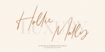 Hollie Mally handwritten font is a natural & modern script font. It's perfect for logos, invitations, stationery, wedding designs, social media posts, advertisements, product packaging, product designs, label, photography, watermark, special events or anything. This font includes ligatures and Multilingual support. What are the advantages of Hollie Mally? - Very simple installation - PUA Encoded open - Very great for branding, logotype, handlettering, invitations, or fashion branding. - Multilingual Support - Support for Adobe Illustrator, Corel Draw, Indesign or Adobe Photoshop - Support for MAC or WINDOWS
 - ITC Johann Sparkling by ITC,
$29.99ITC Johann Sparkling is the work of Austrian designer Viktor Solt, a perfect imitation of the handwriting of an educated person of the 18th century. ITC Johann Sparkling is intended to close the gap between highly formal copperplate scripts and the scribbled look of 'true' handwriting," says Solt. "I am not very interested in highly formal and perfect calligraphy, but rather in quick, personal-looking scripts. Usually I start with some historical samples in mind, but I do not try to copy these sources. Instead, I incorporate them into my own handwriting. It takes up to two weeks, and many sheet of paper, before the respective script becomes my own. Of course, this would not be an economic approach for individual lettering jobs, but I can conserve the custom script for future use by digitizing it." ITC Johann Sparkling should be used in fairly large point sizes and its capitals only as initials. - Homeplate by Alphabet Agency,
$10.00 Homeplate is a classic serif display font. The font is designed for use in vintage themes and works particularly well in bar, steakhouse, rodeo and country music themes. The font was originally developed for use in branding in baseball teams. The font is an all capitals font and includes 128 characters.
 - Silfer Queen Script by Soft Creative,
$18.00 Introducing Silfer Queen Script vintage calligraphy font. Silfer Queen Script is a classic calligraphy font. This is a classic thin font with an italic style. Here you will get a beautiful classic font. This font is available in several modern swirls that can make your work look elegant, sweet and perfect.
 - Tuxedo Stencil JNL by Jeff Levine,
$29.00 The sheet music for the 1934 tune "Two in A Dream" had the title hand lettered in a bold type style that utilized some stencil and some solid lettering. Following through on the stencil portion of the design, Tuxedo Stencil JNL was created in both regular and oblique versions. The 1930s were the era of elegant supper clubs and night spots, and it was not unusual to find gentlemen all decked out in formal wear for an evening on the town, hence the font's name.
 - A La Nage - Personal use only

- Lanford by Ironbird Creative,
$10.00 Lanford is a powerful display typeface inspired by vintage type with carefully crafted. This typefaces is perfect for people looking for vintage aesthetic. Feature : Uppercase Lowercase Numerals & Punctuations Multilingual If you have any questions, please contact (ironbirdcreative@gmail.com)
 - Knocked Around - Unknown license


