10,000 search results
(0.03 seconds)
- Friendly by Positype,
$29.00 Friendly is an homage to Morris Fuller Benton's adorable Announcement typeface. It is not a strict interpretation, digital revival or reverent reproduction of the original letterforms… but I would be remiss and shady to not acknowledge the letterforms that inspired this typeface. If you are looking for a more accurate 'scanned revival' I would recommend searching "Announcement" on MyFonts. As stated earlier, it is an homage to the original letterforms of the typeface but takes a great bit of freedom tightening the construction up in order to loosen up the movement of the variant letterforms to allow a great deal of usable personality. I enjoy stating this dichotomy… "loosen up to tighten up the forms" and vice versa. It seems counterintuitive or silly but by allowing the letterforms to normalize, I felt more comfortable going back and adding rather indulgent personality. Infused with stylistic alternates, swashes, titling, many many contextual alternates, 9 stylistic sets and 2 stylistic sets with wordmarks, the typeface became far more 'friendly' for me… how could it not? With so many loops, swashes and typographic indulgences, it was bound to be fun. The more elaborate and 'overdone' Friendly got, the more I wanted to slant it. Here's where my thinking differs from MFB's original. I like slanted romans… especially ones with long ascenders, but I do not like much of a slant. It has to be the lettering person in me. It's hard for me to do a completely upright serif and not pair it with an angle, but I did not feel Announcement's 'Italic' offered much and the actual slant needed to be far less. If it's not an italic, I prefer the letters to slant with an angle equivalent to the thickness of the vertical stroke. The Slanted version of Friendly is set at 3.6 degrees, is quite subtle, and very fitting for me. You will find that most characters have a contextual, stylistic, swash and titling alternate assigned to them and some have an echoed alternate to the swash and titling options if the stylistic alt has been selected in tandem. Additionally, all of these are accessible in the glyph palette directly from the base glyph typed or through selecting options through the Stylistic Sets 1–9. Stylistic Sets 10 & 11 are a little different. They are actually configured as complex majuscule ligatures… a result of me getting carried away. Other features like a default old style numeral set and coordinating glyphs have been produced along with case support, ordinals, and more have been added to make it more relevant for contemporary use.
 - Phone Pro by Tamar Fonts,
$50.00 "Relation Between Typology and Type Design" 'PRISTINE'; this font is—neither beautiful nor ugly, neither vigorous nor weak, neither traditional nor modern, neither serif nor sans serif, neither script nor printable, neither a text font nor a display font—it is rather all of the above, which makes it a more versatile typographic tool—[handwritten] characters that are well-suited for a wide variety of applications—from editorial design, [friendly] greeting cards... to branding, advertising, publicity and digital. Each glyph design combines its unique shapes and stylish ink-traps with parabolic curves. Each glyph design has been treated as an 'individual character'—the way I would treat a breathing, living, vulnerable and courteous human being; looking after each and every character as if it was my only child — bringing to light the authenticity and uniqueness of each individual, as well as my objective to bring about peace and harmony between them all as a whole. Designed with the intention of harmonizing between four scripts — Latin, Cyrillic, Greek and Hebrew; the whole family has a comprehensive set of characters—in addition to the Latin letters, the Phone typeface also has a full set of characters for Vietnamese, partially extended Cyrillic, Greek and Hebrew (sold separately). The t_t ligature is something unique to Phone, as well as the t_z ligature, among others and extras. A distinctive trait of the Phone typeface, is a high x-height combined with relatively short ascenders. The Phone typeface is in a way evoking the feeling of some Gaelic font and of the [Egyptian] Papyrus font (by Chris Costello, though, not being based on neither of those), having an exotic and an exquisite look, under the category of "Soft Fonts & Friendly Faces". Copyright Tamar Fonts/Hillel Glueck 2021 ALL RIGHTS RESERVED Any unauthorized distribution of my work is strictly prohibited, and will be prosecuted; do the right thing, and do not participate in the piracy of my typefaces; if you appreciate my work, then please pay for it and help me prosper — thank you!
 - Apricot by Canada Type,
$24.95 A. R. Bosco made Romany for ATF in 1934, when there was much demand for script types in advertising and publishing. It was the high times of Speedball lettering, and a casual script in that fashion was naturally very welcome. It became an instant hit and was used widely for a good part of the 1930s and 1940s. Apricot is not only a revival of Bosco's work, but also a major expansion of it. It contains very effective solutions to the many problems presented by the original metal type, which had to always be tracked too wide because of the forms of some of its letters. Solving these problems was not an easy task. A comprehensive set of alternates was designed to give the user the ability to replace some forms in certain uses, and a large set of two-, three-, and even four-letter ligatures was added to solve the awkwardness of some of the more common letter pairings. The resulting work is quite delightful, especially for those who like to take advantage of OpenType technology. Apricot is the rarest kind of script in digital type these days, the kind that is upright, round, bold, feminine, and distinctly young in appearance. A birthday cake for a teenage girl can certainly benefit from these letters. So can greeting cards, family show posters, diary covers, party invitations, women's shirts, toy packaging, celebration literature, and almost anything that needs that special touch of shiny happy youth. Apricot is available in all common font formats. The Postscript and True Type versions come in 4 fonts, which include one for alternates and two for ligatures alongside the main font. The OpenType version is one font that contains more than 380 glyphs and all the necessary programming for the palettes of OpenType-supporting applications. If you liked Canada Type's hugely popular font Dominique, you will love Apricot.
 - Nipsey by Putracetol,
$28.00 Introducing Nipsey - a unique display font inspired by vintage albums and posters from 1970s music bands. With its classic typeface and groovy impression, Nipsey brings a fun and retro vibe to your designs. What sets Nipsey apart is the combination of various alternates, such as swashes, stylistic sets, stylistic alternates, contextual alternates, and ligatures, making this font even more distinctive and versatile. Nipsey is perfect for a wide range of display purposes, including album covers, posters, labels, t-shirts, apparel, signage, quotes, logos, greeting cards, logotypes, and more. Its eye-catching design adds a touch of nostalgia and personality to any project, making it stand out in a crowd. To access the alternative characters in Nipsey, you can use OpenType savvy programs such as Adobe Illustrator, Adobe InDesign, Adobe Photoshop, Corel Draw X version, and Microsoft Word. The OpenType features allow you to easily switch between uppercase and lowercase letters, as well as apply alternates and ligatures to create unique and customized lettering compositions. In your zip package, you'll find the Nipsey font files in otf, ttf, and woff formats, providing versatility for different design projects. The font includes uppercase and lowercase letters, numerals, punctuation, and symbols, ensuring that you have all the elements you need for your designs. Nipsey also offers multilingual support, making it accessible for designers around the world to create designs in different languages. Whether you're designing for English, Spanish, French, or any other language, Nipsey has got you covered. If you have any questions, feedback, or comments, feel free to reach out to PutraCetol Design Studio via PM or email. The team is happy to assist you in your creative endeavors. In conclusion, Nipsey is a unique and versatile display font that brings a fun and retro vibe to your designs. With its alternative characters and multilingual support, Nipsey offers endless possibilities for creating eye-catching designs for various display purposes. So, let your creativity flow with Nipsey and elevate your design projects to the next level! Thanks for choosing Nipsey from PutraCetol Design Studio. Happy Creating!
 - Free Money by Jeremy Woods,
$10.00 Free money is an organic-looking display font. It was inspired by gig poster art, alternative comics and b-grade movies.
 - Pirkey Avot MF by Masterfont,
$59.00 Inspired by old Haggada manuscripts, the geometric forms with rounded edges stand out in signage or book jackets - you name it.
 - Lupulus by W Type Foundry,
$25.00 Lupulus is a typeface inspired by the works of german expressionist artist and type designer Rudolf Koch. Drawing inspiration from types such as Neuland and Kabel for some of its features, it possesses a gothic and contemporary essence. Its constant rhythm; strict, solemn, yet boldly exuberant keeps it clean and functional. Its expressiveness allows for a wide range of uses: short texts, headlines, posters and branding, for which it is exceptionally well-suited. Lupulus consists of 17 fonts: 8 weights, 8 italic variables and one free ornamental variable. Featuring alternate characters, it is a comprehensive and versatile set built to suit your design needs. It comes fully equipped with Opentype for any and all technical requirements. Learn about upcoming releases, work in progress and get to know us better! On Instagram W Type Foundry On facebook W Type Foundry wtypefoundry.com
 - Ukiyo Mind by Kitchen Table Type Foundry,
$15.00 By chance I stumbled upon an unfinished font in my fonts folder (while looking for something else). It had a stupid working name, but when I opened it, the font looked really nice! I have no idea why I never finished it. I renamed it Ukiyo Mind, because the font looked a bit like Japanese brush strokes. Ukiyo is a Japanese term which roughly translates as ‘the fleeting/transient world’. In mediaval Japan, the word was associated with Buddhism, but later it was used to describe the urban lifestyle and the pleasure seeking aspects of it. Nowadays it refers to a ‘living in the moment’ state of mind. Ukiyo Mind is a really nice brush font, which I probably made using Chinese ink and a brush. It comes with extensive language support and a set of alternates for the lower case glyphs.
 - Elaina by Laura Worthington,
$39.99 Elaina Family Elaina Script is a tidy, precisely penned script face — perhaps closest of all of Laura’s faces to her own handwriting. In its standard form, with its sober x-height and restrained ascenders and descenders, it’s a pleasure to read at smaller display sizes and in short blocks of text. It is accompanied by an unconnected version of the lowercase characters, its stylistic alternates, and a companion font, Elaina Semi Serif, useful for body text and complementary contexts. Of course, like most of Laura’s typefaces, it includes hundreds of swashes, alternates, and ligatures, for attention-getting effects at large sizes and in brand identities. Elaina Script Elaina Script is a tidy, precisely penned script face — perhaps closest of all of Laura’s faces to her own handwriting. In its standard form, with its sober x-height and restrained ascenders and descenders, it’s a pleasure to read at smaller display sizes and in short blocks of text. It is accompanied by an unconnected version of the lowercase characters. Of course, like most of Laura’s typefaces, it includes hundreds of swashes, alternates, and ligatures, for attention-getting effects at large sizes and in brand identities. Elaina Semi-Serif Elaina Semi Serif was designed to complement Elaina Script. Both faces share calligraphic roots and typographic and allow them to mix harmoniously. Its modulated strokes and subtly flared terminals give it a humanist feel that adds warmth and positivity to any setting.
 - FS Rosa by Monotype,
$52.99 FS Rosa is a free-spirited and optimistic serif typeface – reminiscent of those used on fanzines, film sequences and book covers of the 1970s, such as Cooper and Windsor, it has a laid-back nature with a touch of rebellion. It also reminds of type used in colourful protest graphics by nun-turned-designer Corita Kent, and its personality is akin with brands like Whole Foods - positive rather than preachy. While unconventional, it’s sensible enough to work perfectly for socially conscious brands, magazines, websites and campaigns that want a fairer and more responsible world. Hand-drawn digitally, FS Rosa is warm and open-minded – its irregular letterforms are rounded, with soft terminals, a large x-height and wide apertures. But it is also quirky and eclectic, with irregular shapes – its short ascenders and descenders have slanted serifs, its uppercase forms have unusually low crossbars and the letters are filled with oddities and surprises. The typeface looks to stand out against a sea of homogenous, geometric sans serifs, and celebrates beauty through imperfection. It comes in five weights of Thin, Light, Regular, Bold and Black. The heavier weights make an impact and are great for loud, headline statements. The Regular weight is functional, balanced and robust for text, and the lighter weights have an elegance and contemporary beauty. FS Rosa is eclectic yet with its soft roundness, also positive and progressive. Its name, inspired by the phrase “rose-tinted glasses”, reflects its optimism.
 - SirucaPictograms - 100% free

- China Town - Unknown license

- Junkyard by Victory Type,
$-Inspired by the local city dump is Junkyard, a fat, chunky, boxy and delightful font made by Victory Type. It's surprisingly easy and enjoyable to read! It adds pizzazz to any document - Estencil by RG Hunt Type Design,
$15.00 Estencil was inspired by the use of stencil fonts used as text knocked out of steel plates. Not suitable for long text, it works well for display, signage, and wayfinding applications., maintaining legibility from a distance. It includes the Western European character set, with 251 glyphs.
 - ITC Newtext by ITC,
$40.99ITC Newtext was designed by Ray Baker, who created a well designed and legible typeface and built into it every design refinement which could optimize its usefulness. The expanded shapes are generous and legible and the economical vertical set results in more lines to the page. - Eccentric by Solotype,
$19.95Here's another old-timer that needed a lowercase, so we drew one. Originally issued as a caps-only type by The American Type Founders Company about 1898, this font found its way into Craftsman period design. It was the inspiration for Galadriel, a dry transfer sheet alphabet. - Cat Blvck by The Design Speak,
$100.00 Another experimental typeface by Marshall. This typeface is almost difficult to read but that is almost the point. It features words or almost enclosed circles as well as thick strokes around the letter forms. The font has an mysterious edge while providing shock to whomever views it.
 - Raspberry Script by Mans Greback,
$59.00 Raspberry Script is a tall and characteristic script typeface. It supports hundred of Latin languages, and has several ligatures to maximize the letters' flow. The font is designed and created by Noah Kinard and Måns Grebäck. Also check out its sister fonts: Blueberry Script and Strawberry Script.
 - Wirey by Joshua Conley,
$22.00 Wirey is an uppercase hand drawn font inspired by bent copper wires. It is designed for headers, titles and posters where fonts need to be big and unique. Wirey is styled in a way that looks hand drawn but also keeps a simple, professional element within it.
 - Carpellon by Creativemedialab,
$16.00 Carpellon is inspired by tattoo scripts, and features nice curves to represent the combination of art and beauty. It is unique and easy to read, and includes both regular and ornament styles. It is best for use with gothic art themes, tattoo lettering, posters, logos and more.
 - Hallymoon by Hikhcreative,
$19.00 Hallymoon is a monoline display font script, a typeface inspired by old neon signs. Its very suitable to use on many of your design projects such as Signage , Book Covers, Invitation, Packaging, Logotype and more. I made this with love for your project. Hope you enjoy it!
 - Arundel Sans by Rocket 88 Foundry,
$35.00 The design of Arundel Sans was inspired by Arundel Castle in West Sussex, England. It has a strong vertical emphasis, with a solid, geometric feel. It is a quirky mix of medieval and modern. Arundel Sans is ideal for use as a distinctive headline or display font.
 - Blueberry Script by Mans Greback,
$59.00 Blueberry Script is a bold and characteristic script typeface. It supports hundred of Latin languages, and has several ligatures to maximize the letters' flow. The font is designed and created by Noah Kinard and Måns Grebäck. Also check out its sister fonts: Raspberry Script and Strawberry Script.
 - Fragment by Ali Güzel,
$9.00 The font is designed inspired by the pieces. While it is being designed, it is aimed to give a sharp feeling and look balanced rather than being legible. So on logos, T-shirts, and all things printed, this font can be used if the content is appropriate.
 - Mainstream by Mans Greback,
$59.00 Mainstream is a graffiti handwriting font, designed created by Måns Grebäck. It is vivid, artistic and contains a wide range of characters. Write underscores after any word to make an underline. Example: Mainstream_ Write * after any letter to put a crown on it. Example: Mainstre*am
 - Hey Baby Script by Bosstypestudio,
$13.00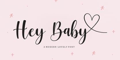 Hey Baby Script is a Chic and Lovely Calligraphy font, described by a Love touch with natural handwritten style, perfect for your favorite projects. Fall in love with its incredibly distinct and timeless style and use it to create spectacular designs! What's Include : Multilingual Support Thank You,
 - Korsel by Cocodesign,
$10.00 Korsel handwritten font script display. This font was designed by handwriting, and it has a modern and unique forms of calligraphy, the writing style is very natural. Belgia has a very unique style of calligraphy, it is very suitable for use in the work of modern design.
 - Paisu Howard by Realtype,
$17.00 Paisu Howard is a Comics fonts was creating with a brush pen. Friendly-looking, it is inspired by the lettering of the comics typeface with an adventurous and humorous font-style. It is chunky, marked and brush textured. This fonts created to make an freestyle of design.
 - Diagonal ND by Neufville Digital,
$29.60 Inspired by Barcelona’s Diagonal street, Antoni Morillas designed Diagonal ND in 1970. A sans that alternates straight and inclined lines, with a strong rhythm and its own personality. Its range of possible usages are very varied: signage, headlines, packaging, etc. Diagonal is a Trademark of BauerTypes SL
 - Sez Who Sez You by Comicraft,
$29.00 Hand-crafted by Richard Starkings in the classic style of Will Eisner's The Spirit, this free and easy font made its debut in the pages of...The Spirit! Never let it be said that those awfully nice chaps at Comicraft don't think about what they're doing!
 - Organic Weekend by Bogstav,
$14.00 It is monospaced and organic. Two words that often not goes hand in hand, but in this case it does. You have 6 different versions of each letter to choose from, or just let the Contextual Alternates do the job by automatically cycles as you type.
 - Amient by Piotr Łapa,
$30.00 Amient is a modern, experimental, display typeface inspired by contemporary typography. It has a very eccentric and expressive character. The letterforms are eclectic but consistent at the same time. Amient is a bold choice for bold projects. It will work well on posters, covers, titles, and logotypes.
 - Strawberry Script by Mans Greback,
$59.00 Strawberry Script is a stylish and characteristic script typeface. It supports hundred of Latin languages, and has several ligatures to maximize the letters' flow. The font is designed and created by Noah Kinard and Måns Grebäck. Also check out its sister fonts: Raspberry Script and Blueberry Script.
 - Stars And Type by Tim Kirkman,
$22.00 Stars & Type is a display font inspired by a road trip around the USA. It is bold, abstract and experimental and is meant for attention grabbing large headlines. Utilising stars to give a sense of Americana, it would be suited to editorial, advertising and display typography.
 - Madelisa Script by Bosstypestudio,
$14.00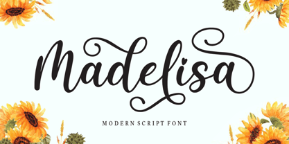 Madelisa Script is a Chic and Lovely Calligraphy font, described by a Love touch with natural handwritten style, perfect for your favorite projects. Fall in love with its incredibly distinct and timeless style and use it to create spectacular designs! What's Include : Multilingual Support Thank You,
 - P22 BlancoNeg by IHOF,
$24.95 BlancoNeg was inspired by the lettering of Saul Bass with some thoughts of Op-Art. Each character relies on the positive and negative spaces of its neighboring letters to help define its own shape. This font is casual with the look of cut out paper forms.
 - Moneta by Monotype,
$35.99 Moneta is an elegant transitional serif with high contrast. Its morphology is based on the study of traditional broad-edge pen script. It comes in 4 different weights (Light, Regular, Bold and Black) and has variable features. Designed by Santi Rey and launched on January 2020.
 - Safir Script by Mans Greback,
$59.00 Safir Script is a happy typeface in high quality. It has a vintage look, optimized for logos, titles and slogans. The font supports hundreds of languages. It contains contextual alternates, swashes and ligatures. Write % followed by a number (0-9) to make swashes! Example: Safir%1
 - Crypick by Grontype,
$14.00 Crypick is a Modern Serif Font, created with unique design. the parts of the font is simply watery looks inspired by ocean wave. this font comes with some ligatures and alternates, and already PUA encoded for easily accessed into optional Glyphs. Crypick Font is simply designed to ease any design project such as invitational card, logo tagline, attentional flyer, magazine header, and much more Features : Complete standard glyphs ligatures and alternates PUA encoded Numeral and Punctuation Multilingual Support Thankyou for your attention, Regard : Grontype
 - Pen Elegant JNL by Jeff Levine,
$29.00 A 1918 lettering instruction book by William Hugh Gordon presented a number of lettering styles that were geared toward sign and show card painters along with tips and tricks regarding the correct construction of such signs for maximum effect. One pen lettered Roman alphabet with a beautiful set of numerals has been recreated digitally as Pen Elegant JNL, which is available in both regular and oblique versions. To note, Gordon was the co-inventor of the Speedball lettering pen with Ross F. George in 1915.

