10,000 search results
(0.081 seconds)
- Millie by Kyle Wayne Benson,
$10.00 Millie is a stressed, geometric script who spends her days as industrial lettering and her nights paired with blackletter on the patches of motorcycle gangs. Millie was weighted by the conventions of broad nib calligraphy, inspired by the Milwaukee Tools logo, and finds herself best used in logos and titles. She was designed to be used on about a 20 degree angle, though she looks just fine on a level plane. By using opentype, many ligatures, and two sets of stylistic alternates, Millie was developed to look great with any string of letters. Access the first stylistic set for a disconnected script look, and the second set for even more connections and fluid script than standard. Millie Round takes the edge off a bit, giving the entire set a more approachable and versatile feel.
 - 1st Ave by Design is Culture,
$39.00 1st Ave is the most experimental of my typefaces. I took a picture of a metal and neon sign in the East Village of New York City. These signs are slowly being replaced by LED and LCD displays, but if you look hard, you can still find quite a few in the city. The signs give a mid 20th century feel to the city. To design 1st Ave, I took a picture of the sign, scanned it and increased the contrast in Photoshop so that the photographic forms became line art. There weren't enough letterforms in the sign to create the whole alphabet, so I cut up the strokes and collaged them back together to finish the entire alphabet. Important Note: 1st Ave is an experimental typeface and is not compatible with certain software such as Microsoft Word.
 - Graphique Next by profonts,
$41.99 The original Graphique Pro was designed by the famous Swiss designer Hermann Eidenbenz in 1945 and included one outline shadow style. His idea of a very narrow, very economic headline font became increasingly more popular over the last decades and since the recent trend of layered fonts his idea is more up-to-date than ever. profonts studio now took the idea of the Graphique Pro to its next level: Graphique Pro Next. This layered type family consists of 8 styles which can be combined in plenty of ways to create unique designs. The fonts thereby preserve the outstanding and timeless drawings of the original Graphique Pro font and will add an aesthetic and fresh look to every project. Please have a look at the Graphique Pro Next Type Specimen for more details about the language support and font layer combinations.
 - Rotis Sans Serif Paneuropean by Monotype,
$98.99Rotis is a comprehensive family group with Sans Serif, Semi Sans, Serif, and Semi Serif styles. The four families have similar weights, heights and proportions; though the Sans is primarily monotone, the Semi Sans has swelling strokes, the Semi Serif has just a few serifs, and the Serif has serifs and strokes with mostly vertical axes. Designed by Otl Aicher for Agfa in 1989, Rotis has become something of a European zeitgeist. This highly rationalized yet intriguing type is seen everywhere, from book text to billboards. The blending of sans with serif was almost revolutionary when Aicher first started working on the idea. Traditionalists felt that discarding serifs from some forms and giving unusual curves and edges to others might be something new, but not something better. But Rotis was based on those principles, and has proven itself not only highly legible, but also remarkably successful on a wide scale. Rotis is easily identifiable in all its styles by the cap C and lowercase c and e: note the hooked tops, serifless bottoms, and underslung body curves. Aicher was a long-time teacher of design with many years of practical experience as a graphic designer. He named Rotis after the small village in southern Germany where he lived. Rotis is suitable for just about any use: book text, documentation, business reports, business correspondence, magazines, newspapers, posters, advertisements, multimedia, and corporate design. - Clarabela by Scoothtype,
$9.00 Clarabela is a handwritten font with varied base lines, designed to convey elegance and style. It's smooth, clean and feminine. Clarabela also has a slanted style that looks beautiful and more elegant. Works perfectly for logos, magazines, menus, books, greeting cards, packaging, labels, t-shirts etc. All your designs will have an amazing homemade touch with Clarabela. Clarabela is coded with PUA Unicode, which allows full access to all additional characters without having special design software. Mac users can use Font Book, and Windows to attach your favorite text editor/application. To activate the OpenType Stylistic alternative, you need a program that supports OpenType features such as Adobe Illustrator CS, Adobe Indesign & CorelDraw X6-X7, Microsoft Word 2010 or newer versions. And there are additional ways to access alternatives/swash, using Character Map (Windows), Nexus Fonts (Windows), Font Books (Mac) or software programs like PopChar (for Windows and Mac). If you need help or advice, please contact me via email.
 - Ongunkan Karamanli Turkic Scrip by Runic World Tamgacı,
$50.00 The font I made based on the Greek alphabet used by the Karamanlı Turks, who are Orthodox Christians, by adapting it to Turkish, which I deduced by looking at the inscriptions and translations. In order to write in Turkish, Turkish special characters are loaded with letter combinations and sounds. But it can still be easily written in Greek.
 - Caslon Antique by GroupType,
$19.00 Caslon Antique is a decorative American typeface that was designed in 1894 by Berne Nadall. It was originally called "Fifteenth Century", but was renamed "Caslon Antique" by Nadall's foundry, Barnhart Bros. & Spindler, in the mid-1920s. The design of the typeface is meant to evoke the Colonial era. Early printers would reuse metal type over and over again, and the faces would become chipped and damaged from use. Caslon Antique emulates this look. Despite the name, it is not a member of the Caslon family of typefaces. The renaming is believed to have been a marketing maneuver to boost the popularity of a previously unpopular typeface by associating it with the highly popular Caslon types. Caslon Antique is popular today when a "old-fashioned" or "gothic" look is desired. It is used by the musical group The Sisters of Mercy on their albums, for the logo of the musical Les Misérables, and for the covers of the books in A Series of Unfortunate Events. It is also frequently used on historical displays. It was used for the previous edition of the Warhammer Fantasy Role-Play. Most recently, it has been used on promotional material for the smash musical Monty Python's Spamalot on Broadway, the West End, and its tour of the United States. British 80's band The The also used the font in several of their music videos, usually displaying several lyrics from the song in the opening scenes. It used on the cover of Regina Spektor's album, Begin to Hope. This description was sourced (in part) from Wikipedia, the free encyclopedia.
 - Gabby by Bellafonts,
$25.00 Gabby is an authentic handwriting of a First Grader. I took all the papers from her backpack during her first grade year and scanned in various letters, cleaned them up, and turned them into a font. This font is how I captured memories of my daughter's handwriting. This font is perfect for projects requiring the handwriting of a child, such as kid-friendly t-shirts and school projects. Comic Sans can move over because Gabby is readable and authentic. Unlike many decorative fonts, Gabby works well in All Caps or Caps and Lower case. The license allows creative and commercial use, meaning you can use this font on t-shirts, marketing gear, and just about any project you want to do, whether you make money or not. The only stipulation I have is try not to be a jerk with the font. This is my daughter's handwriting, and we would both cringe if we discovered it was used to bully or threaten people. The license attempts to protect religious icons and the US Military, but overall, just don't be mean with the font. If you want to be mean, try Comic Sans.
 - LTC Kennerley by Lanston Type Co.,
$24.95 Kennerley Old Style was designed by Goudy for publisher Mitchell Kennerley in 1911. Goudy described it as a "book letter with strong serifs, firm hairlines, and makes a solid, compact page." One of Goudy's best text faces, Kennerley is considered an original American classic as it is not based on historical type designs.
 - One of the guys by PizzaDude.dk,
$15.00 One of the guys is a simple, highly legible, mono lined comic book font. Simple, yes, but full of personality! Use it as it is, or spice up your text by using the extra layer. The extra layer could be ghouly slime, birthday cake cream, snow or whatever your imagination figures out!
 - General Merchandise JNL by Jeff Levine,
$29.00 Antique X Condensed is a condensed slab serif font found with the pages of a Rob Roy Kelly book of wood type designs. It was introduced around 1840 by Wells and Webb, and the example served as the model for General Merchandise JNL, which is available in both regular and oblique versions.
 - Curwen Initials by ARTypes,
$30.00Transcribed from letters designed by Jan van Krimpen for The Curwen Press at Plaistow, London, in 1925; printed on pages 49, 51 & 53 of A Specimen Book of Types and Ornaments in Use at The Curwen Press (1928). A setting at 120 pt is recommended to match the size of the original. - Office Space JNL by Jeff Levine,
$29.00 Office Space JNL is based on “Condensed Edina” from the 1921 Miller & Richard type specimen book and is available in both regular and oblique versions. This spurred serif Art Nouveau monoline font is a milestone – marking the 1900th font design released by Jeff Levine Fonts since its inception in January of 2006.
 - Erler Titling by RMU,
$30.00 Herbert Thannhaeuser’s 1953 titling font Erler-Versalien which was distributed by Typoart in hot-metal times, was carefully redrawn and redesigned. To preserve its handwritten character, irregularities in the letters’ strokes were left as they are. This font spreads best its beauty in book titles, magazines, diplomas, greeting cards or as initials.
 - Raegan by madeDeduk,
$18.00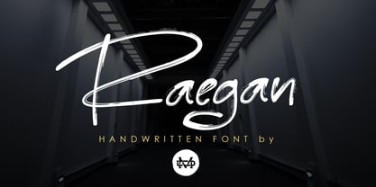 Raegan is a handwritten Brush. This font perfect is for poster design, book covers, merchandise, fashion campaigns, newsletters, branding, advertising, magazines, greeting cards, album covers, and quote designs and more. Feature: - Uppercase - lowercase - Numbers and Symbol - International Glyphs - Alternative Uppercase - Alternative lowercase If you need anything else please contact me by message.
 - Ceriburn by Typeskets,
$18.00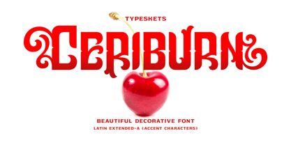 Ceriburn is inspired by the sweetness and richness of cherries. It easily evokes impressions of nature, elegance, and romanticism. You can use this stunning decorative font for logos, packaging, business cards, crafts, books, labels, headlines, invitations, print templates, and a multitude of other design ideas! Letter, Number & Punctuation, Accent Characters, Alternates Features.
 - Unicorn Fold by Attype Studio,
$10.00 Unicorn Fold inspired by fairytail creature "Unicorn". Comes with display font, this layered font make a shiny effect for typography that you creates. Unicorn Fold is perfect for branding, logo, invitation, stationery, social media post, product packaging, merchandise, blog design, game titles, cute style design, Book/Cover Title and more. Features : - Multilingual Support
 - Avegreat by Digitype Studio,
$15.00 Avegreat is a clean and modern serif typeface with a visually appealing character, complemented by a variety of discretionary ligatures, making it a chic serif font. Perfect for versatile applications across various formal formats such as logos, wedding/invitation cards, packaging, magazines, fashion, books, makeup, invitations, novels, labels, stationery, or any advertising purposes.
 - AT Lagermont by Amera Type,
$20.00 Lagermont is inspired by console games, labels and print media from the 19th century. With a strong and bold serif font style comes with an elegant, where every curve is made very gracefully and gently. It will be a perfect choice for graphic design, clothing, books, logos and many other visual displays
 - Hedgehog Hans by Hanoded,
$15.00 Hans My Hedgehog is an old fairytale which was made famous by the Grimm Brothers, when they published it in the early 19th century. Hedgehog Hans font is a fat, rounded and rather cute typeface, which is ideal for children's books and posters. It is highly legible, and comes with extensive language support.
 - Aldo Manuzio by RMU,
$30.00 This 1897 Schelter & Giesecke in-house design was carefully redrawn, extended and redesigned for modern usage. It is a remarkable font for book covers, film and video titles, ads and much more. This font contains a 'long s' and its ligatures which can be reached by the OTF historical feature and ligatures.
 - Stonekids by Blankids,
$17.00 Introducing a new Layered bold script called Stonekids. Stonekids inspired by handlettering, bold script logotype and kids fonts. Stonekids comes with open type features and multilingual accent good for logotype, poster, badge, book cover, t-shirt design, packaging and any more. Multilingual accents: ŽžŠŒšŸÀÁÂÃÄÅÆÇÈÉÊËÌÍÎÏÐÑÒÓÔÕÖØÙÚÛÜÝßàáâãäåæçèéêëìíîïðñòóôõöøùúûüýÿ Features: - Uppercase - Lowercase - Number - Punctuation - Multilingual - PUA Encode - Opentype
 - Koloss CT by CastleType,
$39.00 A well-designed bold art deco font. Very chunky. Uppercase, lowercase, numerals and punctuation. CastleType additions to the Koloss family include Koloss Bold Condensed and Koloss Bold Wave. The latter was used beautifully in the wonderful children's book The Leaf Men (and the Brave Good Bugs) written and illustrated by William Joyce.
 - Kanjur by Grummedia,
$20.00Kanjur was inspired by a page from an 18th century Buddhist book. Used for block text at first glance it has a very striking resemblance to Asian lettering. It is an English reading caps only font with minimal characters ( A-Z 0-9 & £ $ ¢ ! ? , . ). It is not intended as a serious font, just enjoy. - Hello Jack by Sipanji21,
$15.00 Hallo Jack is a funny, bold and cute display font with a sharp corner. Get inspired by its unique feel, and turn to add a lovely charm to any crafts project, this font suitable for any project about kids, children, or Student, like, book Cover, kids shirt, baby shower poster, and etc.
 - Bugbear by Hanoded,
$15.00 A Bugbear is a kind of hobgoblin, comparable to the Bogeyman. No tablets or gizmos were involved in the creation of this font. It was made entirely by hand, using an old-fashioned roller ball pen and a sheet of paper. Use Bugbear for your children’s book covers, party posters and product packaging.
 - Freak by HiH,
$10.00 Freak was originally released by The Great Western Type Foundry in 1889. According to Maurice Annenberg, Great Western became Barnhart Brothers & Spindler when the Barnhart brothers bought out the Toepfer family in 1868.The plant superintendent, Charles Spindler, became Secretary of the new firm. Specimen books as late as 1899 show the name Great Western alongside the BB&S name. At some point, prior to 1925, Freak was renamed “Bamboo” by BB&S. It was delisted when BB&S was absorbed by ATF in 1929. Listed in McGrew under “Bamboo”.
 - Northwoods Rough by Cultivated Mind,
$19.00 Northwoods Rough is a handwritten sans serif collection by Cultivated Mind. This collection includes 30 handwritten rough sans serif fonts. Northwoods Rough comes in three rough versions (Rough/Rougher/Roughest). Choose between light, italic or bolder versions for designing. Test out the FREE Northwoods Demo before you buy. Northwoods Rough Demo is for testing only. Northwoods supports most of Central European and Eastern European languages. Use Northwoods Rough for packaging designs, products, signage, books and magazines. Fonts are designed by Cindy Kinash and posters by featured Behance designer, Mustafa Akülker.
 - Bell by URW Type Foundry,
$35.99 Bell is a facsimile of the typeface cut originally for John Bell by Richard Austin in 1788~ using as a basis the matrices in the possession of Stephenson Blake & Co. Used in Bells newspaper~ The Oracle~ it was regarded by Stanley Morison as the first English Modern face. Although inspired by French punchcutters of the time~ with a vertical stress and fine hairlines~ Bell is less severe than the French models and is now classified as Transitional. Essentially a text face~ the Bell font family can be used for books~ magazines~ long articles~ etc.
 - Tiza by Sudtipos,
$39.00 Tiza is a rough take on informal faces and handwriting, brought on by the recent demand for scripts and brush lettering. Its flow leaves traces simulating runny pen ink, which makes it very suitable for handwriting-like paragraphs as well as casual greeting card and invitation setting. The bold weight, Tiza Negra, fits very nicely on book covers as well as large signs. Tiza is the proverbial reminder that typefaces can sometimes be more human than they are normally perceived. Designed by lettering great Angel Koziupa, and digitized and completed for Sudtipos by Alejandro Paul.
 - Bannikova by ParaType,
$30.00 Designed at Polygraphmash type design bureau in 1946-51 by Galina Bannikova, inspired by Russian Grazhdansky early- and mid-18th century typefaces as well as Roman Humanist typefaces of the Renaissance. With the archaic features of some characters the face is well recognized because of unique shapes. It is one of the best original typefaces of the Soviet typography. The typeface is useful in text and display composition, in fiction and art books. The revised, improved and completed digital version was designed at ParaType in 2001 by Lyubov Kuznetsova.
 - CartoGothic Std - 100% free

- Doublepoint by Volcano Type,
$19.00 The double amount of Monopoint is Doublepoint - Isn't that simple? By overlaying the single weights from light to bold you will get a nice outline-in-outline look.
 - 1up by Fly Fonts,
$15.001up is a retro font that is influenced by classic video games and modern pixel fonts. Looks great in display sizes and also works well when used smaller. - Cuantica by Graviton,
$12.00 Cuantica font family has been designed for Graviton Font Foundry by Pablo Balcells in 2012. It is display typeface with a geometric look. Cuantica consists of 4 styles.
 - Collage by Turtle Arts,
$20.00Collage is a font inspired by paper collaging, tearing apart magazines and building unique looking words and phrases. Collage also includes funky symbols and images in the font. - Wanted Denim by Vozzy,
$5.00 Introducing a vintage look layered label font named "Wanted Denim". This font was inspired by classic slab serif fonts from denim labels and logos. Typeface includes six styles (including effect styles), for sample look at 3rd preview. This font will good viewed on any retro design like poster, t-shirt, label, logo etc.
 - Gumley by Robert Corseanschi,
$29.00 Gumley - a font which has a fresh natural look and feel inspired by nature, at the same time it has a gummy feel which would fit very well on packaging design. With a little inspiration every product can look awesome with this font, starting from kids magazines to logos and package design.
 - Craft String by Putracetol,
$24.00 Craft String - Display Script Font. This script is a special script or typeface whose emphasis is reversed from general thinking. Craft String is a casual script font inspired by monoline hand written, pop cultures and urban culture Craft String is casual and fun script that stands out from the crowd, Craft String font that perfect for story books, illustrations, comic books, t-shirts, posters, greeting cards, logos, branding, stickers, svg, crafting and all for display purposes. The alternative characters were divided into several Open Type features such as Swash, Stylistic Sets, Stylistic Alternates, Contextual Alternates, and Ligature. The Open Type features can be accessed by using Open Type savvy programs such as Adobe Illustrator, Adobe InDesign, Adobe Photoshop Corel Draw X version, And Microsoft Word. This font is also support multi language.
 - Sabon by Linotype,
$45.99 In the early 1960s, the German Master Printers’ Association requested that a new typeface be designed and produced in identical form on both Linotype and Monotype machines so that text and technical composition would match. Walter Cunz at Stempel responded by commissioning Jan Tschichold to design a new version of Claude Garamond’s serene and classical Roman. Its bold, and particularly its italic styles are limited by the requirements of Linotype casting machines, forcing the character widths of a given letter to match between styles, giving the italic its characteristic narrow f. The family’s name is taken from Jacques Sabon, who introduced Garamond’s Romans to Frankfurt. Sabon has long been a favorite of typographers for setting book text, due to its smooth texture, and in large part because Tschichold’s book typography remains world famous.
