10,000 search results
(0.041 seconds)
- HU Big Round by Heummdesign,
$15.00 HU Big Round is handwritten font yet very neat and well organized. The X-height is particularly tall, emphasizing the round form of it. It is very attractive to use is various media such as card and subtitle.
 - Bittle Birdy by HansCo,
$15.00 Whimsical, charming and undeniably cute: Bittle Birdy is, as the name suggests, the perfect font for making any kid’s or baby-themed project stand out! This font is perfect for elegant logo design, packaging or invitation cards. Enjoy!
 - Winter Cold by Sakha Design,
$10.00 Winter Cold is a sweet and adorable display font. Whether you’re using it for crafts, digital design, presentations, or making greeting cards, this font has the potential to become your favorite go-to font, no matter the occasion!
 - Plinc Flourish by House Industries,
$33.00 Flourish breaks the mold of traditional typography. Part italic, part roman, this iconoclastic font is all style. William Millstein casts the contours of formal pen strokes in a taut upright framework to create a typeface that nods back to its origins while looking defiantly forward. The neat and light semi-serif flaunts crisp geometric touches without conceding warmth or personality. A sophisticated design solution that isn’t stuck up, Millstein Flourish makes invitations, identities, and editorial settings thrive. Originally offered by Photo-Lettering in the early 1940s, Millstein Flourish was digitally updated by Jeremy Mickel in 2011. Like all good subversives, House Industries hides in plain sight while amplifying the look, feel and style of the world’s most interesting brands, products and people. Based in Delaware, visually influencing the world.
 - Noemi Slab by Brackets,
$22.00 Noemí is a broad typeface based on a formally classic skeleton, but with a strong Meccano character, where its quadrangular serifs are the protagonists of the slab style. It is a typeface designed to solve the basic problems of newspaper printing, adapted to a novel and strong communication, in the case of a wide typeface and with generous ink traps making the impression. Noemí was born from the need to create a broad, functional typeface family with a strong compact character intended for use in the press. Intended for editing and layout in a newspaper / magazine with a wide range of subfamilies thought and designed to achieve a diverse graphic functionality; designed from the same common skeleton, with a style based on the mix between the Mecan characters of traditional typewriter fonts and Roman fonts.
 - Eterea by Corradine Fonts,
$60.00 Eterea is a formal font inspired in the monumental inscriptions of classic Rome, but not strictly sticking to the ancient roman typographic characteristics. Its unique look is the result of mixing diverse typographic styles, but mostly having traces from the 16th century transitional style. It bears a big difference of proportion between upper and lower case, additionally to the upper case having much more ornamental traces. Eterea has four different flavors of capitals which change very slightly in the cursive versions. In the italic versions, the lower case (actually small capitals) changes substantially its characters to make its reading more flowing and is not simply an inclined version of the letters. Eterea is a very expressive font, ideal for titles and short texts of sober and elegant appearance.
 - Miraikato Script by Mans Greback,
$49.00 Miraikato Script is a rustic handwriting typeface. As a cute brush writing, its naive and happy movements brings out the optimism and genuineness in any project. It has the flow and elegance of a formal font, while maintaining the youthful enjoyment of a real handwritten text. The Miraikato Script family is provided in six styles: The weights Thin, Regular and Bold, plus each weight as Italic. The font is built with advanced OpenType functionality and has a guaranteed top-notch quality, containing stylistic and contextual alternates, ligatures and more features; all to give you full control and customizability. It has extensive lingual support, covering all Latin-based languages, from North Europe to South Africa, from America to South-East Asia. It contains all characters and symbols you'll ever need, including all punctuation and numbers.
 - Document by Aah Yes,
$11.00Document is an easy-to-read sans serif with large lower-case letters, but with one difference - it is slightly slanted to the right, but a lot less than a conventional italic angle. This is intended to give it a more informal and modern look than a perfectly upright font would be, and which also contributes extra dynamism while reading. It's a sort of in-between font, for situations where a boring old upright typeface is too formal and staid but where the italic version is too slanted and obvious. There are six weights, giving adequate representation for most jobs, from large bodies of text to headlines. The zip package contains both OTF and TTF versions - install either OTF or TTF, not both versions of a font on the same machine. - Series A Signage JNL by Jeff Levine,
$29.00 The basis for Series A Signage JNL is Highway Gothic; a type style design formally known as the FHWA Series. The font was developed by the United States Federal Highway Administration, and originally consisted of only capital letters and figures. Each Letter designation represented a character width from "A" (condensed) to "F" (wide). Due to poor visibility at high speeds, Series "A" was discontinued. At one point lower case characters were added to the various widths of the design, but this typeface revival is based on the original guidelines specified in the 1948 (reprinted 1952) book "Standard Alphabets for Highway Signs" [this was the original name for the FHWA series fonts preceding the eventual name change to Highway Gothic]. Unlike the original, Series A Signage JNL is available in both regular and oblique versions.
 - Waghu by Twinletter,
$12.00 Waghu is an abstract font that you can use for casual design purposes. It is also right for you to use it for formal design purposes, this font can adapt beautifully if you use it in your project. there are three alternatives thin, regular, and bold. makes it easier for you to combine them according to your needs. This handwritten font is perfect for children’s magazines, drink banners, games, posters, beverage, outdoor events, thumbnails, food banners, cheerful writing, film titles, quotes, titles, logos, and various kinds of projects you need, of course, your various design projects will be perfect and extraordinary if you use this font because this font is equipped with a complimentary font family, both for titles and subtitles and sentence text. start using our fonts for your amazing projects.
 - Trust Sans by Latinotype Mexico,
$29.00 Empathic • Contemporary • Versatile • Corporate A typeface specially designed for corporate identity. Trust Sans is a friendly typeface, with a flowing ductus and humanist features, specially created to help designers face everyday challenges. This font comes in a variety of weights—perfectly suited to establishing an effective typographic hierarchy—and contains an extensive character set, including small caps, different figure styles, case-sensitive forms, contextual and discretionary ligatures, etc. The family glyph set supports over 200 Latin-based languages. Trust Sans is composed of two complementary sub-families: a standard, formal font and an alternative, more casual, version. Each family comes in 6 weights, from Thin to Black, with matching true italics. All these characteristics make it an ideal typeface for a range of applications such as editorial design, immersive text, corporate identity, branding or packaging.
 - Arando Script by Mans Greback,
$59.00 Arando Script is a retro script typeface. A perfected calligraphy with uniquely beautiful letterforms, Arando Script is a professional quality handwriting font family. Drawn and created by Mans Greback in 2022, it is perfect for a formal restaurant headline or feminine logotype design. Arando Script is provided in four styles: Regular, Bold, Italic and Bold Italic, which compliment each other and maximise your options and design experience. The font is built with advanced OpenType functionality and has a guaranteed top-notch quality, containing stylistic and contextual alternates, ligatures and more features; all to give you full control and customizability. It has extensive lingual support, covering all Latin-based languages, from Northern Europe to South Africa, from America to South-East Asia. It contains all characters and symbols you'll ever need, including all punctuation and numbers.
 - Buddy by Hackberry Font Foundry,
$24.95 Buddy is the new companion sans for Contenu, the book font family designed for my book on font design design. Originally, I called it Compagnon, but that seemed to pompous. Then I called it Aide, but that was too formal and dry. It's a loose, free, easy to read sans, so when my wife suggested Buddy, it clicked. This is the 4-font Buddy family of Regular, Italic, Bold, & Bold Italic. I made a new, more limited feature set for these fonts due to their designed usage, but there are still small caps, small cap figures, oldstyle figures, numerators, and denominators. The bold is closer to a black, and the italics are only slightly slanted obliques. If you need a strong black in caps, use the small caps of the bold.
 - BB Noname (Pro) by Bold Studio,
$49.00 BB Noname™ (Pro) is intended to imply the appearance of a conventional typeface in a contemporary context. Due to the frequent use in the public service (among other things), the style associates a supposedly objective face. The style is characterized by the proportions, the contradiction of the apparently perfect reduction and the retention of chirographic elements. In addition, the rapid further development of the input devices has meant that existing character sets have been added again and again, regardless of style and technical requirements. With this work, the properties were analyzed, the characteristic features highlighted and summarized in a complete typesetting: Anonymity (procedure), bureaucracy (style by category), convention (shape) and formality (optical corrections). ● 3 Variants: Human, Computer, Interaction ● 20 Stylistic-Sets ● 34 Styles ● 39 OpenType features ● 93 Languages Support ● 35,598 (1,047/Style)
 - ITC Styleboy by ITC,
$29.99 Although ITC Styleboy has a retro feel, it isn't based on any earlier typeface. As far as inspiration goes," says designer Chester Wajda, "I'd have to say comic strips of the '20s and '30s, and silent-film marquee lettering from the '20s - with a hint of a Chinese brush?" He originally created the typeface for a children's book he was working on. "I wanted it to be fun, but still somewhat formal in its underlying structure," he says. "It's largely based on right and 45-degree angles, with slight tucks inward on the stems and bowls, and a few flourishes here and there." Styleboy's top-heavy look is most noticeable in the caps, but it's exaggerated too in the "8" and the lowercase "g." Styleboy is Wajda's first typeface design."
 - Rare Bird Specimen III by Rare Bird Font Foundry,
$100.00 RARE BIRD SPECIMEN III Rare Bird Specimen III is a graceful hand by Karla Lim of Written Word Calligraphy. This all lowercase font feels both modern and feminine. While uppercase letters are still lowercase in shape, they are larger and read as caps. OBSERVATIONS Specimen III has a dancer-like form; supple and lithe. Willowy letters are nimble and lissome, content alone or paired with a stronger, more masculine specimen. DEFINING CHARACTERISTICS Opentype programming, formal title and preposition word art, 7 alternate lowercase t cross-strokes, Roman numerals, old-style numerals, seamlessly semi-connecting calligraphic letters, realistic double-letter ligatures, in and out-stroked letters at the beginning and end of words where appropriate, basic Latin encoding. POTENTIAL SIGHTINGS Bridal + baby shower stationery, logo design, gourmet food packaging, clothing labels.
 - NERMOLA Scripcy Font by Alit Design,
$12.00 Introducing NERMOLA Scripcy Font from alitdesign. The rise of typeface duos in the marketplace made us not want to be left behind so we created a pairing of our own. This font duo launch contains both a sans serif and signature script. NERMOLA Scripcy sans serif has characters that are unique, elegant, formal and assertive. It is suitable for the heading or subheading of any text. The uppercase of the sans looks very unique and elegant. The script letters are also unique and natural in character. Additionally, it has several alternatives that can be replaced using OpenType features. NERMOLA Scripcy fonts are the perfect addition to your font collection library. The designs are elegant and romantic and are equally suitable for logotype design and for any phrase, poem, or quote.
 - Crescent by TrendGFX Design Studios,
$20.00 The most sensational design of the decade is now at large. These high-definition fonts can be used for titles, banners, tattooing, logotypes and many more places. Be it domestic or industrial, formal or informal, it can be used in every field imaginable. It has a sensational, funky style and remarks the current youth's style. Such a font style has never been seen by the world, until today. These designs are 100% original and handmade. I searched a million miles but found this as the most appropriate idea for the world of font types at this time. It's the coolest, funkiest and the best font ever made. It's the era of graffiti and 3D, and we've combined both to give you CRESCENT.. So, use it, love it, buy it!
 - As of my last update, the specific font named "Nickerbocker-Normal" is not a widely recognized standard typeface in the vast landscape of typography. However, based on its naming convention, we can d...
- Generis Slab by Linotype,
$29.00The idea for the Generis type system came to Erik Faulhaber while he was traveling in the USA. Seeing typefaces mixed together in a business district motivated him to create a new type system with interrelated forms. The first design scheme came about in 1997, following the space saving model of these American Gothics. Faulhaber then examined the demands of legibility and various communications media before finally developing the plan behind this type system. Generis’s design includes two individually designed styles; each of with is available with and without serifs, giving the type system four separate families. Each includes at least four basic weights: Light, Regular, Medium, and Bold. Further weights, small caps, old style figures, and true italics were added to each family where needed. The Generis type system is designed to meet both optical criteria and the highest possible measure of technical precision. Harmony, rhythm, legibility, and formal restraint make up the foreground. Generis combines aesthetic, technical, and economic advantages, which purposefully and efficiently cover the whole range of corporate communication needs. The unified basic form and the individual peculiarity of the styles lead to Generis’ systematic, total-package concept. The clear formal language of the Generis type system resides beneath the information, bringing appropriate typographic expression to high-level corporate identity systems, both in print and on screen. The condensed and aspiring nature of the letterforms allows for the efficient setting of body copy, and the economic use of the page. A range of accented characters allows text to be set in 48 Latin-based languages, offering maximal typographic free range. This previously unknown level of technical and design execution helps create higher quality typography in all areas of corporate communication. Optimal combinations within the type system: Generis Serif or Generis Slab with Generis Sans or Generis Simple. - Generis Serif by Linotype,
$29.00The idea for the Generis type system came to Erik Faulhaber while he was traveling in the USA. Seeing typefaces mixed together in a business district motivated him to create a new type system with interrelated forms. The first design scheme came about in 1997, following the space saving model of these American Gothics. Faulhaber then examined the demands of legibility and various communications media before finally developing the plan behind this type system. Generis’s design includes two individually designed styles; each of with is available with and without serifs, giving the type system four separate families. Each includes at least four basic weights: Light, Regular, Medium, and Bold. Further weights, small caps, old style figures, and true italics were added to each family where needed. The Generis type system is designed to meet both optical criteria and the highest possible measure of technical precision. Harmony, rhythm, legibility, and formal restraint make up the foreground. Generis combines aesthetic, technical, and economic advantages, which purposefully and efficiently cover the whole range of corporate communication needs. The unified basic form and the individual peculiarity of the styles lead to Generis’ systematic, total-package concept. The clear formal language of the Generis type system resides beneath the information, bringing appropriate typographic expression to high-level corporate identity systems, both in print and on screen. The condensed and aspiring nature of the letterforms allows for the efficient setting of body copy, and the economic use of the page. A range of accented characters allows text to be set in 48 Latin-based languages, offering maximal typographic free range. This previously unknown level of technical and design execution helps create higher quality typography in all areas of corporate communication. Optimal combinations within the type system: Generis Serif or Generis Slab with Generis Sans or Generis Simple. - Materia Pro by Elsner+Flake,
$79.00 Minimal, modular, modern—at first glance, Materia shows a contemporary flair, combining pure, strong geometrical form with a subtle, distinct appearance. Actually, the design was inspired by lettering from the turn of the 19th to the 20th century that still can be found in the East of France. While its formal origins date back as far as this, revived e. g. by the constructivists into the nineteen twenties and later on by Dutch information designer Wim Crouwel in the nineteen-sixties, the visual language of Materia still speaks of the »future«. Following a minimalistic concept the font is formally built on a grid. Wherever optical curves are needed for a smoother, more comfortable shape of letters than a simple rectangular block, diagonals cut off the egdes – like a diamond is cut to achieve more beauty. Thus headlines and texts set in Materia are given a certain »egdy« feeling, whereas their tonality is still kept well-balanced, keeping concentation all on information in a nonconfomist way. Materia comes in eight styles, from elegant Thin to attention-forcing Ultra. Even a regular Italic is available, following the classic type-set-principle. Two of the styles are explicitly designed for display use, Shadow and Code. Both are ready for combinations with Bold or each other respectively, the layering of Shadow and Code e. g. allows astonishing effects or highlighting within the letters. For OpenType-users Materia is a real Pro, containing accented Latin letters for over 70 languages, small caps, old style, tabular and lining figures and special condensed titling all caps for cases in which space is all that counts. How useful all of the above mentioned is may be seen in the book David Lynch – Lithos, designed by Koma Amok, published in 2010 by item éditions, Paris, and Hatje Cantz, Germany, which was typeset completely in Materia.
 - Generis Simple by Linotype,
$39.00The idea for the Generis type system came to Erik Faulhaber while he was traveling in the USA. Seeing typefaces mixed together in a business district motivated him to create a new type system with interrelated forms. The first design scheme came about in 1997, following the space saving model of these American Gothics. Faulhaber then examined the demands of legibility and various communications media before finally developing the plan behind this type system. Generis’s design includes two individually designed styles; each of with is available with and without serifs, giving the type system four separate families. Each includes at least four basic weights: Light, Regular, Medium, and Bold. Further weights, small caps, old style figures, and true italics were added to each family where needed. The Generis type system is designed to meet both optical criteria and the highest possible measure of technical precision. Harmony, rhythm, legibility, and formal restraint make up the foreground. Generis combines aesthetic, technical, and economic advantages, which purposefully and efficiently cover the whole range of corporate communication needs. The unified basic form and the individual peculiarity of the styles lead to Generis’ systematic, total-package concept. The clear formal language of the Generis type system resides beneath the information, bringing appropriate typographic expression to high-level corporate identity systems, both in print and on screen. The condensed and aspiring nature of the letterforms allows for the efficient setting of body copy, and the economic use of the page. A range of accented characters allows text to be set in 48 Latin-based languages, offering maximal typographic free range. This previously unknown level of technical and design execution helps create higher quality typography in all areas of corporate communication. Optimal combinations within the type system: Generis Serif or Generis Slab with Generis Sans or Generis Simple. - Generis Sans by Linotype,
$29.00The idea for the Generis type system came to Erik Faulhaber while he was traveling in the USA. Seeing typefaces mixed together in a business district motivated him to create a new type system with interrelated forms. The first design scheme came about in 1997, following the space saving model of these American Gothics. Faulhaber then examined the demands of legibility and various communications media before finally developing the plan behind this type system. Generis’s design includes two individually designed styles; each of with is available with and without serifs, giving the type system four separate families. Each includes at least four basic weights: Light, Regular, Medium, and Bold. Further weights, small caps, old style figures, and true italics were added to each family where needed. The Generis type system is designed to meet both optical criteria and the highest possible measure of technical precision. Harmony, rhythm, legibility, and formal restraint make up the foreground. Generis combines aesthetic, technical, and economic advantages, which purposefully and efficiently cover the whole range of corporate communication needs. The unified basic form and the individual peculiarity of the styles lead to Generis’ systematic, total-package concept. The clear formal language of the Generis type system resides beneath the information, bringing appropriate typographic expression to high-level corporate identity systems, both in print and on screen. The condensed and aspiring nature of the letterforms allows for the efficient setting of body copy, and the economic use of the page. A range of accented characters allows text to be set in 48 Latin-based languages, offering maximal typographic free range. This previously unknown level of technical and design execution helps create higher quality typography in all areas of corporate communication. Optimal combinations within the type system: Generis Serif or Generis Slab with Generis Sans or Generis Simple. - AB One by AB Studio,
$23.99 AB One is a captivating sans-serif font family that effortlessly blends modern aesthetics with a dynamic, fluid formality inspired by the world of architecture. This versatile typeface offers three distinct weights, each carefully crafted to cater to a range of design needs. Key Features: Dynamic Fluidity: AB One embodies the dynamic essence of architectural forms, showcasing a graceful flow and a sense of movement. The font's letterforms possess an inherent flexibility that adds a touch of vibrancy to your designs, making it an excellent choice for contemporary projects that demand energy and liveliness. Sleek and Modern: The light weight of AB One radiates a modern, minimalist charm, perfect for creating a sleek and refined impression in your design projects. Its clean lines and well-balanced proportions ensure readability while evoking a sense of cutting-edge sophistication. Three Distinct Weights: The AB One font family offers three carefully crafted weights to provide versatility in your design work. Sans-Serif Elegance: As a sans-serif typeface, AB One represents a harmonious marriage of legibility and style. Its straightforward, elegant letterforms make it suitable for a wide range of applications, including branding, advertising, editorial design, and web interfaces. Inspired by Architecture: Drawing inspiration from the world of architecture, AB One captures the essence of structural elegance and sophistication. This font is an ideal choice for projects that require a touch of architectural finesse. Versatile Application: AB One's adaptability allows it to excel in a variety of design contexts. It seamlessly integrates with other design elements, providing a harmonious and engaging visual experience. AB One is a typeface that thrives on the principles of sleek modernity and architectural inspiration, making it a go-to choice for designers who seek to infuse their projects with a touch of dynamic fluid formality.
 - Mifelin by Nathatype,
$29.00 Mifelin is a well-defined serif font. Serifs are small ornaments that appear at the ends of the lines of letters, giving them a neater, more structured appearance. The well-defined serifs in this font create an elegant and professional impression. This serif font has a balanced and harmonious proportion of height and width. The proportions ensure that each letter looks proportional and easy to read. The line of letters in this font has a smoothness and clarity that distinguishes each character. Sharp, clear lines give off a professional and organized impression. This clarity also helps strengthen the legibility of the font in a variety of design settings. This serif font with an elegant look has a classic style that remains relevant in modern designs. Despite having strong roots in traditional typographic design, this font is able to adapt to more contemporary design contexts and give it a touch of elegance and class. Even though it has a touch of elegance, this serif font still prioritizes good readability. Each letter is carefully designed to ensure that the text remains easy to read and understand for the reader. Prominent readability is the hallmark of this font. Enjoy the various features available in this font. Features: Stylistic Sets Ligatures Multilingual Supports PUA Encoded Numerals and Punctuations Mifelin is suitable for any designs that require a formal and official impression. This font is can be used in the design of books, magazines, reports, formal invitations, brand identities, and other design projects that require elegance and professionalism. Find out more ways to use this font by taking a look at the font preview. Thanks for purchasing our fonts. Hopefully, you have a great time using our font. Feel free to contact us anytime for further information or when you have trouble with the font. Thanks a lot and happy designing.
 - Dynatype by Alphabet Soup,
$60.00 Suddenly...it’s the World of Tomorrow! With the push of a button Dynatype automates your typesetting experience. Dynatype is actually Two fonts in One–without switching fonts you can instantly change from Dynatype’s “regular” style to its alternate connecting version with the simple push of a button. For more details download “The Dynatype Manual” from the Gallery Section. What is Dynatype? Dynatype is the upright, slightly more formal cousin of Dynascript. It shares many of the characteristics of it’s slightly older relation, but is drawn entirely from scratch and has it’s own unique character. Dynatype may be reminiscent of various mid-century neon signage, and of sign writing, Speedball alphabets and even baseball scripts. Its design also takes some cues from a historical typographic curiosity that began in Germany in the ‘20s and which lasted into the ‘60s—when Photo-Lettering gave it the name "Zip-Top". Basically it was believed to be the wave of the future—that by weighting an alphabet heavier in its top half, one could increase legibility and reading speed. The jury’s still out on whether or not there’s any validity to this notion, but I think you’ll agree that in the context of this design, the heavier weighting at the top of the letters helps to create some uniquely pleasing forms, and a font unlike any other. Typesetters across the planet will also be able to set copy in their language of choice. Dynatype’s 677 glyphs can be used to set copy in: Albanian, Basque, Catalan, Cornish, Croatian, Czech, Danish, Dutch, Esperanto, Estonian, Faroese, Finnish, French, Galician, German, Hungarian, Icelandic, Indonesian, Irish, Italian, Kalaallisut, Latvian, Lithuanian, Malay, Maltese, Manx, Norwegian Bokmål, Norwegian Nynorsk, Oromo, Polish, Portuguese, Slovak, Slovenian, Somali, Spanish, Swahili, Swedish, Turkish, and Welsh—and of course English. Sorry! Off-world languages not yet supported. PLEASE NOTE: When setting Dynatype one should ALWAYS select the “Standard Ligatures” and “Contextual Alternates” buttons in your OpenType palette. See the “Read Me First!” file in the Gallery section.
 - Ambra Sans by Zetafonts,
$39.00 Designed by Cosimo Lorenzo Pancini with Francesco Canovaro as a development and reinvention of Tarif by Andrea Tartarelli, Ambra Sans is a humanist sans typeface family, drawn around a lively, expressive skeleton but developed with a contemporary, post-digital sensibility that implies low contrast and tall x-height. In designing Ambra Sans, the authors wanted to research the elusive natural signature of handmade humanist letter shapes, in the effort of preserving it while still developing all the capabilities of type as a technical tool in the digital age. Like a frail insect preserved in amber, humanist design is the "ghost in the machine" of this font, that aims at seducing the viewers with its soft, welcoming text flow, firmly opposing the rigid, formal tone of most sans serif fonts. Born to provide a useful tool to graphic designers with branding and editorial needs, Ambra Sans develops around two subfamilies with slight but fundamental differences. The display family offers a taller x-height, optimizing readability and spacing in headings and display use, while offering a single story lowercase g to provide more consistent branding usage. The text family, on the other side, goes for a smaller x-height to give more traditional proportion to the text and removes the slight tapering in the stems to provide better rendering on screen in small formats. Both subfamilies of Ambra Sans develop around a wide range of seven weights with corresponding true italics, with Ambra Display sporting an extra heavy weight for maximum versatility. In total the family counts 30 fonts, each with over 600 glyphs for a wide language coverage. Open type features and glyph alternates further enrich the usage possibility of this typeface that wants to offer contemporary designer an alternative, unexpectedly human approach to contemporary sans type, softly preserving the spirit of handmade calligraphy while encasing its frail nature in a transparent, strong and powerful design language.
 - Kibly by Khoir,
$15.00 Kibly - Clean, classy serifs have beautiful curves and alternative additions that make this font look elegant, great for logo designs, titles, posters, business cards, branding needs, and more. What's included? Uppercase Characters Lowercase Characters Support 75+ Language Alternative Variation
 - Joyscript Two by Jonahfonts,
$35.00 Joyscript-Two is an upgrade of the 'Plain-Joyscript' Font containing many more ligatures which makes it much more versatile and may be applied to many applications including headlines, logos, ads, captions, packaging, bulletins, posters, books and greeting cards.
 - Janetta by Sinfa,
$14.00 Janetta is a script that includes very carefully designed beginning and end letters. It is perfect for your needs in making logos, invitations, cards, product packaging, headers, and more. Janetta also includes several sets of lowercase letters including swashes.
 - Abigail YOFF by YOFF,
$4.95 Abigail handwriting font is a polished version of a handwriting. It looks great in flowing text or for posterdesigns or maybe greeting cards. Only your imagination sets the limit. Enjoy this new release and put it to good use!
 - Scooter by Ascender,
$29.99 Scooter is an informal handwriting script named for a bashful but lovable yellow Labrador Retriever. The font is perfect for memos, fliers, cards and of course, a personalized dog bed. This font is great for making a wagging impression.
 - Play Ground by Wacaksara co,
$12.00 Play Ground is a fancy hand-lettering script font with cute styles this font is great for your next creative project such as logos, printed quotes, invitations, cards, product packaging, headers, Logotype, Letterhead, Poster, Apparel Design, Label, and etc.
 - Bardi by URW Type Foundry,
$39.99 Tilp Barde is a striking, moderately dynamic design suitable for many different typographic tasks. Its individual ductus is inspired by handwriting, however without calligraphic embellishment. There are no serifs but tiny endings which lead to think of wood-carving.
 - Story Element by Ali Hamidi,
$10.00 Story Element is a friendly, simple, and fun display font. Whether you’re using it for crafts, digital design, presentations, or making greeting cards, this font has the potential to become your favorite go-to font, no matter the occasion!
 - Negentherophy by Fromletterel,
$12.00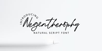 Negentherophy is a natural signature font to beautify your designs with its natural charm, suitable to create gorgeous wedding invitation, beautiful social media post, business card and other beautiful projects. It also contains ligature to add more natural charm.
 - Gostend by Fype Co,
$14.00 Gostend is a handwritten script font with a natural texture. It has a thin calligraphy look making it perfect for branding and digital designs. Use this font for logos, social media, websites, blogs, Instagram, business cards, branding, and more!
 - Seamize by Epyto Type Co,
$19.00 Seamize is a display typeface, with a few experimental vibes and a semi-psychedelic feel. It works perfectly for creative projects such as logo, T-shirt/apparel, badge, invitation, packaging, headline, poster, magazine, greeting card, and many other purposes.
 - Meigtan by Dicubit,
$10.00 Meigtan is a curly typeface/font designed with carefully handcrafted. This perfectly made to be applied in logo or branding, stationery, books, packaging, fashion, magazines, t-shirt, greeting or wedding cards, vintage design, novels, labels and many advertising purposes.