10,000 search results
(0.046 seconds)
- Eskos Display by Pesotsky Victor,
$10.00 Eskos Display is a bright and eye-catching headline set. It is designed specifically to attract attention and be the base of the composition. It is deliberately diagonal and gives a sharp oblique texture to the texts. Such an exciting font will be perfect for posters, headlines on media sites or magazines, and it can also be the base for a corporate identity. The font supportsBasic Latin, Cyrillic and more than 100 languages all together. Eskos Display was designed by Viktor Pesotsky.
 - Krooked Teeth by PizzaDude.dk,
$20.00The inspiration of the name of the font comes from a song by Smashing Pumpkins, but the real reason why I named the font "Krooked Teeth" is that the font has got a crooked look to it, almost like crooked teeth! Furthermore I like the handwritten look. It works great in small sizes, but also loveable at large sizes! I replaced the 'C' with a 'K' in order to make it look more Danish. Just like my name: Jakob with a "'k" ! - Essence by kloeg architecture,
$29.00 This font is especially designed by architects for architect, urban planners, landscape architects, industrial and product designers. It is ideal for the use with line drawings. Because of it's geometric shape it blends in with your drawings. It's adjusted to fit most of the common line width types. It also contains many icons, especially for use in these professions. On top of that you can find many glyphs and icons to create legends and title blocks. More information about kloeg design.
 - Chenko by Studio K,
$45.00 Chenko is a nod to Alexander Rodchenko the Russian Constructivist artist and designer whose poster work is characterised by its stark, stripped down typography and bold, geometric graphics. It was truly revolutionary in its day, and continues to be influential in ours. Chenko is my own take on his deceptively simple letterforms, and designing a font without a curve or a diagonal (okay I cheated on a few details like the O-slash and A ring characters) presented some interesting design challenges!
 - Aisha Lovely by Matra Creative,
$12.00 Aisha Lovely is inspired by classic typography and brings its own unique style to every design project. This fantastic script font is best suited for headers of all sizes, and for blocks of text that have maximum and minimum variations. Be it for the web, printing, moving images or whatever – Aisha Lovely will look spectacular.This font is PUA encoded which means you can access all the funny glyphs and swash easily! It also has many special features including alternative glyphs
 - Rivertale by takoliko,
$10.00 Rivertale inspired by the flow of a river. Rivertale have a little bit of a wavy curve on some gliph that give a little psychedelic touch. Rivertale have a flexibility to used as a formal font or a more casual font and it give a little bit feminim style. Rivertale came with Reguler and Oblique fonts. It has a ligature and support multilingual language. It can easily be matched to an incredibly large set of projects, and good for communicating your brands.
 - Gibeon by Brenners Template,
$19.00 GIBEon Display Serif Family- Basically, it seeks a psychedelic groove and freedom. For its evolved balances, the heights of uppercase(cap) and lowercase(x-) evenly arranged to eliminate the sense of imbalance. Glyphs are designed by reflecting their characteristics to preserve individual originality. The three master styles are complementary to each other, and the It enhances the imagination of designers. Ligatures and Alternates can also help with more natural layout editing. And, enjoy the freedom and groove of Italic Instants!
 - Barley Script by Mans Greback,
$59.00 Barley Script is a round and flowing script typeface. It is handmade by Måns Grebäck and works perfectly for logotypes and slogans. The font contains a lot of alternate characters and ligatures to make the script simulate a handpainted logo. With its hundreds of glyphs it also has support for a wide range of languages. Write underscores before any word to make an underline. Example: _Barley If your software supports ligatures, you can write multiple underscores for a longer line. Example: __Bakeries
 - Rayid by Kapak and Kadoo,
$38.00 Rayid (رائد): Pioneer. “What if we remove the curves?” This was the whole idea. Rayid could be used at its best for names, titles, headings and other large size contexts. It has the ability to catch the eyes of the target. It is a modern font which respects the traditions by futurism. *Arabic marks (Tashkeel) are included but if your design needs them, first check if they work properly for you.* Please DO NOT HESTITATE to tell me if you saw any bugs.
 - Ring Wind by Ochakov,
$9.00 Typography exists to honor content. Like oratory, music, dance, calligraphy-like anything that lends its grace to language – typography is an art that can be deliberately misused. It is a craft by which the meanings of a text ( or its absence of meaning) can be clarified, honored and shared, or knowingly disguised. When we long for life without difficulties, remind us that oaks grow strong in contrary winds and diamonds are made under pressure. The Ring Font Family continues to grow strong.
 - SK Sofuto by Shriftovik,
$32.00 SK Sofuto is a bold display typeface inspired by graffiti culture. Striking and unusual forms of the font distinguish it and do not allow you to forget about it. SK Sofuto is a typeface that cannot be unnoticed. It is bright, wicked, and screaming. The typeface supports multilingualism, namely Latin, both classical and extended, as well as Cyrillic! The SK Sofuto typeface will make your work noticeable and will fit perfectly in both poster and printing design, as well as in web design.
 - Aquinas by ITC,
$29.00Aquinas is distinguished by the contrast between its upright, generous capitals and its narrow, slanted lower case letters which look almost like italics. The combination of these so different alphabets creates an opportunity to give texts an unusual yet elegant look. Aquinas is suitable for both running text and headlines and should be used in point sizes of 10 or larger. The lyrical and sophisticated feel of Aquinas makes it a particularly good typeface for poems, songs and other artistic texts. - Bellisa Script by Matra Creative,
$10.00 Bellisa Sript is inspired by classic typography and brings its own unique style to every design project. This fantastic script font is best suited for headers of all sizes, and for blocks of text that have maximum and minimum variations. Be it for the web, printing, moving images or whatever - Bellisa Sript will look spectacular. This font is PUA encoded which means you can access all the funny glyphs and swash easily! It also has many special features including alternative glyphs and ornaments.
 - Zuume by Adam Ladd,
$25.00 Zuume is a high-impact, condensed, display font family. Its weight range gives a sharp, technical feel in the lighter weights, while the bolder weights are meant to be tightly spaced and stacked for visual punch. The strong and sturdy design makes it ideal for eye-catching headlines, branding, packaging, sports, logos, and more. The Cut family takes the dynamic nature of this design further by adding sliced out elements to flat, horizontal strokes, giving it more movement, aggression, and speed.
 - Baseball Dynasty by Breauhare,
$19.99 Baseball Dynasty™ is an all-caps Art Nouveau font with authentic, classy, turn-of-the-century styling that recalls the early days of baseball. It can be used for historical purposes such as documentaries, but it also lends itself to nostalgic marketing & packaging with its down home, good-old-days kind of vibe. Let Baseball Dynasty™ help you knock your project out of the park! Digitized by John Bomparte. **Breauhare’s Elephant Party™ font also appears in the “Granny’s” poster
 - Yorkten Slab by insigne,
$- The Yorkten family of fonts is back with another satisfying addition to its clean style. The rhythmic, new Yorkten Slab expands Yorkten’s basic, contemporary form of geometric and simple lines and adds a level of self-confidence and elegance to your work. Slab's basic structure is compact. It’s more condensed than most slabs, so you can save space yet still have clear, consistent readability. The added serifs create a fresh text color, too, that syncs well with the new font’s inherited features. Like its predecessor, Yorkten Slab offers its natural, simple structure with more than fifty fonts in the family and three different widths - extended, normal or condensed. Each group has eight weights from a lean thin to tough looking black, giving Yorkten Slab plenty of bragging rights among its peers. And like Yorkten, too, Yorkten Slab’s greatest value is the ability of its members to work easily and well together and with a variety of other fonts. Yorkten Slab ensures that you have the necessary tools for any challenge. In combination with its superior functionality and excellent readability, this versatile font can be effectively used for many print and screen operations: e-books, applications, headlines, banners, posters and websites to name a few options. Don’t wait any longer. Start tapping the possibilities that Yorkten Slab offers your work.
 - OkayCursive by Okaycat,
$24.50 OkayCursive began over coffee, in a local flower shop, where my wife takes a floral arrangement class. I discovered a book there, with old photographs from Paris of flower shop displays. What caught my eye in the background of one of these photos, was the hand-painted lettering on a sign. Inspired, I quickly sketched some of the letters on a napkin and stuck it in my pocket. I began to sketch more over the next few days, looking to construct a full-out cursive font with this distinct French look. I wanted my design to be creative & free flowing, but I also wanted it to be at least somewhat proper. So, I consulted some schoolbooks for reference on the correct cursive forms. After more drawing, I began to create the final vector art. Gradually, these ideas -- plus many hours of careful kerning and metrics -- came together to form OkayCursive. Use OkayCursive any time you want fancy, legible, and luxurious text. Works great if you are designing a logo, or use it to create some beautiful titling. Use it for advertisement copy, or even for short to medium-length bodies of text -- go ahead and have fun with it. OkayCursive is extended, containing the full West European diacritics & a full set of ligatures, making it suitable for multilingual environments & publications.
 - Agatized Formal by ULGA Type,
$25.00 Agatized Formal is a chunky stencil typeface with slightly condensed letterforms and tight spacing. Designed primarily for display use, it’s ideal for posters, logos, advertising, book cover designs or small chunks of text such as pull-out quotes. It exudes authority without taking itself seriously, like a plump jolly uncle in charge of a brass band. Agatized Formal is a big, bold typeface with a charismatic presence that commands attention – in a friendly way, of course. But what really makes this typeface come alive is its arsenal of alternative characters and ligatures. There is a saying: Use sparingly. Whoa! Not here, no, no, no. Make your Glyphs palette earn its money. Flex your OpenType muscles: get stylized, contextualized, indulge in some ligaddiction. This typeface is a peacock that likes to put on a show, spread its plumage and strut around in all its blazing glory. Agatized, according to Wiktionary, means: A living thing converted into the form of agate; fossilized. I felt the name suited the solid, almost rock-like letterforms, but most of all I just wanted a typeface name that began with the letter A. Although Agatized Formal is a single-weight typeface it has a sibling, Agatized Informal, an older, more casual brother, rougher round the edges with craggy good looks and an altogether more jaunty style.
 - Bruschetta by Canada Type,
$24.95The problem with scripts in general, and brush scripts in particular, is that the majority of them cannot be set in all-caps words or sentences. So as a rule of thumb most designers try to avoid brush scripts when they know they will be entering an all-cap zone. But here comes Bruschetta, so you won’t need to reduce your design options. Bruschetta is a great flowing brush script that can be attractively used in upper-lower, lower-lower, or upper-upper settings. Bruschetta also has so much variety in its design features – original, funny, natural, friendly, legible, and even somewhat psychedelic – it just may be the most versatile brush script ever made. Bruschetta also has an historical value as the revival of the Helmut Matheis’ Contact design from 1963. Why it hasn’t been digitized until this point is beyond us! So we digitized it from original specimen, expanded the character set to completion, and even added a few built-in alternates. Bruschetta’s versatility allows it to be used in a variety of applications. It is great for signage, posters, product labels, menus, book covers, and pretty much anywhere where a friendly bold brush type is needed. Get yourself a copy and show your friends and clients why the overused Choc and Cooper aren’t the last word in cool! - Metro Office by Linotype,
$50.99The Metro Office family is designed after the model of the original sans serif family – Metro No.1 – produced by W.A. Dwiggins and Mergenthaler Linotype’s design studio during the late 1920s and 1930s. A distinctly new interpretation of the sans serif idea, Metro was a thoroughly “American” sans serif when it was released. However, over the ensuing decades, it became a favorite the world over. Moreover, it is one of the first “humanist” sans serif typefaces designed. While redesigning Metro in 2006, Linotype’s Type Director Akira Kobayashi drew from his own knowledge of humanistic letterforms. The result is a redefined Metro; a typeface that is finally ready for heavy text setting. The original Linotype Metro No.1 never had italic variants. Kobayashi has created oblique variants, extending its use in document setting. A double-storey a and g, as well as a wider w were features of Dwiggins’ original Metro design that were filtered out by Mergenthaler Linotype in the 1930s. Kobayashi remedied this historical slight, retooling Dwiggins’ original forms and optimizing their legibility. Kobayashi has additionally retooled some of Metro’s more troublesome letters, which has black elements that became too dense. By opening up the troublesome joins (like that on the Q), Kobayashi has given his new Metro a more even color in text, improving its legibility while retaining its original spirit. - Saskya by Dear Alison,
$29.00 While I was in Boston in 2014, I visited the Museum of Fine Arts and to my good fortune there was an exhibit of etchings by Rembrandt, one of my favorite artists. As to be expected, many were simply gorgeous, but one especially caught my eye. It was an etching of a priest (Jan Cornelis Sylvius, Preacher) with an extensive amount of writing in Latin. While I'm not certain that it was Rembrandt's own hand, the script was beautiful and I was fascinated by it because it had to be written on the etching plate in reverse. I snapped a few photos using my phone and later found other editions on line. I was so taken by the script that it begged me to create a modern typeface from it. The result is Saskya, named after Rembrandt's wife Saskia. There were many ligatures and glyph variants in the print, of which I captured many of them and made them accessible via OpenType features. The complete alphabet was not present in the sample, however, I discovered some other source material to sensitively fill in those gaps, with a remaining last few that I created myself. A truly romantic hand, Saskya will work well for invitations of many sorts, and when you're looking for that 'old thyme' scripty feeling in your graphics.
 - PF DIN Text by Parachute,
$79.00 The purpose of the original DIN 1451 standard was to lay down a style of lettering which is timeless and easily legible. Unfortunately, these early letters lacked elegance and were not properly designed for typographic applications. Ever since its first publication in the 1930’s, several type foundries adopted the original designs for digital photocomposition. By early 2000, it became apparent that the existing DIN-based fonts did not fulfil the ever-increasing demand for a diverse set of weights and additional support for non-Latin languages. Parachute® was set out to fill this gap by introducing the PF DIN series which has become ever since the most comprehensive and sophisticated set of DIN typefaces. It was based on the original standards but was specifically designed to fit typographic requirements. Its letterforms divert from the stiff geometric structure of the original and introduce instead elements which are familiar, softer and easier to read. The first set of fonts was completed in 2002 as a group of 3 families which included condensed and compressed versions. With its vast array of weights, the extended language support, but most of all its meticulous and elaborate design, it has proved itself valuable to numerous design agencies around the world. Ever since its first release, it has been used in diverse editorials, packaging, branding and advertising campaigns as well as a great number of websites. It was quoted by Publish magazine as being “an overkill series for complex corporate identity projects”. The whole PF DIN Text type system (with normal, condensed and compressed styles) includes 45 weights from Hairline to Extra Black including true-italics. Additionally, every font in the Pro series is powered by 270 very useful symbols for packaging, environmental graphics, signage, transportation, computing, fabric care. There are 2 versions to choose from: The PRO version is the most powerful. All weights support Latin, Cyrillic, Greek, Central/Eastern European, Romanian, Baltic and Turkish, with 20 advanced opentype features including small caps. The standard STD version is more economic. All weights support Latin, Central/Eastern European, Romanian, Baltic and Turkish, with 18 advanced opentype features including small caps. In 2010 Parachute® released 4 new families DIN Monospace, DIN Stencil, DIN Text Arabic and DIN Text Universal. All these are complemented by the popular DIN Display version. Altogether the Parachute DIN series is a set of 8 superfamilies with a total of 96 weights.
 - Maga by DSType,
$40.00 Maga shares the skeleton with one of our first typefaces (Quaestor, from 2004), but we didn't want to simply expand an existent design, so we took a step forward—not just with improved features and new weights, but also making the italics more usable than its predecessor. The balance between the counters and the space between letters makes this a very space-saving typeface with plenty of legibility, yet stylish enough for contemporary magazine design.
 - Barkertraps by Maulana Creative,
$11.00 Barkertraps is casual script font, with thin high contrast stroke, slanted and fun character. It has Opentype features ligatures of character, To give you an extra creative work. Barkertraps font support multilingual more than 100+ language. This font is good for logo design, Social media, Movie Titles, Books Titles, a short text even a long text letter and good for your secondary text font with sans or serif. Make a stunning work with Barkertraps font.
 - Birani by Attype Studio,
$16.00 Birani is lovely script font with swash on beginning & ending word. This font perfect for valentine & wedding theme design. Combine it with Birani beginning, ending swash & ligatures to make perfect design for yor projects. Birani perfect for valentine promotion, wedding invitation, branding, logo, invitation, stationery, social media post, product packaging, merchandise, blog design, game titles, cute style design, Book/Cover Title and more. What's Included : - Birani Family Font - Ligature - Multilingual Support - Beginning & Ending Swash
 - Dreadnought by Hanoded,
$15.00 With Dreadnought I go back to my roots: one of my very first fonts was a scary brush typeface called Face Your Fears - a very popular typeface with horror lovers, thrill seekers and gangsta rappers. Dreadnought was created using a stiff brush and some very high quality paint on textured paper. The result is a lively, scary and very legible font. Use it for your movie, book or album: you won't be disappointed!
 - Rick Veitch by Comicraft,
$39.00 For our latest Master of Comic Book Art, Roarin' Rick Veitch, we've created a Brat Pack of fonts worthy of a Maximortal! This is The One! This will make your Heartburst! If you Can't Get No Rick Veitch between 1941 and 1963, wipe that Swamp Thing off America's Best Greyshirt, because this font is nothing short of A Miracle, Man! It's Epic! Abraxas and the Earthman and your Army @ Love recommend it.
 - Honeybird by Scholtz Fonts,
$21.00 Honeybird originated in a study of calligraphic fonts of the 20th century, took its own direction and developed into a slightly quirky, very readable contemporary script font, typical of Anton Scholtz's free-wheeling style. The exaggerated upper case characters create an exuberance, while the small lower case characters maintain the impression of restrained order with flashes of quirky contrast. Honeybird has 45 OpenType ligatures, designed to ensure the smooth flow of the text.
 - Melville Text by Luhop Creative,
$27.00 Melville Family is a meticulously crafted font collection that falls under the transitional serif classification. It offers a variety of font styles, including italic and serif old style, with a total of 16 unique styles to choose from Melville is a versatile and flexible solution that can be used in various industries such as stationary office, newspaper, cover book, web design, and text. Discover how Neville can enhance your projects and meet your specific needs.
 - Owlmoons by Maulana Creative,
$12.00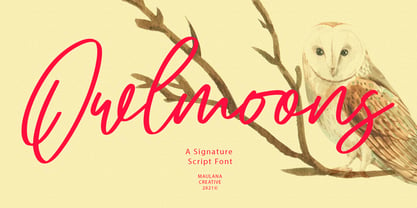 Owlmoons is casual signature font, with bold stroke, slanted and fun character. It has Opentype features ligatures of character, To give you an extra creative work. Owlmoons font support multilingual more than 100+ language. This font is good for logo design, Social media, Movie Titles, Books Titles, a short text even a long text letter and good for your secondary text font with sans or serif. Make a stunning work with Owlmoons font.
 - Cripto Font by Intellecta Design,
$18.90The CriptoFont and CriptoFont Ornamental were to be used alone or together, providing a nice solution to the project, be it a book, an invitation, or many others. Cripto Font Ornamental has two kinds of ornaments, one used in the beginning of words or sentences (using the uppercase keys), and other to be used to close words or sentences (using the lowers case keys). See the samples in PDF guide and in gallery - Aron by Artisticandunique,
$12.00 Aron - Sans Serif Font Family - Multilingual supports - 6 Style Aron Sans serif font family, with is geometric structure and 6 styles, helps you create many alternatives in your creative projects. It is also assertive about being a highly readable font with different weights in creating striking and powerful titles. Ideal for books and magazines, editorials, headlines, websites, logos, branding, advertising and more. If you have a question, please contact me. Have a good time.
 - Old Style 7 by Linotype,
$29.00The name Old Style No. 7 comes from a time when foundries released a variety of typefaces under one name. Linotype produced Old Style No. 7, which was based on an early 1870s typeface from the Bruce Typefoundry, which had based its design on a type from the Scottish foundry Miller and Richards. Old Style No. 7 is a reliable text type that is serviceable for both books and shorter copy demands, such as magazines. - Kamryn by Sharkshock,
$115.00 Kamryn is an updated overhaul of an earlier project. This version retains a distinct retro look with swashes and rounded serifs. This gives it a wholesome feel that will work well in children’s books, 80’s era apparel, or scrapbooking. European accents and extended punctuation were added along with improved kerning and alternates. Overlap may occur in certain uppercase/lowercase combinations. The 3D versions are equipped with several ligatures that correct this.
 - Spirodelic by Mysterylab,
$16.00 Spirodelic is a funky pop-art font with a sassy vintage vibe. This all-capitals design incorporates coiled spirals into the letters, and will add a lot of swirly psychedelic fun to your designs. It's great for retro seventies looks of course, but really also works well on anything modern that needs a loose and lighthearted touch, like kids books, toy packaging, flavored drinks, clothing lines, surf gear, logos... you name it.
 - Milarossa by Agny Hasya Studio,
$12.00 Milarossa Is a Serif Display Typeface That Is Elegant and Classic Yet Modern. It Comes in 2 (Two) Styles (Regular and Italic) and Is Created With Stylistic Alternatives and Ligatures. Perfect for Your Design Projects Like Logos, Branding, Advertising, Product Designs, Stationery, Magazine Designs, Book/Cover Title Designs, Photography, Art Quotes, Wedding Designs, Fashion Designs, Special Events, Labels, Product Packaging, and More. Featured with Uppercase and Lowercase, Numeral and Punctuation, Multilingual Support, and Opentype Features.
 - Raittens by Gassstype,
$22.00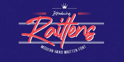 Introducing Raittens is Modern Handwritten Font is a Authentic Style and classy style, Raittens a natural handwritten feel. This handmade font will make your design has a beautiful natural touch for each details. It is perfect for any design project as Invitation,logo, book cover, craft or any design purposes,photography overlays, signs, window art, scrapbooking, tags and so much more! This font is PUA encoded which means you can access all of ligatures.
 - Tuesday Jingle by Attype Studio,
$13.00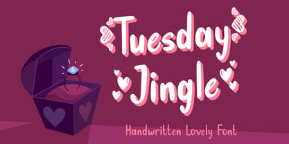 Tuesday Jingle is an exquisite font for Valentine theme design, with dingbats heart on character "{}[]" Fall in love with it and bring your projects to the highest levels! Tuesday Jingle is perfect for branding, logo, invitation, stationery, social media post, product packaging, merchandise, blog design, game titles, cute style design, Book/Cover Title and more. What's Included : - Tuesday Jingle.otf - Heart dingbats on character "{}[]" - Multilingual Support --- Hope you enjoy with our font! Attype Studio
 - Hofisem by Arendxstudio,
$14.00 Hofisem is a retro Serif typeface from the 1970s style, full of nostalgia and handmade funk, it has a thickness that is very fitting for retro styles and the like, solid and uniqueness of each character style made. Hofisem comes with opentype features such stylistic alternates, stylistic sets & ligatures good for logotypes, posters, badges, book covers, t-shirt designs, packaging and much more. Features: -Uppercase & Lowercase -Multilingual support -Numbers -Symbols -Punctuation -Ornament
 - Cholasette by Maulana Creative,
$15.00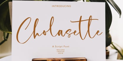 Cholasette is casual script font, with clean high contrast stroke, upright and fun character. It has Opentype features ligatures of character, To give you an extra creative work. Cholasette font support multilingual more than 100+ language. This font is good for logo design, Social media, Movie Titles, Books Titles, a short text even a long text letter and good for your secondary text font with sans or serif. Make a stunning work with Cholasette font.