10,000 search results
(0.044 seconds)
- PF Encore Sans Pro by Parachute,
$79.00 Encore Sans Pro is a sans serif which projects an image of reliability, authority and competence making it ideal for corporate applications. A functional typeface which combines utility with style. It’s subtle round characteristics such as the slightly curved-in edges, create a distinctly contemporary look, blending effectively traditional with modern details. Encore Sans Pro has received 3 international awards and distinctions including a Silver at the european ED Awards 2010. This is a contemporary typeface which may function as the perfect alternative to several overused classic sans. Encore Sans Pro does not pretend being different but it does claim its own personality. It is simple and stylish. Furthermore, it is extremely versatile. It comes with 22 weights and supports simultaneously Latin, Greek and Cyrillic. Each font contains 1535 glyphs and is loaded with 22 advanced OpenType features. Extreme weights, such as the elegant hairline, are carefully designed to establish an even color throughout, while ultra black despite its heavy characteristics is quite legible and powerful. Other intermediate weights such as light and book are ideal as body text for magazines and catalogs. Every font in this series has been completed with 270 copyright-free symbols, for packaging, public areas, environment, transportation, computers, fabric care and urban life.
 - Ambiguity by Monotype,
$50.99 Ambiguity is a type family with five distinct personalities or ‘states’, created as a tool for coaxing designers and brands out of their comfort zone. It embraces both tradition and radicality, as well as generosity and thrift, encouraging us to question our beliefs about the intersection of style and meaning. The family is designed by Charles Nix, who describes Ambiguity as “as much thought experiment as typeface.” Its five states—Tradition, Radical, Thrift, Generous and Normate—each express or subvert different aspects of typographic tradition. Tradition is conservative, relying on historical letter shapes. Radical rejects inherited ideas of proportion, making typically slender letterforms wide, and wide letterforms slender. “It’s contrarian,” says Nix. Thrift cherry picks the condensed shapes from Tradition and Radical, while Generous does the same for wide forms. Normate sits at the center, a synthetic blend of all of the others. “Tradition is very comforting,” says Nix. “It’s the mask of conservatism. It’s calming because it delivers the proportions we expect. With Thrift more fits into a smaller space, so it’s great where words want to get large, like gigantic headlines, or text needs to cram in, like small screen type. You get a sense of carefree and luxury from the Generous cut. One would expect the Radical to be used in a sort of Dadaist way, but in a classic context it provides an enjoyable jolt.” Ambiguity is a litmus test. Designers could spend hours trying on typefaces that offer just one of these voices. Ambiguity provides five different personalities—ideas—beliefs—each of which also work seamlessly together. “It’s a palettea, like idea cards,” he says. “It’s a way of making yourself see differently. My hope is that traditionalists will try on radical clothes and vice versa. It’s a way of exploring outside your comfort zone, breaking out of the doldrums, by stepping through a variety of voices.”
 - Finest Romance by Din Studio,
$25.00 Be a trendsetter and get prominent with the best style from the Finest Romance. Finest Romance is a duo font from mixtures of serif and script fonts. This harmonic duo font work hand in hand to produce marvelous designs because it expresses modernity, elegance and a little romance. Additionally, the geometric serif font’s letters are simple and consistent for a great legibility purpose. On the other hand, the script font’s letters are designed to be similar to a handwriting by adding more variations to the letters with curves and final swinging wipes. You can use this font together or separately based on your necessity. With this font’s amazing features, you can enhance your design products. Features: Stylistic Sets Ligatures Multilingual Supports PUA Encoded Numerals and Punctuations Finest Romance fits for various design projects, such as posters, banners, logos, magazine covers, quotes, name cards, invitations, headings, printed products, merchandise, social media, etc. Find out more ways to use this font by taking a look at the font preview. Hopefully, you have a great experience using our font. Feel free to contact us if you require more information when you are dealing with a problem. Thank you. Happy designing.
 - Hand Shop Pack by Fontscafe,
$29.00 We’re really excited to unveil our all-new line of ‘HAND SHOP FONTS’. As the name suggests, these are fonts that have a hand-made or hand-typography feel reminiscent of shop signboards from the past with an attentive focus by the shop owners, always looking to discover exciting and unique ways to promote their products or services. While for decades typography has strived hard for perfection, one of the routes taken by the typography world as a whole has been to eliminate any form of ‘human imperfection’ in the typesets, but what about the times when you DO want to send across emotions of a personal human touch through your fonts? We did a step back...these fonts will give your shop-signs a personal touch, telling your buyers that they will get personalized attention, be it through an online or an offline business…We hope you love them as much as we do. The “Hand Shop EXTENDED Pack” containing a total of 14 fonts from the “Hand Shop Banners & Elements Pack” (3 fonts) , the “Hand Shop Typography Pack 01” (8 fonts) and the “Hand Shop Typography Pack 02” (3 fonts)
 - Maxengine by Ditatype,
$29.00 Maxengine is a bold script font that refuses to conform. This rebellious yet playful typeface marries boldness with a touch of whimsy, creating a dynamic and unique script that captures attention and refuses to be confined by traditional design norms. The characters in Maxengine boast a rounded shape, bringing a sense of friendliness and approachability to the bold script. What truly sets it apart is the intentionally uneven outline details, adding an element of spontaneity and creative flair to each letter. This unconventional approach results in a font that exudes personality and breaks away from the ordinary. In addition, enjoy the features here. Features: Ligatures Stylistic Sets Multilingual Supports PUA Encoded Numerals and Punctuations Maxengine fits in headlines, logos, posters, flyers, branding materials, greeting cards, print media, editorial layouts, and many more designs. Find out more ways to use this font by taking a look at the font preview. Thanks for purchasing our fonts. Hopefully, you have a great time using our font. Feel free to contact us anytime for further information or when you have trouble with the font. Thanks a lot and happy designing.
 - Biotrons by Ditatype,
$29.00 Biotrons is not your ordinary bold display serif font—it's a visual powerhouse that commands attention with its unique design. This font is a daring exploration of boldness and precision, bringing a cutting-edge aesthetic to the world of script typography. The characters in Biotrons are defined by their bold strokes and sharp corners, creating a strong and impactful visual presence. The deliberately uneven outlines add an element of unpredictability, giving each letter a sense of individuality and flair. Biotrons is a font that thrives on breaking away from the expected norms, offering a dynamic and modern take on the traditional script. Enjoy the features here. Features: Ligatures Stylistic Sets Multilingual Supports PUA Encoded Numerals and Punctuations Biotrons fits in headlines, logos, posters, flyers, branding materials, greeting cards, print media, editorial layouts, and many more designs. Find out more ways to use this font by taking a look at the font preview. Thanks for purchasing our fonts. Hopefully, you have a great time using our font. Feel free to contact us anytime for further information or when you have trouble with the font. Thanks a lot and happy designing.
 - Belucian by Font Bureau,
$40.00 The Belucian series offers a distinguished text design supported by dynamic headline structure. In need of a distinctive display style, Smart magazine asked Font Bureau in 1990 to revise the work of Lucian Bernhard from 1925. David Berlow prepared Belucian Demi, now accompanied by Kelly Ehrgott-Milligan’s 1994 Demi Italic, added Book and Book Italic for text, and designed Ultra for dynamic impact in headlines; FB 1990–94
 - Anselm Sans by Storm Type Foundry,
$63.00One of the good practices of today’s type foundries is that they release their type families as systems including both serif and sans serif type. Usually, the sources of inspiration need to be well tried with time and practice, since production of a type family is such a laborious and complex process. From the beginning, it needs to be clear that the result will be suited for universal use. Such systems, complete with the broad, multi-lingual variations permitted by the OpenType format, have become the elementary, default instrument of visual communication. Non-Latin scripts are useful for a wide scope of academic publications, for packaging and corporate systems alike. And what about outdoor advertisement designated for markets in developing countries? Cyrillics and Greek have become an integral part of our OpenType font systems. Maybe you noticed that the sans serif cuts have richer variety of the light – black scale. This is due to the fact that sans serif families tend to be less susceptible to deformities in form, and thus they are able to retain their original character throughout the full range of weights. On the other hand, the nature of serifed, contrasted cuts does not permit such extremes without sacrificing their characteristic features. Both weights were drawn by hand, only the Medium cut has been interpolated. Anselm Ten is a unique family of four cuts, slightly strengthened and adjusted for the setting in sizes around 10 pt and smaller, as its name indicates. The ancestry of Anselm goes back to Jannon, a slightly modified Old Style Roman. I drew Serapion back in 1997, so its spirit is youthful, a bit frisky, and it is charmed by romantic, playful details. Anselm succeeds it after ten years of evolution, it is a sober, reliable laborer, immune to all eccentricities. The most significant difference between Sebastian/Serapion and Anselm is the raised x-height of lowercase, which makes it ideal for applications in extensive texts. Our goal was to create an all-round type family, equally suitable for poetry, magazines, books, posters, and information systems. - Anselm Serif by Storm Type Foundry,
$63.00 One of the good practices of today’s type foundries is that they release their type families as systems including both serif and sans serif type. Usually, the sources of inspiration need to be well tried with time and practice, since production of a type family is such a laborious and complex process. From the beginning, it needs to be clear that the result will be suited for universal use. Such systems, complete with the broad, multi-lingual variations permitted by the OpenType format, have become the elementary, default instrument of visual communication. Non-Latin scripts are useful for a wide scope of academic publications, for packaging and corporate systems alike. And what about outdoor advertisement designated for markets in developing countries? Cyrillics and Greek have become an integral part of our OpenType font systems. Maybe you noticed that the sans serif cuts have richer variety of the light – black scale. This is due to the fact that sans serif families tend to be less susceptible to deformities in form, and thus they are able to retain their original character throughout the full range of weights. On the other hand, the nature of serifed, contrasted cuts does not permit such extremes without sacrificing their characteristic features. Both weights were drawn by hand, only the Medium cut has been interpolated. Anselm Ten is a unique family of four cuts, slightly strengthened and adjusted for the setting in sizes around 10 pt and smaller, as its name indicates. The ancestry of Anselm goes back to Jannon , a slightly modified Old Style Roman. I drew Serapion back in 1997, so its spirit is youthful, a bit frisky, and it is charmed by romantic, playful details. Anselm succeeds it after ten years of evolution, it is a sober, reliable laborer, immune to all eccentricities. The most significant difference between Sebastian/Serapion and Anselm is the raised x-height of lowercase, which makes it ideal for applications in extensive texts. Our goal was to create an all-round type family, equally suitable for poetry, magazines, books, posters, and information systems.
 - Pliego by Huy!Fonts,
$35.00 Pliego is a textface designed to offer a comfortable continuous reading, with humanist proportions, an even texture, and informal calligraphic details noticeable only at big sizes, that gives it a contemporary feeling. Pliego has been named after Pliegos de Cordel, the Spanish word for the popular books that were common during the XVI, XVII and XVIII centuries. These were rough, cheap books that basically consisted in a folded sheet attached to a string, hence the name. Their content was varied, from popular tales to ballads and songs, but also crimes and mysteries. They were cheaply made, roughly printed and bound. The name Pliego evokes the idea of a rough look, angular edges, informal taste, but classical look. To cover today’s needs, Pliego includes five weights with matching italics. Designed and engineered for continuous reading, the Book, Regular and Medium weights will perform at their best under 14 points. However, don’t be scared to use for headlines and titles: because of its quirky details and calligraphic flavour, Pliego’s personality is accentuated when enlarged. With an extensive Latin character set, Pliego covers a wide amount of Latin-based languages, including Latin Plus encoding and Vietnamese support.
 - Shinn by Red Rooster Collection,
$45.00 Designed by Nick Shinn. Digitally engineered by Steve Jackaman. Humanist sans serif with a calligraphic cut and tall ascenders. Light, Medium and Extra Bold designed by Nick in 1985 for Typsettra; Steve added the Book and Bold weights, and the Italics.
 - Melts Script Rough by Estudio Calderon,
$20.00 Melts Script Rough by Estudio Calderón is the textured version of Melts Script. It has a texture design in high definition that runs very good in any size and concepts. Good news! It includes a free version of “Melts Script Rough Sanscript One”. Specimen
 - Sergury by Ingrimayne Type,
$5.00 Sergury is an ultra-bold typeface formed by cutting circular elements from rectangular blocks. It is caps only and is so bold that it is almost unreadable. The three tall styles were added in 2021. Sergury is a variation of Porker, another experimental typeface.
 - Eskos by Pesotsky Victor,
$10.00 Eskos is designed for headings. It is deliberately diagonal and gives a sharp, oblique texture in the text set. It has rough irrational knots and oblique strokes. Eskos supportsBasic Latin, Cyrillic and more than 100 languages all together. The font was designed by Viktor Pesotsky.
 - Gluten by Andinistas,
$24.67 Gluten is an experimental font family designed by Carlos Fabian Camargo. It includes irregular shadows to communicate craftsmanship. Its multiple upper cases with condensed width and naive lines are notable for their expressive drawing with a high amount of contrast between thick and thin strokes.
 - Lake Informal by Linotype,
$29.99Lake Informal was designed by Rudolf Ruzicka in 1935. It is a handwriting font which imitates the result of a feather script on paper. A dynamic, individual font, it is also very legible even in smaller point sizes and is perfect for personal correspondence. - FG Typical by YOFF,
$14.95FG Typical is inspired by typewriting. But the letters got skewed in processing making it look a bit corny, but it looks great at small sizes as well as large. the characters all have the same height except for the i, å, ä etc. - LeftheriaPRO by Sea Types,
$29.00 LeftheriaPRO has its structure projected from the capitals of the Greek columns of Ionian order, it is a typography condensed with vertical emphasis composed by 5 weights (light, regular, medium, semibold, bold) including ligatures, alternates, smal caps, old styles figures, fractions, superiors, inferiors. | Download Specimen
 - Benton Gothic Thin NF by Nick's Fonts,
$10.00 This typeface takes its inspiration from Lightline Gothic, designed by Morris Fuller Benton for ATF in 1908. This version is even lighter, making it suitable for headlines. Both versions of this font support the Latin 1252, Central European 1250, Turkish 1254 and Baltic 1257 codepages.
 - Kid Knowledge by 38-lineart,
$6.00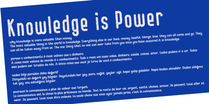 Kid Knowledge is a striking family. It includes 5 amazing styles which can be combined perfectly, giving you the opportunity to create multiple unique designs in an instant. It was inspired by children’s science projects and will give a playful touch to your designs.
 - Ganbate Script by Balevgraph Studio,
$12.00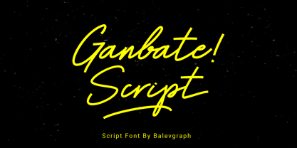 Gilbert Script is a bold and modern script font. Be intrigued by its ravishing style and use it to create beautiful wedding invitations, beautiful stationary art, engaging social media posts and more! What's Included? Uppercase & Lowercase Numbers & Punctuation Ligature, Alternate & Swashes Multilingual Support PUA Encoded
 - Kallilu NF by Nick's Fonts,
$10.00This extrabold display face takes its design cues from the typeface Thomac, designed by George Piscitelle in the 1960s. Its semiscript styling makes for headlines that get attention. Both versions of the font contain the complete Unicode Latin 1252 and Central European 1250 character sets. - Mugpie by PizzaDude.dk,
$14.00 Originally handdrawn, and then digitized by hand. But carefully keeping the characteristics of the handmade lines. Mugpie has that happy-go-lucky feeling to it - use it for your posters, postcards, packaging, wrapping - anything that could need a fresh breath of funkadelic comic boost! :)
 - French Forge by Anton Shlyonkin,
$- This is decorative typeface for large scale designs (like headers or so), inspired by french forged balcony decorations. This font has 2 dimensions in it (thin letters like a, o, e and ‘wide’ m, b etc.), to make it more vibrant and add volume.
 - Vernox by Latour,
$20.00 Vernox is a geometric sans serif font inspired by Swiss design. You can completely align the grid to a grid. It is intended for small pieces of text such as titles and qoutes. Vernox comes with 2 weights. It makes perfect for all creative projects.
 - Estandar Rounded by Latinotype,
$- Estandar Rounded is a retro and vintage wayfinding sans serif font, inspired by old signals in central park and Europe. It is a Condensed sans with their tall x-height. The family has 6 Weights, italics and dingbats. It is an extension of Estandar font.
 - Carta Marina by insigne,
$21.99 Carta Marina is based on the titling found on the famous map drawn by Olaus Magnus in 1539. The map of northern Europe took 12 years to complete, and the total size is a huge 1.7 meters tall by 1.25 meters wide. More information about the map, as well as the high resolution reference document used to create the typeface and illustration set can be found at the James Ford Bell Library, University of Minnesota. The titling is slightly aged, very sturdy and elegant. Carta Marina includes a full set of OpenType alternates for every character in the English alphabet, oldstyle figures, historical forms, small caps and 64 discretionary ligatures. These ligatures are used to alter the appearance of the type so that the printing appears realistic and without any duplicate letters to detract from the antique appearance. The Carta Marina family also includes some of the unique illustrations that gave the map its character. It includes depictions of fanciful sea creatures, land animals and some of the inhabitants of the lands pictured.
 - Quick Silver FS by Designova,
$23.00 Quick Silver FS is unique, fresh and cute handwritten font for branding / logo design / logotypes / greeting cards / promotional graphics and anything in between. Quick Silver FS is inspired from modern era cartoon titles and completely handmade with passion and perfection. Extended Character Sets Along with the basic Latin character set, we have added Western European, Central European, South Eastern European character sets for your convenience. Advanced Kerning We have performed advanced, in-depth kerning for all possible letter combinations. What You Get This font being a handmade typeface, comes with only single weight (Regular). CREDITS: Font designed by Lis at Fontastica, produced by Fontastica, distributed by Designova. Created with ProCreate and Fontself on iPad Pro.
 - Innova by Durotype,
$49.00 Innova. A new grotesque for the 21st century. More open. More squarish. More legible. After the many grotesques which have been designed over the years, is it still possible to improve this genre? Innova is a new design — a contribution to the tradition of grotesque typefaces. It is an attempt to improve both this genre’s legibility and versatility. Innova consists of two families: Innova and Innova Alt. The Innova family has rectangular dots. The Innova Alt family has round dots — making its personality a little friendlier. Innova is well suited for both text and display use — for graphic design, corporate identity design, magazines, newspapers, books, reports, editorials, web, advertising, signage, etc. Innova includes 16 uprights and 16 matching italics. It includes small caps, arbitrary fractions, and extensive language support. It includes nine numerical styles: lining and oldstyle figures (proportional and tabular), small cap figures, superiors, inferiors, numerators, and denominators. Innova embodies the renewal needed for the traditional grotesques. It is a grotesque which is fit for the 21st century. In order to see whether you agree with this, please try the free Innova Alt Demi. For more information about Innova, download the PDF Specimen Manual.
 - Hinge by Trim Studio,
$15.00 Hinge is a modern font with a tradition feel on it. Inspired by curves and round touches of classic feel.
 - La Macchina by FontMesa,
$20.00 La Macchina is a bold script suitable for logos, letterheads & headlines. It also resembles the lettering used by Lamborghini Automobiles.
 - Godiva by Suby Studio,
$10.00 Godiva is vintage font family inspired by vintage lettering. It works perfectly for achieving that vintage aesthetic with your designs.
 - DetourDork by JOEBOB graphics,
$9.00 DetourDork was inspired by American highway signs. Hand-drawn with a medium marker, but it looks very clean and straight.
 - EB Martin by Erik Bertell,
$12.95 Martin is a quirky modern blackletter, inspired by several traditional styles. Despite the organic feel, its construction is entirely geometric.
 - HK Nova by Hanken Design Co.,
$30.00 HK Nova is a geometric sans inspired by the Century Gothic and Futura. It formalizes Century Gothic and softens Futura.
 - FS Clerkenwell by Fontsmith,
$80.00 A creative context 2003. Fontsmith was sharing a small, cold, whitewashed studio space in Northburgh Street, Clerkenwell. But things were on the up following prestigious custom type commissions for The Post Office and E4. “Slab serifs were on the brink of another revival, we could feel it,” says Jason Smith. “All we wanted to do was have a play with these slabs, go as far as we could within what was acceptable and readable.” “It wasn’t initially clear what was happening,” recalls Phil Garnham. “We were becoming very influenced by our surroundings, outside the studio space. We absorbed the essence and the designer grime of where we were.” Process Jason began by drawing stems on-screen. “The key aspect of the font is the upward bend of the leading shoulder serif, the way it kind of ramps up and then plummets back down the stem. “The regular and light characters are quite narrow – great for text but the bold is quite wide and chunky – better for headlines. I think ‘y’ is quite different for a slab design. We call it the Fontsmith ‘y’.” Promotion Fontsmith were determined to get FS Clerkenwell noticed. To launch the font, Ian Whalley, a designer friend of Fontsmith, captured words heard on the streets of Clerkenwell, set them in the new font and crafted a small book of typographic conversations. It was a first for Fontsmith. “I think that’s part of why this font has been so successful,” says Phil. “It really does embody the spirit of the area, as a special place for design, arts and crafts. And designers love that.” Contemporary twist FS Clerkenwell, based on influences in and around this part of London with a rich tradition of printing and design, mixes tradition with creation. Old-fashioned values meet new-school trends. Its quirky, contemporary character lends an edge to headlines, logotypes and any large-size text.
 - Bell Gothic by ParaType,
$30.00 The Bitstream version of Bell Gothic designed by Chauncey H. Griffith in 1938 for telephone directories of the Bell Telephone Company. It is a good sans serif choice for listings, catalogues and directories as its design is very space saving. The weight of the line is moderate and uniform. Being a clear and easy-to-read font, Bell Gothic is popular now for display and magazine advertising. Cyrillic version by Isabella Chaeva was released by ParaType in 1999. Italic styles added in 2009 by the same designer.
 - Sketchbook - Unknown license

- Caligraf by Mans Greback,
$29.00 Caligraf is a classical calligraphy script. It was drawn and created by Måns Grebäck during 2019 and 2020. The character design blends traditional soft flowing handwriting with a modern, sharp look, and its angle and weight balance gives it a determined and progressive pace. Caligraf is a multistyle font family, composed of Thin, Light, Regular, Bold and Black. Its range ensures usability in any context, while also giving the ability to emphasize phrases or words. Use it in an invitation, a diploma, a logotype or in a decorative body text. Being a font with over 850 glyphs, it is guaranteed to contain all characters you'll ever need, including all punctuation and numbers. It has an extensive lingual support, covering European and Asian Latin scripts.
 - Classic Clips JNL by Jeff Levine,
$29.00 During the years of physically doing camera-ready paste-up work before the advent of the digital age, clip art books dominated the way stock art was added to a print project. Clip art books were eventually replaced by clip art CDs, DVDs and online download sites, just as the books themselves had replaced the stock photo engravings of the letterpress era. With the kind permission of Graphic Products Corporation, Jeff Levine Fonts offers up a sampling of images found within the pages of Graphic Source clip art books; aptly entitled Classic Clips JNL.
