10,000 search results
(0.044 seconds)
- After Story by Senekaligrafika,
$12.00 “After Story” is a playful handwriting font special for summer display,that puts a smile on your project and will inspire you to create something fun and memorable. “After Story” will help you to create special and touching typographical design for vacation projects, for every day or the happiest day in life, happy birthday cards, baby shower, greeting card, headings, flyer, product packaging, book cover, printed quotes, logos, and many more. It is really universal and modern font. The owner of endless possibilities!
 - Varstate by Alphabet Agency,
$15.00 The Varstate font family is a versatile collection of fonts inspired by the varsity team name lettering often seen on apparel such as Letterman jackets, t-shirts and hoodies. The fonts can be used in combination to provide a variety of design options and different looks in genres such as sports, leisure and industry. The family contains fonts in 4 weights; Normal, Semi Light, Light and Extra Light. Each font includes Latin basic characters which includes uppercase, lowercase, numbers, punctuation and much more.
 - Corbert Compact by The Northern Block,
$- A compact geometric sans serif typeface influenced by Bauhaus and the early modernist era. Precise shapes are optically adjusted to create a clear, natural typeface with excellent legibility across various applications. Corbert compact is part of the popular Corbert type system; other widths include Normal, Condensed and Wide. Details include over 590 characters; OpenType features consist of five variations of numerals, including inferiors, superiors, fractions, alternative lowercase a, e and g, and language support covering Western, South, and Central Europe.
 - Solaris by Ultramarin,
$40.00 Solaris is a sans serif or a grotesque as we still call it where I come from. (it is an old term which means strange compared with Roman which was the normal font) The face is an open sans, which means that the round signs take the air into the form, minuscule d is drawn kind of backwards like in Gill Sans, which sets off on minuskel a. Here is the Regular version, with a slightly difference between stems and hairlines.
 - Dexa Pro Variable by Artegra,
$79.00 Dexa Pro is now available on variable version. The family was designed by Ceyhun Birinci in 2020 with an inspiration to create a contemporary super family with inspiration from classic sans serif families. It's a workhorse family consisting of condensed, narrow, normal and expanded widths. Each width has a wide weight range from thin to black, along with their true italic counterparts. With more than 770 glyphs per font, It offers a ton of language support from all the Latin languages to Cyrillic.
 - Magdelin by Adam Ladd,
$24.00 Magdelin is a minimal yet warm gothic sans with normal and alternate families. At its core, the design has simple forms and low contrast, yet it takes some qualities from the humanist class with its calligraphy or cursive-inspired details found in the italics and the bowl shapes of characters like b and d. The small x-height, longer ascenders and descenders, and semi-condensed proportions give it a bit of a vintage or classic feel while still appearing contemporary and modern.
 - FF Cube by FontFont,
$62.99 Danish type designer Jan Maack created this display and sans FontFont in 2008. The family has 18 weights, ranging from Light to Bold in Condensed, Normal, Expanded, and Extra Expanded (including italics) and is ideally suited for advertising and packaging, logo, branding and creative industries, poster and billboards as well as sports. FF Cube provides advanced typographical support with features such as ligatures, alternate characters, case-sensitive forms, and stylistic alternates. It comes with tabular oldstyle and tabular lining figures.
 - LTC Goudy Modern by Lanston Type Co.,
$39.95Goudy Modern/Open was designed by Frederic Goudy, who was inspired by the caption of a French engraving. It is Goudy's first attempt at a "modern" face, but with less contrast and rigidity normally found in Bodoni style Modern faces. Goudy Modern was designed later in 1918 after viewing a proof of Goudy Open with the line filled in. Not a true modern face, but still a Goudy classic. The Pro versions include ligatures, varieties of numerals and Central European character sets. - FF Super Grotesk by FontFont,
$68.99 German type designer Svend Smital created this sans FontFont in 1999. The family has 6 weights, ranging from Regular to Bold in Condensed and Normal and is ideally suited for film and tv and editorial and publishing. FF Super Grotesk provides advanced typographical support with features such as ligatures, alternate characters, case-sensitive forms, fractions, super- and subscript characters, and stylistic alternates. It comes with a complete range of figure set options – oldstyle and lining figures, each in tabular and proportional widths.
 - LTC Goudy Open by Lanston Type Co.,
$39.95Goudy Modern/Open was designed by Frederic Goudy, who was inspired by the caption of a French engraving. It is Goudy's first attempt at a "modern" face, but with less contrast and rigidity normally found in Bodoni style Modern faces. Goudy Modern was designed later in 1918 after viewing a proof of Goudy Open with the line filled in. Not a true modern face, but still a Goudy classic. The Pro versions include ligatures, varieties of numerals and Central European character sets. - Modena JW Font Duo by Jen Wagner Co.,
$16.00 Modena is a beautiful high fashion font duo that makes for gorgeous logos, posters, wedding invitations, blog posts, social media, and more! I love using them together with layer masks in Photoshop, so it looks like the script is running through the lines of the sans serif. The sans looks stunning with tracking set to 220, as well as where it falls normally at 0! Modena Script includes over 50 ligatures to make everything look totally hand-done, and alternates for each letter.
 - Ekela by AukimVisuel,
$9.00 Ekela family has 216 styles in 5 versions: Normal, Round, Circle, Punch and Round Punch. Ekela family is a neat, unique sans serif simple font with minimal and round letters. It can easily be combined with an incredibly large set of projects, so add it to your creative ideas and notice how it sets them apart! Suitable for a wide variety of designs thanks to its neat styling, Ekela family has the potential to become your favorite font, whatever the occasion!
 - Porosya by NREY,
$19.00 Introducing new typeface - Porosya. Porosya has multilingual support includes cyrillic. Many ligatures make your typography most variable. Porosya Typeface was inspired by ethnic slavonic style which combining classic typography with awesome features bring classic touch on this culture. It works well with normal size text and for large displays or short words. You may combine uppercase and smallcase in the text body, as alternates symbols. The Porosya typeface is suitable for : product packaging, labeling, logo, classic shop, ethnic shop, titles, etc
 - Plasto by Eko Bimantara,
$19.00 Plasto is a complete grotesk sans serif family. The quirky letterforms and its slight width variation characterized the typeface as fun and playful as "plastic" in a graphic layout, fit for various design spaces, fit for both informal or functional purposes, fit for large display and also small text. Plasto complete family contains 54 styles with two axes; Weight and Width. The weight consists of 18 styles from Thin to Black, and the width consists of 3 styles, condensed, normal and expanded.
 - Minimo by Ahmet Altun,
$19.00 Minimo Font Family comes in 4 weights; Normals and Obliques. To have an eye-pleasing view, the corners are rounded and the lowercases are made smaller than the standard. With its soft structure, it is aimed to be legible even in the small sizes and also to be suitable for usage as webfont and application font. Moreover, with this font family, you can create eye-pleasing, cute and also nice works such as posters, printings, t-shirts, adds, magazines etc.
 - Edits And Credits JNL by Jeff Levine,
$29.00Edits and Credits JNL is a cheerful sans serif typeface modeled from ceramic letters in a movie titling set from the late 40s or early 1950s. In the original kit, letters would be lined up accordingly against a contrasting background and photographed for home or professional movie and slide titles. Note: The cap height is slightly smaller than normal for the respective point size. This will give the effect of wider line spacing - similar to that of home movie titles. - Feltboard JNL by Jeff Levine,
$29.00Feltboard JNL was drawn from images of letters and numbers contained in a felt board (also known as a flannel board) sign kit from the 1940s or 1950s. The irregularity of stroke widths and character shapes is representative of the actual shapes of the die-cut pieces found within this kit. Note: The cap height is slightly smaller than normal for the respective point size. This will give the effect of wider line spacing - similar to that of hand-made signs. - DT Skiart by Dragon Tongue Foundry,
$30.00 Looking for something between a Serif and Sans Serif font? Try the DT Skiart font. This high quality, versatile font has the professional feel of a Serif, but has the open readability of a Sans Serif. A smart crisp font with smooth simple lines. It has a medium to strong stroke contrast, with the vertical line being heavier than the horizontal line, and no serifs. The DT Skiart family is made up of 5 weights in both italic and normal.
 - Tomkin by Typesketchbook,
$55.00 Tomkin font is an extra large super family of 54 fonts! Tomkin have such a big abundance of contrast, styles, weights, width. Typesketchbook consists of a very usable, clean and modern sans typeface with Semi-square struture. The complete Tomkin type family includes 9 weights with italic and 3 width (normal, narrow, condense) versions for each of them all in all 54 fonts for a multifunctional usage, especially for cooperative work, such as website, magazine, editorial, publishing , as well as packaging.
 - Aden by Sultan Fonts,
$19.99 Aden is An Arabic typeface for desktop applications. Aden is Modern typeface style. The font comes in two styles: normal and bold. The design is open, calligraphic, and very dynamic. This makes it suitable for large display sizes, especially in the area of advertising, while still functioning well as a text face. The font includes a matching Latin design and support for Arabic. It also includes proportional and tabular numerals for the supported languages. Aden typeface comes with many opentype features.
 - Rixiline by Creative Lafont,
$10.00 Introducing Rixiline Script, a unique blend of classic and modern font. imperfect style ups and downs, like a dance letters, smooth, clean and simple. Rixiline Script perfect for wedding, event, invitation, escort card, clothes, display, logos, quotes, slider blog, custom address, stamps, packaging, greeting card, etc. Rixiline Script comes with a complete set of standard characters, eastern diacritic symbols, consist 917 glyphs in total, and alternative characters as OpenType features to play with. The alternative characters were divided into several OpenType features such as Ligature and Stylistic Sets. You can create an attractive message by using the alternate characters in your design. The ZIP file are include the following: Webfont Features Rixiline Script : Basic Latin A-Z and a-z Numbers & Punctutation Symbols Stylistic Set Lots of Swashes, Ligatures & Alternates Script 917 Glyphs PUA Encode (Specially Coded Fonts) Support Latin Pro Character If you don't have a program that supports OpenType features such as Adobe Illustrator and CorelDraw X Versions, you can access all the alternate glyphs using Font Book (Mac) or Character Map (Windows). Don't forget to check out other cool fonts on our store and wait for new fonts. Follow our shop for upcoming updates including additional glyphs and language support. feel free to send me a message, comment, like and share. If you have any question, don't hesitate to contact me by email. Thank You
 - Parisi by Eurotypo,
$34.00 The Parisii was a small Gallic people settled in the current Paris region, which gave its name to the city of Paris. According to Caesar (53 BC.), their main town (oppidum) was Lutetia (Paris). Parisii was born of inspiration to be leafing through some old magazines on the terrace of a cafe in the beautiful city that is Paris. Parisi is like the city: casual, youth, romantic, free spirited and, at the same time, sophisticated, elegant and classic. The Parisi family font is a lovely and casual handlettering script, which is based on gestual calligraphy. Parisi has a slight bounce and intentional irregularity giving your words a wonderful flow. Fat and thin stroke in this font impresses the harmony. Parisi consists of 3 subfamilies: Regular, Italic and Condensed. This font includes Parisi font has OpenType features such as Stylistics and Contextual alternates, swashes, Standard and Discretional Ligatures, stylistic sets and ornaments that allow you to mix and match pairs of letters to fit your design. This will help your creativity and make it easier to make the impressive and elegant typographic work. This OpenType features may only be accessible via OpenType-aware applications, a Central European language support. Parisi looks lovely on wedding invitations, greeting cards, logos, business-cards and is perfect for using in ink or watercolour based designs, fashion, magazines, food packaging and menus, book covers and more!
 - Bank Sans EF by Elsner+Flake,
$35.00 With its extended complement, this comprehensive redesign of Bank Gothic by Elsner+Flake offers a wide spectrum for usage. After 80 years, the typeface Bank Gothic, designed by Morris Fuller Benton in 1930, is still as desirable for all areas of graphic design as it has ever been. Its usage spans the design of headlines to exterior design. Game manufacturers adopt this spry typeface, so reminiscent of the Bauhaus and its geometric forms, as often as do architects and web designers. The creative path of the Bank Gothic from hot metal type via phototypesetting to digital variations created by desktop designers has by now taken on great breadth. The number of cuts has increased. The original Roman weight has been augmented by Oblique and Italic variants. The original versions came with just a complement of Small Caps. Now, they are, however, enlarged by often quite individualized lower case letters. In order to do justice to the form changes and in order to differentiate between the various versions, the Bank Gothic, since 2007 a US trademark of the Grosse Pointe Group (Trademark FontHaus, USA), is nowadays available under a variety of different names. Some of these variations remain close to the original concept, others strive for greater individualism in their designs. The typeface family which was cut by the American typefoundry ATF (American Type Founders) in the early 1930’s consisted of a normal and a narrow type family, each one in the weights Light, Medium and Bold. In addition to its basic ornamental structure which has its origin in square or rectangular geometric forms, there is another unique feature of the Bank Gothic: the normally round upper case letters such as B, C, G, O, P, Q, R and U are also rectangular. The one exception is the upper case letter D, which remains round, most likely for legibility reasons (there is the danger of mistaking it for the letter O.) Because of the huge success of this type design, which follows the design principles of the more square and the more contemporary adaption of the already existing Copperplate, it was soon adopted by all of the major type and typesetting manufacturers. Thus, the Bank Gothic appeared at Linotype; as Commerce Gothic it was brought out by Ludlow; and as Deluxe Gothic on Intertype typesetters. Among others, it was also available from Monotype and sold under the name Stationer’s Gothic. In 1936, Linotype introduced 6pt and 12pt weights of the condensed version as Card Gothic. Lateron, Linotype came out with Bank Gothic Medium Condensed in larger sizes and a more narrow set width and named it Poster Gothic. With the advent of photoypesetters and CRT technologies, the Bank Gothic experienced an even wider acceptance. The first digital versions, designed according to present computing technologies, was created by Bitstream whose PostScript fonts in Regular and Medium weights have been available through FontShop since 1991. These were followed by digital redesigns by FontHaus, USA, and, in 1996, by Elsner+Flake who were also the first company to add cursive cuts. In 2009, they extended the family to 16 weights in both Roman and Oblique designs. In addition, they created the long-awaited Cyrillic complement. In 2010, Elsner+Flake completed the set with lowercase letters and small caps. Since its redesign the type family has been available from Elsner+Flake under the name Bank Sans®. The character set of the Bank Sans® Caps and the Bank Sans® covers almost all latin-based languages (Europe Plus) as well as the Cyrillic character set MAC OS Cyrillic and MS Windows 1251. Both families are available in Normal, Condensed and Compressed weights in 4 stroke widths each (Light, Regular, Medium and Bold). The basic stroke widths of the different weights have been kept even which allows the mixing of, for instance, normal upper case letters and the more narrow small caps. This gives the family an even wider and more interactive range of use. There are, furthermore, extensive sets of numerals which can be accessed via OpenType-Features. The Bank Sans® type family, as opposed to the Bank Sans® Caps family, contains, instead of the optically reduced upper case letters, newly designed lower case letters and the matching small caps. Bank Sans® fonts are available in the formats OpenType and TrueType.
 - Gutta Percha by HiH,
$8.00 Gutta Percha is a font for golfers. It takers its name from a hard, resilient natural substance that comes from the sap of trees grown in southeast Asia and which was used for the hard core of golf balls well into the twentieth century, when it was gradually replaced with synthetic material. It therefore seemed an appropriate name for a font using the image of a golfer of the 1920s. The letters are from our font Besley Clarendon, reduced to 70%. That means that Gutta Percha set at 40 points will have the same size letters as Besley Clarendon set at 28 points. However, it should be noted that the two fonts have different baselines. If you use them together you will have to manually adjust the vertical alignment. Gutta Percha is obviously a very specialized font, both because of the subject matter and because the uppercase is designed for use as dropped caps. There may not be many uses for it, but when it is right, it will be really right. Whether you are publishing a book about the history of golf or a clubhouse bulletin, Gutta Percha will surely be noticed.
 - MFC Haute Monde Monogram by Monogram Fonts Co.,
$19.95 The source of inspiration for Haute Monde Monogram is the 1934 "Book of American Types" by American Type Founders. Found in that specimen book was a wonderfully elegant traditional smallcap-Capital-smallcap monogram alphabet known as “Elite Monogram Initials”. This elegant typeface is now digitally remastered and updated for modern use with functionality beyond its original intentions. Download and view the MFC Haute Monde Guidebook if you would like to learn a little more. MFC Haute Monde Monogram comes complete with Pro format fonts. You will require with programs that can take advantage of OpenType features contained within the Pro fonts.
 - Sophia Bella by madeDeduk,
$15.00 Sophia Bella is a gorgeous handmade signature font. It includes more than 170 ligatures to make everything look natural handmade signature and is perfect for poster design, book covers, merchandise, fashion campaigns, newsletters, branding, advertising, magazines, greeting cards, album covers, and quote designs and more.
 - Fatimah by Goodigital13,
$20.00 feel and use it to create gorgeous wedding invitations, beautiful stationary art, eye-catching social media posts, and cute greeting cards perfectly macth for desgign with valentine theme, any product like book cover, t-shirt, branding, promotion, social media post, quotes, wedding, photography and more.
 - Cocobella by Cultivated Mind,
$29.00 Cocobella is a beautiful chic and elegant hand painted font. The characters are uneven which gives Cocobella an edgy unique look. Cocobella will work best for clothing brands, fashion magazines, advertising, books, greeting cards, invitations, weddings and any time you feel sophisticated and chic.
 - Hermit Crab by Dhan Studio,
$16.00 Hermit Crab is a beautiful modern handwritten font specially designed for your current and future design needs. Hermit Crab Font is perfect for trending projects, modern, logos, blogs, branding, clothing, stationery designs, quotes, greeting cards, t-shirts, invitations, book titles, packaging designs, posters and more.
 - Nervous by Trustha,
$15.00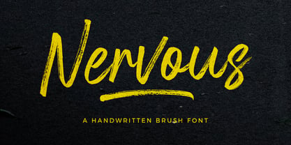 Nervous is a handwritten brush font with a bold twist. Nervous perfect for branding, logo, poster design, book covers, invitations, packaging, headers, greeting cards, apparel designs, fashion campaigns, newsletters, album covers, quote and many more. It will add an authentic spark to any creative project!
 - Cherry Parsley by Abo Daniel,
$13.00 introducing CHERRY PARSLEY - swirly handwritten font - It is great for quotes, cards, banners, books, cutting, silhouettes, social media content, and anything about craft projects. This font is all uppercase. Features: - Uppercase - Number & punctuation - Multilingual - PUA encoded I hope you love it. regards, Abo Daniel Studio
 - FF Cocon by FontFont,
$65.99 FF Cocon’s designer, Evert Bloemsma (1958—2005) described it as a “serious typeface”. Despite first impressions, the description holds up well. Since its 2001 release, FF Cocon has been used in an astoundingly wide variety of design applications. At large sizes, FF Cocon works as a display face, with beautiful detailing. And at small sizes, it remains surprisingly readable. The lowercase letters a, b, d, g, h, m, n, p, q, r and u, were drawn without spurs, as Bloemsma made an attempt to erase every trace of handwriting; even “normal,” neutral sans serif typefaces still retain elements in their letterforms like this. Bloemsma wanted none of it. Although a difficult starting point for a typeface, this proved successful. Bloemsma’s design is a family of rounded yet rather asymmetrical forms with details reminiscent of brush-strokes, but that were not made with a brush in hand. In spite of its claim to seriousness, FF Cocon is a family of seductive, voluptuous styles. The original FF Cocon had two widths—normal and condensed. Later, a more compact Extra Condensed version was introduced, as well as italics.
 - Senkron by Gurup Stüdyo,
$19.00 Senkron is composed of "normal" and a "blok" styles. Senkron ("normal") was designed as a pure and modern neo grotesk font. The anatomy of the letters are designed to achieve an equal text color. For this purpose, the legs of the letters “R” and "K" are designed with a vertical angle to prevent the white space that would occur in the middle of these letters. In the minuscule, the characteristic features of letters such as ‘a’, ‘l’, ‘t’ are concretized and legibility is supported in the text. Considerable attention has been paid to the harmony between the anatomical structures of the letters and the diacritical mark’s structure. Senkron Blok is arranged for situations which have diacritical marks overflow to leadings of the headline and headline typographical color is affected negatively from this situation. For this purpose, majuscule diacritical letters are resolved within the letter height. However, when this is done, new forms are obtained by integrated diacritical marks with letters instead of directly merging them. The idea behind this approach is to preserve the typographic value of diacritical marks and emphasize the semantic value of diacritical letters. 82 letters have been redesigned in this way.
 - Conthey by ROHH,
$29.00 Conthey™ is a highly customisable unicase sans serif family designed for headlines and display use. Its modern, sharp and friendly character will add a fresh, positive vibe to your projects. Conthey customization options include weight variants from hairline to extra bold, width variants from narrow to normal, as well as style variants - possibility to change the mood of the font - from normal unicase, which is already a little cheerful in character, to even more playful, neo-deco proportioned unicase. Conthey feels at home when used for modern branding, magazine layout, headlines and posters. Variable fonts, broad choice of styles and additional alternative stylistic set give the family a great versatility and uniqueness. Conthey consists of 126 fonts in 3 width variants and 3 style variants - 63 uprights and their corresponding italics. Conthey family contains also 2 variable 3-axis fonts, with axes: weight, width and style (that changes internal proportions of some letters, like A H a e g and more). The family has extended language support as well as broad number of OpenType features, such as alternative stylistic set, discretionary ligatures, titling alternates, contextual alternates, slashed zero, fractions, superscript and subscript, ordinals, currencies and symbols.
 - Layal by Arabetics,
$39.00 Layal is an Arabetic type design with a calligraphic flavor. It follows the guidelines of the Mutamathil Taqlidi type style with one glyph for every basic Arabic Unicode character or letter, as defined in Unicode Standards version 5.1, and one additional, final-position, glyph for each Arabic letter that is normally connected with other letters from both sides in traditional cursive Arabic strings. Layal employs variable x-height values. It includes all required Lam-Alif ligatures and uses ligature substitutions and selected marks positioning but it does not use any other glyph substitutions or forming. Text strings composed using types of this family are non-cursive with stand-alone isolated glyphs. Tatweel (or Kashida) glyph is a zero width space. Keying it before any glyph will display that glyph isolated form. Keying Tatweel before Alif Lam Lam Ha will display the Allah ligature. Layal family includes both Arabic and Arabic-Indic numerals; all required diacritic marks, Allah ligature, in addition to standard English keyboard punctuations and major currency symbols. Layal is available in normal, bold, black, light, and extra light, each both in regular and italic styles.
 - Poppy Spoor by Yumna Type,
$15.00 Would you like a legible, professional, prominent font? Well, if that is what you want, you will probably have trouble finding one as it is a time-wasting process and is a hard challenge. Let us introduce you to a perfect font for any project, the Poppy Spoor. Poppy Spoor, unlike the other display fonts, is a display font with rather square letters to show you fun, soft, modern impressions due to the thin line designs in low contrasts. This font type, giving you a clipart as a bonus, is legible and is better applied for big text sizes. You can maximize your designs with Poppy Spoor’s features to remain the best in every design at any time. Features: Alternates Ligatures Multilingual Supports PUA Encoded Numerals and Punctuations Poopy Spoor fits best for various design projects, such as brandings, posters, banners, headings, magazine covers, quotes, invitations, name cards, printed products, merchandise, social media, etc. Find out more ways to use this font by taking a look at the font preview. Thanks for purchasing our fonts. Hopefully, you have a great time using our font. Feel free to contact us anytime for further information or when you have trouble with the font. Thanks a lot and happy designing.
 - Zenzai Itacha - Personal use only

- URAL 3d - Unknown license

- Mexican Knappett - Personal use only

- Carolingia - Unknown license


