8,235 search results
(0.012 seconds)
- Melathy by Awan Senja,
$14.00 Melathy is a script calligraphy font. It looks stunning on wedding invitations, thank you cards, quotes, greeting cards, logos, business cards and every other design which needs a handwritten touch. Add it to your most creative ideas and notice how it makes them come alive!
 - Benillia by AEN Creative Studio,
$14.00 Benillia is a sweet and delicate handwritten font. It looks stunning on wedding invitations, thank you cards, quotes, greeting cards, logos, business cards and every other design which needs a handwritten touch. It features a varying baseline, smooth lines, gorgeous glyphs and stunning alternates.
 - Gianira by Scratch Design,
$9.00 Introducing Gianira Script is a modern handwritten with monoline shape font. This font will work for design such as poster, name card, quote, website landing page, title, packaging, clothing, prints ads, logos, branding projects, product packaging, mugs, shopping bags, t-shirts, book covers, name cards, invitation cards, greeting cards, label, photography, watermark, special events, etc. This font is complete with multi-language supports, uppercase & lowercase, punctuations, and stylistic alternates
 - ZebraSkin by Scholtz Fonts,
$19.00 ZebraSkin is an exciting, contemporary display font, incorporating the distinctive markings of one of Africa's most striking animals. One style is available: ZebraSkin Aarde, based on the Aarde Black font. It is best used in conjunction with Aarde Black or Aarde Outline. The popularity of the "animal skin" look in contmporary clothing and soft furnishing design make ZebraSkin a must for artists on the creative edge of contemporary design.
 - Sweet Flower Monogram by AEN Creative Studio,
$14.00 Sweet Flower Monogram is an incredibly beautiful and romantic monogram with handwritten script font, featuring little hearts as ornaments. It looks stunning on wedding invitations, logos, labels, business branding, thank you cards, quotes, greeting cards, business cards and every other design which needs a handwritten touch.
 - Summer Knock by Seemly Fonts,
$14.00 Summer Knock is a unique and interesting display font. A little bit quirky, this font is a great choice for a wide variety of contexts! It looks stunning on thank you cards, quotes, greeting cards, logos, business cards, and every other design which needs a creative spark.
 - Dayana by Stefani Letter,
$14.00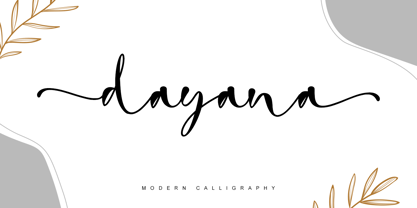 dayana is a lovely and delicate handwritten font. It looks gorgeous on wedding invitations, thank you cards, quotes, greeting cards, logos, business cards, and every other design which needs a handwritten touch, and much more! It features a varying baseline, smooth lines, gorgeous glyphs, and stunning alternates.
 - Thrainly Sellier by Namara Creative Studio,
$12.00 Thrainly Sellier is a stylish and incredibly elegant script font, Includes uppercase and lowercase letters, numerals, punctuation, alternates, ligatures, swash and multilingual support. It looks stunning on wedding invitations, thank you cards, quotes, greeting cards, logos, business cards and every other design which needs a handwritten touch.
 - Fresno by Parkinson,
$15.00 Fresno is a two-font family. Fresno Inline and Fresno Black. Fresno Black is a recent addition. It can be used alone, and it is carefully tailored to fit behind the Inline font to add color to the inline. There are alternate characters: A, M & N in the caps and lowercase key positions. Fresno is a square gothic style typical of Mid-20th Century Showcard Lettering. A lettering genre known as “Gaspipe.” Signage samples similar to this still exist on buildings in my home town, Oakland, California. I have designed over a half dozen variations of this form over the years. Including Amboy. Golden Gate Initials, Matinee, Motel, and Hotel. Designed in 2001 by Jim Parkinson, Fresno has recently been refreshed, enhanced, and re-released.
 - Munchies by W Type Foundry,
$25.00 Munchies is a reverse contrast slab-serif font family. Inspired by the volume and size of 19th century wood letterpress blocks and the Italian Caslon language. Munchies has 12 variants, from Heavy to Thin, with opentype options in a set consisting of uppercase, lowercase, small caps, ligatures, and alternate letters (A, M, N, V, W, &, Arrows, *). Munchies is divided into two subfamilies: Normal and Display. The Normal style has an appearance reminiscent of Western posters with a “measured” contrast. While the Display style takes the contrast to the extreme. Both styles are also available in Variable version. The inverted contrast makes it an interesting and striking looking typeface that stands out in any context. Perfect for headlines, bold branding, or animation like kinetic typeface.
 - Amboy by Parkinson,
$20.00 Amboy is a two-font family. Amboy Inline and Amboy Black. Amboy Black is a recent addition. It can be used alone, but it is carefully tailored to fit behind the Inline font to add color to the inline. There are alternate characters: A, M & N in the caps and lowercase key positions. Amboy is a square gothic style typical of Mid-20th Century Showcard Lettering. A lettering genre known as “Gaspipe.” Signage samples similar to this still exist on buildings in my home town, Oakland, California. I have designed over a half dozen variations of this form over the years. Including Golden Gate Initials, Matinee, Motel, Hotel and Fresno. Designed in 2001 by Jim Parkinson, Amboy has been refreshed, enhanced, and re-released.
 - Leco 1983 by CarnokyType,
$15.00 LECO 1983 is a headline display OpenType typeface with its three styles: LECO 1983: regular LECO 1983 Blind: without interiors of signs LECO 1983 Negative: in its inverse form. The inspiration for creating this font came from the label on a 1983 bottle of Lečo. The characteristic feature of this font is an embedded diacritic. The monolinear character of drawings is dominant. This font is drawn as capital letter type for both: upper case and lower case letters. It contains alternatives of some signs (e, f, g, m, n, y) and (& and a glyph No) but it consists several interesting alternatives (ligatures) of pairs as (in, on, of, by) as well. This font is best used on strong posters or as a headline display typeface.
 - Marlowe by FaceType,
$30.00 If you are looking for a unique typeface with a light and pure elegance, Marlowe will be your choice. Marlowe is the rat pack of fonts: Regular is perfect for headlines and subtitles, while the expressive Escapade, Swirl and Cocktail styles are charming display fonts. All four provide an extended set of capitals, small caps and lower case characters. Please take a close look at the elegant alternate letters for A, E, K, M, N, O, Q, R, W and g – there are even three kinds of ampersands to choose from. Altogether Marlowe offers amazing 25 alternates and 74 discretionary ligatures, while Marlowe Swirl has additional 26 automated ligatures. Make sure you use applications supporting all these lavish OpenType features.
 - FF Bauer Grotesk by FontFont,
$50.99 FF Bauer Grotesk is a revival of the metal type Friedrich Bauer Grotesk, released between 1933 and 1934 by the foundry Trennert & Sohn in Hamburg Altona, Germany. The geometric construction of the typeface, infused with the art déco zeitgeist of that era, is closely related to such famous German designs as Futura, Erbar, Kabel and Super Grotesk that debuted a few years earlier. However, Bauer Grotesk stands out for not being so dogmatic with the geometry, lending the design a warmer, more homogenous feeling. The oval “O” is a good example of that, as well as characteristic shapes like the capital M or the unconventionally differing endings of “c” and “s” which make for a less constructed look. Watch the FF Bauer Grotesk introduction video on Vimeo
 - Core Sans R by S-Core,
$20.00 The Core Sans R Family is a part of the Core Sans Series, such as N, NR, N SC, M, E, A, D. and G. This font family has closed and square letter shapes, and overall rounded finishes provide a soft and friendly appearance. Simple shapes with a tall x-height make the text legible and the spaces between individual letter forms are precisely adjusted to create the perfect typesetting. The Core Sans R Family consists of 7 weights (Thin, Light, Regular, Medium, Bold, Heavy, Black) and Italics for each format. Core Sans R supports complete Basic Latin, Cyrillic, Central European, Turkish, Baltic character sets. Each font includes proportional figures, tabular figures, oldstyle figures, numerators, denominators, superscript, scientific inferiors, subscript, fractions and case features.
 - Centric Serif SG by Spiece Graphics,
$39.00 Here is a boxy, extremely squared alternative to display designs like Eden or Glamour. In comparison, Centric Serif does not share the fragile and delicate nature of these old 1930s classics. Instead it is fairly robust with a splayed M and a simple flattop A. It is interesting to note that Centric Serif (unlike Centric Geo) sports serifs in exaggerated and curiously bizarre ways. Centric Serif is now available in the OpenType Std format. Some new stylistic alternates and historical forms have been added to this OpenType version. Advanced features work in current versions of Adobe Creative Suite InDesign, Creative Suite Illustrator, and Quark XPress. Check for OpenType advanced feature support in other applications as it gradually becomes available with upgrades.
 - Hawaii Summer by Gravitype,
$14.90 Hawaii Summer is a fresh and playful display font, designed to bring a unique style to your projects. Its natural look makes it perfect to be integrated into exotic environments, thanks to the warm vibes that its lines transmit. It is suitable in multiple situations, like for: food and beverage, bar signs, packaging, t-shirts, flyers, magazines, posters, ad campaigns, social media, banners, etc... Stylistic alternates are included for letters: “m” to be the inverse of “w” and thus be more symmetrical, for example, if a logo design requires it “p” and “r” with a slightly decreased contrast to appear neater, especially for big size text like headlines Hawaii Summer supports multiple languages to be tourist-friendly ;) Get ready for the summer!
 - House Sans by TypeUnion,
$30.00 House Sans is a 100 style super-family made up of 5 widths, 10 weights plus matching italics in two design approaches through stylistic alternates to the E, F, L and e characters. The weights range from compressed to expanded, from thin to heavy creating a plethora of styles to create with. House Sans has a unique visual structure to key glyphs such as the A, M & Y that give the font a stand out feel while the contrasting horizontal bars provide a nice balance. The compressed weights are great for fitting in tight spaces whilst the Heavy styles are perfect for standing out from the crowd. The font features extensive support for European and Cyrillic languages, stylistic and discretionary ligatures, plus superiors, inferiors and fractions.
 - Solen by Larin Type Co,
$15.00 Solen this is a modern sans-serif font that includes nine weights from thin to black and nine weights in Italic style. This multi-purpose font captures a huge range for the design and creation of your project. Solen family will perfectly cope with a variety of tasks and he will always look stylish and modern. With it, you can create logos, labels, use in advertising, packaging, branding, book covers and magazines, cosmetics, banners, posters, headings, descriptions and much more. This font is easy to use has OpenType features. Full alphabet with Uppercase and Lowercase A-z Numbers, fractions Punctuation and symbols Alternates for Uppercase "A, E, K, M, N, U" Alternates for Lowercase "a, g, k, t, y" Multilingual support
 - Centric Geo SG by Spiece Graphics,
$39.00 Here is a boxy, extremely squared alternative to display designs like Eden or Glamour. In comparison, Centric Geo does not share the fragile and delicate nature of these old 1930s classics. Instead it is fairly robust with a splayed M and a simple flattop A. It is interesting to note that Centric Serif (unlike Centric Geo) sports serifs in exaggerated and curiously bizarre ways. Centric Geo is now available in the OpenType Std format. Some new stylistic alternates and historical forms have been added to this OpenType version. Advanced features work in current versions of Adobe Creative Suite InDesign, Creative Suite Illustrator, and Quark XPress. Check for OpenType advanced feature support in other applications as it gradually becomes available with upgrades.
 - Edison Swirl SG by Spiece Graphics,
$39.00 Edison Swirl, with its terminals majestically looping and twirling in a circular fashion, quickly takes us back to the Victorian era of type. This unusual fancy face, which dates back to the early 1900s, distinguishes itself by employing splayed M & N caps. Some letterforms also contain double cross-strokes for added interest. Edison Swirl is full of ornament and detail which creates a truly striking pattern of intrigue and delight. Edison Swirl is also available in the OpenType Std format. Some new characters have been added to this OpenType version. Advanced features currently work in Adobe Creative Suite InDesign, Creative Suite Illustrator, and Quark XPress 7. Check for OpenType advanced feature support in other applications as it gradually becomes available with upgrades.
 - Cool Daddy by Hanoded,
$15.00 It’s a brand new year, but I have been going back in time. To the seventies to be precise. A ‘bubblegum’ font was on the top of my to-do list, so when it was finally finished, it reminded me of seventies posters. As if by magic, a catchy bassline started playing in my head and before I knew it, Boney M appeared - all dressed up in Purple and singing Daddy Cool. Cool Daddy is a fat, rounded bubblegum font, which will take you back to the decade of moustaches, afros and glitter. This ultra groovy font will funk up your designs 4-sho. So boogie on, take it back to your crib and get down with it. You diggin’?
 - Basco Std by Typofonderie,
$59.00 A mix of Renaissance & tropical atmosphere Basco is an exploration of the Renaissance style, a period in which letterforms were informed primarily by hand writing. It is clearly a contemporary interpretation of calligraphic shapes forms. The serifs are subtly asymmetrical. Slightly curved arches on the n, m and u are noticeable, creating an interesting tension in the text. Bruno Mello’s distinctive style is most obvious in his mastery of super fluid curves. It is a result of his extensive exploration of calligraphic forms, their tensions and dynamics, mixing angularities with curves. The roman weights include alternate swashes, as well as initial and terminal glyphs. The italics, based on chancellery script, feature simple stroke endings, most visible on the s and c. ➼ Basco minisite
 - Upton by Halbfett,
$30.00Upton is a modern and condensed sans serif. The initial inspiration for its design came from lettering Wim Crouwel created for a poster design. It also takes some cues from neutral grotesks like Helvetica and Akzidenz. Because of its narrow letterforms, Upton is best applied to headlines and poster-sized typography. Upton’s italics were designed with high-quality compensation for all circles and strokes. Upton ships in two different formats. Depending on your preference, you can install the typeface as two Variable Fonts or use the family’s 14 static OpenType font files instead. Those weights run from Extralight to Extrabold. While the static-format fonts offer a good intermediary-step selection, users who install the Variable Font have vastly greater control over their text’s stroke width. The weight axes in Upton’s Variable Fonts allow users to differentiate between almost 1,000 possible font weights. That enables you to fine-tune your text’s exact appearance on-screen or in print. In its fonts, Upton has several ligatures. That includes optional “discretionary ligatures,” which bring a unique tone to display usage. For instance, the fonts include optional ligatures for the letter combinations “E-T”, “F-l”, “L-E-T-T-E”, “L-E-T-T”, “L-E-T”, “L-E-L-O”, “L-U”, “i-j”. and “m-m”. There are also many alternate glyphs. Stylistic Set 1 substitutes in new forms for “G”, “R”, “a”, “f”, “g”, “i”, “r”, “t”, and “y”. Six more Stylistic Sets have alternates for the “æ”, “g”, “k”, “o”, “K”, “O”, and “Q”. Additional OpenType features activate other useful features, such as fractions, numbers in circles, or symbols. - PF Bague Round Pro by Parachute,
$79.00 Bague Round is a soft contemporary geometric typeface which blends distinct minimalist characteristics with mainstream details. It originates from Bague Universal, a superfamily with a warm well-balanced texture and a distinct personality. Usually, round sans letterforms tend to look rather organic and playful at heavier weights. This problem was avoided in Bague Round by applying all necessary optical corrections at the rounded corners in order to retain its robust qualities. Mechanical replacement of the stem endings with standard arcs was not implemented and each round form of the horizontal, vertical and diagonal strokes was treated differently from the other. Whilst the rounded endings at heavier weights become gradually more flat at acute corners, the round stems in letters such as A, b, m, p, s are perfectly matched with sharp diagonals in letters such as M, N, w, v, in a very distinct manner. A remarkable feature of Bague Round is its vast array of uppercase alternates and ligatures which truly shine when set at display sizes. Make your selection from 6 distinct groups of alternates as well as a rich set of discretionary ligatures and watch it transform into a flexible, charming and stylish typeface with strong modern aesthetics. This typeface offers enormous possibilities and variations for editorial design, branding and corporate identity. The Bague Round type family includes 14 weights from Thin to Ultra Black and matching true-italics with a consistent and well-refined structure. Each style consists of 1017 glyphs with more that 280 alternates and ligatures and an extended set of characters which supports Latin, Cyrillic and Greek. PDF Specimen Bague Round on Behance
 - Minotaur by CastleType,
$59.00 Minotaur is an original monoline design based on an Oscan (http://en.wikipedia.org/wiki/Oscan_language ) votive inscription from the second century B.C.E. The letterforms immediately caught my eye in the wonderful book, Lettering by Hermann Degering, and I decided to create a typeface based on them with only enough compromises to make it usable as a modern alphabet. Not quite as straightforward as I had hoped. For example, the Oscan language (the predominant language in the Italian peninsula before the ascendance of Latin), has no letter "O", so the distinctive curve of the "D" was used as the model for the rounded letters "C" and "G" and more subtly for "O" and "Q"; this shape is also echoed in the original design of "B", "P" and "R". Also, the Oscan letterforms for A, K, L, M, N, S, and U are rather quaint, so I've included modern forms as alternates. Minotaur offers the best of both worlds: Just as the mythical Minotaur is half man and half bull, the font Minotaur is half modern and half ancient. Thanks to OpenType features (stylistic sets), you can easily switch from ancient letterforms to modern (if you have an OpenType-savvy application such as Adobe InDesign) for Latin, Greek, and Cyrillic alphabets. Minotaur supports all modern European languages, including Modern (monotonic) Greek and those that use the Cyrillic alphabet. And, yes, it supports Oscan, both right-facing and left-facing. Minotaur includes 3 OpenType Stylistic Sets: 1 - converts ancient (default) letterforms (A, K, L, M, N, S, and U) to modern alternates; 2 - converts Latin letterforms to equivalent left-facing (standard) Oscan letterforms; 3 - converts Latin letterforms to equivalent right-facing Oscan letterforms.
 - Motorway by K-Type,
$20.00 MOTORWAY is the companion typeface to TRANSPORT, the British road sign lettering. The Motorway alphabet was created for the route numbers on motorway signage, and is taller and narrower than the accompanying place names and distances which are printed in Transport. However, for Motorway Jock Kinneir and Margaret Calvert created only the numbers 0 to 9, the capitals A, B, E, M, N, S and W, ampersand, slash, parentheses and a comma. So, although the lettering made its first appearance on the Preston bypass in 1958, K-Type Motorway is the first complete typeface and contains all upper and lower case letters, plus a full complement of punctuation, symbols and Latin Extended-A accented characters. As with the Transport alphabet the starting point was Akzidenz Grotesk, Motorway taking inspiration from condensed versions. Changes were mainly driven by a quest for legibility, resulting in some reduced contrast between horizontal and vertical strokes, and Gill-esque straight diagonal limbs on the 6 and 9, and high vertex for the M. Kinneir and Calvert designed the limited range of characters in two weights; a SemiBold 'Permanent' weight for use as white letters on blue motorway signs, and a Bold 'Temporary' weight for heavier black letters on yellow non-permanent signage. In addition to creating full fonts in both original weights, the K-Type family adds a new Regular weight, plus a set of italics, completing a highly usable condensed typeface which, while rooted in history, is fully functional for both print and web usage. The K-Type fonts are spaced and kerned normally, simply increase the tracking to recapture the generous spacing of motorway signage.
 - Roloi by Mayfield Type Foundry,
$15.00 Originally inspired by the numerals on a vintage clock face, Roloi is a layered numbers font in the deco lettering style, and includes a full set of automatic clock symbols. Its geometric forms are typical of the deco style, but stop well-short of pure geometry. The irregular stroke and character widths work together to give the forms a warm and energetic, yet cohesive, feel. Roloi offers two layering styles—the personable Fill and the more dynamic Inline. Designed to be layered over the background Regular style, they both lend the forms an added level of interest. Roloi also includes a clock symbol for any and every time of day, rounded to the nearest five-minutes. The regular weight provides the circular clock background, while the Fill and Inline styles produce the clock hands. If ligatures are activated in your text-editing program, type out any time—such as 9:32, 12:05, etc.—and the proper clock symbol will be automatically substituted. Go ahead, type any time out below! To stop the automatic clock symbol substitution, simply deactivate ligatures. Because the clock symbols are standard ligatures, every major modern browser will support their use on the web. With some programing they could even be used to make a lightweight, text-only clock. In addition to the clock symbols and basic numerals, Roloi’s glyph range covers numeric superiors and inferiors, standard and arbitrary fractions, currency symbols, all of the punctuation and symbols commonly associated with currency, unicode clock Face symbols, the A M P / a m p letters, and alternates of the 1, 2, and 4, accessible by selecting Stylistic Set 1.
 - Hermann by W Type Foundry,
$29.00 Hermann is one of our most readable typefaces so far. Since last year, the W Design team had been examining closely the possibility of developing a text font. Thus, we dug into concepts within some of our favorite novels, such as The Steppenwolf and Brave New World, written by Hermann Hesse and Aldous Huxley respectively. Ideas like duality, surrealism, and wildness mainly appeared. With these concepts in mind, we analyzed carefully the typefaces used in both Hesse’s and Huxley’s creations; Sabon and Garamond showed up catching our attention and, of course, awakening our admiration. Consequently, the challenge was to combine the key features of these fonts with the concepts already identified. At first, we made a text font which was suitable to compose long texts. However, we realized that we needed to refine some characteristics to convey all the ideas. A full set of capital discretionary ligatures was designed, which convert Hermann in a display font when is required. We also designed swashes (from A-Z) and final forms (in letters h, k, m, n, r and x in romans, and in letters a, d, e, h, i, l, m, n, r, t, u, x and z in italics), conveying more dynamism and versatility when it comes to composing visually. Hermann was designed not only to be accurate in terms of legibility but also to be wild and bold. That is why we took a big leap and designed from the beginning a font that is inspired by the world of 20th-century novels, using the name of one of its greatest exponents, Hermann Hesse.
 - Oxford Street by K-Type,
$20.00 Oxford Street is a signage font that began as a redrawing of the capital letters used for street nameplates in the borough of Westminster in Central London. The nameplates were designed in 1967 by the Design Research Unit using custom lettering based on Adrian Frutiger’s Univers typeface, a curious combination of Univers 69 Bold Ultra Condensed, a weight that doesn’t seem to exist but which would flatten the long curves of glyphs such as O, C and D, and Universe 67 Bold Condensed with its more rounded lobes on glyphs like B, P and R. Letters were then remodelled to improve their use on street signs. Thin strokes like the inner diagonals of M and N were thickened to create a more monolinear alphabet; the high interior apexes were lowered and the wide joins thinned. The crossbar of the A was lowered, the K was made double junction, and the tail of the Q was given a baseline curve. K-Type Oxford Street continues the process of impertinent improvement and includes myriad minor adjustments and several more conspicuous amendments. The stroke junctions of M and N are further narrowed and their interior apexes modified. The middle apex of the W is narrowed and the glyph is a little more condensed. The C and S are drawn more open, terminals slightly shortened. The K-Type font adds a new lowercase which is also made more monolinear so better suited to signage, loosely based on Univers but also taking inspiration from the Transport typeface both in a taller x-height and character formation. The lowercase L has a curled foot, the k is double junctioned to match the uppercase, and terminals of a, c, e, g and s are drawn shorter for openness and clarity. A full repertoire of Latin Extended-A characters features low-rise diacritics that keep congestion to a minimum in multiple lines of text. The font tips the hat to signage history by including stylistic alternates for M, W and w that have the pointed middles of the earlier MOT street sign typeface. Incidentally, Alistair Hall (‘London Street Signs’, Batsford, 2020) notes that when the manufacturer of signs was changed in 2007, Helvetica Bold Condensed was substituted in place of the custom design, “an unfortunate case of an off-the-peg suit replacing a tailored one” and a blunder that has happily since been rectified, though offending nameplates can still be spotted by discerning font fans.
 - Aliestar by Krakenbox Studio,
$12.00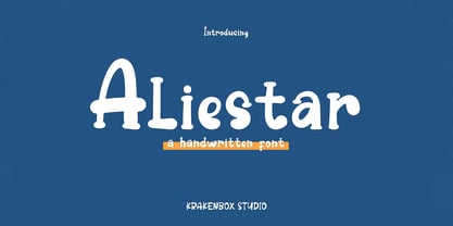 This font feels equally charming and elegant. It looks stunning on wedding invitations, thank you cards, quotes, greeting cards, logos, business cards and every other design which needs a handwritten touch. It is also PUA encoded which means you can access all of the glyphs and swashes with ease!
 - Aster Sphin by Krakenbox Studio,
$15.00 Aster Sphin is a fashionable sophisticated signature-style script with its own unique curves and an elegant inky flow. Its elegant, classy, and modern look. It looks stunning on wedding invitations, thank you cards, quotes, greeting cards, logos, business cards and every other design which needs a customized touch.
 - Hello Bellandia by IM Studio,
$13.00 Hello Bellandia is a new modern script font with an irregular base line. Hello Bellandia looks beautiful on wedding invitations, thank you cards, quotes, greeting cards, logos, business cards and more. Perfect for use in ink or watercolors. Includes initial and final letters, alternatives and multi-language support.
 - Blueberry Powder Variative by OKSHUtypeCO,
$12.00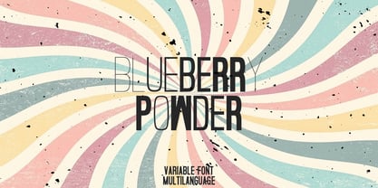 Blueberry Powder Variable - variable font, support multilanguage. brand, trend, cards, etc. Very suitable for greeting cards, branding materials, business cards, quotes, posters, and more!This font are perfect for wedding postcard. Or you can create perfect and unique design of your logo, blog, stationery, marketing, magazines and more 🙂
 - Jastin Septia by Letter Muray,
$17.00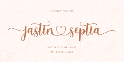 Jastin Septia feels equally charming and elegant. It looks lovely on wedding invitations, thank you cards, quotes, greeting cards, logos, business cards, and every other design which needs a handwritten touch. This font is PUA encoded which means you can access all of the glyphs and swashes with ease!
 - Hi Joana by Beary,
$14.00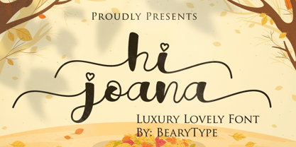 Hi Joana feels equally charming and elegant. It looks stunning on wedding invitations, thank you cards, quotes, greeting cards, logos, business cards and every other design which needs a handwritten touch. This font is PUA encoded which means you can access all of the glyphs and swashes with ease!
 - Holmeria by Akifatype,
$14.00 Holmeria is a new clean smooth brush font, giving it a trendy and feminine touch. Holmeria looks lovely on wedding invitations, thank you cards, quotes, greeting cards, logos, business cards and more. Perfect for using in ink or watercolor. Including initial and terminal letters, alternates and multiple language support.
 - Grand Amoura by Reyrey Blue Std,
$14.00 Grand Amoura is a romantic and smooth handwritten font. It looks stunning on wedding invitations, thank you cards, quotes, greeting cards, logos, business cards and every other design which needs a handwritten touch. Grand Amoura is here to elevate your work to the highest level. Includes: Ligatures Swash
 - Martha Script by Hrz Studio,
$14.00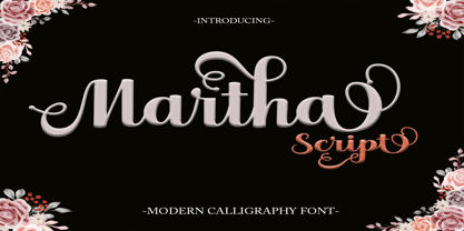 Martha Script feels equally charming and elegant. It looks stunning on wedding invitations, thank you cards, quotes, greeting cards, logos, business cards, and any other design that needs a handwritten touch. This font is PUA encoded, which means you can access all of the glyphs and swashes with ease!
 - Valentina by Slex Studio,
$12.00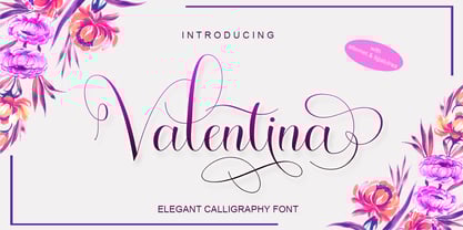 Valentina is an elegant calligraphy font. It looks stunning on wedding invitations, thank you cards, quotes, greeting cards, logos, business cards and every other design which needs a handwritten touch. This font is PUA encoded which means you can access all of the glyphs and swashes with ease!