10,000 search results
(0.041 seconds)
- LTC Hess Monoblack by Lanston Type Co.,
$24.95 A very rare metal face made a brief appearance in Lanston Specimen books and has all but vanished from use. In fact no examples of the font in use seem to exist. It shares some of the hand-rendered casual feel of Nicholas Cochin, but much heavier and well suited for bold headlines and package design.
 - Tarpon Springs JNL by Jeff Levine,
$29.00 An early-1960s Canadian magazine ad for a brand of birth control pills featured the least likely spokesperson – Annette Funicello (“starring in “Beach Blanket Bingo” and “How to Stuff A Wild Bikini”). The text was hand lettered in an Art Deco-inspired sans serif type design. Tarpon Spring JNL is available in both regular and oblique versions.
 - SandraOh by Chank,
$59.00Sandra Oh is a quirky modern take on the classic serif fonts of the 20th century, updated here with a wiggle in her walk and a giggle in her talk. A Chankstore classic from the earlier days of the internet, this font is now available in OpenType format for the first time. Perfect for indie films or youtube videos. - Sone by Soneri Type,
$50.00 Sone is designed to be bold with stripped off nonessential details making it uncomplicated, simple in expression, yet appealing and easy to decipher, even from a distance. Serene and gentle in quality by low contrast, slow ductus and large x-height reducing the up down motion, plus enhance the legibility. It works beautifully in both, display and body copy.
 - Ambigue by Linotype,
$29.99The original name for Ambigue was “Confidence”. This font family received the first prize at the German Kurt Christians-Foerderpreis in 1997/98. Its interpolated weights offer a subtle differentiation in the grey levels. A special “Small” weight is available that offers better readability in very small sizes. The work was supported by Professor Jovica Veljovic. - Regio Mono by Degarism Studio,
$30.00 Regio Mono is a monospaced typeface designed with industrial-strength, sturdy columns and tidy layouts. contrasting geometric shapes and sharp terminals. Whether used in design or in a code editor, Design proposal, Ads, Packaging and more. Regio Mono comes in six weights, from Ultra Light to Bold, and with a character set that covers over 200 Latin languages.
 - Fyra by Jonathan Hughes,
$- Fyra is a family of fonts ideal for diagrams and signage. Included in the family are versions with uppercase letters in circles and squares, as well as numbers 0-99 in circles and squares. The characters themselves were designed to be very neutral, so they should pair well with whatever other typefaces you are using on your project.
 - Amazed Breath by Almarkha Type,
$29.00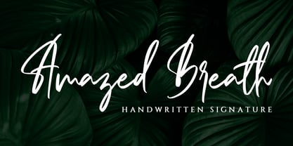 Amazed Breath is a classy script font that comes in Regular and Slant. Inspired by luxury, this font will look classy and awesome in many ways in your latest project. Amazed Breath is perfect for logos and branding, photography, invitations, watermark, advertisements, product designs, stationery, wedding designs, labels, product packaging, special events or anything that needs a handwritten taste.
 - Ongunkan Karamanli Turkic Scrip by Runic World Tamgacı,
$50.00 The font I made based on the Greek alphabet used by the Karamanlı Turks, who are Orthodox Christians, by adapting it to Turkish, which I deduced by looking at the inscriptions and translations. In order to write in Turkish, Turkish special characters are loaded with letter combinations and sounds. But it can still be easily written in Greek.
 - Facility Signage JNL by Jeff Levine,
$29.00 A famous 1971 photo shows boxing champ Muhammad Ali making faces through a window at Joe Frazier at the challenger’s training facility. A small sign sits in the window that says “Joe Frazier Training Headquarters” and is lettered in a simple sans serif condensed typeface. This is now available as Facility Signage JNL in both regular and oblique versions.
 - Movie Producer JNL by Jeff Levine,
$29.00 The Nov. 13, 1915 and Nov. 27, 1915 issues of Moving Picture World carried ads for Jesse L. Lasky Productions in which the titles of the upcoming films were hand lettered in an elegant Art Nouveau spurred serif style. This stylish alphabet is now available digitally as Movie Producer JNL in both regular and oblique versions.
 - MVB Grenadine by MVB,
$39.00Reminiscent of the hand-lettering found in mid-century children’s books, Akemi Aoki’s MVB Grenadine is a quirky sans, broken free of its geometric roots. Letterforms bounce along the baseline in a jolly dance, yet remain clear and legible, whatever the reader’s age. MVB Grenadine is available in a broad range of six weights, each with italics. - Dance Moderne JNL by Jeff Levine,
$29.00 A small book entitled “Portfolio of Alphabet Designs for Artists, Architects, Designers & Craftsmen” [published in 1938 by Irene K. Ames] contained a number of pages displaying hand lettered alphabet examples. One sample in particular stood out for its bold Art Deco look and unusual design. This is now available as Dance Moderne JNL, in both regular and oblique versions.
 - Nouveau Event JNL by Jeff Levine,
$29.00 The 1920s film production company Tiffany-Stahl often used a hand lettered Art Nouveau novelty type design with thick horizontal lines in their various film release ads. One such ad was in the August 11, 1929 of “The Film Daily”. This served as the model for Nouveau Event JNL, and is available in both regular and oblique versions.
 - Messy Linocut 2D by 2D Typo,
$24.00 Don't try to find logic in this font, nor the harmony of the forms. It is meant to be crank. All the letters were first cut in linoleum and then digitized. Hence, everything is alive. You will find no uniform elements. We think this font will find its use in the hands of a brave designer.
 - Norma by Linotype,
$29.99Norma was my second sans serif. You can find a few details in common with Dialog, but the graphic impression of Norma is totally different.Every typeface has some characters that are the favourites. In Norma I simply love the lowercase roman a. Don't you, too, think that it is perfection itself? Norma was released in 1994. - French Script by Monotype,
$40.99French Script font is based on script handwriting and engraving used in formal announcements and invitations in general, and specifically on a 1905 ATF face named Typo Upright," by Morris Fuller Benton. French Script lends itself to typesetting in which an elegant mood is desired. French Script is an upright script font with an engraved appearance and decorative capitals. " - Lisa Fiore by Wiescher Design,
$39.50 Lisa is an elegant script family in the tradition of early Italian type designers like Bodoni. I added counter strokes and floral embellishments to the font. Lisa comes in three variations: the beautiful Lisa Bella, the flowery Lisa Fiore and the extra swinging Lisa Piu (which means more in Italian). Enjoy! Your elegant script designer Gert Wiescher
 - Ki by Mint Type,
$29.00 Ki is a monospaced display typeface inspired by older VCR / camcorder OSD (on-screen display) fonts. It is peculiar for its diagonal angles being restricted to 45°, which results in a specific textural effect perfectly legible in small type sizes. Ki comes in 7 weights with corresponding italics, and features extensive language support with over 500 glyphs, including Cyrillic.
 - Pass the Port by Comicraft,
$39.00There are Rum doings in the harbor tonight, me hearties! Black-hearted buccaneers are gatherin' in the tavern and there's talk of gunpowder, treason and plot. Even if there are ladies in the room, we advise that you Pass the Port, put away your pieces of eight and weigh anchor until the Pirates have Caribbean and gone. - Clincher by ParaType,
$20.00 Clincher is a set of monospaced and duospaced fonts designed specifically for program coding and user interface design. Distinctive font design and multiple alternates allow to use it in advertising, wayfinding and signage as well as in short texts when regularity and monospacing is important. The font was designed by Alexander Lubovenko and released by Paratype in 2018.
 - AT Move Holborn by André Toet Design,
$39.95 HOLBORN Aptly named after ‘High Holborn’, a high-street in London where the Central School of Art & Design was based. A font, just in capitals, based on the original design and the earlier sketches (1976) by André Toet. The strong optical illusion in this alphabet makes it an outstanding typeface. Concept/Art Direction/Design: André Toet © 2017
 - Semper by Linotype,
$29.99Semper is slightly angular since it is in part based on callygraphic lettering. That is not as evident as in the italic of Jenson Classico. On the contrary, the text looks even and harmonious, which makes the typeface easy to use. The name is Latin meaning always, but you knew that already. Semper was released in 1993. - Modakshar BT by Bitstream,
$50.99Modakshar was inspired by traditional Indic handwriting scripts which ‘hang’ from a common upper horizontal bar. Adapting this motif to Latin letterforms was challenging. The typeface was first conceived in the 1970's as a design project in school. The current digital design was completed in 2002. Basic motif was inspired by traditional Indic script handwriting. - Dietal by Tour De Force,
$25.00 Dietal is condensed slab serif family that comes in 5 weights. Dietal coquettes with different type categories from sans and slab to calligraphy, western and display elements. It is available in two versions: with curved and sharp joining. Contains Stylistic Alternates, Ordinals and Tabular Figures as Open Type Features in Extended Latin and Cyrillic character set.
 - Baren by Larin Type Co,
$14.00 Baren is a bold sans serif font, it will look great both in modern design and in vintage projects. This font family has only Capital letters and includes 9 styles: Regular, Outline, Round, Round Outline, Rough, Rough Outline, Vintage, Halftone, Lines style. In the Vintage, Halftone and Lines style, upper and lower sets have different textures.
 - Churchward Freedom by BluHead Studio,
$25.00BluHead Studio LLC is pleased to announce the release of 7 fonts from the Churchward Freedom family designed by New Zealand typeface designer Joseph Churchward. BluHead Studio is in the process of digitizing many of the fonts in Churchward's extensive library of exciting and unique designs and will be releasing them in OpenType format on a regular basis. - LTC Record Title by Lanston Type Co.,
$24.95 Record Title was designed by Frederic Goudy in 1927 as a proprietary commission for the Architectural Record magazine. Based on classic Roman letter proportions, Goudy considered this one of his most successful commissions ever. It is an all caps titling face originally digitized by Jim Rimmer for Lanston in 2001. It was remastered in early 2007.
 - Retirement JNL by Jeff Levine,
$29.00 The hand lettered film credits for 1937’s “Make Way for Tomorrow” were done in a sans serif design with an ever-so-slight flare and a slightly semi-calligraphic look. Unusual in both style and varying character thicknesses, the lettering has been digitally redrawn as Retirement JNL, which is available in both regular and oblique versions.
 - PSZ Alpha by Patrick Siegfried Zimmer,
$45.00 PSZ Alpha was designed by Patrick Siegfried Zimmer in 2023. It is a modern typeface designed in a sans serif-grotesque structure and it has been created by taking inspiration from the leading Grotesk fonts that have been designed at the beginning of the 20th century. PSZ Alpha is designed to give results in both screens and editorial designs.
 - Lisa Piu by Wiescher Design,
$39.50 Lisa is an elegant script family in the tradition of early Italian type designers like Bodoni. I added counter strokes and floral embellishments to the font. Lisa comes in three variations: the beautiful Lisa Bella, the flowery Lisa Fiore and the extra swinging Lisa Piu (which means more in Italian). Enjoy! Your elegant script designer Gert Wiescher
 - Egon Sans Condensed by TipografiaRamis,
$29.00 Egon Condensed is a geometric sans serif typeface family built in nine styles - light, regular, bold weights in roman and italic respectably, plus three alternatives in roman. Egon Sans Condensed is an extension of Egon family - Egon Slab Serif (2008) and Egon Sans Serif (2010). Egon Sans is released as OpenType single master with a Western CP1252 character set.
 - Freak by Cool Fonts,
$24.00 This is a funky hand lettered font that just begs to be used for coffeehouse promo. It is best when used in sizes above 16 points and is even better when used for posters where it can be printed in giant sizes. It was hand drawn in Fractal Designs Painter with lots of little Doo-Dads.
 - Answer by Atlantic Fonts,
$26.00 Answer is a handsome, handwritten, and happy font family. Subtle variations in this unicase font can be found in upper and lower glyphs and in the handful of double-letter ligatures. Answer is balanced, squarish, roundish, fine, and fun, with a little sophistication and lots of handmade appeal. Answer posters also feature Atlantic Doodles, Kiwi Fruits and Shoebox Shapes.
 - Chessnota by AKTF,
$10.00 Chessnota is a font suitable for the design of chess schemes. It includes original graphic images of chess pieces as well as checkers. Smaller pieces are placed at the level of the text string in order to replace letters in chess notation. It can be used for printing of chess magazines, books, in any design of schemes on websites.
 - Ebdus by AdultHumanMale,
$12.00 Ebdus is a thin, modern, lightweight font, occasionally a little gawky and tall, sometimes a little plump and rounded. The font is available in 5 weights from Thin to Heavy but they all lean towards all things anorexia. It looks as good in copy as it does in headlines, it’s perfect for an angry letter to an uppity android.
 - Ramston by Katatrad,
$29.00 Ramston is a humanist sans serif typeface of 20 fonts in total — a normal and a condensed width in 5 weights with matching italics. The condensed version is designed for space-saving typography but with high legibility in mind. Ramston is an ideal font family for display, print, corporate identity, mobile devices, magazine cover, signage, and web design creation.
 - P22 Hiromina 03 by IHOF,
$24.95 Hiromina03 is named after the wife of its designer, Hajime Kawakami. The three fonts in the set are based on Hiromi Kawakami's unique hand-lettering style. The distinctly feminine character of Hiromina03 is harmoniously integrated in all three writing systems, Katakana, Hiragana and Latin. The enclosed key charts give instructions for character placement in Katakana and Hiragana.
 - Ignorance by Typogama,
$29.00 Ignorance is a script typeface that mimics traditional handwriting found in America in the 19th century. Full of vitality and personality, this typeface includes a wide range of Opentype ligatures, alternates and swash characters that allow multiple choices for each setting. This design is principally aimed for use in display and titling setting that will reveal it's finer details.
 - 112 Hours by Device,
$9.00 Rian Hughes’ 15th collection of fonts, “112 Hours”, is entirely dedicated to numbers. Culled from a myriad of sources – clock faces, tickets, watches house numbers – it is an eclectic and wide-ranging set. Each font contains only numerals and related punctuation – no letters. A new book has been designed by Hughes to show the collection, and includes sample settings, complete character sets, source material and an introduction. This is available print-to-order on Blurb in paperback and hardback: http://www.blurb.com/b/5539073-112-hours-hardback http://www.blurb.com/b/5539045-112-hours-paperback From the introduction: The idea for this, the fifteenth Device Fonts collection, began when I came across an online auction site dedicated to antique clocks. I was mesmerized by the inventive and bizarre numerals on their faces. Shorn of the need to extend the internal logic of a typeface through the entire alphabet, the designers of these treasures were free to explore interesting forms and shapes that would otherwise be denied them. Given this horological starting point, I decided to produce 12 fonts, each featuring just the numbers from 1 to 12 and, where appropriate, a small set of supporting characters — in most cases, the international currency symbols, a colon, full stop, hyphen, slash and the number sign. 10, 11 and 12 I opted to place in the capital A, B and C slots. Each font is shown in its entirety here. I soon passed 12, so the next logical finish line was 24. Like a typographic Jack Bauer, I soon passed that too -— the more I researched, the more I came across interesting and unique examples that insisted on digitization, or that inspired me to explore some new design direction. The sources broadened to include tickets, numbering machines, ecclesiastical brass plates and more. Though not derived from clock faces, I opted to keep the 1-12 conceit for consistency, which allowed me to design what are effectively numerical ligatures. I finally concluded one hundred fonts over my original estimate at 112. Even though it’s not strictly divisible by 12, the number has a certain symmetry, I reasoned, and was as good a place as any to round off the project. An overview reveals a broad range that nonetheless fall into several loose categories. There are fairly faithful revivals, only diverging from their source material to even out inconsistencies and regularize weighting or shape to make them more functional in a modern context; designs taken directly from the source material, preserving all the inky grit and character of the original; designs that are loosely based on a couple of numbers from the source material but diverge dramatically for reasons of improved aesthetics or mere whim; and entirely new designs with no historical precedent. As projects like this evolve (and, to be frank, get out of hand), they can take you in directions and to places you didn’t envisage when you first set out. Along the way, I corresponded with experts in railway livery, and now know about the history of cab side and smokebox plates; I travelled to the Musée de l’imprimerie in Nantes, France, to examine their numbering machines; I photographed house numbers in Paris, Florence, Venice, Amsterdam and here in the UK; I delved into my collection of tickets, passes and printed ephemera; I visited the Science Museum in London, the Royal Signals Museum in Dorset, and the Museum of London to source early adding machines, war-time telegraphs and post-war ration books. I photographed watches at Worthing Museum, weighing scales large enough to stand on in a Brick Lane pub, and digital station clocks at Baker Street tube station. I went to the London Under-ground archive at Acton Depot, where you can see all manner of vintage enamel signs and woodblock type; I photographed grocer’s stalls in East End street markets; I dug out old clocks I recalled from childhood at my parents’ place, examined old manual typewriters and cash tills, and crouched down with a torch to look at my electricity meter. I found out that Jane Fonda kicked a policeman, and unusually for someone with a lifelong aversion to sport, picked up some horse-racing jargon. I share some of that research here. In many cases I have not been slavish about staying close to the source material if I didn’t think it warranted it, so a close comparison will reveal differences. These changes could be made for aesthetic reasons, functional reasons (the originals didn’t need to be set in any combination, for example), or just reasons of personal taste. Where reference for the additional characters were not available — which was always the case with fonts derived from clock faces — I have endeavored to design them in a sympathetic style. I may even extend some of these to the full alphabet in the future. If I do, these number-only fonts could be considered as experimental design exercises: forays into form to probe interesting new graphic possibilities.