10,000 search results
(0.04 seconds)
- Chalofa by Realtype,
$12.00 Chalofa consist of a sophisticated, elegant, classy and modern handwriting style. With a little dirty curvature and made from the typography of new trends, Chalofa has a smooth wet ink look suitable for adding a modern and classy touch to your project. Perfect for branding, weddings, social media, product design, stationery, etc. Calofa can add to all projects where hand touch is needed. Try mixing your design with this font. Don't hesitate to pair with serif or serif in your work idea. Find interesting layouts to complement your project. This font has include multilingual support.
 - Vanny Onesha by Youngtype,
$18.00 Vanny Onesha script is a hand brush font made with brushes and ink. This typeface is ideal for use in thick watercolour designs or handwriting styles, such as blog titles, posters, wedding elements, t-shirts, clothing, book covers, business cards, greeting cards, branding, merchandise etc. Contains full set: - Uppercase - Lowercase - alternative - Ligatures - Punctuation - number - multilingual support. How to access all alternative characters, using Windows Character Map with Photoshop: - https://www.youtube.com/watch?v=Go9vacoYmBw How to access all alternative characters using Adobe Illustrator: - https://www.youtube.com/watch?v=XzwjMkbB-wQ Thank you!
 - Astella Script by Youngtype,
$18.00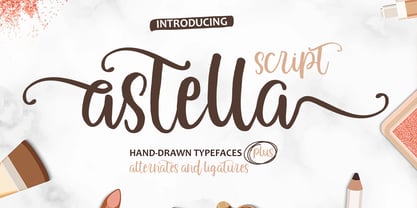 Astella Script is a hand brush font made with brushes and ink. This typeface is ideal for use in thick watercolor designs or handwriting styles, such as blog titles, posters, wedding elements, t-shirts, clothing, book covers, business cards, greeting cards, branding, merchandise, and more. Contains full set: - Uppercase - Lowercase - Alternative - Ligatures - Punctuation - Numbers - Multi-lingual support How to access all alternative characters, using Windows Character Map with Photoshop: https://www.youtube.com/watch?v=Go9vacoYmBw How to access all alternative characters using Adobe Illustrator: https://www.youtube.com/watch?v=XzwjMkbB-wQ Thank you!
 - Samhain by Hanoded,
$15.00 Samhain is a Gaelic festival marking the end of the harvest season and the beginning of winter. There is no set date, but normally it is held around the end of October and beginning of November. Samhain font was made with a bamboo pen and Chinese ink on rough paper - hence the grungy look. It is quite a heavy font, so I wouldn't set a complete text in it, but it is ideal to create headlines, posters, postcards and invitations. Of course, Halloween comes to mind! Samhain comes with extensive language support.
 - The Angella Script Duo by madjack.font,
$10.00 The Angella Script Duo is a hand brush font created with brush and ink. This typeface is ideal for use in bold watercolour designs or handwritten styles, such as blog titles, posters, wedding elements, t-shirts, clothing, book covers, business cards, greeting cards, branding, merchandise, etc. Contains the complete set: - Uppercase - Lowercase - alternative - fasteners - Punctuation - number - Multilingual support. How to access all alternative characters, using the Windows Character Map with Photoshop: - https://www.youtube.com/watch?v=Go9vacoYmBw How to access all alternative characters using Adobe Illustrator: - https://www.youtube.com/watch?v=XzwjMkbB-wQ
 - Strives Less by Youngtype,
$18.00 Strives Less script font is a made with brushes and ink. This typeface is ideal for use in thick watercolor designs or handwriting styles, such as blog titles, posters, wedding elements, t-shirts, clothing, book covers, business cards, greeting cards, branding, merchandising, and more. Contains a full set of : Uppercase Lowercase Alternates Punctuation Numbers Multi-lingual support How to access all alternative characters, using Windows Character Map with Photoshop: https://www.youtube.com/watch?v=Go9vacoYmBw How to access all alternative characters using Adobe Illustrator: https://www.youtube.com/watch?v=XzwjMkbB-wQ
 - Smooth Brushings by Hanoded,
$20.00 When I was painting this font, I suddenly had the movie Cool Runnings (1993, directed by Jon Turteltaub) in my head. I had to name the font, so I came up with Smooth Brushings. Of course, this font has nothing to do with the movie. Smooth Brushings is an all caps brush font, which was made with a stiff brush and some China Ink. Upper and lower case glyphs can be mixed. It is a very legible and clear font, ideally suited for posters, product packaging and book covers.
 - Fuuld by That That Creative,
$20.00 Fuuld is a brutalist condensed modern display font that mixes organic and geometric, hand made, and digital production. it has a contemporary look perfect for logos, posters, branding, magazines, and avant garde social media accounts be it instagram, TikTok, or whatever. The cool thing about this font besides how cool it looks is that it uses less ink than a regular font in its weight. this makes it perfect for any environmentally conscious print projects. Try the font with no fill and a stroke for a whole new style.
 - Santa by Typo5,
$12.95Born as a revival of an Egyptian typeface, this hand-drawn typeface is is perfect for headers and even as a body text. It manages to keep the neutrality required for a legible typeface and having slight details that makes it unique. All the details are hand drawn, and it comes in 3 versions: Santa 01 Black, with the original inked look Santa 02 Line, an sketch version of the font, Santa 03 Out, an outline version with subtle different strokes. A Santa Pack is available including all the 3 styles. - Motley Crew by Hanoded,
$20.00 Motley Crew is my last font for 2016. It is quite a lively, quirky and a little bit scary typeface, which will give your designs a little more ‘joie de vivre’. It was made with a soft brush and Chinese ink. The splatter was added after I had painted the glyphs. I forgot to put away my laptop, which now looks like this font… Motley Crew wishes you all the best for the coming year - in a lot of languages, as it comes with a generous splatter of diacritics.
 - Mongnai Script by Youngtype,
$14.00 Mongnai Script is a hand brush font made with brushes and ink. This typeface is ideal for use in thick watercolor designs or handwriting styles, such as blog titles, posters, wedding elements, t-shirts, clothing, book covers, business cards, greeting cards, branding, merchandise etc. Contains full set: - Uppercase - Lowercase - alternative - fastener - Punctuation - number - multilingual support. How to access all alternative characters, using Windows Character Map with Photoshop: - https://www.youtube.com/watch?v=Go9vacoYmBw How to access all alternative characters using Adobe Illustrator: - https://www.youtube.com/watch?v=XzwjMkbB-wQ Thank you!
 - Banshee by Adobe,
$29.00The wind howled, the night grew long, and British type designer and lettering artist Tim Donaldson created the typeface Banshee. This dramatic display face is modeled after one of Donaldson�s handwritten lettering styles. Banshee began as letters rapidly written by Donaldson with one of his homemade ruling" pens. The letterforms are firmly rooted in the tradition of classical chancery italics. With its ragged lines and counters, Banshee realistically captures the irregularity of pen and ink on paper, lending an immediacy to packaging, advertisements, posters, and invitations that few digital typefaces can match." - Blusher Script by Youngtype,
$18.00 Blusher script is a hand brush font made with brushes and ink. This typeface is ideal for use in thick watercolor designs or handwriting styles, such as blog titles, posters, wedding elements, t-shirts, clothing, book covers, business cards, greeting cards, branding, merchandise etc. Contains full sets of: - Uppercase - Lowercase - Alternatives - Ligatures - Punctuation - Numbers - Multi-lingual support How to access all alternative characters, using Windows Character Map with Photoshop: https://www.youtube.com/watch?v=Go9vacoYmBw How to access all alternative characters using Adobe Illustrator: https://www.youtube.com/watch?v=XzwjMkbB-wQ Thank you!
 - Miss Moonling by Youngtype,
$18.00 Miss Moonling is a hand brush font made with brushes and ink. This typeface is ideal for use in thick watercolor designs or handwriting styles, such as blog titles, posters, wedding elements, t-shirts, clothing, book covers, business cards, greeting cards, branding, merchandise etc. Contains full set: - Uppercase - Lowercase - Alternative - Ligatures - Punctuation - Number - Multilingual support. How to access all alternative characters, using Windows Character Map with Photoshop: - https://www.youtube.com/watch?v=Go9vacoYmBw How to access all alternative characters using Adobe Illustrator: - https://www.youtube.com/watch?v=XzwjMkbB-wQ Thank you!
 - Meteor Strike by Hanoded,
$15.00 My kids asked me what killed the dinosaurs. I told them it probably was a meteor strike off the coast of Yucatán in Mexico. So, when I made this font, that little talk about the meteor hitting earth came to mind and a font name was born! Meteor strike is a slightly slanted brush font. It was made with my Chinese ink and a cheap brush (like most of my brush fonts). Meteor Strike comes with an attitude and a cheeky grin. It will sure leave a lasting impact on your designs!
 - TT Marxiana by TypeType,
$59.00 TT Marxiana useful links: Specimen | History of creation | Graphic presentation | Customization options Please note! If you need OTF versions of the fonts, just email us at commercial@typetype.org About TT Marxiana: TT Marxiana is a project to reconstruct a set of pre-revolutionary fonts that were used in the layout of the "Niva" magazine, published by the St. Petersburg publishing house A.F. Marx. In our project, we decided to focus on a specific set of fonts that were used in the preparation and printing of the "Niva" magazine in 1887, namely its Antiqua and Italic, Grotesque and Elzevir. As part of the TT Marxiana project, we sought to adhere to strict historicity and maintain maximum proximity to the paper source. We tried to avoid any “modernization” of fonts, unless of course we consider this to be kerning work, the introduction of OpenType features and creation of manual hinting. As a result, with the TT Marxiana font family, a modern designer gets a full-fledged and functional set of different fonts, which allows using modern methods and using modern software to create, for example, a magazine in a design typical of the late 19th century. The TT Marxiana project started in the late summer of 2018 and from the very beginning went beyond the traditional projects of TypeType because of the importance of preserving the historical identity. Since up to this point, we had never before reconstructed the font from historical paper sources and with such a level of elaboration and attention to detail, it took us two years to implement this project. You can read more about all stages of the project in our blog, and here we will briefly talk about the result. As it turned out, drawing a font following the scanned pages of a century-old magazine is a very difficult task. In fact, such a font reconstruction very much resembles archaeological excavations or solving a complex cipher, and all these efforts are needed only in order to finally understand what steps need to be taken so that the resulting font is not just an antiqua, but the specific and accurate antiqua from "Niva" magazine. In addition, due to the specifics of printing, same characters in the old magazine setting looked completely different, which greatly complicated the task. In one place, there was less ink than needed, and the letter in the reference was not well-printed and thin, in some other place there was more ink and the letter had flooded. An important task was to preserve and convey this feeling of typographic printing, but at the same time it was important to identify the common logic and character of the dot gains so that the font would form a harmonious, single, but at the same time lively picture. Since the "Niva" magazine was historically published in Russian, the magazine had no shortage of references for the reconstruction of Cyrillic characters, but there were not many Latin letters in the magazine at all. In addition, the paper source lacked a part of punctuation, diacritics, there were no currency signs nor ligatures at all—we developed all these characters based on font catalogs of the 19–20 centuries, trying to reflect characteristic details from the main character composition to the max. So, for example, the Germandbls character, which is not in the original "Niva" set, we first found in one of the font catalogs, but still significantly redesigned it. We decided that in such a voluminous project, only graphic similarities with the original source are not enough and we came up with a feature that can be used to exchange modern Russian spelling for pre-revolutionary spelling. When this feature is turned on, yat and yer appear in the necessary places (i, ѣ, b, ѳ and ѵ), the endings of the words change, and so appears a complete sensation of the historical text. This feature works in all fonts of the TT Marxiana font family. TT Marxiana Antiqua is a scotch style serif, the drawing of which carefully preserved some of the artifacts obtained by printing, namely dot gain, a slight deformation of the letters and other visual nuances. TT Marxiana Antiqua has an interesting stylistic set that imitates the old setting and in which some of the signs are made with deliberate sticking or roughness. Using this set will provide an opportunity to further simulate the setting of that great time. TT Marxiana Grotesque is a rather thick and bold old grotesk. Its drawing also maximally preserved the defects obtained during printing and characteristic of its paper reference. In addition to pre-revolutionary spelling, TT Marxiana Grotesque has a decorative set with an inversion. This is a set of uppercase characters, numbers and punctuation, which allows you to type inverse headers, i.e. print white on black. As a result of using this set, you get the text against black bars—this way of displaying was very characteristic for print advertising at the turn of the century. In addition, about 30 decorative indicator stubs were drawn for this set: arrows, hands, clubs, etc. TT Marxiana Elzevir is a title or header font and is a compilation of monastic Elzevir that were actively used in the "Niva" magazine for all its prints. Unlike the antiqua, TT Marxiana Elzevir has sharper forms, and the influence of deformations from typographic printing is not as noticeable in the forms of its signs. This is primarily due to the specifics of its drawing and the fact that it was usually used as a heading font and was printed in large sizes. The height of the lowercase and uppercase characters of Elsevier is the same as the heights of the antiqua, but the font is more contrasting and lighter, it has a lot of white and, unlike the antiqua and the grotesque, there are a lot of sharp corners. An exclusive feature of the TT Marxiana Elzevir is an alternative set of uppercase characters with swash. • TT Marxiana Antiqua consist of 625 glyphs each and and it has 23 OpenType features, such as: aalt, ccmp, locl, subs, sinf, sups, numr, dnom, frac, ordn, lnum, pnum, tnum, onum, salt, calt, liga, ss01, ss02, ss03, ss04, ss05, case. • TT Marxiana Antiqua Italic consist of 586 glyphs each and and it has 22 OpenType features, such as: aalt, ccmp, locl, subs, sinf, sups, numr, dnom, frac, ordn, lnum, pnum, tnum, onum, salt, calt, liga, ss01, ss02, ss03, ss04, case. • TT Marxiana Grotesque consists of 708 glyphs and it has 22 OT features, such as: aalt, ccmp, locl, subs, sinf, sups, numr, dnom, frac, ordn, lnum, pnum, tnum, onum, salt, calt, liga, ss01, ss02, ss03, ss04, case. • TT Marxiana Elzevir consists of 780 glyphs and it has 21 OT features, such as: aalt, ccmp, locl, ordn, frac, tnum, onum, lnum, pnum, calt, ss01, ss02, ss03, ss04, ss05, ss06, salt, c2sc, smcp, case, liga. FOLLOW US: Instagram | Facebook | Website TT Marxiana language support: Acehnese, Afar, Albanian, Alsatian, Aragonese, Asu, Aymara, Banjar, Basque, Belarusian (cyr), Bemba, Bena, Betawi, Bislama, Boholano, Bosnian (cyr), Breton, Bulgarian (cyr), Catalan, Cebuano, Chamorro, Chiga, Cornish, Corsican, Cree, Danish, Dutch, Embu, English, Erzya, Estonian, Faroese, Fijian, Filipino, Finnish, French, Friulian, Gaelic, Galician, German, Gusii, Haitian Creole, Hiri Motu, Hungarian, Icelandic, Ilocano, Indonesian, Interlingua, Irish, Italian, Javanese, Judaeo-Spanish, Kabuverdianu, Kalenjin, Karachay-Balkar (cyr), Kashubian, Khasi, Khvarshi, Kinyarwanda, Kirundi, Kongo, Kumyk, Ladin, Leonese, Luganda, Luo, Luxembourgish, Luyia, Macedonian, Machame, Makhuwa-Meetto, Makonde, Malagasy, Malay, Manx, Mauritian Creole, Minangkabau, Montenegrin (cyr), Mordvin-moksha, Morisyen, Nauruan, Ndebele, Nias, Nogai, Norwegian, Nyankole, Occitan, Oromo, Palauan, Polish, Portuguese, Rheto-Romance, Rohingya, Romansh, Rombo, Rundi, Russian, Rusyn, Rwa, Samburu, Sango, Sangu, Scots, Sena, Serbian (cyr), Seychellois Creole, Shambala, Shona, Soga, Somali, Sotho, Spanish, Sundanese, Swahili, Swazi, Swedish, Swiss German, Tagalog, Taita, Tetum, Tok Pisin, Tsonga, Tswana, Ukrainian, Uyghur, Valencian, Volapük, Võro, Vunjo, Walloon, Xhosa, Zulu.
 - Plinc Banjo by House Industries,
$33.00 When it comes to poster design, the line between wild west and psychedelic can be surprisingly fine. Dave West combined both typographic genres to create his refreshing Banjo. Developed in the late 1960s for Photo-Lettering, Inc., this curvaceous high-contrast sort-of serif might have been born on the nineteenth-century frontier, but it was raised in the counterculture of the mid-twentieth century. Use it wherever the conventional and uncommon collide. Vectorized by Mitja Miklavčič in 2017. Like all good subversives, House Industries hides in plain sight while amplifying the look, feel and style of the world’s most interesting brands, products and people. Based in Delaware, visually influencing the world.
 - Patriotica JNL by Jeff Levine,
$29.00 Patriotica JNL was inspired by some hand lettering designed by the late Alf Becker for Signs of the Times® magazine. The alphabet was modified and the character set extended in this digital version. Special thanks to Tod Swormstedt of ST Publications, Inc. and the American Sign Museum in Cincinnati for providing a copy of the original lettering for use as a work model. Patriotica JNL is available as a complete font or in a set of two layers (stars layer and stripes layer) for creating two-color graphics. As always, keep in mind that there are some slight variations between drawing programs, so some adjustments may need to be made in the alignment of the layers.
 - FS Untitled Variable by Fontsmith,
$319.99Developer-friendly The studio has developed a wide array of weights for FS Untitled – 12 in all, in roman and italic – with the intention of meeting every on-screen need. All recognisably part of a family, each weight brings a different edge or personality to headline or body copy. There’s more. Type on screen has a tendency to fill in or blow so for each weight, there’s the choice of two marginally different versions, allowing designers and developers to go up or down a touch in weight. They’re free to use the font at any size on any background colour without fear of causing optical obstacles. And to make life even easier for developers, the 12 weight pairs have each been designated with a number from 100 (Thin) to 750 (Bold), corresponding to the system used to denote font weight in CSS code. Selecting a weight is always light work. Easy on the pixels ‘It’s a digital-first world,’ says Jason Smith, ‘and I wanted to make something that was really functional for digital brands’. FS Untitled was made for modern screens. Its shapes and proportions, x-height and cap height were modelled around the pixel grids of even low-resolution displays. So there are no angles in the A, V and W, just gently curving strokes that fit, not fight, with the pixels, and reduce the dependency on font hinting. Forms are simplified and modular – there are no spurs on the r or d, for example – and the space between the dot of the i and its stem is larger than usual. The result is a clearer, more legible typeface – functional but with bags of character. Screen beginnings FS Untitled got its start on the box. Its roots lie in Fontsmith’s creation of the typeface for Channel 4’s rebrand in 2005: the classic, quirky, edgy C4 headline font, with its rounded square shapes (inspired by the classic cartoon TV shape of a squidgy rectangle), and a toned-down version for use in text, captions and content graphics. The studio has built on the characteristics that made the original face so pixel-friendly: its blend of almost-flat horizontals and verticals with just enough openness and curve at the corners to keep the font looking friendly. The curves of the o, c and e are classic Fontsmith – typical of the dedication its designers puts into sculpting letterforms. Look out for… FS Untitled wouldn’t be a Fontsmith typeface if it didn’t have its quirks, some warranted, some wanton. There’s the rounded junction at the base of the E, for example, and the strong, solid contours of the punctuation marks and numerals. Notice, too, the distinctive, open shape of the A, V, W, X and Y, created by strokes that start off straight before curving into their diagonal path. Some would call the look bow-legged; we’d call it big-hearted. - FS Untitled by Fontsmith,
$80.00 Developer-friendly The studio has developed a wide array of weights for FS Untitled – 12 in all, in roman and italic – with the intention of meeting every on-screen need. All recognisably part of a family, each weight brings a different edge or personality to headline or body copy. There’s more. Type on screen has a tendency to fill in or blow so for each weight, there’s the choice of two marginally different versions, allowing designers and developers to go up or down a touch in weight. They’re free to use the font at any size on any background colour without fear of causing optical obstacles. And to make life even easier for developers, the 12 weight pairs have each been designated with a number from 100 (Thin) to 750 (Bold), corresponding to the system used to denote font weight in CSS code. Selecting a weight is always light work. Easy on the pixels ‘It’s a digital-first world,’ says Jason Smith, ‘and I wanted to make something that was really functional for digital brands’. FS Untitled was made for modern screens. Its shapes and proportions, x-height and cap height were modelled around the pixel grids of even low-resolution displays. So there are no angles in the A, V and W, just gently curving strokes that fit, not fight, with the pixels, and reduce the dependency on font hinting. Forms are simplified and modular – there are no spurs on the r or d, for example – and the space between the dot of the i and its stem is larger than usual. The result is a clearer, more legible typeface – functional but with bags of character. Screen beginnings FS Untitled got its start on the box. Its roots lie in Fontsmith’s creation of the typeface for Channel 4’s rebrand in 2005: the classic, quirky, edgy C4 headline font, with its rounded square shapes (inspired by the classic cartoon TV shape of a squidgy rectangle), and a toned-down version for use in text, captions and content graphics. The studio has built on the characteristics that made the original face so pixel-friendly: its blend of almost-flat horizontals and verticals with just enough openness and curve at the corners to keep the font looking friendly. The curves of the o, c and e are classic Fontsmith – typical of the dedication its designers puts into sculpting letterforms. Look out for… FS Untitled wouldn’t be a Fontsmith typeface if it didn’t have its quirks, some warranted, some wanton. There’s the rounded junction at the base of the E, for example, and the strong, solid contours of the punctuation marks and numerals. Notice, too, the distinctive, open shape of the A, V, W, X and Y, created by strokes that start off straight before curving into their diagonal path. Some would call the look bow-legged; we’d call it big-hearted.
 - Bessington by wearecolt,
$16.00 Bessington is a quirky rough uppercase display font, each character hand drawn using rich black ink on a soft paper giving it a beautifully ragged look.
 - FF Kaytek Rounded by FontFont,
$50.99 Kaytek™ Rounded completes the Kaytek typeface family with seven carefully rounded weights. Every style of the typeface takes up exactly the same amount of space, thanks to the careful creation by Radek Łukasiewicz. This means designers can switch between styles without the text being reflowed, making it particularly useful in magazines, where space might be limited, and also on the internet, where hover links appear in a different style. Kaytek Rounded comes in seven weights, from Thin to Black. It pairs also with Kaytek Sans, Kaytek Slab, and Kaytek Headline.
 - Engravers by Linotype,
$39.00In 1899, Robert Wiebking (who worked for a number of foundries in his time) designed an all-caps typeface named Engravers Roman (see Engravers #2). American Type Founders, Inc. (ATF) released a heavier variant in 1902, Engravers Bold, designed by Morris Fuller Benton. Engravers Bold was also released by the Barnhart Brothes & Spinder foundry. Today, Linotype's Engravers brings turn-of-the-century elegance directly to your keyboard. Use the Engravers typeface on any formal piece -- from table cards, to menus, invitations, or advertising work. Engravers is similar to Copperplate Gothic, Sackers Gothic and Nicolas Cochin. - Peking Duck by Hanoded,
$15.00 I used to be a tour guide and I traveled to China numerous times. Usually, the itinerary mentioned going to a restaurant in Beijing and eating ‘Beijing Roast Duck’ (北京烤鸭), a famous dish that has been prepared since the Imperial era. Typically, the whole duck is sliced at your table. The skin is crisp, glazed and thin and you should eat it with thin pancakes and thinly sliced spring onion. Of course, if I had to guide several ‘China tours’ in a row, I would often eat something else (there is only so much Beijing Duck you can eat). Peking Duck is a nice, handmade, Chinese Ink font. Use it for your restaurant menu, your book covers or your posters, advertising oriental food!
 - Hwaiting Handwriting by Konstantine Studio,
$20.00 Inspired by the emerging Korean culture that grabbing the worldwide actuation in so many realms of the industry. To bridge the vibes and to make it easier to consume, we found the gap to fill with simple things in life that are useful for it, and yes, it’s a new day it’s a new font. So without any further ado, please welcome Hwaiting Handwriting. 1/3 series of Korean vibes typefaces. It’s handwriting-based fonts with the reference of the ancient style ink and brush strokes but make it modern. Crafted with deep research about Korean traditional letters, shaped up with the approach of universal Latin letters. This is the first drop of 3 series from the Hwaiting family. So stay tuned for the upcoming release.
 - Wanted by ITC,
$29.99 One look at the font Wanted brings to mind swinging saloon doors, double shots of whiskey and sheriff's badges. It belongs to the so-called Italienne typefaces which began to appear at the beginning of the 19th century. The distinguishing characteristic of such typefaces is the robustness of its serifs, which exceeds that of the base strokes. Wanted looks almost as though it were stamped on paper. Small white flecks appear in some of the strongest black strokes just as they would in a stamp which did not get quite enough ink...or are they perhaps the work of a sharp shooter? Wanted is best for short headlines and perfect for anything which should have the look and feel of the Wild West.
 - VTF Gladius by VarsityType,
$18.00 This dynamic athletic block has the need for speed. VT Gladius is a display typeface loaded with energy and ready to take off. Each letterform is built on a system of angles that generate a distinct rhythm, drawing the eye through the shape, making every word feel more dynamic. Further reinforcing this are the slightly thicker baseline-adjacent horizontal stems — alluding to the ink-pooling that lower strokes have in traditional penmanship — creating a “bounce” that gives each letter that much more personality. For further customization, the “Disable Speed Cuts” OpenType feature and discretionary ligatures serve as another fine-tuning tool. With five weights, a stencil version, and oblique styles for each, this 12-font family is ready to kick things in to another gear.
 - Filthy Creation by Wing's Art Studio,
$9.00 Filthy Creation; An Outrageously Cartoonish Slime Font - Barf Bag Optional! Creeping off my ink-drenched drawing board, these illustrated slime fonts offer designers a unique set of diabolical tools for use in their gruesome creations. The five hand-drawn font styles are reminiscent of the best in vintage horror comics, 80s trading cards, gross-out movies, paperbacks and Saturday morning cartoons. Each style comes with uppercase and lowercase characters, plus numerals, punctuation, language support and symbols. Added to this is a complete set of alternatives (no need to repeat those oo’s, tt’s and ee’s) and an extra collection of grotesque illustrations that’ll leave you reaching for the barf bag! When you need the most gory, disgusting and slimy looking titles, look no further than this Filthy Creation.
 - Fortune Teller by Kitchen Table Type Foundry,
$15.00 Back in the nineties I had a deck of Tarot cards. It was part interest and part curiosity, but I also liked the look of them. My readings were just for fun; I thought it was all a joke, but when people started to return for more readings (because what I had predicted actually happened), I quit. That was way out of my comfort zone! Fortune Teller is a nice brush font. I made it with one of my late father in law’s Chinese brushes and ink. It comes with all diacritics and a set of alternate glyphs. If you buy this font, you will meet with a tall and handsome stranger and you will win the lottery. Guaranteed! Haha!
 - Cosmic Turtle by Hanoded,
$10.00 Cosmic Turtle is the belief that the world is supported by a giant turtle. It is mostly found in Hindu and Chinese mythology and the mythologies of the indigenous peoples of the Americas. I had to think of this, as the idea of the Cosmic Turtle is referenced to in the 1982 book ‘A Wild Sheep Chase’ by Haruki Murakami - my favourite author. Cosmic Turtle is a font that I made using a broken chop stick and Chinese ink. I was actually trying to create something scary for Halloween, but this is what came out and I quite like it. Cosmic Turtle is a fat display font with rough edges, wobbly glyphs and a set of double letter ligatures for you to play with.
 - Cedar Street by Three Islands Press,
$39.00 There's something satisfying about tweaking to perfection a typeface based on the particular style of lettering applied to a particular kind of paper by a particular human hand. One day, in pursuit of this curious sense of satisfaction, I sat down with a porous pad of lined note paper and printed out the alphabet with a ballpoint pen. I found particularly interesting the bulbous ends of the strokes where the ink soaked in. I couldn't help myself: I drew out the rest of the character set, scanned, hand-traced, and -- as with all 3IP font designs -- manipulated every glyph to an obsessive degree. Named it Cedar Street, after a favorite address of mine. Full release has a single medium weight with a thorough character set.
 - Blazing Furnace by Kitchen Table Type Foundry,
$16.00 At home we have a wood stove. Last year, I bought a whole bunch of tree trunks, which I cut up with a chainsaw and then chopped with my Swedish axe. In Holland we have a saying that firewood keeps you warm three times: when you cut the tree, when you chop the wood and when you burn it in the stove. Our stove is rather small, so it is not exactly a blazing furnace, but I liked the name because it seems to fit this font. Blazing Furnace was made with ink and a brush. It is a bit messy and rough, but it comes with multilingual support and a nice set of alternates for the lower case letters.
 - Delish Pro by Fontforecast,
$29.00 Delish Pro is a bouncy brush font family. Hand lettered with lots of character. This delicious family contains 7 fonts in various styles, especially designed to make sure there's always one that fits your design needs. There's an Upright and an Italic version, and both come in a condensed edition, perfect if you're looking for a more efficient use of space. Alternate characters and double letter ligatures give you the ability to fine-tune your design as you please. To compliment the range Delish Pro Sketch and Delish Narrow Pro Sketch were added. A sturdy Caps font with a dry marker effect. To make this family even more flexible an extra treat of 64 swashes and ink splatters are included. Enjoy!
 - PF DaVinci Script Pro by Parachute,
$79.00 PF DaVinci Script Pro is based on DaVinci’s own handwriting. He is considered to be one of the greatest painters of all time and perhaps the most diversely talented person ever to have lived. This great Italian artist left us with a unique writing (used to write from right to left), which we attempted to decode and simplify with PF Da Vinci Script Pro. Many of these letters are free interpretations and do not stick to the original forms. This typeface comes in 2 different styles: Regular and a more informal style called Inked. The all new “Pro” version supports all European languages including Latin, Greek, Greek Polytonic and Cyrillic. It comes loaded with many stylistic alternates in all languages.
 - Sweet Lady by Black Studio,
$15.00 Sweet Lady Script is a new modern script font with an irregular baseline. Feminine style and style. Sweet Lady Script looks beautiful in wedding invitations, thank you cards, quotes, greeting cards, logos, business cards and many more. Perfect for use in ink or watercolor. Includes start and end letters, alternatives and support for many languages. To activate the OpenType Stylistic alternative, you need a program that supports OpenType features such as Adobe Illustrator CS, Adobe Indesign & CorelDraw X6-X7, Microsoft Word 2010 or a later version. There is an additional way to access alternatives / swashes, using the Character Map (Windows), Nexus Fonts (Windows), Font Books (Mac) or a software program such as PopChar (for Windows and Mac). How to access all alternate characters: Thank you for purchasing!
 - Gladysh by Sealoung,
$15.00 Introducing our latest font creation, a harmonious blend of elegance and boldness – Gladysh Elegant Condensed Serif Typeface. This unique font is meticulously crafted to cater to a diverse range of design needs, providing a versatile solution for both modern and classic projects. Key Features: Thin and Bold Styles: Strike the perfect balance between subtlety and prominence with our meticulously designed thin and bold variations. Whether you're crafting a sleek corporate logo or designing a minimalist poster, these styles offer the flexibility to express your creativity. Italic Grace: Elevate your design with the added touch of sophistication. The italic variations of ThinBold introduce a graceful slant, ideal for conveying a sense of movement, emphasis, and a touch of editorial flair. Perfect for fashion, editorial, or any project where a dynamic aesthetic is desired. Versatility in Application: From branding and advertising to web design and print materials, ThinBold Italic Typeface adapts seamlessly to various design contexts. Experiment with different weights and italics to achieve the visual impact you desire. Clean and Readable: Despite its stylish intricacies, ThinBold remains highly legible. Each character is meticulously crafted to ensure clarity and readability, making it an excellent choice for body text as well as headlines. Extensive Character Set: The font includes a comprehensive character set, encompassing a variety of accents and special characters to support multiple languages. This ensures that your design projects can maintain a consistent and professional look across diverse linguistic requirements. Elevate your design projects with the Gladysh Elegant Condensed Serif Typeface – where sophistication meets versatility. Download and incorporate this font into your toolkit for a sleek, contemporary, and dynamic visual identity.
 - New Ayres by MaGo Fonts,
$20.00 Based on my very first font creation, New Ayres keeps the same feel, but raised to high-quality level. Its long clean lines and soft curves merge old style and modern, giving a new meaning to timeless elegance. Perfect for titling; with at least five alternates per letter, the possibilities become endless. Choose the one better suited for your project and make your text stand out immediately! 703 glyphs take part in this font, including a large set of alternates, ligatures and swashes for you to choose from. With accents and special characters for languages, New Ayres supports 88 languages: Afrikaans, Albanian, German, Swiss German, Upper Sorbian, Asu, under Sorbian, Bemba, Bena, Norwegian Bokmal, Bosnian, Catalan, Czech, chiga, cornic, Creole Cape Verdean, Creole Mauritian, Croatian, Danish, embu, Slovak, Slovene, Spanish, Esperanto, Estonian, Euskera, Faroese, Filipino, Finnish, French, Rialan, scottish Gaelic, Galician, Greenlander, gusii, Hungarian, Indonesian, Irish, Icelandic, Italian, Kalenjin, Kamba, Kikuyu, Kinyarwanda, Kiroundi, kölsch, latvian, lithuanian, luo, luxembourgish, luyia, machame, makhuwa-meetto, makonde, malay, malagasy, maltese, manx, meru, Northern ndebele, nyankole, norwegian nynorsk, oromo, polish, portuguese, romeo, rombo, romanian, rwa, samburu, sango, sena, shena, shamble, Shona, rope, somali, swedish, swahili, taita, teso, Turkmen, vunjo, walser, zulu. This font is PUA encoded: this means each character has a unicode name, and you may access any of them through this codes. Open Type features on the open type file: easy access for alternates and ligatures! The download includes both .otf and .ttf files, so you may choose which one suits you better. With a strong personality, but yet adaptable into many styles, New Ayres is everything you are needing for your projects!!
 - Rolphie by Aah Yes,
$9.95 Rolphie can be your go-to sans-serif, with 16 easy-to-read weights and 10 versions for each weight, and the subtlety of choice that represents. The versions contained in each weight are: Regular; Condensed; Half-Condensed; Expanded; Small Capitals: and their italic counterparts. (At heavier weights particularly it seemed to be justified to have two Condensed versions). Plus there's 20 funky versions with the letters all shook up (that would make a good title for a song), or jumbled around, plus some Shadow, Doubled-Up, College, and other FX versions. In total there's 180 variations, giving a comprehensive selection of both standard and funky fonts, and that subtle degree of choice of weight. To make things easier, the weights are put in ascending numerical order from 01 to 16, and the FX versions have been stuck in the 80s and 90s, (like two musicians I know). There are grouped packages available for certain weights (which have 10 fonts in them) and the complete family package (180 fonts) which represent better value than the individual fonts, and there's a basic package containing the Normal and Italic versions of all 16 weights (32 fonts). A limit of 5 sub-family packages has been imposed, unfortunately, which precludes a more comprehensive selection. To let you know what's in the font that you might otherwise never know about . . . With Discretionary Ligatures on, you get special characters if you type Mc St. Rd. Bd. Ave. c/o No. (p) (P) - include the full-stop/period. With Stylistic Alternates switched on, you get plenty of extra characters - including a WiFi symbol (type Wifi or WiFi) / bullet numbers instead of ordinary numbers / that different U-dieresis / special characters for c/o No. Mc / an upside down ~ / a huge bullet, and different forms for cent, dollar, percent, per-thousand. As you'd expect, there's all the accented characters for all Western European scripts using Latin letters, and standard ligatures, plus other Open Type features including Class Kerning, Slashed-Zero, Historical Forms, Sub- and Superscript numbers, fractions for halves, thirds and quarters, Ornamental forms giving bullet numbers, etc. There's also the main mathematical operators, symbols like card-suits and male/female signs and so on, and some more obscure stuff like schwa and O-horn, U-horn - and there's lots more if you can Access All Alternates. Much will depend on what your software recognises. The Small Caps versions have (intentionally) lost the ligatures for lower case ff, fi, fj, fl, fr, fu, ffi, ffj, ffl, ffr, ffu. The names for the weights are not absolute - we had to make up some names to make them stretch out to sixteen - so rather - see them as relative to each other, being in ascending numerical order by weight.
 - Truth FB by Font Bureau,
$40.00 In 1994, Apple® Computer, Inc., asked David Berlow for “a future gothic” to replace Chicago®, their system font. Now called Charcoal®, the design was released with Mac® OS 8 in 1996. Through operating system bundles it found its way into every form of design. Released from constraint, Berlow designed Truth FB, a radical series with a spectrum of seven weights. Like its forbear, Truth FB opens new design avenues; FB 2005
 - Hauser Script by Red Rooster Collection,
$45.00 Hauser Script is a freely drawn brush script typeface, which was designed in 1936 by George Hauser for Ludlow. Hauser took advantage of the slanting matrices of the Ludlow machine to create what is possibly the most informal of American brush scripts. Steve Jackaman of International TypeFounders, Inc. (ITF) digitally engineered the typeface in 1998. Hauser Script has a graceful, calligraphic look that brings class to any project at display and subhead sizes.